
Recommended
More Related Content
What's hot
What's hot (20)
Viewers also liked
Similar to Ek final-web
Similar to Ek final-web (20)
Recently uploaded
Recently uploaded (20)
Ek final-web
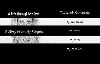
- 1. Table of Contents A Life Through My Eyes My Old Pieces My Series A Story From My Fingers My Blog My Magazine
- 2. My Emotions Graphite pencil on paper 2010
- 3. The Resurrection Graphite pencil and watercolor on paper 2010
- 4. The Crow Oil pastel on paper 2010
- 5. That Ruby Ring Scratchboard and watercolor 2010
- 6. Flower Still Life Graphite and colored pencil on paper 2010
- 7. Kitten Scratchboard 2010
- 8. Winter Scene Pen and Ink on paper 2010
- 9. Sister Self-Portrait Inspired by Van Gogh’s Self Portrait Craft - The tools I used to make this piece were water color paint on paper. First I drew out the image of my sister on the paper and then applied a pink wash to start off the tone of the overall painting. I then added more layers of slightly thicker paint with water and painted the background with natural curved swirls. After that I applied a pink wash for the hair and a pinkish-orange wash for the face. Again I painted the hair with slightly thicker paint with water and used quick dashed strokes to give it the same effect as Van Gogh's Self Portrait. I used the same tech- nique with the face but with orange toned colors. I also did more blotching when painting the face than dashes. Last, I outlined the hair with a dark blue to stand out like Van Gogh's red hair in his blue Self Portrait. “Her expression may show that she is content, but what is going on inside of her begs to differ.” Composition - The layout of this piece is of a traditional three-quarters portrait pose. I used the same swirly three- colored lines in the background as in Van Gogh's Self Portrait. I painted the hair straight to contrast the natural swirly lines and keep the viewer interested throughout the whole piece. The face overall consists of straight vertical lines and some straight horizontal lines. The swirls on the other hand are seem to flail around the entire background. Because of this, the viewer may then follow the spiraling lines and stay interested for a longer time. Concept - I wanted the viewer to see the portrait of a woman as her seemingly happy self. Her expression may show that she is content, but what is going on inside of her begs to differ. The swirl shapes in the background may portray the disorderly life she is living. They are in the background to symbolize the fact that she temporarily Watercolor paint on paper pushes her problems to the back of her mind in order to show the public the joyful mask she unwillingly puts on. December 2011
- 10. P Craft - To make this piece, I used sharpie marker on paper. I sketched out the image of a man shouting and then began to make small dots with the sharpie markers. I made the dots more concentrated in areas of that particular color and added darker shades with each other to make a darker e a tone when looked at from far away. Areas with highlights, or lighter spots, I only added a few dots just to give a hint of that color. Composition - I arranged the man's image in this piece c to be cropped to his face to focus on his expression. I made the face in all warm colors and mostly red shades. I put his open mouth at the bottom of the page to make the viewer's eye travel from top to bottom of the piece. The background is in cool blue tones to contrast with the foreground which e is all warm tones. Also, to make the man's eye stand out, I made them blue as well. Concept - The overall feeling of this piece was to be anger, depicted by the red tones in the man’s face. He is the man whom the previous woman is married to. Unhappy and completely furious, the man expresses his anger which foreshadows the abuse he means to portray towards his wife. He doesn’t get everything he wants, which brings him to this state of being. Having ultimate control is what he yearns for and proceeds in trying to obtain over his wife. Sharpie on paper September 2011
- 11. Graphite on paper October 2011 Craft – The tools I used to make this piece consisted of a photo- graph, pencil and paper. I drew out the photo of the girl plastered to glass. I made the highlights as white as I could by erasing all traces of graphite. I did the opposite by making the dark parts as dark as I could by using a softer pencil and my pressing harder and applying more layers of graphite. Composition -While drawing the image, I made sure to keep highlights as white as possible to accentuate the fact that it is skin against glass. I made the dark parts of the picture as dark as possible to show that the girl is in a secluded place and definitely trapped. I wanted the viewer to see the girl’s hands first, so I made them take up the majority of the piece. The fingers pointing up- wards direct the viewer’s eyes to the face of the girl in the piece. Concept – The meaning of this piece is that the woman feels as though she is trapped in the abusive relationship with her husband and there is nobody there to help free her. She is pressed against the sheet of glass almost as though she is in a box and suffocating to death. Her hands beg for freedom and are faced in that direc- tion. She can see through to that freedom, but is not able to reach it just yet. “..trapped in the abusive relationship with her husband and there is nobody there to help free her..” Let Me Out
- 12. Untitled Love Craft – The tools I used to make this piece were pencil, paper, and a photograph. I wanted something with a romantic theme, so I found a photograph of a couple holding each other. I drew the outlines of both figures, but only shaded in the figure of the woman. I left the man’s figure a contour drawing with empty white space inside of him. I made the background a smooth black. Composition – When planning out this piece, I wanted the viewer to look directly at the man’s figure so I left him white while I shaded in the female with great detail, and made the background black. The reason for this is to contrast the man’s white figure from the dark background. I also wanted the viewer to notice the natural beauty in the woman’s features, so I drew her hair to be wavy and natural- looking. I made the hands go on either side of the man’s figure to create interest in the entire piece. I wanted the viewer’s eyes to go from hand to hand and along the arm up to the woman’s body. From that I wanted the viewer’s eye to travel along the man’s body since he is holding that of the female. “..his absence in the life of his wife.. She is left to hold onto nothing..” Concept – This piece is about when the woman remembers the intimate times she had with her husband before he turned into her abusive partner. He used to love her and their connection was the strongest at that point. The empty space in his body represents his absence in the life of his wife. She is left to hold onto nothing. The white outline may also signify the empty feelings he now portrays to his wife; putting her aside and listing other things as his priorities. Graphite on paper October 2011
- 13. Finding Craft – The tools I used to make this piece were a pen- Myself cil, paper, and a photo of holding hands and handcuffs. I drew out the image of the hands and shaded the man’s hand completely and as realistic as possible. I used a sharp tip on my pencil to get crisp edges to make the hand look real. I made the arm of the man very soft by using my finger to smooth it out. I added some detail to the fingers of the female hand but left the rest of her arm blank and white by drawing only the contour of her arm. I also made the top right corner of the piece a gradient. Composition – I wanted the viewer to first see the white female arm, so I made the background behind the arm a dark shade to contrast. I left the background behind the male arm to contrast from its shading. I wanted the viewer to look down along the man’s arm, concentrate on the holding hands, and then veer off on the handcuff and its chain as well as along the blankness of the female’s arm. I made the hands a bit lower than the center of the page to make it more interesting for the eye. Concept – In this piece, the woman is yet again trapped in her relationship with her husband and longs for free- dom. She is emotionally and physically attached to him, yet she is obviously unhappy. She finds someone new with whom she can be her true self. For this reason, the woman’s arm begins to take form into a real hand rather than a flat contour. Her bare finger where her wedding ring used to be represents her transition from the control of her husband into the life she wishes she had chosen with the one she had always loved. “..her transition from the control of her husband into the life she wishes she had chosen with the one she had always loved.”
- 14. Glimpse of Freedom Graphite and colored pencil on paper September 2011
- 15. Craft - The tools I used to make this piece was Change of graphite pencil, colored pencil, and paper. I took a photo of my sister’s friend on her wedding day and used it as my subject. After drawing the couple, I decided to change the bride’s hair color from brown to blonde. After that, I drew a knife being stabbed into the groom’s back. The background came last and the Heart only color that felt right with this image was red, so I added a gradient red and lightly added a red heart glow also. To finish it off, I colored the dripping blood in bright red. Composition - The first thing I wanted the viewer to see was the knife stabbed in the groom’s back. I ac- complished this by adding red blood at the bottom of the knife to bring attention. I also drew the knife a bit darker than any other object in the piece to stand out. I made the composition interesting by placing the hand in the bottom right corner which ends up going off the page. The head of the groom also goes off the page to crop the focus onto the knife.The direction of the lines of the hands are opposite of the lines used in the knife. In a way, the fingers seem to point or lead in the direc- tion of the knife to bring more attention to it. “..doing what your gut feeling Concept - By drawing the image of a bride stabbing tells you, rather than following her husband in the back, the message I wanted to send is that a person may think they know someone and trust your heart” them, but be ultimately betrayed and only being able to find that out the hard way. The betrayer may not have had those intentions at first, but as the relationship pro- gresses, they begin to wonder why they are there and what the future holds. Confusion leads them into mak- ing mistakes and hurting the other person, even though they meant well in the very beginning. This piece is about not knowing where to go when in a relationship, and doing what your gut feeling tells you, rather than following your heart. Graphite on paper September 2011
- 16. Far Too Late Double Portrait Craft - The tools I used to create this piece were my camera, a pencil and paper. I took two photos of myself making two different expressions and using my hands to accentuate those expressions. I drew out the photos and added lots of shading and detail to make them look as realistic as possible. I also flipped one photo upside down and connected all the arms at the bottom of each photo to make one large image. “She definitely was not ready for what was on the horizon...” Composition - To avoid any boring composition, I chose to make one portrait below the other, rather than side by side like usual. I wanted the viewer to look from face to face, and then from eyes to eye in each face. The con- nected arms also create a path in a circular direction that helps move the eye around. Having the bottom portrait upside down forces the eye to try to flip it right side up. I wanted the viewer to feel compelled to turn their head upside down to view the face right side up since their eyes won’t be able to do so. Concept - The meaning of this piece is that the girl in the story just realized that what she had done was something that would change her life forever. She was aware of the outcome, but still proceeded in doing her deed. If this piece had a dialogue, it would be “Oh shit! Oh shit..” The reason for this is the top face portrays the feeling of shock and surprise, while the bottom face depicts that of realiza- tion and shame. The bottom face also shows the girl not wanting to believe the situation she was currently in and the situation that would soon approach her. She definitely was not ready for what was on the horizon. Graphite on paper December 2011
- 17. G “..she is hiding something from the l a rest of the people in her life..” Craft - The tools I used to make this m piece were colored pencil on paper. I decided to draw a page out of one of my magazines. I drew out the image of the woman with pencil and shaded some parts to reference where the shadows would be. Before I colored a certain o area, I erased any pencil marks, espe- cially if the area was to be colored with a light color. I made layers of color before I was sure which shade I wanted to end with. I put layers of different shades of that color in the beginning and pressed u down harder later on. Compostition - What I wanted the viewer to see first was the blue scarf on the woman and her sunglasses. I made her skin and the overall color of the r piece in warm tones and constrasted with the blue scarf in cool blue tones. I also made the sunglasses a dark color and her lips bright red to stand out from the rest of the light image. To give the portrait a non-traditional feel, I left the bottom of the scarf and the blouse sketched out without color to give it an unfinished look to spark imagination from the viewer. Concept - The portrait of the woman in a scarf and sunglasses portrays the image of a glamourous woman who works hard to keep her good looks and show that she cares about how people see her. She wants to give a good im- pression on everyone she meets. The sunglasses hide her eyes and the scarf hides most of her hair, just like she is hiding something from the rest of the people in her life. It gives a mysterious Graphite and colored feel to the viewer. pencil on paper September 2011
- 18. Free To Be Myself Craft - The tools I used to make this piece were pencil, paper, and a photograph. I sketched out the drawing on paper and then shaded it to make it look as realistic as possible. I tried to blend the graphite on the paper as smoothly as possible to achieve a realistic look to the piece. Composition - I wanted the viewer to focus on the kissing couple, so I positioned the girl’s hand onto the man’s cheek. I did this so the length of the arm led the viewer’s eyes to their lips. The positioning of both figure’s arms go in a circu- lar shape to ultimately lead the viewer’s eyes to the kiss. The blank space around them only accentuates more focus onto the couple holding each other. I also made the couple upside down because the couple is laying down in bed. Also, it is because the perspective from which the viewer is experiencing the piece is more interesting that way. Concept - What I wanted the viewer to think about is that the woman in the picture is finally free to be herself and free to be with the one she truly loves. The blank space around her represents the absence of anything that could potentially get in her way of pursuing whatever makes her happy. She finally lets go of the past and whatever it was that was holding her back, and welcomes the hopeful future with open arms. Graphite on paper November 2011
- 19. F a r e w e l l Encyclopedia, varnish, sharpie, on cardboard September 2011
- 20. About Me My life, my art, and my series. I have been interested in art ever since I was a young girl. I was always drawing, coloring, painting, building anything I could get my tiny hands on. At the age of 6, my kindergarten teacher was the first to notice my talent. Since then, my ability and passion has only grown stronger. My older sister Barbara had always pushed me to get better and work harder on my art. Her determination in her own work inspired me to strive for something better in my own pieces. Out of that, I began to have an interest in portraits, especially that of women. I am also very interested in different facial expressions since they are the main portrayal of any emotion a person may have. I, myself, am known to have distinct, and sometimes pretty quirky, facial expressions to mirror what I am feeling inside. Because of this, many of my pieces are self-portraits, one of which includes four different facial expressions that I usu- ally show. Another thing I really enjoy drawing are hands. Like facial expressions, I feel as though hands play a huge role in depicting a person’s emotion. In general, I think hands are very fascinating. Just by looking at one’s hands, you can tell what kind of person they are. Whether it is their race, gender, age, and even some aspects of their personality, it can all be determined just by examining the hands of that person. I also get really absorbed in the detail in every one of my pieces. I feel as though very intricate detailing is very important in my art. The meaning behind my art is equally important because there is no greater satisfaction than when the viewer gets the same message out of my piece as I intended to put in. All of these aspects influenced me into choosing the story in my series. I wanted the viewer to be able to relate to my story, yet I still wanted a sense of uniqueness with the portrayal of it. To do this, I created my pieces from different points of view. Some of which are from perspectives that aren’t usually seen but make the pieces all the more interest- ing. This series is basically a window into my mind. Every aspect included in this series plays a huge role in my life. Childhood Graphite on paper 2010