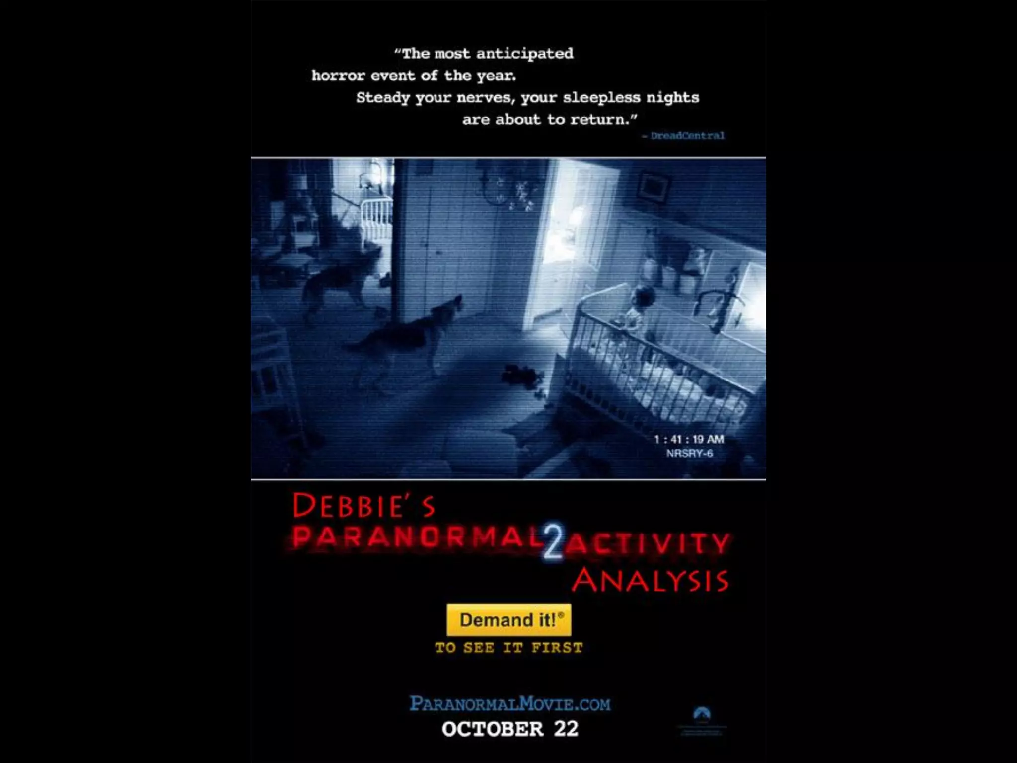
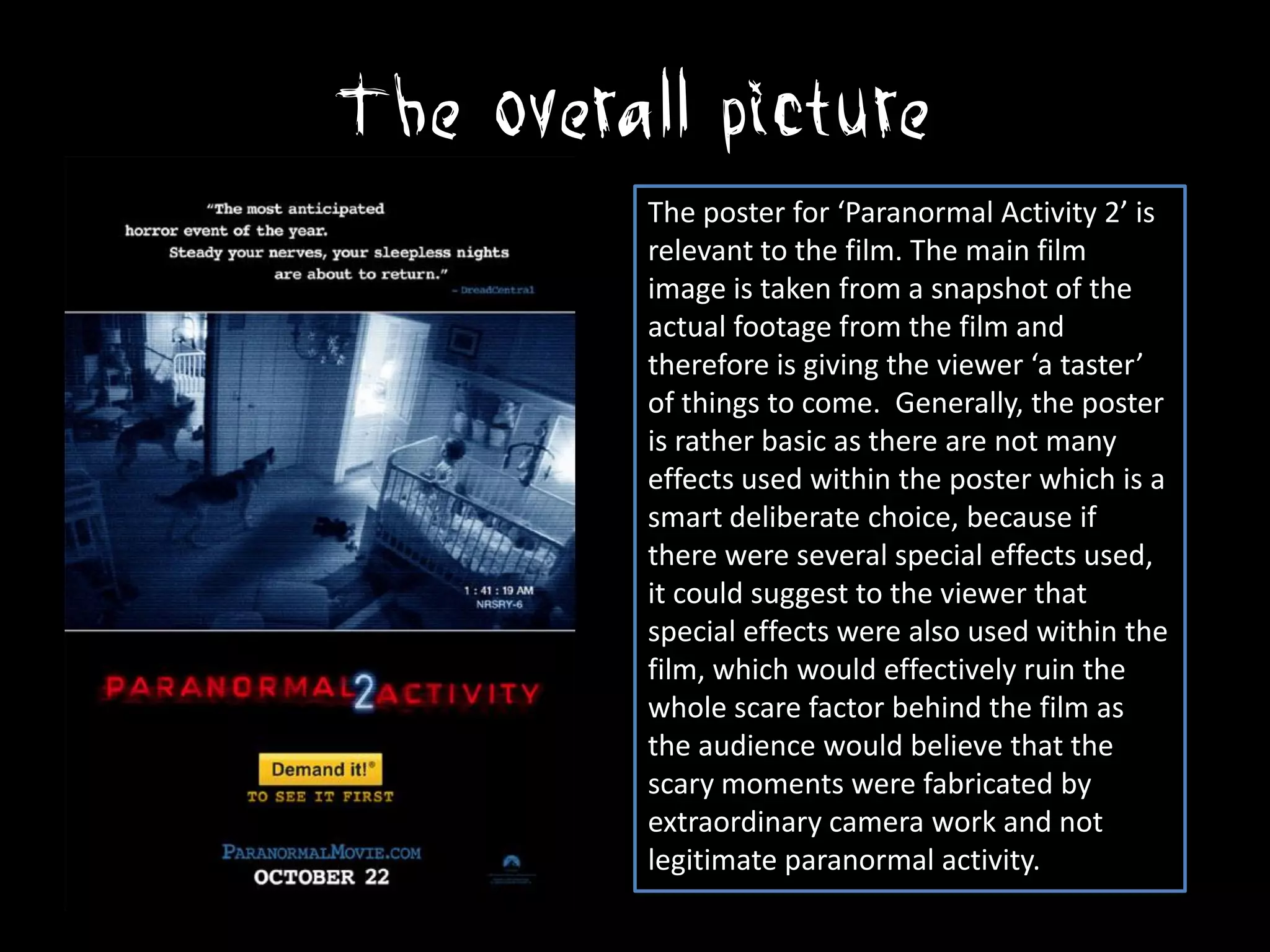
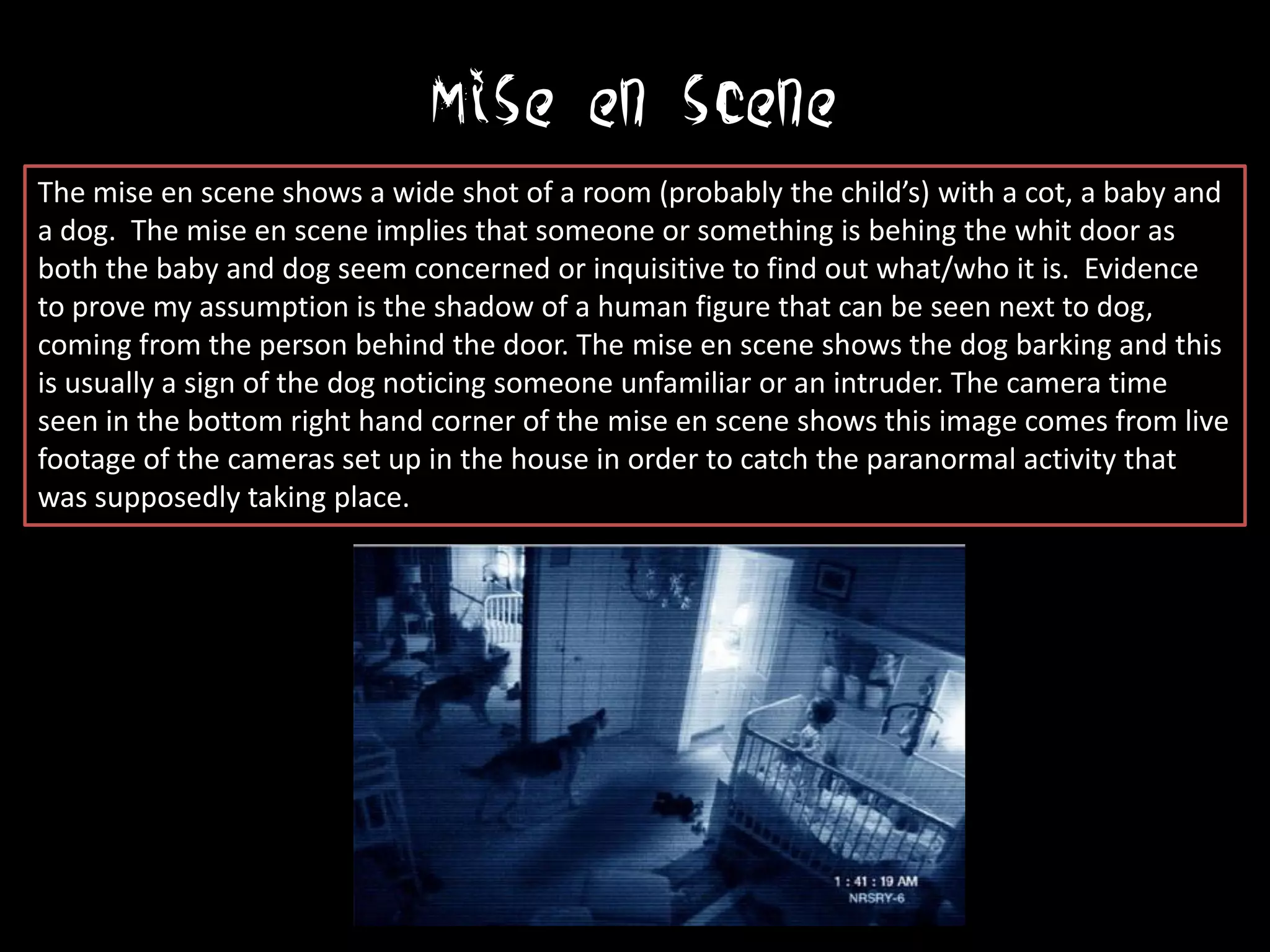
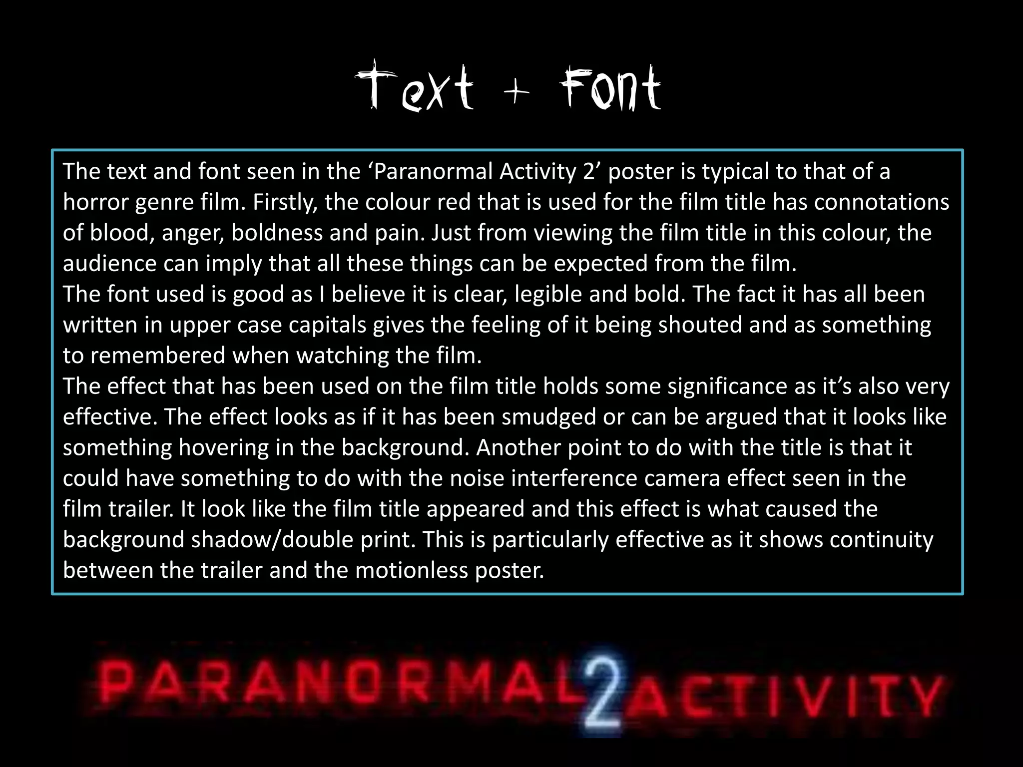
The overall picture
         The poster for ‘Paranormal Activity 2’ is
         relevant to the film. The main film
         image is taken from a snapshot of the
         actual footage from the film and
         therefore is giving the viewer ‘a taster’
         of things to come. Generally, the poster
         is rather basic as there are not many
         effects used within the poster which is a
         smart deliberate choice, because if
         there were several special effects used,
         it could suggest to the viewer that
         special effects were also used within the
         film, which would effectively ruin the
         whole scare factor behind the film as
         the audience would believe that the
         scary moments were fabricated by
         extraordinary camera work and not
         legitimate paranormal activity.
Mise en scene
The mise en scene shows a wide shot of a room (probably the child’s) with a cot, a baby and
a dog. The mise en scene implies that someone or something is behing the whit door as
both the baby and dog seem concerned or inquisitive to find out what/who it is. Evidence
to prove my assumption is the shadow of a human figure that can be seen next to dog,
coming from the person behind the door. The mise en scene shows the dog barking and this
is usually a sign of the dog noticing someone unfamiliar or an intruder. The camera time
seen in the bottom right hand corner of the mise en scene shows this image comes from live
footage of the cameras set up in the house in order to catch the paranormal activity that
was supposedly taking place.
Text + Font
The text and font seen in the ‘Paranormal Activity 2’ poster is typical to that of a
horror genre film. Firstly, the colour red that is used for the film title has connotations
of blood, anger, boldness and pain. Just from viewing the film title in this colour, the
audience can imply that all these things can be expected from the film.
The font used is good as I believe it is clear, legible and bold. The fact it has all been
written in upper case capitals gives the feeling of it being shouted and as something
to remembered when watching the film.
The effect that has been used on the film title holds some significance as it’s also very
effective. The effect looks as if it has been smudged or can be argued that it looks like
something hovering in the background. Another point to do with the title is that it
could have something to do with the noise interference camera effect seen in the
film trailer. It look like the film title appeared and this effect is what caused the
background shadow/double print. This is particularly effective as it shows continuity
between the trailer and the motionless poster.
What’s what?!
                Film Title


                Review


                Film Website


                Release Date

Paranormal activity poster analysis

  • 2.
    The overall picture The poster for ‘Paranormal Activity 2’ is relevant to the film. The main film image is taken from a snapshot of the actual footage from the film and therefore is giving the viewer ‘a taster’ of things to come. Generally, the poster is rather basic as there are not many effects used within the poster which is a smart deliberate choice, because if there were several special effects used, it could suggest to the viewer that special effects were also used within the film, which would effectively ruin the whole scare factor behind the film as the audience would believe that the scary moments were fabricated by extraordinary camera work and not legitimate paranormal activity.
  • 3.
    Mise en scene Themise en scene shows a wide shot of a room (probably the child’s) with a cot, a baby and a dog. The mise en scene implies that someone or something is behing the whit door as both the baby and dog seem concerned or inquisitive to find out what/who it is. Evidence to prove my assumption is the shadow of a human figure that can be seen next to dog, coming from the person behind the door. The mise en scene shows the dog barking and this is usually a sign of the dog noticing someone unfamiliar or an intruder. The camera time seen in the bottom right hand corner of the mise en scene shows this image comes from live footage of the cameras set up in the house in order to catch the paranormal activity that was supposedly taking place.
  • 4.
    Text + Font Thetext and font seen in the ‘Paranormal Activity 2’ poster is typical to that of a horror genre film. Firstly, the colour red that is used for the film title has connotations of blood, anger, boldness and pain. Just from viewing the film title in this colour, the audience can imply that all these things can be expected from the film. The font used is good as I believe it is clear, legible and bold. The fact it has all been written in upper case capitals gives the feeling of it being shouted and as something to remembered when watching the film. The effect that has been used on the film title holds some significance as it’s also very effective. The effect looks as if it has been smudged or can be argued that it looks like something hovering in the background. Another point to do with the title is that it could have something to do with the noise interference camera effect seen in the film trailer. It look like the film title appeared and this effect is what caused the background shadow/double print. This is particularly effective as it shows continuity between the trailer and the motionless poster.
  • 5.
    What’s what?! Film Title Review Film Website Release Date