Research Data and Scholarly Communication (with notes)
•
7 likes•3,850 views

Presented for Marquette University's Scholarly Communication Symposium on February 11, 2013.

Recommended
Recommended
More Related Content
What's hot
What's hot (20)
Viewers also liked
Viewers also liked (20)
Similar to Research Data and Scholarly Communication (with notes)
Similar to Research Data and Scholarly Communication (with notes) (20)
More from Dorothea Salo
More from Dorothea Salo (13)
Recently uploaded
Recently uploaded (20)
Research Data and Scholarly Communication (with notes)
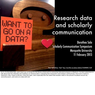
- 1. Research data and scholarly communication Dorothea Salo Scholarly Communication Symposium Marquette University 11 February 2013 Photo: Todd Huffman, “Data?” http://www.flickr.com/photos/oddwick/2126909099/ CC-BY So hi, I’m Dorothea Salo, and I teach lots of things for the library school and its continuing-education program in Madison. I’ve been asked here to talk about how the relatively new emphasis on research data is changing how researchers and scholars communicate. Since we’re nearly to Valentine’s Day, I have to tell you, I love this topic, and I especially love the sweet little wooden robot in the picture! So please excuse my overenthusiasm, and come on a data with me!
- 2. When you think Scholarly
- 4. chances are you think Photo: linda, “Endless source of inspiration” http://www.flickr.com/photos/jinterwas/ Photo: marya, “austria today -- 20 years ago” http://www.flickr.com/photos/emdot/45246607/ 5325454434/ CC-BY CC-BY books and journals, the classic, measurable, bought-and-sold artifacts of the research process
- 5. or even Or if you’re hip to the digital jive, you think about JSTOR and other massive databases and archives of the journal literature
- 6. or even or Hathi Trust, a massive archive of library books, govdocs, and other such materials
- 7. or even or if open access is your thing, you might even think about open-access journal publishers like Public Library of Science.
- 8. And when you think Data! especially research data
- 9. chances are you think Photo: kevin dooley, “Actual is not normal (a tribute to Edward Tufte)” http://www.flickr.com/photos/pagedooley/2121472112/ CC-BY bar graphs and other sorts of graphs and charts, such as you might find on the pages or pixels of a published journal article
- 10. or Photo: Steve Jurvetson, “Rocket Flight Computer Readout” http://www.flickr.com/photos/jurvetson/4093645514/ CC-BY Or funky pictures that capture phenomena as moments in time, once again part of the published record
- 11. or even Photo: T Farrant of GDS Infographics, “Ballooning CEO Salaries and Mass Layoffs” http://www.flickr.com/photos/gdsdigital/4963409391/ CC-BY Or if you’re a hipster data consumer, maybe you’re into pretty infographics.
- 12. Data trapped in amber Photo: Luz, “amber” http://www.flickr.com/photos/nieve44/3800137286/ CC-BY What all these common notions of data have in common is that they’re not actually data! The publication process takes pieces of the data -- not everything -- and reduces them to a graph or a table or a chart that tells a story. Part of the reason this is done is that until quite recently, the scholarly publishing process was print-based, and printing most data makes absolutely zero sense, economically or in terms of scholarly reuse. And another part of the reason is that we human beings read articles to understand the stories they’re telling, and graphs and charts and tables tell stories much better than the actual data usually do. So a graph or a table or a chart or an infographic is data trapped in amber. It’s very beautiful, and human beings appreciate that beauty, BUT... you can’t get those little particles of data back out, much less do anything useful with them if you did!
- 13. Data trapped in notebooks Photo: Steve Jurvetson, “How the Eagle Landed -- the Grumman Construction Log” http://www.flickr.com/photos/jurvetson/7610058658/ CC-BY So if we want the data without all that amber in the way, can we go back in the research process and capture it? Well, here’s where we run into another paper-based problem: the lab notebook. The data’s there, but the work to reuse it is just inconceivable -- and that’s IF we have the space to store all those notebooks to begin with! For anyone interested in data, paper is a problem.
- 14. But that’s changing! (you
- 15. know,
- 16. just
- 17. like
- 19. else,
- 20. right?) As data are collected and stored digitally -- and that’s already happening, in practically any discipline you name -- suddenly research can take advantage of the different affordances of digital materials. So the way all of us treat data is changing, and changing such that data are becoming a first-class citizen of scholarly communication, every bit as important as books and journals!
- 21. Hey!
- 22. You
- 23. got
- 24. your scholarly
- 26. my data! In some ways this dance is a little bit like those Reese’s peanut-butter-and-chocolate commercials people who are as old as I am remember from childhood.
- 27. Hey!
- 28. You
- 29. got
- 30. your data in
- 31. my scholarly
- 33. Let’s see both of those in action. (and
- 34. talk
- 35. about
- 37. we
- 38. fit
- 39. in)
- 40. Hey!
- 41. You
- 42. got
- 43. your scholarly
- 45. my data! As we all know, the literature’s pretty much gone digital! That gives us the option of treating it like a great big digital dataset.
- 46. Data-mining the literature Photo: Janet Lindenmuth, “Setting Props” http://www.flickr.com/photos/j3net/3916541891/ CC-BY The computer-science and information-retrieval folks have been finding interesting ways to throw computers at text for decades; they often call it “text mining” or “data mining.” And it goes without saying that the research literature is a pretty rich and fascinating dataset! What’s more, it’s got pretty good metadata, as these things go, which makes it an especially juicy target.
- 47. Who
- 48. owns
- 50. allowed
- 51. to
- 53. with
- 54. it? What
- 55. if
- 56. it’s
- 57. locked
- 59. a
- 60. paywall? This raises the question of how anybody gets their hands on enough of the scholarly literature OR its metadata to run analyses on, given that it lives lots of different places and is owned by lots of different people and organizations. Guess what, this is one place that libraries are stepping in to help! At Madison, for example, we had a group of digital humanists who wanted to text-mine the Early English Books Online database, which is licensed. So our librarians called EEBO, worked something out, made security arrangements for the data, and got the researchers what they needed. (CLICK) Which is great, but it’s hideously laborious. There’s no WAY we can pull that off for everybody we license stuff from, not least because a lot of them will say no! So this is another reason open access is important to the academy: it makes it so much easier to treat the scholarly literature as data and extract more knowledge from it!
- 61. Impact Factor you’re
- 62. KIDDING
- 64. right? So there are lots of applications of data-mining the scholarly literature I COULD talk about, but since we’re focusing on scholarly communication today, I want to talk about data-mining the USE of the scholarly literature, because that’s bidding fair to change how our faculty face tenure and promotion committees. We know about the journal impact factor, and we also know (CLICK) if we’re honest with ourselves that the way it’s used to judge faculty publication records is a complete crock -- statistically flawed, opaque data, completely useless for measuring people instead of journals... it’s seriously EMBARRASSING TO THE ENTIRE ACADEMY that this hideously flawed and incomplete measure is determining people’s careers! Seriously. Please. Anywhere you see journal impact factor figuring in tenure and promotion decisions, MAKE THAT STOP. I’ll be more than happy to point you to support for that decision.
- 65. #altmetrics: ImpactStory But if we don’t use and abuse journal impact factor, what SHOULD we be paying attention to? That’s the question that “alternative metrics” investigators are asking, and starting to offer potential answers to. I’m showing you an example from ImpactStory, which you can find at impact story dot org, because they’re pulling together a lot of usage information from a lot of sources, and they’re showing their work, and I think that’s important, because part of the conversation about tenure and promotion is, what SHOULD we value, and how do we collect evidence about it? So here you can see, we’ve separated use by scholars and students, on the left in blue, and use by the general public, on the right in green. (CLICK) And for scholars, we’re looking at saves to bibliographic tools like Mendeley, citations, and recommendations from review services like Faculty of a Thousand. For the public, we’re looking for social-media mentions, bookmarks, and citations in public venues like Wikipedia. What I like about this is that it’s nuanced. Some disciplines couldn’t give a flying flip what the public thinks of them. Great! They get to pretend the entire right column isn’t even there. But consider translational medicine, whose whole reason for being is getting research out of the lab and into medical practice. Do they want their information to reach the public! You bet! And altmetrics promises to give them a way to measure how well they’re doing at that, and use it to assess career accomplishments.
- 66. Showing off... So where are libraries in the altmetrics arena? Well, it turns out we have a dog in this hunt, some of us, as we’ve taken on the job of making sure our faculty show to their best advantage on the Web. One of the best-known projects in this area is VIVO, which started at Cornell and has found takers elsewhere, which lets libraries aggregate their faculty’s publication history and derive data about what they write about, when, and with whom.
- 67. ... not just for humans... Here at Marquette you can see traces of this too, with the Most Popular Papers page in the library’s digital repository of papers. There’s DATA behind that, somewhere, usage data! But it’s hidden, except in this very boiled-down story-telling-for-humans form. Altmetrics challenges us to move beyond telling stories to humans...
- 68. ... but for machines! ... to make sure that machines can aggregate usage data from all over the web, to make sure that data shows up in places like ImpactStory. And conversely, we can help our faculty show off their impact by including ImpactStory’s number crunching in our faculty showcases, as the ImpactStory API makes possible.
- 69. Hey!
- 70. You
- 71. got
- 72. your data in
- 73. my scholarly
- 74. communication! So that’s a little bit about how scholarly communication is becoming conscious of itself as a data-producing and data-using enterprise. The other side of the coin is that researchers are generating data, and sometimes sharing it, and they naturally want appropriate credit for the work they put in and the value those data have, and they want it to COUNT when they go up for tenure and promotion! And researchers who want to reassess and reuse data don’t want to have to go through the runaround of emailing the author, emailing again when they don’t get a response, not understanding the response they DO get, even when it’s a “yes” (which it often isn’t)... and so on. In other words, data sharing is becoming a form of scholarly communication. So let’s talk about that.
- 75. Infrastructure Photo: Steve Jurvetson, “Inverted Tension” http://www.flickr.com/photos/jurvetson/992371651/ CC-BY As a librarian, I’m intimately aware of the immense, cathedral-like infrastructure we’ve built to deal with scholarly communication in the form of books and journals. It’s not just library buildings and shelves! It’s policies on copyright ownership and tenure-and-promotion. It’s assessment and quality-control modalities like journal peer review and book reviews and, much though I hate it, journal impact factor. It’s citation norms and style guides. It’s library cataloging, and journal-article databases. For data, our infrastructure looks a little like this Gaudi cathedral, impressive -- but you can see a lot of scaffolding because it’s definitely still under construction. Libraries, archives, institutions, funders, journals, everybody’s scrambling to build systems and processes that work. So a lot that I’m telling you today will look completely different -- and much, much better -- in five years! But that’s okay; there’s still plenty to talk about now! So let’s go on a really quick tour of some of this emerging infrastructure for governing, managing, sharing, publishing, and crediting data. We’ll start with data policy, which is really the foundation of our cathedral here.
- 76. Funder policies Most people in this room probably know already about the shot heard ‘round the research world, namely the NSF requirement for data- management plans in all grant applications. And from where I’m sitting there’s still a lot of confusion about this with respect to how researchers are expected to share and communicate about their data -- which is only to be expected, because different chunks of NSF have different guidelines about that! What’s clear, though, is that the NSF requirement is consciously trying to create a bias toward data sharing and publication wherever possible. I do think that emphasis will continue and in fact intensify, and certainly we’ll see more policies from other funders as well.
- 77. Institutional data policies This has sent institutions scrambling to catch up with the new funding environment by building policies of their own. This is hard! It’s fraught with tension over data ownership, for one thing, which is an issue much more complicated than I have time to discuss here. And because the technology and training infrastructure on most campuses around data is still so fragmentary, data-retention policies can feel a little like unfunded mandates. So institutional policy development is hard and to some extent politically perilous work, but it has to be done and we’re doing it.
- 78. Journal data policies Now, I ran into this “Journal Research Data Policy Bank” project from the UK about a week ago, and it blew my mind. Since when have we had enough journal data policies to need this? But we do need it now, because journals in a lot of disciplines are waking up to data publication, maybe as a fraud-prevention measure, maybe partnering with a data repository to make life easier for authors and data reusers, maybe making it easier to link from a published article to a dataset held elsewhere -- so if we’re talking about the naturalization of data into regular scholarly-communication processes, this is definitely one place it’s happening! But it’s scattershot. I can’t even give you a rule of thumb about which journals do and don’t have data policies, because it’s really all over the map. That’s why projects like this exist. The best I can tell you is, find out well before you submit an article to a journal!
- 79. Capturing and managing data One of the things I teach my students about data management is that you can’t just tack it on at the end of a project -- that’s a recipe for disaster. The better-planned and more consistent your data management is while you’re doing the research, the more the data actually communicate at the end. The obvious corollary to this is that if datasets are to be full citizens in the scholarly-communication-verse, we *have to care* about the technology researchers use to store, clean, and analyze data. We know, for example, that a great many researchers keep data in Excel -- it’s convenient, it’s flexible, it’s widely available -- but we ALSO know that there are common poor practices in Excel use among researchers that make Excel data harder to understand and reuse. DataUp is a combination Excel plugin and web service that looks for those poor practices and also helps researchers describe their Excel spreadsheets so that other people can open the file and know a bit better what they’re looking at. I love this project -- if you’re an Excel user, check it out!
- 80. Capturing and managing data Another example of change in data storage and communication processes is what’s called “open notebook science,” UsefulChem being a good example of that. This movement to some extent is about researchers being VERY impatient with the lack of tools and storage on their campuses, or the low quality or appropriateness of services provided, such that they cobble together tools on their own. And as a communications modality, I love this, I do -- but as a preservationist, I hate and fear it, because one server bobble or one cloud service going under, and a lot of valuable data is just gone! This is a key missing piece of our cathedral: campus data-storage and data-processing services that WORK.
- 81. Sharing and storing data But we also have some responsibly-run answers to data-storage. Figshare, for example, is a data-management startup that just signed a big supplementary-data-storage agreement with the open-access journal publisher Public Library of Science. The difference between Figshare and UsefulChem is that Figshare has signed another agreement too, this one with a well-known digital archiving cooperative called CLOCKSS, which will take care of all the data in Figshare if Figshare goes out of business or has a major technical breakdown.
- 82. Keeping data safe And some institutions are starting to build reliable data environments as well. I’m showing you Purdue’s PURR because I love its name, but there’s also Penn State’s ScholarSphere, the University of Prince Edward Island’s Virtual Research Environments, Stanford’s SULAIR, and so on. These are typically both data-management AND data-communication environments, though the back-end details differ. I know I’ve been saying this a lot, but -- I do expect to see more of these, especially as pioneers like Purdue show us how best to build them.
- 83. Helping people find data So if there’s all these data repositories and datasets swimming around out there, how do we FIND them? We haven’t communicated data if researchers who could use data can’t actually find it! That’s what Databib is about -- and here’s where I disclose that I’m on Databib’s advisory board. Anybody can add a data repository to Databib after a short signup. Advisory board members then check the entry and approve it to go live. We’ve been around for about half a year, we hit 500 repositories the end of last year, and we’re gunning for more, so help us out! And when you’re not sure where data might be hiding, Databib is one useful place to look.
- 84. Citing data So we’ve managed, processed, stored, archived, and published data -- now we get to the good bit, getting CREDIT for it. There’s an outfit called DataCite that’s issued some recommendations on how to cite and link to data as simply as possible, while still making it possible to do all the neat credit-gathering tricks I discussed earlier when I talked about ImpactStory. Frankly, to some extent this is a job for journals and style guides to take up. All the recommendations in the WORLD won’t make any difference if nobody uses them! So those of you who edit journals, be thinking about this, because the sooner it becomes a normal part of publishing, the better.
- 85. Citation infrastructure: name authority control So, I have to tell a story here. I ran Wisconsin’s analogue to Marquette’s e-repository for several years, and one winter I decided I was going to clean up the author listings, because they were a mess -- people in there with just their initials, the same person with up to eight different versions of their name in there, stuff like that. And it was AWFUL. Oh, my gosh. The worst problem was graduate student co-authors who didn’t go on to publish anywhere else; finding their full names was a horrendous chore, when I could manage to do it at all. It’s not enough to clearly identify datasets; we need to identify the people who create them! Now, libraries already do this for people who write books; it’s called “name authority control.” Which is fine, but a lot of researchers never write books, so they escape library author directories. That’s what ORCID is about. Each researcher gets a unique identifier, which can then be tied to all the publications, presentations, datasets, and other research products they produce! ORCID is the plumbing under the data cathedral. You don’t necessarily see it all the time, but you really want to have it there!
- 86. Human infrastructure: education and training Okay, that’s our whirlwind tour of data in scholarly communication! Because I’ve been motormouthing about technology and policy all this time, I want to close by talking about how we improve the *human infrastructure* involved with data, because nothing matters without that -- really, NOTHING. So up here is MANTRA, one of several research-data management curricula that are emerging from various grant projects. And these grant projects are fine and great and wonderful, but as somebody who DOES data-management training for a living, I have to tell you, curriculum is not the problem! I know what to teach. What I need are VENUES and LEARNERS. So circling all the way back around to policy, I’m telling you, please, help me find the people I need to be teaching, and build the policies that route them through me! Education is a vital part of scholarly communication. If we don’t prepare our undergraduates and graduate students to thrive within an environment in which research data are a first-class citizen, we’re really doing them a disservice! So help me figure out how to train MORE -- and train better.
- 87. Thank you! This presentation available under a Creative Commons 3.0 Attribution license. If you reuse, please continue to credit included images! Photo: Todd Huffman, “Data?” http://www.flickr.com/photos/oddwick/2126909099/ CC-BY Thanks for sticking with me, and I hope to chat with people more at lunch and during breaks today!