Download to read offline


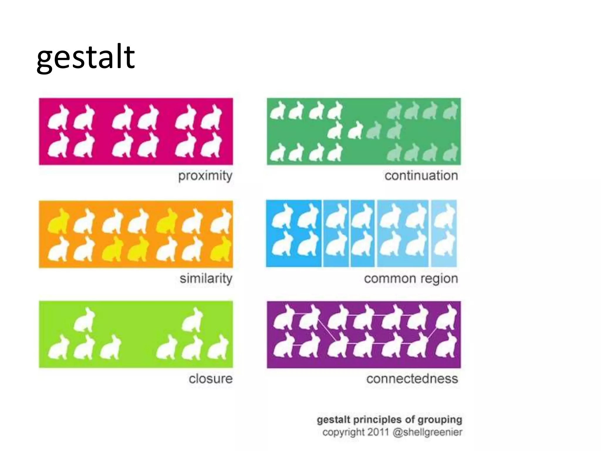
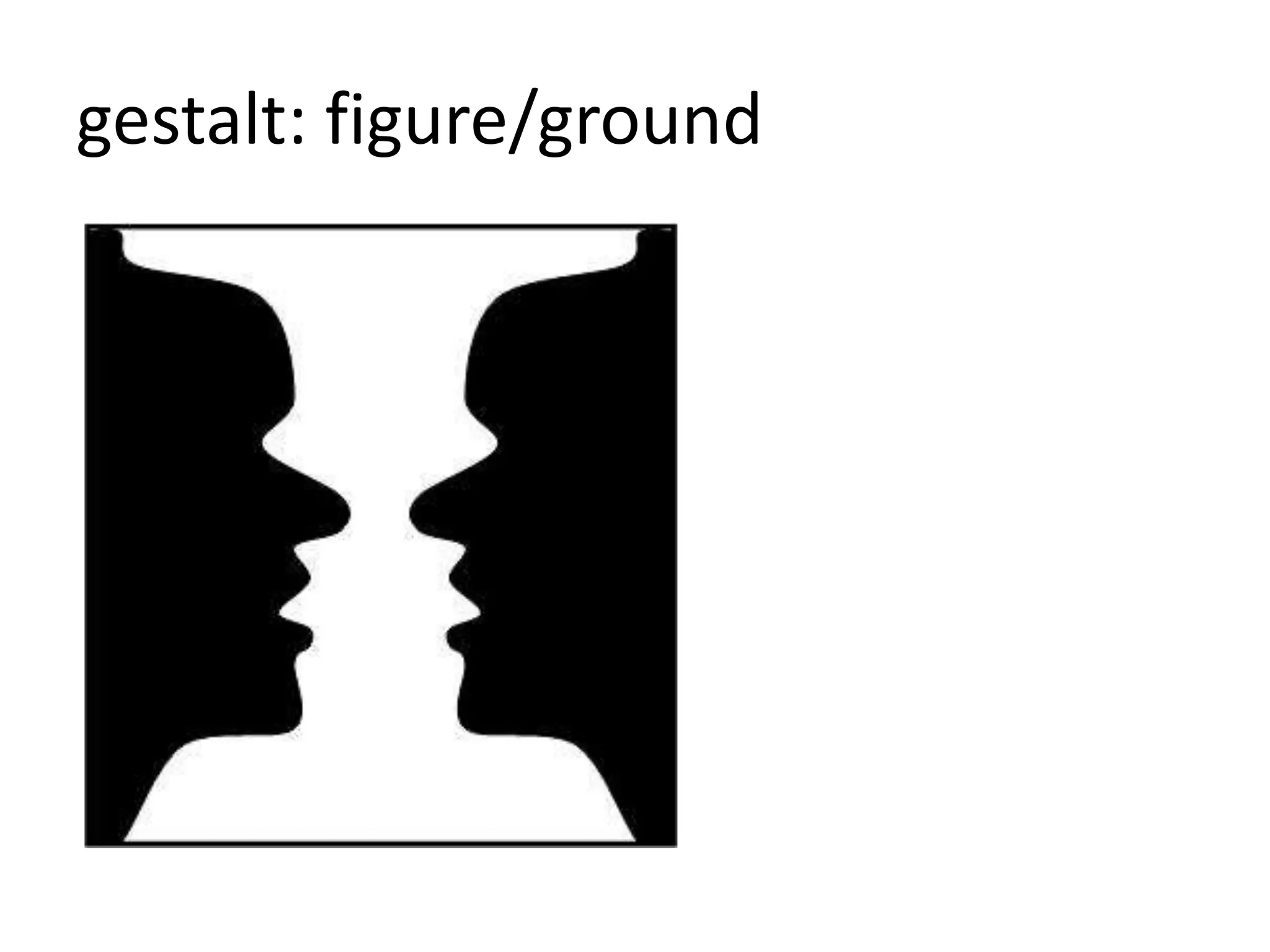
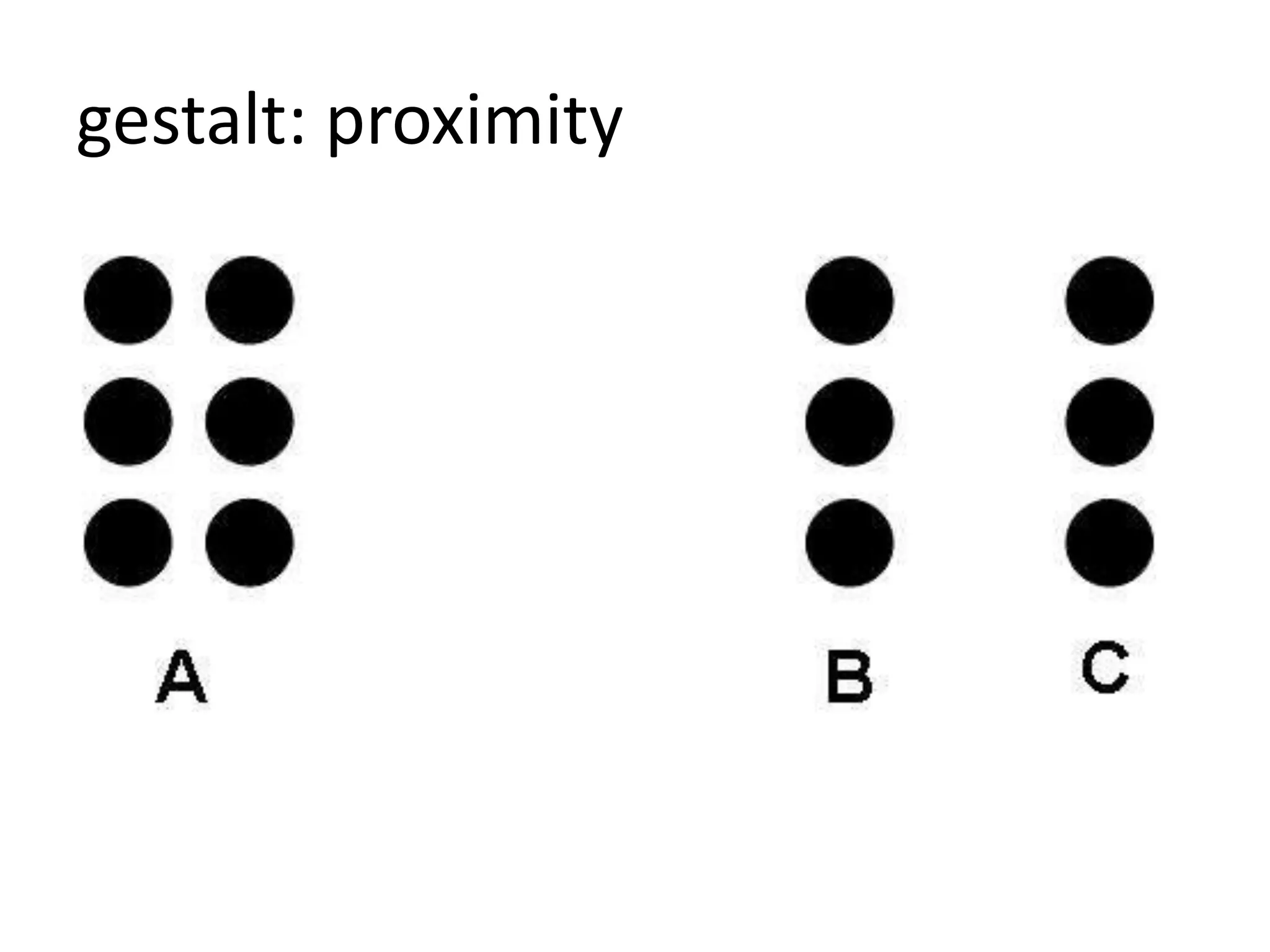
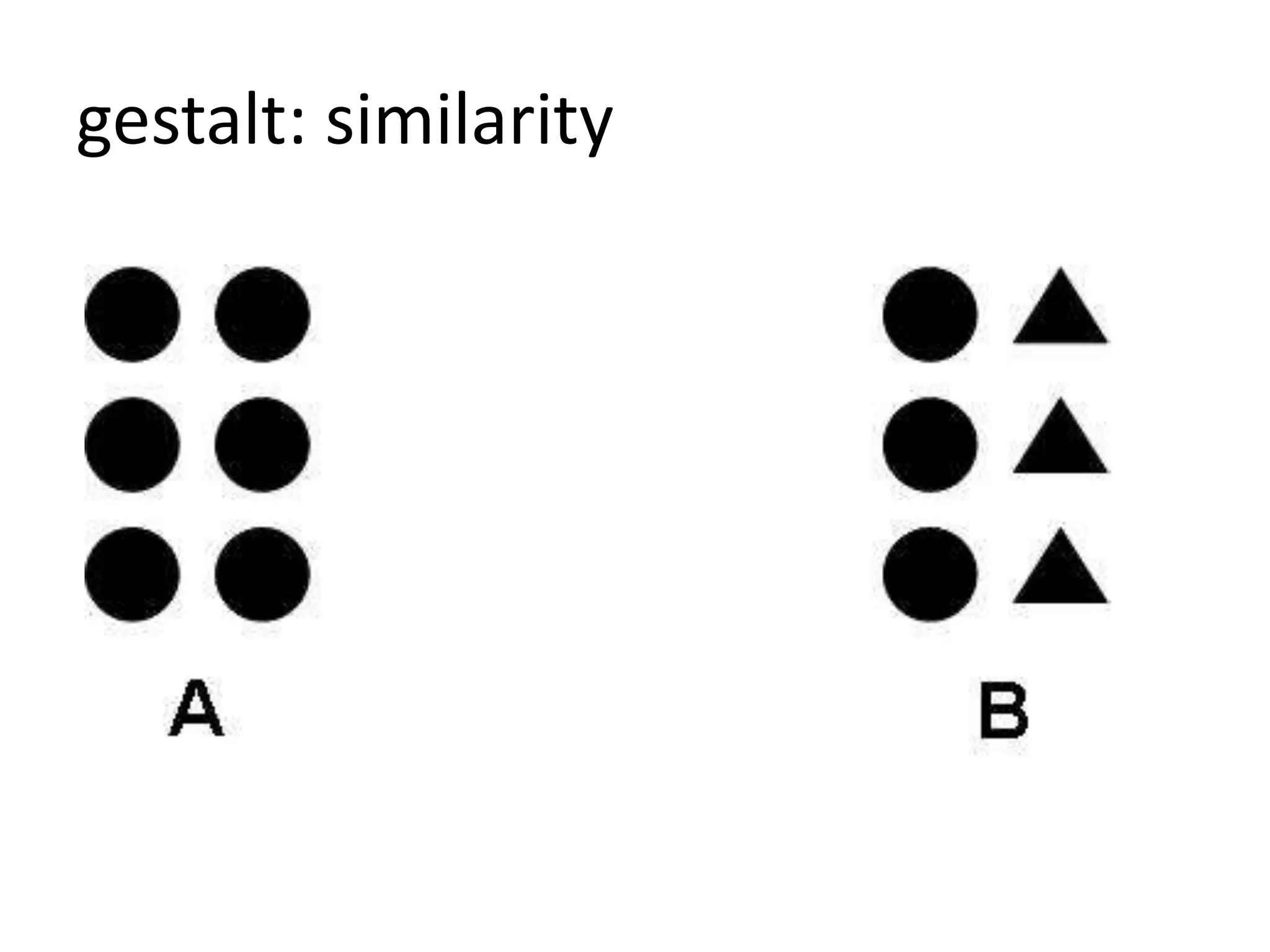
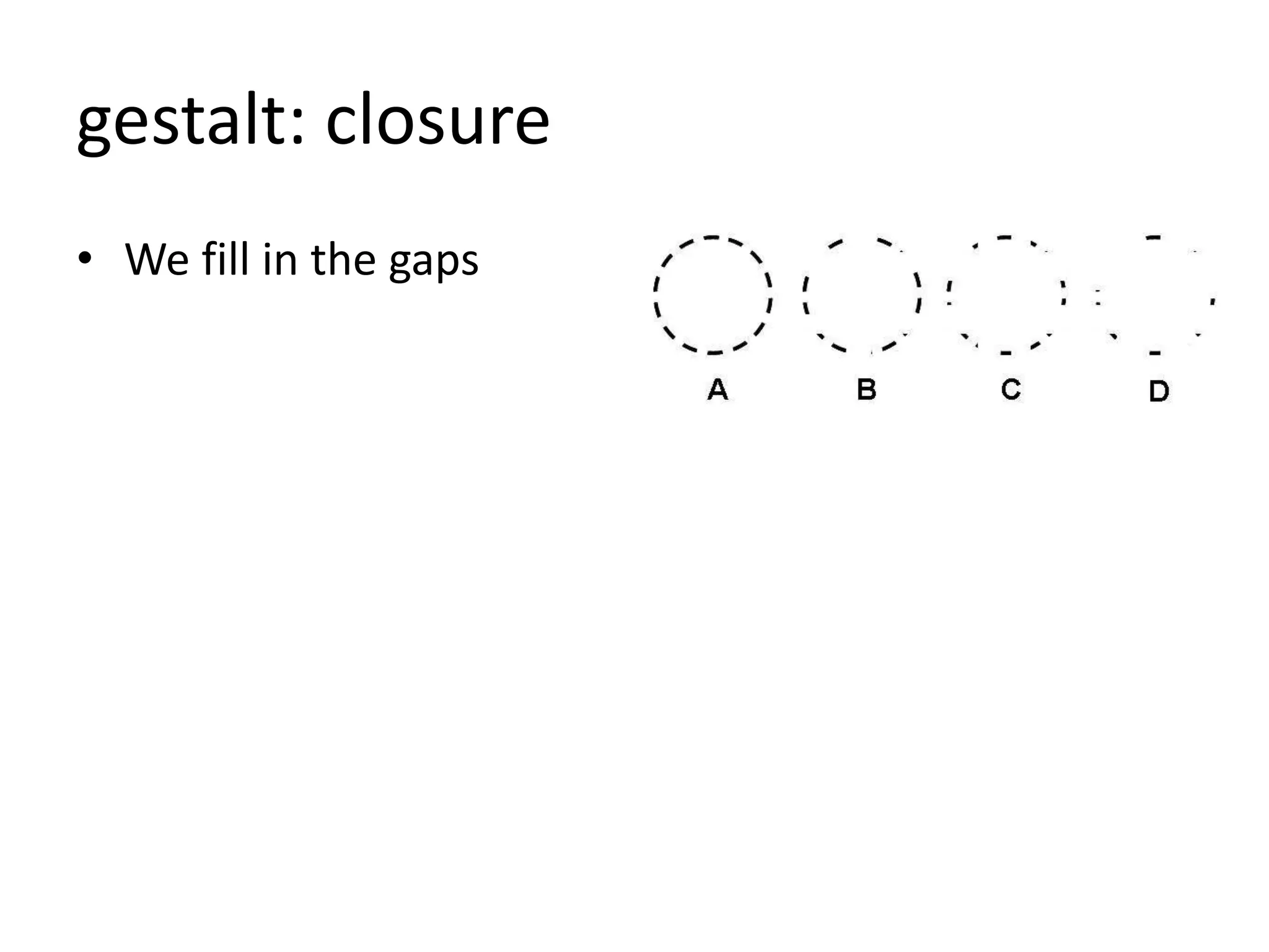
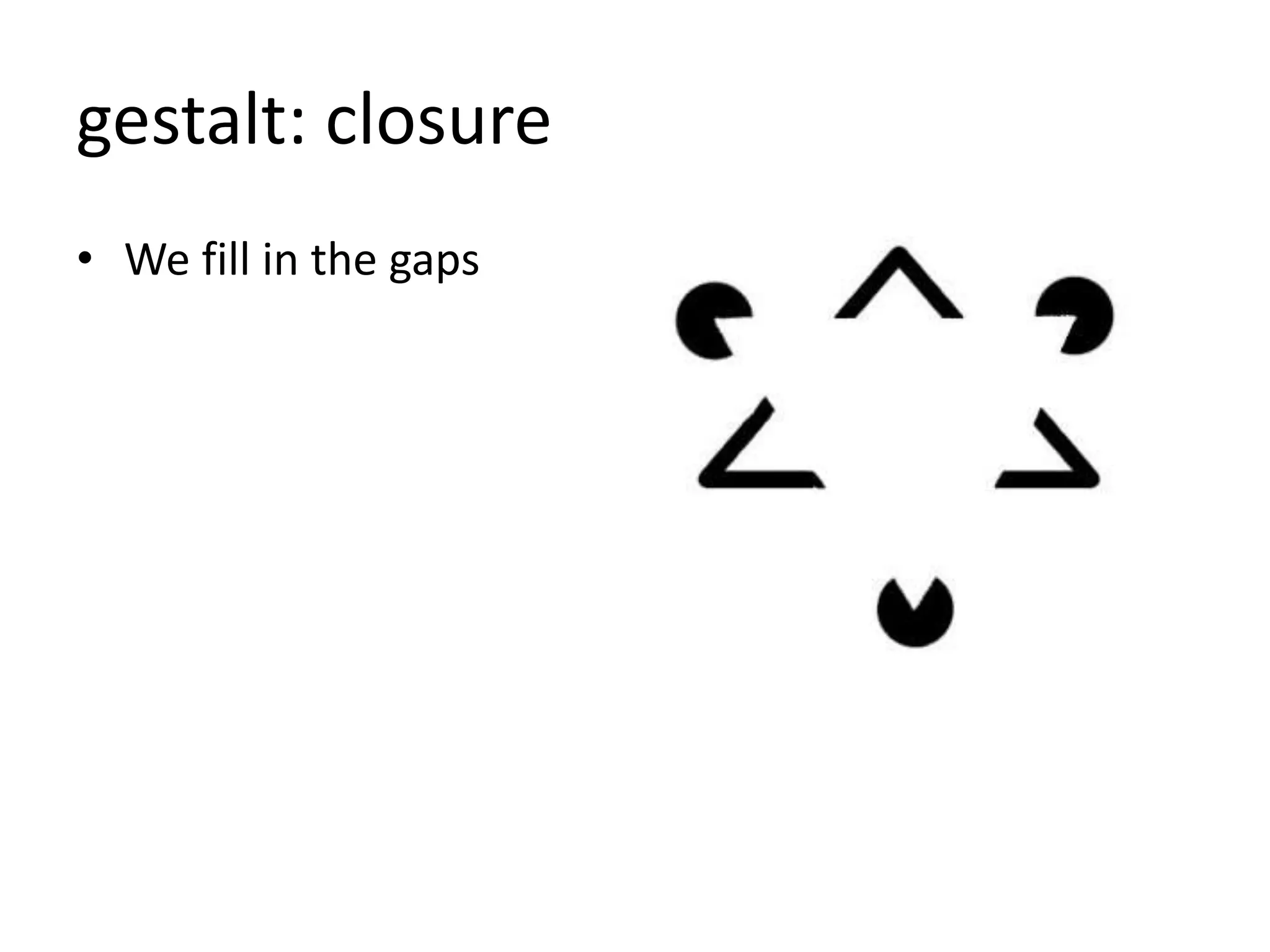
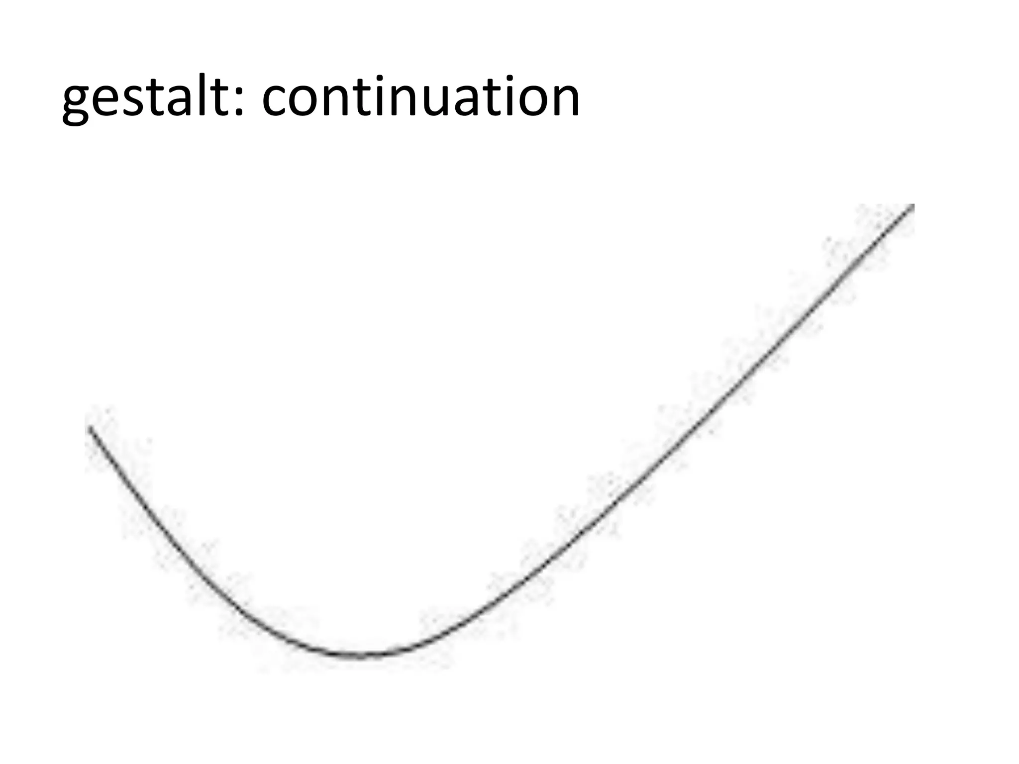
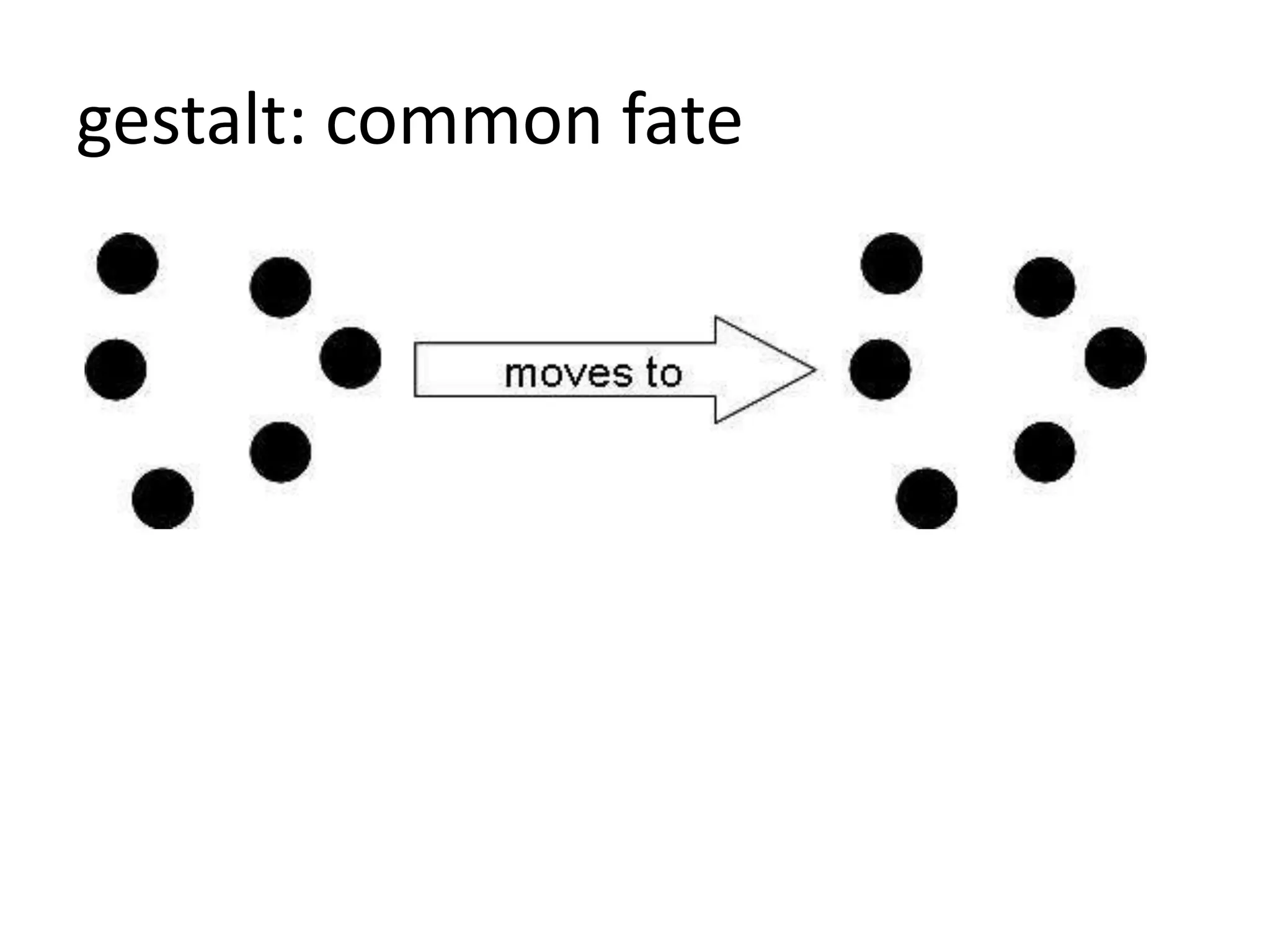
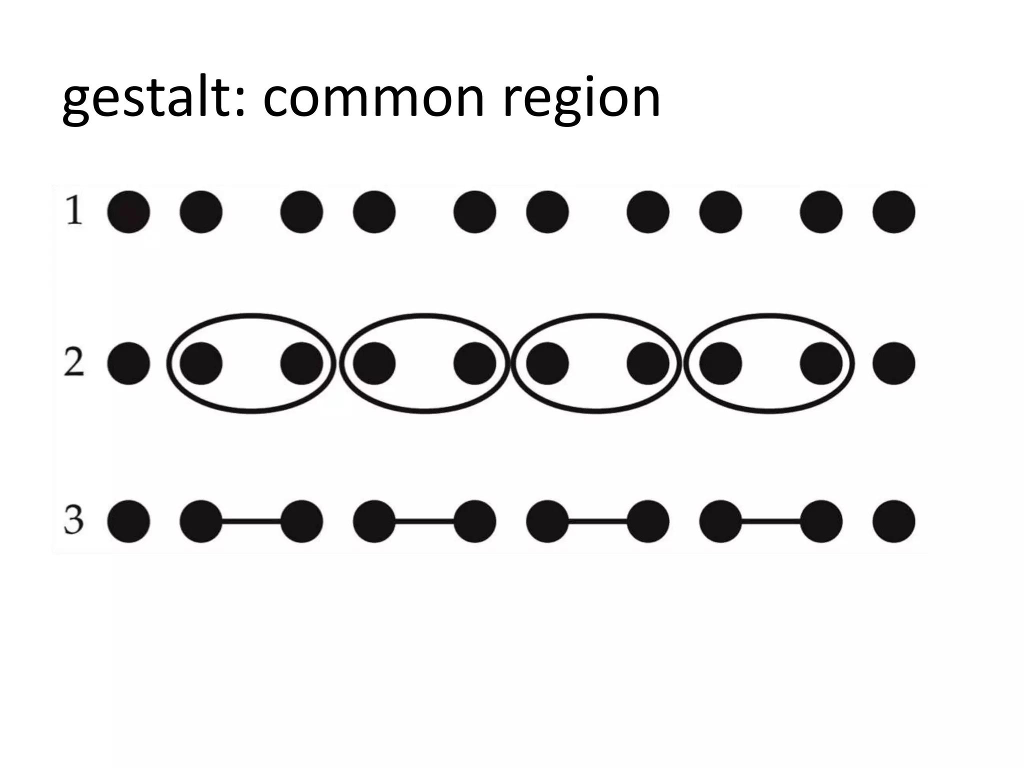


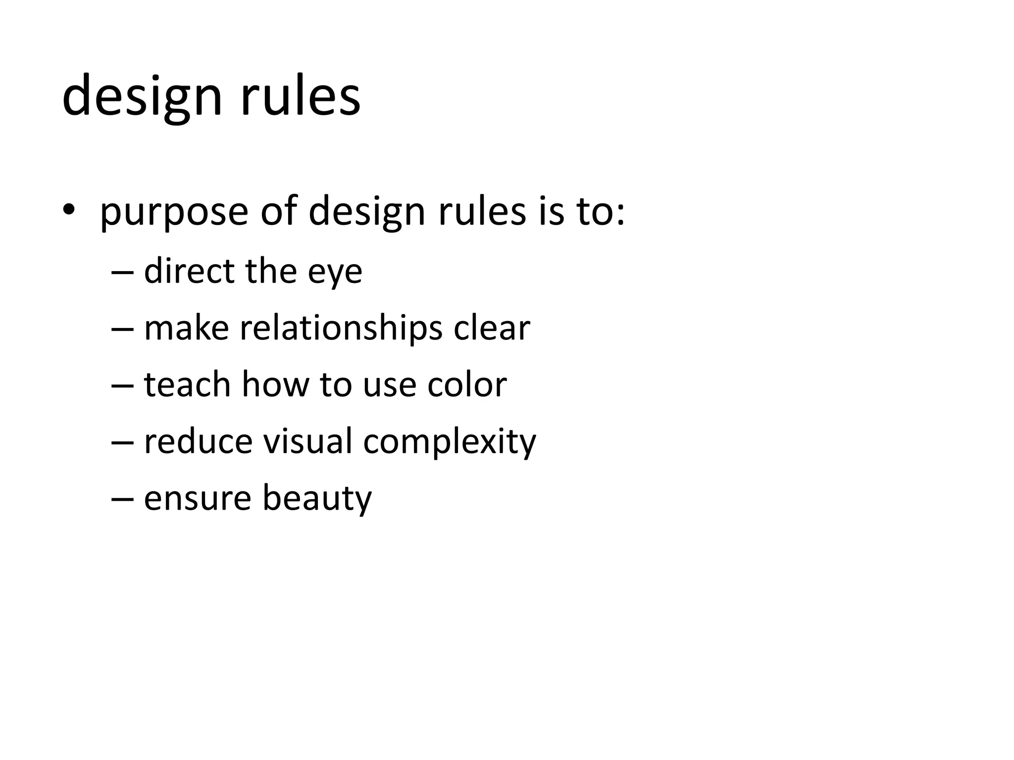
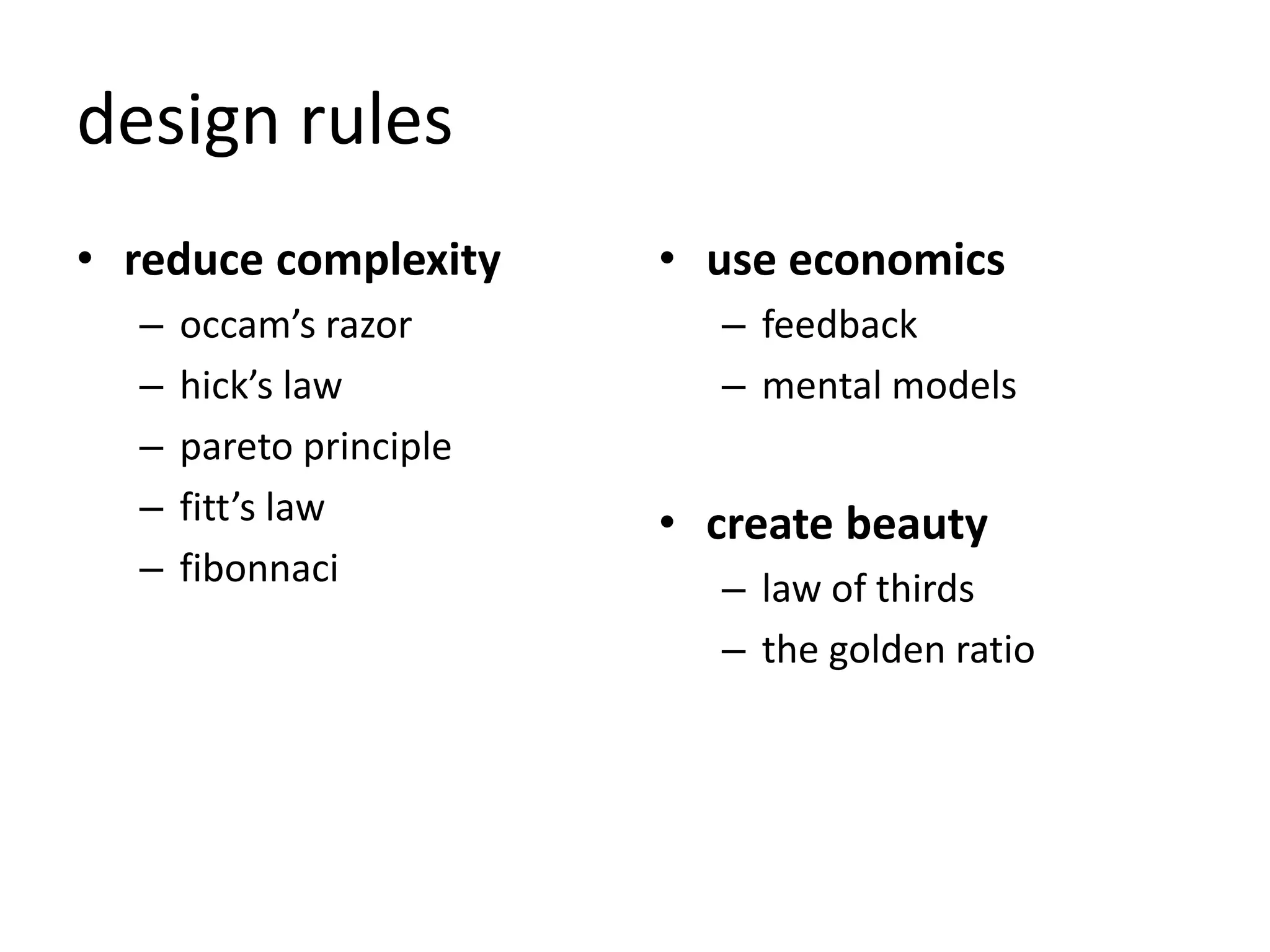

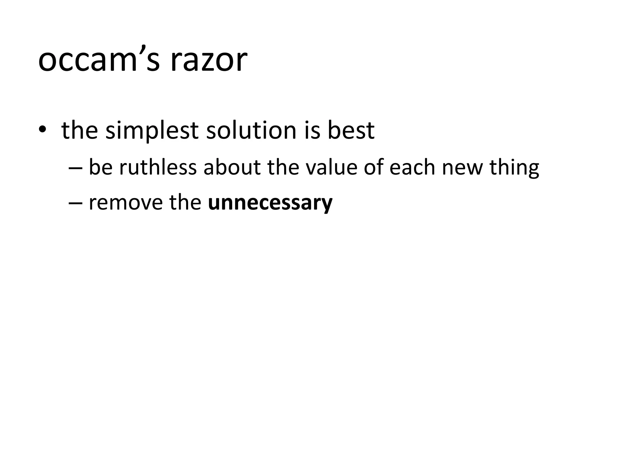
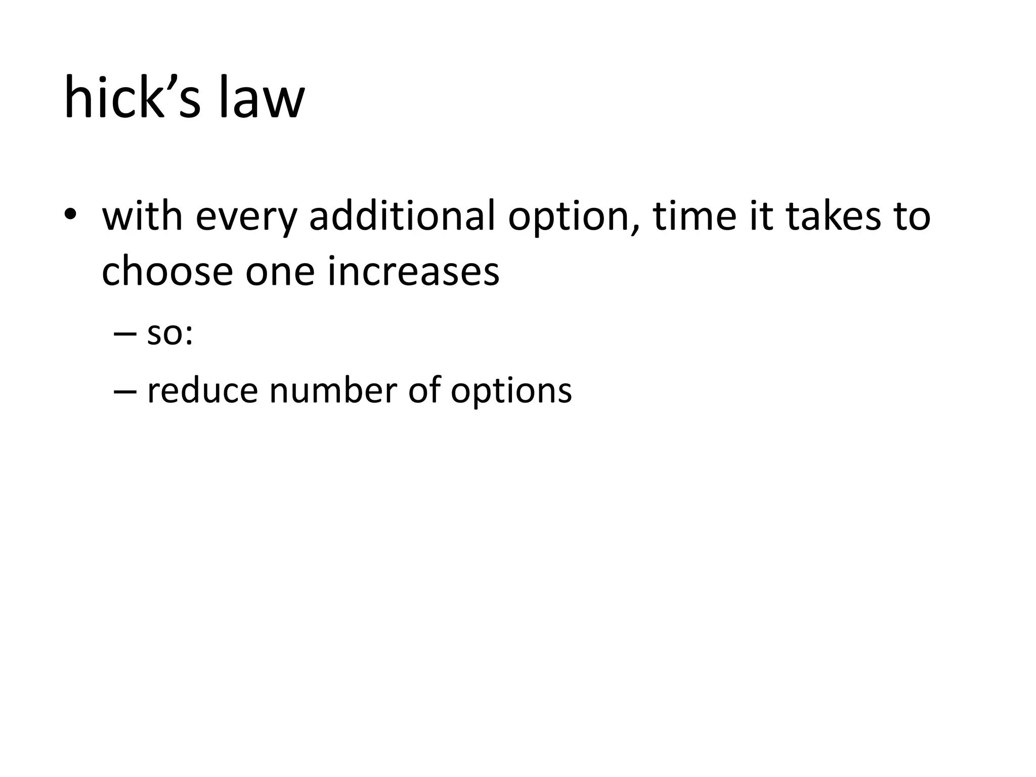
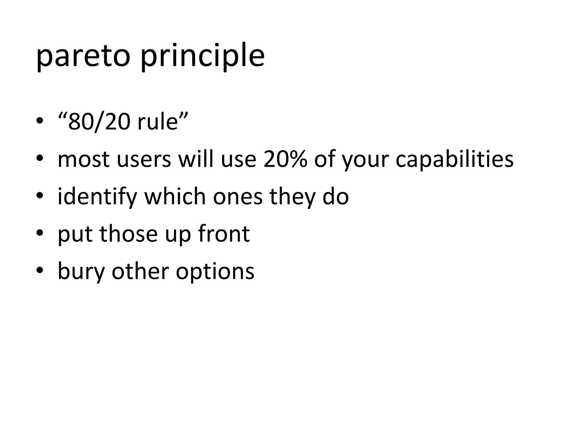

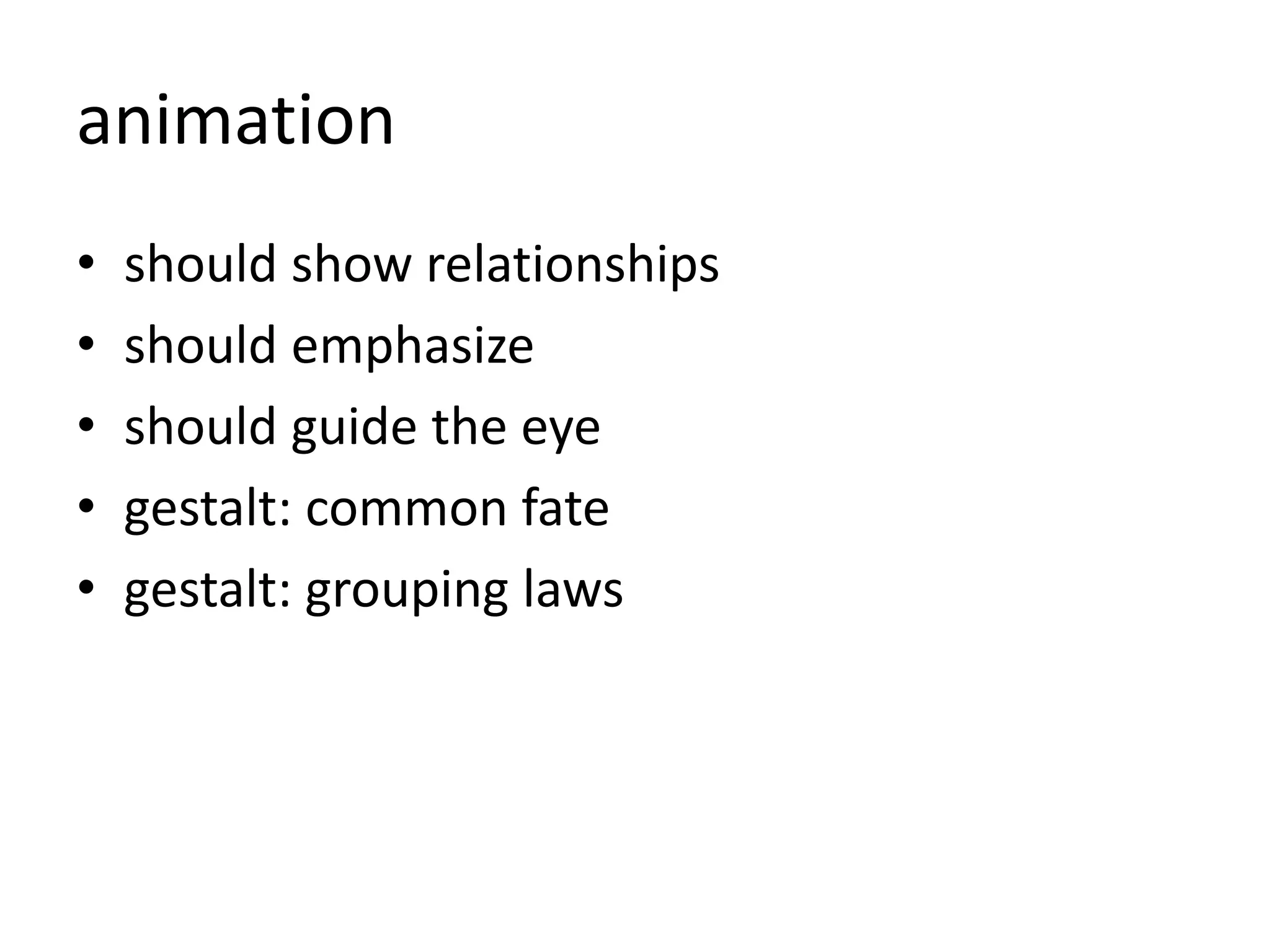


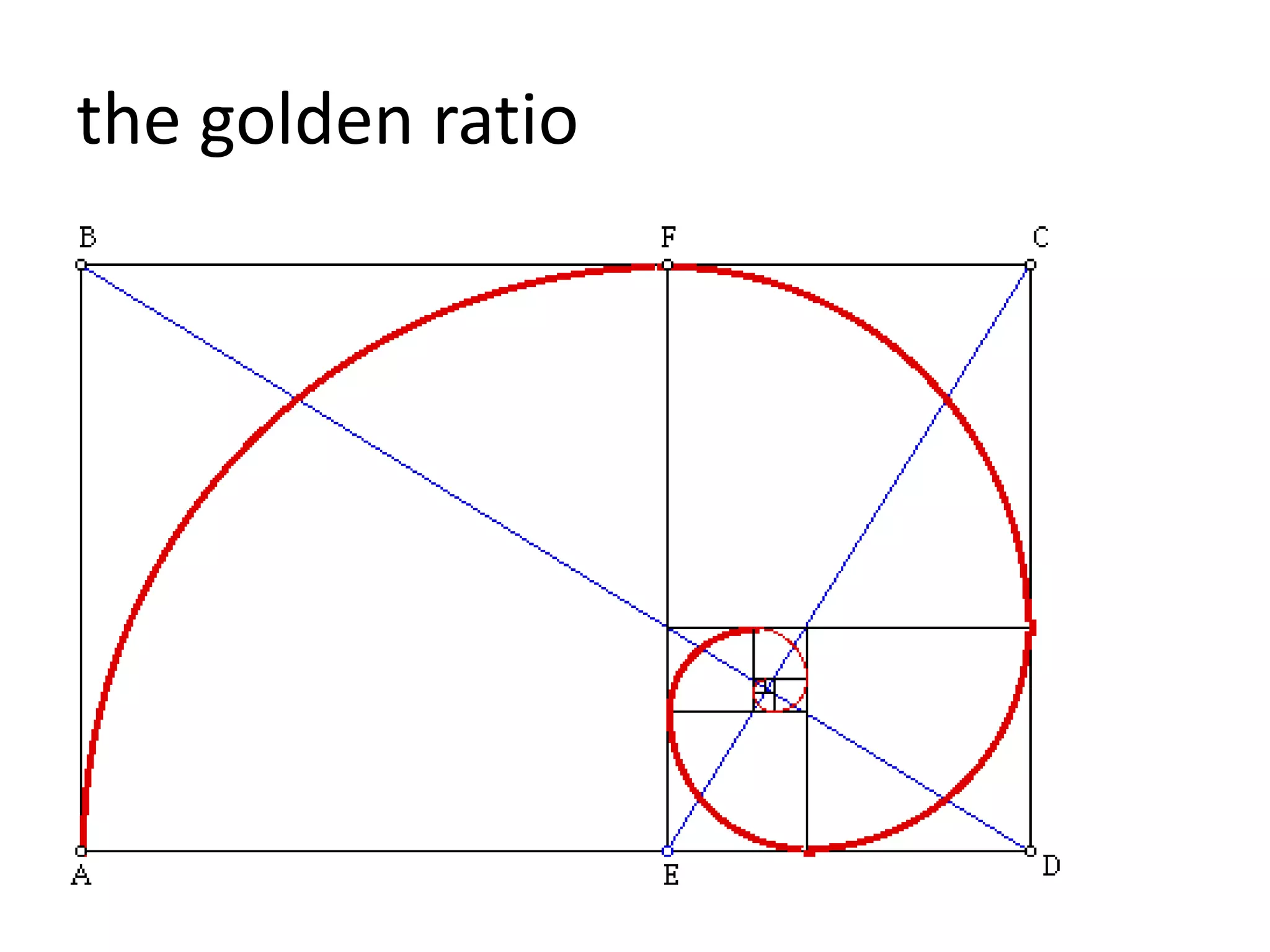
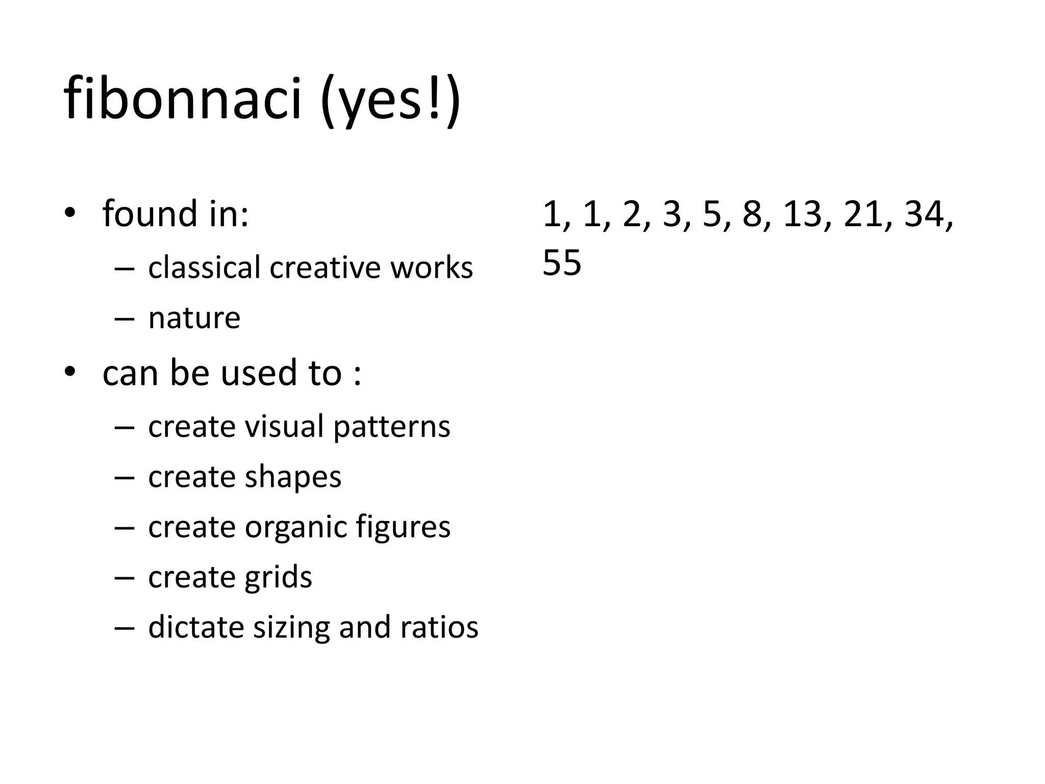

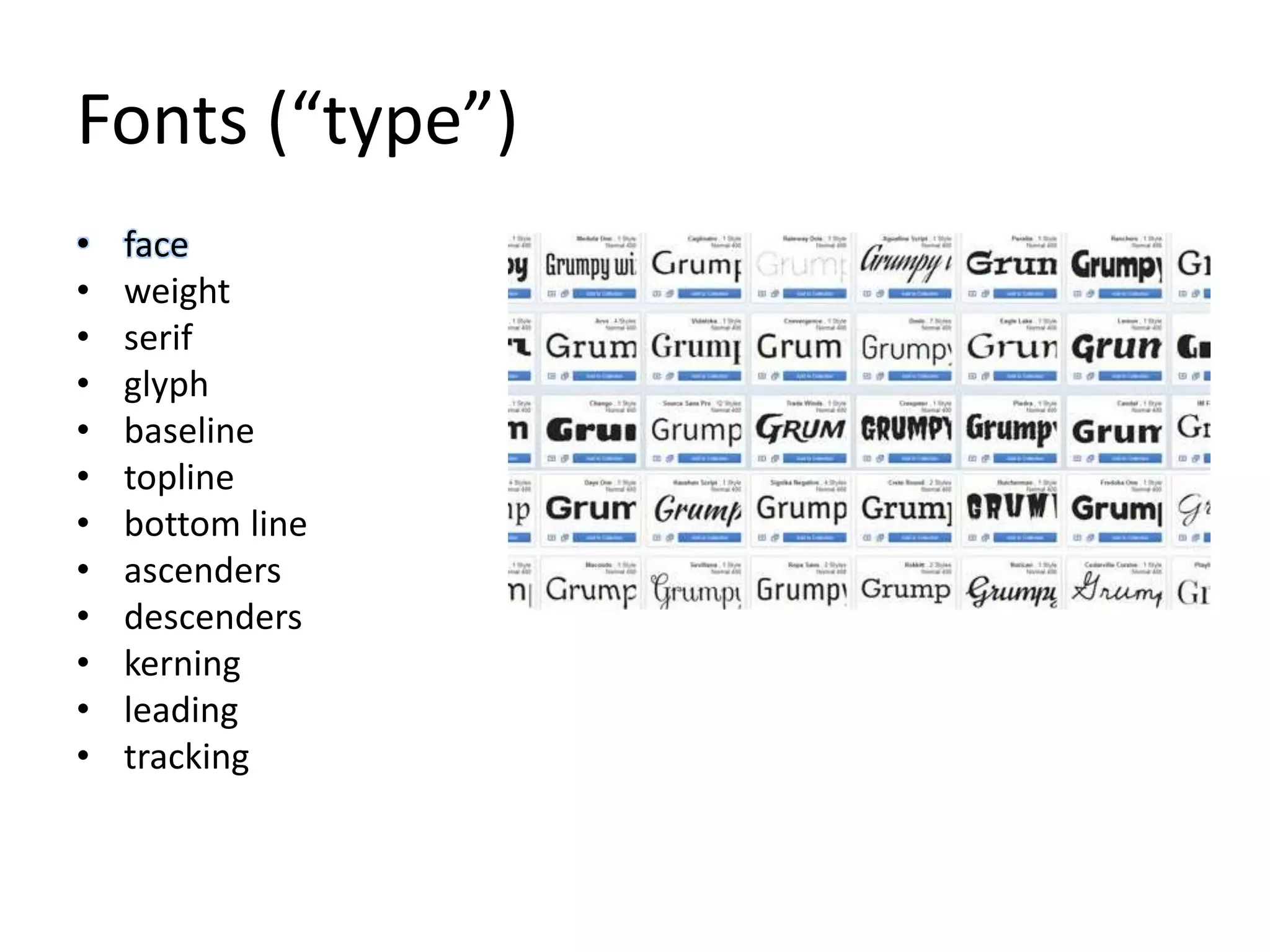
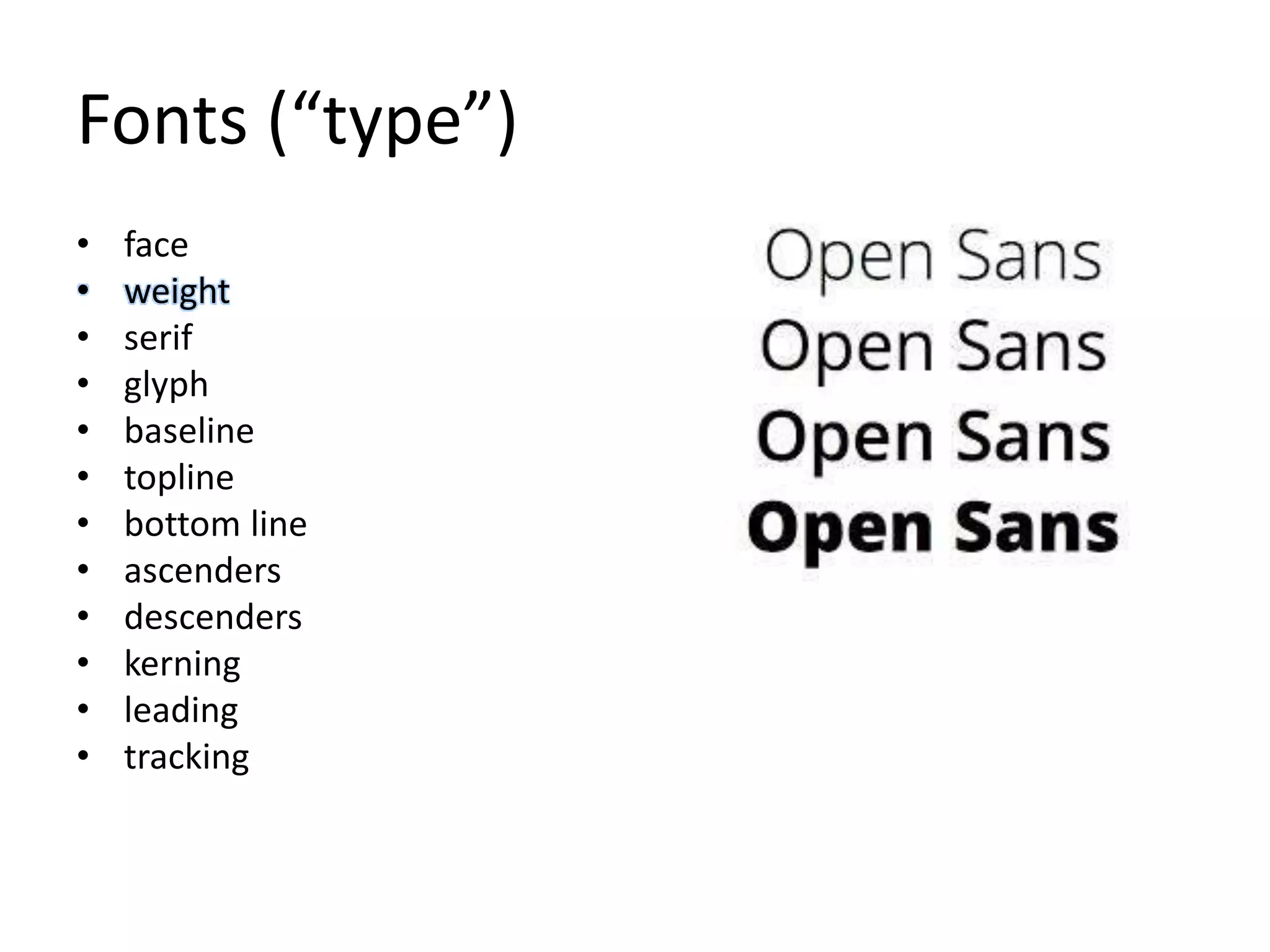
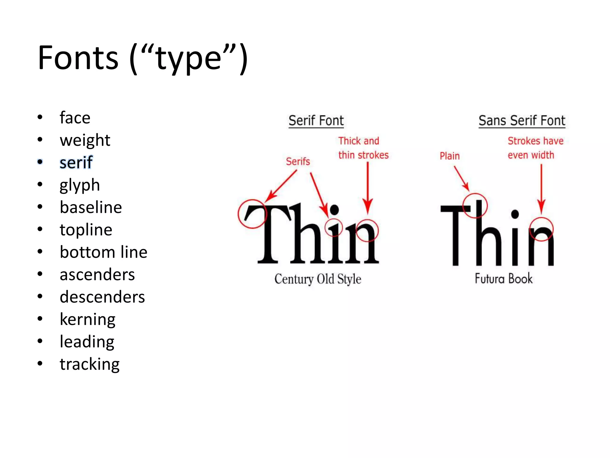
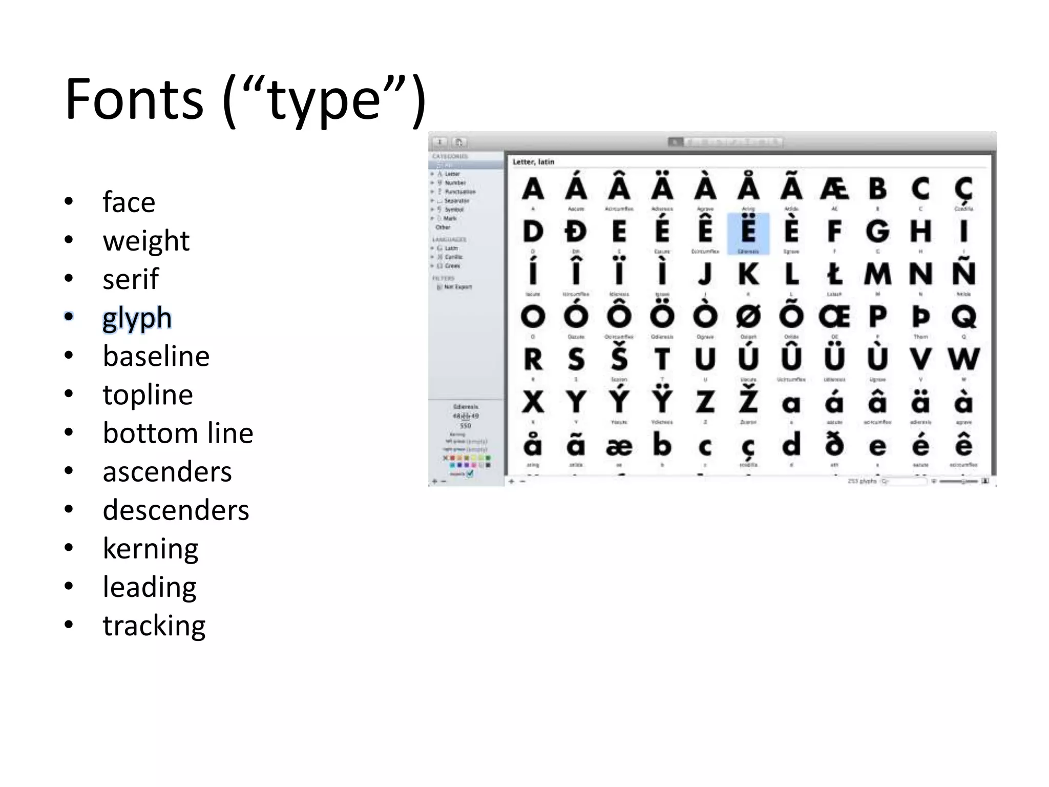
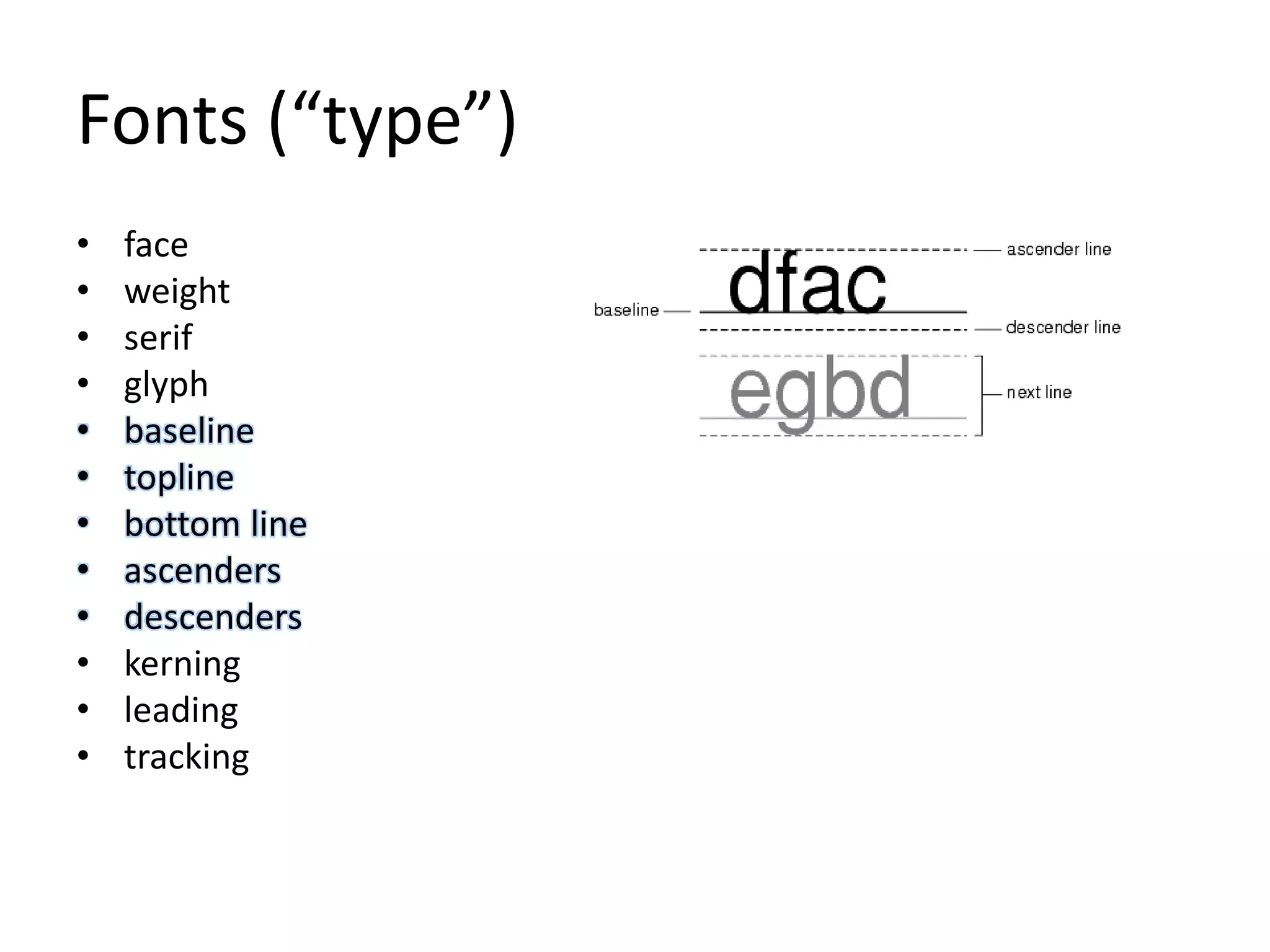
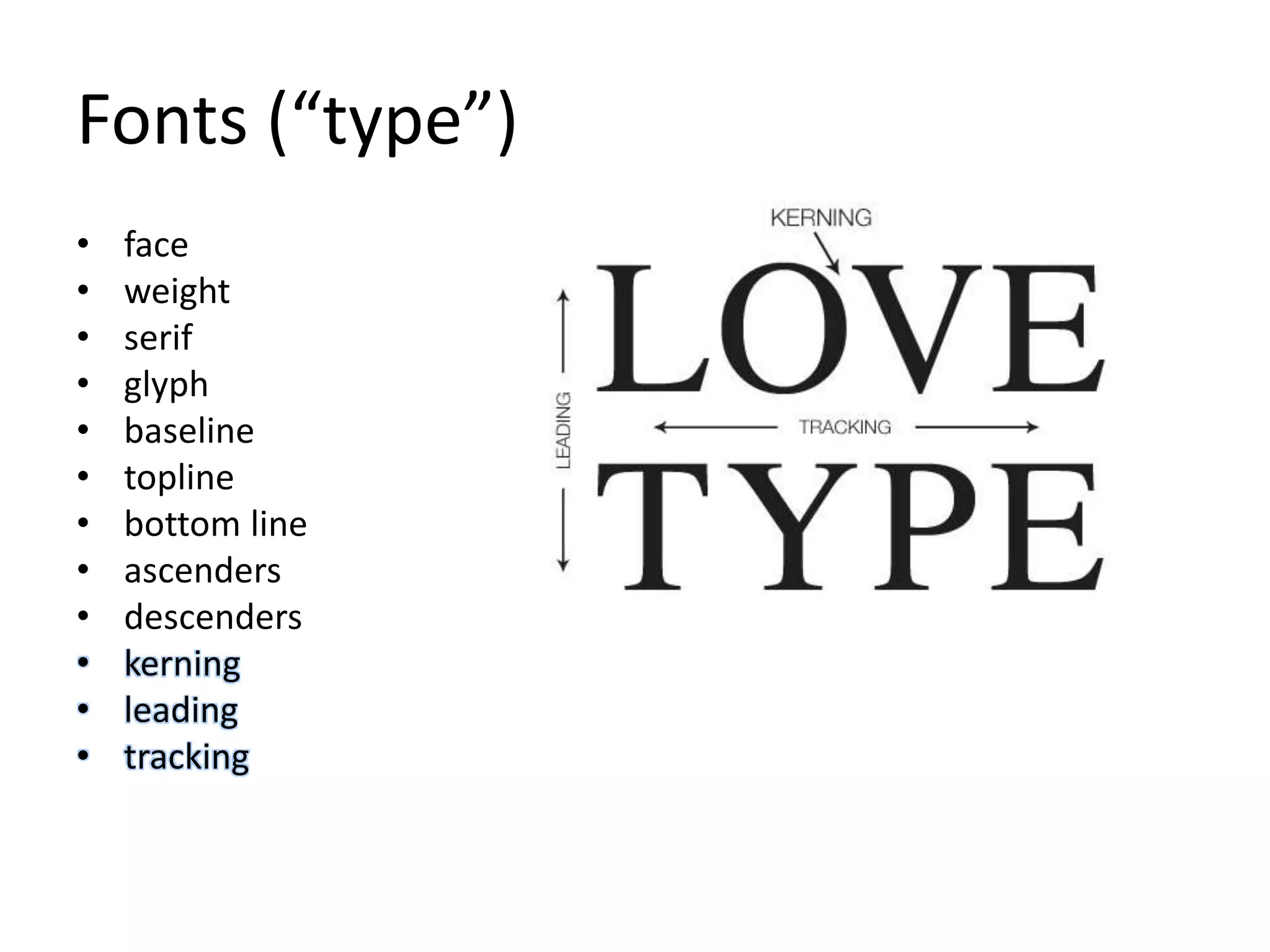


The document discusses design principles focusing on cognition, memory, and motivation, emphasizing the importance of gestalt principles in visual design. It outlines various design rules, including reducing complexity through methods like Occam's Razor and Hick's Law, as well as the significance of feedback and mental models to enhance user understanding. Additionally, it highlights the role of aesthetics in design using concepts like the golden ratio and explores typography elements essential for effective visual communication.


![iStat Menus 7.20 Crack for MacOS 2026 Full Version [Latest] pptx](https://cdn.slidesharecdn.com/ss_thumbnails/softwareoverview-251207191544-22b737dc-thumbnail.jpg?width=640&height=640&fit=bounds)
![AnyTrans for iOS 8.9.14.20251127 With Crack for MacOS [Latest] pptx](https://cdn.slidesharecdn.com/ss_thumbnails/softwareoverview-251207190907-2316965f-thumbnail.jpg?width=640&height=640&fit=bounds)


