
Recommended
More Related Content
Viewers also liked
Similar to Skin Deep Exhibition_Graphic Look and Feel
Similar to Skin Deep Exhibition_Graphic Look and Feel (20)
Recently uploaded
Recently uploaded (20)
Skin Deep Exhibition_Graphic Look and Feel
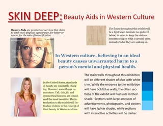
- 1. Beauty Aids in Western Culture Beauty Aids are products or services that claim to alter one's physical appearance, for better or worse, for the sake of beautification. In Western culture, believing in an ideal beauty causes unwarranted harm to a person's mental and physical health. The floors throughout this exhibit will be a light wood laminate (as pictured below) in order to keep the visitors concentrating on what is around them instead of what they are walking on. The main walls throughout this exhibition will be different shades of blue with white trim. While the entrance to the exhibition will have bold blue walls, the other sec- tions of the exhibit will fluctuate in their shade. Sections with large amounts of advertisements, photographs, and posters will have lighter shades, while sections with interactive activities will be darker. In the United States, standards of beauty are constantly chang- ing. However, some things re- main true. Tall, thin, fit, and symmetrical features are consid- ered the most beautiful. The in- troduction to the exhibit will in- troduce visitors to the concept of ideal beauty in Western culture.
- 2. Promoting Racism Thinking of our target audience (Millennials, Adult Men and Women), we want to have a color scheme that best appeals to those groups. Blue and Red are the typical colors that those groups prefer (Bogle, 2013), which is perfect for an exhibition focused on American Beauty Culture, as well as our main exhibition colors. Using blue and white as a simplistic theme for our main walls, this section feature red accent walls. This exhibit will display both advertisements for products and the products themselves that promote racist thinking through the encouragement of men and women to make physical alterations in order to appear more fair-skinned. Such products include skin bleaching (pictured to the left) and skin light- eners (pictured below). The advertisements pictured right are for products created by Madam C.J. Walker. Considered the first female self-made millionaire in America, she developed and marketed a successful line of beauty products for black women. This section will examine the implications of her products.
- 3. Promoting Sexism A terrarium of nightshade. Nightshade, a poisonous purple flower, was used in eye drops by women to dilute pupils to seem more seductive. There are many side effects of this plant, including permanent blindness. This exhibition features a series of mannequins wearing popular corsets from throughout the decades (the one below is from the 1860s). Male girdles will also be featured, such as the one pictured to the right. Because all of the items in this section of the exhibit address the issues of sex- ism that are promoted through beauty aids and beauty products, the accent colors will all be gender-neutral (white, yellow, green, etc.). All of the items in this exhibit relay important information and thus they will “work together to support the intent and goals of the exhibi- tion” (Chicone and Kissel, 2014, p. 109). The tools used for permanent make-up ap- plication will be displayed in order to show their mental and physical implications.
- 4. Promoting Ageism This section will feature a make-shift cosmetic stand which will feature bright lighting to emphasize the unnaturalness of the featured cosmetic products. There will be three rooms in this section of the exhibit. The first room will feature sterile lighting and white displays. They will also contain light blue walls in order to increase the bright effect of lighting but to keep the exhibit cohesive. The light blue/bright light combination will also remind visitors unnatural lighting. The second room will provide visitors with an opportunity to experiment with texture. There will be large scale images of skin damage due to anti-aging creams, large photographs/images of naturally aged skin, and much more. These walls will be a darker shade of blue to facilitate a change in feeling for the viewer from the first room. The third room mimics an anti-aging center. It will be set up to look comfortable, yet futuristic. The accent colors will be purple and black, while the main walls will be blue and white like the rest of the exhibition. Like the first room, it will have a clinical appearance with bright lighting. There will also be large scale photographs of models who “never age,” and displays featuring content on the huge price tag of hormone replacement therapy/ anti-aging and images of the health side effects. This section will also feature advertisements from products that promote ageism. One such advertisement, Oil of Olay (shown above), is considered one of the earliest attempts to develop and market an anti-aging cream.
- 5. Body Dysmorphia This section will feature advertisements, products, and various photographs of beauty aids that contribute to body dysmorphia, which is a belief that one’s own body is defective. This section will include neutral colors as accents, including green, beige, and brown. These warm tones will be used in order to help visitors feel more comfortable while observing and participating in potentially emotional ex- periences. These neutral colors will also provide a nice juxtaposition to the "unnatural" beauty aids. The tapeworm diet has been around for almost 100 years with the idea that only half the food you eat goes to your stomach and the rest goes to the tapeworm. To the left, is a black-lit photograph of a tapeworm. To the right, is a poster that displays the negative side effects of using steroids. These photographs, posters, and advertisements will help introduce visitors to the absurdity of certain product uses.
- 6. Modification This section will feature approximately fifty percent images and fifty percent objects. The images will range from poster-size charts of procedures, such as facial cosmetic surgery, to drawings of how the surgery is done and what the goal of the procedure is. These charts will also explain the medical uses and, more importantly, the lack of medical reasoning for said procedures. This section will also include wall- mounted glass cases featuring, in chronological order, specific implant types, such as breast implants or cheek implants. In the case of breast implants, this will run from early materials such as ivory and glass to silicone injections and implants to the saline and silicone gel implants used today. The image to the left shows an opportunity that visitors will have to touch silicone gel that is used in these implants. Many visitors are likely to feel shocked by this section's inclusion of surgical images and direct links to the body, so a cool color palette (such as pale greens) will be used as accents in order to hopefully "relax the visitors and aid in their concentration" (Bogle, p. 190).
- 7. Habits This section will feature a large room split in half. One side will feature historic ads that advertise that smoking and drinking are healthy habits, while the other side will feature contemporary ads and editorials showing that smoking and drinking are beautiful habits. The side focusing on the past will feature yellow and red accent walls. These bold colors will help energize visitors. The contemporary side will feature lighter colors in order to draw the visitors’ attention to the various photographs and advertisements displayed. "Graphics not only convey information—they can also set the tone, create a sense of time and place, decorate, and give pattern and texture to surface. Enlarged patterns, images, photographs, or type (often called "super graphics") convey in- formation, act as decoration, and create atmosphere" (McLean, p.136). Keeping this in mind, this section will focus on graphics to tell the story of the implica- tions that these habits have on the beauty industry and, more importantly, on a person’s physical and mental health.
- 8. References References Bogel, E. (2013). “Color and Lighting.” Museum Exhibition Planning and Design. Alta Mira Press . Chicone, S. and R. Kissel. (2013). “Material of the Visual.” Dinosaurs & Dioramas: Creating Natural History Exhibitions. McLean, K. (2001). “On the Surface: Color, Texture, Graphics, and Materials.” Planning for People In Museum Exhibitions. Washington, DC: Association of Science-Technology Centers .