The website uses blue as its main color throughout the logo, template, and text to symbolize how every child in the world suffers from child labor. An emotive image shows a poor child suffering from child labor as he looks through rubbish to find plastic bottles, creating tension. While the text uses a formal, representable font, subheadings use a childish font to connect to children, the charity's audience. Orange is also used to highlight key information and calls to action like "Donate Now" to stand out on the website.
Pre Engineered Building Manufacturers Hyderabad.pptx
Analysed child hope website
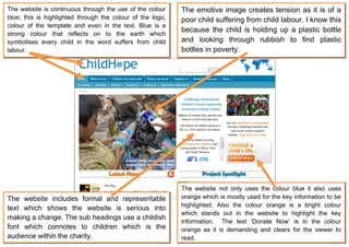
1. The website is continuous through the use of the colour The emotive image creates tension as it is of a
blue; this is highlighted through the colour of the logo, poor child suffering from child labour. I know this
colour of the template and even in the text. Blue is a
because the child is holding up a plastic bottle
strong colour that reflects on to the earth which
symbolises every child in the word suffers from child and looking through rubbish to find plastic
labour. bottles in poverty.
The website not only uses the colour blue it also uses
The website includes formal and representable orange which is mostly used for the key information to be
highlighted. Also the colour orange is a bright colour
text which shows the website is serious into
which stands out in the website to highlight the key
making a change. The sub headings use a childish
information. The text ‘Donate Now’ is in the colour
font which connotes to children which is the orange as it is demanding and clears for the viewer to
audience within the charity. read.