Audience research qualitative media slasher horror
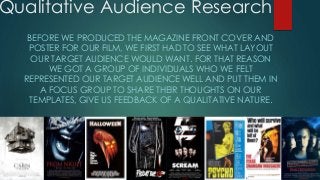
1. Qualitative Audience Research
BEFORE WE PRODUCED THE MAGAZINE FRONT COVER AND
POSTER FOR OUR FILM, WE FIRST HAD TO SEE WHAT LAYOUT
OUR TARGET AUDIENCE WOULD WANT. FOR THAT REASON
WE GOT A GROUP OF INDIVIDUALS WHO WE FELT
REPRESENTED OUR TARGET AUDIENCE WELL AND PUT THEM IN
A FOCUS GROUP TO SHARE THEIR THOUGHTS ON OUR
TEMPLATES, GIVE US FEEDBACK OF A QUALITATIVE NATURE.
2. KILLER
ACOLADE/REVIEW
ACOLADE/RE
VIEW
ACOLADE/REVIEW ACOLADE/REVIEW
TAGLINE
FILM CREDITS
PRODUCTION, DISTRIBUTION
COMPANIES, ETC. CERTIFICATE
“Wow, this is really good,
everything is so organised
and I think having the
killer so close to the
camera is a clever idea as
it makes it feel like he is
bearing down on you.”
POSTER TEMPLATE; 1
“I think the way this page
is positioned is good,
everything is where it
should be and it looks like
a professional film poster
should.”
“Showing the
accolades/reviews the
film has won is a good
idea, it will make people
want to see the film”
This was the groups favourite
page as they felt having the
a close up of the killer made
it more menacing, they felt
the composition of the page
was very neat and tidy. They
also felt that it looked
professional and having the
accolades/reviews the film
has won on the poster was a
good idea.
3. VICTIM
ACOLADE/REVIEW
ACOLADE/R
EVIEW
ACOLADE/REVIEW ACOLADE/REVIEW
TAGLINE
FILM CREDITS
PRODUCTION, DISTRIBUTION
COMPANIES, ETC.
CERTIFICATE
POSTER TEMPLATE; 2“I like this one too, but the
composition is not as
good as the last one
(template; 1).”
“I don’t like the fact that
the victim is the main
image on this one. It’s
okay, but just not as
scary.”
“I think this is quite bad, it
does not resonate with
me, I feel nothing towards
this.”
This was the groups least
favourite of the three, I feel
that they just did not find it
strong enough in terms of
the main image, it did not
affect them like template;
1 did. They also did not like
the composition of the
poster which is important
as this is a major part of
what makes a poster look
professional.
4. KILLER
ACOLADE/REVIEW
ACOLADE/REVIEW
ACOLADE/REVIEW ACOLADE/REVIEW
TAGLINE
FILM CREDITS
PRODUCTION, DISTRIBUTION
COMPANIES, ETC. CERTIFICATE
POSTER TEMPLATE; 3“This one is also nice, I like
again how close the killer
is.”
“I think the title of the film
is too low on the page.”
“I like the first one just a
little bi more than this,
both top class.”
The proffered template; 1 over
this one due to the
composition, they didn’t like
how low the name of the film
was.”
5. MAGAZINE TEMPLATE; 1“The colours are nice,
organisation good and
the fact the killer is the
main focus just like the
poster improves the brand
identity.”
“Everything is positioned
nicely, I like the film tape
running down the side.”
“The fact that the
typography is the same
on the poster as it is on
here is a intelligent
touch.”
MASTHEAD
BANNER
ARTICLE
ARTICLE
BARCODE, ISSUE
NUMBER, PRICE
KILLER
ARTICLE
With this template the
feedback we got was
extremely positive, they
liked the composition of
the page, the emphasized
brand identity and small
things like the film tape
running down the side for
the articles to go in.
6. MASTHEAD
BANNER
BARCODE, ISSUE NUMBER,
PRICE
VICTIM
ARTICLEARTICLEARTICLE
OFFER
MAGAZINE TEMPLATE; 2“This one is nice as well,
the space is filled up well,
not so sure about the
position of the barcode,
issue number and price
though.”
“Having an offer their to fill
up space is a very useful
edition as it will convince
more people to buy it.”
“I don’t like the fact that
the villain is on the cover
as it is supposed to be
threatening, and it’s
just…not.”
The focus group did not like
this one so much as although
they liked how the space
vacated by making the film
tape horizontal was used to fit
in an offer they did not like
the fact that the victim was
on the cover as it was not
threatening and they also did
not enjoy where the
barcode/issue number/price
was.
7. MAGAZINE TEMPLATE; 3“I don’t like the angle of
the film tape at all, it looks
like a child designed it.”
“It’s fine I guess, just not as
good as the others in my
opinion.”
(No comment)
MASTHEAD
BANNER
BARCODE, ISSUE
NUMBER, PRICE
KILLEROFFER
We were kind of glad
that they did not like this
one, it was not our
favourite either, the
focus group felt that this
was too childish looking
and it just did not look
quite right.
8. Conclusion
In conclusion I feel that the feedback given by the
focus group was invaluable. As the people in the
focus groups were people from our target
audience it gave us real life insight into what to
do when constructing our poster and magazine.
What to put in them, what to avoid putting in
them etc. and a real appreciation for the the
importance of details.