1. Salford City College
Eccles Centre
AS Media Studies
Foundation Portfolio
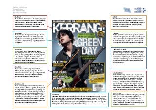
Masthead Colour
The masthead of this magazine is the iconic ‘Kerrang logo’ The white colours used in the masthead and the main
featured on all of the kerrang editions. This automatically cover line help to make sure that these are the first thing
makes it stand out. The logo itself appears smashed you see and read when looking at the magazine. The green
which appeals to the audience as this effect links to the and yellow contrast with the other colours in the cover
rock vibe which is the magazines main concept. again making them stand out.
Main image Typefaces
The main image of the magazine is an image of the lead The fonts used on the cover of the magazine are typically
singer of the band Green Day. From this we know that used in the kerrang magazine. The writing is equally spaced
this is the main focus in the magazine. This is an easily but on angles creating an untidy look which stands out to
recognised celebrity and so helps to protect the theme of the target audience but might be over looked by fans of
the magazine. other magazines. It is a typical layout of a rock magazine.
Model credit Photography Lighting
The model credit on this magazine cover helps to The lighting in this cover is high key to make him stand out
promote the particular artist. For example, the pull quote against the background. There is a light behind his head
used is presumably said by a fan of the artist saying ‘this that we cannot see the source which gives him a slightly
is the best show’. This gives the artist a positive silhouetted look emphasising the fact that he could be mid
representation. Also, the name of the artists is written performance when the image was taken. This will appeal
large and bright suggesting that they are better than the more to the audience that if he was simply him in a light
others written about in the magazine. room doing nothing.
Coverlines
The cover lines in Kerrang magazine are set out
differently to most other music magazines. They are
much more scattered about the page which gives it a laid Target audience
back approach but also I think appeals to the target I believe that the target audience of this magazine is males
audience that the magazine was designed for. and females who enjoy the rock music genre. They would
probably be around age 14-20. However, the magazine
may be also aimed at fans of other genres of music by
introducing articles from celebrities that might not usually
Main cover line appear in this type of magazine. The magazine may also
The main cover line is positioned at the top of the cover use references to other popular things such as the harry
so t hat it stands out. It is in a larger font that the rest of potter reference in this magazine. This will intrigue people
the writing which again makes it more eye grabbing. Fans that may not normally look at this type of magazine.
of this band will see this and automatically be attracted
to it because of its large size. It does not obscure the Design principle
main image so does not draw too much focus away but is House Style This magazine makes use of the Gutenberg design principle
the first thing you read when you see the magazine. This The house style of this magazine is similar to the other kerrang magazine covers in the fact that it has
in that we naturally read from left to right. Therefore,
is also topped by a quote from the male singer pictured a very untidy look with the cantered images and writing. However, this is important for kerrang in
naturally, the first thing we will see is the artists face.
which is cantered slightly to give it a messed up look and terms of attracting the correct audience to buy their magazine. The font remains the same apart from Following this principle, we then read the covverlines in
again appeal more to the target audience. the masthead. This layout makes it a memorable sight for the reader amongst other music magazines
the weak fallow area, and finally the group of small images
and they will be able to pick it out easily without really looking. in the strong fallow area in the top right.