Design and Development of a Provenance Capture Platform for Data Science
Front cover analysis
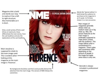
1. Magazine title is bold and stands out. Easy to read as it has a left to right structure. Also memorable as it is short. Words like ‘Special edition’ in bold tempt the audience to purchase as the magazine is at it’s peak. 2 of 10 also shows it is a rare occurance. Main images of magazines generally always close up, medium close up or big close up. Also, the person featured as the main image is preferably supposed to make direct contact with the audience. This image follows what is conventional of a magazine. These codes and conventions differ depending on the amount of people in the image but apply when there is only one. Only a small variety of fonts used (three at maximum), these differentiate the main stories, from the sub headlines and also the explanations of the sub headlines. Main storyline is supposed to relate to the main image used. This is evident when looking at this magazine as the main image is ‘Florence’. Barcode is always included in professional magazines No background should be used that could possibly distract the attention from the main image. This version of NME follows this convention.
2. ‘Also inside’ tempts The readers as it tells them they are receiving more than they bargained for. Title of magazine is bold and easy to read with a left to right structure and nothing covering it. Relatively bare background, doesn’t distract readers from main image. Date is essential as it tells the readers when the magazine is usually out for them to purchase it again. Buzzwords signal to the audience when they are receiving more than they usually should. ‘Plus’ does this within this version of ‘Mojo’. Barcode included as it always on in professional magazines. Sub headlines in bold to ensure that they stand out.
3. Plain background doesn’t distract the audience from the main image which is a long shot, due to it being a band. This is conventional of magazines, however if one person is included in the image it must be a form of close up. ‘Q’ is still recognisable although the artists face is covering a small fraction of it. This is essential as the magazine want the brand to be reinforced as much as possible. ‘Bonus’ displays extra features in the magazine boldly to tempt the readers. Barcode is always included in professional magazines. Main storyline dominates the magazine due to the fact is has the largest font and a different type to the other storylines. Word ‘exclusive’ tells the audience they will be unable to find these stories anywhere else