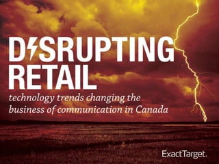
4 Technology Trends Disrupting Retail (Canada Research)
•Download as PPTX, PDF•
10 likes•3,528 views

Presentation deck for the trends disrupting the retail environment for the next 5 years. We talk about the importance of life cycle marketing, marketing automation, mobile optimization, analytics/data, and cross-channel integration

Recommended
Recommended
More Related Content
Similar to 4 Technology Trends Disrupting Retail (Canada Research)
Similar to 4 Technology Trends Disrupting Retail (Canada Research) (20)
More from Kyle Lacy
More from Kyle Lacy (20)
Recently uploaded
Recently uploaded (20)
4 Technology Trends Disrupting Retail (Canada Research)
- 50. • Contrast – carefully consider your color choices to ensure the text and images stand out properly against the background. • Avoid reversing out small text on a dark background. • Text Size – 13px for body copy. No pinching = 15-16px (depending on font) and preview it on your mobile device.
- 51. • Imagery – Images help tell your brand’s story, so consider taking the time to choose artful shots that complement your message. • Layout – One-column layout works best for mobile. If you have a multi- column layout, plan how elements shift or stack.
- 54. Great defensive design techniques like HTML text and alt text.
- 59. Mothercare uses styled alt text and background colors for most of the effect, but also uses mosaic color blocking to recreate the stroller image.
- 61. Consumers are suspicious of first-name personalization in subject lines. Open rates are lower when it’s used as are click rates.
- 64. Lenovo, welcome email Kyle, thank you for signing up. Enjoy your exclusive Lenovo offer. Michael’s, progressive profiling email — Kyle, isn't it time we got to know each other? Olive Garden, birthday email — Kyle, go celebrate your birthday with a free app or dessert! ThinkGeek, 5/17/13 — Kyle, I am your father
- 65. Helzberg created 60,000 unique animated gifs to target each of their subscribers by name with charms. The subject line was not personalized.
- 66. Outperformed a similar email by nearly 300% in items of revenue generated.
- 117. Meet Stacie • 29 years old • Married • Elementary School Teacher • Runs 4-5 times a week; likes to race against friends • Long-time Nike customer and Facebook Fan but not a current subscriber • Local Store: Niketown New York, E 57th St
- 118. Purchase & Initiate Stacie bought the NIKE AIR MAX+ 2013 because her previous pair of Air Max shoes wore out. She types in the URL for the the landing page and is directed to the Make it Count landing Page Type this into your web browser: Learn How You Can Make It Count www.makeitcount.com/nike When her shipment arrives she notices that the packing materials contain a post card publicizing the Nike Make It Count Desktop Experience
- 119. Capture Stacie follows Nike , joins the #MakeItCount initiative on Twitter, and selects the option to become a Nike member on Nike.com, opting into promotional messages.
- 120. Cross Sell Since Stacie joined the Make It Count initiative, so we drop her into the Nike+/Fuelband area of the site. Stacie uses guided selling tools to look for other running gear for running in NYC with her friends, and it recommends the Nike Fuel Band and other related gear Running gear She browses the items… Even adding the Nike Fuel Band to her cart… But decides not to purchase.
- 121. Prompt The iGoDigital Customer Intelligence Engine notices she has not purchased the Fuel Band …and triggers an abandoned cart message for the Nike Fuel Band based on Stacie’s web behavior, with a promo code to incent purchase. Promo Code Below:
- 122. Success Stacie stops by her local Niketown and buys the Nike Fuel Band with her promo code. She requests an eReceipt. The eReceipt contains a bounce back offer with upsell opportunities eReceipt $149.00 Have you seen these?
- 123. 7 days after her FuelBand purchase, Stacie receives an automated rating/review email. Engage Review your Recent FuelBand purchase. Triggered Send +7 days Log your runs on Nike+ She is also invited to join Nike+ Triggered Send+14 days She adds her mobile number to her profile so she can receive mobile alerts about local Nike running events . Stacie Johnson’s Profile 1-503-509-6995
- 124. A Relationship Group Runs 3/5,3/7, & 3/9 Or an email about an upcoming event Stacie can request information and receive an SMS alert about an upcoming local event…
- 125. Inspired Marketing Type this into your web browser: Learn How You Can Make It Count www.youtube.com/nike
Editor's Notes
- The overriding, reoccurring theme from those we ask is that digital marketing is becoming more and more personal; more targeted to the individual. GinniRometty, CEO of IBM, sums it up well: “What you will see with rapid data and social sharing is the death of the average and the era of you”
- “Businesses need to be able to truly serve the individual.” Well said. Traditionally, marketer have targeted groups of customers; a select audience.Marketers are now shifting their focus to targeting individuals; the individuals that exist within a select audience.
- Email has survived more “guru”-predicted, near-death experiences than any other medium. The lesson, “_____ Is Dead” proclamations are foolish in a world fragmented by channels and devices. There’s more than enough room for everyone. This should calm some content marketing nerves who woke up to “Blogging Is Dead” headlines earlier this year. But it should also serve as a cautionary tale about beating a dead subject line. “_____ Is Dead” headlines are clearly provocative, linkbait. However, if you ride such waves too late or with a faulty premise, you run the risk of sending “rolling eye content” and losing your credibility. Don’t sacrifice accuracy for provocation.
- Email has survived more “guru”-predicted, near-death experiences than any other medium. The lesson, “_____ Is Dead” proclamations are foolish in a world fragmented by channels and devices. There’s more than enough room for everyone. This should calm some content marketing nerves who woke up to “Blogging Is Dead” headlines earlier this year. But it should also serve as a cautionary tale about beating a dead subject line. “_____ Is Dead” headlines are clearly provocative, linkbait. However, if you ride such waves too late or with a faulty premise, you run the risk of sending “rolling eye content” and losing your credibility. Don’t sacrifice accuracy for provocation.
- Responsive design has moved from a nice to have to a must have. The increased, everyday importance and use of mobile in our lives requires us to design to meet customer expectations.And their number one expectation is that there be no pinching required to read what we are trying to sell them or tell them. Any effort needed to pinch-in or zoom-out is not worth the value they may find in your hard to read email … another lost subscriber, another lost opportunity.
- Responsive design has moved from a nice to have to a must have. The increased, everyday importance and use of mobile in our lives requires us to design to meet customer expectations.And their number one expectation is that there be no pinching required to read what we are trying to sell them or tell them. Any effort needed to pinch-in or zoom-out is not worth the value they may find in your hard to read email … another lost subscriber, another lost opportunity.
- Local Moments!Anywhere, anytime, anyhow is the new mantra. Sending consumers easy to action messages on their mobile devices can create exciting “right now” opportunities for brands to engage with their customers.
- Staples lets you change your email address, opt-down to receive fewer emails, or opt out completely. The options are clearly laid out.
- Staples lets you change your email address, opt-down to receive fewer emails, or opt out completely. The options are clearly laid out.
- Lowe’s email is very tablet-friendly. Even their navigation bar is touch-friendly. They limit their product grid to two columns wide, use large text and big buttons. They also use plenty of white space to boost contrast and make the text easier to read.They also use plenty of white space to boost contrast and make the text easier to read.
- emails are still desktop-oriented. They’re very long, use small text, and have a 5-column wide product grid.
- emails are still desktop-oriented. They’re very long, use small text, and have a 5-column wide product grid.
- emails are still desktop-oriented. They’re very long, use small text, and have a 5-column wide product grid.
- emails are still desktop-oriented. They’re very long, use small text, and have a 5-column wide product grid.
- emails are still desktop-oriented. They’re very long, use small text, and have a 5-column wide product grid.
- emails are still desktop-oriented. They’re very long, use small text, and have a 5-column wide product grid.
- The email clients that block images by default have been struck through, but it’s changing all the time.
- This 2011 B&H email uses great defensive design techniques like HTML text and alt text,…
- image server failed so no images were displayed.
- image server failed so no images were displayed.
- image server failed so no images were displayed.
- image server failed so no images were displayed.
- image server failed so no images were displayed.
- emails are still desktop-oriented. They’re very long, use small text, and have a 5-column wide product grid.
- emails are still desktop-oriented. They’re very long, use small text, and have a 5-column wide product grid.
- emails are still desktop-oriented. They’re very long, use small text, and have a 5-column wide product grid.
- emails are still desktop-oriented. They’re very long, use small text, and have a 5-column wide product grid.
- emails are still desktop-oriented. They’re very long, use small text, and have a 5-column wide product grid.
- emails are still desktop-oriented. They’re very long, use small text, and have a 5-column wide product grid.
- emails are still desktop-oriented. They’re very long, use small text, and have a 5-column wide product grid.