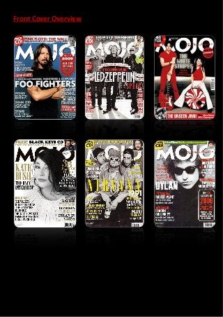
2. There are many characteristics to MOJO magazine that help create a running brand
identity, many front covers will share conventions, colour schemes and fonts, while
these may also differ, relying on conventions such as mode of address to develop the
brand identity. The masthead remains the same on every MOJO magazine front cover,
only changing in colour on some occasions. Due to the sheer size and prominence of the
masthead, many main images sensibly overlap a section of the masthead, while leaving
enough of it for the audience to recognise it. The font of the masthead is an edgy sans
serif display font that corresponds to the sharp and stimulating mode of address that the
rest of the magazine reveals. The consistent use of this font has helped make MOJO
instantly recognisable to the audience, and thus an element of brand identity has been
created. Along with the masthead, there is always a gentle tagline on the front of it,
reading ‘The Music Magazine’ in a light, script font; a contrast to the cutting edge of the
masthead, emphasising the polarising genres of music covered in MOJO. The mode of
address of MOJO is shrewd, bold and coherent. It avoids unnecessary rebellion by
featuring very little or no swear words, and is easily readable while also being engaging
and intellectual. Although on the front covers of MOJO, mode of address isn’t
prominent, due to its lack of appearance. Buzz words used are always somewhat formal
and unobtrusive, i.e. ‘plus’, ‘unseen’ and ‘exclusive’, which help to attract an audience
without leaving them feeling forced.
MOJO magazine’s front covers always differ in terms of their colour scheme, but the
masthead will usually remain white or black, while the standard white, red and black
colour scheme will always subtly be present among front covers. In order to keep a loyal
and interested fanbase, in addition to attracting new fans, MOJO will always experiment
with different colours, fonts and positions for the main sell line of each issue. Additional
sell lines all tend to be scattered around the sides of the cover, maintaining a composed
and chunky look, while feature article photographs are rare. And if they are featured,
then they will always be in the top right corner as a part of the skyline. Puffs feature
often among the front covers of MOJO, but they hardly ever come in a conventional
circle form; MOJO usually has strange shaped puffs in order to illustrate the alternative
genres covered in the magazine. Another element worth noting is that there is always a
small circular puff in the very top left of each cover, advertising the free CD that comes
with every issue.
In general, MOJO magazine doesn’t follow a particular type of camera shot for the main
images featuring on the front covers. It presents the artists in whatever way they wish to
be presented, be it imposing, with a low angle long shot, as seen above with the image
of the three remaining members of Led Zeppelin, or angelic, with a gentle aerial
medium close up, as seen above with the image of Kate Bush. MOJO will always feature
the names of many artists on the cover, usually in the additional sell lines, thus leading
to many fans of different artists and genres being attracted into reading the magazine,
and overall, ensuring that the front cover has served its purpose well.