1. Question 2: How does your media product represent particular social groups?
In my magazine, I decided to use the same social as the magazines I researched about which were
‘Vibe’ Magazine and ‘Rolling Stone’ which are already existing magazines that I have analysed to help
create my magazine. I tried to think extremely about the role of women in my magazine and the way
they are represented in the media, because this is very important aspect and I needed to add it to
my project and make sure it was done appropriately.
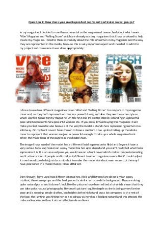
I chose to use two different magazine covers ‘Vibe’ and ‘Rolling Stone ‘ to compare to my magazine
cover and, as they both represent women in a powerful way, and also they are the same style as
what I wanted to use for my magazine. On the first one (Nicki) the model is standing in a powerful
pose which represents how powerful women are. If you are a female buying this magazine it will
make you feel powerful also because of the way the model is stand she is representing women in a
solid way. On my front cover I have chosen to have a medium close up shot taking up the whole
cover to represent that women are just as powerful enough to take up a whole magazine front
cover, the main focus of the page was the models face.
The image I have used of the model has a different facial expression to Nicki and Beyoncé have a
very serious facial expression on as my model has her eyes closed and you can’t really tell what facial
expression it is. It is an unusual pose you would see on a front cover which makes it more interesting
and it attracts a lot of people and it makes it different to other magazine covers. But if I could adjust
it now I would probably just do a mid-shot to make the model stand out even more, but the way I
have positioned the model makes it look different.
Even though I have used two different magazines, Nicki and Beyoncé are doing similar poses,
midshot, there’s no props and the background is similar as it’s a white background. They are doing
quite natural poses and it doesn’t look like the pictures have been edited a lot which shows that they
can take quite natural photographs. Beyoncé’s picture is quite simple as she is doing a very famine
pose and is wearing simple clothes, but bright cloth which stand out a lot compared to the rest of
the face, the lighting was hitting her in a good way as her skin is looking natural and this attracts the
male audience more than it attracts the female audience.
2. Similar to Beyoncé my model is doing a very feminine pose, which represent women as very
feminine. My model I dressed correctly for the magazine and also a casual look, which is a look that
girls are more likely to wear and enjoy looking at. Nicki looks like she is wearing something expensive
and I didn’t want to use that look as o wanted to attract younger audience who didn’t have as much
money, so I chose to go with simple just like Beyoncé. The differences shows that no every women
on a magazine look the same but they represent the same or similar thing.
For the spread page I have chosen to use the same model as the front cover to make the magazine
look organized and also because the front interests the reader to want to read more about the
model which was a very successful R&B artist. I chose to just use one image, but I decided to make
the picture take one page which catches the reader’s attention as soon as they turn to the page, and
they will know straight away who the article about and it will remind them about the front cover.
The image I have used is a mid-shot of my model who is covering her eyes with her hands and is an
unusual pose but it also makes it interesting and catches the reader’s eyes, the model covering her
eyes suggests that she is hiding away from all the problems she has had in the past year.