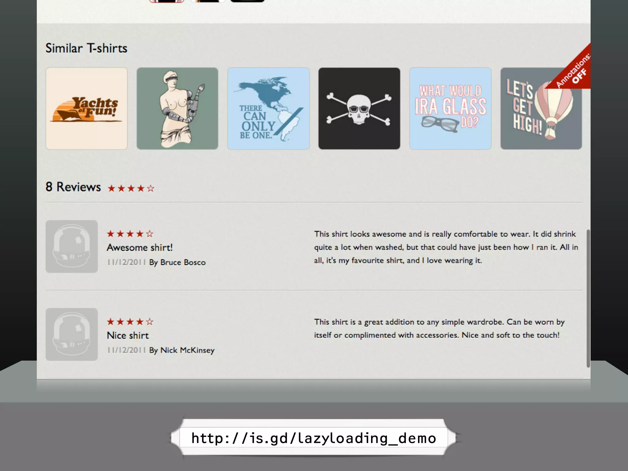
Download as PDF, PPTX
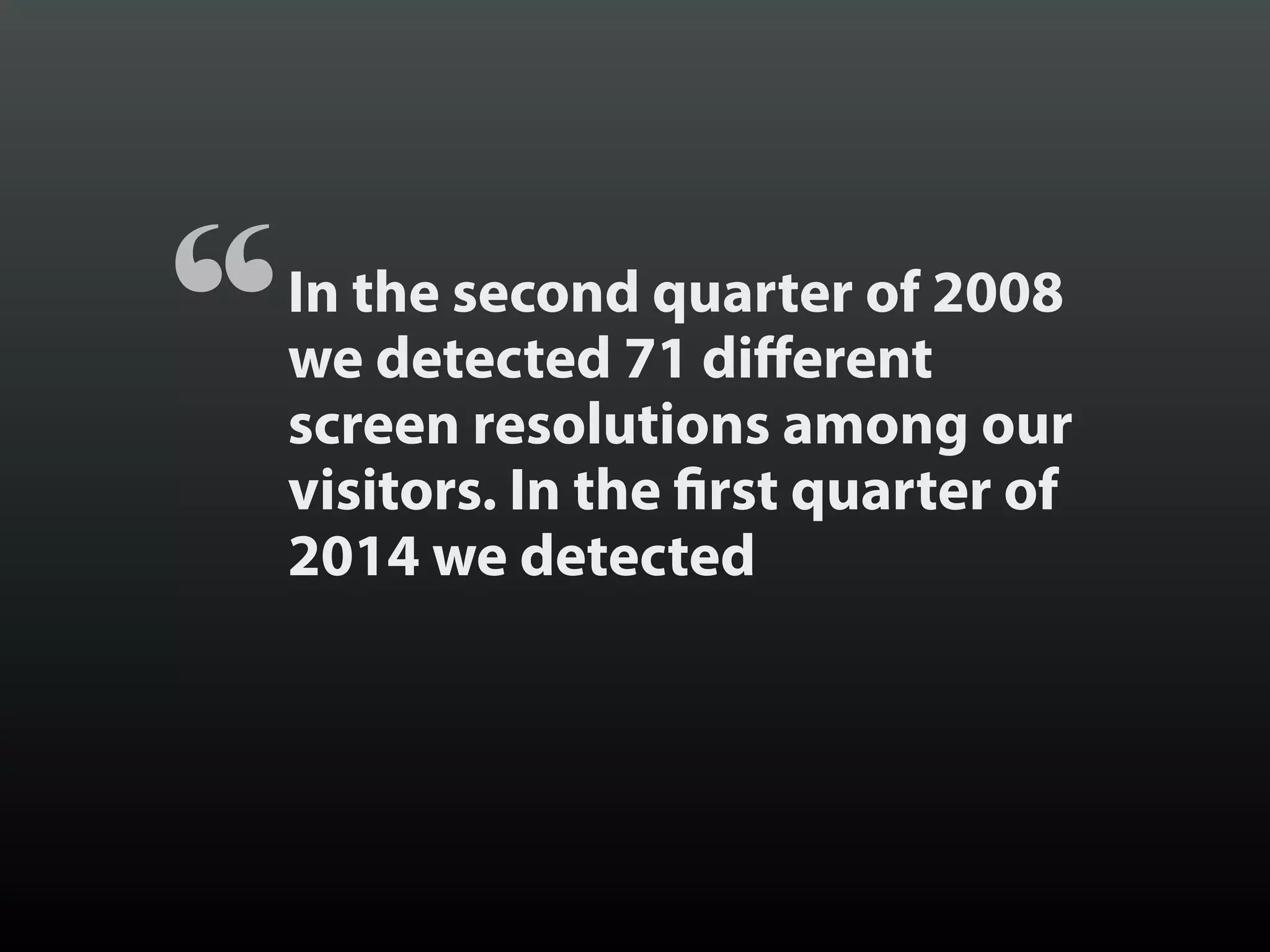
![[In 2008] the majority of our visitors
saw our website in Internet
Explorer on a Windows computer on a
minimum 1,024 pixel wide screen.
Times have really changed.
“
Jason Samuels
IT Manager,
National Council on Family Relations
Source](https://image.slidesharecdn.com/beyondresponsive18f2015-150812140602-lva1-app6891/75/Beyond-Responsive-18F-2015-3-2048.jpg)
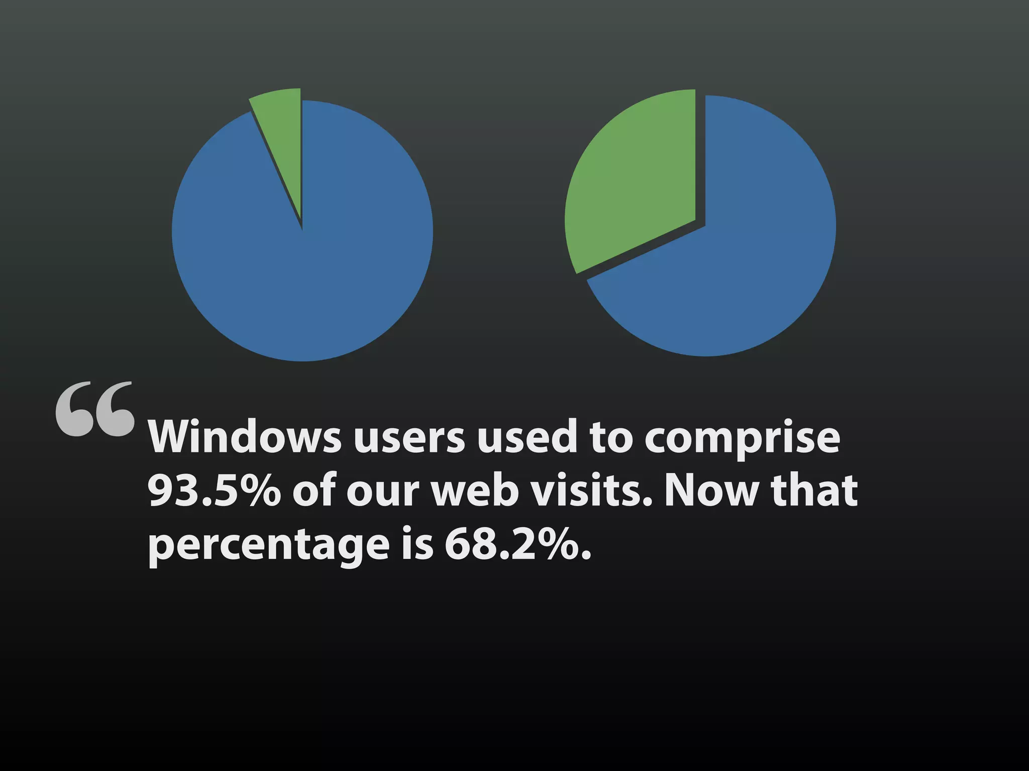
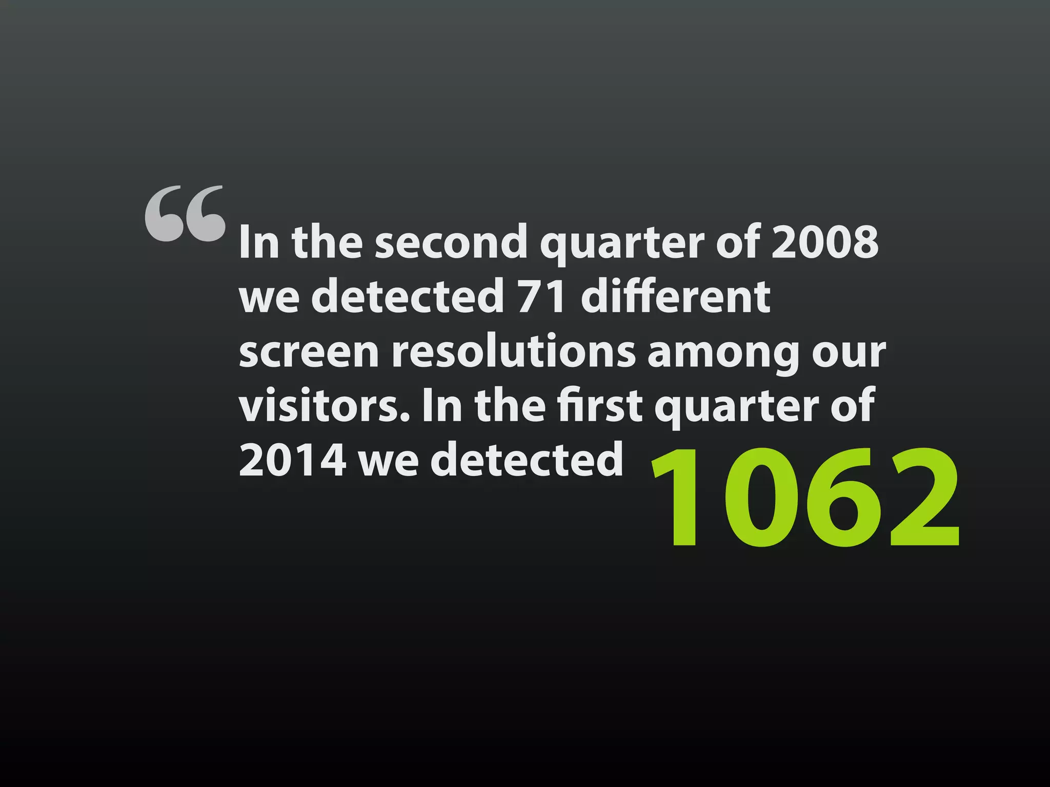
![[In 2008] 74.9% of our web visitors
used Internet Explorer. That
number has fallen to 19.7%.
Firefox now comprises 20%,
Safari 16.7%, and Chrome 37%.
“](https://image.slidesharecdn.com/beyondresponsive18f2015-150812140602-lva1-app6891/75/Beyond-Responsive-18F-2015-6-2048.jpg)


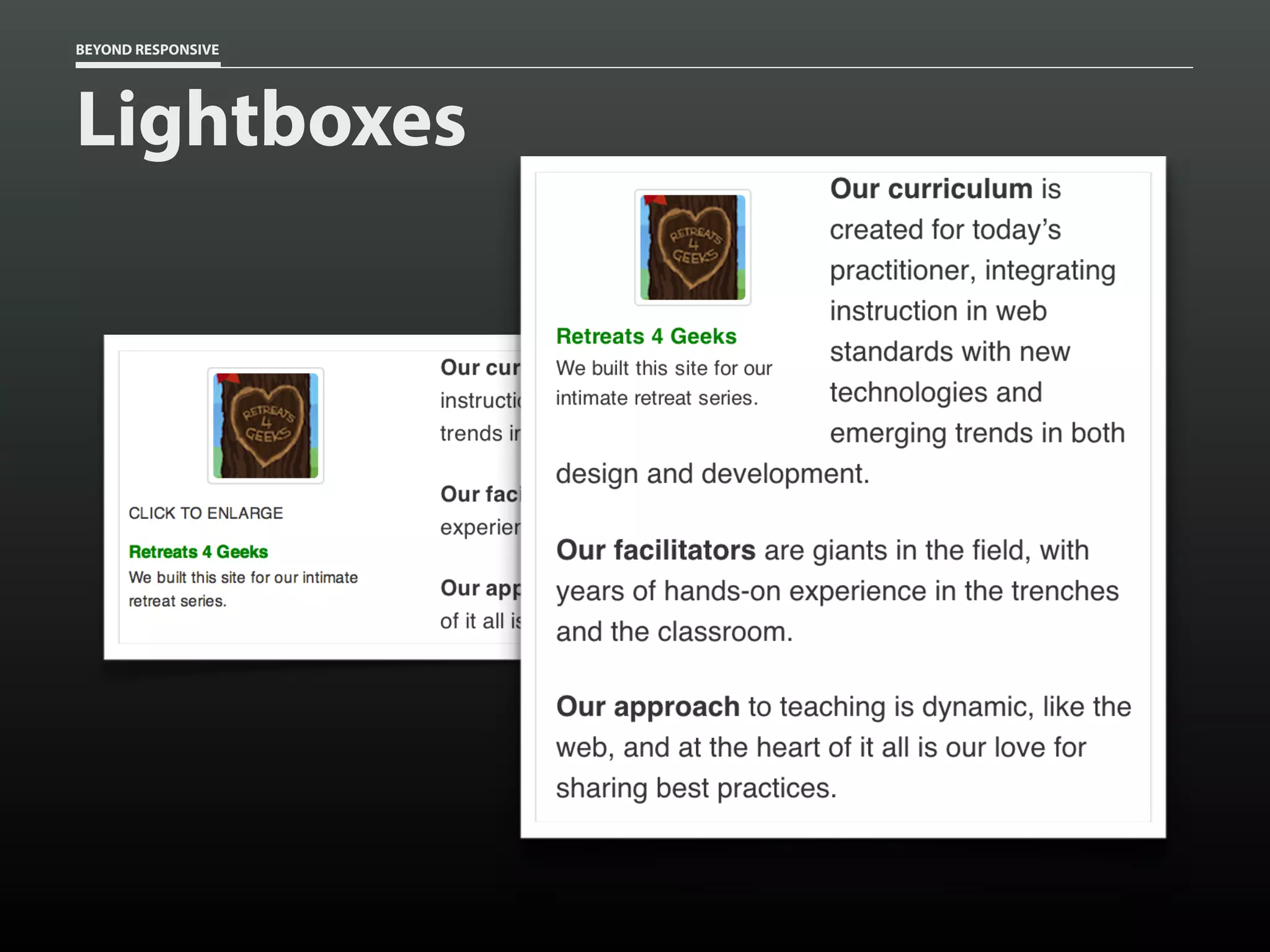
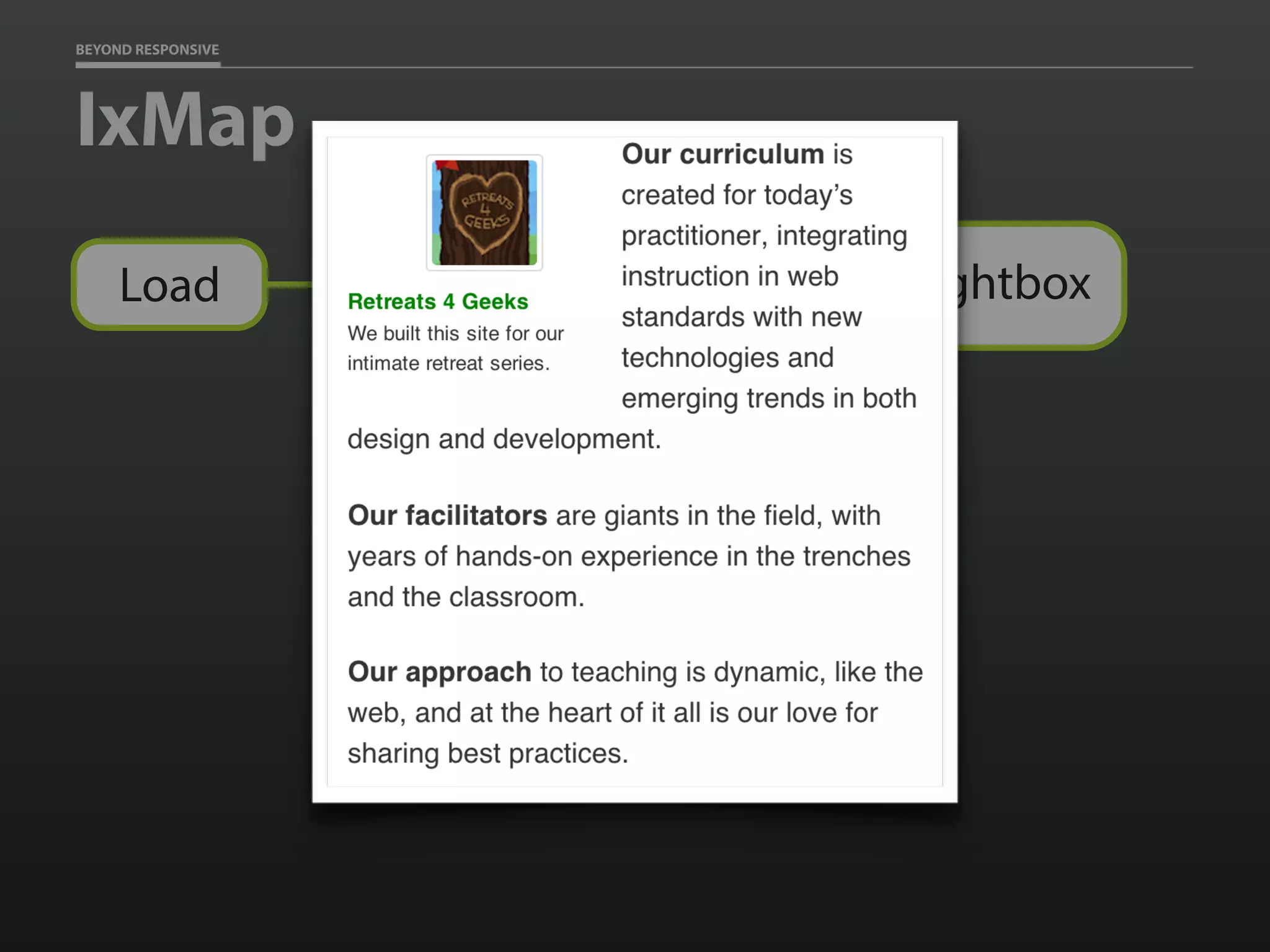

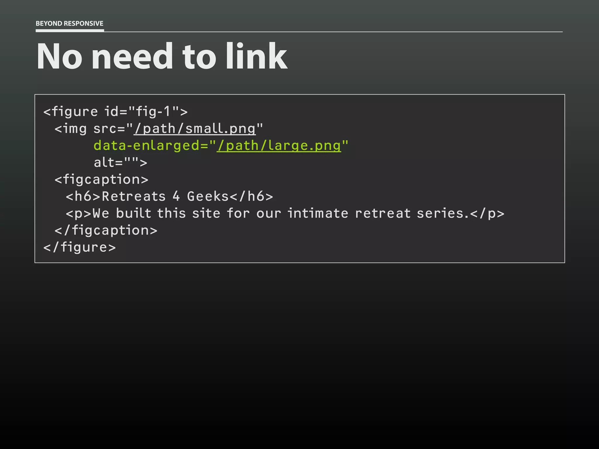


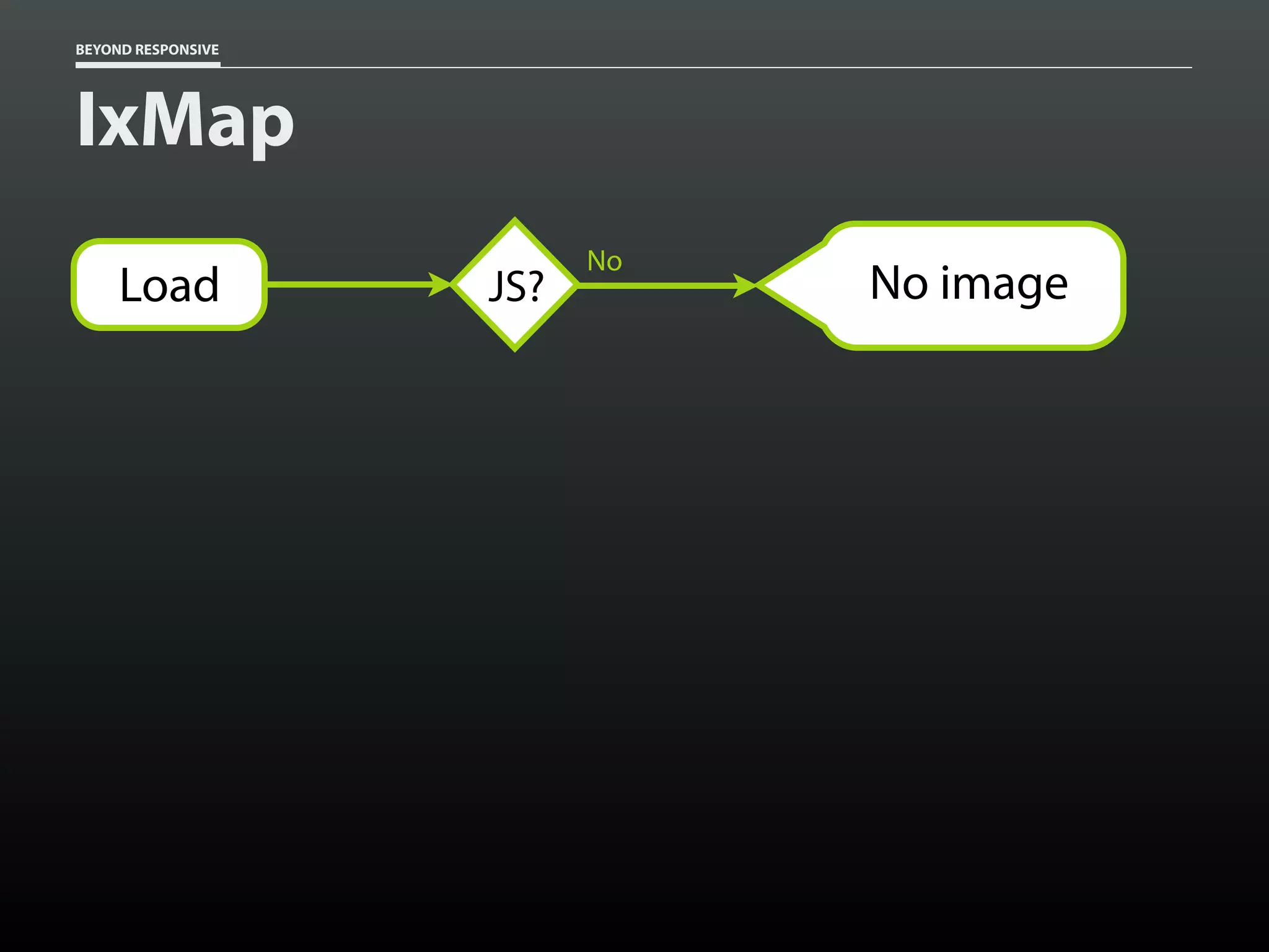
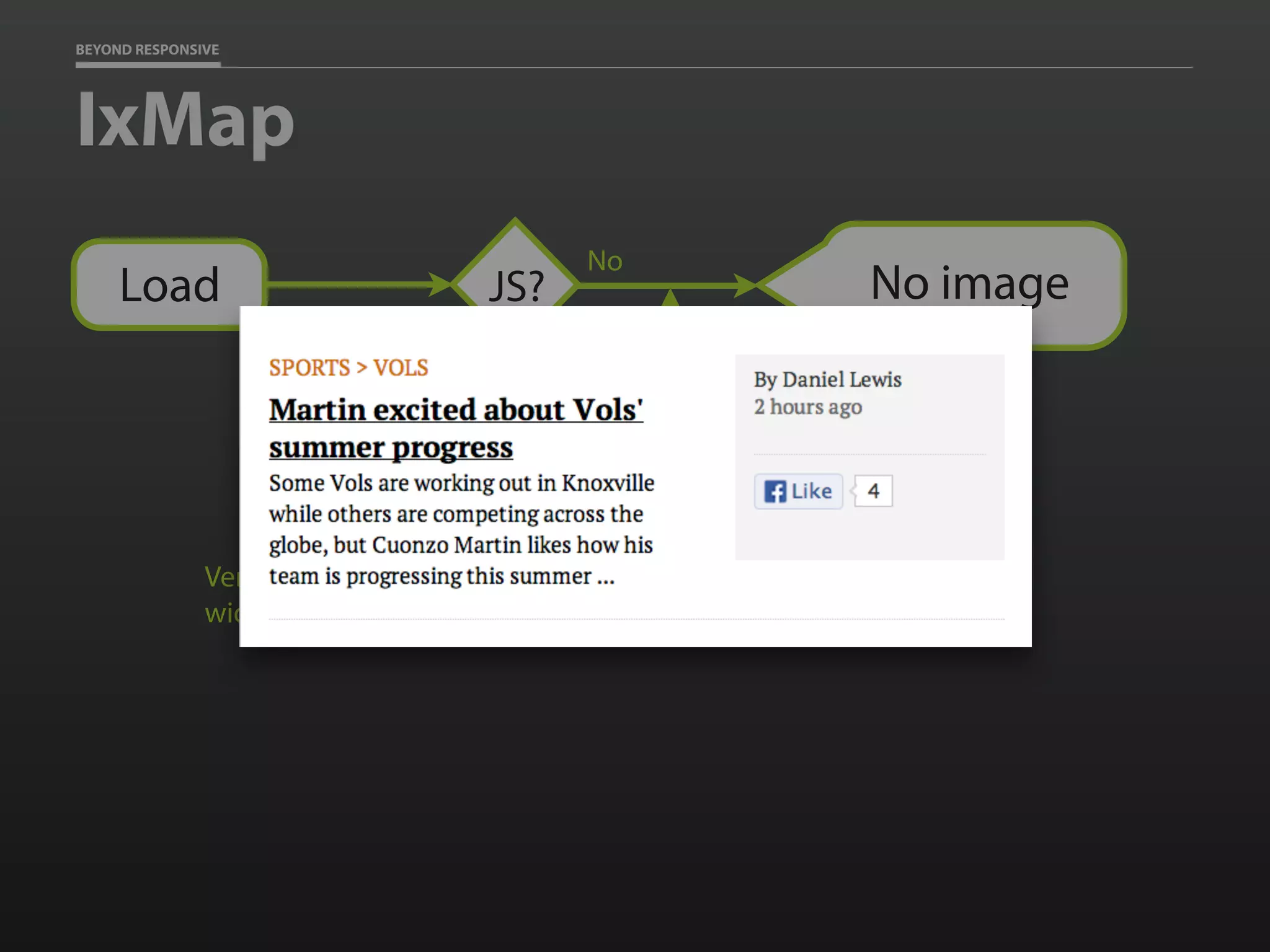
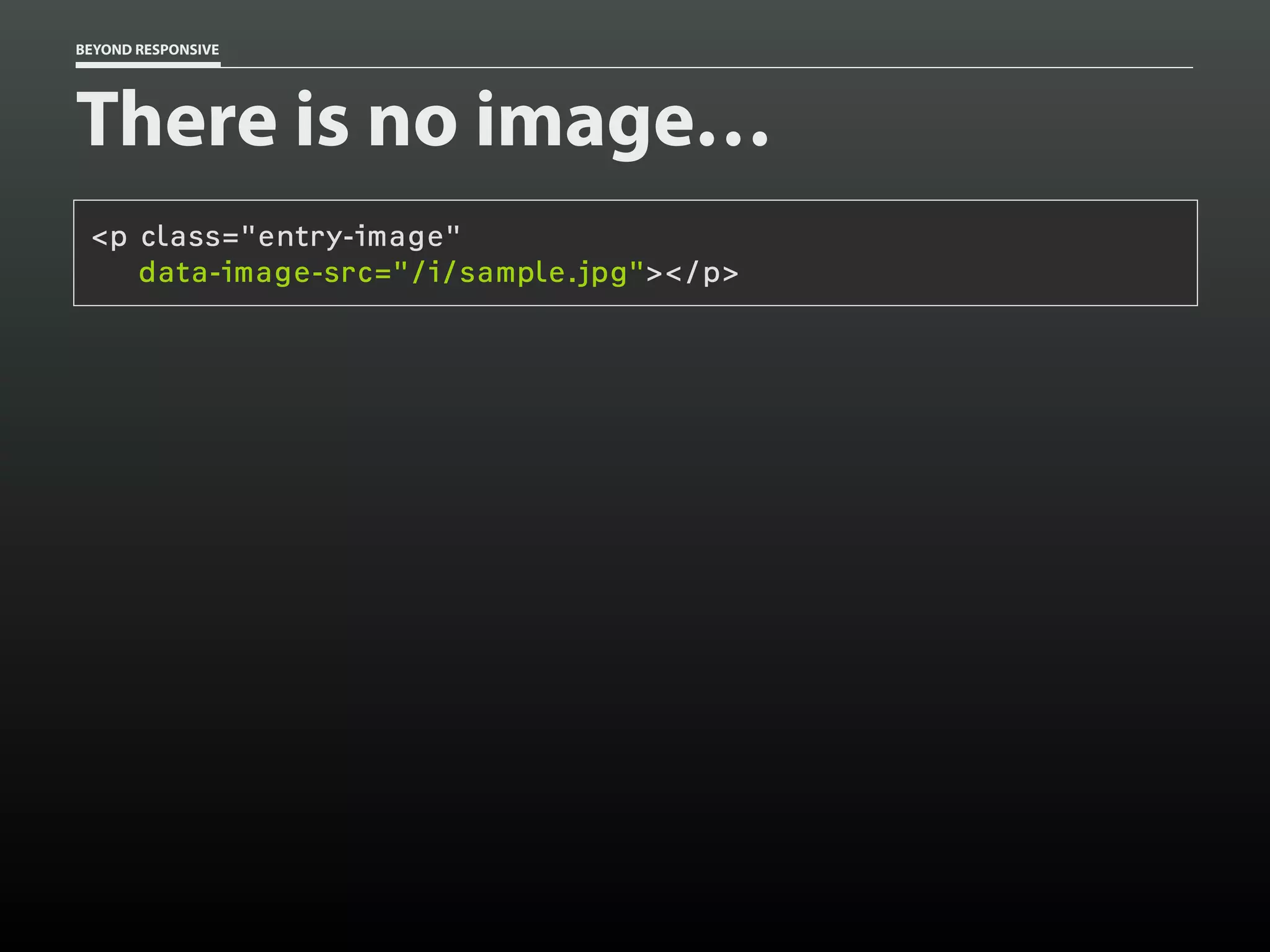
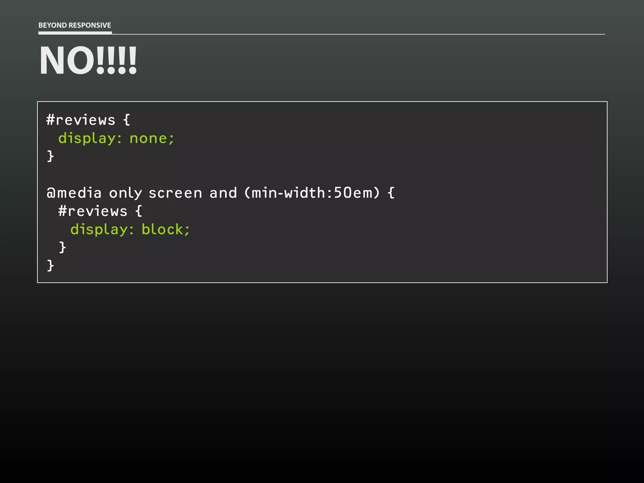
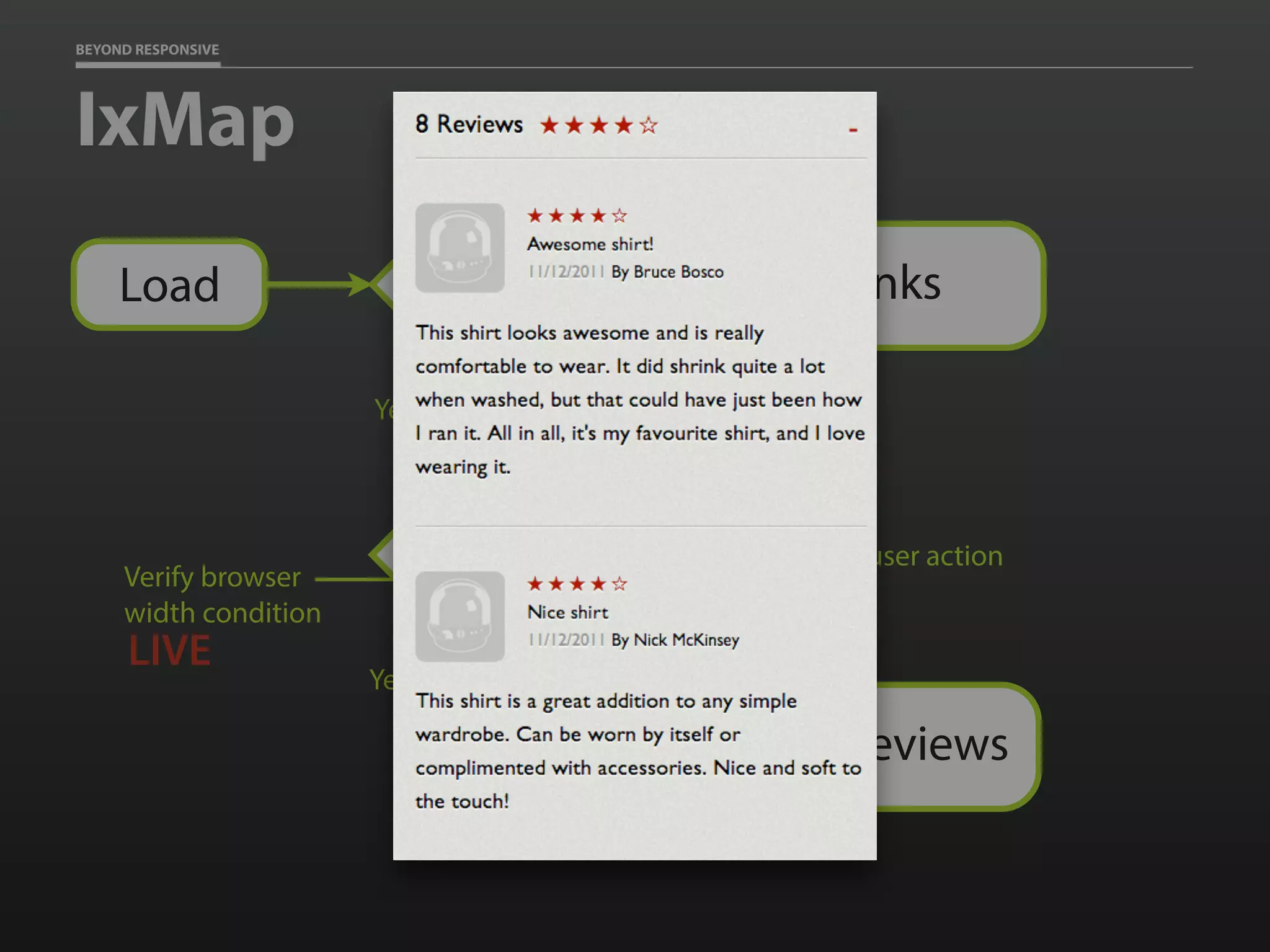
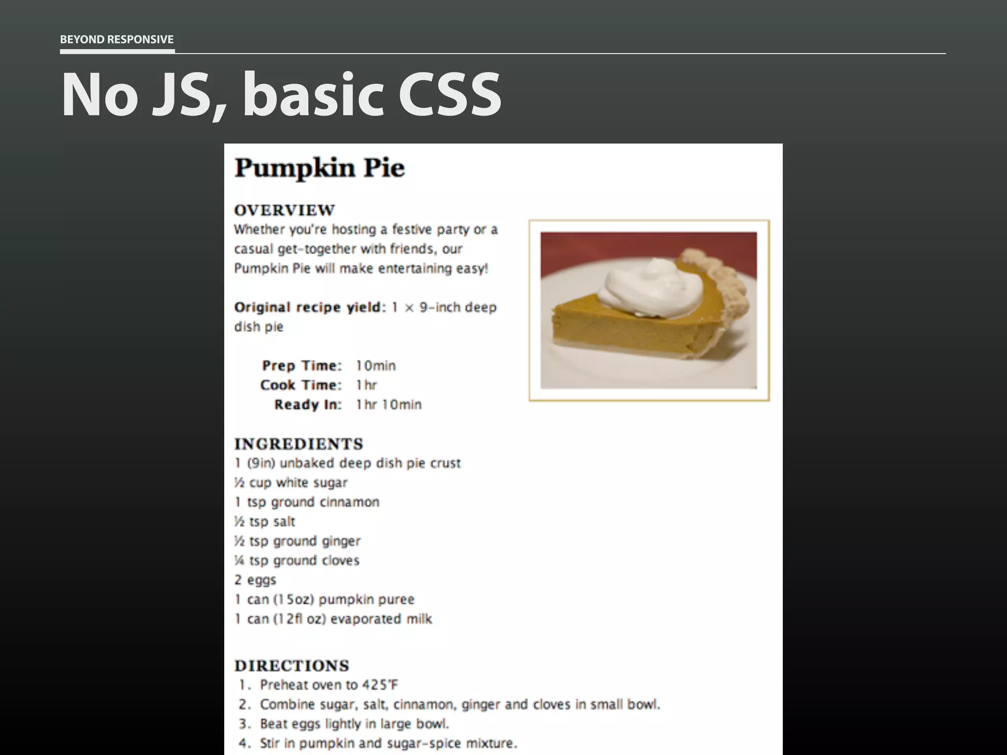
![BEYOND RESPONSIVE
CSS at rest
[data-image-src] {
display: none;
}](https://image.slidesharecdn.com/beyondresponsive18f2015-150812140602-lva1-app6891/75/Beyond-Responsive-18F-2015-89-2048.jpg)
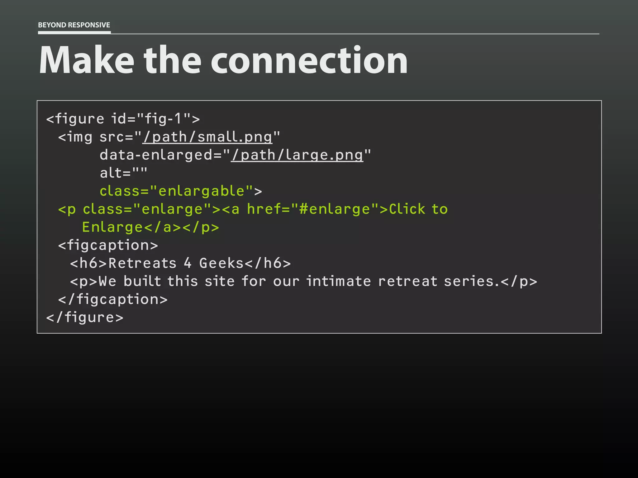
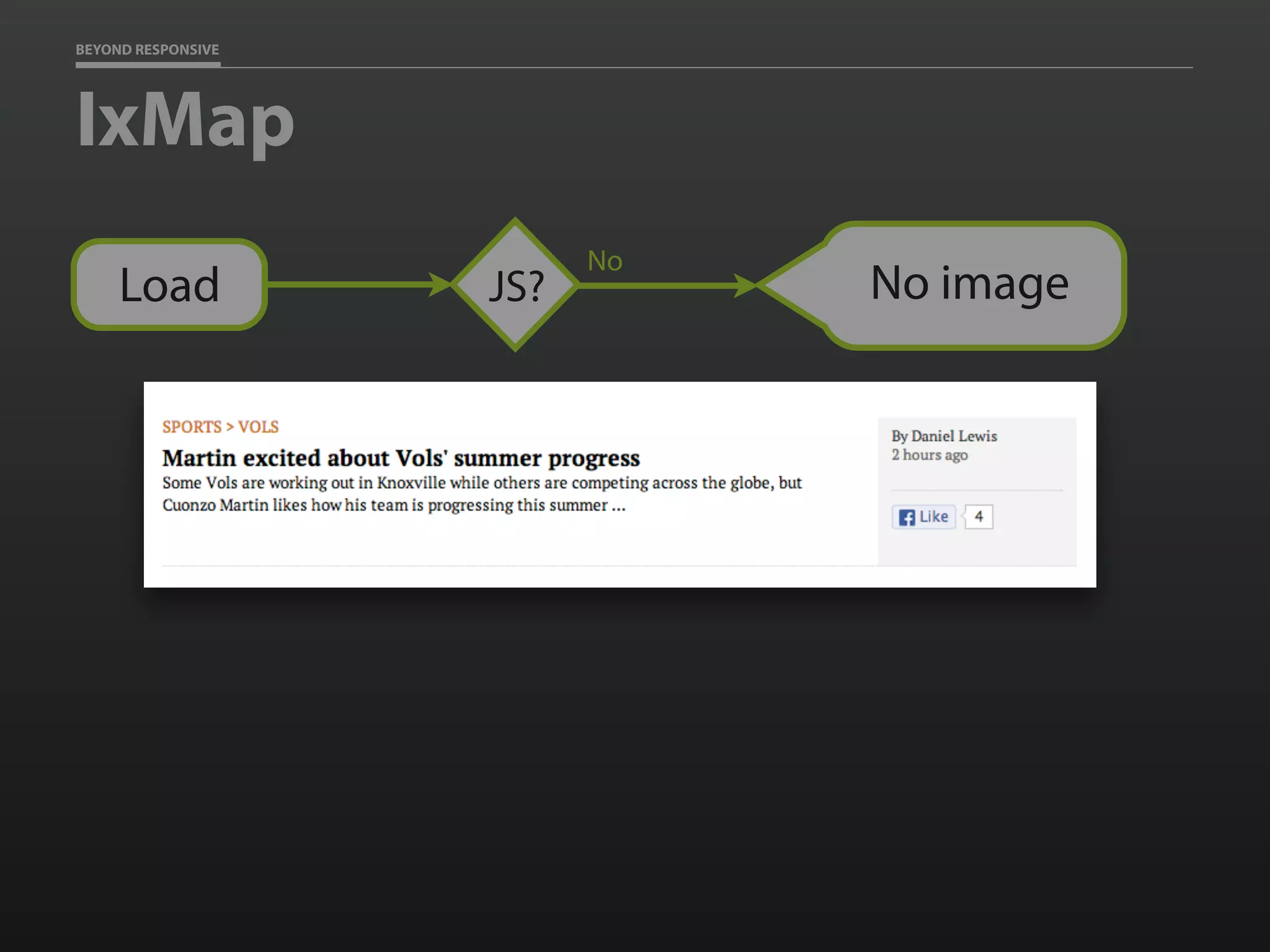
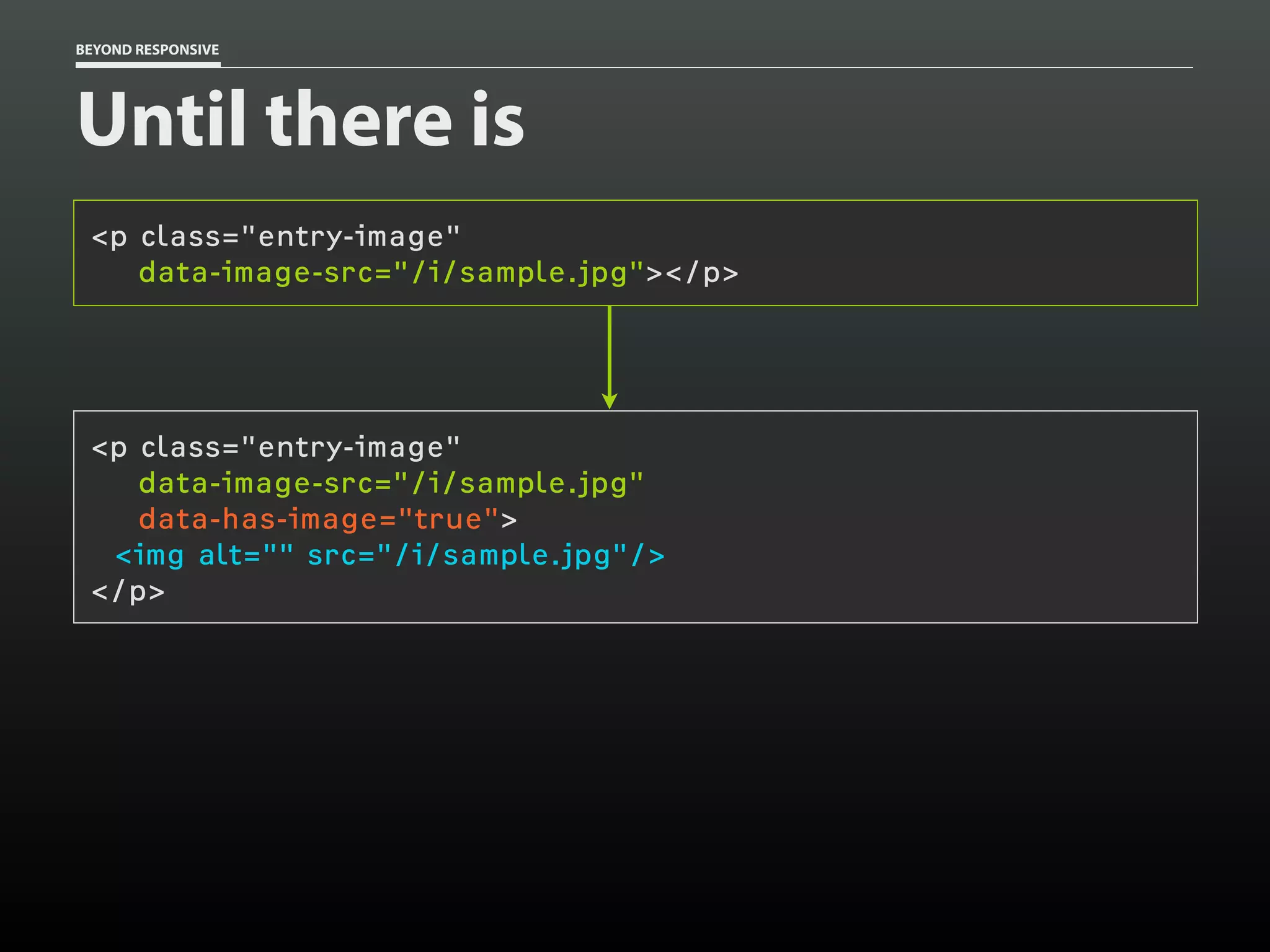
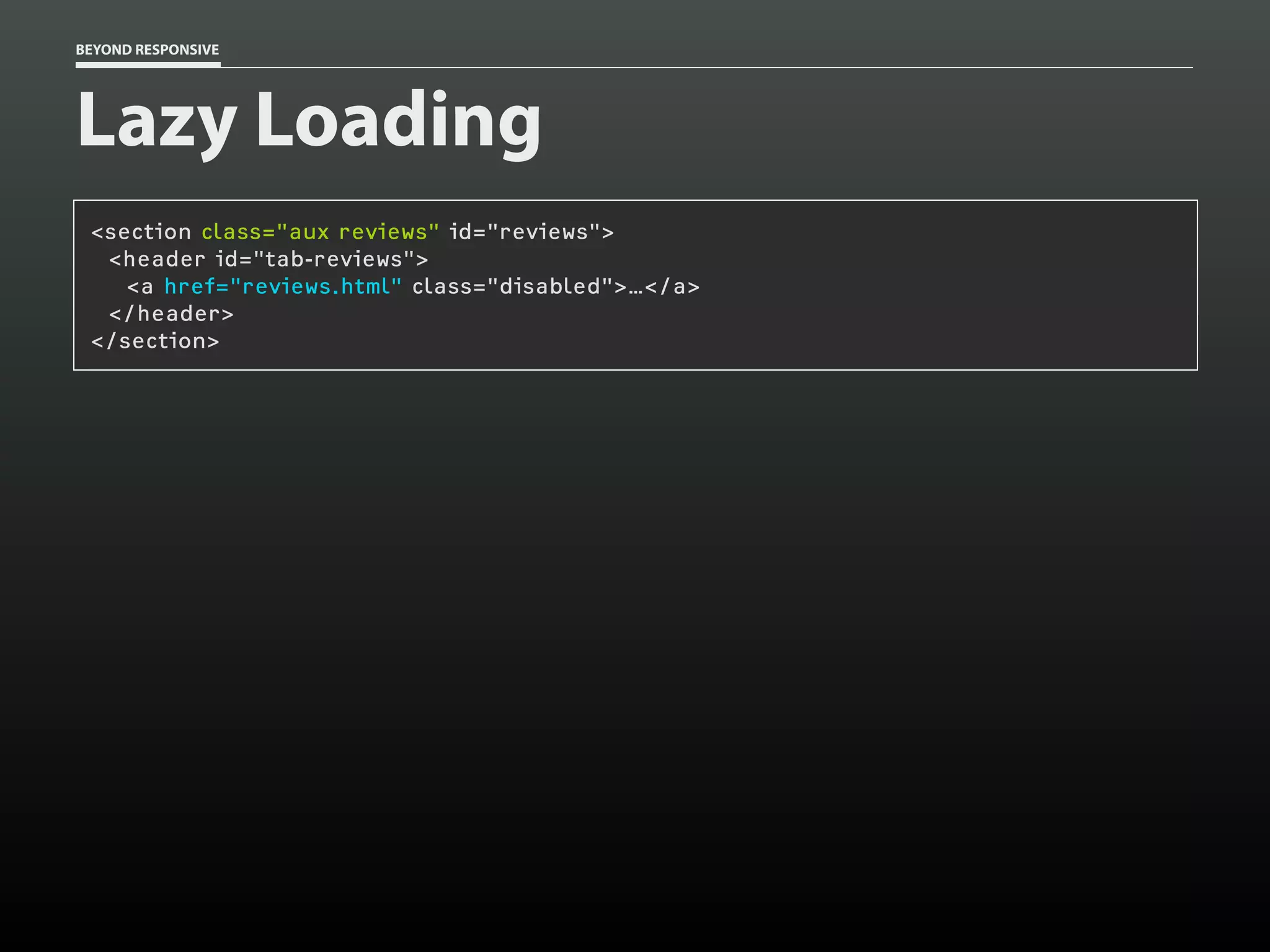
![BEYOND RESPONSIVE
CSS at play
[data-image-src][data-image-loaded] {
display: block;
}](https://image.slidesharecdn.com/beyondresponsive18f2015-150812140602-lva1-app6891/75/Beyond-Responsive-18F-2015-90-2048.jpg)
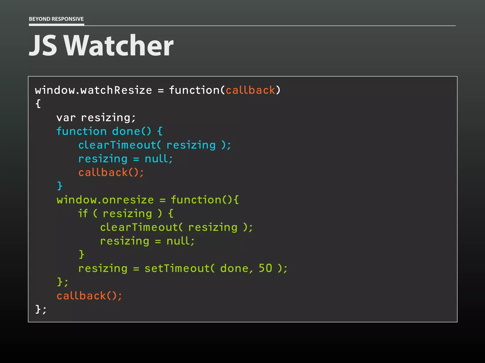
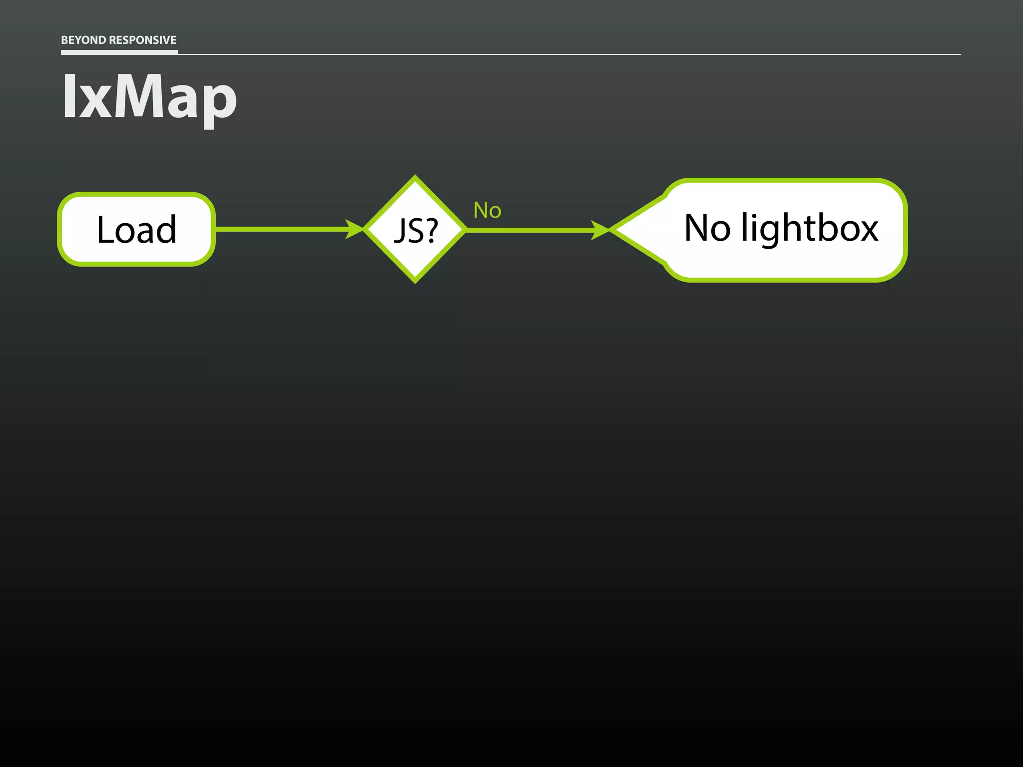
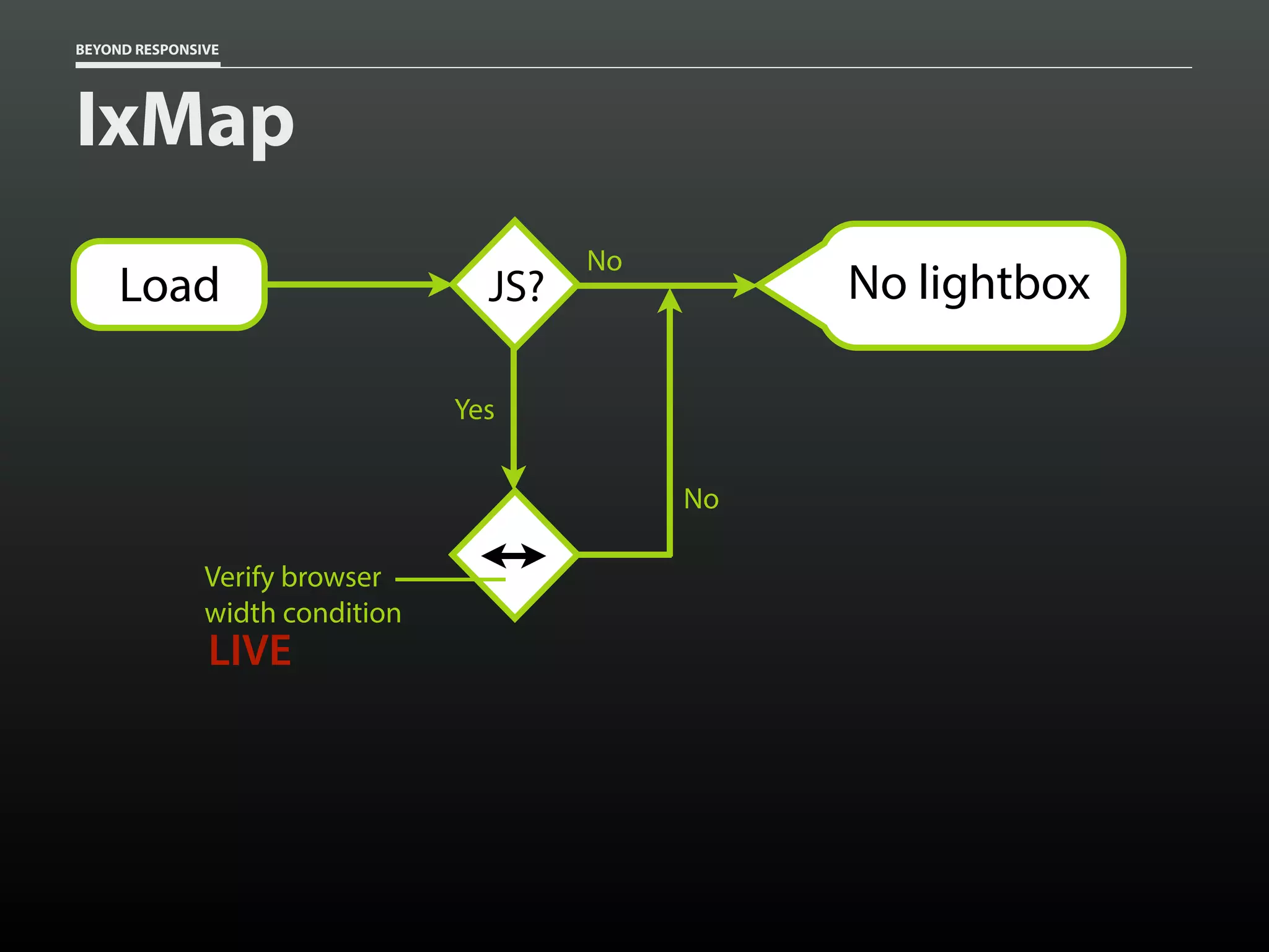
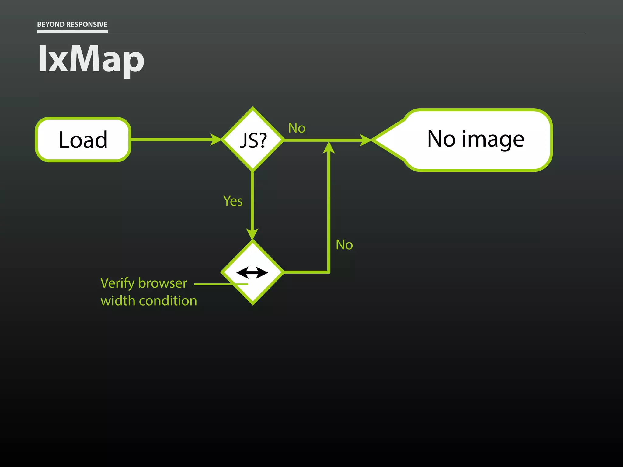
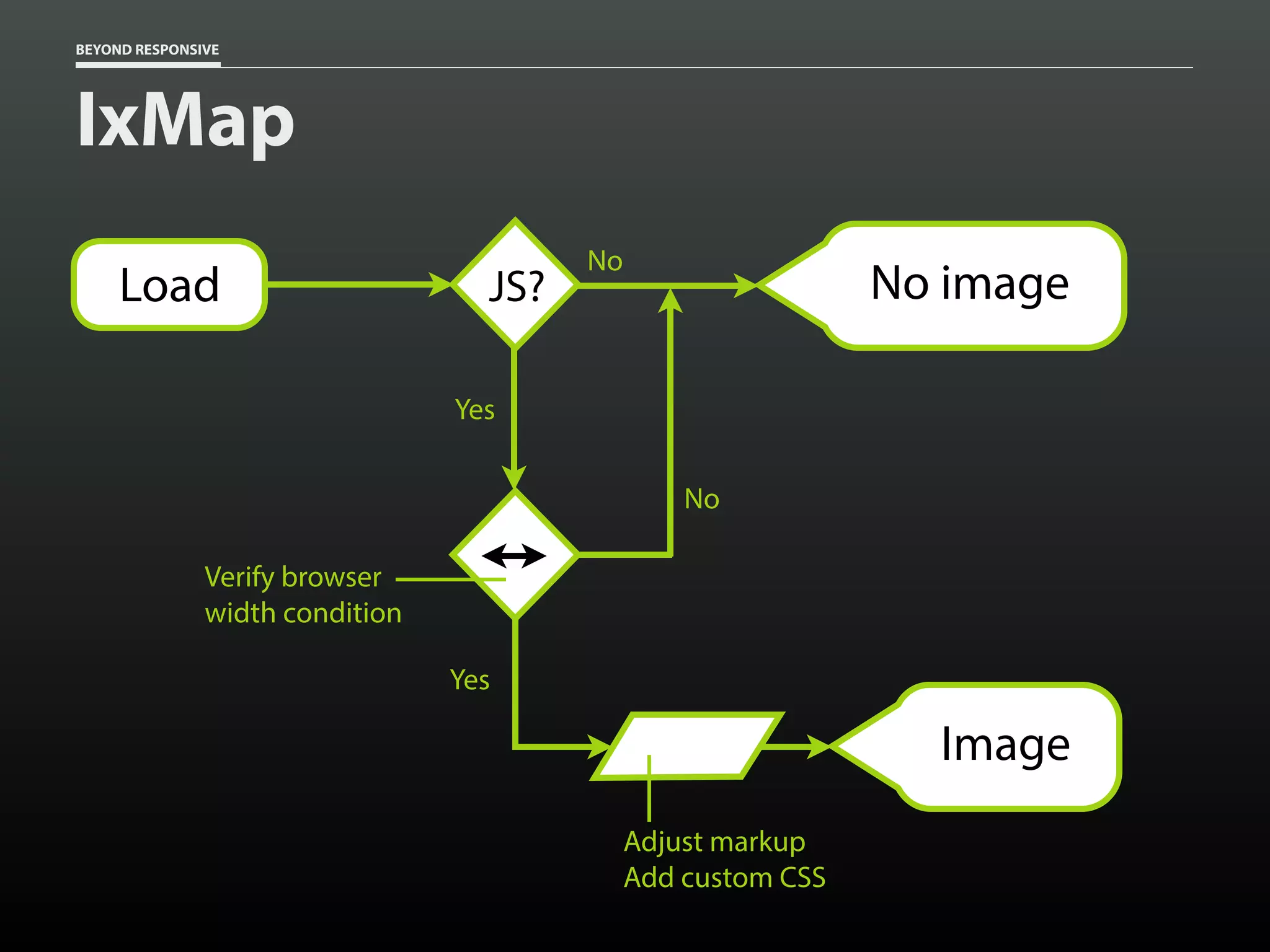
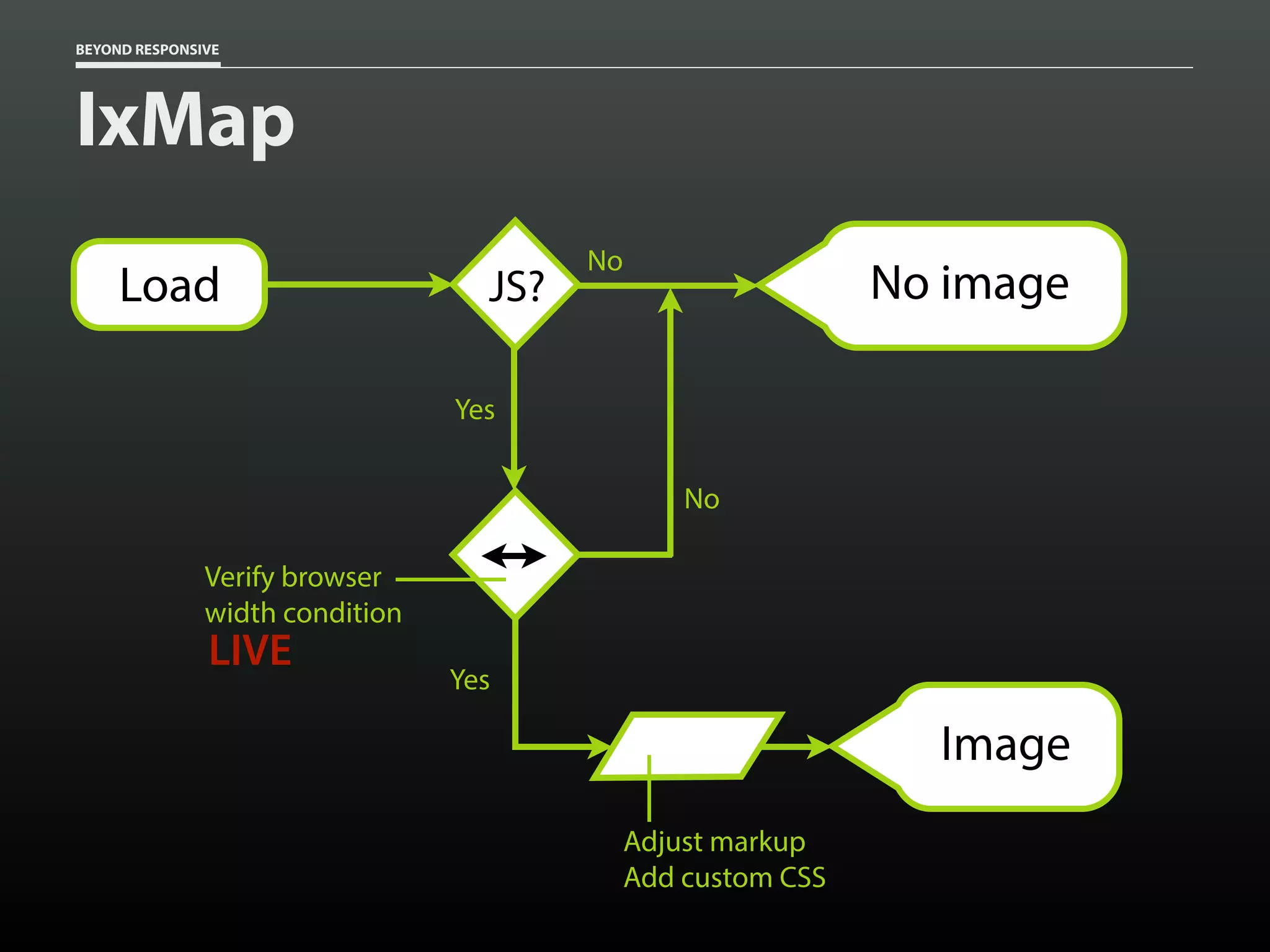
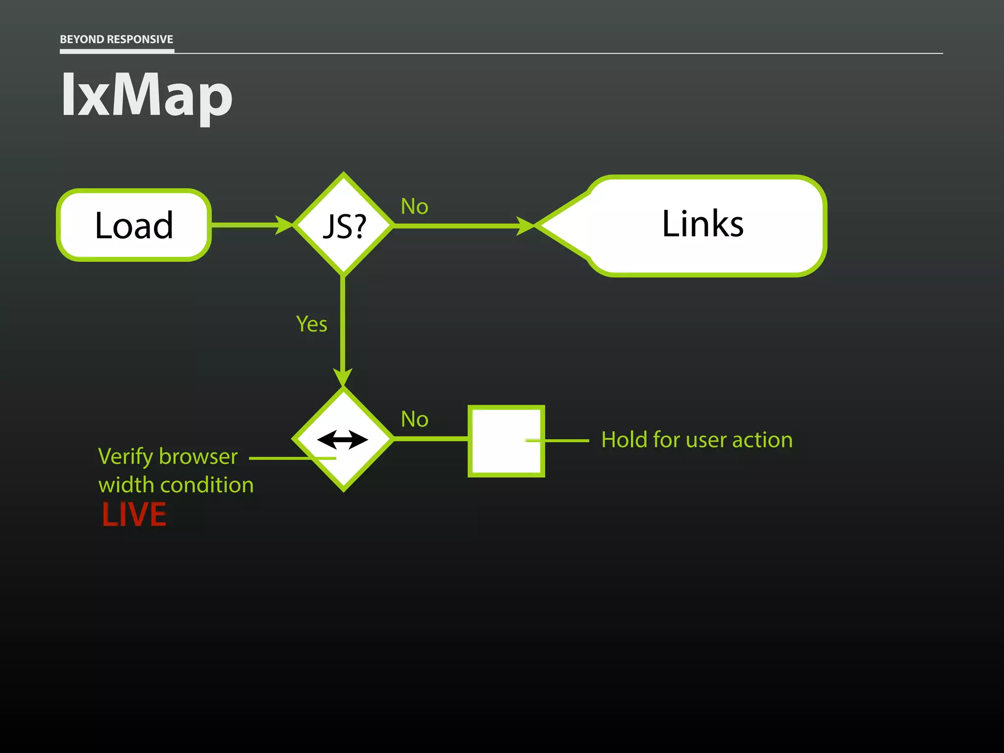
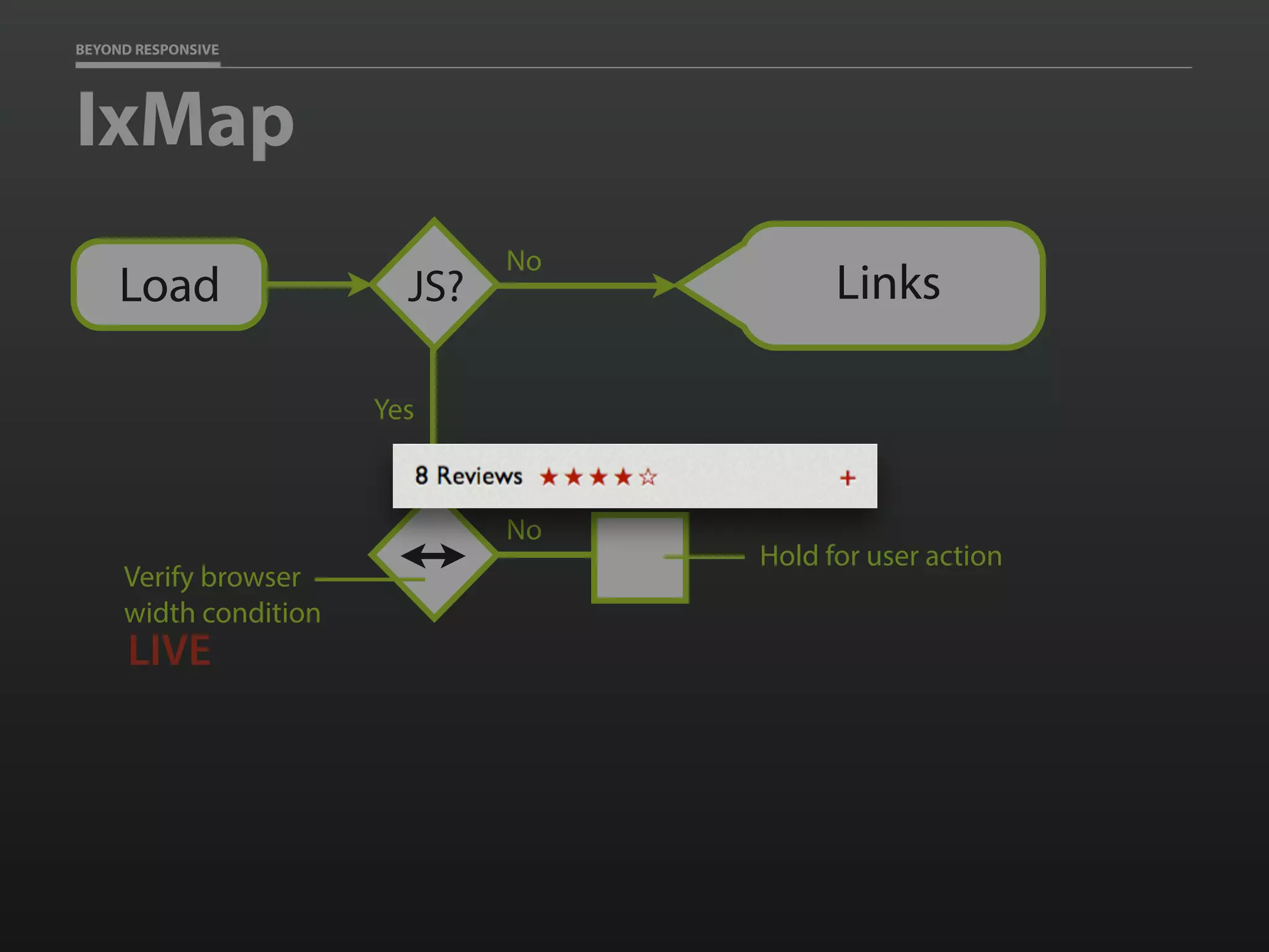
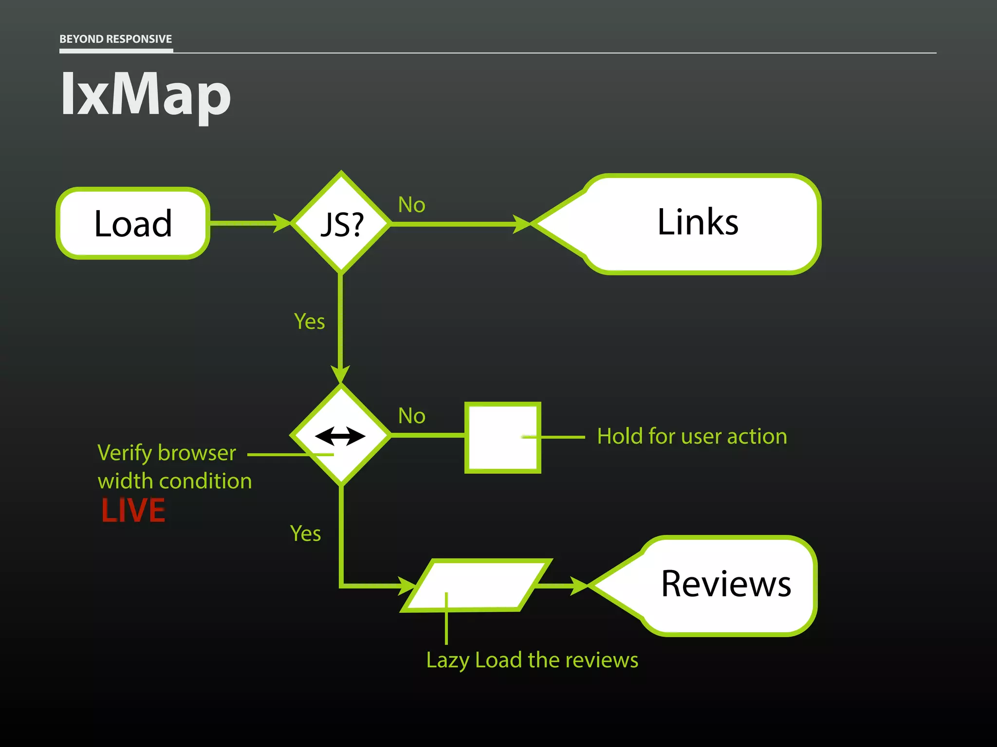
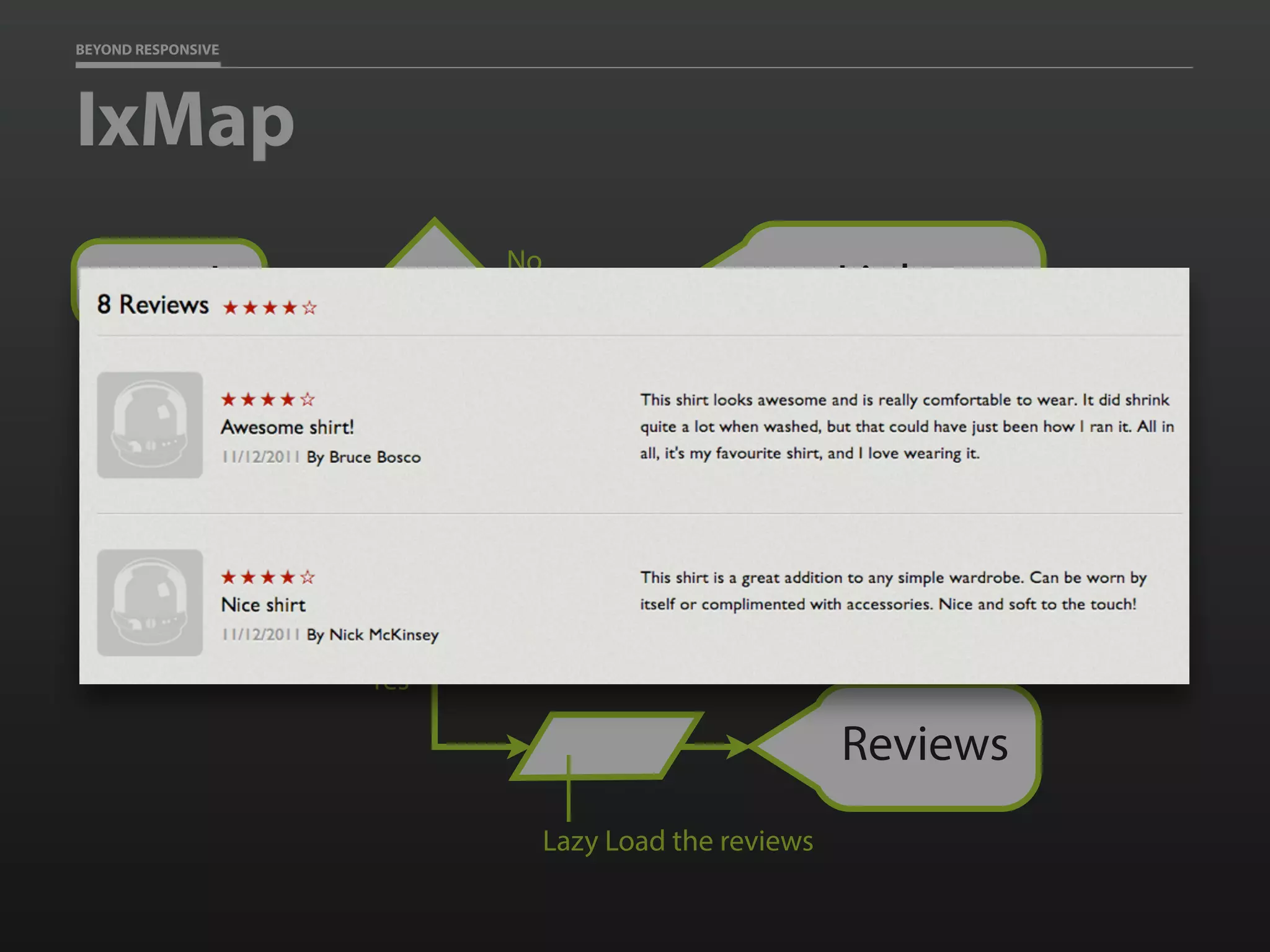
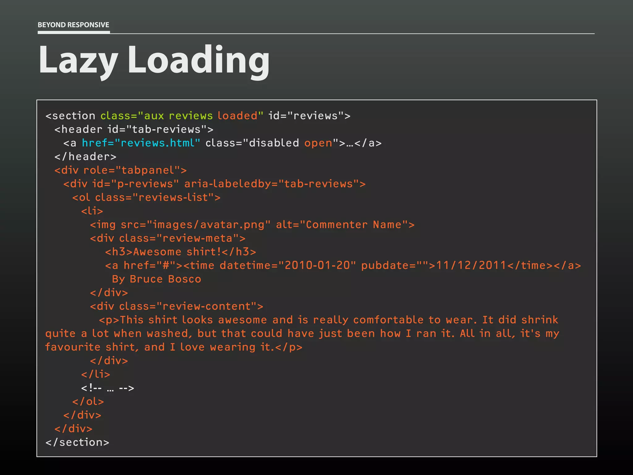
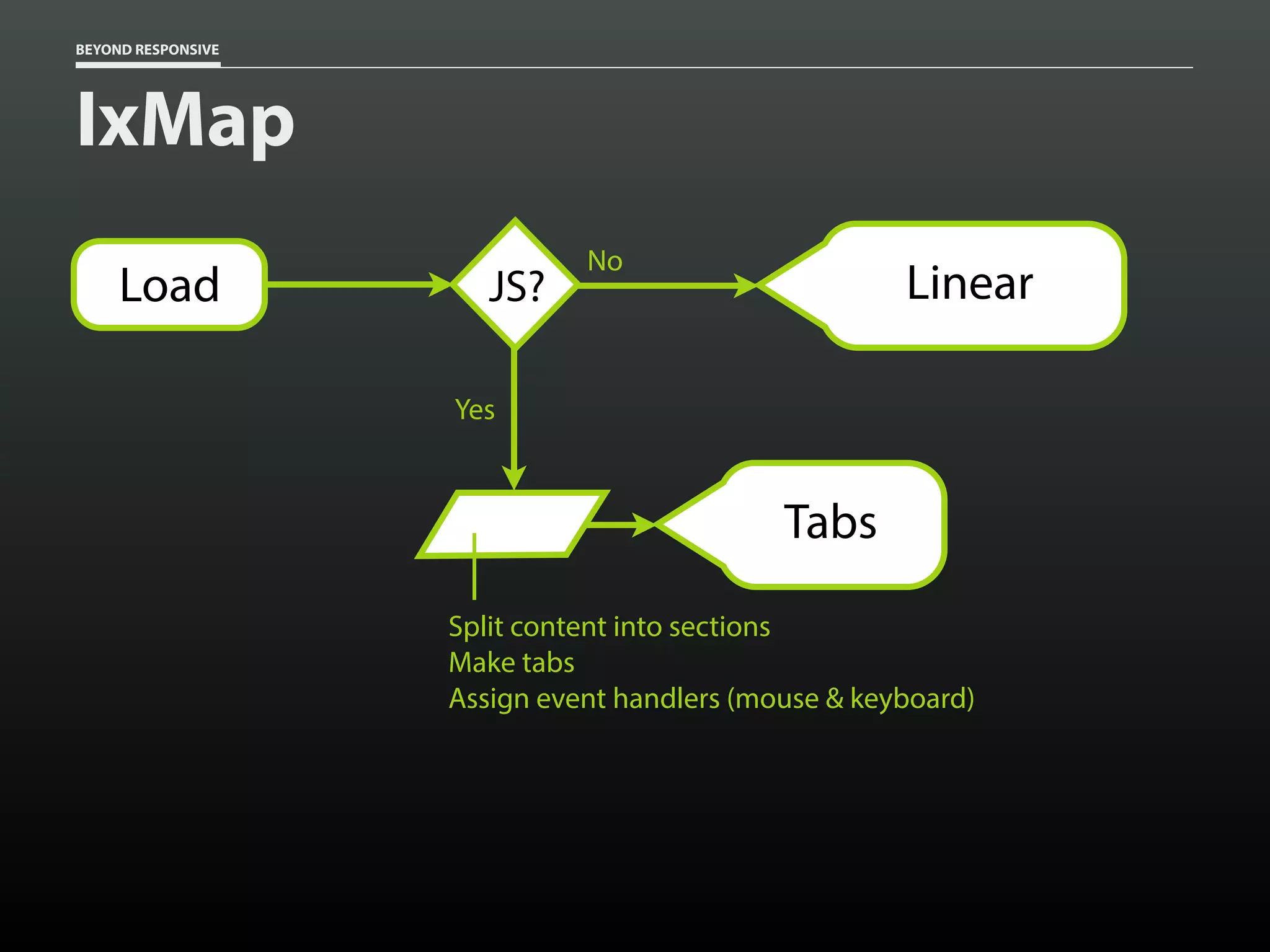
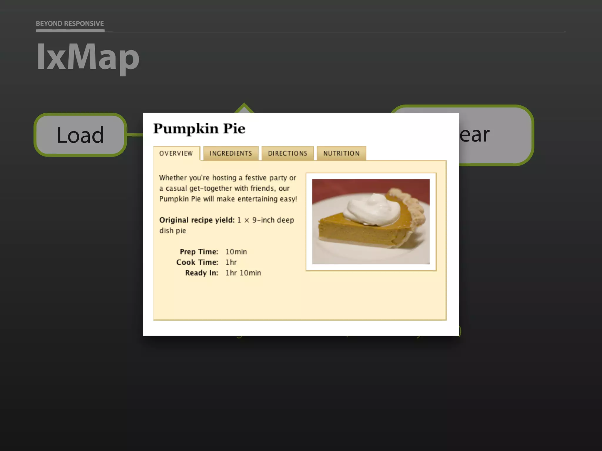
![BEYOND RESPONSIVE
JS Watcher
window.watchResize(function(){
var threshold = 400,
image = document.createElement('img'),
paragraphs = document.getElementsByTagName('p'),
i = paragraphs.length,
p, loaded, src, img;
if ( browser_width >= threshold ) {
image.setAttribute('alt','');
while ( i-- ) {
p = paragraphs[i];
src = p.getAttribute('data-image-src');
loaded = p.getAttribute('data-image-loaded');
if ( src != null && loaded == null ) {
img = image.cloneNode(true);
img.setAttribute('src',src);
p.appendChild( img );
p.setAttribute('data-image-loaded','');
}
}
image = paragraphs = p = img = null;
}
});](https://image.slidesharecdn.com/beyondresponsive18f2015-150812140602-lva1-app6891/75/Beyond-Responsive-18F-2015-93-2048.jpg)
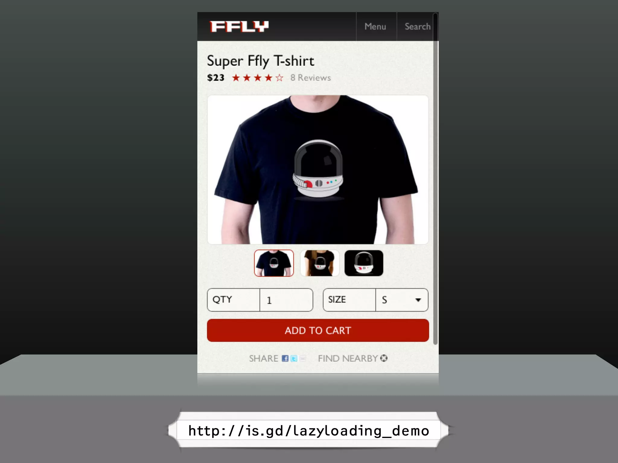
![BEYOND RESPONSIVE
Smart CSS
[data-image-src][data-image-loaded] {
display: block;
}](https://image.slidesharecdn.com/beyondresponsive18f2015-150812140602-lva1-app6891/75/Beyond-Responsive-18F-2015-95-2048.jpg)
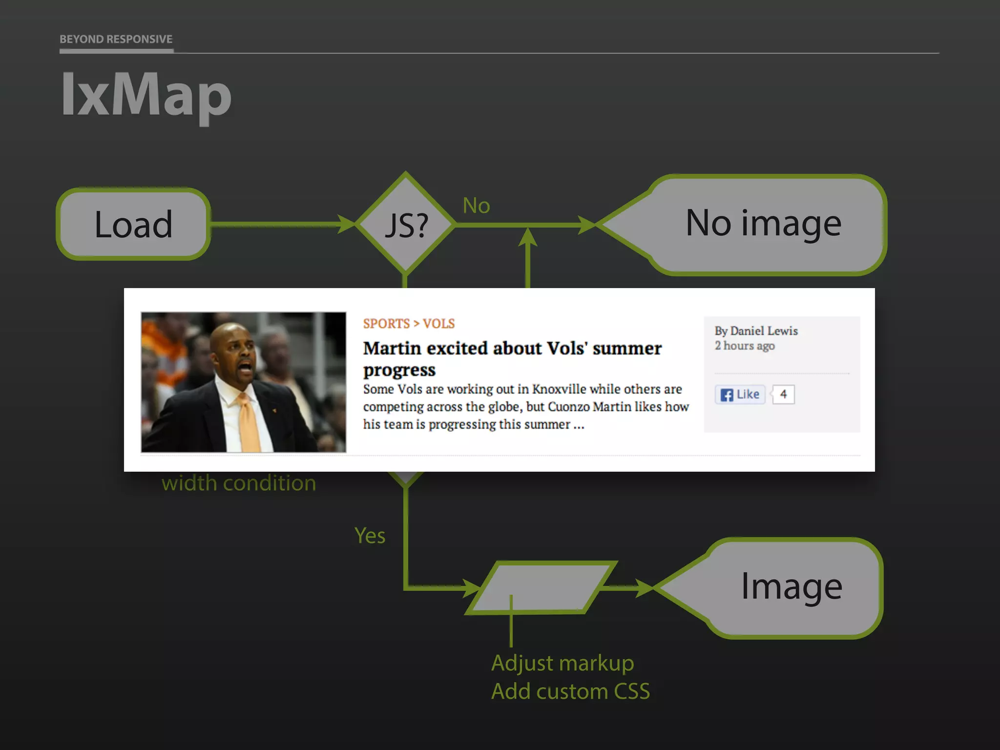
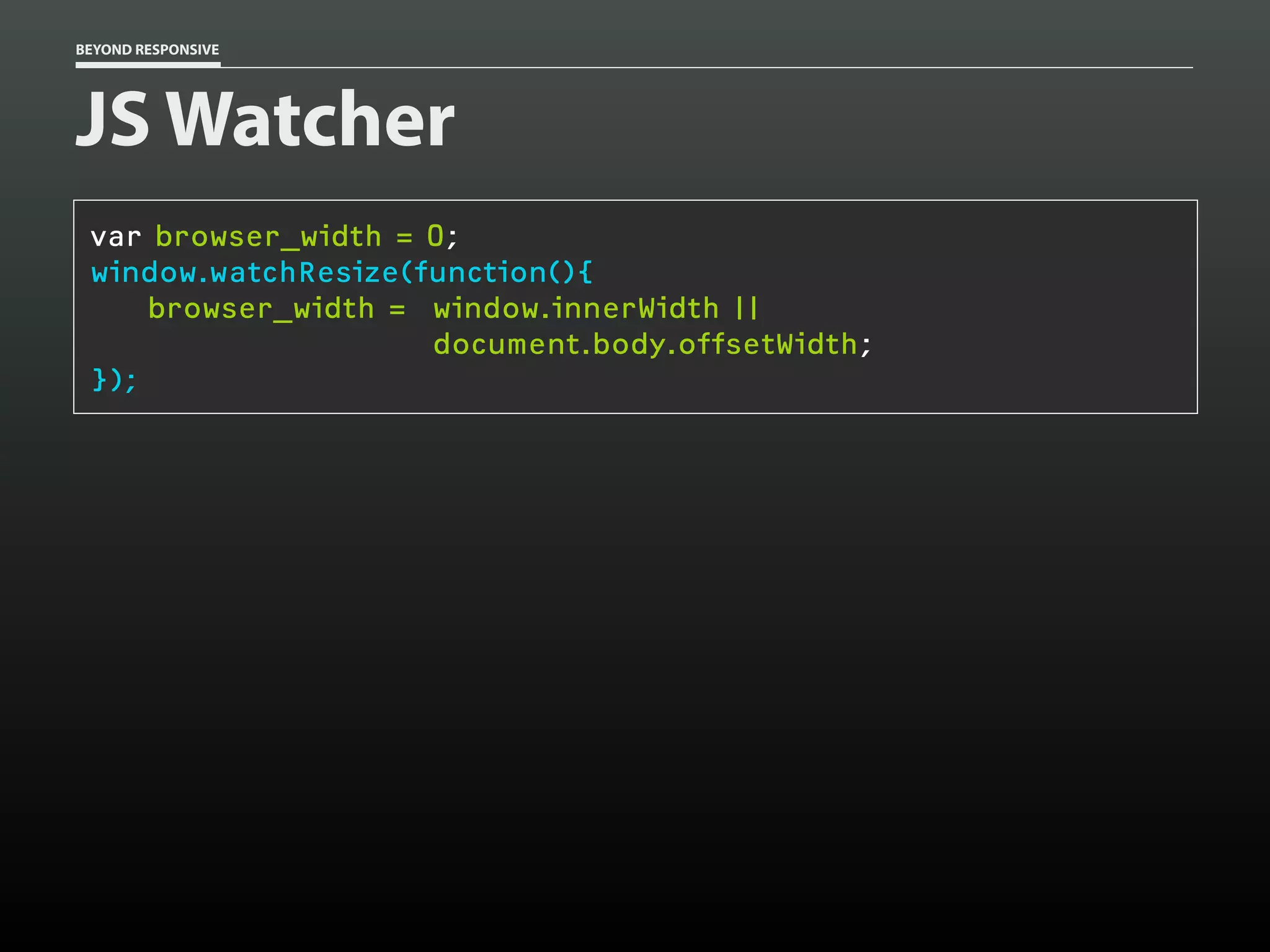
![BEYOND RESPONSIVE
Smart CSS
[data-image-src][data-image-loaded] {
display: block;
}
@media only screen and (min-width:400px) {
[data-img-src][data-image-loaded] {
display: block;
}
}](https://image.slidesharecdn.com/beyondresponsive18f2015-150812140602-lva1-app6891/75/Beyond-Responsive-18F-2015-96-2048.jpg)


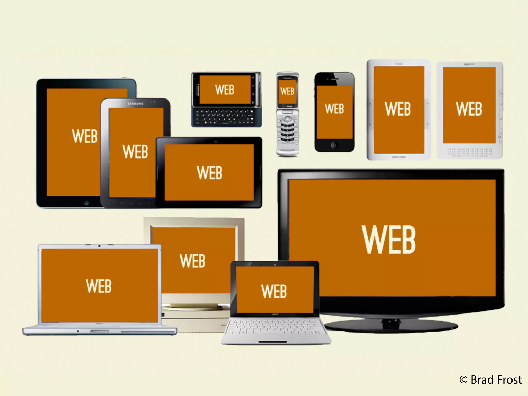
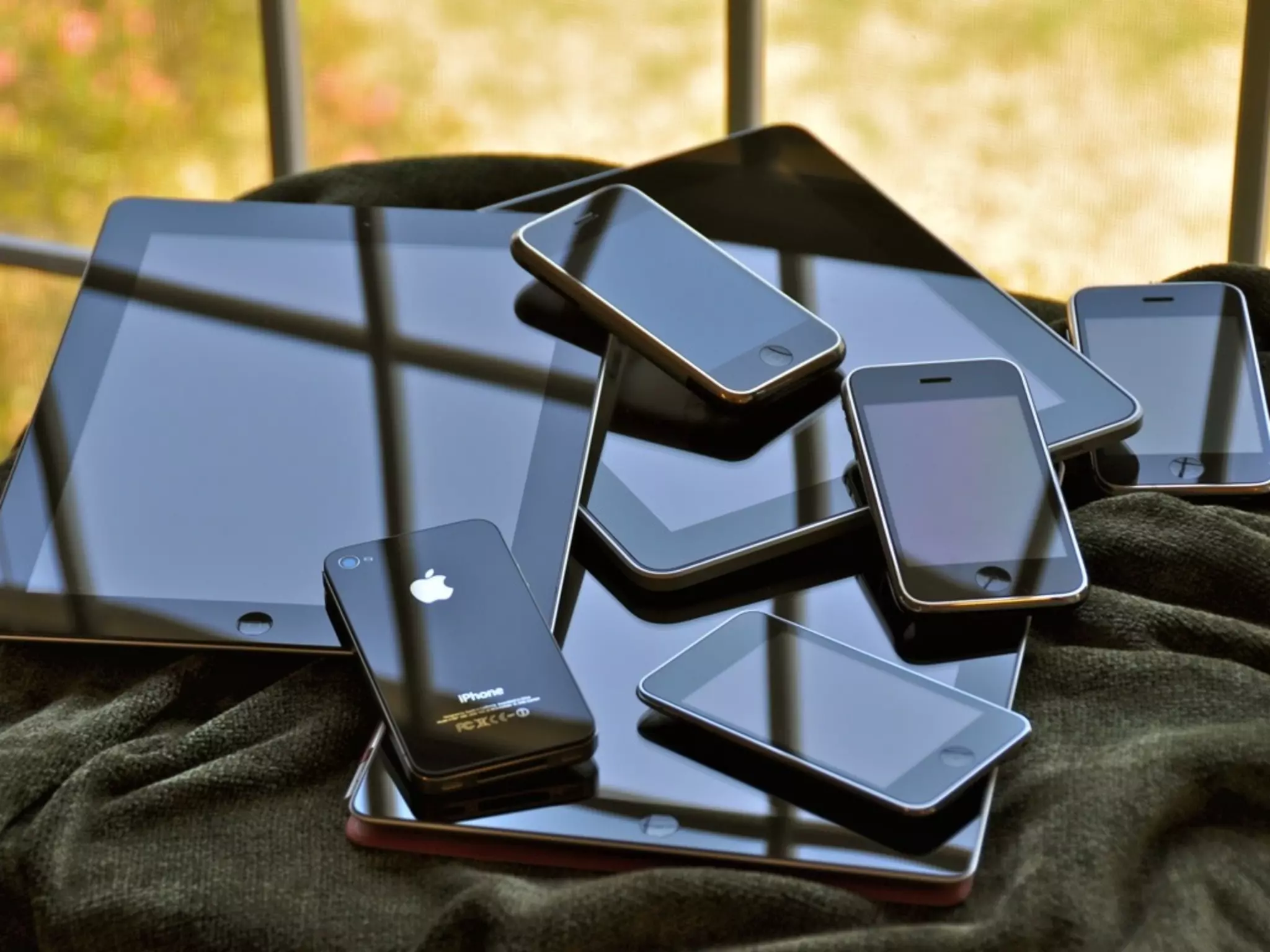
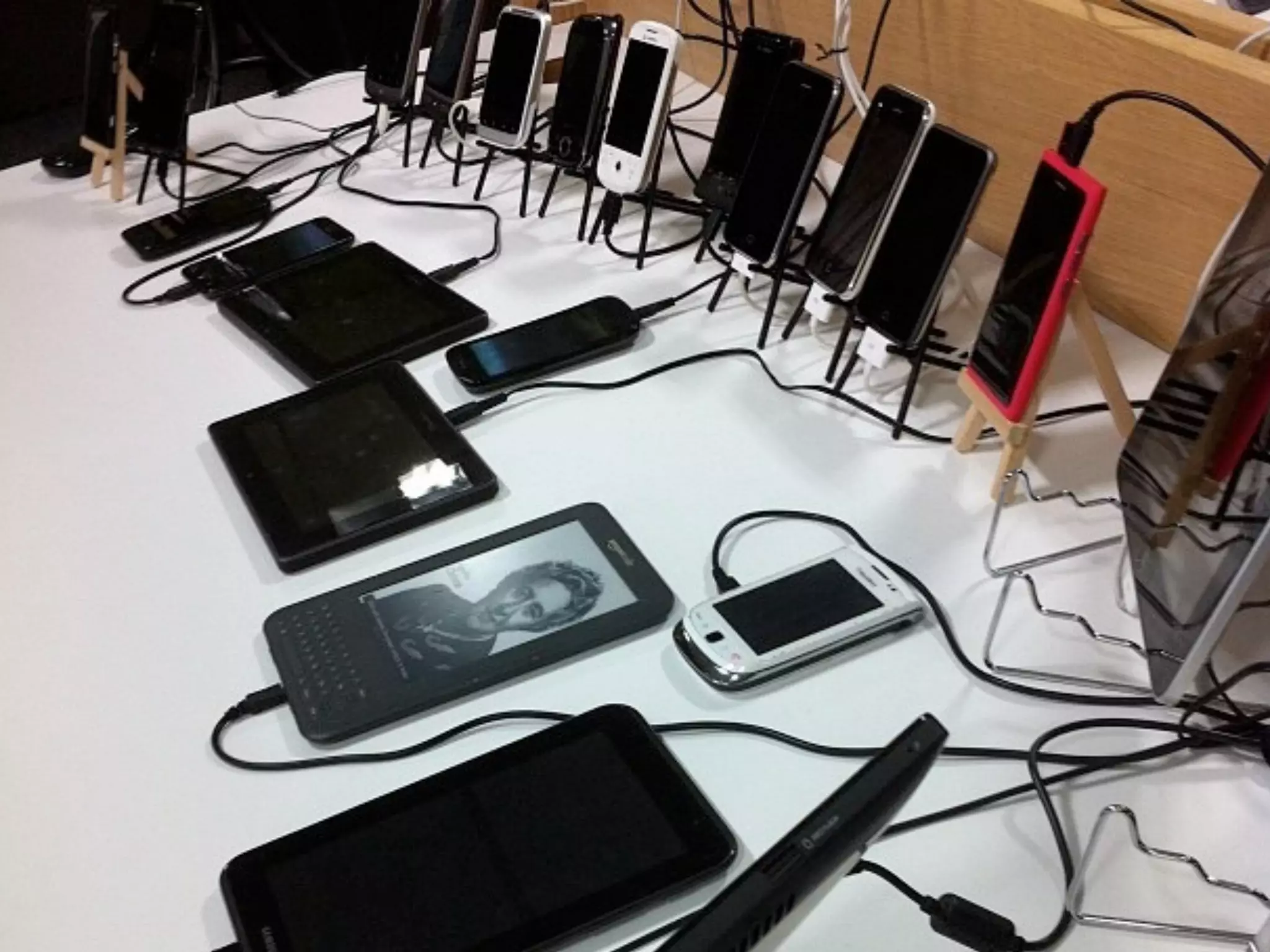
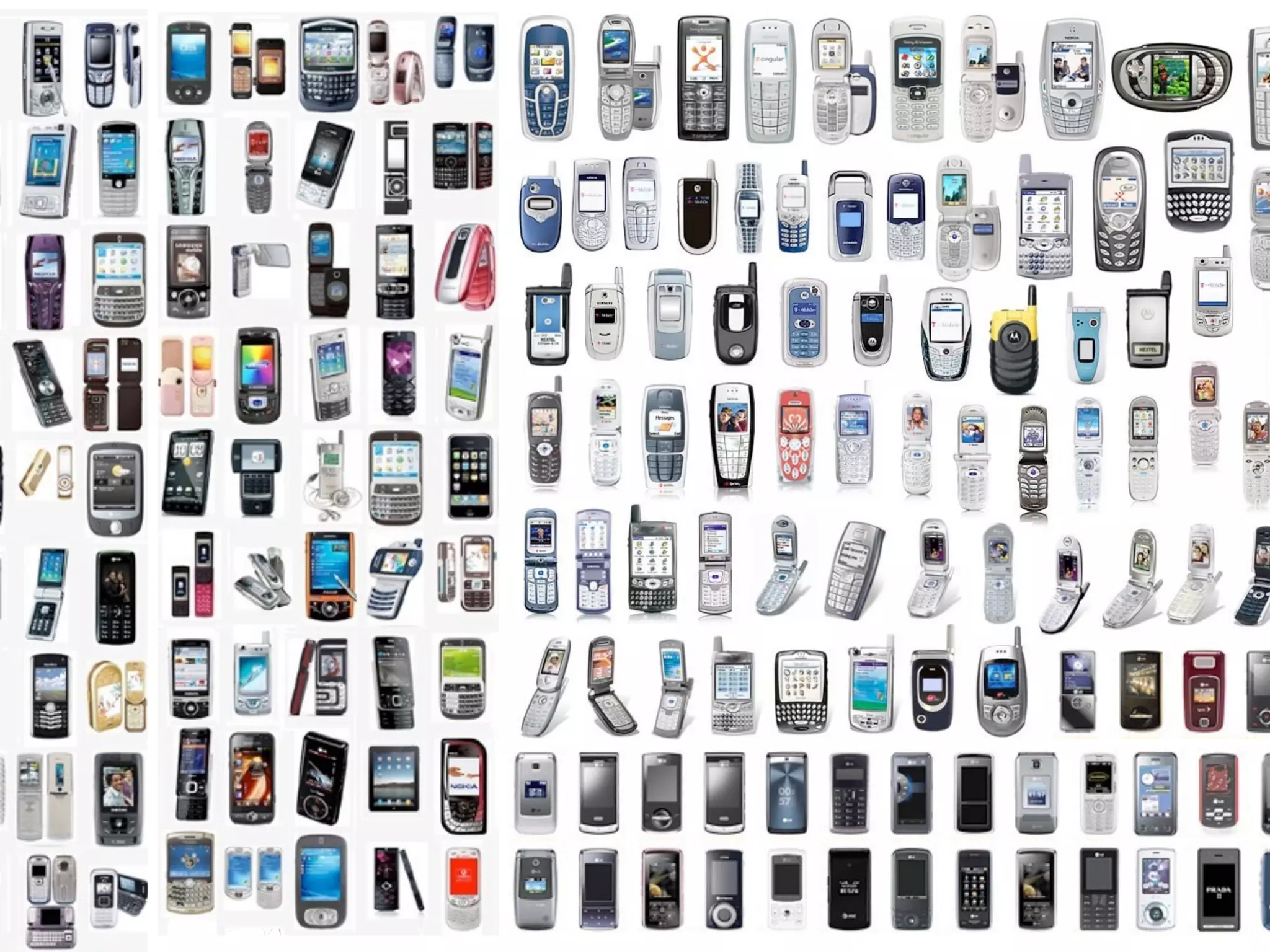
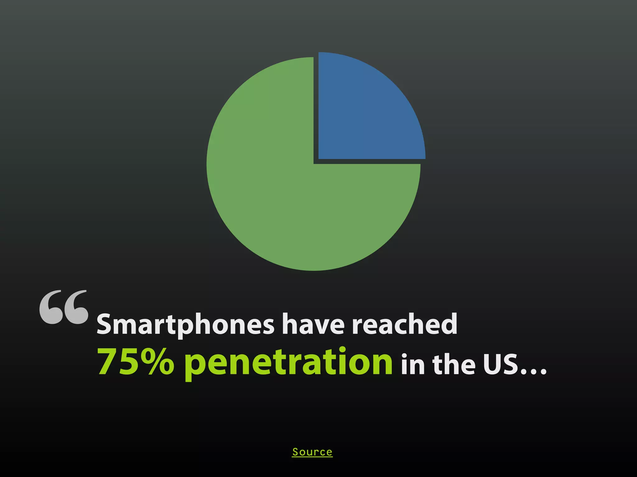
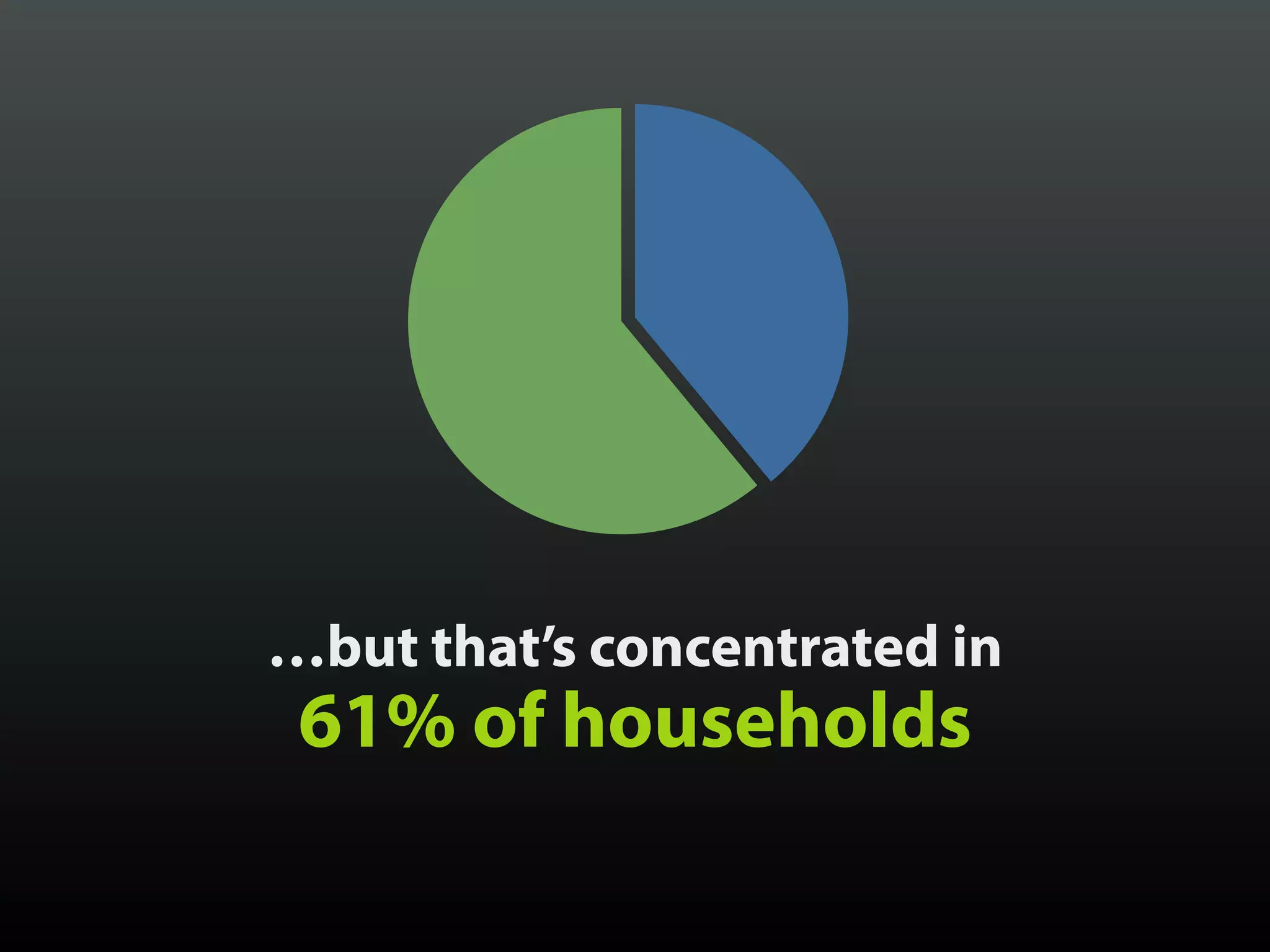
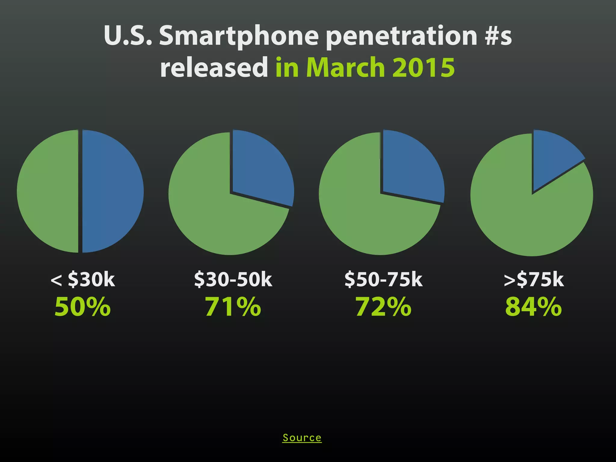
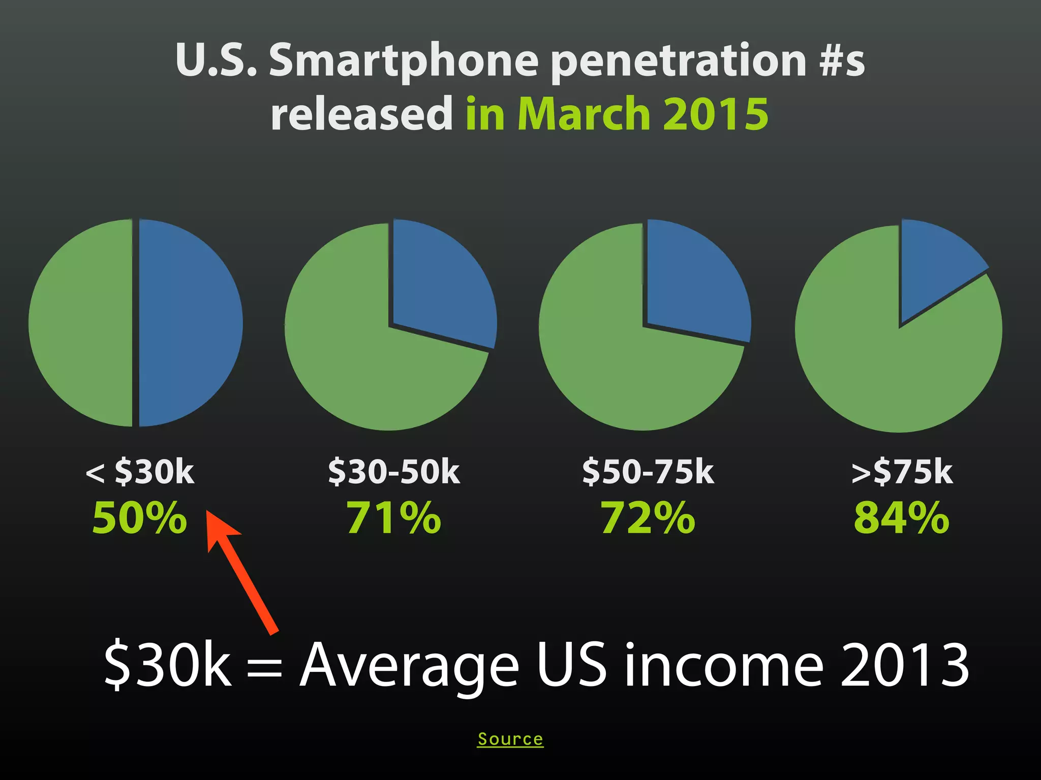
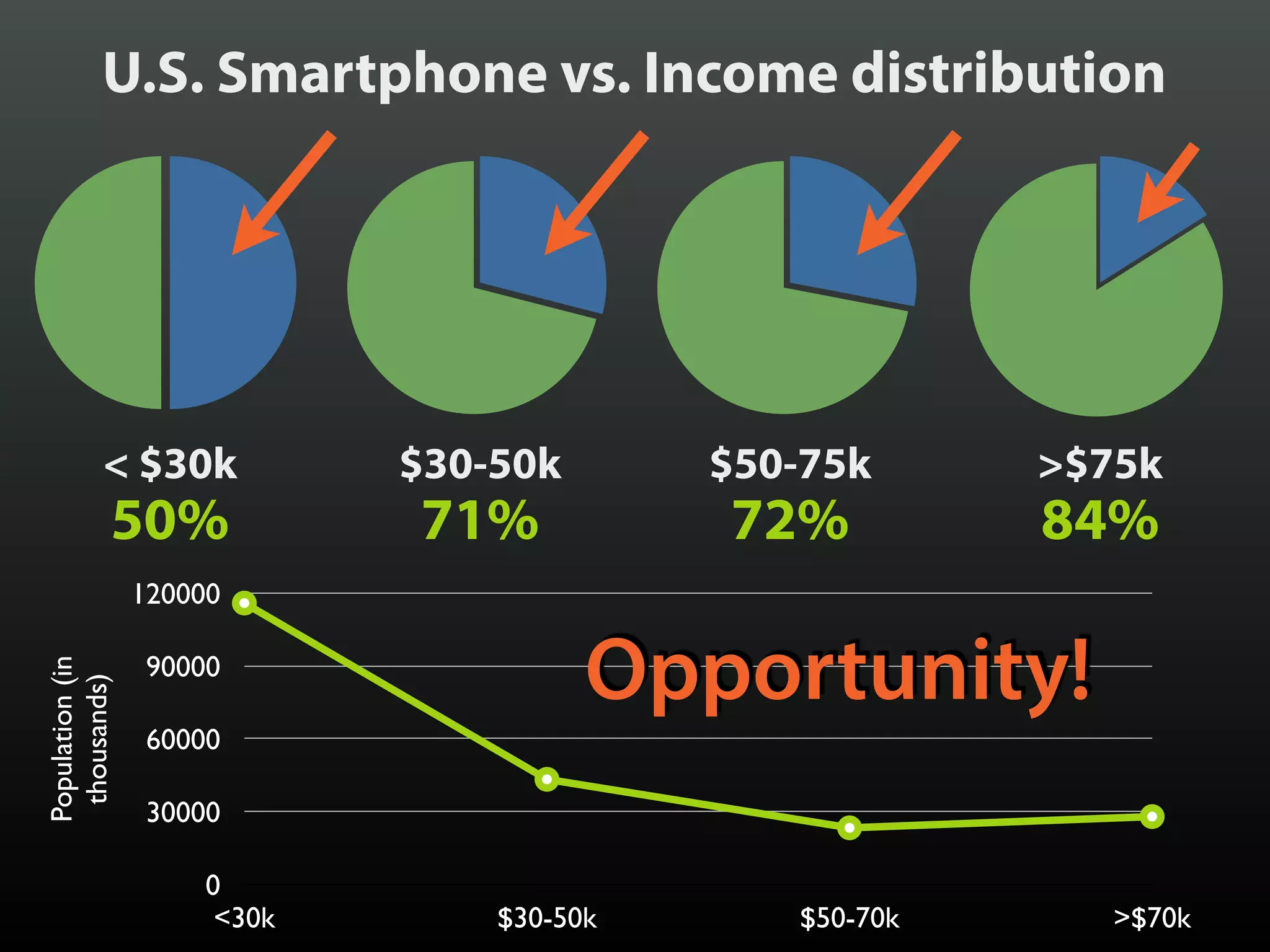
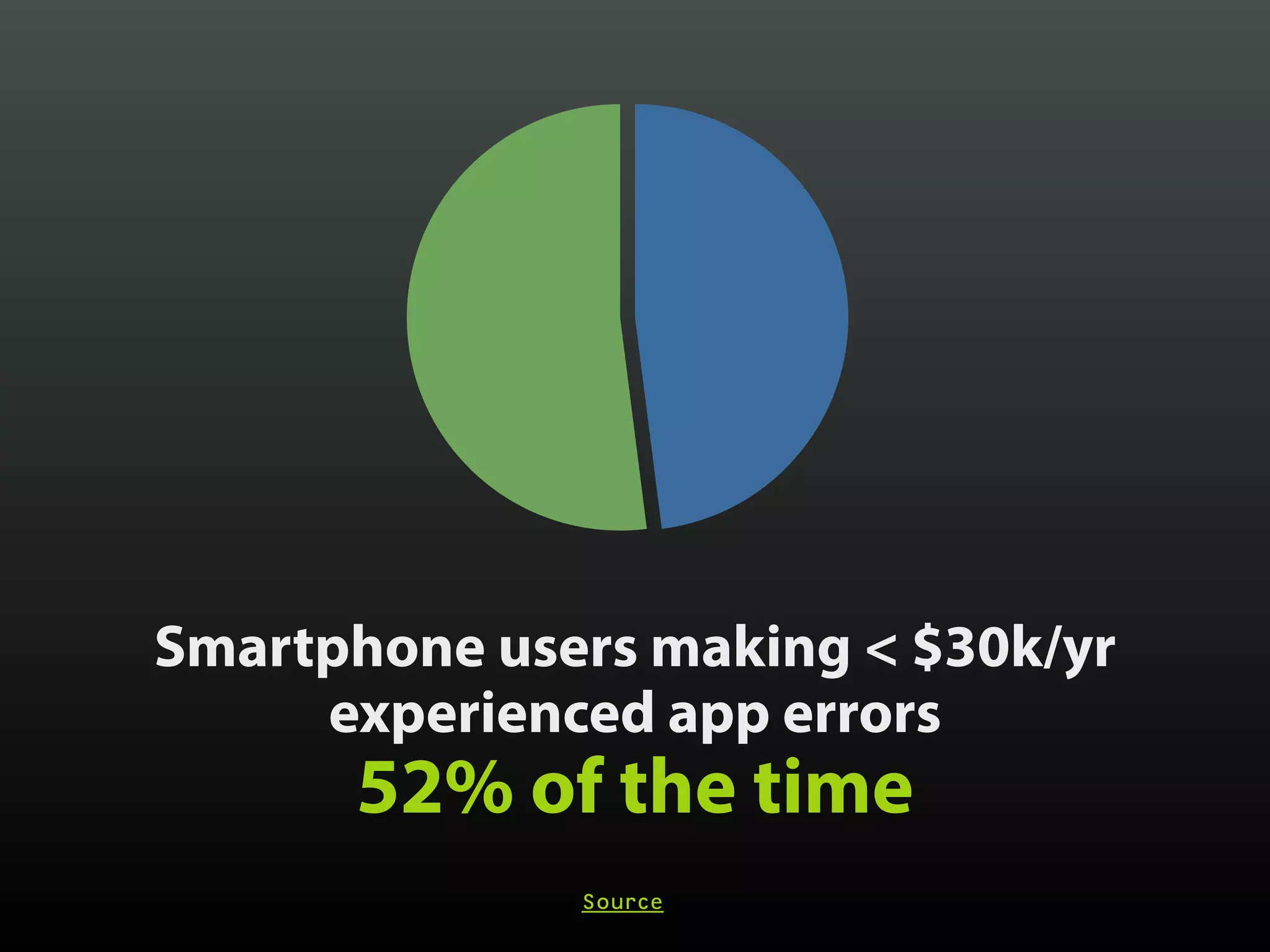
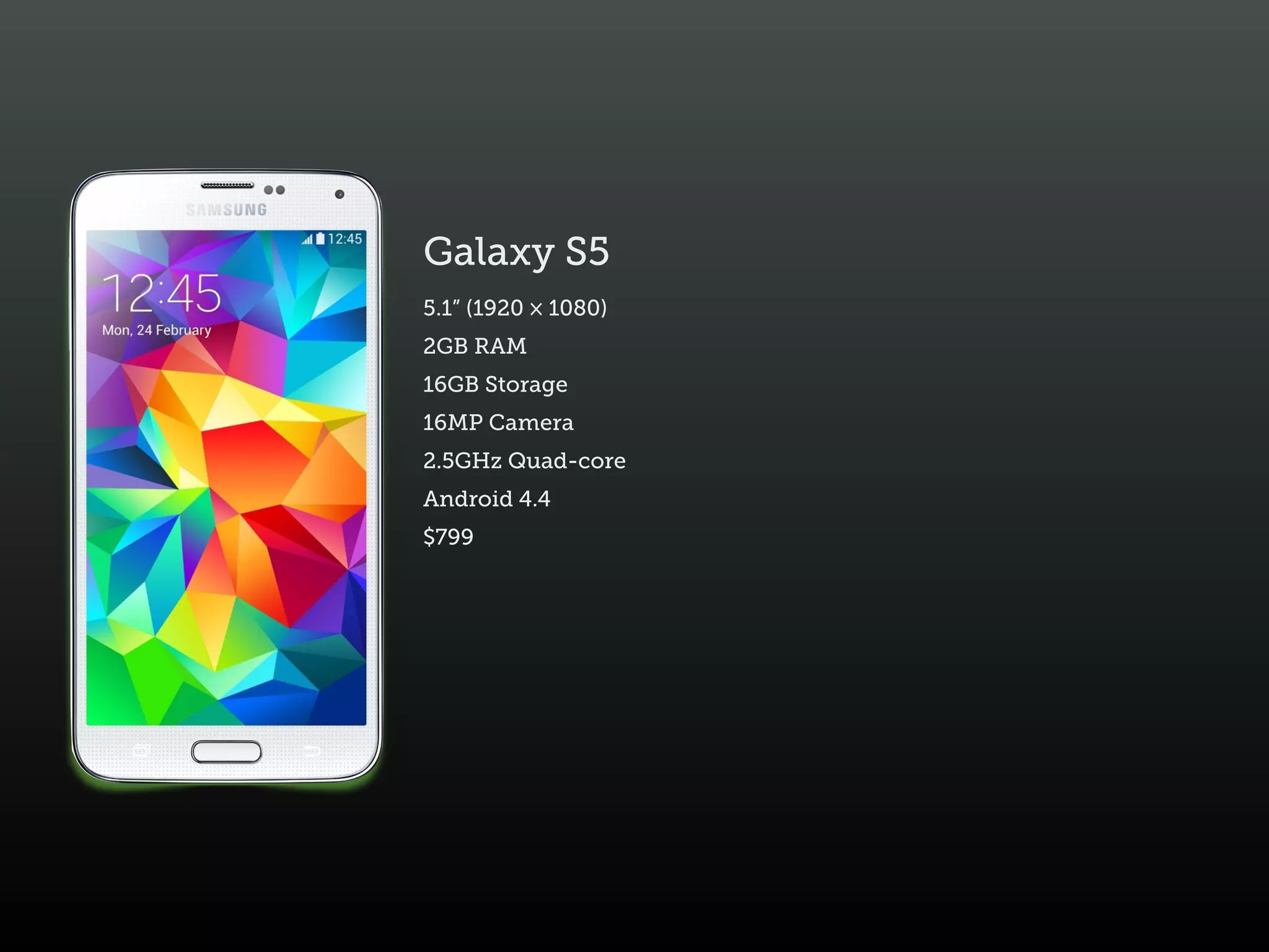
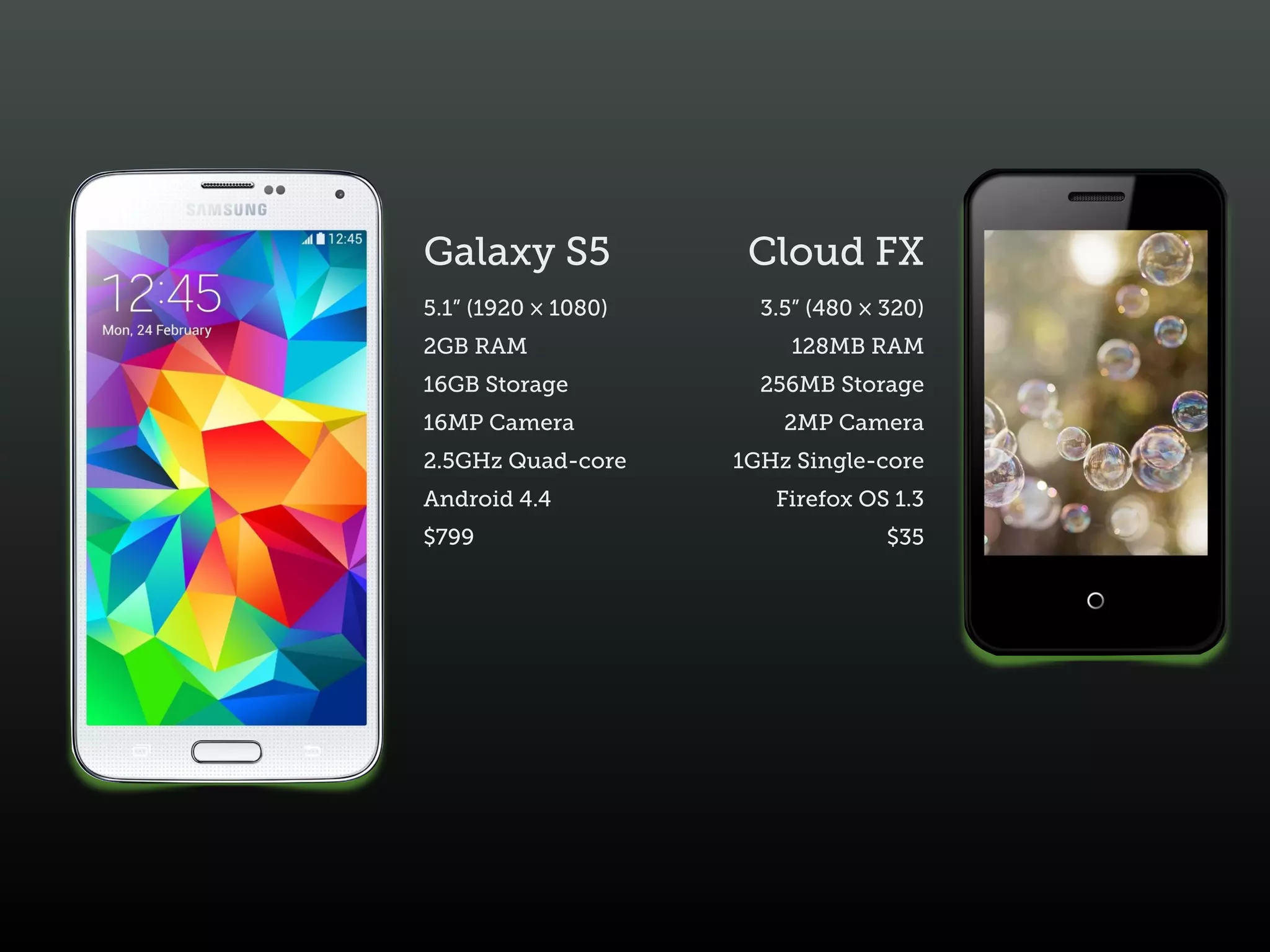
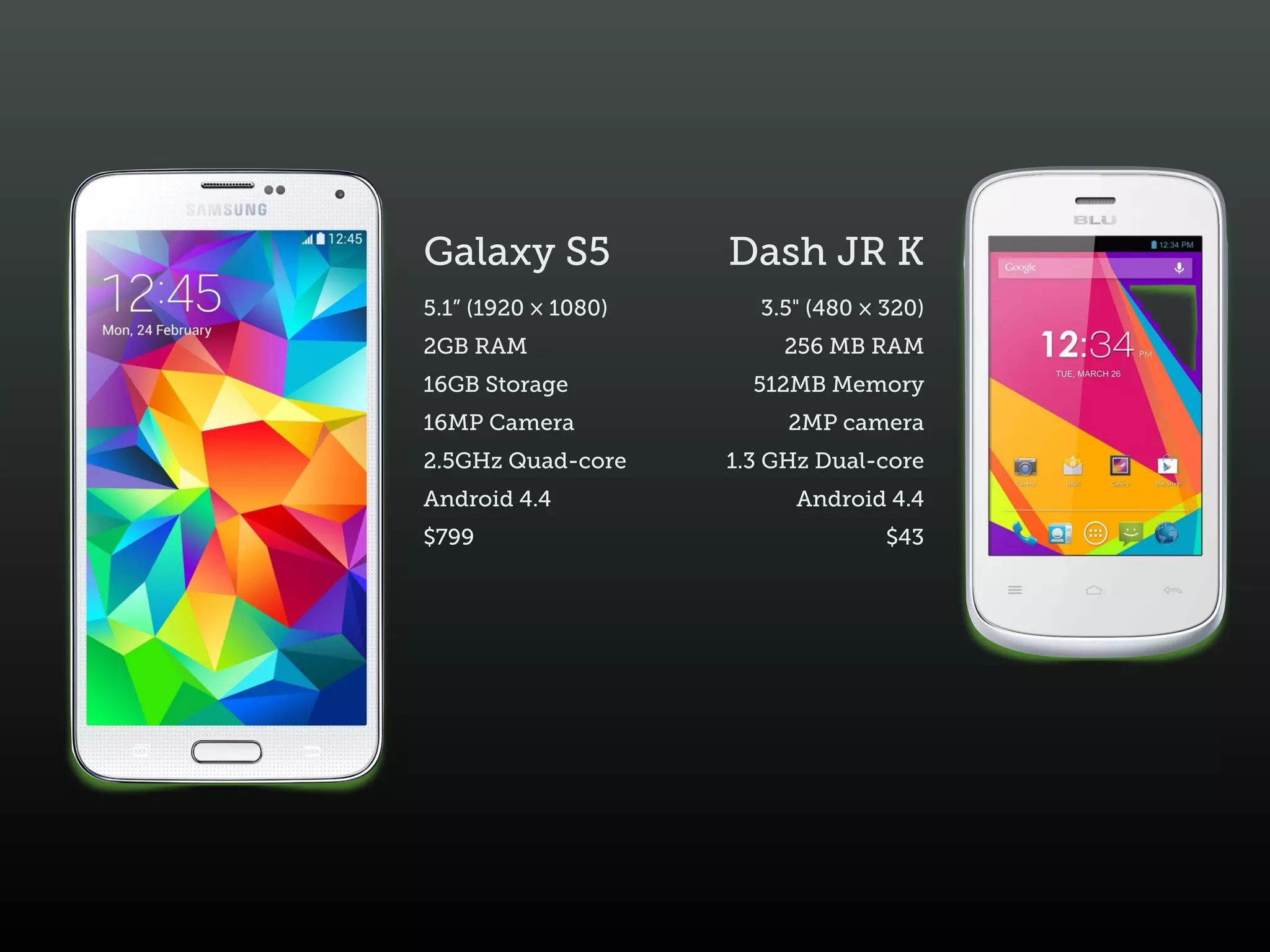
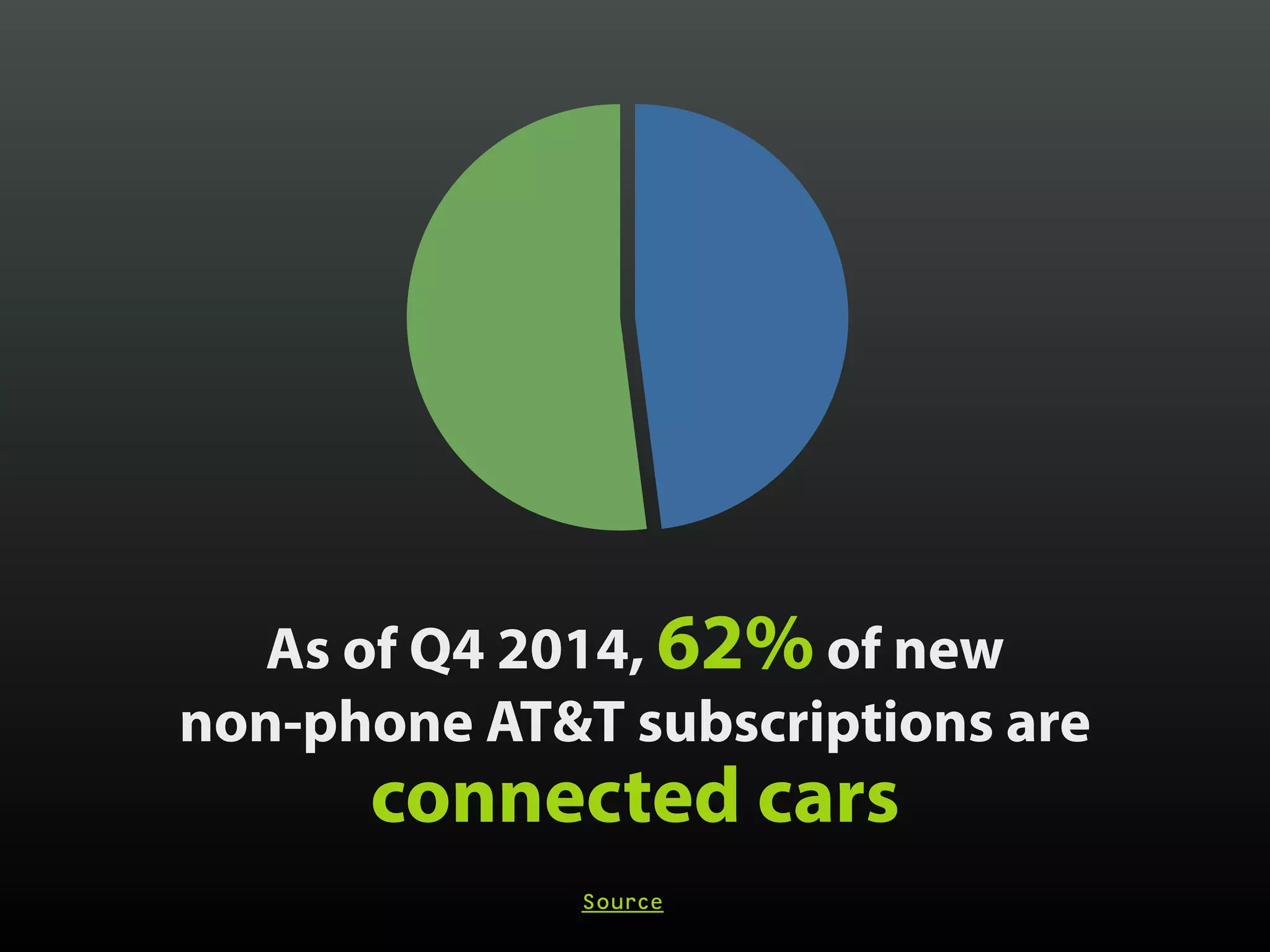
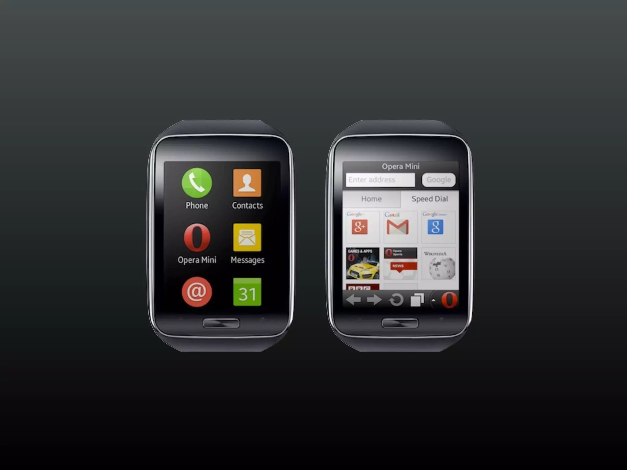
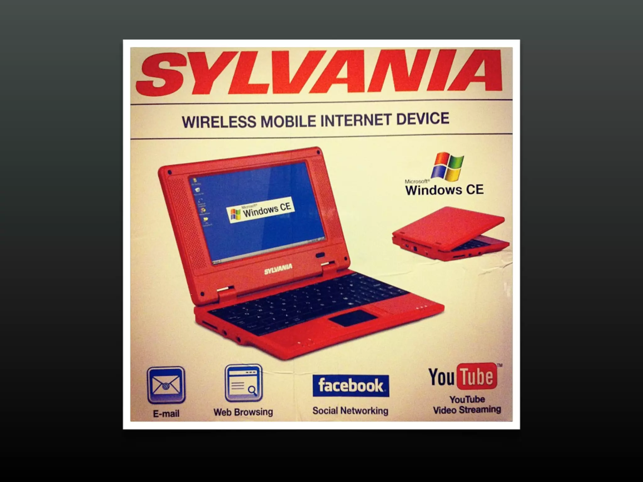
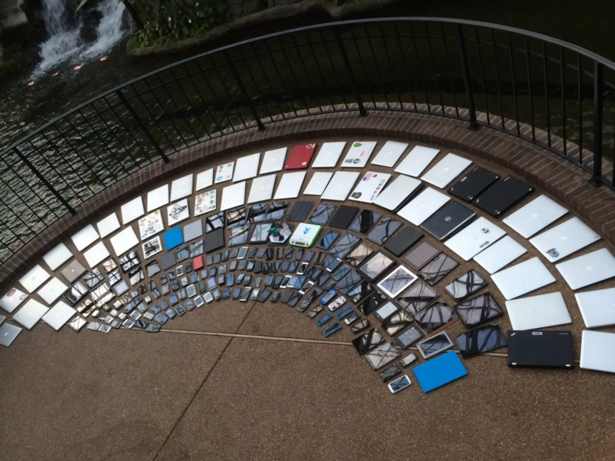
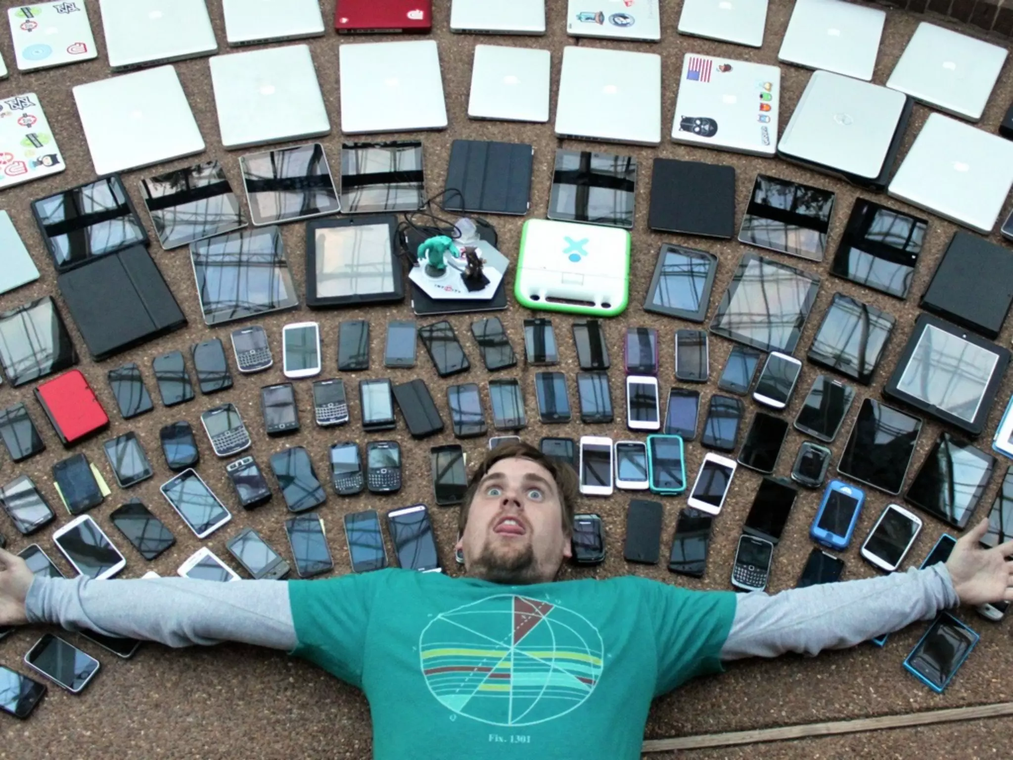
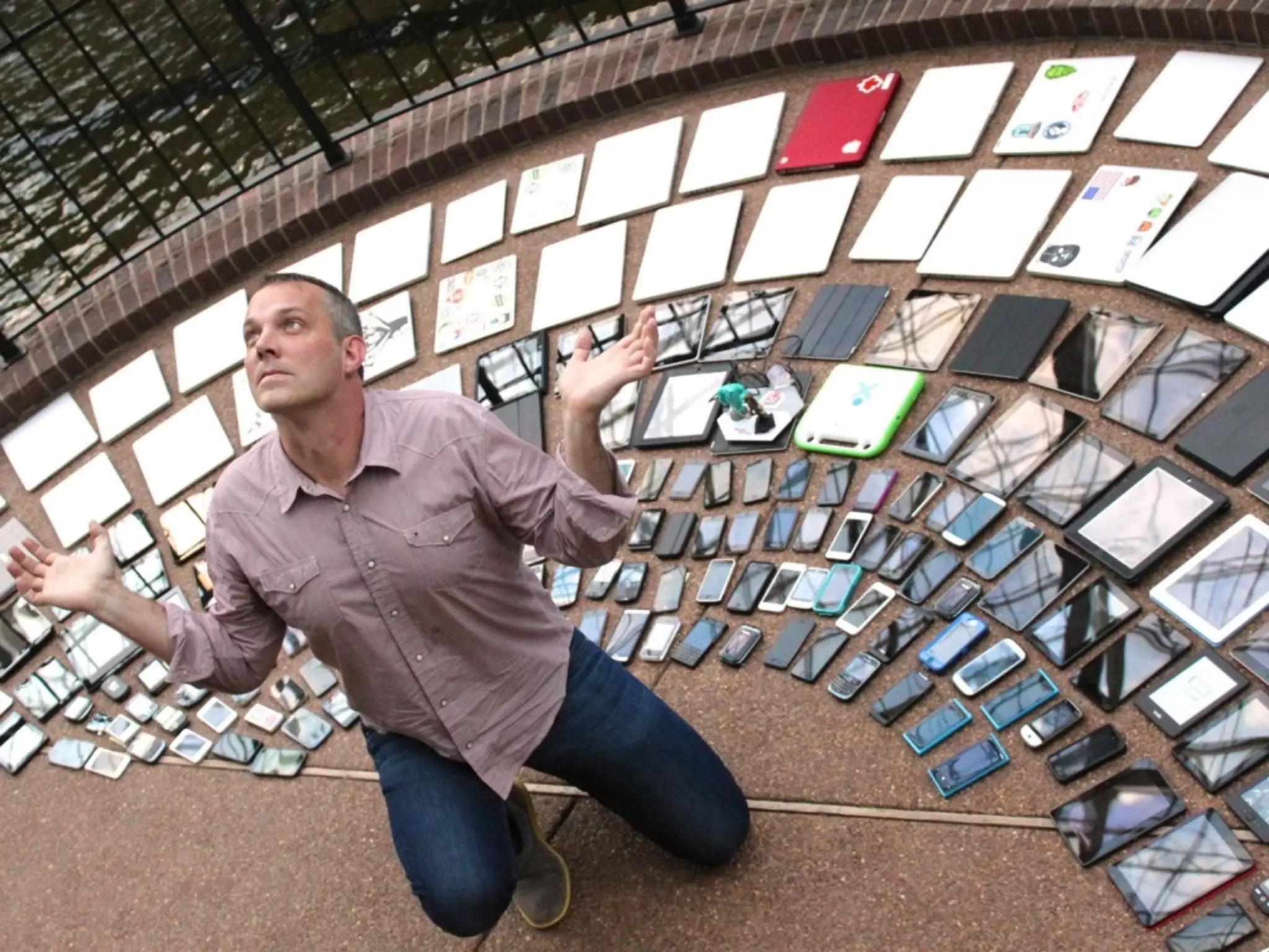
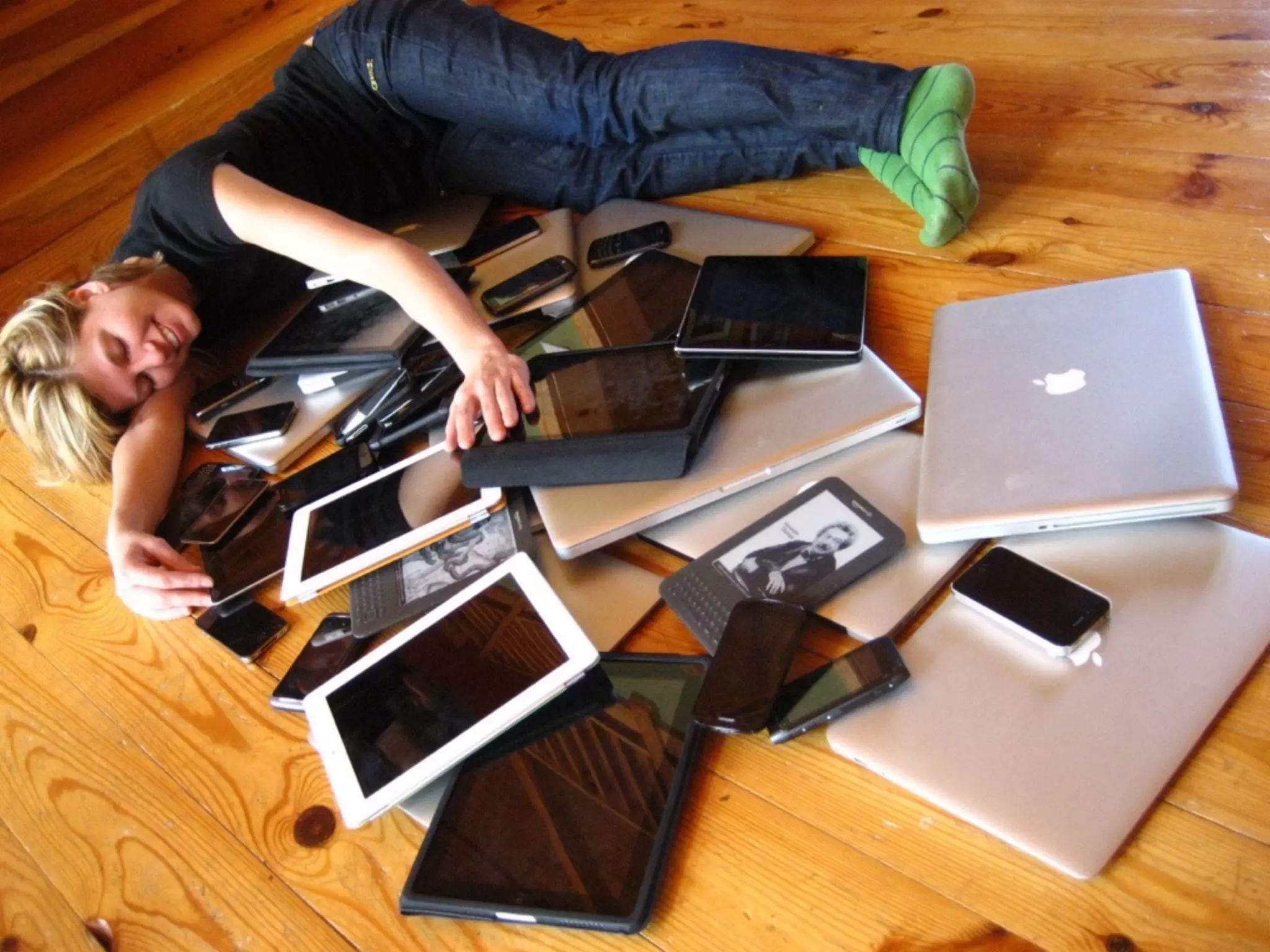
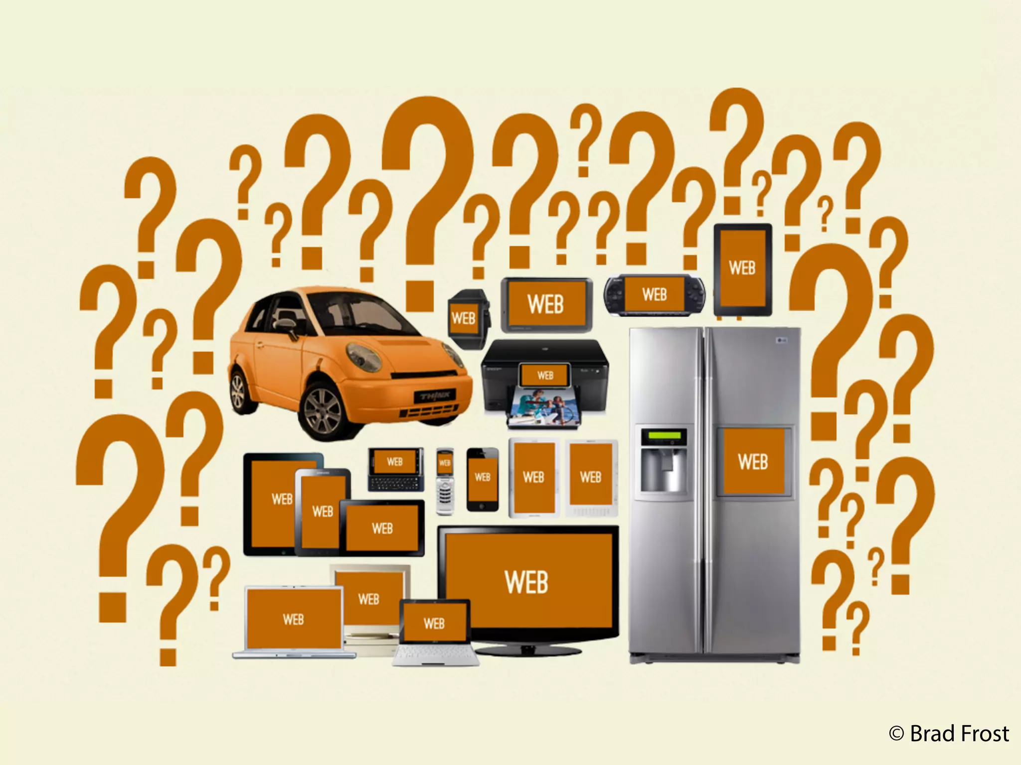
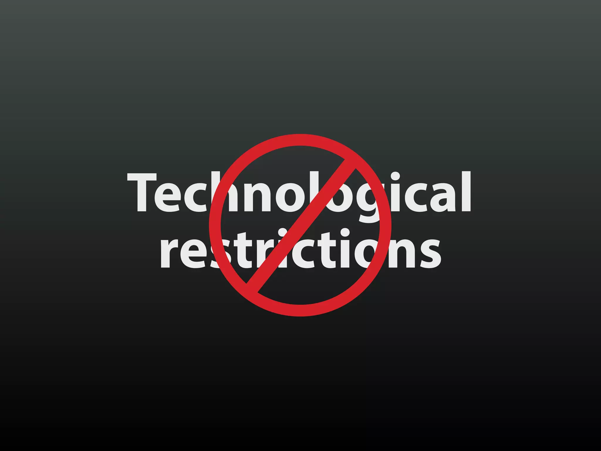
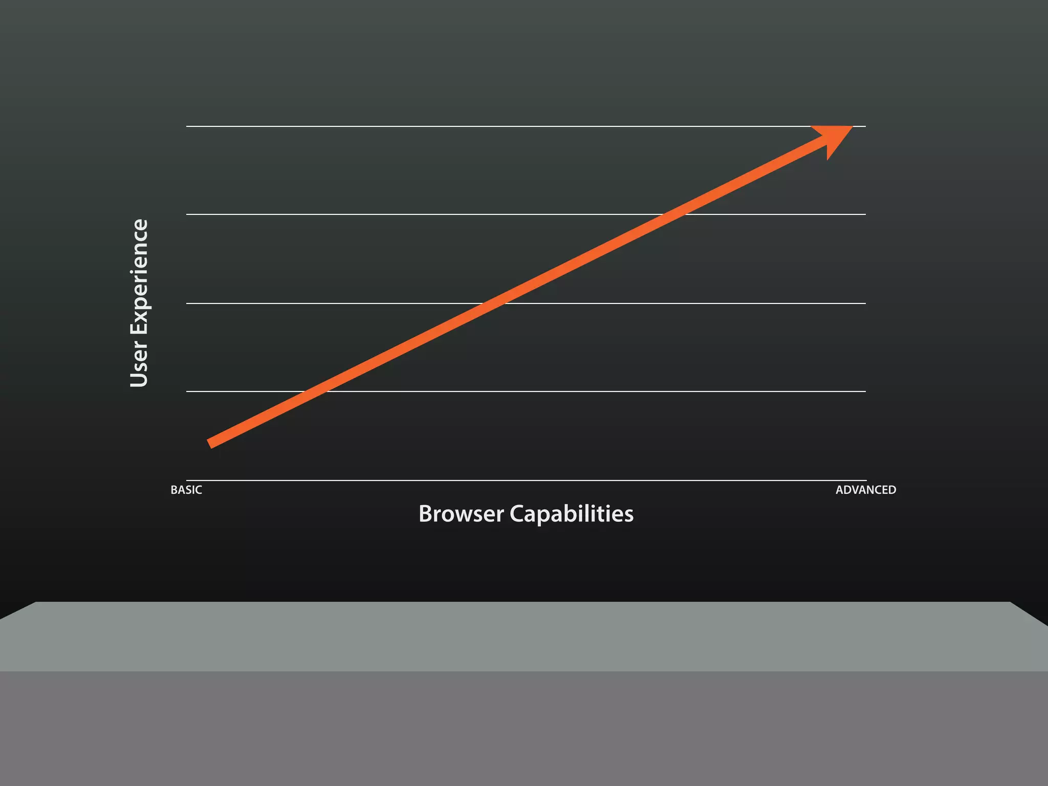
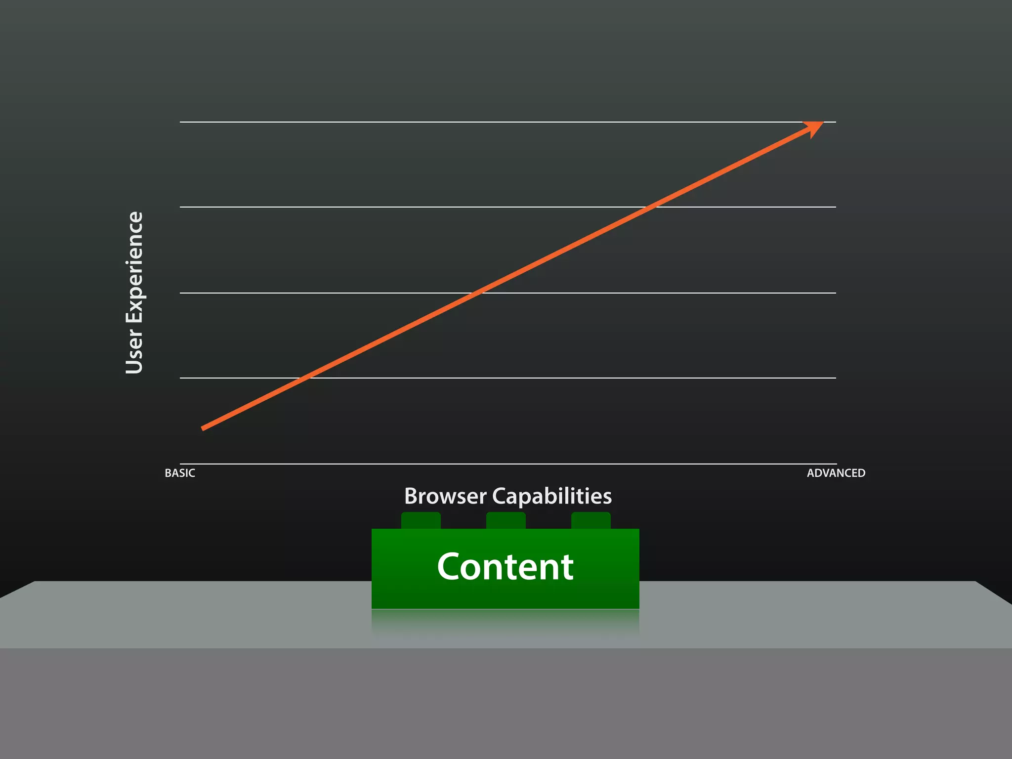
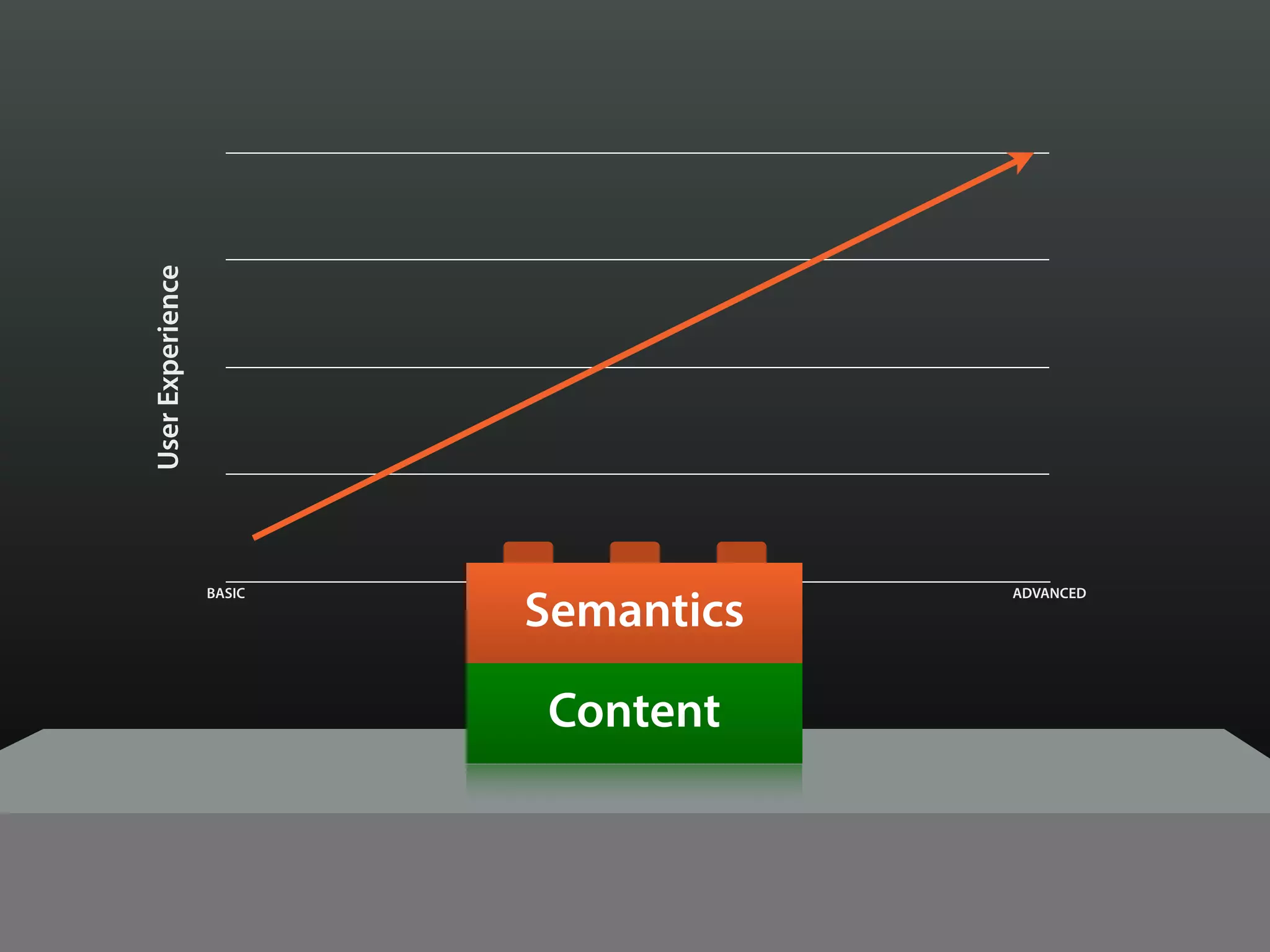
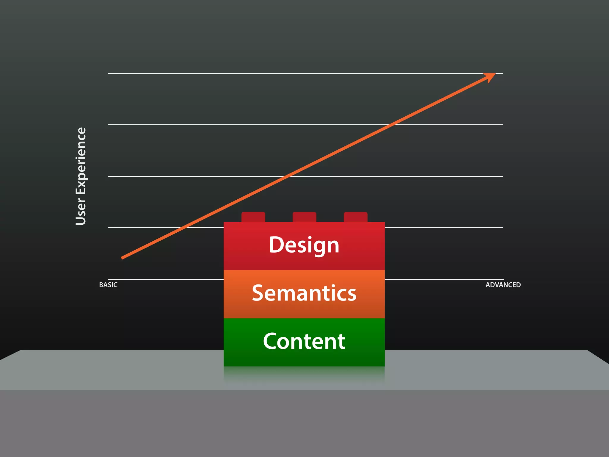
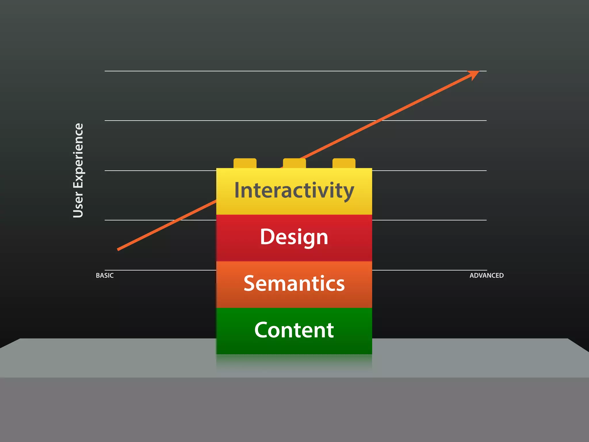
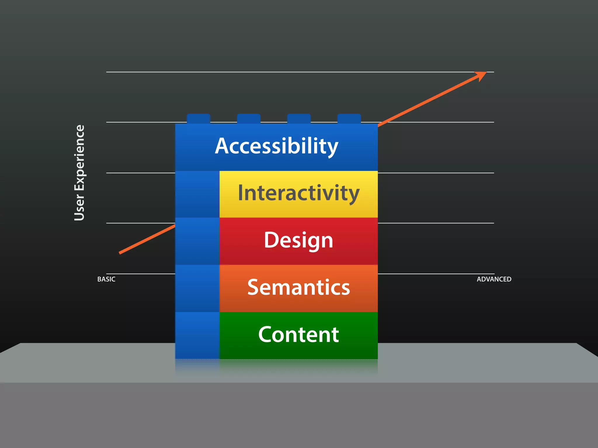
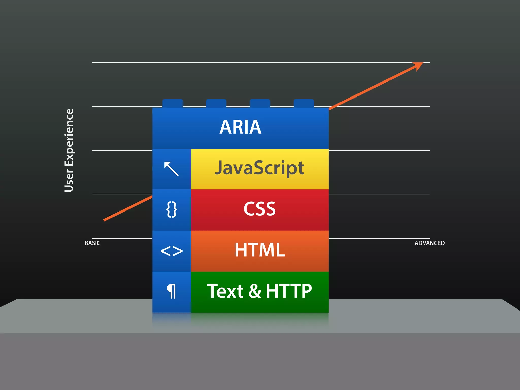
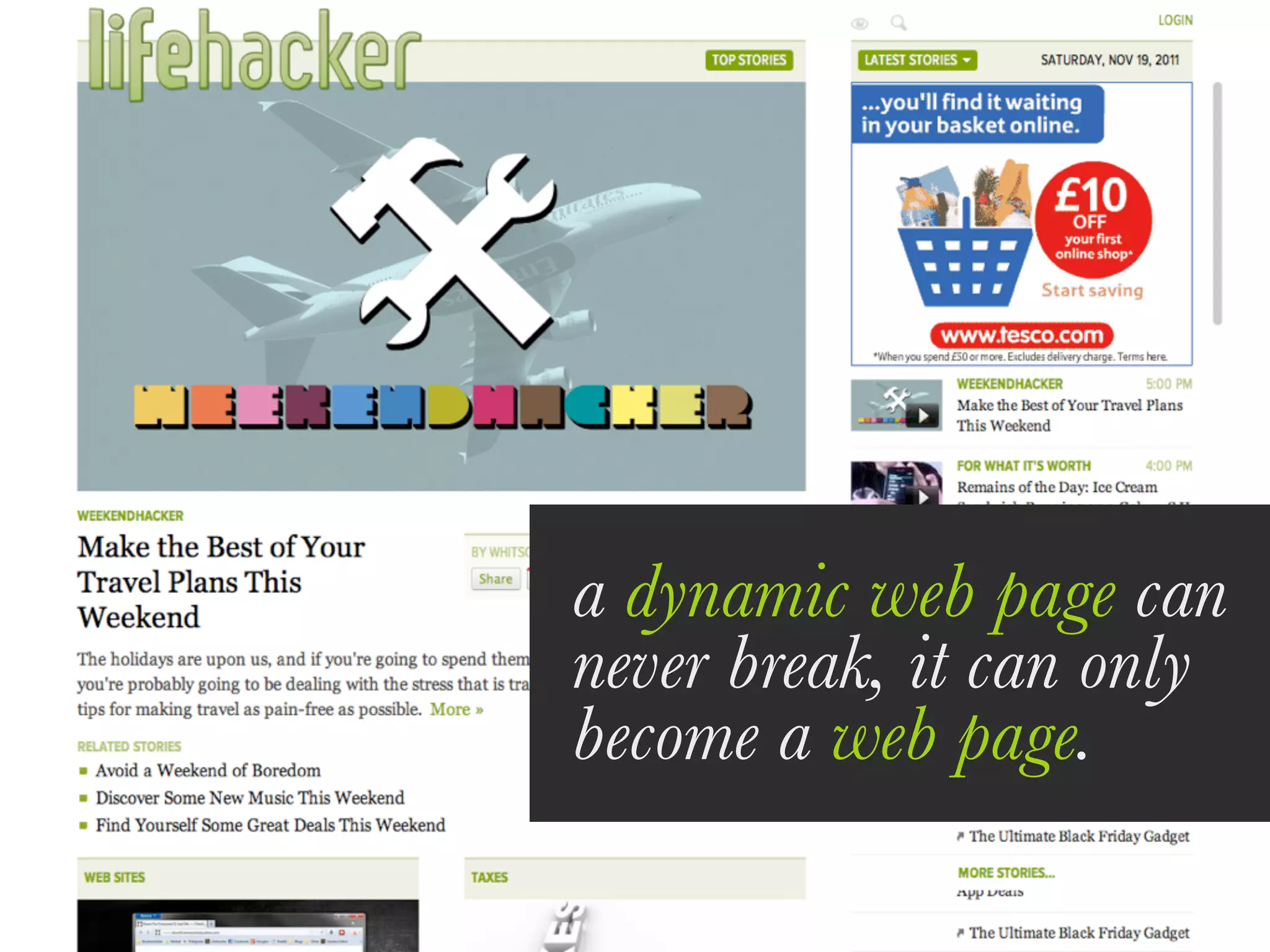
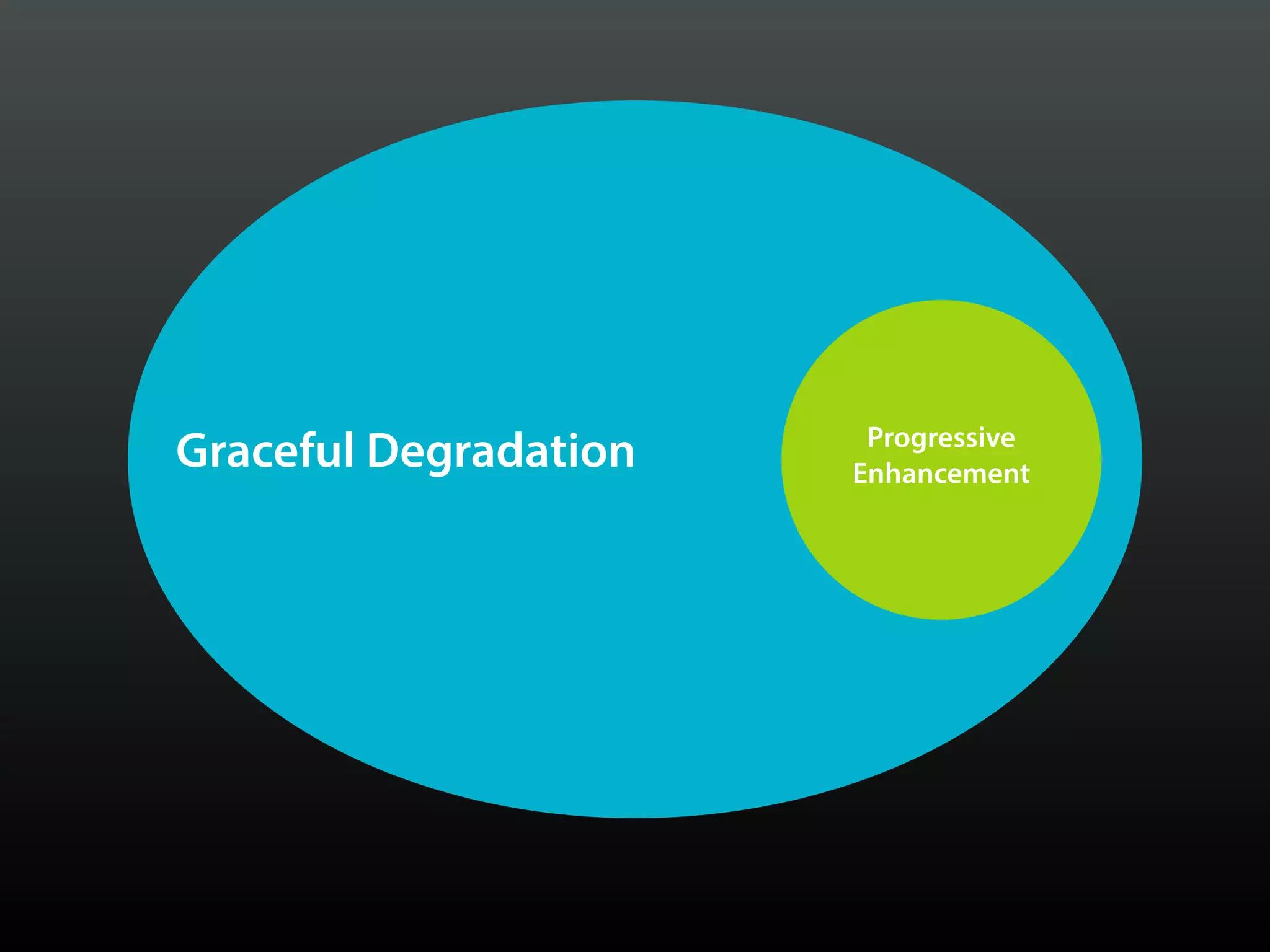
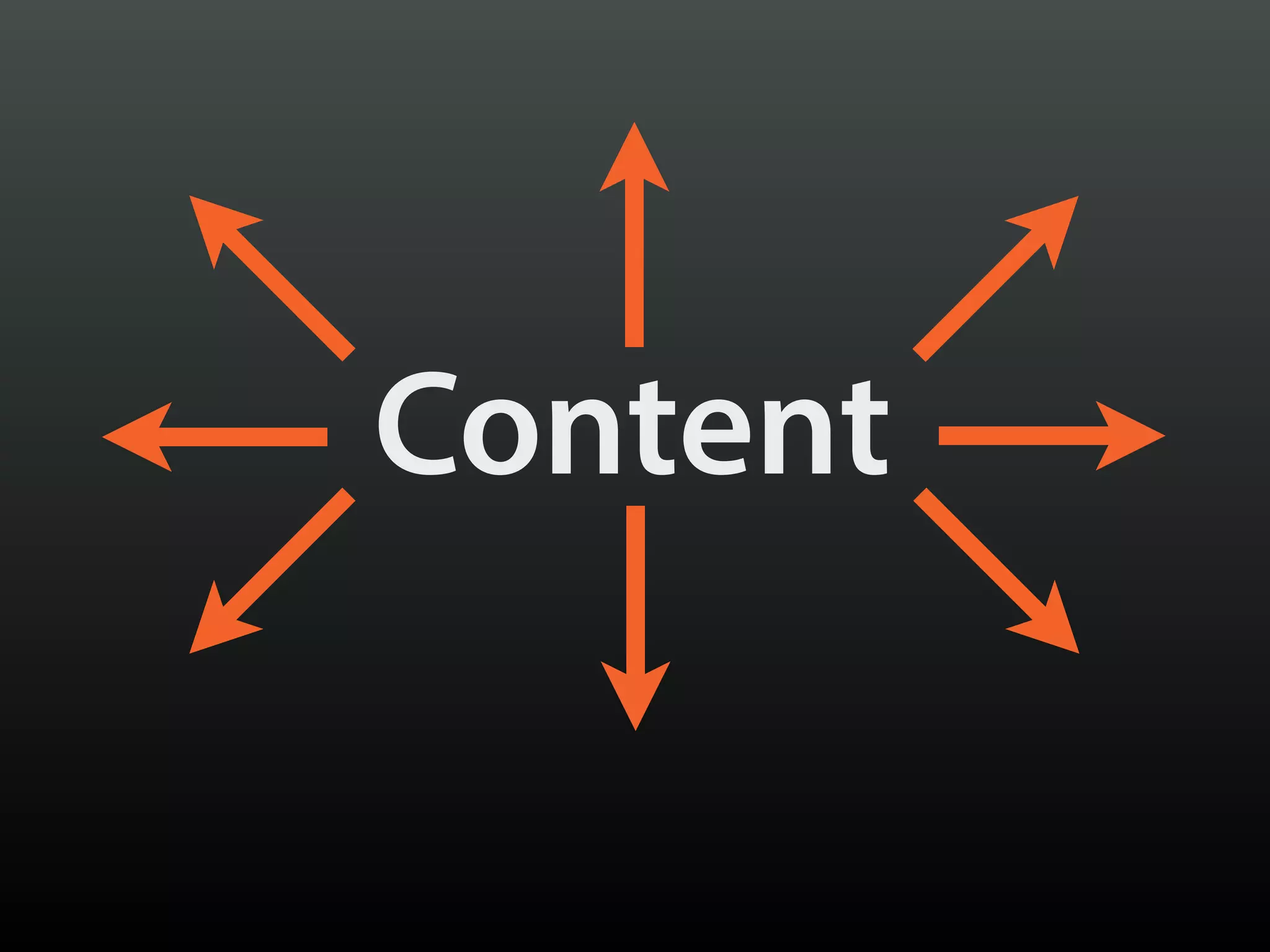
The document discusses the evolution of web usage, highlighting the drastic shift from desktop to mobile and the increase in browser diversity since 2008. It emphasizes the importance of responsive web design and progressive enhancement to accommodate varying screen resolutions and user experiences across devices. Additionally, it touches on the implications of smartphone penetration relative to income levels and provides insights into user expectations for web functionality.
![Planning Adaptive Interfaces [EnhanceConf 2016]](https://cdn.slidesharecdn.com/ss_thumbnails/planningadaptiveinterfacesenhanceconf2016-160303145802-thumbnail.jpg?width=640&height=640&fit=bounds)
![Beyond Responsive [Web Design Day]](https://cdn.slidesharecdn.com/ss_thumbnails/beyondresponsive-webdesignday-150611184657-lva1-app6892-thumbnail.jpg?width=640&height=640&fit=bounds)
![There Are No “Buts” in Progressive Enhancement [Øredev 2015]](https://cdn.slidesharecdn.com/ss_thumbnails/therearenobutsinprogressiveenhancementredev-151106102141-lva1-app6892-thumbnail.jpg?width=640&height=640&fit=bounds)


![Beyond Responsive Workshop [Beyond Tellerrand 2014]](https://cdn.slidesharecdn.com/ss_thumbnails/beyondresponsivebeyondtellerrand2014-140520172747-phpapp02-thumbnail.jpg?width=640&height=640&fit=bounds)


![Designing the Conversation [SpeechTek 2016]](https://cdn.slidesharecdn.com/ss_thumbnails/designingtheconversationspeechtek2016-160525150459-thumbnail.jpg?width=640&height=640&fit=bounds)
![Ruining the User Experience [SXSW 2007]](https://cdn.slidesharecdn.com/ss_thumbnails/ruiningtheuserexperiencefinal-150528130049-lva1-app6891-thumbnail.jpg?width=640&height=640&fit=bounds)
![The Features of Highly Effective Forms [SmashingConf NYC 2016]](https://cdn.slidesharecdn.com/ss_thumbnails/thefeaturesofhighlyeffectiveformssmashingconfnyc2016-160615155113-thumbnail.jpg?width=640&height=640&fit=bounds)
![Writing for Engagement [TechReady 22]](https://cdn.slidesharecdn.com/ss_thumbnails/writingforengagementtechready22-170111212357-thumbnail.jpg?width=640&height=640&fit=bounds)
![Falling in Love With Forms [An Event Apart DC 2015]](https://cdn.slidesharecdn.com/ss_thumbnails/fallinginlovewithforms-150811135256-lva1-app6892-thumbnail.jpg?width=640&height=640&fit=bounds)
![Falling in Love with Forms [Øredev 2015]](https://cdn.slidesharecdn.com/ss_thumbnails/fallinginlovewithformsredev2015-151106102126-lva1-app6892-thumbnail.jpg?width=640&height=640&fit=bounds)
![Falling in Love with Forms [F0WD 2015]](https://cdn.slidesharecdn.com/ss_thumbnails/fallinginlovewithformsfowd2015-151103161415-lva1-app6892-thumbnail.jpg?width=640&height=640&fit=bounds)
![Designing the Conversation [SmashingConf 2016]](https://cdn.slidesharecdn.com/ss_thumbnails/designingtheconversationsmashingconf2016-160928152809-thumbnail.jpg?width=640&height=640&fit=bounds)
![Designing with Empathy [Code & Creativity 2014]](https://cdn.slidesharecdn.com/ss_thumbnails/designingwithempathycodecreativity2014-140714135349-phpapp01-thumbnail.jpg?width=640&height=640&fit=bounds)

![Adaptive Designs Across Devices [UXIM 2015]](https://cdn.slidesharecdn.com/ss_thumbnails/beyondresponsive-150413180811-conversion-gate01-thumbnail.jpg?width=640&height=640&fit=bounds)
![Beyond Responsive [ConvergeSE 2015]](https://cdn.slidesharecdn.com/ss_thumbnails/beyondresponsive-150417122739-conversion-gate01-thumbnail.jpg?width=640&height=640&fit=bounds)
![Planning Adaptive Interfaces [RWD Summit 2016]](https://cdn.slidesharecdn.com/ss_thumbnails/planningadaptiveinterfacesrwdsummit2016-160330235919-thumbnail.jpg?width=640&height=640&fit=bounds)

![Beyond Responsive [Future of Web Design 2015]](https://cdn.slidesharecdn.com/ss_thumbnails/beyondresponsive-webdesignday-150611184657-lva1-app6892-151102130728-lva1-app6892-thumbnail.jpg?width=640&height=640&fit=bounds)
![Responsive Design & Beyond [Code & Creativity Workshop]](https://cdn.slidesharecdn.com/ss_thumbnails/codecreativityworkshop1-140506164731-phpapp01-thumbnail.jpg?width=640&height=640&fit=bounds)


![Adapting to Reality [Starbucks Lunch & Learn]](https://cdn.slidesharecdn.com/ss_thumbnails/adaptingtorealitystarbuckslunchlearn-190327234123-thumbnail.jpg?width=640&height=640&fit=bounds)

![Adapting to Reality [Guest Lecture, March 2021]](https://cdn.slidesharecdn.com/ss_thumbnails/adaptingtorealitybrowsertechnologiesguestlecture-210311215856-thumbnail.jpg?width=640&height=640&fit=bounds)
![Exploring Adaptive Interfaces [Generate 2017]](https://cdn.slidesharecdn.com/ss_thumbnails/exploringadaptiveinterfacesgenerate2017-170922213042-thumbnail.jpg?width=640&height=640&fit=bounds)
![Performance as User Experience [An Event Apart Denver 2017]](https://cdn.slidesharecdn.com/ss_thumbnails/performanceasuserexperienceaeaden2017-171212234737-thumbnail.jpg?width=640&height=640&fit=bounds)
![Performance as User Experience [AEA SEA 2018]](https://cdn.slidesharecdn.com/ss_thumbnails/performance-as-user-experience-180409182414-thumbnail.jpg?width=640&height=640&fit=bounds)
![Performance as User Experience [AEADC 2018]](https://cdn.slidesharecdn.com/ss_thumbnails/performanceasuserexperienceaeadc2018-180806174424-thumbnail.jpg?width=640&height=640&fit=bounds)
![Better Performance === Greater Accessibility [Inclusive Design 24 2018]](https://cdn.slidesharecdn.com/ss_thumbnails/betterperformancegreateraccessibility-181113020711-thumbnail.jpg?width=640&height=640&fit=bounds)
![PWA: Where Do I Begin? [Microsoft Ignite 2018]](https://cdn.slidesharecdn.com/ss_thumbnails/pwa-wheredoibeginmicrosoftignite2018-180928155323-thumbnail.jpg?width=640&height=640&fit=bounds)
![Media in the Age of PWAs [ImageCon 2019]](https://cdn.slidesharecdn.com/ss_thumbnails/mediaintheageofpwasimagecon2019-190502180729-thumbnail.jpg?width=640&height=640&fit=bounds)
![Getting Started with Progressive Web Apps [Beyond Tellerrand 2019]](https://cdn.slidesharecdn.com/ss_thumbnails/gettingstartedwithprogressivewebapps-191113063610-thumbnail.jpg?width=640&height=640&fit=bounds)

![Delivering Critical Information and Services [JavaScript & Friends 2021]](https://cdn.slidesharecdn.com/ss_thumbnails/deliveringcriticalinformationandservicesjavascriptfriends2021-210513212454-thumbnail.jpg?width=640&height=640&fit=bounds)
![Conversational Semantics for the Web [CascadiaJS 2018]](https://cdn.slidesharecdn.com/ss_thumbnails/conversationalsemanticsfortheweb-181116232055-thumbnail.jpg?width=640&height=640&fit=bounds)
![Designing the Conversation [Beyond Tellerrand 2019]](https://cdn.slidesharecdn.com/ss_thumbnails/designingtheconversationbeyondtellerrand2019-191115005417-thumbnail.jpg?width=640&height=640&fit=bounds)
![Designing the Conversation [Concatenate 2018]](https://cdn.slidesharecdn.com/ss_thumbnails/designingtheconversationconcatenate2018-180810154426-thumbnail.jpg?width=640&height=640&fit=bounds)


![Designing the Conversation [Accessibility DC 2018]](https://cdn.slidesharecdn.com/ss_thumbnails/designingtheconversationaccessibilitydc2018-180806175332-thumbnail.jpg?width=640&height=640&fit=bounds)
![Designing the Conversation [Paris Web 2017]](https://cdn.slidesharecdn.com/ss_thumbnails/designingtheconversationparisweb-171011181500-thumbnail.jpg?width=640&height=640&fit=bounds)


