Responsive UX - One size fits all @BigDesign conference #BigD12
•Download as KEY, PDF•
9 likes•2,615 views

The document discusses responsive UX, which is designing websites and applications that adapt to different screen sizes and devices using fluid grids, media queries, and responsive images; it provides examples of how to implement responsive design principles through fluid grids, image scaling, and media queries to build sites that automatically adjust for smartphones, tablets, and other devices.

Recommended
More Related Content
What's hot
What's hot (20)
Viewers also liked
Similar to Responsive UX - One size fits all @BigDesign conference #BigD12
Similar to Responsive UX - One size fits all @BigDesign conference #BigD12 (20)
Recently uploaded
Recently uploaded (20)
Responsive UX - One size fits all @BigDesign conference #BigD12
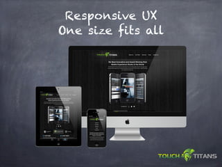
- 1. Responsive UX One size fits all
- 2. Hello. • Kirk Ballou CEO of TouchTitans Mobile Experience Studio • Platforms: iOS, Android, Windows Phone, Symbian • Target devices: Smartphones, Tablets and Set Top Box • Mobile UX, Design and Development • Mobile Monday Dallas founder - momodfw.com Our Clients
- 4. What is Responsive UX? The use of Media Queries, Fluid Grids and Adaptive Layouts Responding to the users display and capabilities.
- 5. History of Responsive UX Ethan Marcotte - Responsive Web Design http://alistapart.com/articles/responsive- web-design/ Luke Wroblewski - Mobile First http://lukew.com/
- 6. Principles Total width based on average browser size from W3c. 1280 so 1140pixels wide for browser size. Others target 960px wide. The screen sizes you target should be based on what your audience is using. Check your analytics. Divide your site into columns. For each column grab pixels wide. 285 px (left panel) / 1140 (site width) use this percentage instead of defining the left panel as 285px wide. .leftcol { width: 25%; }
- 7. Where can I use it? *sorry IE.
- 8. Why use it? One URL. M.brandname.com One site to maintain. Cater to the user Utilize device capabilities
- 9. Why use it? No Redirects for Mobile and Tablet users. Many brands maintain several mobile and tablet sites. The most overlooked benefit Improve Load Times for mobile!
- 11. Doing it wrong Majority of Responsive UX sites scale desktop size images to mobile. Avg. desktop connection 3-5 mps. 3G speed - 795kps
- 12. Doing it wrong 2 Megabyte download Desktop - 3MB/per sec 5 second download Mobile - 720kb/per sec 21 second download
- 13. Methods to avoid lag on mobile Jquery Lazy loader http://www.appelsiini.net/projects/lazyload Default mobile size images.. switch for desktop either via CSS3 or Javascript. CSS Tricks 9 ways to switch images http://css-tricks.com/css-image- replacement/
- 14. Testing Performance Web Page Test http://www.webpagetest.org/ Pingdom http://tools.pingdom.com/fpt/ Blaze - mobile site performance http://www.blaze.io/mobile/
- 15. Media Queries /* iPads (portrait and landscape) ----------- */ @media only screen and (min-device-width : 768px) and (max-device-width : 1024px) { /* Styles for iPad go here */ }
- 16. Media Queries - iPad 3 /* the ‘new’ iPads (portrait and landscape) ----------- */ @media only screen and (min-device-width : 1536px) and (max-device-width : 2048px) and (-webkit-min-device-pixel-ratio:2){ /* Styles for ‘new’ iPad go here */ }
- 17. Fluid Grid CSS View .container { padding-left: 20px; padding-right: 20px; } .row { width: 100%; max-width: 1140px; min-width: 755px; margin: 0 auto; overflow: hidden; } .onecol, .twocol, .threecol, .fourcol, .fivecol, .sixcol, .sevencol, .eightcol, .ninecol, .tencol, .elevencol { margin-right: 3.8%; float: left; min-height: 1px; } .row .onecol { width: 4.85%; }
- 18. Fluid Grid HTML View <div class="container"> <div class="row"> <div class="onecol"> <p>One column wide </p> </div> <div class="onecol"> <p>One column wide </p> </div> <div class="onecol"> <p>One column wide </p> </div> <div class="onecol"> <p>One column wide </p> </div> <div class="sixcol last"> <p>Six columns wide</p> </div> </div>
- 19. Fluid Grid - Browser View
- 20. Image scaling img { max-width: 100%; } .myImg{ min-width: 60%; }
- 21. Boston Globe
- 22. Boston Globe
- 24. FortySeven Media
- 25. Colly.com
- 27. Development Tips Load time testing. Browser testing. Modify interactions for the device Take advantage of device features. Store locator eliminated.
- 28. Code example
- 29. Development and Testing Tools Coda Dreamweaver CS6 - http://adobe.com Fluid Grid Kit - http://cssgrid.net/ Tiny Grid - http://tinyfluidgrid.com/ Adobe Shadow - http://labs.adobe.com 1
- 30. Thank you! Any questions? Twitter: @kirkballou Email: kirk.ballou@touchtitans.com Site: http://touchtitans.com
Editor's Notes
- \n
- \n
- \n
- \n
- \n
- \n
- \n
- \n
- \n
- \n
- \n
- \n
- \n
- \n
- \n
- \n
- \n
- \n
- \n
- \n
- \n
- \n
- \n
- \n
- \n
- \n
- \n
- \n
- \n
- \n