SlideShare a Scribd company logo
1 of 16
Typography
Structures
StefaniaMariaPadalino|Art227-Typography:Structures|Instructor:JohnNettleton|OregonStateUniversity|June9,2004
DYNAMICENERGY
StefaniaMariaPadalino|Art227-Typography:Structures|Instructor:JohnNettleton|OregonStateUniversity|June9,2004
This book is a very short summary of a course
I took this year at Oregon State University,Art 227
Typography: Structures with John Nettleton.
What I have learned about letterforms and typography is
that letters have a life and dignity of their own,
as Robert Bringhurst said.“Letterforms that honor and
elucidate what humans see and say deserve to be honored
in their turn.
Well-chosen words deserve well-chosen letters; these in
turn deserve to be set with affection, intelligence,
knowledge, and skill.Typography is a link, and it ought,
as a matter of honor, courtesy, and pure delight, to be as
strong as the others in the chain.”
I am impressed with the way the textbooks I have read
for this class talk about letters and typography.
I feel like I am approaching almost a sacred subject, and
if nothing else, I should regard it with respect.
SMP
“Typography is concerned with the structuring
and arranging of visual language. Both typeform and
typography are designed to convey a message.
The question of how typography is used to convey
a message can be divided into two parts, typography
as appearance or style, and the practicalities
of working with typography, such as legibi-
lity, scale and formatting.”
Phil Baines & Andrew Haslam
“In all stages of the historical development of the world, the
written word and typography have [sic] been a fundame-
ntal ingredient in human culture.
Only a few specialists are, however, familiar with their
background and effect.Whereas the names of the innovators
in the “classical disciplines”, [sic] such as painting, music and
literature, are common knowledge, those of type designers
and typographers of all historical periods are largely unknown;
only a few appreciate the significance of their work.
Yet the effects of text and typography on all spheres of human
activity are constantly present.They influence the
fields of aesthetics and technology, of the arts and economics.
Without them the rapid exchange of information we take for
granted in our contemporary world would be inconceivable.”
Typography–An Encyclopedic Survey of Type Design and Techniques
Foreword
2 Letters
4 Letterspacing
6 Kerning
8 Column width
10 Leading
12 Alignment
14 Rags
16 Ligatures
18 Hanging punctuation
20 Expressing Hierarchy
22 Normative studies phase II
Contents
“As with any craft that has evolved over 500 years, typogra-
phy employs a number of technical terms.
These mostly describe specific part of letterforms.
It is a good idea to familiarize yourself with this lexicon.
Knowing a letterform’s component parts makes it much
easier to identify specific typefaces.”
John Kane
The design and use of typefaces as a means of visual
communication from calligraphy to the ever-developing
use of digital type is the broad use of the term typography.
However, the art and practice of typography began
with the invention of moveable type and the printing press.
Typography is sometimes seen as encompassing many
separate fields from the type designer who creates
letterforms to the graphic designer who selects typefaces
and arranges them on the page.
“Typography is the craft of endowing human language
with a durable visual form, and thus with an independent
existence.Typography is concerned with the structuring
and arranging of visual language.”
Robert Bringhurst
Letters
Typography exists to honor content.
Letters have a life and dignity of their own.
Read the text before designing it.
Give full typographic attention even to
incidental details.
Make the visible relationship between the
text and other elements.
Choose a typeface or a group of faces that
will honor and elucidate the character
of the text.
Important to remember
Mphx x-height
ascender height
descender height
median
baseline
cap height
Baseline
The imaginary line defining the visual
base of letterforms.
Median
the imaginary line defining the
x-height of letterforms.
x-height
The height in any typeface of the
lowercase ‘x.’
Descender
That portion of the stem of a lower-
case letterform that projects below
the baseline
Ascender
The portion of the stem of a lower-
case letterform that projects above
the median.
Bembo Typography
Caslon Typography
Baskerville Typography
Bodoni Typography
Helvetica Typography
Univers Typography
2
Comparing typefaces
“The space between letters is integral to all typography.
A particular letterspace may enhance or destroy the aesthetic
quality of a typeface or the legibility of text.‘A man who
would letterspace lower case would steal sheep,’
Fredirec Goudy liked to say. If this wisdom needs updating,
it is chiefly to add that a woman who would letterspace lower
case would steal sheep as well.
Normal letterspace is related to the counterforms of lower
case letters.Typefaces with large counterforms require more
letterspace than typefaces with small counterforms.
Letterspace must be decisive, either in harmony with
or in strong contrast to the counterforms of lower case letters.
For text, most typefaces set with the default set width appear
too tight.Additional letterspace improves legibility and
aesthetic quality. Unprofessional typesetting is generally cause
not by the choice of typeface, but by too much, too
little, or irregular letterspacing.Nevertheless, like every rule, this
one extends only as far as its rationale.The reason for not let-
terspacing lower case is that it hampers legibility. But, there are
some lowercase alphabets to which this principle doesn’t apply.
(Robert Bringhurst)
‘Don’t letterspace the lower case without a reason.’
Robert Bringhurst
4
When letterspacing is too tight, the type appears patchy,
disrupted by clusters;when too open, it looks scattered and framented.
In both instances,the type is irritating and tiresome to read.
The correct letterspacing in continuous text is a subtle question
of balance: what is the optimum space that sufficiently separa-
tes the letters without creating a string of disconnected elements
that are difficult to grasp? The answer depends on the typeface and
size, and the visual result intended by the typographic designer.
For both serif and sans serif type the optimum letterspace for text
is determined by the counterforms of the lower case letters.
Typefaces with small counterforms require less space between let-
ters that those with large counterforms. If the letterspace is visually
larger than the median counterforms of the lower case letter, the
type appears too open. On the computer, most design applications
adopt an average set width intended to work with all type sizes.
For most typefaces, however, text composed with this setting appears
too tight, requiring the letterspace to be increase for optimum legi-
bility and aesthetic quality. In sizes larger than 24 point, most
typefaces composed with an average set width appear too open.
Display sizes generally require a decrease in letterspacing.
In large type sizes, individual letterforms are visually more distinct,
making it important to pay special attention to the letterforms in re-
lation to each other.”
Willi Kunz, Macro-and Microaesthetic
Letterspacing
Normal tracking
Ideas
Everything is connected to everything else and searching for solutions often
requires being alert to spot the unlikely connections...
In Critique magazine Marty Neumeier writes:“If idea-making can’t be reduced
to a system, perhaps it can be expressed in a formula.
Like the workings of the internal combustion engine, the conceptual process
can be seen as a series of controlled explosions that drive ideas forward.
In a car engine, when fuel is mixed with fresh air and ignited by a spark,
the wheels turn and the car accelerates. In the human mind,when a problem
is mixed with a new perspective and exposed to intuition, the wheels turn and we
arrive at a new concept. Problem + fresh perspective x intuition = concept.
Tight tracking
Ideas
Everything is connected to everything else and searching for solutions often requires being
alerttospottheunlikelyconnections...
InCritiquemagazineMartyNeumeierwrites:“Ifidea-makingcan’tbereducedtoasystem,
perhapsitcanbeexpressedinaformula.Liketheworkingsoftheinternalcombustionengine,the
conceptual process can be seen as a series of controlled explosions that drive ideas forward.
In a car engine,when fuel is mixed with fresh air and ignited by a spark,the wheels turn and the
caraccelerates.Inthehumanmind,whenaproblemismixedwithanewperspectiveandexposed
tointuition,thewheelsturnandwearriveatanewconcept.Problem+fresh
perspectivexintuition=concept.
Loose tracking
Ideas
Everything is connected to everything else and searching for
solutions often requires being alert to spot the unlikely connections...
In Critique magazine Marty Neumeier writes:“ If idea-making
can’t be reduced to a system, perhaps it can be expressed in a formula.
Like the workings of the internal combustion engine, the concep-
tual process can be seen as a series of controlled explosions that drive
ideas forward. In a car engine, when fuel is mixed with fresh air and
ignited by a spark, the wheels turn and the car accelerates.
In the human mind, when a problem is mixed with a new perspective
and exposed to intuition, the wheels turn and we arrive at a new
concept. Problem + fresh perspective x intuition = concept.
“Kern consistently and modestly or not at all.
Don’t stretch the space until it breaks.”
Robert Bringhurst
“The term ‘kerning’ describes the automatic adjustment
of space between letters. Because kerning removes space
between letters, it is often mistakenly referred to as
‘letterspacing.’ In fact, letterspacing means adding space
between letters, not removing it. For our purposes,the
term ‘tracking,’ used in most computer program that
incorporate typesetting, best describes the addition or
removal of space between letters. Keep in mind that even
the best tracking table sometimes requires minor adjust
ments, especially at larger point sizes.”
John Kane
Kerning can increase consistency of spacing in word like
Washington or Toronto, where the combinations Wa and To
are kerned, But names likeWisconsin,Tübingen,Tbilisi and
Los Alamos, as well as common words like The and
This, remain more or less immune to alteration. Hand com-
positors rarely kern text sizes, because their kerning pairs
must be manually fitted, one at a time. Computerized
typesetting makes extensive kerning easy, but judgment is still
required, and the computer does not make gook judgment
any easier to come by.Too little kerning is preferable
to too much, and inconsistent kering is worse than none.
Type design is an art practiced by few and mastered by fewer,
but font-editing softwaremakes it possible for anyone to
alter in a moment the widths and shapes of letters to which
as artist may have devoted decades of study, years of inspira-
tion and a rare concentration of skill.The power to destroy
such a type designer’s work should be used with caution.
And arbitrarily condensing or expanding letterforms is the
poorest of all methods for fitting un-editable copy into
unalterable space.”
Robert Bringhurst
Kerning
YeYe Without kerningWith kerning
Originally, the term ‘kern’ described
the portion of a letterform that
extended beyond the body of the type
slug. Today the term ‘kerning’
describes the automatic adjustment of
space between letters.
Because kerning removes space
between letters, it is often mistakenly
referred to as ‘letterspacing.’ In fact,
letterspacing means adding
space between letters, not removing it.
6
Visually awkward combinations, such as Ke, LT,ey, vo,
are improved by reducing the space between the individual
letters. Adjusting the letterspace between two letters is
known as kerning.Words set in all capital letters also require
attention to the space between individual letters.
The particular combinations of letterforms determine whether
space needs to be added or subtracted to achieve a visually
even composition.The optimum letterspace for a word set
in all capital letters is determined by letters with large
counterforms, such as C, D, G, O, Q, or with large surroun-
ding space, such as L,T, V, Q,Y. if any of these letters stand
apart, the space between the other letters needs to be
increased. Ultimately, every letter should unobtrusively inte-
grate itself into the visual form of the word.Unprofessional
typesetting is generally cause not by the choice of type-
face, but by too much, too little, or irregular letterspacing.”
Willi Kunz, Macro-and Microaesthetic
“
“
8
The question of column width is not merely one of design
or format; the question of legibilityis of equal importance.
The reader should be able to read the message of a text easily
and comfortably.This depends to a not inconsiderable extent
on the size of the type, the length of the lines, and the
leading.Printed matter in normal format is generally read with
the eye at a distance of 30-35 cm.The size of the type should be
calculated with this distance in mind. Both too small and
too large a type costs the reader an effort. He tires more rapidly.
According to a well-known empirical rule there should
be 7-10 words per line, for a text of any length of the line can
be readily calculated. So as to keep the type area light and
open in appearance, we have to determine the leading, i.e. the
vertical distance from line to line, so that it suits the size
of type. Photo- typesetting has brought an additional problem;
namely, that of the spacing between letters. In lead type the dis-
tance between the letters was determined by the body size
an equalized. In photo-typesetting the distance between letters
has to be adjusted a new every time in the photosetting machine.
Hence the irregularity of the typeface and the, unfortunately,
usually too closely set letters.The designer is well advised
when ordering photo-typesetting to insist on normal spacing
between the letters.
Practical experience has shown that the column width
of most printed matter (magazines, brochures) contain from 5
to 8 words, averaging 40 to 60 characters. Even though there
are no standards for the number of characters per line, we can
take the average number of 40 to 60 characters as being
an easily readable quantity.Type sizes for continuous text matter
are between 8 and 12 points. Well-leaded lines emphasize the
horizontal and make reading easier. In each kind of work (e.g.
book or display pane), the dimensions of the page size or format
are an important factor in determining the arrangement
of columns.Where display lines are placed on above another,
the space between lines has to be judged optically. In some cases
equal line-spaces (leading) has an unequal optical effect.
Such “errors” are overcome by different variations of linespacing.”
Ruedi Rüegg
Every difficulty standing in the reader’s way means loss
of quality in communication and memorability.
Just as overlong lines tire, so do overshot ones.The eye find
the long line strenuous to read because too much energy must
be spent keeping the horizontal line in sight over a long
distance. In the case of the too short line, the eye is copelled
to change lines too often and this again wastes energy.
The right width of column is essential for an even and
pleasant rhythm of reading which enables the reader to relax
and concentrate wholly on the content.”
Grid Systems in Graphic Design
Column width
Column width long
Column width short
Column width medium
“ “
“
“Choose a comfortable measure.”
Robert Bringhurst
Leading calls for just as close attention as the width of the lines.
For, like lines which are too long or too short, leading can
also affect the type area and hence the readability of the text.
Lines that are too narrowly set impair reading speed because
the upper and lower lines are both taken in by the eye at the
same time.The eye cannot focus on excesi-vely close so accu-
rately that one line alone is read without the immediate
surrounding area also entering the visual field.The eye is distrac-
tires more easily.The same also holds true in respect of lines
that are too widely space.The reader has trouble in linking up
with the next line, his uncertainty grows, and fatigue sets in
earlier. Good leading can carry the eye optically form one
line to the next, giving it confidence and stability, and enabling it
to absorb and remember more easily what has been read.
Where reading is smooth and easy, the meaning content of the
words is gra-sped more clearly; they acquire more character
and expression and etch themselves more sharply on the mind.
Proper leading is one of the most important factors in obta-
ining a harmonious and functional type area which is aestheti
cally pleasing and will stand the test of the time.Another point
calling for attention concerns the type area containing 3, 4
or more different type sizes.To ensure a regular and attractive
typographic design the leads for the various type sizes must be
adjusted to one another.The size of the leads determines the
number of lines that can be accommodated on a printed page.
The larger the leads, the smaller the number of lines that can
be placed on a page.”
From Grid Systems in Graphic Design
Leading
10
Ideas
Everything is connected to everything else and
searching for solutions often requires being alert to spot the
unlikely connections…
In Critique magazine Marty Neumeier writes:“If idea
making can’t be reduced to a system, perhaps it can be
expressed in a formula. Like the workings of the internal
combustion engine, the conceptual process can be seen
as a series of controlled explosions that drive ideas forward.
In a car engine, when fuel is mixed with fresh air and
ignited by a spark, the wheels turn and the car accelerates.
In the human mind, when a problem is mixed with a new
perspective and exposed to intuition, the wheels turn
and we arrive at a new concept. Problem + fresh perspec-
tive x intuition = concept. An example of this formula
in practice is the invention of the printing press. Gutenberg
could not figure out how to press a large number of letter
seals onto a single sheet of paper at the same time.
One day at a wine festival (after sampling a glass or two), he
began to look carefully at a wine press. Suddenly he reali-
zed that the wine press, with minor alterations, might
be transformed into a printing press. Mein Gott! The simple
mixture of two ideas, the letter seal and the wine press,
sparked by a little imagination, produced one of the greatest
inventions of the Renaissance.”
9/9 Bembo
Idea
Everything is connected to everything else and
searching for solutions often requires being alert to spot
the unlikely connections…
In Critique magazine Marty Neumeier writes:“If idea
making can’t be reduced to a system, perhaps it can be expre-
ssed in a formula. Like the workings of the internal combustion
engine, the conceptual process can be seen as a series
of controlled explosions that drive ideas forward. In a car engine,
when fuel is mixed with fresh air and ignited by a spark, the
wheels turn and the car accelerates. In the human mind,
when a problem is mixed with a new perspective and expo-
sed to intuition, the wheels turn and we arrive at a new concept.
Problem + fresh perspective x intuition = concept.
An example of this formula in practice is the invention of the
printing press. Gutenberg could not figure out how to
press a large number of letter seals onto a single sheet of paper
at the same time. One day at a wine festival (after sampling
a glass or two), he began to look carefully at a wine press.
Suddenly he realized that the wine press, with minor alterations,
light be transformed into a printing press. Mein Gott!
The simple mixture of two ideas, the letter seal and the wine
press, sparked by a little imagination, produced one of the
greatest inventions of the Renaissance.”
9/14 Bembo
“
“Choose a basic leading that suits the typeface, text and measure.”
Robert Bringhurst
12
Traditionally, it was common practice to set type in a
justified alignment.This was done for reasons of efficiency;
in addition it was more familiar and was considered to be
more refined. In the 1920s, designer began to question
this typographic convention and experiment with alterna-
tive text setting styles. Unjustified and asymmetrical
typography began to find widespread acceptance.Among
experimental typographic designers was Herbert Bayer,
who said,“I have long believed that our conventional
way of writing and setting type could be improved for easier
I started to abandon the flush-left-and-right system for short
lines of text and have introduced the flush-left system,
leaving a ragged-right outline.
There are appropriate reasons for setting either justified
or unjustified typography, but type set flush left and ragged
right promotes greater legibility. If properly used, flush-left,
ragged-right typography provides visual points of refe-
rence that guide the eye smoothly down the page from line
to line. Because each line is either shorter or longer than the
next, the eye is cued from one to another. Lacking are
visual cues that promote easy reading.With the use of unju-
stified typography, wordspacing is even, creating a smooth
rhythm and a consistent texture.The indiscriminate
placement of additional space between works in order to
justify lines causes awkward gaps or “rivers” in paragraphs,
which are disruptive to reading. Hyphenations at the
end of lines should be used whenever possible to
keep wordspacing consistent.”
Typographic Design
Alignment Flush left
This format most closely mirrors the
asymmetrical experience of handwriting.
Each line starts at the same point but
ends wherever the last word on the line
ends. Spaces between words are consis-
tent throughout the text, allowing the
type to create an even gray value.
Centered
This format imposes symmetry
upon the text, assigning equal value
and weight to both ends of any line.
It transforms fields of text into shapes,
thereby adding a pictorial quality to
material that is non-pictorial by nature.
Because centered type creates such a
strong shape on the page,it’s important
to amend line breaks so that the text
does not appear too jagged.
Flush right
This format places emphasis on
the end of a line as opposed to
its start. It can be useful in situations
(like captions) where the relationship
between text and image might be
ambiguous without a strong orien-
tation to the right.
Justified
Like centering, this format imposes a
symmetrical shape on the text. It is
achieved by expanding or reducing
spaces between words and, sometimes
between letters. The resulting openness
of lines can occasionally produce ‘rivers
of space running vertically trough the
text. Careful attention to line breaks and
hyphenation is required to amend this
problem whenever possible.
,
,
“
“Shape the page and frame the textblock so that it honors and reveals every element, every relationship between elements, and every logical nuance of the text.”
Robert Bringhurst
When setting ragged text with a computer, take a moment
to refine your software’s understanding of what constitutes
an honest rag. Many programs are predisposed to invoke
a minimum as well as a maximum line. If permitted to do so,
whether they are ragging or justifying the text. Ragged
setting under these conditions produces an orderly ripple
down the righthand side, making the text look like a neatly
pinched piecrust.This approach combines the worst fea-
tures of justification with the worst features of ragged set-
ting, while eliminating the principal virtues of both. Unless
the measure is excruciatingly narrow, it is usually better to
set a hard rag.This means a fixed word space, no minimum
line, and no hyphenated linebreaks.”
Robert Bringhurst
In justified text, there is always a trade-off between evenness
of word spacing and frequency of hyphenation.The best
available compromise will depend on the nature of the text
as well as on the specifics of the design. Good compositors
like to avoid consecutive hyphenated line-ends, but frequent
hyphens are better that sloppy spacing, and ragged setting is
better yet. Narrow measures – which prevent good justifi-
cation are commonly used when the text is set in multiple
columns. Setting ragged right under these conditions will
lighten the page and decrease its stiffness, as well as prevent-
ing an outbreak of hyphenation. Many unserifed faces look
best when set ragged no matter what the length of the measure.
And monospaced fonts, which are common on typewriters,
always look better-set ragged, in standard typewriter style.
A typewriter (or a computer-driven printer of similar quality)
that justifies its lines in imitation of typesetting is a presump-
tuous machine, mimicking the outer form instead of the
inner truth of typography.
“Set ragged if ragged setting suits the text and the page.”
Robert Bringhurst
Rags
When setting ragged-right test, care should be
taken not to rag the type too much. Uncontrolled line breaks
of erratic rhythm can create awkward spaces that inhibit
reading. In ragged-right type, care should be given to the
selection of interline spacing, for it influences
legibility and appearance. Spatial consistency and rhythmic
line breaks result from careful typographical decisions.
The breaking of lines can be determined by the author’s
meaning rather tan by appearance.This method, sometimes
referred to as ”thought-unit” typography, arranges lines
into discrete parts related to the meaning of the text. Ragged
right lines may be of any length, with line breaks that are
logical and focus on the intended message of the writer.”
Typographic Design
14
example of soft rag
example of medium rag
example of hard rag
“
“
“Ligatures combine two or three letters into a single
character.They are available on in expert fonts, and are cru-
cial for the refined setting of serf type.The ligatures fi an fl
are, because of their frequency, the most important.
Letterspaced text precludes the use of ligatures.”
Willi Kunz
Ligature
16
Bembo, set without ligatures (above) and with ligature (below)
Use the ligatures required by the font, and the characters
required by the language, in which you are setting type.
In most roman faces the letter f reaches into the space beyond it.
In most Italics, the f reaches into the space on both sides.
Typographers call these overlaps kerns. Only a few kerns, like
those in the arm of the f and the tail of the j, are implicit
in a normal typefont.
Robert Bringhurst
ff fi fl ffi ffl
ff fi fl ffi ffl
“If you wish to avoid ligatures altogether, restrict yourself to faces that don’t require them.
Willi Kunz
AE ae
Æ æ
Hanging Punctuation Attention to typographic detail is
one aspect of design that separates the
amateurs from the pros.Today's software
makes some of these details of typog-
raphy easier than ever to accomplish.
Hanging punctuation, commonly used
for pull-quotes, creates the illusion of
a uniform edge for the text, with
the punctuation outside the margins.
It's also called optical alignment.
Beyond punctuation, optical margin
adjustments may be used to make
subtle shifts to allow for the shapes of
letters and serifs, such as exten-
ding the edge of initial caps outside the
outer margin.
“
Compare these two examples
of a pull-quote without and with
hanging punctuation:
Attention to typo-
graphic detail is one
aspect of design that
separates the amate-
“
“Attention to typo-
graphic detail is one
aspect of design that
separates the amate-
The eye craves order and alignment. However, techni-
cally aligned text doesn't always look as if it is perfectly
aligned because of the shape and size of characters in text,
especially punctuation. Optical alignment makes text
edges look more orderly and balanced.At typical body copy
sizes, optical misalignment is rarely noticeable. However,
at the larger text sizes used for pull-quotes and headlines the
use of hanging punctuation adds a touch of refinement
to the layout. It may take extra time to hang your punctua-
tion, especially if your software has no automatic alignment
options, but the results are noticeable.
http://desktoppub.about.com
Designing with Hanging Punctuation
In some programs, such as Adobe Illustrator and Adobe InDesign, hanging
punctuation is an automated function. For other programs it requires some manual
manipulation of the text. For programs that don't have automatic options to hang
punctuation you can use kerning or invisible characters to create the
hanging punctuation effect.To manually hang the initial (left) quotation mark
in a pull-quote:
Method 1
Add a space in front of the left quotation mark
Kern the space to the left (negative kern value) until it moves outside the margin
Note:The quotation mark may not show up on screen once kerned but it will print.
Method 2
Apply a hanging indent to the paragraph so that the quotation mark extends to
the left of the optical margin for the remainder of the text.
Or, create a paragraph style or style sheet with a hanging indent.
1.
2.
•
•
18
Examples of Hanging Punctuation
In most circumstances, a designer’s first goal is to make material
comprehensible to a reader. In other words, you should understand the
material well enough to know how someone else needs to read it to
make the best sense out of it.This understanding happens on two
levels: content and form.The recipe opposite is a fairly straightforward
presentation of the making of an apple tart.With the exception of one
or two terms specific to cooking, its content does not require any
special knowledge. However, in its form–the manner in which informa-
tion is set and place on a page–the process it describes can be made
clearer than it appears as plain typescript.To understand the form, you
must first understand the kinds of information the recipe contains and
then rank it according to levels of importance, thereby creating
a hierarchy. In this recipe there are the following levels of information:
title (1)
subtitles (2)
text (3).
Within the text there are
ingredient lists (3A)
oven temperature instructions (3B)
directions (3C).
Successfully setting this recipe in type requires that you make
each of these distinctions clear to the reader.
Expressing Hierarchy
Establishing a format
After analyzing and organizing the content, devise a format
that expresses differences within the text. Because the line
length required for easy reading of directions is more or less
twice the line length required for a list of ingredients, the area
within the margins of the sheet is divided vertically into
three intervals, or columns. Ingredients cross-align with the
directions that refer to them. Single line spaces indicate breaks
between paragraphs. Double line spaces indicate breaks
between sections of text.
John Kane
20
Optimum of study two
Normative Studies phase 2
Optimun of study one
Optimum of study three
22
Colophon
Computer programs used: QuarkXPress Passport
Adobe Illustrator 10
Adobe Photoshop 7.0
Fonts: Bembo – Bembo Bold
Helvetica Neue – 75 Helvetica Bold
Fonts & size: Headings - 75 Helvetica Bold - 24 pt. type
SubHeadings - Bembo Bold - 12 pt. type
Text - Bembo 9/11.5
Bibliography
Carter, Rob, Day, Ben, and Meggs, Philip.
Typographic Design: Form and Communication.
John Wiley & Sons, Inc.Third Edition.
Kane, John.A type primer. Prentice Hall, Inc. 2003
Bringhurst, Robert.The Elements of Typographic Style.
2nd rev. ed. Point Roberts,WA: Hartley & Marks, 1996.
Kunz,Willi.Typography: Macro-and Microaesthetics.
Conclusion
My intent for this book was to keep
it simple even because the time available
to me was very limited. I also wanted to
create a sense of dynamicity and this
is the best I could think about for the
time on hand.
I hope the result is not too bad.
SMP

More Related Content

Viewers also liked

Glenthøj et al. - 2016 - Social cognition in patients at ultra-high risk for ...
Glenthøj et al. - 2016 - Social cognition in patients at ultra-high risk for ...Glenthøj et al. - 2016 - Social cognition in patients at ultra-high risk for ...
Glenthøj et al. - 2016 - Social cognition in patients at ultra-high risk for ...
Tina Dam Kristensen
 
The Elements of Design - Texture and Typography
The Elements of Design - Texture and TypographyThe Elements of Design - Texture and Typography
The Elements of Design - Texture and Typography
coachhahn
 
Typography - Graphic Design
Typography - Graphic DesignTypography - Graphic Design
Typography - Graphic Design
Abanoub Hanna
 
EBJ-13 | MEET Our Families
EBJ-13 | MEET Our FamiliesEBJ-13 | MEET Our Families
EBJ-13 | MEET Our Families
AEC-Inglês
 

Viewers also liked (10)

Glenthøj et al. - 2016 - Social cognition in patients at ultra-high risk for ...
Glenthøj et al. - 2016 - Social cognition in patients at ultra-high risk for ...Glenthøj et al. - 2016 - Social cognition in patients at ultra-high risk for ...
Glenthøj et al. - 2016 - Social cognition in patients at ultra-high risk for ...
 
Los alimentos
Los alimentosLos alimentos
Los alimentos
 
Caleche $25 gift certificate rrr
Caleche $25 gift certificate rrrCaleche $25 gift certificate rrr
Caleche $25 gift certificate rrr
 
Emerson aphorism
Emerson aphorismEmerson aphorism
Emerson aphorism
 
Capitulo 1 pt. 1
Capitulo 1 pt. 1Capitulo 1 pt. 1
Capitulo 1 pt. 1
 
The Elements of Design - Texture and Typography
The Elements of Design - Texture and TypographyThe Elements of Design - Texture and Typography
The Elements of Design - Texture and Typography
 
Typography - Graphic Design
Typography - Graphic DesignTypography - Graphic Design
Typography - Graphic Design
 
Decision tree
Decision treeDecision tree
Decision tree
 
Utilidad y demanda economia
Utilidad y demanda economia Utilidad y demanda economia
Utilidad y demanda economia
 
EBJ-13 | MEET Our Families
EBJ-13 | MEET Our FamiliesEBJ-13 | MEET Our Families
EBJ-13 | MEET Our Families
 

Similar to Typography Structure

Essay Techniques. Graham Hospital School of Nursing
Essay Techniques. Graham Hospital School of NursingEssay Techniques. Graham Hospital School of Nursing
Essay Techniques. Graham Hospital School of Nursing
Jennifer Magee
 
Marketing· Product or Service · If product Product, Price, P.docx
Marketing· Product or Service · If product Product, Price, P.docxMarketing· Product or Service · If product Product, Price, P.docx
Marketing· Product or Service · If product Product, Price, P.docx
infantsuk
 
Best Essay Introductions. Alverno College
Best Essay Introductions. Alverno CollegeBest Essay Introductions. Alverno College
Best Essay Introductions. Alverno College
Samantha Hall
 
Write And Essay For Me. College of Saint Mary
Write And Essay For Me. College of Saint MaryWrite And Essay For Me. College of Saint Mary
Write And Essay For Me. College of Saint Mary
Lisa Taylor
 
Example Of Essay. Colorado Mesa University
Example Of Essay. Colorado Mesa UniversityExample Of Essay. Colorado Mesa University
Example Of Essay. Colorado Mesa University
Melissa Lofton
 
Why Writing Is Important Essay.pdf
Why Writing Is Important Essay.pdfWhy Writing Is Important Essay.pdf
Why Writing Is Important Essay.pdf
Shantel Jervey
 
How To Write A Comparison And Contrast Essay.pdf
How To Write A Comparison And Contrast Essay.pdfHow To Write A Comparison And Contrast Essay.pdf
How To Write A Comparison And Contrast Essay.pdf
Nicole Barnes
 

Similar to Typography Structure (20)

Typography manual2pages
Typography manual2pagesTypography manual2pages
Typography manual2pages
 
typography_fundamentals
typography_fundamentalstypography_fundamentals
typography_fundamentals
 
Tips and Tricks how to use Typography
Tips and Tricks how to use TypographyTips and Tricks how to use Typography
Tips and Tricks how to use Typography
 
TypeCon 2017 Education Forum presentation
TypeCon 2017 Education Forum presentationTypeCon 2017 Education Forum presentation
TypeCon 2017 Education Forum presentation
 
Essay Techniques. Graham Hospital School of Nursing
Essay Techniques. Graham Hospital School of NursingEssay Techniques. Graham Hospital School of Nursing
Essay Techniques. Graham Hospital School of Nursing
 
Hook Of An Essay.pdf
Hook Of An Essay.pdfHook Of An Essay.pdf
Hook Of An Essay.pdf
 
Marketing· Product or Service · If product Product, Price, P.docx
Marketing· Product or Service · If product Product, Price, P.docxMarketing· Product or Service · If product Product, Price, P.docx
Marketing· Product or Service · If product Product, Price, P.docx
 
The Power of Typography
The Power of TypographyThe Power of Typography
The Power of Typography
 
Typography class 3
Typography class 3Typography class 3
Typography class 3
 
Writing Good Essay.pdf
Writing Good Essay.pdfWriting Good Essay.pdf
Writing Good Essay.pdf
 
Type classification-ebook
Type classification-ebookType classification-ebook
Type classification-ebook
 
Best Essay Introductions. Alverno College
Best Essay Introductions. Alverno CollegeBest Essay Introductions. Alverno College
Best Essay Introductions. Alverno College
 
Essay Papers.pdf
Essay Papers.pdfEssay Papers.pdf
Essay Papers.pdf
 
Writing A Essay.pdf
Writing A Essay.pdfWriting A Essay.pdf
Writing A Essay.pdf
 
Write And Essay For Me. College of Saint Mary
Write And Essay For Me. College of Saint MaryWrite And Essay For Me. College of Saint Mary
Write And Essay For Me. College of Saint Mary
 
IVC - Lesson 12
IVC - Lesson 12IVC - Lesson 12
IVC - Lesson 12
 
Example Of Essay. Colorado Mesa University
Example Of Essay. Colorado Mesa UniversityExample Of Essay. Colorado Mesa University
Example Of Essay. Colorado Mesa University
 
Why Writing Is Important Essay.pdf
Why Writing Is Important Essay.pdfWhy Writing Is Important Essay.pdf
Why Writing Is Important Essay.pdf
 
How To Write A Comparison And Contrast Essay.pdf
How To Write A Comparison And Contrast Essay.pdfHow To Write A Comparison And Contrast Essay.pdf
How To Write A Comparison And Contrast Essay.pdf
 
Design concepts
Design conceptsDesign concepts
Design concepts
 

Recently uploaded

怎样办理伯明翰大学学院毕业证(Birmingham毕业证书)成绩单留信认证
怎样办理伯明翰大学学院毕业证(Birmingham毕业证书)成绩单留信认证怎样办理伯明翰大学学院毕业证(Birmingham毕业证书)成绩单留信认证
怎样办理伯明翰大学学院毕业证(Birmingham毕业证书)成绩单留信认证
eeanqy
 
How to Build a Simple Shopify Website
How to Build a Simple Shopify WebsiteHow to Build a Simple Shopify Website
How to Build a Simple Shopify Website
mark11275
 
Minimalist Orange Portfolio by Slidesgo.pptx
Minimalist Orange Portfolio by Slidesgo.pptxMinimalist Orange Portfolio by Slidesgo.pptx
Minimalist Orange Portfolio by Slidesgo.pptx
balqisyamutia
 
Design-System - FinTech - Isadora Agency
Design-System - FinTech - Isadora AgencyDesign-System - FinTech - Isadora Agency
Design-System - FinTech - Isadora Agency
Isadora Agency
 
Top profile Call Girls In Mau [ 7014168258 ] Call Me For Genuine Models We ar...
Top profile Call Girls In Mau [ 7014168258 ] Call Me For Genuine Models We ar...Top profile Call Girls In Mau [ 7014168258 ] Call Me For Genuine Models We ar...
Top profile Call Girls In Mau [ 7014168258 ] Call Me For Genuine Models We ar...
nirzagarg
 
Top profile Call Girls In Meerut [ 7014168258 ] Call Me For Genuine Models We...
Top profile Call Girls In Meerut [ 7014168258 ] Call Me For Genuine Models We...Top profile Call Girls In Meerut [ 7014168258 ] Call Me For Genuine Models We...
Top profile Call Girls In Meerut [ 7014168258 ] Call Me For Genuine Models We...
gajnagarg
 
Call Girls In Ratnagiri Escorts ☎️8617370543 🔝 💃 Enjoy 24/7 Escort Service En...
Call Girls In Ratnagiri Escorts ☎️8617370543 🔝 💃 Enjoy 24/7 Escort Service En...Call Girls In Ratnagiri Escorts ☎️8617370543 🔝 💃 Enjoy 24/7 Escort Service En...
Call Girls In Ratnagiri Escorts ☎️8617370543 🔝 💃 Enjoy 24/7 Escort Service En...
Nitya salvi
 
Abortion pill for sale in Muscat (+918761049707)) Get Cytotec Cash on deliver...
Abortion pill for sale in Muscat (+918761049707)) Get Cytotec Cash on deliver...Abortion pill for sale in Muscat (+918761049707)) Get Cytotec Cash on deliver...
Abortion pill for sale in Muscat (+918761049707)) Get Cytotec Cash on deliver...
instagramfab782445
 
Madhyamgram \ (Genuine) Escort Service Kolkata | Service-oriented sexy call g...
Madhyamgram \ (Genuine) Escort Service Kolkata | Service-oriented sexy call g...Madhyamgram \ (Genuine) Escort Service Kolkata | Service-oriented sexy call g...
Madhyamgram \ (Genuine) Escort Service Kolkata | Service-oriented sexy call g...
HyderabadDolls
 
Top profile Call Girls In fatehgarh [ 7014168258 ] Call Me For Genuine Models...
Top profile Call Girls In fatehgarh [ 7014168258 ] Call Me For Genuine Models...Top profile Call Girls In fatehgarh [ 7014168258 ] Call Me For Genuine Models...
Top profile Call Girls In fatehgarh [ 7014168258 ] Call Me For Genuine Models...
gajnagarg
 

Recently uploaded (20)

Essential UI/UX Design Principles: A Comprehensive Guide
Essential UI/UX Design Principles: A Comprehensive GuideEssential UI/UX Design Principles: A Comprehensive Guide
Essential UI/UX Design Principles: A Comprehensive Guide
 
Dahisar Comfortable Call Girls ,09167354423,Mira Road Model Call Girls
Dahisar Comfortable Call Girls ,09167354423,Mira Road Model Call GirlsDahisar Comfortable Call Girls ,09167354423,Mira Road Model Call Girls
Dahisar Comfortable Call Girls ,09167354423,Mira Road Model Call Girls
 
LANDSCAPE ARCHITECTURE PORTFOLIO - MAREK MITACEK
LANDSCAPE ARCHITECTURE PORTFOLIO - MAREK MITACEKLANDSCAPE ARCHITECTURE PORTFOLIO - MAREK MITACEK
LANDSCAPE ARCHITECTURE PORTFOLIO - MAREK MITACEK
 
How to Create a Productive Workspace Trends and Tips.pdf
How to Create a Productive Workspace Trends and Tips.pdfHow to Create a Productive Workspace Trends and Tips.pdf
How to Create a Productive Workspace Trends and Tips.pdf
 
Abu Dhabi Call girls Service0556255850 Call girls in Abu Dhabi
Abu Dhabi Call girls Service0556255850 Call girls in Abu DhabiAbu Dhabi Call girls Service0556255850 Call girls in Abu Dhabi
Abu Dhabi Call girls Service0556255850 Call girls in Abu Dhabi
 
怎样办理伯明翰大学学院毕业证(Birmingham毕业证书)成绩单留信认证
怎样办理伯明翰大学学院毕业证(Birmingham毕业证书)成绩单留信认证怎样办理伯明翰大学学院毕业证(Birmingham毕业证书)成绩单留信认证
怎样办理伯明翰大学学院毕业证(Birmingham毕业证书)成绩单留信认证
 
How to Build a Simple Shopify Website
How to Build a Simple Shopify WebsiteHow to Build a Simple Shopify Website
How to Build a Simple Shopify Website
 
Minimalist Orange Portfolio by Slidesgo.pptx
Minimalist Orange Portfolio by Slidesgo.pptxMinimalist Orange Portfolio by Slidesgo.pptx
Minimalist Orange Portfolio by Slidesgo.pptx
 
Just Call Vip call girls Fatehpur Escorts ☎️8617370543 Two shot with one girl...
Just Call Vip call girls Fatehpur Escorts ☎️8617370543 Two shot with one girl...Just Call Vip call girls Fatehpur Escorts ☎️8617370543 Two shot with one girl...
Just Call Vip call girls Fatehpur Escorts ☎️8617370543 Two shot with one girl...
 
Q4-W4-SCIENCE-5 power point presentation
Q4-W4-SCIENCE-5 power point presentationQ4-W4-SCIENCE-5 power point presentation
Q4-W4-SCIENCE-5 power point presentation
 
❤️ Call Girls Service Amritsar Call Girls (Adult Only) 💯Call Us 🔝 6378878445 ...
❤️ Call Girls Service Amritsar Call Girls (Adult Only) 💯Call Us 🔝 6378878445 ...❤️ Call Girls Service Amritsar Call Girls (Adult Only) 💯Call Us 🔝 6378878445 ...
❤️ Call Girls Service Amritsar Call Girls (Adult Only) 💯Call Us 🔝 6378878445 ...
 
Design-System - FinTech - Isadora Agency
Design-System - FinTech - Isadora AgencyDesign-System - FinTech - Isadora Agency
Design-System - FinTech - Isadora Agency
 
Call Girls Jalaun Just Call 8617370543 Top Class Call Girl Service Available
Call Girls Jalaun Just Call 8617370543 Top Class Call Girl Service AvailableCall Girls Jalaun Just Call 8617370543 Top Class Call Girl Service Available
Call Girls Jalaun Just Call 8617370543 Top Class Call Girl Service Available
 
Top profile Call Girls In Mau [ 7014168258 ] Call Me For Genuine Models We ar...
Top profile Call Girls In Mau [ 7014168258 ] Call Me For Genuine Models We ar...Top profile Call Girls In Mau [ 7014168258 ] Call Me For Genuine Models We ar...
Top profile Call Girls In Mau [ 7014168258 ] Call Me For Genuine Models We ar...
 
Top profile Call Girls In Meerut [ 7014168258 ] Call Me For Genuine Models We...
Top profile Call Girls In Meerut [ 7014168258 ] Call Me For Genuine Models We...Top profile Call Girls In Meerut [ 7014168258 ] Call Me For Genuine Models We...
Top profile Call Girls In Meerut [ 7014168258 ] Call Me For Genuine Models We...
 
Call Girls In Ratnagiri Escorts ☎️8617370543 🔝 💃 Enjoy 24/7 Escort Service En...
Call Girls In Ratnagiri Escorts ☎️8617370543 🔝 💃 Enjoy 24/7 Escort Service En...Call Girls In Ratnagiri Escorts ☎️8617370543 🔝 💃 Enjoy 24/7 Escort Service En...
Call Girls In Ratnagiri Escorts ☎️8617370543 🔝 💃 Enjoy 24/7 Escort Service En...
 
Abortion pill for sale in Muscat (+918761049707)) Get Cytotec Cash on deliver...
Abortion pill for sale in Muscat (+918761049707)) Get Cytotec Cash on deliver...Abortion pill for sale in Muscat (+918761049707)) Get Cytotec Cash on deliver...
Abortion pill for sale in Muscat (+918761049707)) Get Cytotec Cash on deliver...
 
Madhyamgram \ (Genuine) Escort Service Kolkata | Service-oriented sexy call g...
Madhyamgram \ (Genuine) Escort Service Kolkata | Service-oriented sexy call g...Madhyamgram \ (Genuine) Escort Service Kolkata | Service-oriented sexy call g...
Madhyamgram \ (Genuine) Escort Service Kolkata | Service-oriented sexy call g...
 
Top profile Call Girls In fatehgarh [ 7014168258 ] Call Me For Genuine Models...
Top profile Call Girls In fatehgarh [ 7014168258 ] Call Me For Genuine Models...Top profile Call Girls In fatehgarh [ 7014168258 ] Call Me For Genuine Models...
Top profile Call Girls In fatehgarh [ 7014168258 ] Call Me For Genuine Models...
 
TRose UXPA Experience Design Concord .pptx
TRose UXPA Experience Design Concord .pptxTRose UXPA Experience Design Concord .pptx
TRose UXPA Experience Design Concord .pptx
 

Typography Structure

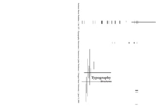
  • 3. This book is a very short summary of a course I took this year at Oregon State University,Art 227 Typography: Structures with John Nettleton. What I have learned about letterforms and typography is that letters have a life and dignity of their own, as Robert Bringhurst said.“Letterforms that honor and elucidate what humans see and say deserve to be honored in their turn. Well-chosen words deserve well-chosen letters; these in turn deserve to be set with affection, intelligence, knowledge, and skill.Typography is a link, and it ought, as a matter of honor, courtesy, and pure delight, to be as strong as the others in the chain.” I am impressed with the way the textbooks I have read for this class talk about letters and typography. I feel like I am approaching almost a sacred subject, and if nothing else, I should regard it with respect. SMP “Typography is concerned with the structuring and arranging of visual language. Both typeform and typography are designed to convey a message. The question of how typography is used to convey a message can be divided into two parts, typography as appearance or style, and the practicalities of working with typography, such as legibi- lity, scale and formatting.” Phil Baines & Andrew Haslam “In all stages of the historical development of the world, the written word and typography have [sic] been a fundame- ntal ingredient in human culture. Only a few specialists are, however, familiar with their background and effect.Whereas the names of the innovators in the “classical disciplines”, [sic] such as painting, music and literature, are common knowledge, those of type designers and typographers of all historical periods are largely unknown; only a few appreciate the significance of their work. Yet the effects of text and typography on all spheres of human activity are constantly present.They influence the fields of aesthetics and technology, of the arts and economics. Without them the rapid exchange of information we take for granted in our contemporary world would be inconceivable.” Typography–An Encyclopedic Survey of Type Design and Techniques Foreword
  • 4. 2 Letters 4 Letterspacing 6 Kerning 8 Column width 10 Leading 12 Alignment 14 Rags 16 Ligatures 18 Hanging punctuation 20 Expressing Hierarchy 22 Normative studies phase II Contents
  • 5. “As with any craft that has evolved over 500 years, typogra- phy employs a number of technical terms. These mostly describe specific part of letterforms. It is a good idea to familiarize yourself with this lexicon. Knowing a letterform’s component parts makes it much easier to identify specific typefaces.” John Kane The design and use of typefaces as a means of visual communication from calligraphy to the ever-developing use of digital type is the broad use of the term typography. However, the art and practice of typography began with the invention of moveable type and the printing press. Typography is sometimes seen as encompassing many separate fields from the type designer who creates letterforms to the graphic designer who selects typefaces and arranges them on the page. “Typography is the craft of endowing human language with a durable visual form, and thus with an independent existence.Typography is concerned with the structuring and arranging of visual language.” Robert Bringhurst Letters Typography exists to honor content. Letters have a life and dignity of their own. Read the text before designing it. Give full typographic attention even to incidental details. Make the visible relationship between the text and other elements. Choose a typeface or a group of faces that will honor and elucidate the character of the text. Important to remember Mphx x-height ascender height descender height median baseline cap height Baseline The imaginary line defining the visual base of letterforms. Median the imaginary line defining the x-height of letterforms. x-height The height in any typeface of the lowercase ‘x.’ Descender That portion of the stem of a lower- case letterform that projects below the baseline Ascender The portion of the stem of a lower- case letterform that projects above the median. Bembo Typography Caslon Typography Baskerville Typography Bodoni Typography Helvetica Typography Univers Typography 2 Comparing typefaces
  • 6. “The space between letters is integral to all typography. A particular letterspace may enhance or destroy the aesthetic quality of a typeface or the legibility of text.‘A man who would letterspace lower case would steal sheep,’ Fredirec Goudy liked to say. If this wisdom needs updating, it is chiefly to add that a woman who would letterspace lower case would steal sheep as well. Normal letterspace is related to the counterforms of lower case letters.Typefaces with large counterforms require more letterspace than typefaces with small counterforms. Letterspace must be decisive, either in harmony with or in strong contrast to the counterforms of lower case letters. For text, most typefaces set with the default set width appear too tight.Additional letterspace improves legibility and aesthetic quality. Unprofessional typesetting is generally cause not by the choice of typeface, but by too much, too little, or irregular letterspacing.Nevertheless, like every rule, this one extends only as far as its rationale.The reason for not let- terspacing lower case is that it hampers legibility. But, there are some lowercase alphabets to which this principle doesn’t apply. (Robert Bringhurst) ‘Don’t letterspace the lower case without a reason.’ Robert Bringhurst 4 When letterspacing is too tight, the type appears patchy, disrupted by clusters;when too open, it looks scattered and framented. In both instances,the type is irritating and tiresome to read. The correct letterspacing in continuous text is a subtle question of balance: what is the optimum space that sufficiently separa- tes the letters without creating a string of disconnected elements that are difficult to grasp? The answer depends on the typeface and size, and the visual result intended by the typographic designer. For both serif and sans serif type the optimum letterspace for text is determined by the counterforms of the lower case letters. Typefaces with small counterforms require less space between let- ters that those with large counterforms. If the letterspace is visually larger than the median counterforms of the lower case letter, the type appears too open. On the computer, most design applications adopt an average set width intended to work with all type sizes. For most typefaces, however, text composed with this setting appears too tight, requiring the letterspace to be increase for optimum legi- bility and aesthetic quality. In sizes larger than 24 point, most typefaces composed with an average set width appear too open. Display sizes generally require a decrease in letterspacing. In large type sizes, individual letterforms are visually more distinct, making it important to pay special attention to the letterforms in re- lation to each other.” Willi Kunz, Macro-and Microaesthetic Letterspacing Normal tracking Ideas Everything is connected to everything else and searching for solutions often requires being alert to spot the unlikely connections... In Critique magazine Marty Neumeier writes:“If idea-making can’t be reduced to a system, perhaps it can be expressed in a formula. Like the workings of the internal combustion engine, the conceptual process can be seen as a series of controlled explosions that drive ideas forward. In a car engine, when fuel is mixed with fresh air and ignited by a spark, the wheels turn and the car accelerates. In the human mind,when a problem is mixed with a new perspective and exposed to intuition, the wheels turn and we arrive at a new concept. Problem + fresh perspective x intuition = concept. Tight tracking Ideas Everything is connected to everything else and searching for solutions often requires being alerttospottheunlikelyconnections... InCritiquemagazineMartyNeumeierwrites:“Ifidea-makingcan’tbereducedtoasystem, perhapsitcanbeexpressedinaformula.Liketheworkingsoftheinternalcombustionengine,the conceptual process can be seen as a series of controlled explosions that drive ideas forward. In a car engine,when fuel is mixed with fresh air and ignited by a spark,the wheels turn and the caraccelerates.Inthehumanmind,whenaproblemismixedwithanewperspectiveandexposed tointuition,thewheelsturnandwearriveatanewconcept.Problem+fresh perspectivexintuition=concept. Loose tracking Ideas Everything is connected to everything else and searching for solutions often requires being alert to spot the unlikely connections... In Critique magazine Marty Neumeier writes:“ If idea-making can’t be reduced to a system, perhaps it can be expressed in a formula. Like the workings of the internal combustion engine, the concep- tual process can be seen as a series of controlled explosions that drive ideas forward. In a car engine, when fuel is mixed with fresh air and ignited by a spark, the wheels turn and the car accelerates. In the human mind, when a problem is mixed with a new perspective and exposed to intuition, the wheels turn and we arrive at a new concept. Problem + fresh perspective x intuition = concept.
  • 7. “Kern consistently and modestly or not at all. Don’t stretch the space until it breaks.” Robert Bringhurst “The term ‘kerning’ describes the automatic adjustment of space between letters. Because kerning removes space between letters, it is often mistakenly referred to as ‘letterspacing.’ In fact, letterspacing means adding space between letters, not removing it. For our purposes,the term ‘tracking,’ used in most computer program that incorporate typesetting, best describes the addition or removal of space between letters. Keep in mind that even the best tracking table sometimes requires minor adjust ments, especially at larger point sizes.” John Kane Kerning can increase consistency of spacing in word like Washington or Toronto, where the combinations Wa and To are kerned, But names likeWisconsin,Tübingen,Tbilisi and Los Alamos, as well as common words like The and This, remain more or less immune to alteration. Hand com- positors rarely kern text sizes, because their kerning pairs must be manually fitted, one at a time. Computerized typesetting makes extensive kerning easy, but judgment is still required, and the computer does not make gook judgment any easier to come by.Too little kerning is preferable to too much, and inconsistent kering is worse than none. Type design is an art practiced by few and mastered by fewer, but font-editing softwaremakes it possible for anyone to alter in a moment the widths and shapes of letters to which as artist may have devoted decades of study, years of inspira- tion and a rare concentration of skill.The power to destroy such a type designer’s work should be used with caution. And arbitrarily condensing or expanding letterforms is the poorest of all methods for fitting un-editable copy into unalterable space.” Robert Bringhurst Kerning YeYe Without kerningWith kerning Originally, the term ‘kern’ described the portion of a letterform that extended beyond the body of the type slug. Today the term ‘kerning’ describes the automatic adjustment of space between letters. Because kerning removes space between letters, it is often mistakenly referred to as ‘letterspacing.’ In fact, letterspacing means adding space between letters, not removing it. 6 Visually awkward combinations, such as Ke, LT,ey, vo, are improved by reducing the space between the individual letters. Adjusting the letterspace between two letters is known as kerning.Words set in all capital letters also require attention to the space between individual letters. The particular combinations of letterforms determine whether space needs to be added or subtracted to achieve a visually even composition.The optimum letterspace for a word set in all capital letters is determined by letters with large counterforms, such as C, D, G, O, Q, or with large surroun- ding space, such as L,T, V, Q,Y. if any of these letters stand apart, the space between the other letters needs to be increased. Ultimately, every letter should unobtrusively inte- grate itself into the visual form of the word.Unprofessional typesetting is generally cause not by the choice of type- face, but by too much, too little, or irregular letterspacing.” Willi Kunz, Macro-and Microaesthetic “ “
  • 8. 8 The question of column width is not merely one of design or format; the question of legibilityis of equal importance. The reader should be able to read the message of a text easily and comfortably.This depends to a not inconsiderable extent on the size of the type, the length of the lines, and the leading.Printed matter in normal format is generally read with the eye at a distance of 30-35 cm.The size of the type should be calculated with this distance in mind. Both too small and too large a type costs the reader an effort. He tires more rapidly. According to a well-known empirical rule there should be 7-10 words per line, for a text of any length of the line can be readily calculated. So as to keep the type area light and open in appearance, we have to determine the leading, i.e. the vertical distance from line to line, so that it suits the size of type. Photo- typesetting has brought an additional problem; namely, that of the spacing between letters. In lead type the dis- tance between the letters was determined by the body size an equalized. In photo-typesetting the distance between letters has to be adjusted a new every time in the photosetting machine. Hence the irregularity of the typeface and the, unfortunately, usually too closely set letters.The designer is well advised when ordering photo-typesetting to insist on normal spacing between the letters. Practical experience has shown that the column width of most printed matter (magazines, brochures) contain from 5 to 8 words, averaging 40 to 60 characters. Even though there are no standards for the number of characters per line, we can take the average number of 40 to 60 characters as being an easily readable quantity.Type sizes for continuous text matter are between 8 and 12 points. Well-leaded lines emphasize the horizontal and make reading easier. In each kind of work (e.g. book or display pane), the dimensions of the page size or format are an important factor in determining the arrangement of columns.Where display lines are placed on above another, the space between lines has to be judged optically. In some cases equal line-spaces (leading) has an unequal optical effect. Such “errors” are overcome by different variations of linespacing.” Ruedi Rüegg Every difficulty standing in the reader’s way means loss of quality in communication and memorability. Just as overlong lines tire, so do overshot ones.The eye find the long line strenuous to read because too much energy must be spent keeping the horizontal line in sight over a long distance. In the case of the too short line, the eye is copelled to change lines too often and this again wastes energy. The right width of column is essential for an even and pleasant rhythm of reading which enables the reader to relax and concentrate wholly on the content.” Grid Systems in Graphic Design Column width Column width long Column width short Column width medium “ “ “ “Choose a comfortable measure.” Robert Bringhurst
  • 9. Leading calls for just as close attention as the width of the lines. For, like lines which are too long or too short, leading can also affect the type area and hence the readability of the text. Lines that are too narrowly set impair reading speed because the upper and lower lines are both taken in by the eye at the same time.The eye cannot focus on excesi-vely close so accu- rately that one line alone is read without the immediate surrounding area also entering the visual field.The eye is distrac- tires more easily.The same also holds true in respect of lines that are too widely space.The reader has trouble in linking up with the next line, his uncertainty grows, and fatigue sets in earlier. Good leading can carry the eye optically form one line to the next, giving it confidence and stability, and enabling it to absorb and remember more easily what has been read. Where reading is smooth and easy, the meaning content of the words is gra-sped more clearly; they acquire more character and expression and etch themselves more sharply on the mind. Proper leading is one of the most important factors in obta- ining a harmonious and functional type area which is aestheti cally pleasing and will stand the test of the time.Another point calling for attention concerns the type area containing 3, 4 or more different type sizes.To ensure a regular and attractive typographic design the leads for the various type sizes must be adjusted to one another.The size of the leads determines the number of lines that can be accommodated on a printed page. The larger the leads, the smaller the number of lines that can be placed on a page.” From Grid Systems in Graphic Design Leading 10 Ideas Everything is connected to everything else and searching for solutions often requires being alert to spot the unlikely connections… In Critique magazine Marty Neumeier writes:“If idea making can’t be reduced to a system, perhaps it can be expressed in a formula. Like the workings of the internal combustion engine, the conceptual process can be seen as a series of controlled explosions that drive ideas forward. In a car engine, when fuel is mixed with fresh air and ignited by a spark, the wheels turn and the car accelerates. In the human mind, when a problem is mixed with a new perspective and exposed to intuition, the wheels turn and we arrive at a new concept. Problem + fresh perspec- tive x intuition = concept. An example of this formula in practice is the invention of the printing press. Gutenberg could not figure out how to press a large number of letter seals onto a single sheet of paper at the same time. One day at a wine festival (after sampling a glass or two), he began to look carefully at a wine press. Suddenly he reali- zed that the wine press, with minor alterations, might be transformed into a printing press. Mein Gott! The simple mixture of two ideas, the letter seal and the wine press, sparked by a little imagination, produced one of the greatest inventions of the Renaissance.” 9/9 Bembo Idea Everything is connected to everything else and searching for solutions often requires being alert to spot the unlikely connections… In Critique magazine Marty Neumeier writes:“If idea making can’t be reduced to a system, perhaps it can be expre- ssed in a formula. Like the workings of the internal combustion engine, the conceptual process can be seen as a series of controlled explosions that drive ideas forward. In a car engine, when fuel is mixed with fresh air and ignited by a spark, the wheels turn and the car accelerates. In the human mind, when a problem is mixed with a new perspective and expo- sed to intuition, the wheels turn and we arrive at a new concept. Problem + fresh perspective x intuition = concept. An example of this formula in practice is the invention of the printing press. Gutenberg could not figure out how to press a large number of letter seals onto a single sheet of paper at the same time. One day at a wine festival (after sampling a glass or two), he began to look carefully at a wine press. Suddenly he realized that the wine press, with minor alterations, light be transformed into a printing press. Mein Gott! The simple mixture of two ideas, the letter seal and the wine press, sparked by a little imagination, produced one of the greatest inventions of the Renaissance.” 9/14 Bembo “ “Choose a basic leading that suits the typeface, text and measure.” Robert Bringhurst
  • 10. 12 Traditionally, it was common practice to set type in a justified alignment.This was done for reasons of efficiency; in addition it was more familiar and was considered to be more refined. In the 1920s, designer began to question this typographic convention and experiment with alterna- tive text setting styles. Unjustified and asymmetrical typography began to find widespread acceptance.Among experimental typographic designers was Herbert Bayer, who said,“I have long believed that our conventional way of writing and setting type could be improved for easier I started to abandon the flush-left-and-right system for short lines of text and have introduced the flush-left system, leaving a ragged-right outline. There are appropriate reasons for setting either justified or unjustified typography, but type set flush left and ragged right promotes greater legibility. If properly used, flush-left, ragged-right typography provides visual points of refe- rence that guide the eye smoothly down the page from line to line. Because each line is either shorter or longer than the next, the eye is cued from one to another. Lacking are visual cues that promote easy reading.With the use of unju- stified typography, wordspacing is even, creating a smooth rhythm and a consistent texture.The indiscriminate placement of additional space between works in order to justify lines causes awkward gaps or “rivers” in paragraphs, which are disruptive to reading. Hyphenations at the end of lines should be used whenever possible to keep wordspacing consistent.” Typographic Design Alignment Flush left This format most closely mirrors the asymmetrical experience of handwriting. Each line starts at the same point but ends wherever the last word on the line ends. Spaces between words are consis- tent throughout the text, allowing the type to create an even gray value. Centered This format imposes symmetry upon the text, assigning equal value and weight to both ends of any line. It transforms fields of text into shapes, thereby adding a pictorial quality to material that is non-pictorial by nature. Because centered type creates such a strong shape on the page,it’s important to amend line breaks so that the text does not appear too jagged. Flush right This format places emphasis on the end of a line as opposed to its start. It can be useful in situations (like captions) where the relationship between text and image might be ambiguous without a strong orien- tation to the right. Justified Like centering, this format imposes a symmetrical shape on the text. It is achieved by expanding or reducing spaces between words and, sometimes between letters. The resulting openness of lines can occasionally produce ‘rivers of space running vertically trough the text. Careful attention to line breaks and hyphenation is required to amend this problem whenever possible. , , “ “Shape the page and frame the textblock so that it honors and reveals every element, every relationship between elements, and every logical nuance of the text.” Robert Bringhurst
  • 11. When setting ragged text with a computer, take a moment to refine your software’s understanding of what constitutes an honest rag. Many programs are predisposed to invoke a minimum as well as a maximum line. If permitted to do so, whether they are ragging or justifying the text. Ragged setting under these conditions produces an orderly ripple down the righthand side, making the text look like a neatly pinched piecrust.This approach combines the worst fea- tures of justification with the worst features of ragged set- ting, while eliminating the principal virtues of both. Unless the measure is excruciatingly narrow, it is usually better to set a hard rag.This means a fixed word space, no minimum line, and no hyphenated linebreaks.” Robert Bringhurst In justified text, there is always a trade-off between evenness of word spacing and frequency of hyphenation.The best available compromise will depend on the nature of the text as well as on the specifics of the design. Good compositors like to avoid consecutive hyphenated line-ends, but frequent hyphens are better that sloppy spacing, and ragged setting is better yet. Narrow measures – which prevent good justifi- cation are commonly used when the text is set in multiple columns. Setting ragged right under these conditions will lighten the page and decrease its stiffness, as well as prevent- ing an outbreak of hyphenation. Many unserifed faces look best when set ragged no matter what the length of the measure. And monospaced fonts, which are common on typewriters, always look better-set ragged, in standard typewriter style. A typewriter (or a computer-driven printer of similar quality) that justifies its lines in imitation of typesetting is a presump- tuous machine, mimicking the outer form instead of the inner truth of typography. “Set ragged if ragged setting suits the text and the page.” Robert Bringhurst Rags When setting ragged-right test, care should be taken not to rag the type too much. Uncontrolled line breaks of erratic rhythm can create awkward spaces that inhibit reading. In ragged-right type, care should be given to the selection of interline spacing, for it influences legibility and appearance. Spatial consistency and rhythmic line breaks result from careful typographical decisions. The breaking of lines can be determined by the author’s meaning rather tan by appearance.This method, sometimes referred to as ”thought-unit” typography, arranges lines into discrete parts related to the meaning of the text. Ragged right lines may be of any length, with line breaks that are logical and focus on the intended message of the writer.” Typographic Design 14 example of soft rag example of medium rag example of hard rag “ “
  • 12. “Ligatures combine two or three letters into a single character.They are available on in expert fonts, and are cru- cial for the refined setting of serf type.The ligatures fi an fl are, because of their frequency, the most important. Letterspaced text precludes the use of ligatures.” Willi Kunz Ligature 16 Bembo, set without ligatures (above) and with ligature (below) Use the ligatures required by the font, and the characters required by the language, in which you are setting type. In most roman faces the letter f reaches into the space beyond it. In most Italics, the f reaches into the space on both sides. Typographers call these overlaps kerns. Only a few kerns, like those in the arm of the f and the tail of the j, are implicit in a normal typefont. Robert Bringhurst ff fi fl ffi ffl ff fi fl ffi ffl “If you wish to avoid ligatures altogether, restrict yourself to faces that don’t require them. Willi Kunz AE ae Æ æ
  • 13. Hanging Punctuation Attention to typographic detail is one aspect of design that separates the amateurs from the pros.Today's software makes some of these details of typog- raphy easier than ever to accomplish. Hanging punctuation, commonly used for pull-quotes, creates the illusion of a uniform edge for the text, with the punctuation outside the margins. It's also called optical alignment. Beyond punctuation, optical margin adjustments may be used to make subtle shifts to allow for the shapes of letters and serifs, such as exten- ding the edge of initial caps outside the outer margin. “ Compare these two examples of a pull-quote without and with hanging punctuation: Attention to typo- graphic detail is one aspect of design that separates the amate- “ “Attention to typo- graphic detail is one aspect of design that separates the amate- The eye craves order and alignment. However, techni- cally aligned text doesn't always look as if it is perfectly aligned because of the shape and size of characters in text, especially punctuation. Optical alignment makes text edges look more orderly and balanced.At typical body copy sizes, optical misalignment is rarely noticeable. However, at the larger text sizes used for pull-quotes and headlines the use of hanging punctuation adds a touch of refinement to the layout. It may take extra time to hang your punctua- tion, especially if your software has no automatic alignment options, but the results are noticeable. http://desktoppub.about.com Designing with Hanging Punctuation In some programs, such as Adobe Illustrator and Adobe InDesign, hanging punctuation is an automated function. For other programs it requires some manual manipulation of the text. For programs that don't have automatic options to hang punctuation you can use kerning or invisible characters to create the hanging punctuation effect.To manually hang the initial (left) quotation mark in a pull-quote: Method 1 Add a space in front of the left quotation mark Kern the space to the left (negative kern value) until it moves outside the margin Note:The quotation mark may not show up on screen once kerned but it will print. Method 2 Apply a hanging indent to the paragraph so that the quotation mark extends to the left of the optical margin for the remainder of the text. Or, create a paragraph style or style sheet with a hanging indent. 1. 2. • • 18 Examples of Hanging Punctuation
  • 14. In most circumstances, a designer’s first goal is to make material comprehensible to a reader. In other words, you should understand the material well enough to know how someone else needs to read it to make the best sense out of it.This understanding happens on two levels: content and form.The recipe opposite is a fairly straightforward presentation of the making of an apple tart.With the exception of one or two terms specific to cooking, its content does not require any special knowledge. However, in its form–the manner in which informa- tion is set and place on a page–the process it describes can be made clearer than it appears as plain typescript.To understand the form, you must first understand the kinds of information the recipe contains and then rank it according to levels of importance, thereby creating a hierarchy. In this recipe there are the following levels of information: title (1) subtitles (2) text (3). Within the text there are ingredient lists (3A) oven temperature instructions (3B) directions (3C). Successfully setting this recipe in type requires that you make each of these distinctions clear to the reader. Expressing Hierarchy Establishing a format After analyzing and organizing the content, devise a format that expresses differences within the text. Because the line length required for easy reading of directions is more or less twice the line length required for a list of ingredients, the area within the margins of the sheet is divided vertically into three intervals, or columns. Ingredients cross-align with the directions that refer to them. Single line spaces indicate breaks between paragraphs. Double line spaces indicate breaks between sections of text. John Kane 20
  • 15. Optimum of study two Normative Studies phase 2 Optimun of study one Optimum of study three 22
  • 16. Colophon Computer programs used: QuarkXPress Passport Adobe Illustrator 10 Adobe Photoshop 7.0 Fonts: Bembo – Bembo Bold Helvetica Neue – 75 Helvetica Bold Fonts & size: Headings - 75 Helvetica Bold - 24 pt. type SubHeadings - Bembo Bold - 12 pt. type Text - Bembo 9/11.5 Bibliography Carter, Rob, Day, Ben, and Meggs, Philip. Typographic Design: Form and Communication. John Wiley & Sons, Inc.Third Edition. Kane, John.A type primer. Prentice Hall, Inc. 2003 Bringhurst, Robert.The Elements of Typographic Style. 2nd rev. ed. Point Roberts,WA: Hartley & Marks, 1996. Kunz,Willi.Typography: Macro-and Microaesthetics. Conclusion My intent for this book was to keep it simple even because the time available to me was very limited. I also wanted to create a sense of dynamicity and this is the best I could think about for the time on hand. I hope the result is not too bad. SMP