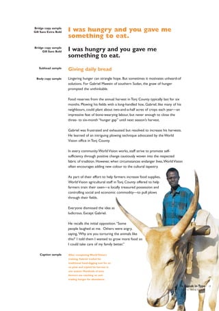
Downloaded 10 times
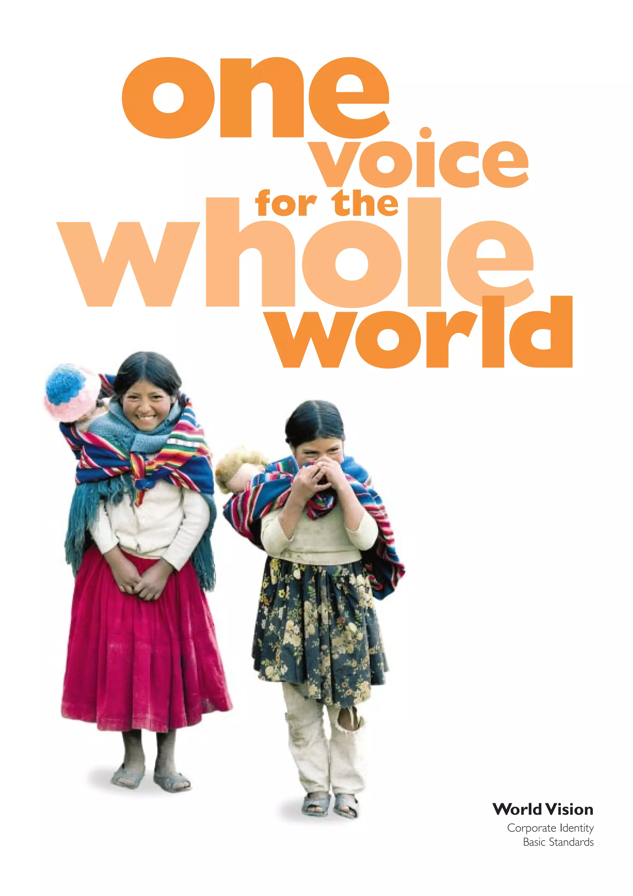


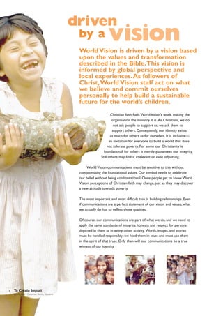

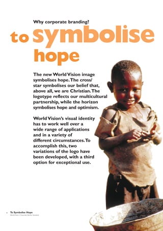
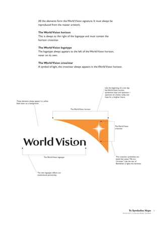
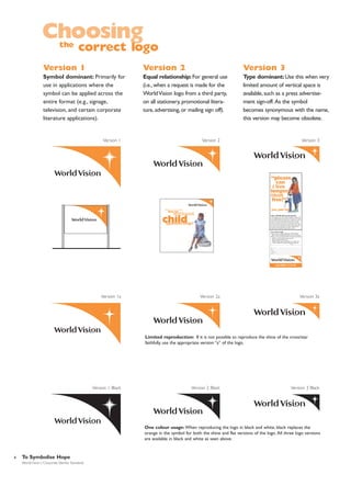
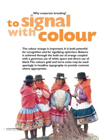
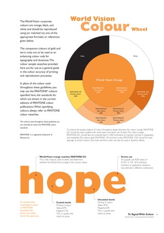
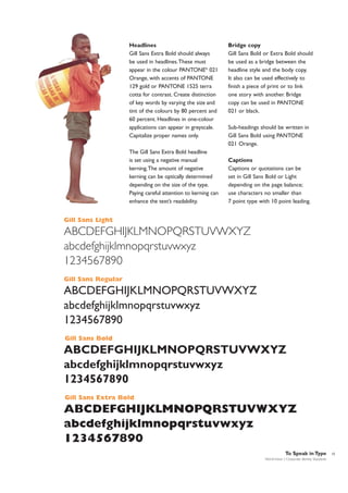
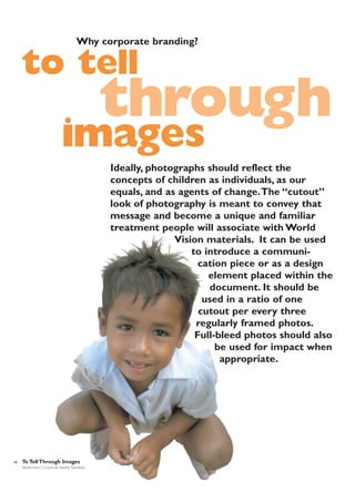
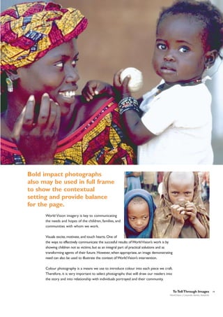
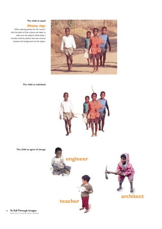

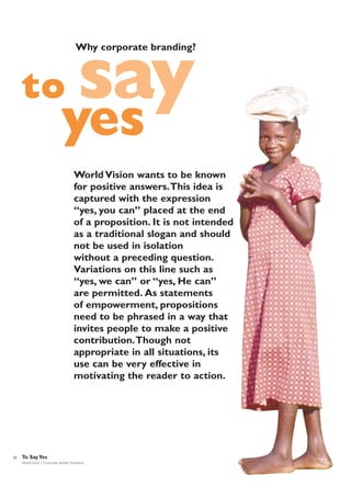


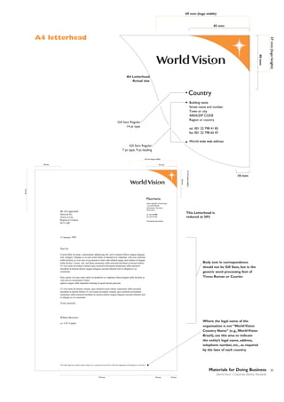
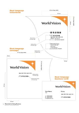
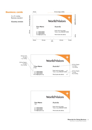
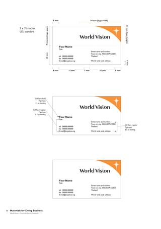
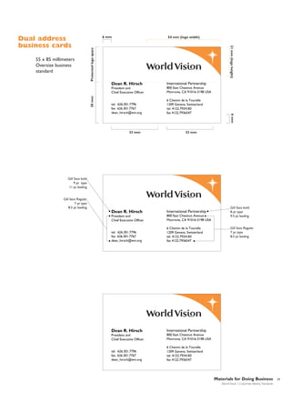
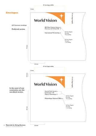
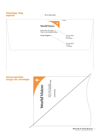
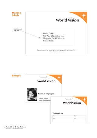
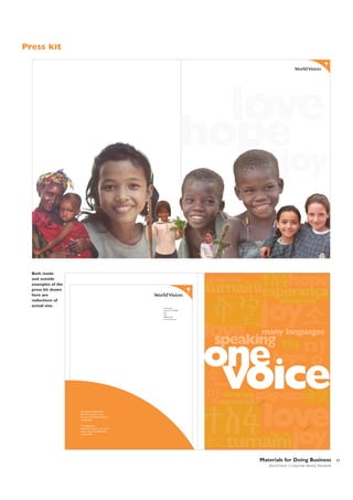
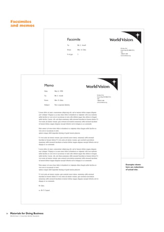
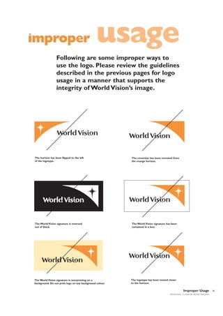
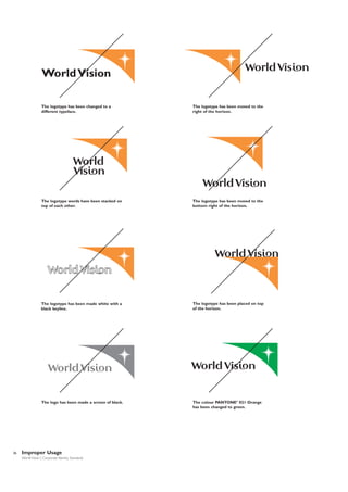

The document provides guidelines for World Vision's new corporate identity system. It introduces the key elements of the new logo, which retains symbols of the cross and world reflected in a star on the horizon. The bright orange color signifies hope. The logotype reflects the global partnership in English. The typeface is distinctive, open and inviting. Limited use of photo "cutouts" helps focus on children as agents of change. The document provides details on proper usage of the logo, including the correct versions to use in different applications and placement recommendations. It establishes orange as the primary color and discusses using it with white space and black typography.