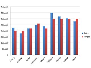
This bar graph shows sales figures for a company over a period of time. The y-axis ranges from 0 to 400,000 representing sales amounts. The x-axis is unlabeled but implies time periods as the bars get progressively taller from left to right. The graph indicates that sales were steadily increasing over time but fell just short of a target amount represented by the horizontal red line.