WEB DESIGN PRINCIPLES
Kevin Cochran
Thrisha Nesbitt
Stephanie Powers
UNITY
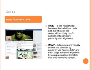
 Unity – is the relationship
between the individual parts
and the whole of the
composition. Unity has 3
components similarity,
proximity and alignment.
 Why? – All profiles are visually
similar, the connect by
proximity via “friends lists” and
each page achieves alignment
by using a standard template
that only varies by content.
www.facebook.com
VARIETY
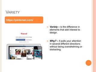
 Variety – is the difference in
elements that add interest to
design.
 Why? – It pulls your attention
in several different directions
without being overwhelming or
distracting.
https://pinterest.com/
BALANCE
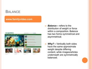
 Balance – refers to the
distribution of weight or force
within a composition. Balance
has two forms symmetrical and
asymmetrical.
 Why? – Vertically both sides
have the same approximate
weight despite differing
content, while images/articles
underneath are symmetrically
balanced.
www.familyvideo.com
SCALE AND PROPORTION
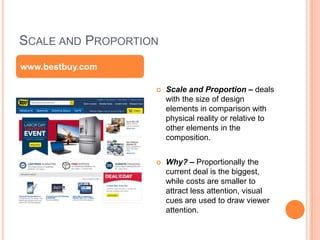
 Scale and Proportion – deals
with the size of design
elements in comparison with
physical reality or relative to
other elements in the
composition.
 Why? – Proportionally the
current deal is the biggest,
while costs are smaller to
attract less attention, visual
cues are used to draw viewer
attention.
www.bestbuy.com
RHYTHM
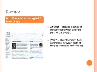
 Rhythm – creates a sense of
movement between different
parts of the design.
 Why? – The information flows
seamlessly between parts of
the page (images and articles).
http://en.wikipedia.org/wiki/
Main_Page
EMPHASIS
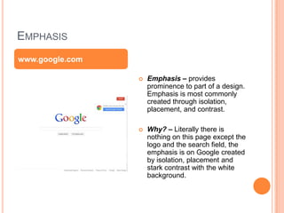
 Emphasis – provides
prominence to part of a design.
Emphasis is most commonly
created through isolation,
placement, and contrast.
 Why? – Literally there is
nothing on this page except the
logo and the search field, the
emphasis is on Google created
by isolation, placement and
stark contrast with the white
background.
www.google.com
SIMPLICITY
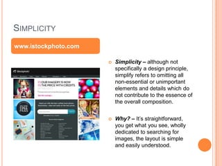
 Simplicity – although not
specifically a design principle,
simplify refers to omitting all
non-essential or unimportant
elements and details which do
not contribute to the essence of
the overall composition.
 Why? – It’s straightforward,
you get what you see, wholly
dedicated to searching for
images, the layout is simple
and easily understood.
www.istockphoto.com

Web design principles

  • 1.
    WEB DESIGN PRINCIPLES KevinCochran Thrisha Nesbitt Stephanie Powers
  • 2.
    UNITY  Unity –is the relationship between the individual parts and the whole of the composition. Unity has 3 components similarity, proximity and alignment.  Why? – All profiles are visually similar, the connect by proximity via “friends lists” and each page achieves alignment by using a standard template that only varies by content. www.facebook.com
  • 3.
    VARIETY  Variety –is the difference in elements that add interest to design.  Why? – It pulls your attention in several different directions without being overwhelming or distracting. https://pinterest.com/
  • 4.
    BALANCE  Balance –refers to the distribution of weight or force within a composition. Balance has two forms symmetrical and asymmetrical.  Why? – Vertically both sides have the same approximate weight despite differing content, while images/articles underneath are symmetrically balanced. www.familyvideo.com
  • 5.
    SCALE AND PROPORTION Scale and Proportion – deals with the size of design elements in comparison with physical reality or relative to other elements in the composition.  Why? – Proportionally the current deal is the biggest, while costs are smaller to attract less attention, visual cues are used to draw viewer attention. www.bestbuy.com
  • 6.
    RHYTHM  Rhythm –creates a sense of movement between different parts of the design.  Why? – The information flows seamlessly between parts of the page (images and articles). http://en.wikipedia.org/wiki/ Main_Page
  • 7.
    EMPHASIS  Emphasis –provides prominence to part of a design. Emphasis is most commonly created through isolation, placement, and contrast.  Why? – Literally there is nothing on this page except the logo and the search field, the emphasis is on Google created by isolation, placement and stark contrast with the white background. www.google.com
  • 8.
    SIMPLICITY  Simplicity –although not specifically a design principle, simplify refers to omitting all non-essential or unimportant elements and details which do not contribute to the essence of the overall composition.  Why? – It’s straightforward, you get what you see, wholly dedicated to searching for images, the layout is simple and easily understood. www.istockphoto.com

Editor's Notes

  • #3 There isn't much going on. Very simplistic in layout.
  • #4 The page is always moving with some type of advertisement or video being constantly played.
  • #5 With the big pictures, the smaller ones balance it out
  • #6 Multiple images
  • #7 Natural clear, good flow
  • #8 It deals with a double picture that changes the proportion of the face, making the face look smaller than if there was only one picture.
  • #9 It has similar shapes.