Web accessibility testing 2 - colour contrast
•Download as DOCX, PDF•
0 likes•146 views

From a 5-part series about free tools for testing web site accessibility.

Recommended
More Related Content
Similar to Web accessibility testing 2 - colour contrast
Similar to Web accessibility testing 2 - colour contrast (8)
More from John McNabb
More from John McNabb (8)
Recently uploaded
Recently uploaded (20)
Web accessibility testing 2 - colour contrast
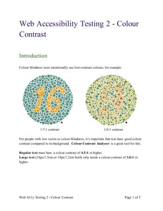
- 1. Web A11y Testing 2 - Colour Contrast Page 1 of 5 Web Accessibility Testing 2 - Colour Contrast Introduction Colour blindness tests intentionally use low-contrast colours, for example: 1.7:1 contrast 1.0:1 contrast For people with low vision or colour blindness, it’s important that text have good colour contrast compared to its background. Colour Contrast Analyser is a great tool for this. Regular text must have a colour contrast of 4.5:1 or higher. Large text (24px/1.5em or 19px/1.2em bold) only needs a colour contrast of 3.0:1 or higher.
- 2. Web A11y Testing 2 - Colour Contrast Page 2 of 5 Examples of poor contrast vs. good contrast: Poor (below 4.5:1) Good (4.5:1 or higher) Contrast is 3.0:1 Contrast is 4.6:1 Contrast is 3.0:1 Contrast is 14.0:1 Warning Colour Contrast Analyser will not work while NVDA is running - it will hang, and you’ll have to close it and try again. How to install 1. Download Colour Contrast Analyser - there are versions for Windows and macOS. 2. Install it and place a shortcut on your desktop. 3. Right-click the shortcut and select Properties.
- 3. Web A11y Testing 2 - Colour Contrast Page 3 of 5 4. Click on the “Shortcut key” field and Ctrl+Alt+c (press all three together). From now on, Ctrl+Alt+c will open it. 5. Click OK.
- 4. Web A11y Testing 2 - Colour Contrast Page 4 of 5 How to use 1. Press Ctrl+Alt+c to open Colour Contrast Analyser. 2. Click on one eye dropper, and use it to sample the text colour. 3. Click on the other eye dropper, and use it to sample the background colour. 4. See what the contrast ratio is. It should be 4.5:1 or higher, or 3.0:1 or higher for large text.
- 5. Web A11y Testing 2 - Colour Contrast Page 5 of 5 On some text (like the above “Get support online”), the colour contrast is barely 4.5:1. You have to choose the right pixels to get a pass.