
Recommended
More Related Content
Similar to Watercolour Nandina
Similar to Watercolour Nandina (20)
Recently uploaded
Recently uploaded (20)
Watercolour Nandina
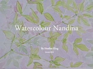
- 1. Watercolour Nandina By Heather King January 2019
- 2. My subject I chose a Nandina frond because I like their delicacy and the fine edge of red around the green leaves. Also, it has a fairly simple shape, as leaves go.
- 3. Step 1: Outline Actually, I wasn’t thinking in steps. I wasn’t even sure I could paint this thing at all, so I just started with what seemed the most obvious place – painting an outline. It’s hard to know for sure the names of the colours I’ve used, as the paint set I used for this piece doesn’t have names on the colours. Best I could do was compare the colours with a set of oil pastels from the same brand (Mont Marte). Going by that, I’ve used ‘sap green’ and ‘crimson’, although I always thought crimson was a bright red, not a strong pink, as this is. Apologies for the crooked photo. I hadn’t thought to share it at that point.
- 4. Step 2: Colouring in I was pretty pleased with how the painted outline went, but it definitely looked unfinished, so I decided to start adding some colour to the leaves. I just diluted the sap green I’d used for the outline and used that for the fill.
- 5. Step 3: Adding depth Well, I can’t believe I’m talking like an artist, but here it is – the step in which I add the illusion of depth by suggesting some shadows behind the leaves. For the shadows, I used a very dilute mix of the same pink I’d used for the outline, and what I think must be ‘Hooker’s green’ (a kind of bluish dark green), also very dilute. I also mixed up a mauve-grey in there, too, using all the colours I’d been using up to this point. I dabbed it on with a damp sponge, but I ended up painting over it in the next step.
- 6. Step 4: More background After adding the shadows, there was still a bit too much white space for my taste. It looked a bit jarring. A bit at a loss as to which colour might serve as a background, I consulted my colour wheel (also by Mont Marte). That suggested using some kind of mauve. I can no longer remember which colours I mixed for the mauve, or whether I used one of the mauves on my palette. I think it was probably the latter. I used a fairly large round brush and carefully filled in the largest of the white spaces I could see, leaving a bit of a margin around the leaves and stems. It only took a few minutes. I also put a very dilute mauve border around the outside, right up against the tape.
- 7. Step 5: Enjoy! I let the piece dry and then removed the tape. I was actually amazed and extremely pleased that I’d been able to paint anything remotely resembling my subject. I see the date on the piece was 3 January 2019 – the day after the painting afternoon with my niece. That means this was only day two of my painting career. In total, I’d say I spent about an hour and a half on this painting. So, I hope this has inspired you to have a go at something you’ve thought until now you could never do. Thanks for reading!