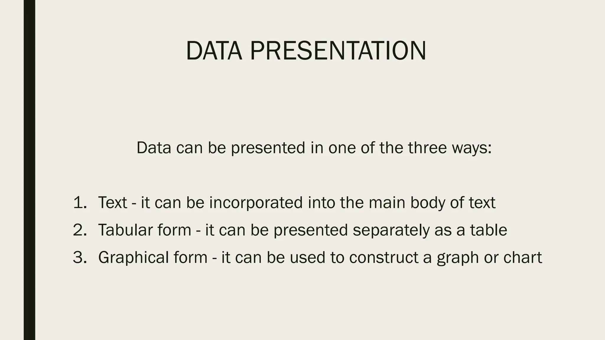
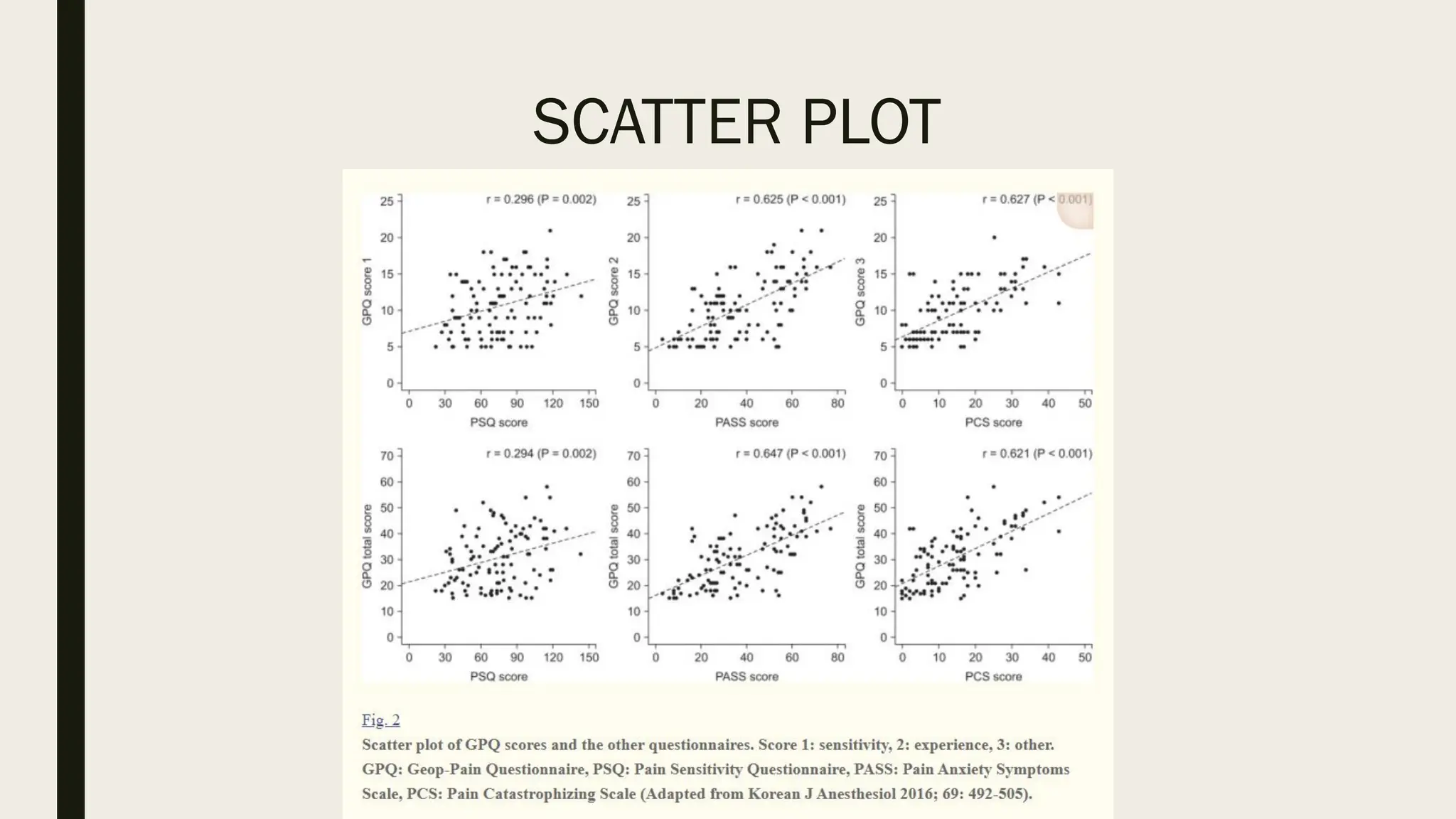
DATA PRESENTATION
DATA
Data are a set of facts and provide a partial picture of reality.
Whether data are being collected with a certain purpose or
collected data are being utilized, questions regarding what
information the data are conveying, how the data can be used,
and what must be done to include more useful information
must constantly be kept in mind.
DATA
Since most data are available to researchers in a raw format,
they must be summarized, organized, and analyzed to usefully
derive information from them.
Furthermore, each data set needs to be presented in a certain
way depending on what it is used for. Planning how the data
will be presented is essential before appropriately processing
raw data.
PLANNING DATA PRESENTATION
First, a question for which an answer is desired must be clearly
defined. The more detailed the question is, the more detailed
and clearer the results are.
A broad question results in vague answers and results that are
hard to interpret. In other words, a well-defined question is
crucial for the data to be well-understood later.
PLANNING DATA PRESENTATION
Once a detailed question is ready, the raw data must be
prepared before processing.
These days, data are often summarized, organized, and
analyzed with statistical packages or graphics software. Data
must be prepared in such a way they are properly recognized
by the program being used.
DATA PRESENTATION
Data can be presented in one of the three ways:
1. Text - it can be incorporated into the main body of text
2. Tabular form - it can be presented separately as a table
3. Graphical form - it can be used to construct a graph or chart
DATA PRESENTATION
Determining which of these methods is the most appropriate
depends upon the amount of data you are dealing with and
their complexity.
Methods of presentation must be determined according to the
data format, the method of analysis to be used, and the
information to be emphasized. Inappropriately presented data
fail to clearly convey information to readers and reviewers.
DATA PRESENTATION
The choice about whether to use text, tables or graphs
requires careful consideration if you are to ensure that your
reader or audience understands your argument and is not left
struggling to interpret data that are poorly presented or in an
inappropriate format.
DATA PRESENTATION
Even when the same information is being conveyed, different
methods of presentation must be employed depending on
what specific information is going to be emphasized.
A method of presentation must be chosen after carefully
weighing the advantages and disadvantages of different
methods of presentation.
DATA PRESENTATION
It is crucial to remember that when using a table or graph the
associated text should describe what the data reveal about the
topic; you should not need to describe the information again in
words.
TEXT PRESENTATION
Text is the main method of conveying information as it is used
to explain results and trends, and provide contextual
information.
Data are fundamentally presented in paragraphs or sentences.
TEXT PRESENTATION
Text can be used to provide interpretation or emphasize
certain data.
If quantitative information to be conveyed consists of one or
two numbers, it is more appropriate to use written language
than tables or graphs.
TEXT PRESENTATION
This kind of representation is useful when we are looking to
supplement qualitative statements with some data. For this
purpose, the data should not be voluminously represented in
tables or diagrams.
It just has to be a statement that serves as a fitting evidence
to our qualitative evidence and helps the reader to get an idea
of the scale of a phenomenon.
TEXT PRESENTATION
EXAMPLE
For instance, information about the incidence rates of delirium
following anesthesia in 2016–2017 can be presented with the
use of a few numbers:
“The incidence rate of delirium following anesthesia was 11%
in 2016 and 15% in 2017; no significant difference of
incidence rates was found between the two years.”
TEXT PRESENTATION
EXAMPLE
If this information were to be presented in a graph or a table, it
would occupy an unnecessarily large space on the page,
without enhancing the readers' understanding of the data.
TEXT PRESENTATION
If more data are to be presented, or other information such as
that regarding data trends are to be conveyed, a table or a
graph would be more appropriate.
If the data under consideration is large then the text matter
increases substantially. As a result, the reading process
becomes more intensive, time-consuming and cumbersome.
TEXT PRESENTATION
By nature, data take longer to read when presented as texts
and when the main text includes a long list of information,
readers and reviewers may have difficulties in understanding
the information.
TABULAR PRESENTATION
A table facilitates representation of even large amounts of data in
an attractive, easy to read and organized manner. The data is
organized in rows and columns. This is one of the most widely used
forms of presentation of data since data tables are easy to
construct and read.
Tables are the most appropriate for presenting individual
information. It can present both quantitative and qualitative data.
ADVANTAGES OF TABULAR
PRESENTATION
Ease of representation: A large amount of data can be easily
confined in a data table. Evidently, it is the simplest form of
data presentation.
Ease of analysis: Data tables are frequently used for statistical
analysis like calculation of central tendency, dispersion etc.
ADVANTAGES OF TABULAR
PRESENTATION
Helps in comparison: In a data table, the rows and columns
which are required to be compared can be placed next to each
other. To point out, this facilitates comparison as it becomes
easy to compare each value.
Economical: Construction of a data table is fairly easy and
presents the data in a manner which is really easy on the eyes
of a reader. Moreover, it saves time as well as space.
COMPONENTS OF TABLES
Table Number: Each table should have a specific table number
for ease of access and locating. This number can be readily
mentioned anywhere which serves as a reference and leads us
directly to the data mentioned in that particular table.
COMPONENTS OF TABLES
Title: A table must contain a title that clearly tells the readers
about the data it contains, time period of study, place of study
and the nature of classification of data.
COMPONENTS OF TABLES
Headnotes: A headnote further aids in the purpose of a title
and displays more information about the table.
Generally, headnotes present the units of data in brackets at
the end of a table title.
COMPONENTS OF TABLES
Stubs: These are titles of the rows in a table. Thus a stub
display information about the data contained in a particular
row.
Caption: A caption is the title of a column in the data table. In
fact, it is a counterpart if a stub and indicates the information
contained in a column.
COMPONENTS OF TABLES
Body or field: The body of a table is the content of a table in its
entirety. Each item in a body is known as a ‘cell’.
Footnotes: Footnotes are rarely used. In effect, they
supplement the title of a table if required.
COMPONENTS OF TABLES
Source: When using data obtained from a secondary source,
this source has to be mentioned below the footnote.
PRINCIPLES OF TABLE CONSTRUCTION
The title should be in accordance with the objective of study:
The title of a table should provide a quick insight into the table.
Comparison: If there might arise a need to compare any two
rows or columns then these might be kept close to each other.
PRINCIPLES OF TABLE CONSTRUCTION
Alternative location of stubs: If the rows in a data table are
lengthy, then the stubs can be placed on the right-hand side of
the table.
Headings: Headings should be written in a singular form. For
example, ‘good’ must be used instead of ‘goods’.
PRINCIPLES OF TABLE CONSTRUCTION
Footnote: A footnote should be given only if needed.
Size of columns: Size of columns must be uniform and
symmetrical.
PRINCIPLES OF TABLE CONSTRUCTION
Use of abbreviations: Headings and sub-headings should be
free of abbreviations.
Units: There should be a clear specification of units above the
columns.
TABLE OVER GRAPH
The strength of tables is that they can accurately present
information that cannot be presented with a graph.
A number such as “132.145852” can be accurately expressed
in a table.
TABLE OVER GRAPH
Another strength is that information with different units can be
presented together.
For instance, blood pressure, heart rate, number of drugs
administered, and anesthesia time can be presented together
in one table.
TABLE OVER GRAPH
Tables are useful for summarizing and comparing quantitative
information of different variables.
GRAPH OVER TABLE
The interpretation of information takes longer in tables than in
graphs, and tables are not appropriate for studying data
trends.
Since all data are of equal importance in a table, it is not easy
to identify and selectively choose the information required.
EXAMPLE OF DATA TABLE
HEAT MAP
Heat maps help to further visualize the information presented
in a table by applying colors to the background of cells.
By adjusting the colors or color saturation, information is
conveyed in a more visible manner, and readers can quickly
identify the information of interest.
HEAT MAP
GRAPH PRESENTATION
Whereas tables can be used for presenting all the information,
graphs simplify complex information by using images and
emphasizing data patterns or trends, and are useful for
summarizing, explaining, or exploring quantitative data.
GRAPH PRESENTATION
While graphs are effective for presenting large amounts of
data, they can be used in place of tables to present small sets
of data.
A graph format that best presents information must be chosen
so that readers and reviewers can easily understand the
information.
SCATTER PLOT
Scatter plots present data on the x- and y-axes and are used to
investigate an association between two variables.
A point represents each individual or object, and an
association between two variables can be studied by analyzing
patterns across multiple points.
SCATTER PLOT
A regression line is added to a graph to determine whether the
association between two variables can be explained or not.
However, if multiple points exist at an identical location, the
correlation level may not be clear.
SCATTER PLOT
BAR GRAPH AND HISTOGRAM
A bar graph is used to indicate and compare values in a
discrete category or group, and the frequency or other
measurement parameters (i.e. mean).
Depending on the number of categories, and the size or
complexity of each category, bars may be created vertically or
horizontally. The height (or length) of a bar represents the
amount of information in a category.
BAR GRAPH AND HISTOGRAM
Bar graphs are flexible, and can be used in a grouped or
subdivided bar format in cases of two or more data sets in
each category.
Whiskers on the bars may be used to represent the mean and
standard deviation.
BAR GRAPH AND HISTOGRAM
A bar graph is a way of summarizing a set of categorical data.
It displays the data using a number of rectangles, of the same
width, each of which represents a particular category.
Bar graphs can be displayed horizontally or vertically and they
are usually drawn with a gap between the bars (rectangles).
BAR GRAPH AND HISTOGRAM
By comparing the endpoints of bars, one can identify the
largest and the smallest categories, and understand gradual
differences between each category.
It is advised to start the x- and y-axes from 0. Illustration of
comparison results in the x- and y-axes that do not start from 0
can deceive readers' eyes and lead to overrepresentation of
the results.
BAR GRAPH AND HISTOGRAM
One form of vertical bar graph is the stacked vertical bar
graph. A stack vertical bar graph is used to compare the sum
of each category, and analyze parts of a category.
While stacked vertical bar graphs are excellent from the
aspect of visualization, they do not have a reference line,
making comparison of parts of various categories challenging
BAR GRAPH AND HISTOGRAM
A histogram is a way of summarizing data that are measured
on an interval scale (either discrete or continuous).
It is often used in exploratory data analysis to illustrate the
features of the distribution of the data in a convenient form.
BAR GRAPH AND HISTOGRAM
PIE CHART
A pie chart, which is used to represent nominal data (in other
words, data classified in different categories), visually
represents a distribution of categories.
PIE CHART
It is generally the most appropriate format for representing
information grouped into a small number of categories.
It is also used for data that have no other way of being
represented aside from a table (i.e. frequency table).
PIE CHART
LINE PLOT
A line plot is useful for representing time-series data such as
monthly precipitation and yearly unemployment rates.
It is used to study variables that are observed over time.
LINE PLOT
Line graphs are especially useful for studying patterns and
trends across data that include climatic influence, large
changes or turning points, and are also appropriate for
representing not only time-series data, but also data
measured over the progression of a continuous variable such
as distance.
LINE PLOT

W2 - Data Presentation research Lecture.pdf

  • 1.
  • 2.
    DATA Data are aset of facts and provide a partial picture of reality. Whether data are being collected with a certain purpose or collected data are being utilized, questions regarding what information the data are conveying, how the data can be used, and what must be done to include more useful information must constantly be kept in mind.
  • 3.
    DATA Since most dataare available to researchers in a raw format, they must be summarized, organized, and analyzed to usefully derive information from them. Furthermore, each data set needs to be presented in a certain way depending on what it is used for. Planning how the data will be presented is essential before appropriately processing raw data.
  • 4.
    PLANNING DATA PRESENTATION First,a question for which an answer is desired must be clearly defined. The more detailed the question is, the more detailed and clearer the results are. A broad question results in vague answers and results that are hard to interpret. In other words, a well-defined question is crucial for the data to be well-understood later.
  • 5.
    PLANNING DATA PRESENTATION Oncea detailed question is ready, the raw data must be prepared before processing. These days, data are often summarized, organized, and analyzed with statistical packages or graphics software. Data must be prepared in such a way they are properly recognized by the program being used.
  • 6.
    DATA PRESENTATION Data canbe presented in one of the three ways: 1. Text - it can be incorporated into the main body of text 2. Tabular form - it can be presented separately as a table 3. Graphical form - it can be used to construct a graph or chart
  • 7.
    DATA PRESENTATION Determining whichof these methods is the most appropriate depends upon the amount of data you are dealing with and their complexity. Methods of presentation must be determined according to the data format, the method of analysis to be used, and the information to be emphasized. Inappropriately presented data fail to clearly convey information to readers and reviewers.
  • 8.
    DATA PRESENTATION The choiceabout whether to use text, tables or graphs requires careful consideration if you are to ensure that your reader or audience understands your argument and is not left struggling to interpret data that are poorly presented or in an inappropriate format.
  • 9.
    DATA PRESENTATION Even whenthe same information is being conveyed, different methods of presentation must be employed depending on what specific information is going to be emphasized. A method of presentation must be chosen after carefully weighing the advantages and disadvantages of different methods of presentation.
  • 10.
    DATA PRESENTATION It iscrucial to remember that when using a table or graph the associated text should describe what the data reveal about the topic; you should not need to describe the information again in words.
  • 11.
    TEXT PRESENTATION Text isthe main method of conveying information as it is used to explain results and trends, and provide contextual information. Data are fundamentally presented in paragraphs or sentences.
  • 12.
    TEXT PRESENTATION Text canbe used to provide interpretation or emphasize certain data. If quantitative information to be conveyed consists of one or two numbers, it is more appropriate to use written language than tables or graphs.
  • 13.
    TEXT PRESENTATION This kindof representation is useful when we are looking to supplement qualitative statements with some data. For this purpose, the data should not be voluminously represented in tables or diagrams. It just has to be a statement that serves as a fitting evidence to our qualitative evidence and helps the reader to get an idea of the scale of a phenomenon.
  • 14.
    TEXT PRESENTATION EXAMPLE For instance,information about the incidence rates of delirium following anesthesia in 2016–2017 can be presented with the use of a few numbers: “The incidence rate of delirium following anesthesia was 11% in 2016 and 15% in 2017; no significant difference of incidence rates was found between the two years.”
  • 15.
    TEXT PRESENTATION EXAMPLE If thisinformation were to be presented in a graph or a table, it would occupy an unnecessarily large space on the page, without enhancing the readers' understanding of the data.
  • 16.
    TEXT PRESENTATION If moredata are to be presented, or other information such as that regarding data trends are to be conveyed, a table or a graph would be more appropriate. If the data under consideration is large then the text matter increases substantially. As a result, the reading process becomes more intensive, time-consuming and cumbersome.
  • 17.
    TEXT PRESENTATION By nature,data take longer to read when presented as texts and when the main text includes a long list of information, readers and reviewers may have difficulties in understanding the information.
  • 18.
    TABULAR PRESENTATION A tablefacilitates representation of even large amounts of data in an attractive, easy to read and organized manner. The data is organized in rows and columns. This is one of the most widely used forms of presentation of data since data tables are easy to construct and read. Tables are the most appropriate for presenting individual information. It can present both quantitative and qualitative data.
  • 19.
    ADVANTAGES OF TABULAR PRESENTATION Easeof representation: A large amount of data can be easily confined in a data table. Evidently, it is the simplest form of data presentation. Ease of analysis: Data tables are frequently used for statistical analysis like calculation of central tendency, dispersion etc.
  • 20.
    ADVANTAGES OF TABULAR PRESENTATION Helpsin comparison: In a data table, the rows and columns which are required to be compared can be placed next to each other. To point out, this facilitates comparison as it becomes easy to compare each value. Economical: Construction of a data table is fairly easy and presents the data in a manner which is really easy on the eyes of a reader. Moreover, it saves time as well as space.
  • 21.
    COMPONENTS OF TABLES TableNumber: Each table should have a specific table number for ease of access and locating. This number can be readily mentioned anywhere which serves as a reference and leads us directly to the data mentioned in that particular table.
  • 22.
    COMPONENTS OF TABLES Title:A table must contain a title that clearly tells the readers about the data it contains, time period of study, place of study and the nature of classification of data.
  • 23.
    COMPONENTS OF TABLES Headnotes:A headnote further aids in the purpose of a title and displays more information about the table. Generally, headnotes present the units of data in brackets at the end of a table title.
  • 24.
    COMPONENTS OF TABLES Stubs:These are titles of the rows in a table. Thus a stub display information about the data contained in a particular row. Caption: A caption is the title of a column in the data table. In fact, it is a counterpart if a stub and indicates the information contained in a column.
  • 25.
    COMPONENTS OF TABLES Bodyor field: The body of a table is the content of a table in its entirety. Each item in a body is known as a ‘cell’. Footnotes: Footnotes are rarely used. In effect, they supplement the title of a table if required.
  • 26.
    COMPONENTS OF TABLES Source:When using data obtained from a secondary source, this source has to be mentioned below the footnote.
  • 27.
    PRINCIPLES OF TABLECONSTRUCTION The title should be in accordance with the objective of study: The title of a table should provide a quick insight into the table. Comparison: If there might arise a need to compare any two rows or columns then these might be kept close to each other.
  • 28.
    PRINCIPLES OF TABLECONSTRUCTION Alternative location of stubs: If the rows in a data table are lengthy, then the stubs can be placed on the right-hand side of the table. Headings: Headings should be written in a singular form. For example, ‘good’ must be used instead of ‘goods’.
  • 29.
    PRINCIPLES OF TABLECONSTRUCTION Footnote: A footnote should be given only if needed. Size of columns: Size of columns must be uniform and symmetrical.
  • 30.
    PRINCIPLES OF TABLECONSTRUCTION Use of abbreviations: Headings and sub-headings should be free of abbreviations. Units: There should be a clear specification of units above the columns.
  • 31.
    TABLE OVER GRAPH Thestrength of tables is that they can accurately present information that cannot be presented with a graph. A number such as “132.145852” can be accurately expressed in a table.
  • 32.
    TABLE OVER GRAPH Anotherstrength is that information with different units can be presented together. For instance, blood pressure, heart rate, number of drugs administered, and anesthesia time can be presented together in one table.
  • 33.
    TABLE OVER GRAPH Tablesare useful for summarizing and comparing quantitative information of different variables.
  • 34.
    GRAPH OVER TABLE Theinterpretation of information takes longer in tables than in graphs, and tables are not appropriate for studying data trends. Since all data are of equal importance in a table, it is not easy to identify and selectively choose the information required.
  • 35.
  • 36.
    HEAT MAP Heat mapshelp to further visualize the information presented in a table by applying colors to the background of cells. By adjusting the colors or color saturation, information is conveyed in a more visible manner, and readers can quickly identify the information of interest.
  • 37.
  • 38.
    GRAPH PRESENTATION Whereas tablescan be used for presenting all the information, graphs simplify complex information by using images and emphasizing data patterns or trends, and are useful for summarizing, explaining, or exploring quantitative data.
  • 39.
    GRAPH PRESENTATION While graphsare effective for presenting large amounts of data, they can be used in place of tables to present small sets of data. A graph format that best presents information must be chosen so that readers and reviewers can easily understand the information.
  • 40.
    SCATTER PLOT Scatter plotspresent data on the x- and y-axes and are used to investigate an association between two variables. A point represents each individual or object, and an association between two variables can be studied by analyzing patterns across multiple points.
  • 41.
    SCATTER PLOT A regressionline is added to a graph to determine whether the association between two variables can be explained or not. However, if multiple points exist at an identical location, the correlation level may not be clear.
  • 42.
  • 43.
    BAR GRAPH ANDHISTOGRAM A bar graph is used to indicate and compare values in a discrete category or group, and the frequency or other measurement parameters (i.e. mean). Depending on the number of categories, and the size or complexity of each category, bars may be created vertically or horizontally. The height (or length) of a bar represents the amount of information in a category.
  • 44.
    BAR GRAPH ANDHISTOGRAM Bar graphs are flexible, and can be used in a grouped or subdivided bar format in cases of two or more data sets in each category. Whiskers on the bars may be used to represent the mean and standard deviation.
  • 45.
    BAR GRAPH ANDHISTOGRAM A bar graph is a way of summarizing a set of categorical data. It displays the data using a number of rectangles, of the same width, each of which represents a particular category. Bar graphs can be displayed horizontally or vertically and they are usually drawn with a gap between the bars (rectangles).
  • 46.
    BAR GRAPH ANDHISTOGRAM
  • 47.
    BAR GRAPH ANDHISTOGRAM By comparing the endpoints of bars, one can identify the largest and the smallest categories, and understand gradual differences between each category. It is advised to start the x- and y-axes from 0. Illustration of comparison results in the x- and y-axes that do not start from 0 can deceive readers' eyes and lead to overrepresentation of the results.
  • 48.
    BAR GRAPH ANDHISTOGRAM One form of vertical bar graph is the stacked vertical bar graph. A stack vertical bar graph is used to compare the sum of each category, and analyze parts of a category. While stacked vertical bar graphs are excellent from the aspect of visualization, they do not have a reference line, making comparison of parts of various categories challenging
  • 49.
    BAR GRAPH ANDHISTOGRAM
  • 50.
    BAR GRAPH ANDHISTOGRAM A histogram is a way of summarizing data that are measured on an interval scale (either discrete or continuous). It is often used in exploratory data analysis to illustrate the features of the distribution of the data in a convenient form.
  • 51.
    BAR GRAPH ANDHISTOGRAM
  • 52.
    PIE CHART A piechart, which is used to represent nominal data (in other words, data classified in different categories), visually represents a distribution of categories.
  • 53.
    PIE CHART It isgenerally the most appropriate format for representing information grouped into a small number of categories. It is also used for data that have no other way of being represented aside from a table (i.e. frequency table).
  • 54.
  • 55.
    LINE PLOT A lineplot is useful for representing time-series data such as monthly precipitation and yearly unemployment rates. It is used to study variables that are observed over time.
  • 56.
    LINE PLOT Line graphsare especially useful for studying patterns and trends across data that include climatic influence, large changes or turning points, and are also appropriate for representing not only time-series data, but also data measured over the progression of a continuous variable such as distance.
  • 57.