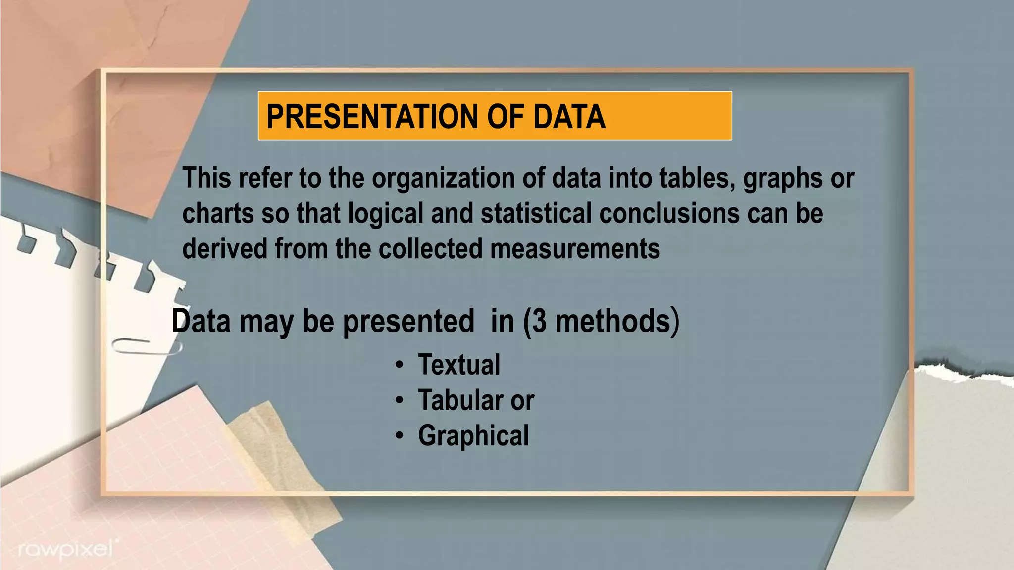
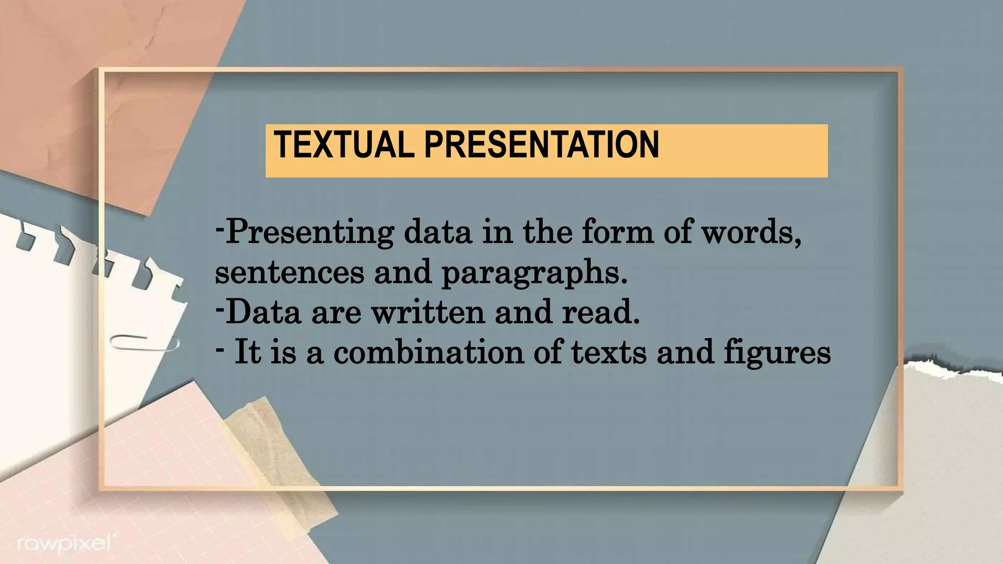
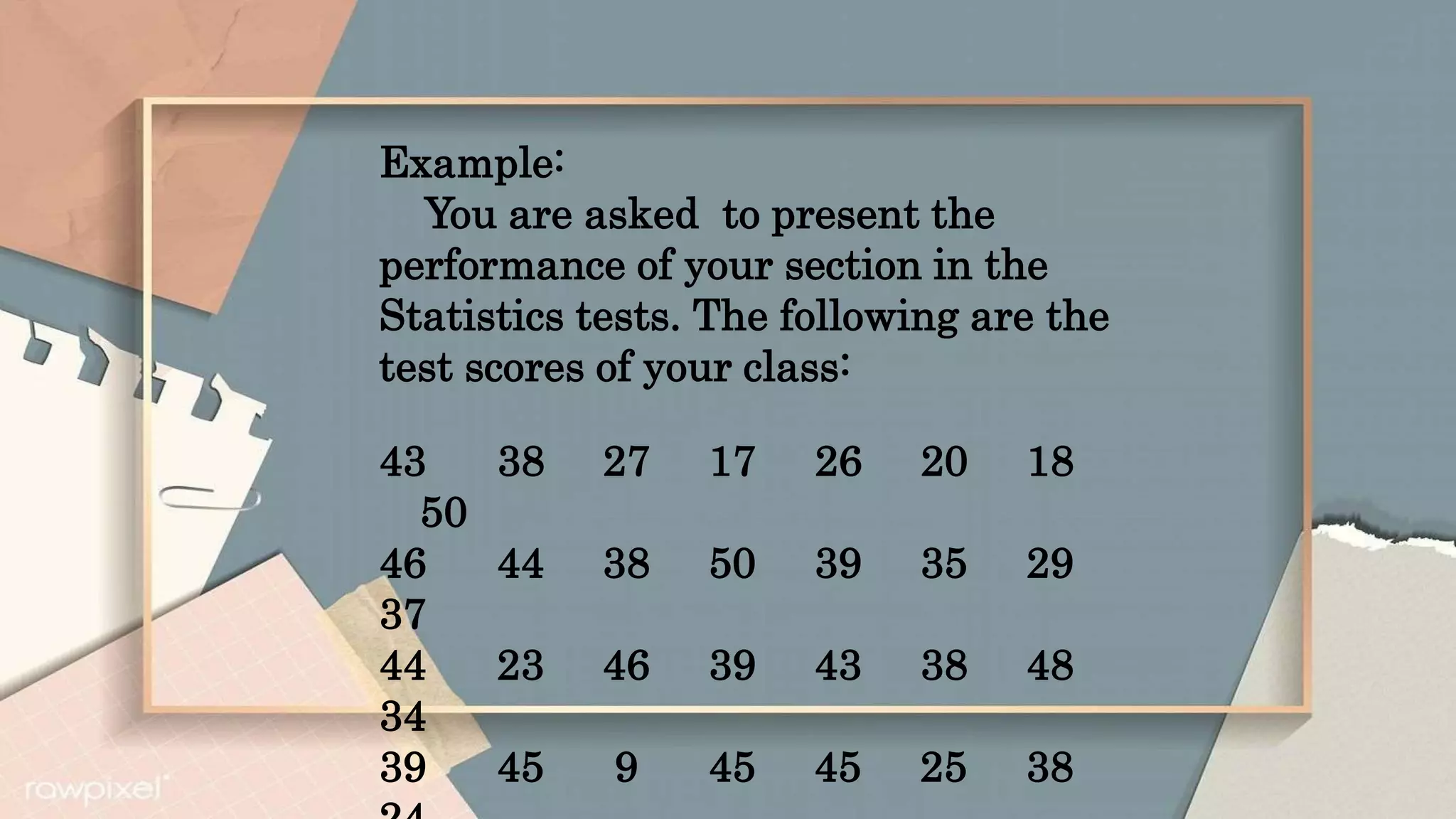
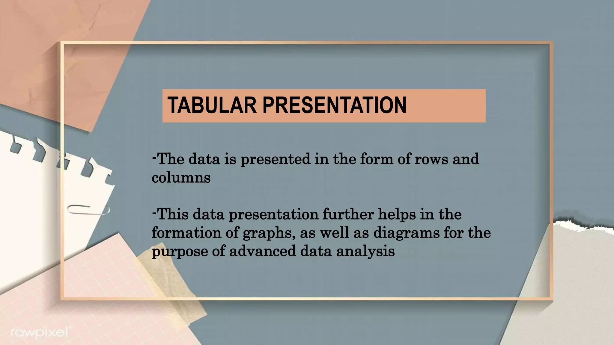
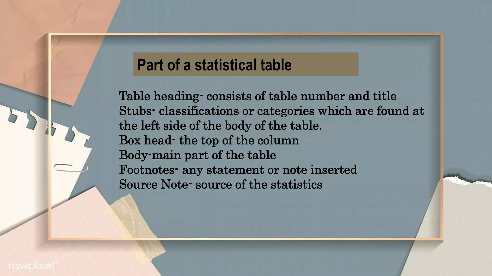
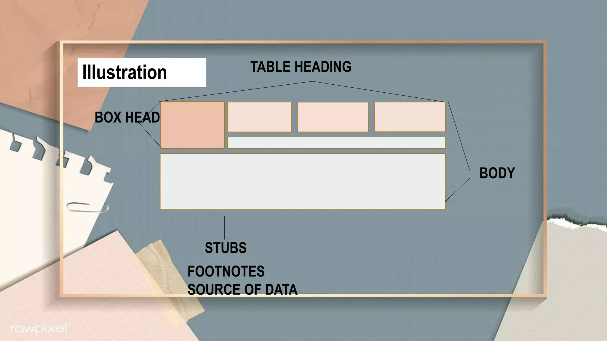
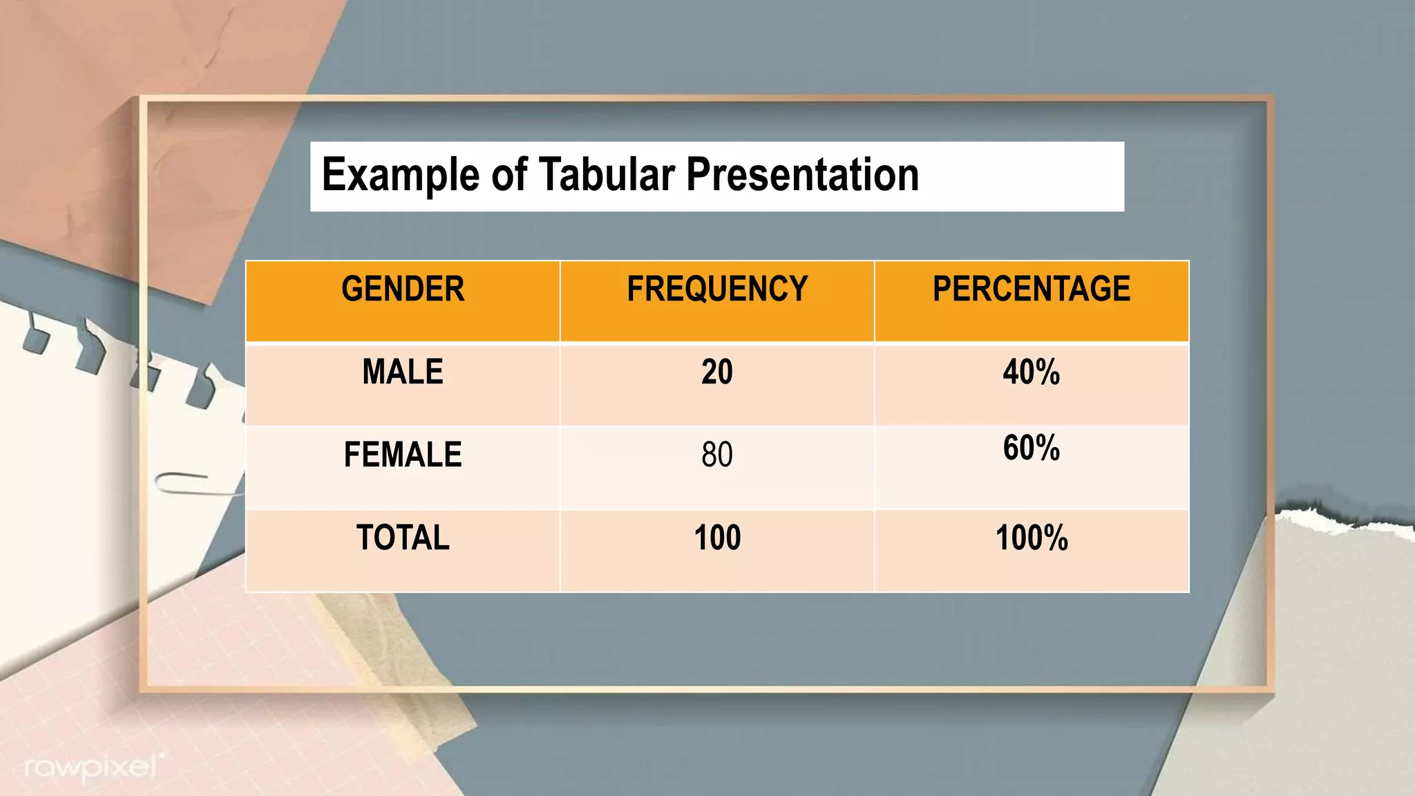
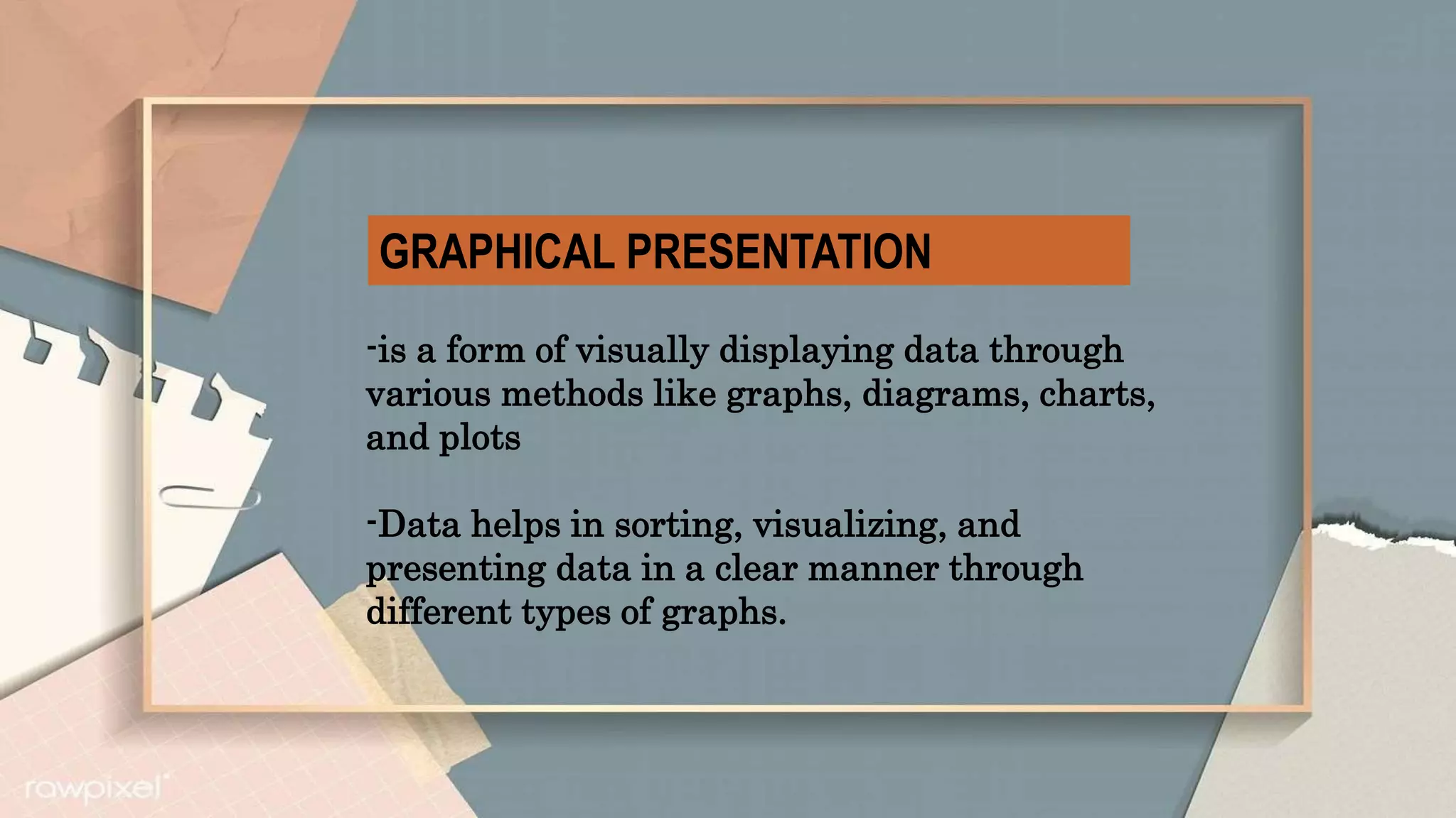
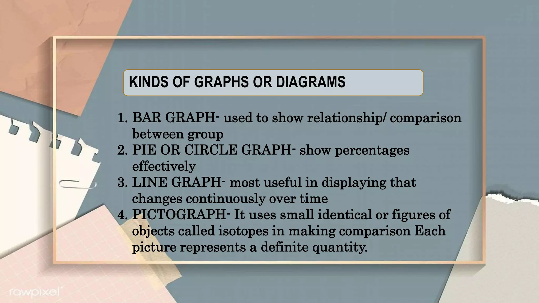
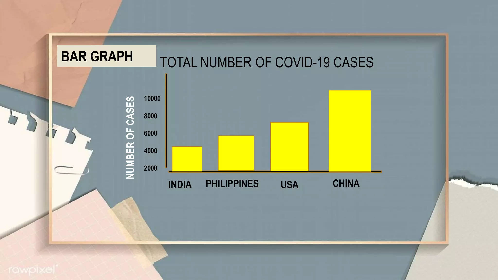
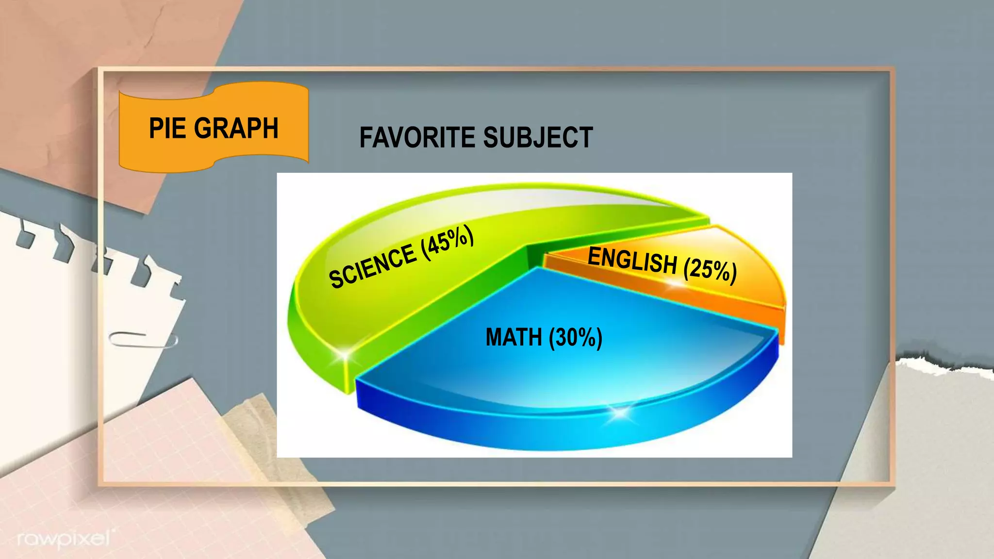
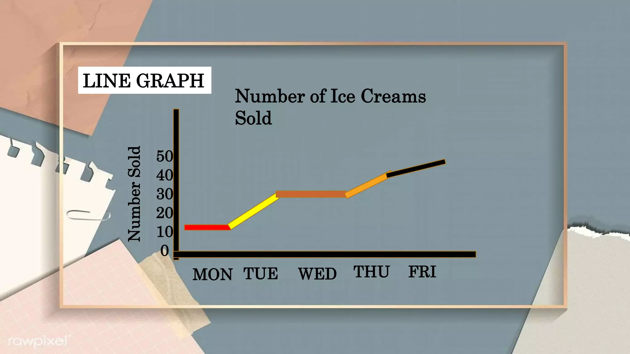
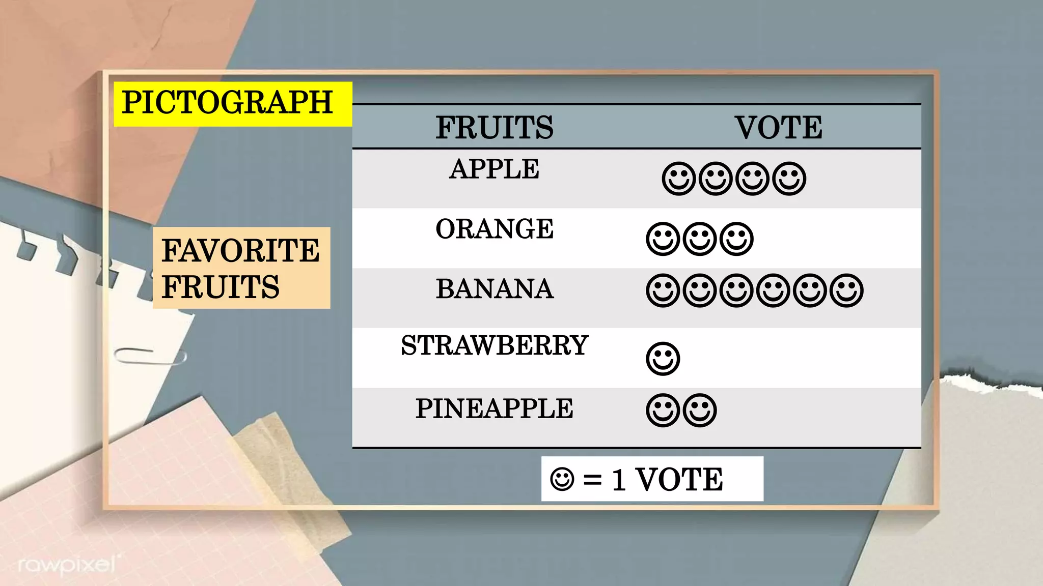
PRESENTATION OF DATA
RUFFA MAE BARCELONIA BEED2-
CONSTRUCTIVISM
PRESENTATION OF DATA
This refer to the organization of data into tables, graphs or
charts so that logical and statistical conclusions can be
derived from the collected measurements
Data may be presented in (3 methods)
• Textual
• Tabular or
• Graphical
TEXTUAL PRESENTATION
-Presenting data in the form of words,
sentences and paragraphs.
-Data are written and read.
- It is a combination of texts and figures
Example:
You are asked to present the
performance of your section in the
Statistics tests. The following are the
test scores of your class:
43 38 27 17 26 20 18
50
46 44 38 50 39 35 29
37
44 23 46 39 43 38 48
34
39 45 9 45 45 25 38
TABULAR PRESENTATION
-The data is presented in the form of rows and
columns
-This data presentation further helps in the
formation of graphs, as well as diagrams for the
purpose of advanced data analysis
Part of a statistical table
Table heading- consists of table number and title
Stubs- classifications or categories which are found at
the left side of the body of the table.
Box head- the top of the column
Body-main part of the table
Footnotes- any statement or note inserted
Source Note- source of the statistics
Illustration
BODY
TABLE HEADING
BOX HEAD
STUBS
FOOTNOTES
SOURCE OF DATA
Example of Tabular Presentation
GENDER FREQUENCY PERCENTAGE
MALE 20 40%
FEMALE 80 60%
TOTAL 100 100%
GRAPHICAL PRESENTATION
-is a form of visually displaying data through
various methods like graphs, diagrams, charts,
and plots
-Data helps in sorting, visualizing, and
presenting data in a clear manner through
different types of graphs.
KINDS OF GRAPHS OR DIAGRAMS
1. BAR GRAPH- used to show relationship/ comparison
between group
2. PIE OR CIRCLE GRAPH- show percentages
effectively
3. LINE GRAPH- most useful in displaying that
changes continuously over time
4. PICTOGRAPH- It uses small identical or figures of
objects called isotopes in making comparison Each
picture represents a definite quantity.
BAR GRAPH
10000
8000
6000
4000
2000
TOTAL NUMBER OF COVID-19 CASES
CHINA
USA
PHILIPPINES
INDIA
NUMBER
OF
CASES
PIE GRAPH FAVORITE SUBJECT
MATH (30%)
LINE GRAPH
Number of Ice Creams
Sold
50
40
30
20
10
0
MON TUE WED THU FRI
Number
Sold
PICTOGRAPH
FRUITS VOTE
APPLE

ORANGE

BANANA 
STRAWBERRY

PINEAPPLE 
 = 1 VOTE
FAVORITE
FRUITS

PRESENTATION OF DATA.pptx

  • 1.
    PRESENTATION OF DATA RUFFAMAE BARCELONIA BEED2- CONSTRUCTIVISM
  • 2.
    PRESENTATION OF DATA Thisrefer to the organization of data into tables, graphs or charts so that logical and statistical conclusions can be derived from the collected measurements Data may be presented in (3 methods) • Textual • Tabular or • Graphical
  • 3.
    TEXTUAL PRESENTATION -Presenting datain the form of words, sentences and paragraphs. -Data are written and read. - It is a combination of texts and figures
  • 4.
    Example: You are askedto present the performance of your section in the Statistics tests. The following are the test scores of your class: 43 38 27 17 26 20 18 50 46 44 38 50 39 35 29 37 44 23 46 39 43 38 48 34 39 45 9 45 45 25 38
  • 5.
    TABULAR PRESENTATION -The datais presented in the form of rows and columns -This data presentation further helps in the formation of graphs, as well as diagrams for the purpose of advanced data analysis
  • 6.
    Part of astatistical table Table heading- consists of table number and title Stubs- classifications or categories which are found at the left side of the body of the table. Box head- the top of the column Body-main part of the table Footnotes- any statement or note inserted Source Note- source of the statistics
  • 7.
  • 8.
    Example of TabularPresentation GENDER FREQUENCY PERCENTAGE MALE 20 40% FEMALE 80 60% TOTAL 100 100%
  • 9.
    GRAPHICAL PRESENTATION -is aform of visually displaying data through various methods like graphs, diagrams, charts, and plots -Data helps in sorting, visualizing, and presenting data in a clear manner through different types of graphs.
  • 10.
    KINDS OF GRAPHSOR DIAGRAMS 1. BAR GRAPH- used to show relationship/ comparison between group 2. PIE OR CIRCLE GRAPH- show percentages effectively 3. LINE GRAPH- most useful in displaying that changes continuously over time 4. PICTOGRAPH- It uses small identical or figures of objects called isotopes in making comparison Each picture represents a definite quantity.
  • 11.
    BAR GRAPH 10000 8000 6000 4000 2000 TOTAL NUMBEROF COVID-19 CASES CHINA USA PHILIPPINES INDIA NUMBER OF CASES
  • 12.
    PIE GRAPH FAVORITESUBJECT MATH (30%)
  • 13.
    LINE GRAPH Number ofIce Creams Sold 50 40 30 20 10 0 MON TUE WED THU FRI Number Sold
  • 14.