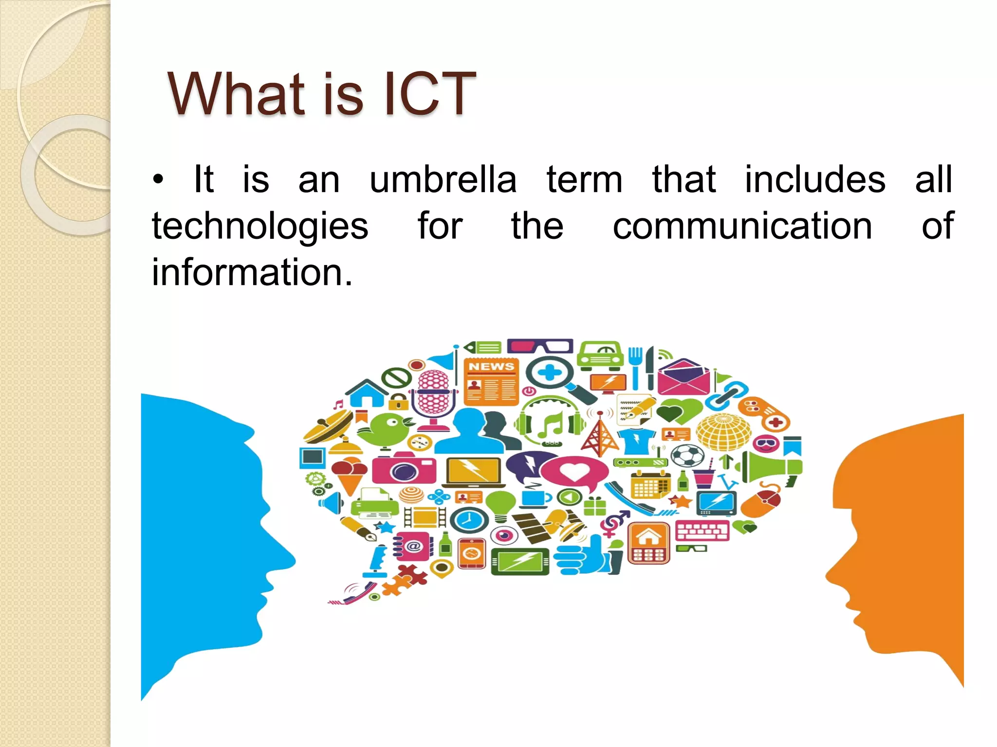
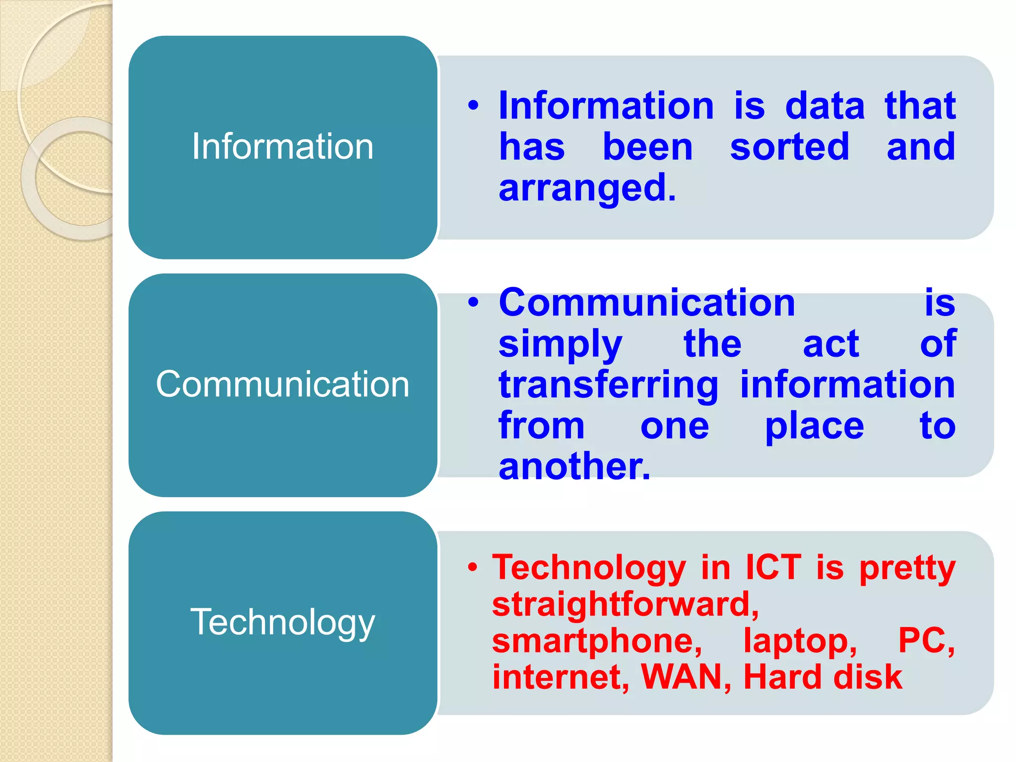
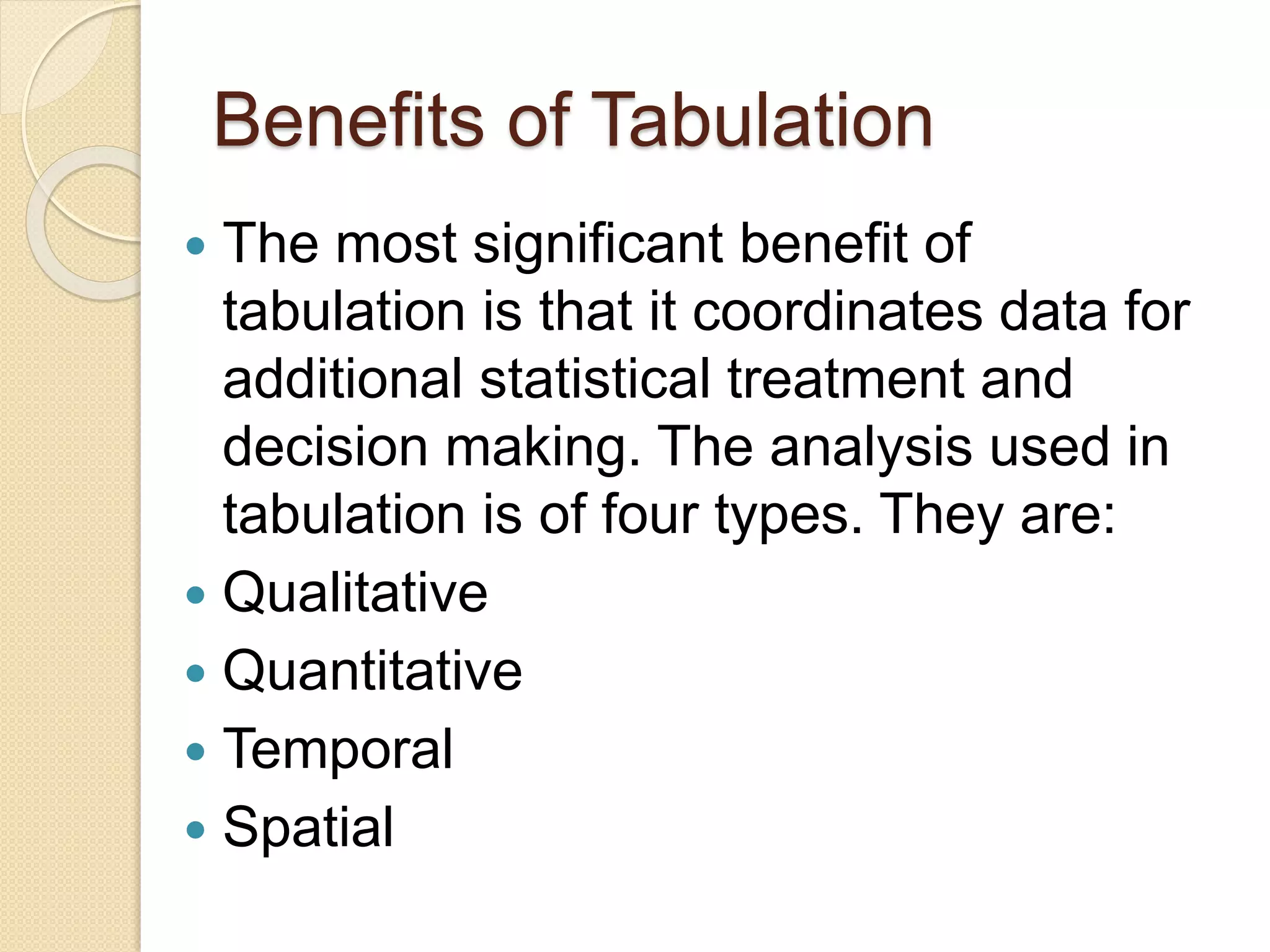
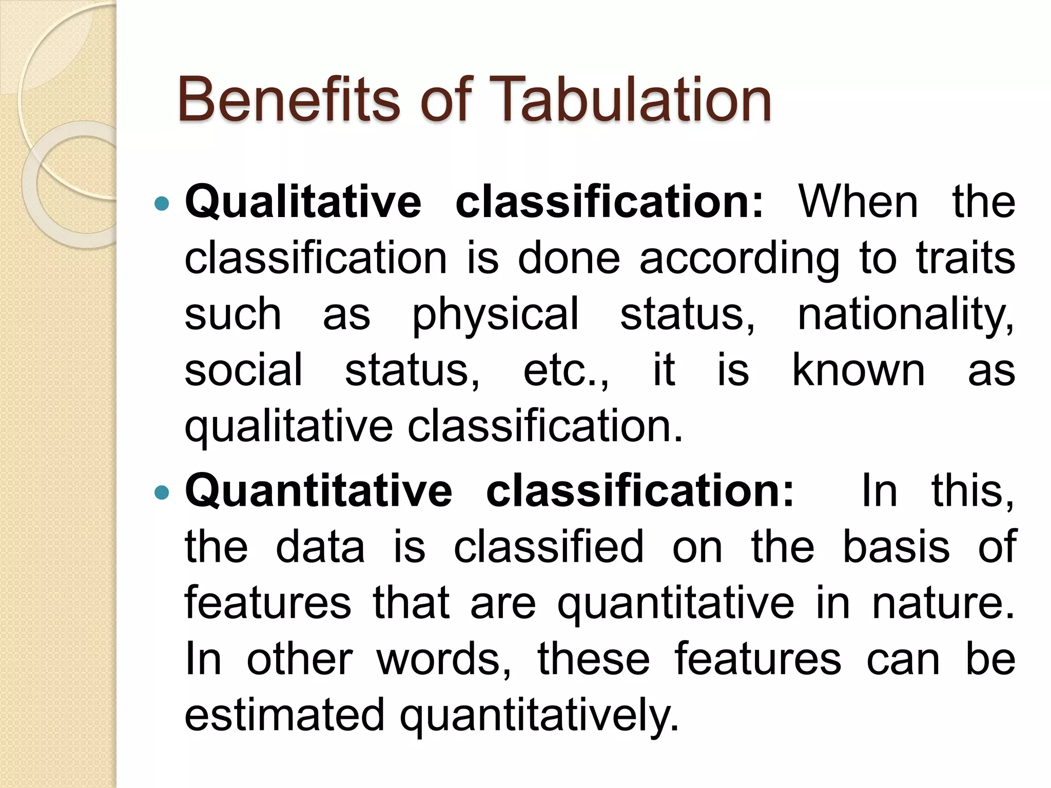
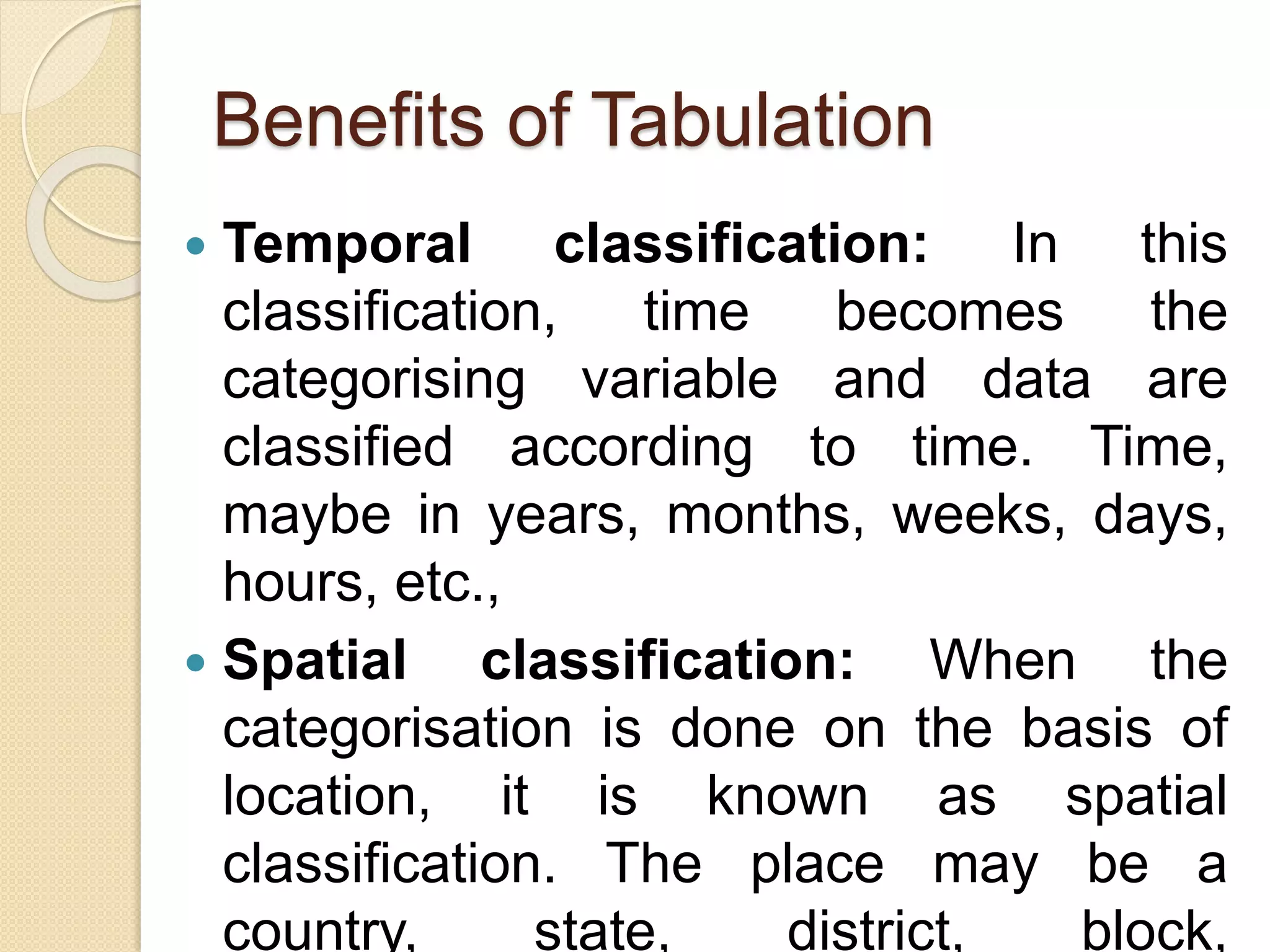
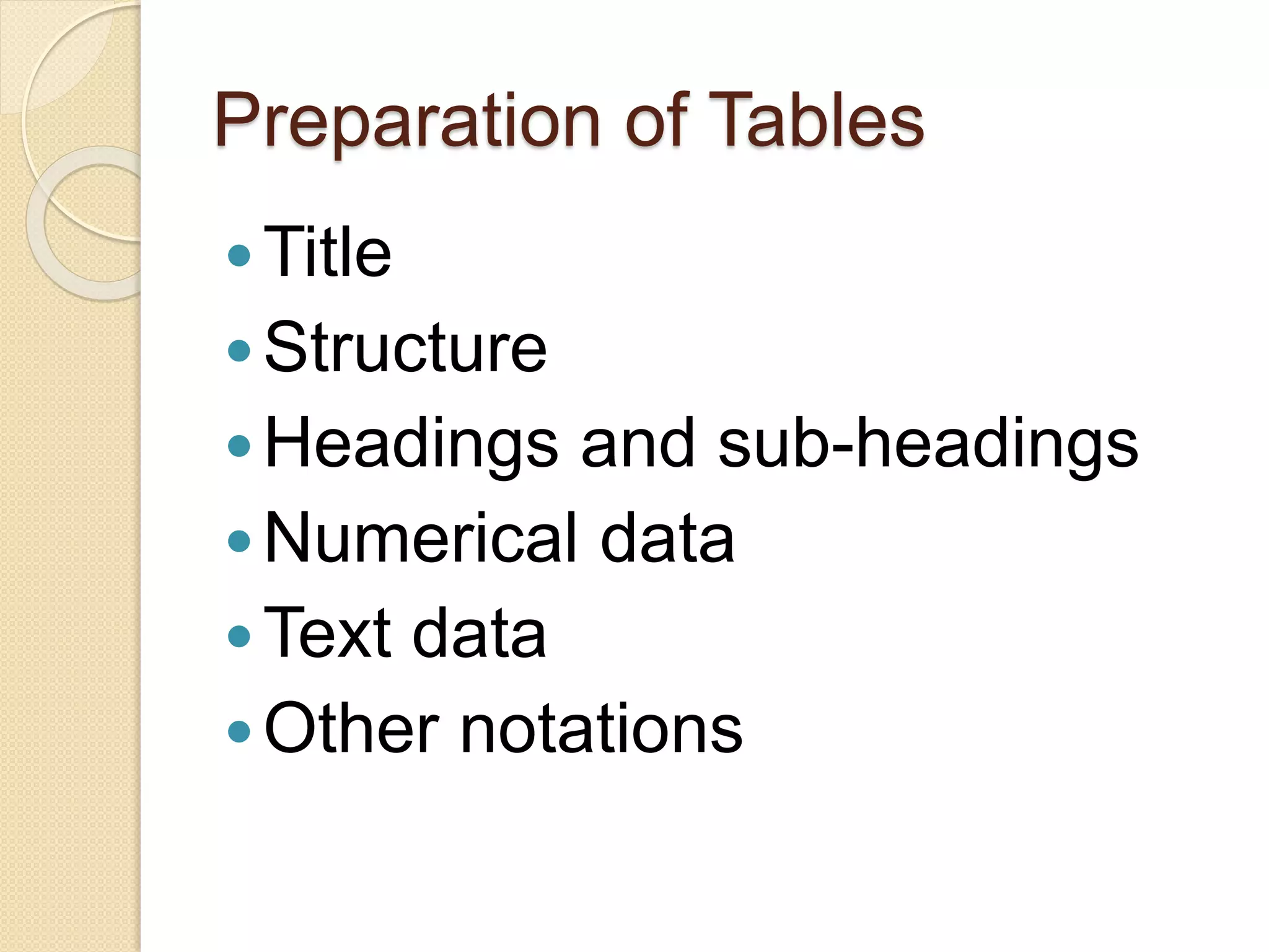
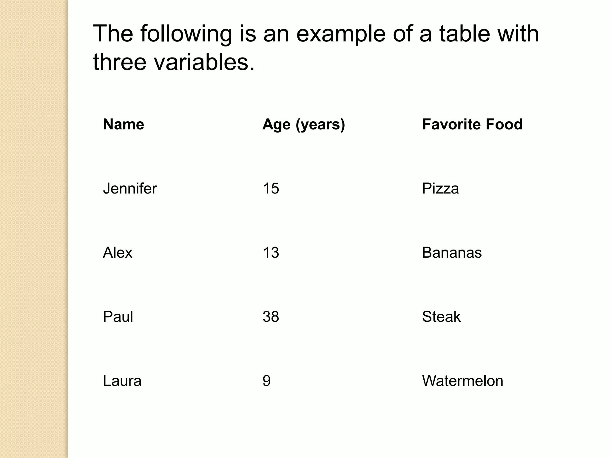
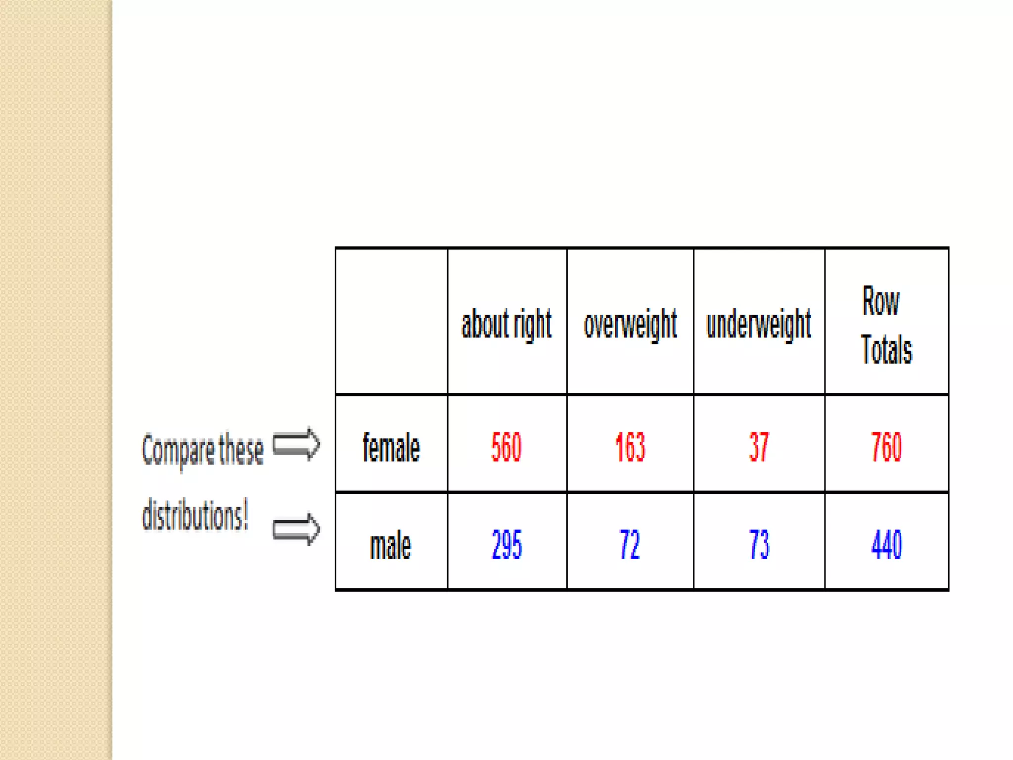
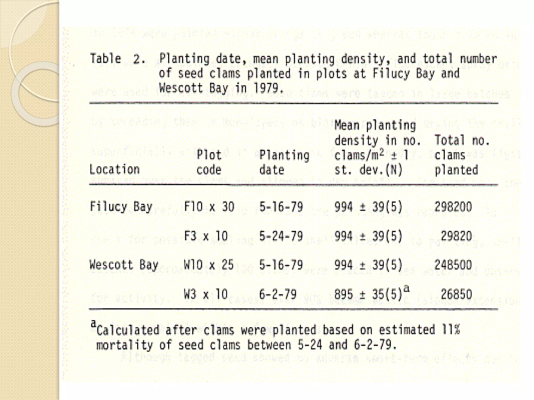
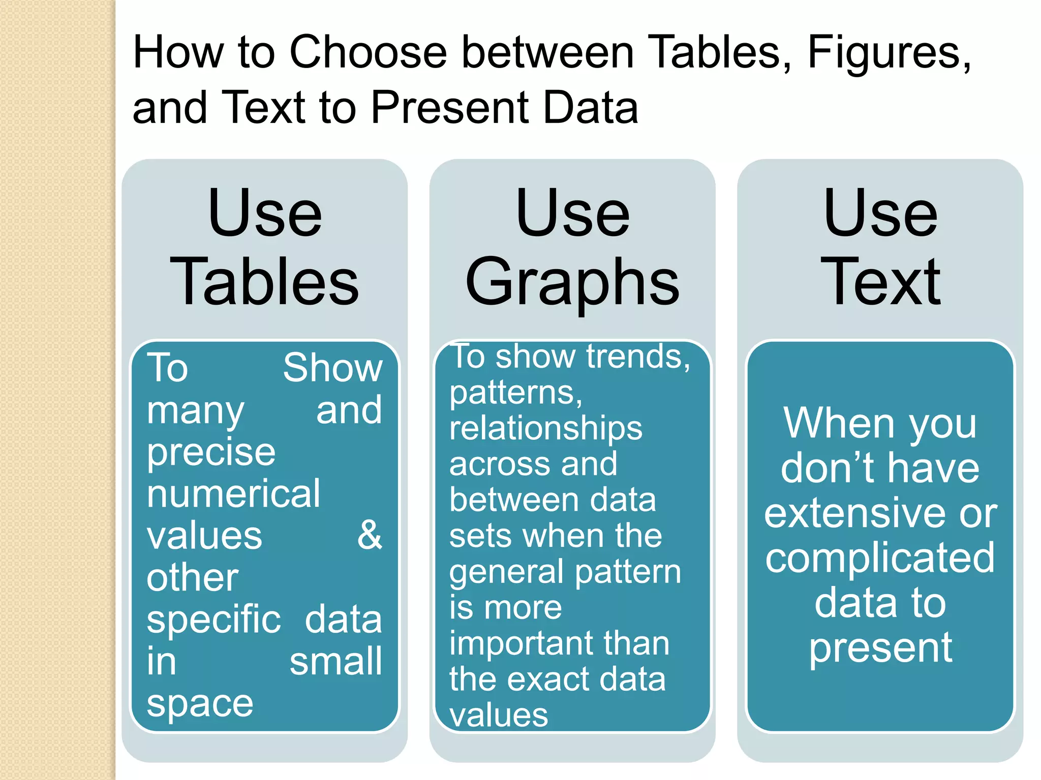
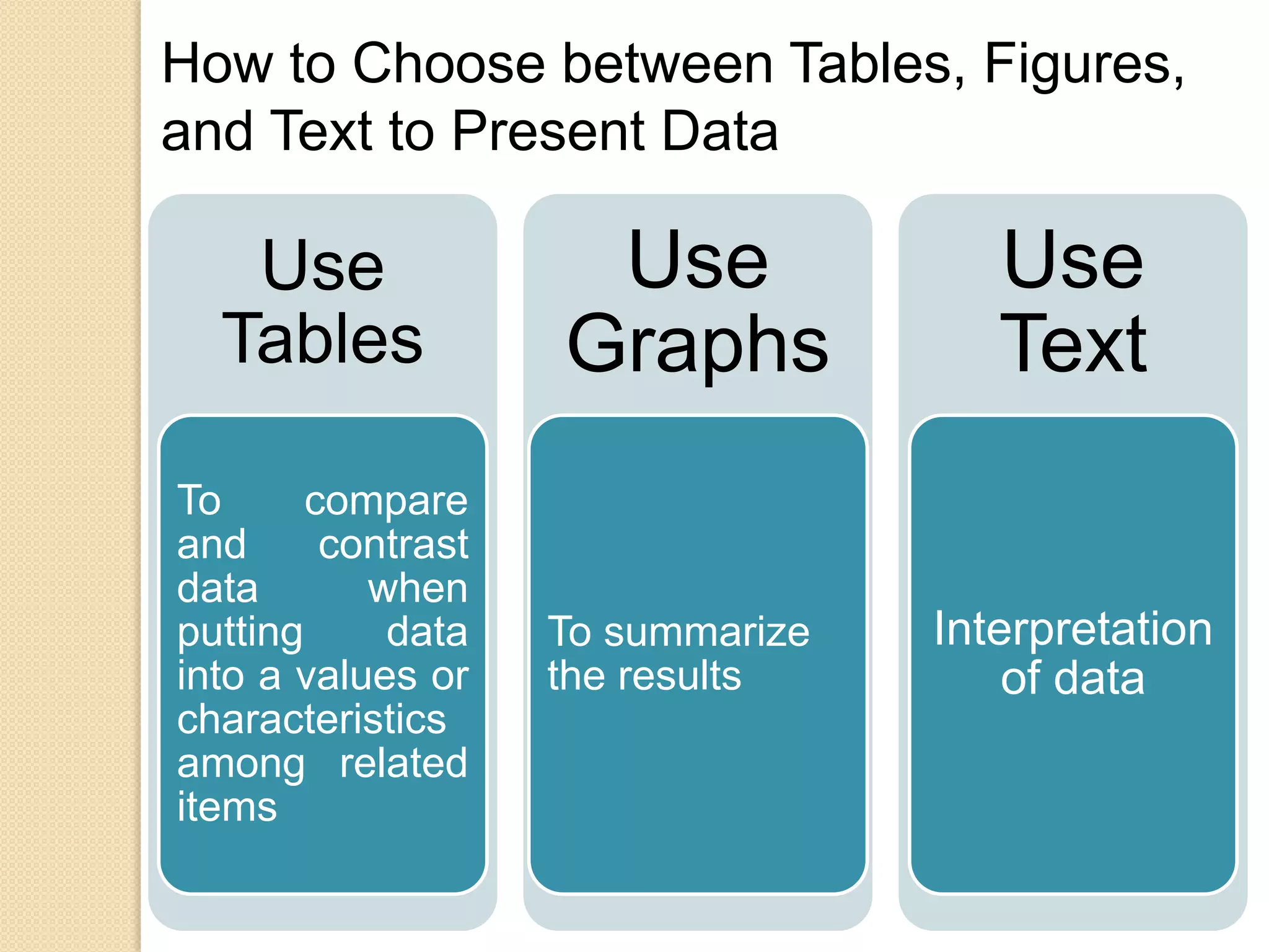
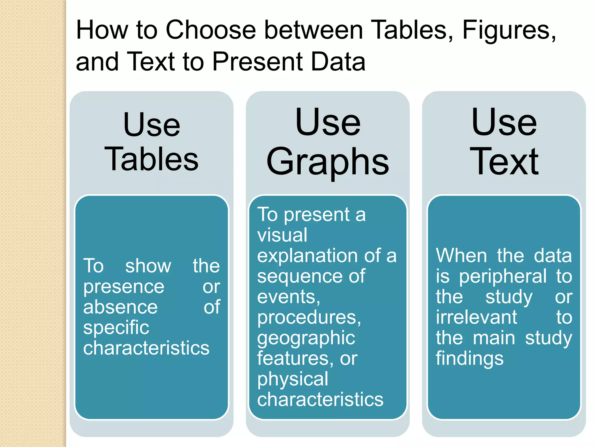
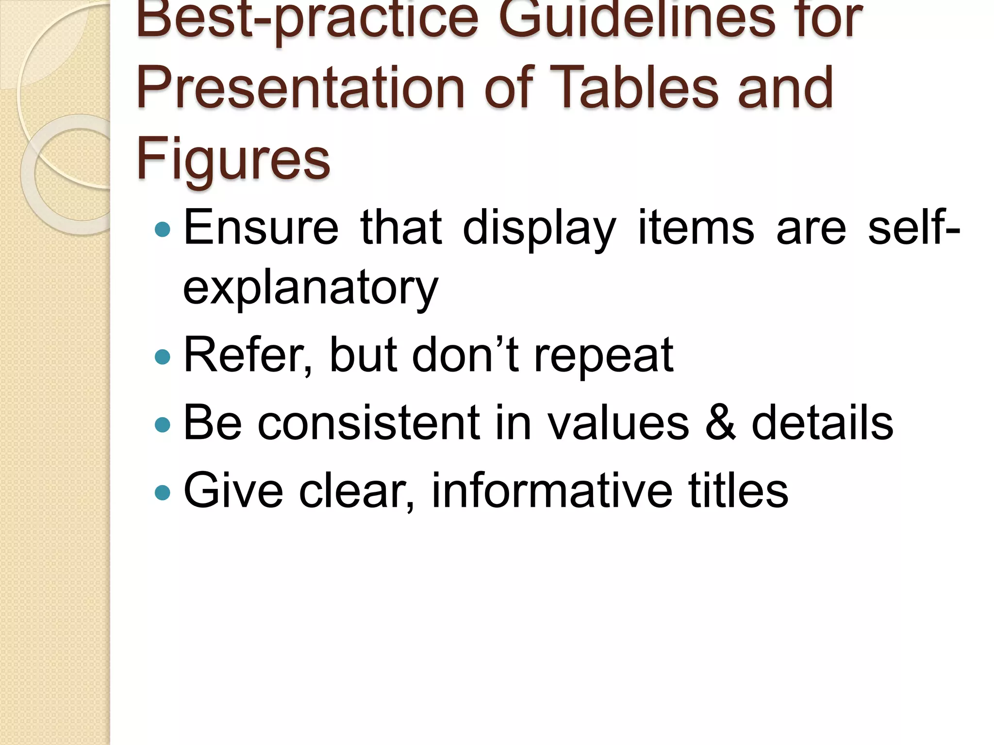
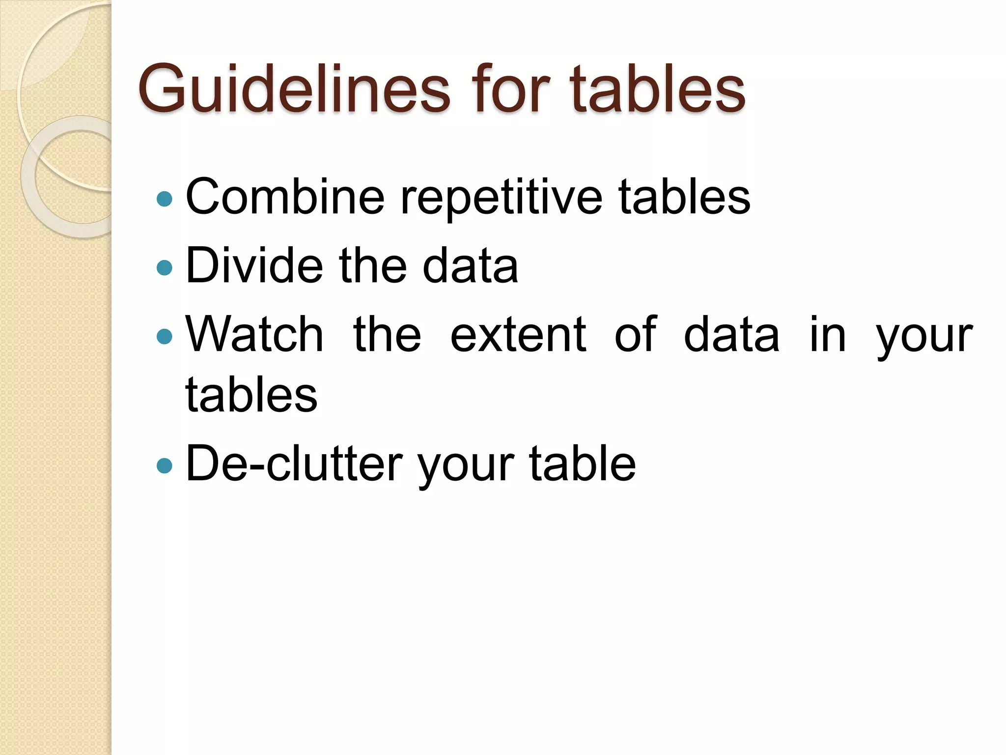
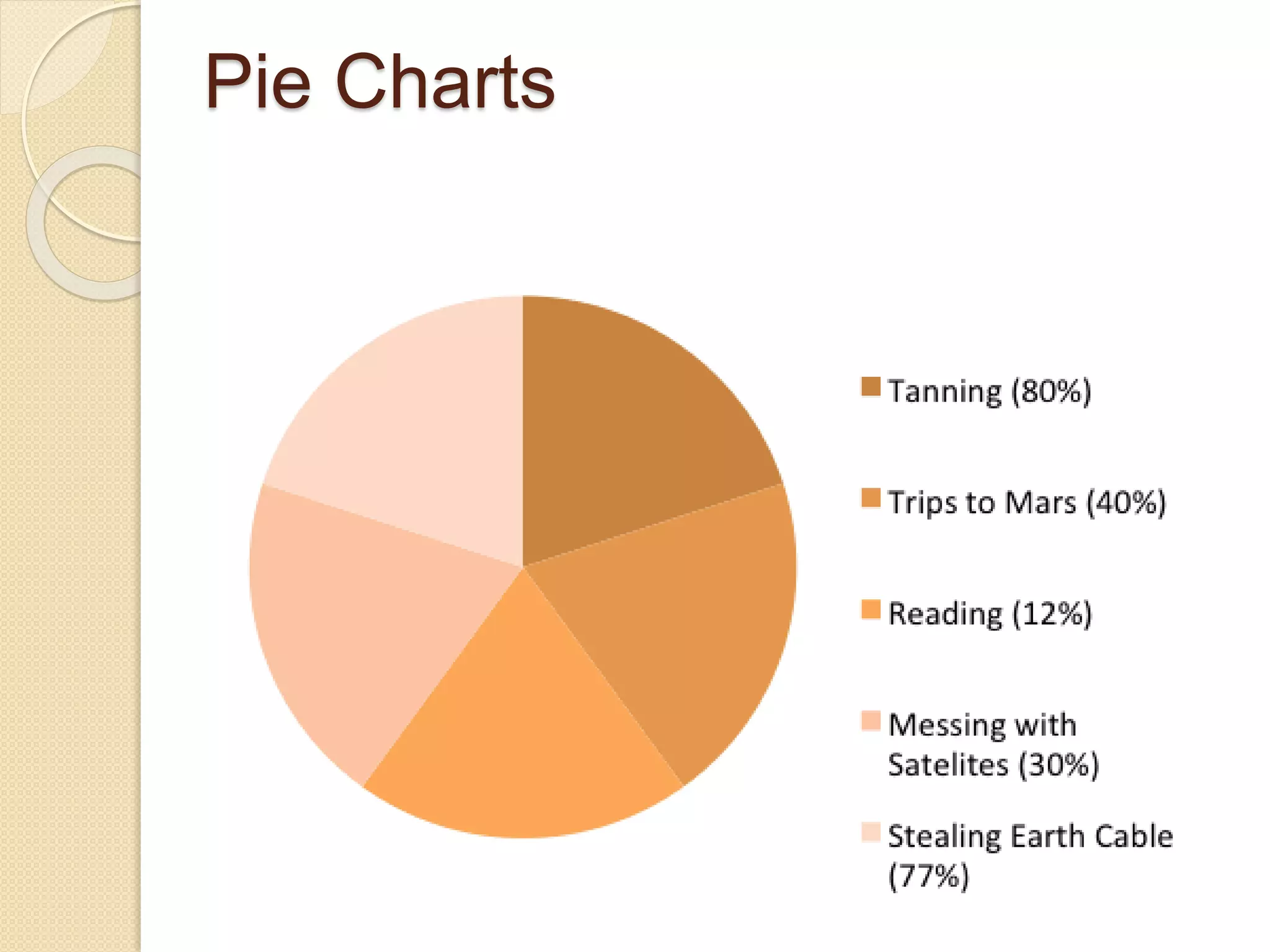
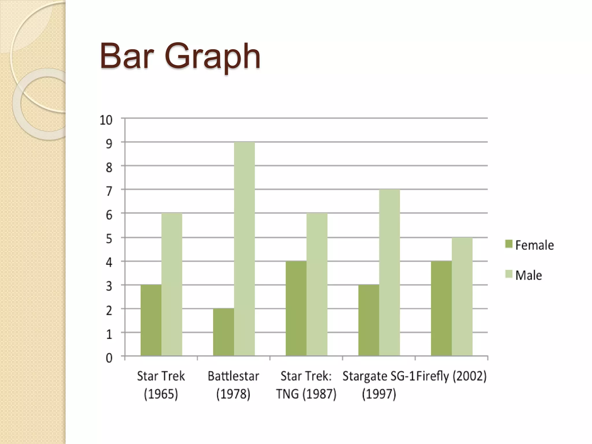
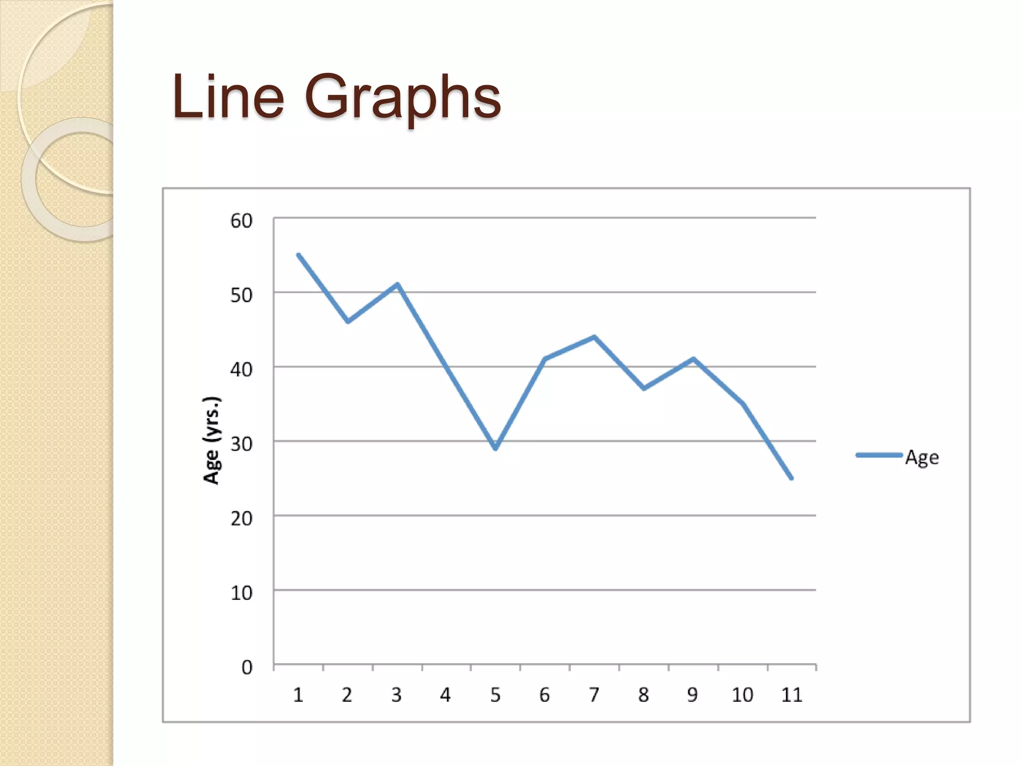
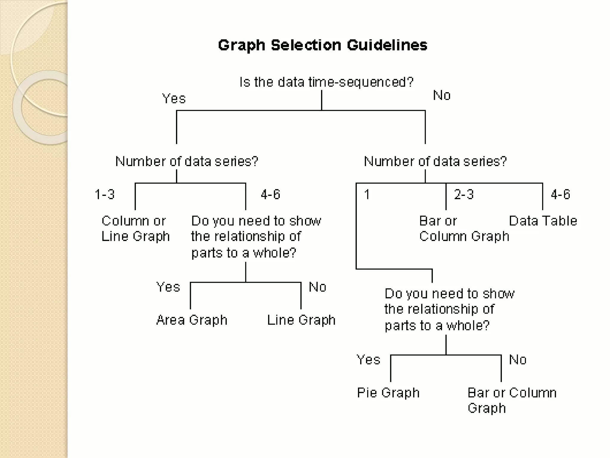
Use of ICT in Presentation of
figures, design, graphs, table
By Dr. Pratibha Sagar
What is ICT
• It is an umbrella term that includes all
technologies for the communication of
information.
• Information is data that
has been sorted and
arranged.
Information
• Communication is
simply the act of
transferring information
from one place to
another.
Communication
• Technology in ICT is pretty
straightforward,
smartphone, laptop, PC,
internet, WAN, Hard disk
Technology
ICT Definition
ICT stand for information and
communication technologies and
is defined, as a "diverse set of
technological tools and
resources used to communicate,
and to create, disseminate,
store, and manage information.
Presentation of Tables
A Table refers to any data
which is presented in orderly
rows across and/or down the
page, often enclosed within
borders.
They are compatible with
numerical data, as well as with
text information.
Presentation of Tables
 Tables are a versatile organization
tool and can be used to
communicate information on their
own, or they can be used to
accompany another data
representation type (like a graph).
 Tables support a variety of
parameters and can be used to
keep track of frequencies, variable
Benefits of Tabulation
 The most significant benefit of
tabulation is that it coordinates data for
additional statistical treatment and
decision making. The analysis used in
tabulation is of four types. They are:
 Qualitative
 Quantitative
 Temporal
 Spatial
Benefits of Tabulation
 Qualitative classification: When the
classification is done according to traits
such as physical status, nationality,
social status, etc., it is known as
qualitative classification.
 Quantitative classification: In this,
the data is classified on the basis of
features that are quantitative in nature.
In other words, these features can be
estimated quantitatively.
Benefits of Tabulation
 Temporal classification: In this
classification, time becomes the
categorising variable and data are
classified according to time. Time,
maybe in years, months, weeks, days,
hours, etc.,
 Spatial classification: When the
categorisation is done on the basis of
location, it is known as spatial
classification. The place may be a
country, state, district, block,
Preparation of Tables
Title
Structure
Headings and sub-headings
Numerical data
Text data
Other notations
Objectives Of Tabulation
To simplify the complex
data
To bring out essential
features of the data
To facilitate comparison
To facilitate statistical
analysis
Limitations of a Table
Lacks description
The table represents only
figures and not attributes.
It ignores the qualitative
aspects of the facts.
Limitations of a Table
Incapable of presenting
individual items
It does not present individual
items.
It presents aggregate data.
Limitations of a Table
Needs special knowledge
The understanding of the table
requires special knowledge.
It cannot be easily used by a
layman.
Name Age (years) Favorite Food
Jennifer 15 Pizza
Alex 13 Bananas
Paul 38 Steak
Laura 9 Watermelon
The following is an example of a table with
three variables.
Presentation of
Graphs/Figures
A Figure refers to any other
form of presentation such as a
bar or pie chart, a graph, a
diagram, a map, a photograph,
a line drawing or a sample of
material.
Presentation of
Graphs/Figures
Several studies, journal
guidelines, and discourses on
scientific writings affirm the
critical role that
tables, figures, and graphs
(or display items) play in
enhancing the quality of
manuscripts.
Presentation of
Graphs/Figures
 These visual elements help
 present detailed results and
complex relationships,
 patterns, and trends clearly and
concisely,
 reduce the length of the
manuscript
 enhance readers’ understanding
of the results
Presentation of
Graphs/Figures
But while well-presented tables
and figures can efficiently
capture and present
information, poorly crafted
tables and figures can confuse
readers and impair the
effectiveness.
How to Choose between Tables, Figures,
and Text to Present Data
Use
Tables
To Show
many and
precise
numerical
values &
other
specific data
in small
space
Use
Graphs
To show trends,
patterns,
relationships
across and
between data
sets when the
general pattern
is more
important than
the exact data
values
Use
Text
When you
don’t have
extensive or
complicated
data to
present
How to Choose between Tables, Figures,
and Text to Present Data
Use
Tables
To compare
and contrast
data when
putting data
into a values or
characteristics
among related
items
Use
Graphs
To summarize
the results
Use
Text
Interpretation
of data
How to Choose between Tables, Figures,
and Text to Present Data
Use
Tables
To show the
presence or
absence of
specific
characteristics
Use
Graphs
To present a
visual
explanation of a
sequence of
events,
procedures,
geographic
features, or
physical
characteristics
Use
Text
When the data
is peripheral to
the study or
irrelevant to
the main study
findings
Best-practice Guidelines for
Presentation of Tables and
Figures
 Ensure that display items are self-
explanatory
 Refer, but don’t repeat
 Be consistent in values & details
 Give clear, informative titles
Guidelines for tables
 Combine repetitive tables
 Divide the data
 Watch the extent of data in your
tables
 De-clutter your table
Graphs
 Every graph is a figure but not every
figure is a graph.
 Graphs are a particular set of figures
that display quantitative relationships
between variables.
Graphs
 Some of the most common graphs
include
 bar charts,
 frequency histograms,
 pie charts,
 scatter plots,
 line graphs,
Graphs
 each of it displays trends or
relationships within and among
datasets in a different way.
 You’ll need to carefully choose the
best graph for your data and the
relationship that you want to show.
 the main objective of graph is
communication.
Pie Charts
 Pie charts are used to show relative
proportions, specifically the
relationship of a number of parts to the
whole.
 Use pie charts only when the parts of
the pie are mutually exclusive
categories and the sum of parts adds
up to a meaningful whole (100% of
something).
 Pie charts are good at showing “big
Pie Charts
Bar Graph
 Bar graphs are also used to display
proportions.
 In particular, they are useful for
showing the relationship between
independent and dependent variables,
where the independent variables are
discrete (often nominal) categories.
Bar Graph
Scattered Plots
 Scatter plots are another way to
illustrate the relationship between two
variables.
 In this case, data are displayed as
points in an x,y coordinate system,
where each point represents
one observation along two axes of
variation.
Scattered Plots
 Often, scatter plots are used to
illustrate correlation between two
variables—as one variable increases,
the other increases (positive
correlation) or decreases (negative
correlation). However, correlation does
not necessarily imply that changes in
one variable cause changes in the
other
Scattered Plots
Line Graphs
 Line graphs are similar to scatter plots
in that they display data along two
axes of variation.
 Line graphs, however, plot a series of
related values that depict a change in
one variable as a function of another
Line Graphs
 Line graphs are similar to bar graphs,
but are better at showing the rate of
change between two points.
 Line graphs can also be used to
compare multiple dependent variables
by plotting multiple lines on the same
graph.
Line Graphs
Use-of-ICT-in-presentation.pdf

Use-of-ICT-in-presentation.pdf

  • 1.
    Use of ICTin Presentation of figures, design, graphs, table By Dr. Pratibha Sagar
  • 2.
    What is ICT •It is an umbrella term that includes all technologies for the communication of information.
  • 3.
    • Information isdata that has been sorted and arranged. Information • Communication is simply the act of transferring information from one place to another. Communication • Technology in ICT is pretty straightforward, smartphone, laptop, PC, internet, WAN, Hard disk Technology
  • 4.
    ICT Definition ICT standfor information and communication technologies and is defined, as a "diverse set of technological tools and resources used to communicate, and to create, disseminate, store, and manage information.
  • 6.
    Presentation of Tables ATable refers to any data which is presented in orderly rows across and/or down the page, often enclosed within borders. They are compatible with numerical data, as well as with text information.
  • 7.
    Presentation of Tables Tables are a versatile organization tool and can be used to communicate information on their own, or they can be used to accompany another data representation type (like a graph).  Tables support a variety of parameters and can be used to keep track of frequencies, variable
  • 8.
    Benefits of Tabulation The most significant benefit of tabulation is that it coordinates data for additional statistical treatment and decision making. The analysis used in tabulation is of four types. They are:  Qualitative  Quantitative  Temporal  Spatial
  • 9.
    Benefits of Tabulation Qualitative classification: When the classification is done according to traits such as physical status, nationality, social status, etc., it is known as qualitative classification.  Quantitative classification: In this, the data is classified on the basis of features that are quantitative in nature. In other words, these features can be estimated quantitatively.
  • 10.
    Benefits of Tabulation Temporal classification: In this classification, time becomes the categorising variable and data are classified according to time. Time, maybe in years, months, weeks, days, hours, etc.,  Spatial classification: When the categorisation is done on the basis of location, it is known as spatial classification. The place may be a country, state, district, block,
  • 11.
    Preparation of Tables Title Structure Headingsand sub-headings Numerical data Text data Other notations
  • 12.
    Objectives Of Tabulation Tosimplify the complex data To bring out essential features of the data To facilitate comparison To facilitate statistical analysis
  • 13.
    Limitations of aTable Lacks description The table represents only figures and not attributes. It ignores the qualitative aspects of the facts.
  • 14.
    Limitations of aTable Incapable of presenting individual items It does not present individual items. It presents aggregate data.
  • 15.
    Limitations of aTable Needs special knowledge The understanding of the table requires special knowledge. It cannot be easily used by a layman.
  • 16.
    Name Age (years)Favorite Food Jennifer 15 Pizza Alex 13 Bananas Paul 38 Steak Laura 9 Watermelon The following is an example of a table with three variables.
  • 19.
    Presentation of Graphs/Figures A Figurerefers to any other form of presentation such as a bar or pie chart, a graph, a diagram, a map, a photograph, a line drawing or a sample of material.
  • 20.
    Presentation of Graphs/Figures Several studies,journal guidelines, and discourses on scientific writings affirm the critical role that tables, figures, and graphs (or display items) play in enhancing the quality of manuscripts.
  • 21.
    Presentation of Graphs/Figures  Thesevisual elements help  present detailed results and complex relationships,  patterns, and trends clearly and concisely,  reduce the length of the manuscript  enhance readers’ understanding of the results
  • 22.
    Presentation of Graphs/Figures But whilewell-presented tables and figures can efficiently capture and present information, poorly crafted tables and figures can confuse readers and impair the effectiveness.
  • 23.
    How to Choosebetween Tables, Figures, and Text to Present Data Use Tables To Show many and precise numerical values & other specific data in small space Use Graphs To show trends, patterns, relationships across and between data sets when the general pattern is more important than the exact data values Use Text When you don’t have extensive or complicated data to present
  • 24.
    How to Choosebetween Tables, Figures, and Text to Present Data Use Tables To compare and contrast data when putting data into a values or characteristics among related items Use Graphs To summarize the results Use Text Interpretation of data
  • 25.
    How to Choosebetween Tables, Figures, and Text to Present Data Use Tables To show the presence or absence of specific characteristics Use Graphs To present a visual explanation of a sequence of events, procedures, geographic features, or physical characteristics Use Text When the data is peripheral to the study or irrelevant to the main study findings
  • 26.
    Best-practice Guidelines for Presentationof Tables and Figures  Ensure that display items are self- explanatory  Refer, but don’t repeat  Be consistent in values & details  Give clear, informative titles
  • 27.
    Guidelines for tables Combine repetitive tables  Divide the data  Watch the extent of data in your tables  De-clutter your table
  • 28.
    Graphs  Every graphis a figure but not every figure is a graph.  Graphs are a particular set of figures that display quantitative relationships between variables.
  • 29.
    Graphs  Some ofthe most common graphs include  bar charts,  frequency histograms,  pie charts,  scatter plots,  line graphs,
  • 30.
    Graphs  each ofit displays trends or relationships within and among datasets in a different way.  You’ll need to carefully choose the best graph for your data and the relationship that you want to show.  the main objective of graph is communication.
  • 31.
    Pie Charts  Piecharts are used to show relative proportions, specifically the relationship of a number of parts to the whole.  Use pie charts only when the parts of the pie are mutually exclusive categories and the sum of parts adds up to a meaningful whole (100% of something).  Pie charts are good at showing “big
  • 32.
  • 33.
    Bar Graph  Bargraphs are also used to display proportions.  In particular, they are useful for showing the relationship between independent and dependent variables, where the independent variables are discrete (often nominal) categories.
  • 34.
  • 35.
    Scattered Plots  Scatterplots are another way to illustrate the relationship between two variables.  In this case, data are displayed as points in an x,y coordinate system, where each point represents one observation along two axes of variation.
  • 36.
    Scattered Plots  Often,scatter plots are used to illustrate correlation between two variables—as one variable increases, the other increases (positive correlation) or decreases (negative correlation). However, correlation does not necessarily imply that changes in one variable cause changes in the other
  • 37.
  • 38.
    Line Graphs  Linegraphs are similar to scatter plots in that they display data along two axes of variation.  Line graphs, however, plot a series of related values that depict a change in one variable as a function of another
  • 39.
    Line Graphs  Linegraphs are similar to bar graphs, but are better at showing the rate of change between two points.  Line graphs can also be used to compare multiple dependent variables by plotting multiple lines on the same graph.
  • 40.