Download as PDF, PPTX


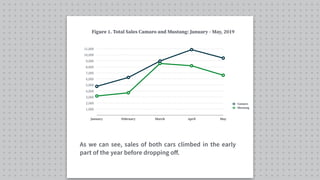


The document provides an overview of line graphs in technical writing, detailing their importance in showing relationships between variables, particularly changes over time. It describes how to create effective line graphs, analyze trends, and communicate findings clearly using examples of sales data for cars. The document emphasizes key practices for writing about line graphs, such as providing context, answering critical questions, and describing the data accurately.