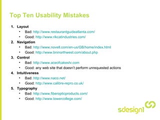
The document lists the top ten usability mistakes in web design:
1. Bad layouts that are confusing versus good clear layouts
2. Poor navigation versus intuitive easy to use navigation
3. Websites that perform unrequested actions versus those that don't
4. Intuitiveness - websites that are not intuitive and easy to use versus those that are
5. Poor typography versus easy to read typography
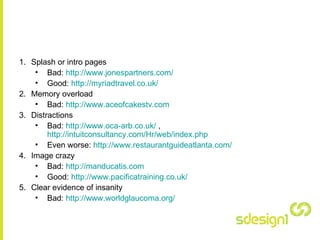
6. Splash/intro pages that slow users down versus quick loading pages
7. Overloading users with too much information versus concise focused content
8. Distracting elements versus clean focused design
The conclusion emphasizes that the design should make content easily accessible and not get in the