The following excel is based on real COVID-19 related data (as May 202.pdf
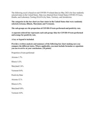
The following excel is based on real COVID-19 related data (as May 2021) for four randomly selected states in the United States. Data was obtained from United States COVID-19 Cases, Deaths, and Laboratory Testing (NAATs) by State, Territory, and Jurisdiction. The categories in the bar chart are four states in the United States that were randomly selected (Arizona, Illinois, Maryland, and Vermont). The sub-groups are the proportion of COVID-19 tests performed and positivity rate. A separate-colored bar represents each sub-group: blue for COVID-19 tests performed and orange for positivity rate. A key or legend is included. Provide a written analysis and summary of the following bar chart making sure you compare the different states. Where applicable, you must include formulas or equations you use to arrive at your conclusions. (10 points) Proportion of tests performed Arizona 1.7% Illinois 5.2% Maryland 2.4% Vermont 0.4% Positivity Rate Arizona 12.% Illinois 6.5% Maryland 9.0% Vermont 4.0% .

Recommended
Recommended
More Related Content
More from RyanGMMDickenss
More from RyanGMMDickenss (20)
Recently uploaded
Recently uploaded (20)
The following excel is based on real COVID-19 related data (as May 202.pdf
- 1. The following excel is based on real COVID-19 related data (as May 2021) for four randomly selected states in the United States. Data was obtained from United States COVID-19 Cases, Deaths, and Laboratory Testing (NAATs) by State, Territory, and Jurisdiction. The categories in the bar chart are four states in the United States that were randomly selected (Arizona, Illinois, Maryland, and Vermont). The sub-groups are the proportion of COVID-19 tests performed and positivity rate. A separate-colored bar represents each sub-group: blue for COVID-19 tests performed and orange for positivity rate. A key or legend is included. Provide a written analysis and summary of the following bar chart making sure you compare the different states. Where applicable, you must include formulas or equations you use to arrive at your conclusions. (10 points) Proportion of tests performed Arizona 1.7% Illinois 5.2% Maryland 2.4% Vermont 0.4% Positivity Rate Arizona 12.% Illinois 6.5% Maryland 9.0% Vermont 4.0%