The document discusses the design choices for a magazine, including adding multiple photos of Mia to create a retro photo booth feel and convey a hip-hop vibe. A large letter M was also included to reference the featured artist and match the black, white, and red color scheme. Care was taken to professionally line up columns on the pages to make the magazine appear polished. The final spread includes page numbers, lined-up columns, an introductory section, and a quotation mark to engage readers and make them want to read the interview.
NewcastleGateshead Initiative partner update meeting 25 Feb 2016newcastlegateshead
Slides from NewcastleGateshead Initiative's Partner Update Meeting at BALTIC Centre for Contemporary Art on Friday 26 February 2016, including presentations on NewcastleGateshead Initiative's plans for 2016/17 and on the devolution agreement for the North East by Helen Dickinson from Newcastle City Council.
West egfr mutation acquired resistanceH. Jack West
Review by Dr. H. Jack West of current understanding of mechanisms behind and emerging treatment options for patients with advanced NSCLC with acquired resistance to EGFR tyrosine kinase inhibitors after a good initial response.
West Immunotherapy, Vaccines for Lung Cancer Mage-A3, Stimuvax, and LucanixH. Jack West
Update of results and current clinical trials of vaccines for lung cancer, including MAGE-A3, Stimuvax, and Lucanix for stage I-III non-small cell lung cancer. @JackWestMD, @CancerGRACE cancerGRACE.org
Changes Afoot: Changing Relationships between Engaged Patients and Docs in Ca...H. Jack West
Discussion of how online patient communities and social media are changing relationships between engaged patients and oncologists, improving quality of cancer care.
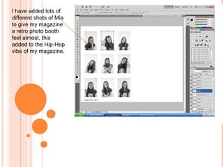
1. I have added lots of
different shots of Mia
to give my magazine
a retro photo booth
feel almost, this
added to the Hip-Hop
vibe of my magazine.
2. I have added a
large M to my
page, as this
links to my
feature artist as
well as the
black, white and
red colour
scheme my
magazine has.
3. I took my a
while to line up
the different
columns on my
magazine and
make them
appear really
professional.
4. For my final
double page
spread, I have
added the page
number at the
bottom of the
page. I also lined
up all my
columns and
added an
introduction
section at the top
of the page.
Finally I have
added a
quotation mark in
the middle of the
page to engage
my target
audience and
make them want
to read the
interview.