This document provides an outline of statistical techniques for describing data and performing statistical inference. It includes sections on graphical and numerical descriptive statistics, probability, random variables, sampling distributions, estimation, hypothesis testing, inference for means, proportions and variances, analysis of variance, regression, and chi-squared tests. Each statistical procedure is briefly described and the corresponding section or page number is provided. Several optional application sections illustrate how various statistical methods can be applied in fields like finance, marketing, and operations management.


![M I N I T A B
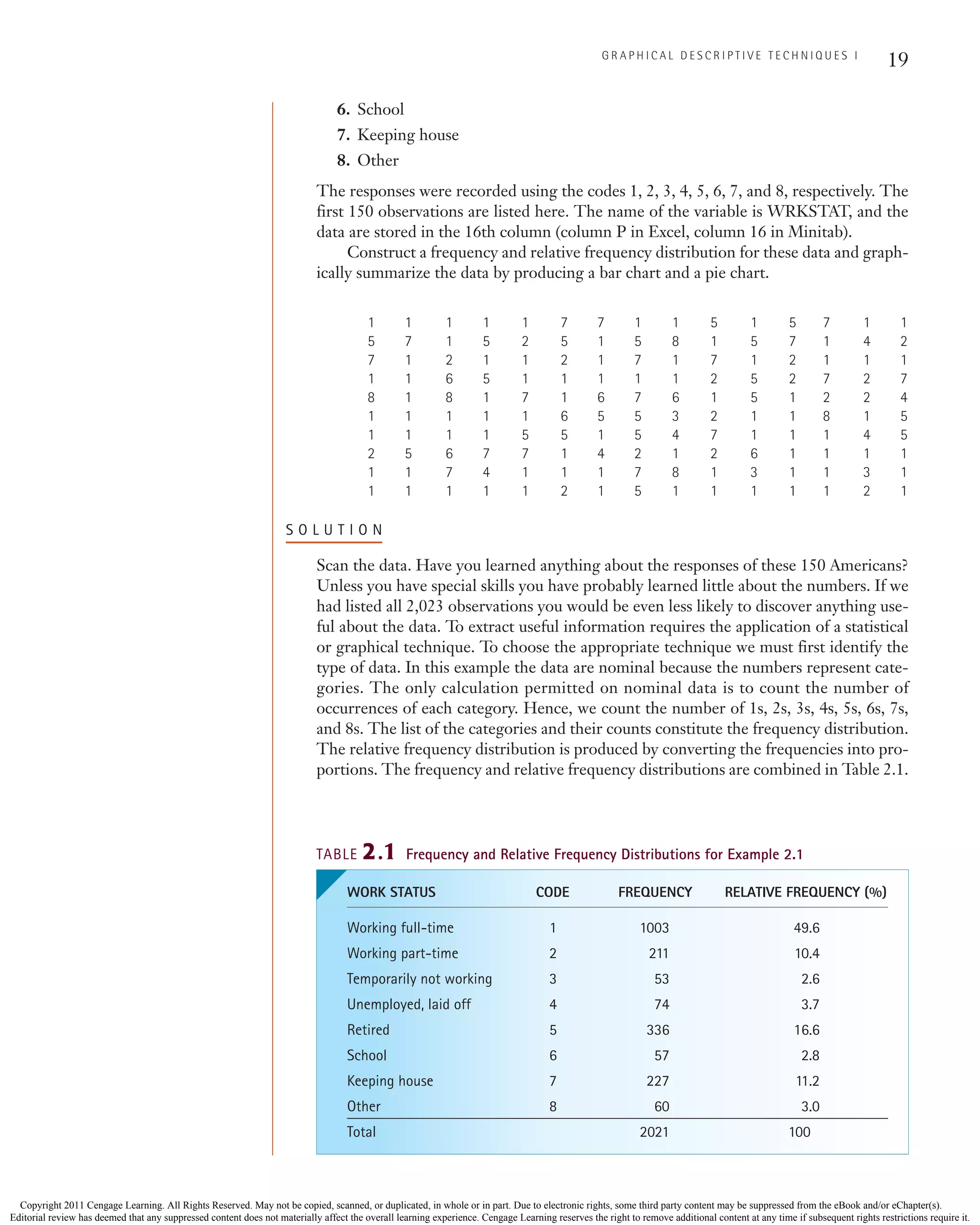
WRKSTAT Count Percent
1 1003 49.63
2 211 10.44
3 53 2.62
4 74 3.66
5 336 16.63
6 57 2.82
7 227 11.23
8 60 2.97
N 2021
* 2
I N S T R U C T I O N S
(Specific commands for this example are highlighted.)
1. Type or import the data into one column. (Open GSS2008.)
2. Click Stat, Tables, and Tally Individual Variables.
3. Type or use the Select button to specify the name of the variable or the column where
the data are stored in the Variables box (WRKSTAT). Under Display, click Counts
and Percents.
20 C H A P T E R 2
There were two individuals who refused to answer hence the number of observations is
the sample size 2,023 minus 2, which equals 2,021.
As we promised in Chapter 1 (and the preface), we demonstrate the solution of all
examples in this book using three approaches (where feasible): manually, using Excel,
and using Minitab. For Excel and Minitab, we provide not only the printout but also
instructions to produce them.
E X C E L
I N S T R U C T I O N S
(Specific commands for this example are highlighted.)
1. Type or import the data into one or more columns. (Open GSS2008.)
2. Activate any empty cell and type
=COUNTIF ([Input range], [Criteria])
Input range are the cells containing the data. In this example, the range is P1:P2024.
The criteria are the codes you want to count: (1) (2) (3) (4) (5) (6) (7) (8). To count the
number of 1s (“Working full-time”), type
=COUNTIF (P1:P2024, 1)
and the frequency will appear in the dialog box. Change the criteria to produce the fre-
quency of the other categories.
CH002.qxd 11/22/10 6:14 PM Page 20
Copyright 2011 Cengage Learning. All Rights Reserved. May not be copied, scanned, or duplicated, in whole or in part. Due to electronic rights, some third party content may be suppressed from the eBook and/or eChapter(s).
Editorial review has deemed that any suppressed content does not materially affect the overall learning experience. Cengage Learning reserves the right to remove additional content at any time if subsequent rights restrictions require it.](https://image.slidesharecdn.com/statisticsformanagementandeconomics9th-keller-220530153509-886c47c9/75/Statistics-for-Management-and-Economics-9th-Keller-pdf-50-2048.jpg)


![Steel Steel
Country production Country production
Belgium 10.7 Mexico 17.2
Brazil 33.7 Poland 9.7
Canada 14.8 Russia 68.5
China 500.5 South Korea 53.6
France 17.9 Spain 18.6
Germany 45.8 Taiwan 19.9
India 55.2 Turkey 26.8
Iran 10 Ukraine 37.1
Italy 30.6 United Kingdom 13.5
Japan 118.7 United States 91.4
Source: World Steel Association.
2.18 Xr02-18 In 2003 (latest figures available) the United
States generated 251.3 million tons of garbage. The
following table lists the amounts by source. Use one
or more graphical techniques to present these figures.
Amount
Source (millions of tons)
Paper and paperboard 85.2
Glass 13.3
Metals 19.1
Plastics 29.4
Rubber and leather 6.5
Textiles 11.8
Wood 13.8
Food scraps 31.2
Yard trimmings 32.4
Other 8.6
Source: Statistical Abstract of the United States, 2009, Table 361.
2.19 Xr02-19 In the last five years, the city of Toronto has
intensified its efforts to reduce the amount of
garbage that is taken to landfill sites. [Currently, the
Greater Toronto Area (GTA) disposes of its garbage
in a dump site in Michigan.] A current analysis of
GTA reveals that 36% of waste collected is taken
from residences and 64% from businesses and public
institutions (hospitals, schools, universities, etc.). A
further breakdown is listed below. (Source: Toronto
City Summit Alliance.)
a. Draw a pie chart for residential waste including
both recycled and disposed waste.
b. Repeat part (a) for nonresidential waste.
Residential
Recycled Pct Disposed Pct
Recycled Plastic 1% Plastic 7%
Recycled Glass 3% Paper 12%
Recycled Paper 14% Metal 2%
Recycled Metal 1% Organic 23%
Recycled Organic/ Other 17%
Food 7%
Recycled Organic/
Yard 10%
Recycled Other 4%
Non-Residential
Recycled Pct Disposed Pct
Recycled Glass 1% Plastic 10%
Recycled Paper 11% Glass 3%
Recycled Metal 3% Paper 31%
Recycled Organic 1% Metal 8%
Recycled Constru- Organic 18%
ction/Demolition 1% Construction
Recycled Other 1% /Demolition 7%
Other 6%
2.20 Xr02-20 The following table lists the top 10 countries
and amounts of oil (millions of barrels annually)
they exported to the United States in 2007.
Country Oil Imports
Algeria 162
Angola 181
Canada 681
Iraq 177
Kuwait 64
Mexico 514
Nigeria 395
Saudi Arabia 530
United Kingdom 37
Venezuela 420
Source: Statistical Abstract of the United States, 2009, Table 895.
a. Draw a bar chart.
b. Draw a pie chart.
c. What information is conveyed by each chart?
2.21 Xr02-21 The following table lists the percentage of males
and females in five age groups that did not have health
insurance in the United States in September 2008. Use
a graphical technique to present these figures.
Age Group Male Female
Under 18 8.5 8.5
18–24 32.3 24.9
25–34 30.4 21.4
35–44 21.3 17.1
45–64 13.5 13.0
Source: National Health Interview Survey.
2.22 Xr02-22 The following table lists the average costs
for a family of four to attend a game at a National
Football League (NFL) stadium compared to a
Canadian Football League (CFL) stadium. Use a
graphical technique that allows the reader to com-
pare each component of the total cost.
29
G R A P H I C A L D E S C R I P T I V E T E C H N I Q U E S I
CH002.qxd 11/22/10 6:14 PM Page 29
Copyright 2011 Cengage Learning. All Rights Reserved. May not be copied, scanned, or duplicated, in whole or in part. Due to electronic rights, some third party content may be suppressed from the eBook and/or eChapter(s).
Editorial review has deemed that any suppressed content does not materially affect the overall learning experience. Cengage Learning reserves the right to remove additional content at any time if subsequent rights restrictions require it.](https://image.slidesharecdn.com/statisticsformanagementandeconomics9th-keller-220530153509-886c47c9/75/Statistics-for-Management-and-Economics-9th-Keller-pdf-59-2048.jpg)


![100 C H A P T E R 4
Using the Computer
There are several ways to command Excel and Minitab to compute the mean. If we sim-
ply want to compute the mean and no other statistics, we can proceed as follows.
E X C E L
I N S T R U C T I O N S
Type or import the data into one or more columns. (Open Xm03-01.) Type into any
empty cell
⫽AVERAGE([Input range])
For Example 4.2, we would type into any cell
⫽AVERAGE(A1:A201)
The active cell would store the mean as 43.5876.
M I N I T A B
I N S T R U C T I O N S
1. Type or import the data into one column. (Open Xm03-01.)
2. Click Calc and Column Statistics . . . . Specify Mean in the Statistic box. Type or
use the Select button to specify the Input variable and click OK. The sample mean
is outputted in the session window as 43.5876.
Median
The second most popular measure of central location is the median.
Median
The median is calculated by placing all the observations in order (ascending
or descending). The observation that falls in the middle is the median. The
sample and population medians are computed in the same way.
When there is an even number of observations, the median is determined by aver-
aging the two observations in the middle.
E X A M P L E 4.3 Median Time Spent on Internet
Find the median for the data in Example 4.1.
S O L U T I O N
When placed in ascending order, the data appear as follows:
0 0 5 7 8 9 12 14 22 33
CH004.qxd 11/22/10 9:06 PM Page 100
Copyright 2011 Cengage Learning. All Rights Reserved. May not be copied, scanned, or duplicated, in whole or in part. Due to electronic rights, some third party content may be suppressed from the eBook and/or eChapter(s).
Editorial review has deemed that any suppressed content does not materially affect the overall learning experience. Cengage Learning reserves the right to remove additional content at any time if subsequent rights restrictions require it.](https://image.slidesharecdn.com/statisticsformanagementandeconomics9th-keller-220530153509-886c47c9/75/Statistics-for-Management-and-Economics-9th-Keller-pdf-130-2048.jpg)


![114 C H A P T E R 4
2. Approximately 95% of the returns lie between ⫺6% [the mean minus two stan-
dard deviations ⫽ 10 ⫺ 2(8)] and 26% [the mean plus two standard deviations
⫽ 10 ⫹ 2(8)].
3. Approximately 99.7% of the returns lie between ⫺14% [the mean minus three
standard deviations ⫽ 10 ⫺ 3(8)] and 34% [the mean plus three standard devia-
tions ⫽ 10 ⫺ 3(8)].
A more general interpretation of the standard deviation is derived from Chebysheff’s
Theorem, which applies to all shapes of histograms.
Chebysheff’s Theorem
The proportion of observations in any sample or population that lie within
k standard deviations of the mean is at least
1 -
1
k2
for k 7 1
When k ⫽ 2, Chebysheff’s Theorem states that at least three-quarters (75%) of
all observations lie within two standard deviations of the mean. With k ⫽ 3,
Chebysheff’s Theorem states that at least eight-ninths (88.9%) of all observations lie
within three standard deviations of the mean.
Note that the Empirical Rule provides approximate proportions, whereas
Chebysheff’s Theorem provides lower bounds on the proportions contained in the
intervals.
E X A M P L E 4.10 Using Chebysheff’s Theorem to Interpret Standard
Deviation
The annual salaries of the employees of a chain of computer stores produced a posi-
tively skewed histogram. The mean and standard deviation are $28,000 and $3,000,
respectively. What can you say about the salaries at this chain?
S O L U T I O N
Because the histogram is not bell shaped, we cannot use the Empirical Rule. We must
employ Chebysheff’s Theorem instead.
The intervals created by adding and subtracting two and three standard deviations
to and from the mean are as follows:
1. At least 75% of the salaries lie between $22,000 [the mean minus two standard
deviations ⫽ 28,000 ⫺ 2(3,000)] and $34,000 [the mean plus two standard devia-
tions ⫽ 28,000 ⫹ 2(3,000)].
2. At least 88.9% of the salaries lie between $19,000 [the mean minus three standard
deviations ⫽ 28,000 ⫺ 3(3,000)] and $37,000 [the mean plus three standard devi-
ations ⫽ 28,000 ⫹ 3(3,000)].
CH004.qxd 11/22/10 9:06 PM Page 114
Copyright 2011 Cengage Learning. All Rights Reserved. May not be copied, scanned, or duplicated, in whole or in part. Due to electronic rights, some third party content may be suppressed from the eBook and/or eChapter(s).
Editorial review has deemed that any suppressed content does not materially affect the overall learning experience. Cengage Learning reserves the right to remove additional content at any time if subsequent rights restrictions require it.](https://image.slidesharecdn.com/statisticsformanagementandeconomics9th-keller-220530153509-886c47c9/75/Statistics-for-Management-and-Economics-9th-Keller-pdf-144-2048.jpg)


![136 C H A P T E R 4
M I N I T A B
16
14
12
10
8
6
4
2
45
40
35
30
20
25
10
15
Fitted Line Plot
Electrical costs = 9.588 + 2.246 Number of tools
S
R-Sq
R-Sq(adj)
5.38185
75.9%
72.9%
Number of tools
Electrical
costs
I N S T R U C T I O N S
1. Type or import the data into two columns. (Open Xm04-17.)
2. Click Stat, Regression, and Fitted Line Plot.
3. Specify the Response [Y] (Electrical cost) and the Predictor [X] (Number of tools)
variables. Specify Linear.
I N T E R P R E T
The slope is defined as rise/run, which means that it is the change in y (rise) for a one-
unit increase in x (run). Put less mathematically, the slope measures the marginal rate of
change in the dependent variable. The marginal rate of change refers to the effect of
increasing the independent variable by one additional unit. In this example, the slope is
2.25, which means that in this sample, for each one-unit increase in the number of
tools, the marginal increase in the electricity cost is $2.25. Thus, the estimated variable
cost is $2.25 per tool.
The y-intercept is 9.57; that is, the line strikes the y-axis at 9.57. This is simply the
value of when x ⫽ 0. However, when x ⫽ 0, we are producing no tools and hence the
estimated fixed cost of electricity is $9.57 per day.
Because the costs are estimates based on a straight line, we often need to know how
well the line fits the data.
y
N
E X A M P L E 4.18 Measuring the Strength of the Linear Relationship
Calculate the coefficient of correlation for Example 4.17.
S O L U T I O N
To calculate the coefficient of correlation, we need the covariance and the standard
deviations of both variables. The covariance and the variance of X were calculated in
Example 4.17. The covariance is
sxy ⫽ 36.06
DATA
Xm04-17
CH004.qxd 11/22/10 9:06 PM Page 136
Copyright 2011 Cengage Learning. All Rights Reserved. May not be copied, scanned, or duplicated, in whole or in part. Due to electronic rights, some third party content may be suppressed from the eBook and/or eChapter(s).
Editorial review has deemed that any suppressed content does not materially affect the overall learning experience. Cengage Learning reserves the right to remove additional content at any time if subsequent rights restrictions require it.](https://image.slidesharecdn.com/statisticsformanagementandeconomics9th-keller-220530153509-886c47c9/75/Statistics-for-Management-and-Economics-9th-Keller-pdf-166-2048.jpg)
![137
N U M E R I C A L D E S C R I P T I V E T E C H N I Q U E S
and the variance of X is
sx
2 ⫽ 16.06
Standard deviation of X is
All we need is the standard deviation of Y.
The coefficient of correlation is
r =
sXY
sxsy
=
36.06
(4.01)(10.33)
= .8705
sy = 2s2
y = 2106.73 = 10.33
s2
y =
1
n - 1
E a
n
i=1
y2
i -
¢ a
n
i=1
yi≤
2
n
U =
1
10 - 1
c6810.20 -
(241.86)2
10
d = 106.73
sx = 2s2
x = 216.06 = 4.01
E X C E L
As with the other statistics introduced in this chapter, there is more than one way to cal-
culate the coefficient of correlation and the covariance. Here are the instructions for
both.
I N S T R U C T I O N S
1. Type or import the data into two columns. (Open Xm04-17.) Type the following into
any empty cell.
⫽ CORREL([Input range of one variable], [Input range of second variable])
In this example, we would enter
= CORREL(B1:B11, C1:C11)
To calculate the covariance, replace CORREL with COVAR.
Another method, which is also useful if you have more than two variables and would
like to compute the coefficient of correlation or the covariance for each pair of variables,
is to produce the correlation matrix and the variance–covariance matrix. We do the cor-
relation matrix first.
1
2
3
A B C
Number of tools Electrical costs
Number of tools 1
Electrical costs 0.8711 1
CH004.qxd 11/22/10 9:06 PM Page 137
Copyright 2011 Cengage Learning. All Rights Reserved. May not be copied, scanned, or duplicated, in whole or in part. Due to electronic rights, some third party content may be suppressed from the eBook and/or eChapter(s).
Editorial review has deemed that any suppressed content does not materially affect the overall learning experience. Cengage Learning reserves the right to remove additional content at any time if subsequent rights restrictions require it.](https://image.slidesharecdn.com/statisticsformanagementandeconomics9th-keller-220530153509-886c47c9/75/Statistics-for-Management-and-Economics-9th-Keller-pdf-167-2048.jpg)


![168 C H A P T E R 5
After each element of the chosen population has been assigned a unique number,
sample numbers can be selected at random. A random number table can be used to
select these sample numbers. (See, for example, CRC Standard Management Tables,
W. H. Beyer, ed., Boca Raton FL: CRC Press.) Alternatively, we can use Excel to per-
form this function.
E X A M P L E 5.1 Random Sample of Income Tax Returns
A government income tax auditor has been given responsibility for 1,000 tax returns.
A computer is used to check the arithmetic of each return. However, to determine
whether the returns have been completed honestly, the auditor must check each entry
and confirm its veracity. Because it takes, on average, 1 hour to completely audit a
return and she has only 1 week to complete the task, the auditor has decided to ran-
domly select 40 returns. The returns are numbered from 1 to 1,000. Use a computer
random-number generator to select the sample for the auditor.
S O L U T I O N
We generated 50 numbers between 1 and 1,000 even though we needed only 40 num-
bers. We did so because it is likely that there will be some duplicates. We will use the first
40 unique random numbers to select our sample. The following numbers were gener-
ated by Excel. The instructions for both Excel and Minitab are provided here. [Notice
that the 24th and 36th (counting down the columns) numbers generated were the
same—467.]
Computer-Generated Random Numbers
383 246 372 952 75
101 46 356 54 199
597 33 911 706 65
900 165 467 817 359
885 220 427 973 488
959 18 304 467 512
15 286 976 301 374
408 344 807 751 986
864 554 992 352 41
139 358 257 776 231
E X C E L
I N S T R U C T I O N S
1. Click Data, Data Analysis, and Random Number Generation.
2. Specify the Number of Variables (1) and the Number of Random Numbers (50).
3. Select Uniform Distribution.
4. Specify the range of the uniform distribution (Parameters) (0 and 1).
5. Click OK. Column A will fill with 50 numbers that range between 0 and 1.
Ch005.qxd 11/22/10 9:09 PM Page 168
Copyright 2011 Cengage Learning. All Rights Reserved. May not be copied, scanned, or duplicated, in whole or in part. Due to electronic rights, some third party content may be suppressed from the eBook and/or eChapter(s).
Editorial review has deemed that any suppressed content does not materially affect the overall learning experience. Cengage Learning reserves the right to remove additional content at any time if subsequent rights restrictions require it.](https://image.slidesharecdn.com/statisticsformanagementandeconomics9th-keller-220530153509-886c47c9/75/Statistics-for-Management-and-Economics-9th-Keller-pdf-198-2048.jpg)


![177
P R O B A B I L I T Y
The concept of mutual exclusiveness can be seen by listing the following outcomes
in illustration 2:
0–50 50–60 60–70 70–80 80–100
If these intervals include both the lower and upper limits, then these outcomes are not
mutually exclusive because two outcomes can occur for any student. For example, if a
student receives a mark of 70, both the third and fourth outcomes occur.
Note that we could produce more than one list of exhaustive and mutually exclu-
sive outcomes. For example, here is another list of outcomes for illustration 3:
Pass and fail
A list of exhaustive and mutually exclusive outcomes is called a sample space and is
denoted by S. The outcomes are denoted by O1, O2, . . . , Ok.
Requirements of Probabilities
Given a sample space S {O1, O2, . . . , Ok}, the probabilities assigned to the
outcomes must satisfy two requirements.
1. The probability of any outcome must lie between 0 and 1; that is,
for each i
[Note: P(Oi) is the notation we use to represent the probability of
outcome i.]
2. The sum of the probabilities of all the outcomes in a sample space must
be 1. That is,
a
k
i=1
P(Oi) = 1
0 … P(Oi) … 1
Sample Space
A sample space of a random experiment is a list of all possible outcomes of
the experiment. The outcomes must be exhaustive and mutually exclusive.
Using set notation, we represent the sample space and its outcomes as
Once a sample space has been prepared we begin the task of assigning probabilities
to the outcomes. There are three ways to assign probability to outcomes. However it is
done, there are two rules governing probabilities as stated in the next box.
S = 5O1,O2, Á ,Ok6
Three Approaches to Assigning Probabilities
The classical approach is used by mathematicians to help determine probability asso-
ciated with games of chance. For example, the classical approach specifies that the
probabilities of heads and tails in the flip of a balanced coin are equal to each other.
Ch006.qxd 11/22/10 11:24 PM Page 177
Copyright 2011 Cengage Learning. All Rights Reserved. May not be copied, scanned, or duplicated, in whole or in part. Due to electronic rights, some third party content may be suppressed from the eBook and/or eChapter(s).
Editorial review has deemed that any suppressed content does not materially affect the overall learning experience. Cengage Learning reserves the right to remove additional content at any time if subsequent rights restrictions require it.](https://image.slidesharecdn.com/statisticsformanagementandeconomics9th-keller-220530153509-886c47c9/75/Statistics-for-Management-and-Economics-9th-Keller-pdf-207-2048.jpg)


![184 C H A P T E R 6
fund will outperform the market given the condition that the manager graduated from a
top-20 MBA program. The conditional probability that we seek is represented by
where the “|” represents the word given. Here is how we compute this conditional
probability.
The marginal probability that a manager graduated from a top-20 MBA program is
.40, which is made up of two joint probabilities. They are (1) the probability that the
mutual fund outperforms the market and the manager graduated from a top-20 MBA
program [P(A1 and B1)] and (2) the probability that the fund does not outperform the
market and the manager graduated from a top-20 MBA program [P(A1 and B2)]. Their
joint probabilities are .11 and .29, respectively. We can interpret these numbers in the
following way. On average, for every 100 mutual funds, 40 will be managed by a gradu-
ate of a top-20 MBA program. Of these 40 managers, on average 11 of them will man-
age a mutual fund that will outperform the market. Thus, the conditional probability is
11/40 = .275. Notice that this ratio is the same as the ratio of the joint probability to the
marginal probability .11/.40. All conditional probabilities can be computed this way.
P(B1 ƒA1)
Conditional Probability
The probability of event A given event B is
The probability of event B given event A is
P(BƒA) =
P(A and B)
P(A)
P(AƒB) =
P(A and B)
P(B)
E X A M P L E 6. 2 Determinants of Success among Mutual Fund
Managers—Part 2
Suppose that in Example 6.1 we select one mutual fund at random and discover that it
did not outperform the market. What is the probability that a graduate of a top-20
MBA program manages it?
S O L U T I O N
We wish to find a conditional probability. The condition is that the fund did not out-
perform the market (event B2), and the event whose probability we seek is that the fund
is managed by a graduate of a top-20 MBA program (event A1). Thus, we want to com-
pute the following probability:
Using the conditional probability formula, we find
Thus, 34.9% of all mutual funds that do not outperform the market are managed by
top-20 MBA program graduates.
P(A1 ƒ B2) =
P(A1 and B2)
P(B2)
=
.29
.83
= .349
P(A1 ƒB2)
Ch006.qxd 11/22/10 11:24 PM Page 184
Copyright 2011 Cengage Learning. All Rights Reserved. May not be copied, scanned, or duplicated, in whole or in part. Due to electronic rights, some third party content may be suppressed from the eBook and/or eChapter(s).
Editorial review has deemed that any suppressed content does not materially affect the overall learning experience. Cengage Learning reserves the right to remove additional content at any time if subsequent rights restrictions require it.](https://image.slidesharecdn.com/statisticsformanagementandeconomics9th-keller-220530153509-886c47c9/75/Statistics-for-Management-and-Economics-9th-Keller-pdf-214-2048.jpg)
![185
P R O B A B I L I T Y
The calculation of conditional probabilities raises the question of whether the two
events, the fund outperformed the market and the manager graduated from a top-20
MBA program, are related, a subject we tackle next.
Independence
One of the objectives of calculating conditional probability is to determine whether two
events are related. In particular, we would like to know whether they are independent
events.
Independent Events
Two events A and B are said to be independent if
or
P(BƒA) = P(B)
P(AƒB) = P(A)
Put another way, two events are independent if the probability of one event is not
affected by the occurrence of the other event.
E X A M P L E 6.3 Determinants of Success among Mutual Fund
Managers—Part 3
Determine whether the event that the manager graduated from a top-20 MBA program
and the event the fund outperforms the market are independent events.
S O L U T I O N
We wish to determine whether A1 and B1 are independent. To do so, we must calculate
the probability of A1 given B1; that is,
The marginal probability that a manager graduated from a top-20 MBA program is
Since the two probabilities are not equal, we conclude that the two events are depen-
dent.
Incidentally, we could have made the decision by calculating and
observing that it is not equal to P(B1) .17.
Note that there are three other combinations of events in this problem. They are
(A1 and B2), (A2 and B1), (A2 and B2) [ignoring mutually exclusive combinations (A1 and
A2) and (B1 and B2), which are dependent]. In each combination, the two events are
dependent. In this type of problem, where there are only four combinations, if one
P(B1 ƒA1) = .275
P(A1) = .40
P(A1 ƒ B1) =
P(A1 and B1)
P(B1)
=
.11
.17
= .647
Ch006.qxd 11/22/10 11:24 PM Page 185
Copyright 2011 Cengage Learning. All Rights Reserved. May not be copied, scanned, or duplicated, in whole or in part. Due to electronic rights, some third party content may be suppressed from the eBook and/or eChapter(s).
Editorial review has deemed that any suppressed content does not materially affect the overall learning experience. Cengage Learning reserves the right to remove additional content at any time if subsequent rights restrictions require it.](https://image.slidesharecdn.com/statisticsformanagementandeconomics9th-keller-220530153509-886c47c9/75/Statistics-for-Management-and-Economics-9th-Keller-pdf-215-2048.jpg)


![194 C H A P T E R 6
This table summarizes how the marginal probabilities were computed. For example,
the marginal probability of A1 and the marginal probability of B1 were calculated as
If we now attempt to calculate the probability of the union of A1 and B1 by summing
their probabilities, we find
Notice that we added the joint probability of A1 and B1 (which is .11) twice. To correct
the double counting, we subtract the joint probability from the sum of the probabilities
of A1and B1. Thus,
This is the probability of the union of A1 and B1, which we calculated in Example 6.4
(page 186).
As was the case with the multiplication rule, there is a special form of the addition
rule. When two events are mutually exclusive (which means that the two events cannot
occur together), their joint probability is 0.
= .40 + .17 - .11 = .46
= [.11 + .29] + [.11 + .06] - .11
P(A1 or B1) = P(A1) + P(B1) - P(A1 and B1)
P(A1) + P(B1) = .11 + .29 + .11 + .06
P(B1) = P(A1 and B1) + P(A2 and B1) = .11 + .06 = .17
P(A1) = P(A1 and B1) + P(A1 and B2) = .11 + .29 = .40
B1 B2 TOTALS
A1 P(A1 and B1) .11 P(A1 and B2) .29 P(A1) .40
A2 P(A2 and B1) .06 P(A2 and B2) .54 P(A2) .60
Totals P(B1) .17 P(B2) .83 1.00
TABLE 6.3 Joint and Marginal Probabilities
Addition Rule for Mutually Exclusive Events
The probability of the union of two mutually exclusive events A and B is
P(A or B) = P(A) + P(B)
E X A M P L E 6.7 Applying the Addition Rule
In a large city, two newspapers are published, the Sun and the Post. The circulation
departments report that 22% of the city’s households have a subscription to the Sun
and 35% subscribe to the Post. A survey reveals that 6% of all households subscribe
to both newspapers. What proportion of the city’s households subscribe to either
newspaper?
Ch006.qxd 11/22/10 11:25 PM Page 194
Copyright 2011 Cengage Learning. All Rights Reserved. May not be copied, scanned, or duplicated, in whole or in part. Due to electronic rights, some third party content may be suppressed from the eBook and/or eChapter(s).
Editorial review has deemed that any suppressed content does not materially affect the overall learning experience. Cengage Learning reserves the right to remove additional content at any time if subsequent rights restrictions require it.](https://image.slidesharecdn.com/statisticsformanagementandeconomics9th-keller-220530153509-886c47c9/75/Statistics-for-Management-and-Economics-9th-Keller-pdf-224-2048.jpg)


![197
P R O B A B I L I T Y
We apply the multiplication rule to calculate P(Fail and Pass), which we find to be
.2464. We then apply the addition rule for mutually exclusive events to find the proba-
bility of passing the first or second exam:
Thus, 96.64% of applicants become lawyers by passing the first or second exam.
= .72 + .2464 = .9664
P(Pass [on first exam]) + P(Fail [on first exam] and Pass [on second exam])
6.47 Given the following probabilities, compute all joint
probabilities.
6.48 Determine all joint probabilities from the following.
6.49 Draw a probability tree to compute the joint proba-
bilities from the following probabilities.
6.50 Given the following probabilities, draw a probability
tree to compute the joint probabilities.
6.51 Given the following probabilities, find the joint
probability P(A and B).
6.52 Approximately 10% of people are left-handed. If
two people are selected at random, what is the prob-
ability of the following events?
a. Both are right-handed.
b. Both are left-handed.
c. One is right-handed and the other is left-handed.
d. At least one is right-handed.
6.53 Refer to Exercise 6.52. Suppose that three people
are selected at random.
a. Draw a probability tree to depict the experiment.
b. If we use the notation RRR to describe the selec-
tion of three right-handed people, what are the
descriptions of the remaining seven events? (Use
L for left-hander.)
c. How many of the events yield no right-handers,
one right-hander, two right-handers, three right-
handers?
P(BƒA) = .3
P(A) = .7
P(BƒAC) = .3
P(BƒA) = .3
P(AC) = .2
P(A) = .8
P(BƒAC) = .7
P(BƒA) = .4
P(AC) = .2
P(A) = .5
P(BƒAC) = .7
P(BƒA) = .4
P(AC) = .2
P(A) = .8
P(BƒAC) = .7
P(BƒA) = .4
P(AC) = .1
P(A) = .9
d. Find the probability of no right-handers, one
right-hander, two right-handers, three right-
handers.
6.54 Suppose there are 100 students in your accounting
class, 10 of whom are left-handed. Two students are
selected at random.
a. Draw a probability tree and insert the probabili-
ties for each branch.
What is the probability of the following events?
b. Both are right-handed.
c. Both are left-handed.
d. One is right-handed and the other is left-handed.
e. At least one is right-handed
6.55 Refer to Exercise 6.54. Suppose that three people
are selected at random.
a. Draw a probability tree and insert the probabili-
ties of each branch.
b. What is the probability of no right-handers, one
right-hander, two right-handers, three right-
handers?
6.56 An aerospace company has submitted bids on two
separate federal government defense contracts. The
company president believes that there is a 40%
probability of winning the first contract. If they win
the first contract, the probability of winning the sec-
ond is 70%. However, if they lose the first contract,
the president thinks that the probability of winning
the second contract decreases to 50%.
a. What is the probability that they win both con-
tracts?
b. What is the probability that they lose both con-
tracts?
c. What is the probability that they win only one
contract?
6.57 A telemarketer calls people and tries to sell them a
subscription to a daily newspaper. On 20% of her
calls, there is no answer or the line is busy. She sells
subscriptions to 5% of the remaining calls. For what
proportion of calls does she make a sale?
EX E R C I S E S
Ch006.qxd 11/22/10 11:25 PM Page 197
Copyright 2011 Cengage Learning. All Rights Reserved. May not be copied, scanned, or duplicated, in whole or in part. Due to electronic rights, some third party content may be suppressed from the eBook and/or eChapter(s).
Editorial review has deemed that any suppressed content does not materially affect the overall learning experience. Cengage Learning reserves the right to remove additional content at any time if subsequent rights restrictions require it.](https://image.slidesharecdn.com/statisticsformanagementandeconomics9th-keller-220530153509-886c47c9/75/Statistics-for-Management-and-Economics-9th-Keller-pdf-227-2048.jpg)


![205
P R O B A B I L I T Y
The tree allows you to determine the probability of obtaining a positive test result. It is
We can now compute the probability that the man has prostate cancer given a positive
test result:
The probability that he does not have prostate cancer is
We can repeat the process for the other age categories. Here are the results.
Probabilities Given a Positive PSA Test
Age Has Prostate Cancer Does Not Have Prostate Cancer
40–49 .0498 .9502
50–59 .1045 .8955
60–69 .2000 .8000
70 and older .3078 .6922
The following table lists the proportion of each age category wherein the PSA test is
positive [P(PT)]
Proportion of Number of Number of Number of
Tests That Are Biopsies Performed Cancers Biopsies per
Age Positive per Million Detected Cancer Detected
40–49 .1407 140,700 .0498(140,700) 7,007 20.10
50–59 .1474 147,400 .1045(147,400) 15,403 9.57
60–79 .1610 161,000 .2000(161,000) 32,200 5.00
70 and older .1796 179,600 .3078(179,600) 55,281 3.25
If we assume a cost of $1,000 per biopsy, the cost per cancer detected is $20,100 for
40 to 50, $9,570 for 50 to 60, $5,000 for 60 to 70, and $3,250 for over 70.
P(CC ƒPT) = 1 - P(CƒPT) = 1 - .0498 = .9502
P(CƒPT) =
P(C and PT)
P(PT)
=
.0070
.1407
= .0498
P(PT) = P(C and PT) + P(CC and PT) = .0070 + .1337 = .1407
We have created an Excel spreadsheet to help you perform the calculations in
Example 6.10. Open the Excel Workbooks folder and select Medical screening.
There are three cells that you may alter. In cell B5, enter a new prior probability for
prostate cancer. Its complement will be calculated in cell B15. In cells D6 and D15, type
new values for the false-negative and false-positive rates, respectively. Excel will do the
rest. We will use this spreadsheet to demonstrate some terminology standard in medical
testing.
Terminology We will illustrate the terms using the probabilities calculated for the
40 to 50 age category.
The false-negative rate is .300. Its complement is the likelihood probability
, called the sensitivity. It is equal to 1 .300 .700. Among men with prostate
cancer, this is the proportion of men who will get a positive test result.
The complement of the false-positive rate (.135) is , which is called the
specificity. This likelihood probability is 1 .135 .865
The posterior probability that someone has prostate cancer given a positive test
result is called the positive predictive value. Using Bayes’s Law, we can
compute the other three posterior probabilities.
[P(CƒPT) = .0498]
P(NTƒCC)
P(PTƒC)
Ch006.qxd 11/22/10 11:26 PM Page 205
Copyright 2011 Cengage Learning. All Rights Reserved. May not be copied, scanned, or duplicated, in whole or in part. Due to electronic rights, some third party content may be suppressed from the eBook and/or eChapter(s).
Editorial review has deemed that any suppressed content does not materially affect the overall learning experience. Cengage Learning reserves the right to remove additional content at any time if subsequent rights restrictions require it.](https://image.slidesharecdn.com/statisticsformanagementandeconomics9th-keller-220530153509-886c47c9/75/Statistics-for-Management-and-Economics-9th-Keller-pdf-235-2048.jpg)


![240 C H A P T E R 7
Portfolios with More Than Two Stocks
We can extend the formulas that describe the mean and variance of the returns of a
portfolio of two stocks to a portfolio of any number of stocks.
Mean and Variance of a Portfolio of k Stocks
Where Ri is the return of the ith stock, wi is the proportion of the portfolio
invested in stock i, and k is the number of stocks in the portfolio.
V(Rp) = a
k
i=1
w2
i s2
i + 2 a
k
i=1
a
k
j=i+1
wiwjCOV(Ri, Rj)
E(Rp) = a
k
i=1
wiE(Ri)
When k is greater than 2, the calculations can be tedious and time consuming. For
example, when k ⫽ 3, we need to know the values of the three weights, three expected
values, three variances, and three covariances. When k ⫽ 4, there are four expected val-
ues, four variances, and six covariances. [The number of covariances required in general
is k(k ⫺ 1)/2.] To assist you, we have created an Excel worksheet to perform the compu-
tations when k ⫽ 2, 3, or 4. To demonstrate, we’ll return to the problem described in
this chapter’s introduction.
Investing to Maximize Returns and
Minimize Risk: Solution
Because of the large number of calculations, we will solve this problem using only Excel. From
the file, we compute the means of each stock’s returns.
Excel Means
Next we compute the variance–covariance matrix. (The commands are the same as those described
in Chapter 4: Simply include all the columns of the returns of the investments you wish to include in
the portfolio.)
Excel Variance-Covariance Matrix
A B C D E
1 Barrick Amazon
Disney
Coca Cola
2 0.00235
Coca Cola
Disney
Barrick
Amazon
3 0.00434
0.00141
4 0.01174
–0.00058
0.00184
5 –0.00170 0.02020
0.00182
0.00167
1
A B C D
0.02834
0.01253
0.00562
0.00881
©
Terry
Vine/Blend
Images/
Jupiterimages
CH007.qxd 11/22/10 6:24 PM Page 240
Copyright 2011 Cengage Learning. All Rights Reserved. May not be copied, scanned, or duplicated, in whole or in part. Due to electronic rights, some third party content may be suppressed from the eBook and/or eChapter(s).
Editorial review has deemed that any suppressed content does not materially affect the overall learning experience. Cengage Learning reserves the right to remove additional content at any time if subsequent rights restrictions require it.](https://image.slidesharecdn.com/statisticsformanagementandeconomics9th-keller-220530153509-886c47c9/75/Statistics-for-Management-and-Economics-9th-Keller-pdf-270-2048.jpg)


![255
R A N D O M V A R I A B L E S A N D D I S C R E T E P R O B A B I L I T Y D I S T R I B U T I O N S
We can also use the table to determine the probability of one individual value of X.
For example, to find the probability that the book contains exactly 10 typos, we note
that
and
The difference between these two cumulative probabilities is P(10). Thus,
P(10) = P(X … 10) - P(X … 9) = .9574 - .9161 = .0413
P(X … 9) = P(0) + P(1) + Á + P(9)
P(X … 10) = P(0) + P(1) + Á + P(9) + P(10)
Using Table 2 to Find the Poisson Probability P(X ⫽ x)
P(x) = P(X … x) - P(X … 3x - 14)
Using the Computer
E X C E L
I N S T R U C T I O N S
Type the following into any empty cell:
We calculate the probability in Example 7.12 by typing
For Example 7.13, we type
= POISSON(5, 6, True)
= POISSON(0, 1.5, False)
= POISSON(3x4, 3m4, 3True] or [False4)
M I N I T A B
I N S T R U C T I O N S
Click Calc, Probability Distributions, and Poisson . . . and type the mean.
7.110 Given a Poisson random variable with ⫽ 2, use
the formula to find the following probabilities.
a. P(X ⫽ 0)
b. P(X ⫽ 3)
c. P(X ⫽ 5)
7.111 Given that X is a Poisson random variable with
⫽ .5, use the formula to determine the following
probabilities.
a. P(X ⫽ 0)
b. P(X ⫽ 1)
c. P(X ⫽ 2)
EX E R C I S E S
CH007.qxd 11/22/10 6:24 PM Page 255
Copyright 2011 Cengage Learning. All Rights Reserved. May not be copied, scanned, or duplicated, in whole or in part. Due to electronic rights, some third party content may be suppressed from the eBook and/or eChapter(s).
Editorial review has deemed that any suppressed content does not materially affect the overall learning experience. Cengage Learning reserves the right to remove additional content at any time if subsequent rights restrictions require it.](https://image.slidesharecdn.com/statisticsformanagementandeconomics9th-keller-220530153509-886c47c9/75/Statistics-for-Management-and-Economics-9th-Keller-pdf-285-2048.jpg)


![268 C H A P T E R 8
a. The probability that X falls between 2,500 and 3,000 is the area under the curve
between 2,500 and 3,000 as depicted in Figure 8.6a. The area of a rectangle is the
base times the height. Thus,
b. [See Figure 8.6b.]
c.
Because there is an uncountable infinite number of values of X, the probability of
each individual value is zero. Moreover, as you can see from Figure 8.6c, the area
of a line is 0.
P1X = 2,5002 = 0
P1X Ú 4,0002 = 15,000 - 4,0002 * a
1
3,000
b = .3333
P12,500 … X … 3,0002 = 13,000 - 2,5002 * a
1
3,000
b = .1667
Because the probability that a continuous random variable equals any indiv-
idual value is 0, there is no difference between and
P(2,500 ⬍ X ⬍ 3,000). Of course, we cannot say the same
thing about discrete random variables.
P12,500 … X … 3,0002
x
f(x)
1
–––––
3,000
2,000
(a) P(2,500 X 3,000)
2,500 3,000 5,000
x
f(x)
1
–––––
3,000
2,000
(b) P(4,000 X 5,000)
4,000 5,000
x
f(x)
1
–––––
3,000
2,000
(c) P(X = 2,500)
2,500 5,000
FIGURE 8.6 Density Functions for Example 8.1
CH008.qxd 11/22/10 6:26 PM Page 268
Copyright 2011 Cengage Learning. All Rights Reserved. May not be copied, scanned, or duplicated, in whole or in part. Due to electronic rights, some third party content may be suppressed from the eBook and/or eChapter(s).
Editorial review has deemed that any suppressed content does not materially affect the overall learning experience. Cengage Learning reserves the right to remove additional content at any time if subsequent rights restrictions require it.](https://image.slidesharecdn.com/statisticsformanagementandeconomics9th-keller-220530153509-886c47c9/75/Statistics-for-Management-and-Economics-9th-Keller-pdf-298-2048.jpg)


![282 C H A P T E R 8
example, Z.05 ⫽ 1.645, which means that 1.645 is the 95th percentile: 95% of all values of Z
are below it, and 5% are above it. We interpret other values of ZA similarly.
Using the Computer
E X C E L
I N S T R U C T I O N S
We can use Excel to compute probabilities as well as values of X and Z. To compute
cumulative normal probabilities , type (in any cell)
(Typing “True” yields a cumulative probability. Typing “False” will produce the value of
the normal density function, a number with little meaning.)
If you type 0 for and 1 for , you will obtain standard normal probabilities.
Alternatively, type
NORMSDIST instead of NORMDIST and enter the value of z.
In Example 8.2 we found . To instruct Excel
to calculate this probability, we enter
or
To calculate a value for ZA, type
In Example 8.4, we would type
and produce 1.6449. We calculated Z.05 ⫽ 1.645.
To calculate a value of x given the probability , enter
The chapter-opening example would be solved by typing
which yields 632.
= NORMINV1.99, 490, 612
= NORMINV11 - A, m, s2
P1X 7 x2 = A
= NORMSINV1.952
= NORMSINV131 - A42
= NORMSDIST11.002
= NORMDIST11100, 1000, 100, True2
P1X 6 1,1002 = P1Z 6 1.002 = .8413
= NORMDIST13X4, 3m4, 3s4,True2
P1X 6 x2
M I N I T A B
I N S T R U C T I O N S
We can use Minitab to compute probabilities as well as values of X and Z.
Check Calc, Probability Distributions, and Normal . . . and either Cumulative proba-
bility [to determine ] or Inverse cumulative probability to find the value of x.
Specify the Mean and Standard deviation.
P1X 6 x2
CH008.qxd 11/22/10 6:26 PM Page 282
Copyright 2011 Cengage Learning. All Rights Reserved. May not be copied, scanned, or duplicated, in whole or in part. Due to electronic rights, some third party content may be suppressed from the eBook and/or eChapter(s).
Editorial review has deemed that any suppressed content does not materially affect the overall learning experience. Cengage Learning reserves the right to remove additional content at any time if subsequent rights restrictions require it.](https://image.slidesharecdn.com/statisticsformanagementandeconomics9th-keller-220530153509-886c47c9/75/Statistics-for-Management-and-Economics-9th-Keller-pdf-312-2048.jpg)


![292 C H A P T E R 8
distribution.) It is very commonly used in statistical inference, and we will employ it in
Chapters 12, 13, 14, 16, 17, and 18.
Student t Density Function
The density function of the Student t distribution is as follows:
where (Greek letter nu) is the parameter of the Student t distribution
called the degrees of freedom, ⫽ 3.14159 (approximately), and ⌫ is the
gamma function (its definition is not needed here).
f1t2 =
≠31n + 1224
2np≠1n22
B1 +
t2
n
R
-1n+122
The mean and variance of a Student t random variable are
and
Figure 8.23 depicts the Student t distribution. As you can see, it is similar to the
standard normal distribution. Both are symmetrical about 0. (Both random variables
have a mean of 0.) We describe the Student t distribution as mound shaped, whereas the
normal distribution is bell shaped.
V1t2 =
n
n - 2
for n 7 2
E1t2 = 0
0
t
FIGURE 8.23 Student t Distribution
Figure 8.24 shows both a Student t and the standard normal distributions. The for-
mer is more widely spread out than the latter. [The variance of a standard normal ran-
dom variable is 1, whereas the variance of a Student t random variable is ,
which is greater than 1 for all .]
n1n - 22
0
Student t distribution
Standard normal
distribution
FIGURE 8.24 Student t and Normal Distributions
CH008.qxd 11/22/10 6:26 PM Page 292
Copyright 2011 Cengage Learning. All Rights Reserved. May not be copied, scanned, or duplicated, in whole or in part. Due to electronic rights, some third party content may be suppressed from the eBook and/or eChapter(s).
Editorial review has deemed that any suppressed content does not materially affect the overall learning experience. Cengage Learning reserves the right to remove additional content at any time if subsequent rights restrictions require it.](https://image.slidesharecdn.com/statisticsformanagementandeconomics9th-keller-220530153509-886c47c9/75/Statistics-for-Management-and-Economics-9th-Keller-pdf-322-2048.jpg)