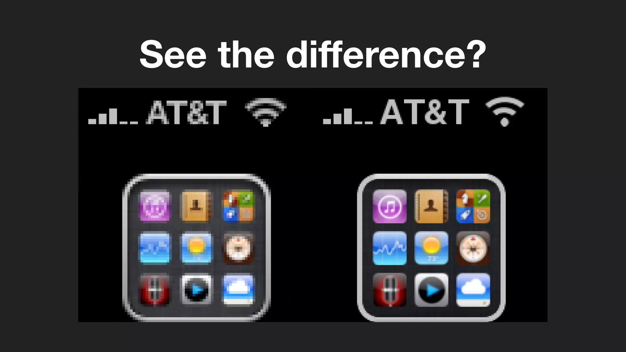
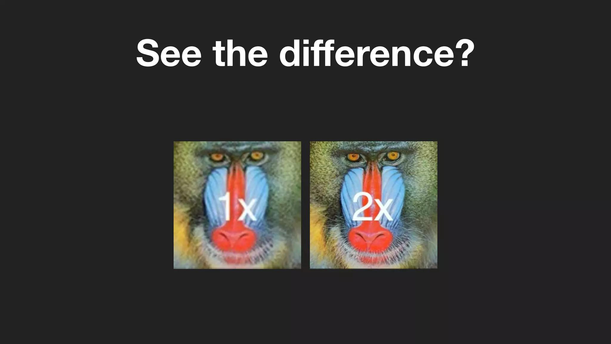
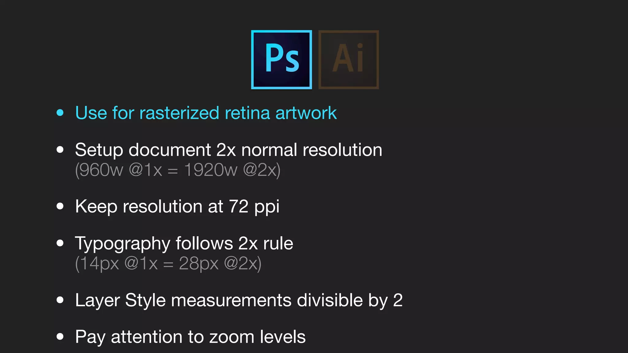
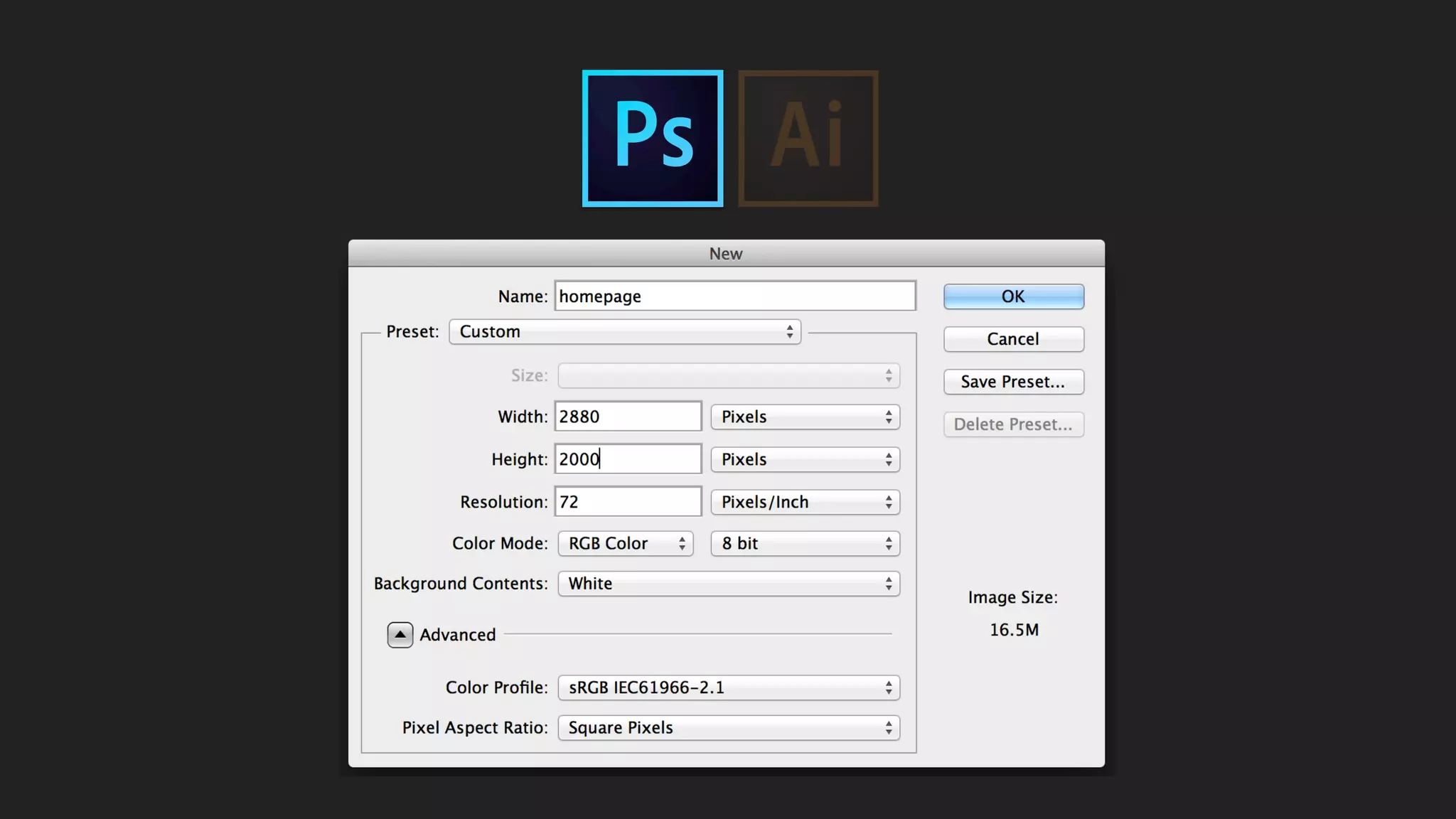
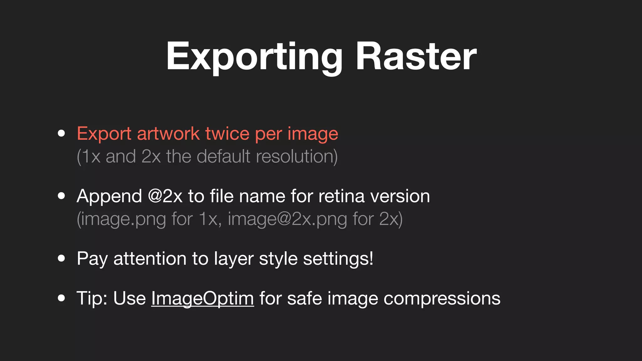
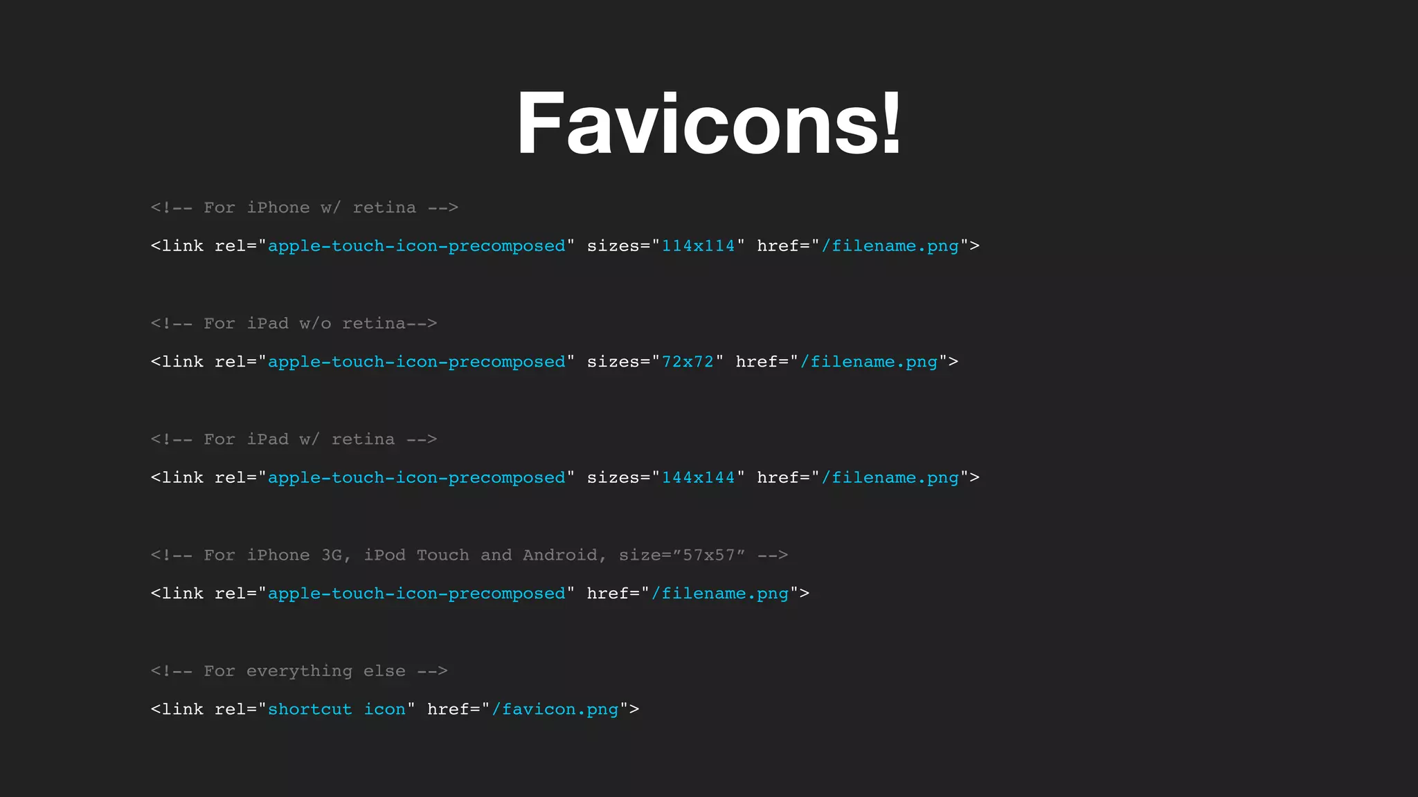
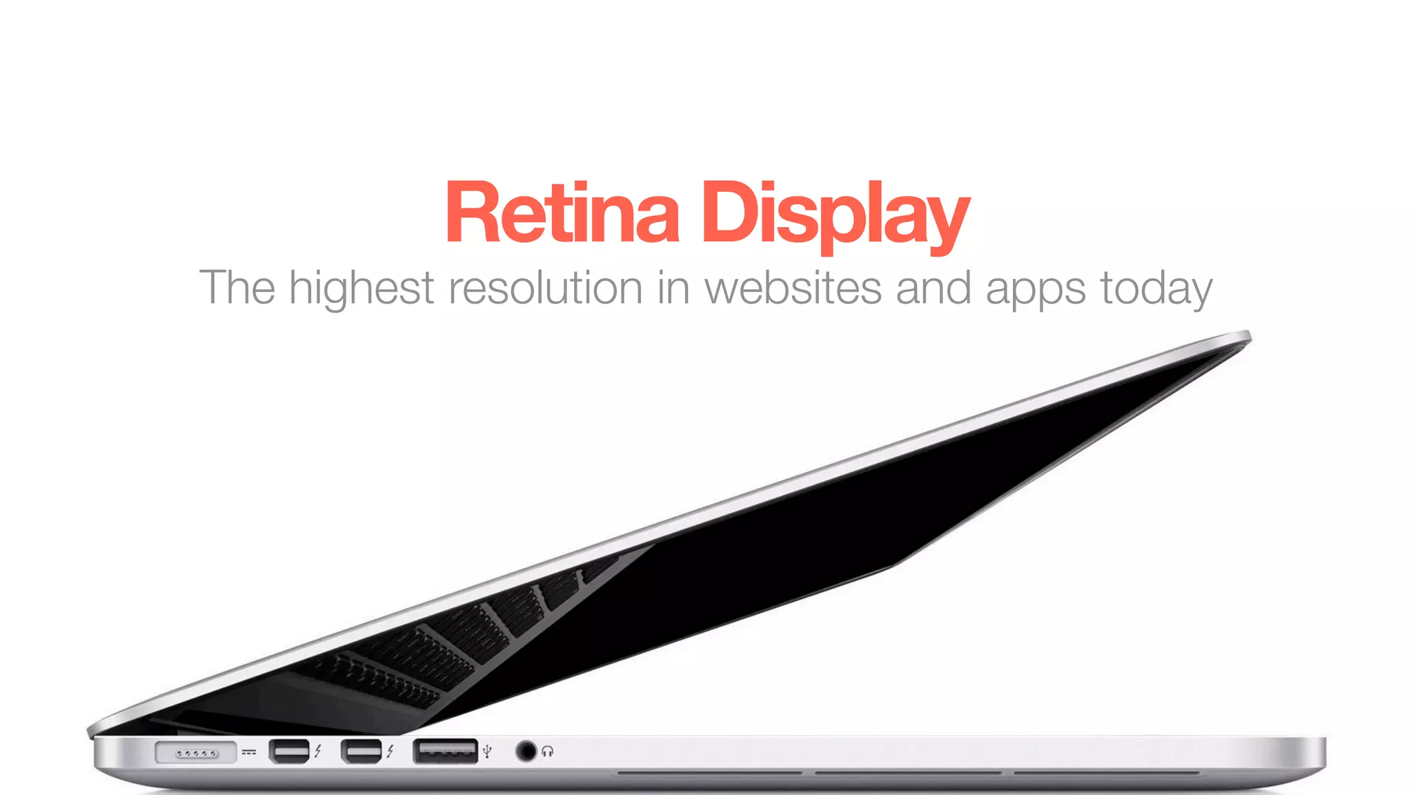
Retina Display
The highest resolution in websites and apps today
What’s a Retina Display?
Overview
• Marketing Term created by Apple
• iPhone 4 was the first device (2010)
• High pixel density displays (~300 ppi or greater)
• One pixel split into 4 pixels
• Drastically reduces pixelation
See the difference?
See the difference?
Supported Devices
Device Resolution Pixel Density
iPhone 4S 960x640 326 ppi
iPhone 5 1136x640 326 ppi
iPad 3rd + 4th Gen. 2048x1536 264 ppi
Macbook Pro 13” 2560x1600 227 ppi
Macbook Pro 15” 2880x1800 220 ppi
...other companies investing as well in HiDPi displays
Designing for Retina
• Use for rasterized retina artwork
• Setup document 2x normal resolution
(960w @1x = 1920w @2x)
• Keep resolution at 72 ppi
• Typography follows 2x rule
(14px @1x = 28px @2x)
• Layer Style measurements divisible by 2
• Pay attention to zoom levels
• Use for vectorized retina artwork
• Does not require document setup adjustments
• Trim artboards to artwork when possible
• SVG format great for icons, logos, small graphics
• Export to <canvas> via free Ai plugin
Don’t forget favicons!
• Used for both websites and apps
• Supports HiDPi
• Saved as .png
(Can use Photoshop or Illustrator)
• Various sizes for mobile devices
Developing for Retina
Raster Artwork .jpg, .gif, .png
Vector Artwork .svg, <canvas>
Choose the right file type
Exporting Raster
• Export artwork twice per image
(1x and 2x the default resolution)
• Append @2x to file name for retina version
(image.png for 1x, image@2x.png for 2x)
• Pay attention to layer style settings!
• Tip: Use ImageOptim for safe image compressions
Exporting Vector
• Export artwork only once!
• Trim artboards to artwork when possible
(Lower file size and greater flexibility in CSS positioning)
• Use SVG default settings (SVG 1.1)
• SVG now fully recommended*
(Not supported in IE8 or lower, Android Browser 2.3 or lower)
Background Images
.sweet-graphic {
width: 50px;
height: 50px;
background-image: url(“images/sweet-graphic.png”);
}
• Use media queries for Background Images (raster only)
• Set background-size property to size of original graphic
• Tip: SVG backgrounds require background-size by default
Background Images
@media only screen and (-webkit-min-device-pixel-ratio: 1.5),
only screen and (-o-min-device-pixel-ratio: 3/2),
only screen and (min--moz-device-pixel-ratio: 1.5),
only screen and (min-device-pixel-ratio: 1.5) {
.sweet-graphic {
background-image: url(“images/sweet-graphic@2x.png”);
background-size: 50px auto;
}
}
Inline Images
• Use Retina.JS for Inline Images
• Store both 1x and 2x graphics in same directory
Favicons!
<!-- For iPhone w/ retina -->
<link rel="apple-touch-icon-precomposed" sizes="114x114" href="/filename.png">
<!-- For iPad w/o retina-->
<link rel="apple-touch-icon-precomposed" sizes="72x72" href="/filename.png">
<!-- For iPad w/ retina -->
<link rel="apple-touch-icon-precomposed" sizes="144x144" href="/filename.png">
<!-- For iPhone 3G, iPod Touch and Android, size=”57x57” -->
<link rel="apple-touch-icon-precomposed" href="/filename.png">
<!-- For everything else -->
<link rel="shortcut icon" href="/favicon.png">
Selling for Retina
The benefits are clear!
• PC + Mac devices moving toward HiDPi screens
• Mobile manufacturers ahead of the curve
• Improves user experience
• No performance hit on older technology
• Great for web/mobile apps, photo-centric sites
10%NEW PROJECTS TODAY
• Retroactive projects currently quoted on per case basis
(Not enough information at this time)
• Projects already in the mix with retina
(Picture.com, TweetBox, Ateb, Atlantic BT, Docurep, Muzik, etc.)
Retina Display
The highest resolution in websites and apps today

Retina Display - Supporting in Web Projects

  • 1.
    Retina Display The highestresolution in websites and apps today
  • 2.
  • 3.
    Overview • Marketing Termcreated by Apple • iPhone 4 was the first device (2010) • High pixel density displays (~300 ppi or greater) • One pixel split into 4 pixels • Drastically reduces pixelation
  • 4.
  • 5.
  • 6.
    Supported Devices Device ResolutionPixel Density iPhone 4S 960x640 326 ppi iPhone 5 1136x640 326 ppi iPad 3rd + 4th Gen. 2048x1536 264 ppi Macbook Pro 13” 2560x1600 227 ppi Macbook Pro 15” 2880x1800 220 ppi ...other companies investing as well in HiDPi displays
  • 7.
  • 8.
    • Use forrasterized retina artwork • Setup document 2x normal resolution (960w @1x = 1920w @2x) • Keep resolution at 72 ppi • Typography follows 2x rule (14px @1x = 28px @2x) • Layer Style measurements divisible by 2 • Pay attention to zoom levels
  • 10.
    • Use forvectorized retina artwork • Does not require document setup adjustments • Trim artboards to artwork when possible • SVG format great for icons, logos, small graphics • Export to <canvas> via free Ai plugin
  • 11.
    Don’t forget favicons! •Used for both websites and apps • Supports HiDPi • Saved as .png (Can use Photoshop or Illustrator) • Various sizes for mobile devices
  • 12.
  • 13.
    Raster Artwork .jpg,.gif, .png Vector Artwork .svg, <canvas> Choose the right file type
  • 14.
    Exporting Raster • Exportartwork twice per image (1x and 2x the default resolution) • Append @2x to file name for retina version (image.png for 1x, image@2x.png for 2x) • Pay attention to layer style settings! • Tip: Use ImageOptim for safe image compressions
  • 15.
    Exporting Vector • Exportartwork only once! • Trim artboards to artwork when possible (Lower file size and greater flexibility in CSS positioning) • Use SVG default settings (SVG 1.1) • SVG now fully recommended* (Not supported in IE8 or lower, Android Browser 2.3 or lower)
  • 16.
    Background Images .sweet-graphic { width:50px; height: 50px; background-image: url(“images/sweet-graphic.png”); } • Use media queries for Background Images (raster only) • Set background-size property to size of original graphic • Tip: SVG backgrounds require background-size by default
  • 17.
    Background Images @media onlyscreen and (-webkit-min-device-pixel-ratio: 1.5), only screen and (-o-min-device-pixel-ratio: 3/2), only screen and (min--moz-device-pixel-ratio: 1.5), only screen and (min-device-pixel-ratio: 1.5) { .sweet-graphic { background-image: url(“images/sweet-graphic@2x.png”); background-size: 50px auto; } }
  • 18.
    Inline Images • UseRetina.JS for Inline Images • Store both 1x and 2x graphics in same directory
  • 19.
    Favicons! <!-- For iPhonew/ retina --> <link rel="apple-touch-icon-precomposed" sizes="114x114" href="/filename.png"> <!-- For iPad w/o retina--> <link rel="apple-touch-icon-precomposed" sizes="72x72" href="/filename.png"> <!-- For iPad w/ retina --> <link rel="apple-touch-icon-precomposed" sizes="144x144" href="/filename.png"> <!-- For iPhone 3G, iPod Touch and Android, size=”57x57” --> <link rel="apple-touch-icon-precomposed" href="/filename.png"> <!-- For everything else --> <link rel="shortcut icon" href="/favicon.png">
  • 20.
  • 21.
    The benefits areclear! • PC + Mac devices moving toward HiDPi screens • Mobile manufacturers ahead of the curve • Improves user experience • No performance hit on older technology • Great for web/mobile apps, photo-centric sites
  • 22.
    10%NEW PROJECTS TODAY •Retroactive projects currently quoted on per case basis (Not enough information at this time) • Projects already in the mix with retina (Picture.com, TweetBox, Ateb, Atlantic BT, Docurep, Muzik, etc.)
  • 23.
    Retina Display The highestresolution in websites and apps today