How to Illustrate Energy Resources Presentation
•
8 likes•1,884 views

Tips for making energy and natural resources presentation charts more visual. Examples of DIY charts makeover - simple use of icons. Apply industry symbols for PowerPoint - Natural Resources: Mining, hard coal, quarrying, lignite, oil, gas, petroleum fuel Energy production: Power station, Renewable, Nuclear Agriculture: Crop cultivation, Livestock production, Forestry, Fishery

Recommended
Recommended
More Related Content
Viewers also liked
Viewers also liked (14)
More from Peter Zvirinsky
More from Peter Zvirinsky (20)
Recently uploaded
Recently uploaded (20)
How to Illustrate Energy Resources Presentation
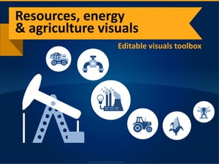
- 1. Visuals by infoDiagram.comVisuals by infoDiagram.com Editable visuals toolbox Resources, energy & agriculture visuals
- 2. Visuals by infoDiagram.com Doing a presentation on resources or energy? On agriculture production? Find some inspiration how to make slides visually appealing
- 3. Visuals by infoDiagram.com Natural resources types RESOURCES, ENERGY Extracting e.g. mining Transport e.g. gas pipelines Power production
- 4. Visuals by infoDiagram.com Natural resources types RESOURCES, ENERGY & AGRICULTURE Extracting e.g. mining Transport e.g. gas pipelines Power production Crop cultivation Livestock production
- 5. Visuals by infoDiagram.com Alternative energy resources Traditional energy resources
- 6. Visuals by infoDiagram.com Alternative energy resources Renewable energy Traditional energy resources
- 7. Visuals by infoDiagram.com Alternative energy resources Renewable energy Nuclear energy Traditional energy resources
- 8. Visuals by infoDiagram.com Gross inland energy consumption, by fuel, EU-28, 2010 35,4% 25,3% 13,5% 10,8% 5,1% 9,9% Source: Eurostat 8
- 9. Visuals by infoDiagram.com Gross inland energy consumption, by fuel, EU-28, 2010 35,4% 25,3% 13,5% 10,8% 5,1% 9,9% Nuclear Hard coal Lignite Renewable Source: Eurostat 9
- 10. Visuals by infoDiagram.com Gross inland energy consumption, by fuel, EU-28, 2010 35,4% 25,3% 13,5% 10,8% 5,1% 9,9% Gas Nuclear Hard coal Lignite Renewable Source: Eurostat 10
- 11. Visuals by infoDiagram.com Gross inland energy consumption, by fuel, EU-28, 2010 35,4% 25,3% 13,5% 10,8% 5,1% 9,9% Oil Gas Nuclear Hard coal Lignite Renewable Source: Eurostat 11
- 12. Visuals by infoDiagram.comVisuals by infoDiagram.com Food production business flow chart CONSUMERMARKET AGRICULTURAL COMMODITY FOOD PRODUCTION Food value increasing processes
- 13. Visuals by infoDiagram.comVisuals by infoDiagram.com Food production business flow chart CONSUMERMARKET AGRICULTURAL COMMODITY FOOD PRODUCTION Food value increasing processes Value distribution
- 14. Visuals by infoDiagram.comVisuals by infoDiagram.com Food production business flow chart CONSUMERMARKET AGRICULTURAL COMMODITY DistributionStorage Production Product Retail, Selling FOOD PRODUCTION Food value increasing processes Value distribution
- 15. Visuals by infoDiagram.com Energy by fuel, EU-28 (Mtoe) Source: Eurostat 0 100 200 300 400 500 600 700 2001 2003 2005 2007 2009 2011 Primary production 0 100 200 300 400 500 600 700 2001 2003 2005 2007 2009 2011 Gross inland consumption Oil Gas Nuclear Hard coal Lignite RES 15
- 16. Visuals by infoDiagram.comVisuals by infoDiagram.com Agricultural output and gross value added at producer prices, EU-28, 2005–12 (2005 = 100%) Source: Eurostat 90% 100% 110% 120% 130% 140% 2005 2006 2007 2008 2009 2010 2011 2012 2013 Crop output Animal output Gross value added of the agricultural sector 16
- 17. Visuals by infoDiagram.com Try free sample of editable PPT graphics See Resources industry presentation visuals Consider adding topic-specific icons to charts, diagrams, text to create stronger visual association
- 18. Visuals by infoDiagram.com Suggestions? Topic cooperation? We will gladly talk & assist you with visuals. Contact: www.infoDiagram.com Twitter: @infoDiagram Follow us on Slideshare for more presentations, hit FOLLOW on slideshare.net/infodiagramFollow