Peter Saville is a pioneering graphic designer known for his album cover designs for Factory Records artists like Joy Division, New Order, and Happy Mondays. His minimalist covers for Joy Division's Unknown Pleasures and Closer albums helped establish their dark post-punk aesthetic using found scientific images and archival photos. Through his designs for Factory Records, Saville developed a signature style that emphasized the artistic identity over commercial promotion and helped shape the visual language of many seminal albums from that label and genre.
Graffiti used to have a negative connotation to it, but it actually is art. From Banksy to Sever to Lady Pink, there are world-renowned street artists who have left their stamp on the world.
Cities such as New York, Melbourne and Moscow boast some of the most extravagant street art murals. It has become a cultural phenomenon and here are our favorites.
You could be a professional graphic designer and still make mistakes. There is always the possibility of human error. On the other hand if you’re not a designer, the chances of making some common graphic design mistakes are even higher. Because you don’t know what you don’t know. That’s where this blog comes in. To make your job easier and help you create better designs, we have put together a list of common graphic design mistakes that you need to avoid.
Transforming Brand Perception and Boosting Profitabilityaaryangarg12
In today's digital era, the dynamics of brand perception, consumer behavior, and profitability have been profoundly reshaped by the synergy of branding, social media, and website design. This research paper investigates the transformative power of these elements in influencing how individuals perceive brands and products and how this transformation can be harnessed to drive sales and profitability for businesses.
Through an exploration of brand psychology and consumer behavior, this study sheds light on the intricate ways in which effective branding strategies, strategic social media engagement, and user-centric website design contribute to altering consumers' perceptions. We delve into the principles that underlie successful brand transformations, examining how visual identity, messaging, and storytelling can captivate and resonate with target audiences.
Methodologically, this research employs a comprehensive approach, combining qualitative and quantitative analyses. Real-world case studies illustrate the impact of branding, social media campaigns, and website redesigns on consumer perception, sales figures, and profitability. We assess the various metrics, including brand awareness, customer engagement, conversion rates, and revenue growth, to measure the effectiveness of these strategies.
The results underscore the pivotal role of cohesive branding, social media influence, and website usability in shaping positive brand perceptions, influencing consumer decisions, and ultimately bolstering sales and profitability. This paper provides actionable insights and strategic recommendations for businesses seeking to leverage branding, social media, and website design as potent tools to enhance their market position and financial success.
Dive into the innovative world of smart garages with our insightful presentation, "Exploring the Future of Smart Garages." This comprehensive guide covers the latest advancements in garage technology, including automated systems, smart security features, energy efficiency solutions, and seamless integration with smart home ecosystems. Learn how these technologies are transforming traditional garages into high-tech, efficient spaces that enhance convenience, safety, and sustainability.
Ideal for homeowners, tech enthusiasts, and industry professionals, this presentation provides valuable insights into the trends, benefits, and future developments in smart garage technology. Stay ahead of the curve with our expert analysis and practical tips on implementing smart garage solutions.
Can AI do good? at 'offtheCanvas' India HCI preludeAlan Dix
Invited talk at 'offtheCanvas' IndiaHCI prelude, 29th June 2024.
https://www.alandix.com/academic/talks/offtheCanvas-IndiaHCI2024/
The world is being changed fundamentally by AI and we are constantly faced with newspaper headlines about its harmful effects. However, there is also the potential to both ameliorate theses harms and use the new abilities of AI to transform society for the good. Can you make the difference?
Book Formatting: Quality Control Checks for DesignersConfidence Ago
This presentation was made to help designers who work in publishing houses or format books for printing ensure quality.
Quality control is vital to every industry. This is why every department in a company need create a method they use in ensuring quality. This, perhaps, will not only improve the quality of products and bring errors to the barest minimum, but take it to a near perfect finish.
It is beyond a moot point that a good book will somewhat be judged by its cover, but the content of the book remains king. No matter how beautiful the cover, if the quality of writing or presentation is off, that will be a reason for readers not to come back to the book or recommend it.
So, this presentation points designers to some important things that may be missed by an editor that they could eventually discover and call the attention of the editor.
White wonder, Work developed by Eva TschoppMansi Shah
White Wonder by Eva Tschopp
A tale about our culture around the use of fertilizers and pesticides visiting small farms around Ahmedabad in Matar and Shilaj.
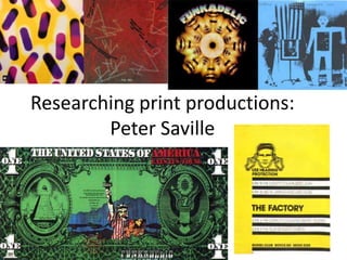
2. Peter Saville, graphic designer for
factory records
• Peter Saville is an award winning art director and graphic designer, as well
as a pioneer of modern typography. He is a cofounder of factory records
and is known for many record sleeves he designed for Factory Records
artists, such as post-punk ‘Joy Division’, ‘New Order’, ‘Orchestral
Manoeuvres In The Dark’ and ‘The Happy Mondays’ .
3.
4. Peter Saville continued
•
•
•
•
•
Alice Twemlow, Design critic wrote: "... in the 1980s ... he would directly and
irreverently "lift" an image from one genre—art history for example—and
recontextualize it in another. A Fantin-Latour "Roses" painting in combination with a
colour-coded alphabet became the seminal album cover for New Order's Power,
Corruption and Lies (1983), for example.“
(Quote taken from:
http://en.wikipedia.org/wiki/Peter_Saville_%28graphic_designer%29)
“Design has become the cover for unnecessary consumption.”- Peter Saville. The more
fine tuning design towards a specific audience, the more a manufacturer can charge for
whatever they are selling, the better something is designed, the more it is valued. Is the
design profession through his eyes, nothing more than a slave to the current economic
system, creating products tailored to a specific audience to make them feel they need it
as it is important for their identity within a subculture etc.
“Meanwhile design, which used to be known as a profession, has become a major
source of pollution.” Jasper Morrison. Every time a new gadget (like another “game
changing” gadget) is introduced, it triggers a massive dump-and-buy reaction all around
the world. Great news for the manufacturers of course. Not so good for just about
every one else.
(Quote’s taken from: http://eicolab.com.au/2011/01/design-and-unnecessaryconsumption/)
5. Peter Saville’s, development of the graphic identity of ‘Joy
Division’ throughout their career – ‘Unknown Pleasures’
Released: June 1979
Label: Factory
Formats: LP, cassette
This was the first and only time that the band gave me something that
they’d like for a cover. I went to see Rob Gretton, who managed them,
and he gave me a folder of material, which contained the wave image
from the Cambridge Encyclopaedia of Astronomy. They gave me the
title too but I didn’t hear the album. The wave pattern was so
appropriate. It was from CP 1919, the first pulsar, so it’s likely that the
graph emanated from Jodrell Bank, which is local to Manchester and
Joy Division. And it’s both technical and sensual. It’s tight, like Stephen
Morris’ drumming, but it’s also fluid: lots of people think it’s a heart
beat. Having the title on the front just didn’t seem necessary. I asked
Rob about it and, between us, we felt it wasn’t a cool thing to do. It
was the post-punk moment and we were against overblown stardom.
The band didn’t want to be pop stars. ( account copied from:
http://www.theguardian.com/music/gallery/2011/may/29/joydivisionneworder)
6. Peter Saville’s, development of the graphic identity of
‘Joy Division’ throughout their career – ‘Closer’
Released: July 1980
Label: Factory
Formats: LP, cassette
Peter Saville: “This cover for the band’s second album was like a
work of antiquity, but inside is a vinyl album, so it’s a postmodern
juxtaposition of a contemporary work housed in the antique. At
first, I didn’t believe the photo was an actual tomb but it’s really in
a cemetery in Genoa. When Tony Wilson (Factory co-founder) told
me Ian Curtis had died I said, ‘Tony, we have a tomb on the cover.’
There was great deliberation as to whether to continue with it. But
the band, Ian included, had chosen the photograph. We did it in
good faith and not in any post-tragedy way” ( account copied from:
http://www.theguardian.com/music/gallery/2011/may/29/joydivisi
on-neworder)
7. Emphasis on artists identity
Released: October 1981
Label: Factory
Formats: Double LP,
cassette, CD
These album covers are very minimal and do little for the promotion of the
band, although this is a typical convention within graphic design for music
distribution, bands and artists who are well known enough do not need to
paste their faces all over the covers in order to sell. For example the initial
‘Beatles’ albums were colourful and created so as to sell the artists,
however when the band had become a pop sensation, when they released
their ‘White’ album which was a blank glossy white background with ‘The
Beatles’ small in the corner. ‘The Beatles’ at that point did not need to
promote themselves and so instead left the case blank, with images of
themselves inside
Released: July 1988
Label: Factory
Not all albums or in complete chronological order