Traditional c+c magazinecover
• Masthead, large bold title of magazine usually placed top middle
of cover. Often consistent in font and style to build a brand
recognition
• Main image, usually a medium close up of a popular artists or
band. The subject usually makes direct eye contact with the
reader. Style and clothing often reflect the genre of music
• Cover lines, headlines around the main image, teasing featured
articles and interviews
• Main cover line/headline, a larger and bolder headline tied to the
main artist and usually overlaps the image
3.
• Colour scheme,reflects brand identity and often fits the music
genre, usually 2-4 colours for visual cohesion
• Barcode, price and issue date. Typically placed bottom corner
• Typography, bold and capitalised text is common for emphasis of
what’s inside
4.
New c+c magazinecover
• Minimalist design, cleaner layouts with fewer cover lines. The
focus is often on aesthetic appeal rather than information
overload
• Experimental typography, more creative and bold/ custom fonts.
Sometimes text interacts dynamically with the image
• Breaking the frame, the main image may not follow traditional
poses and subjects may be smaller in frame or even off centre
• Editorial or fashion influenced style, heavier crossover with
fashion photography. Less about promoting music and more
about building image or aesthetic
5.
• Muted orunconventional colour schemes, use of pastels or
monochrome or off trend palettes for a modern, high end look
• Digital integration/convergence, covers often feature QR codes,
tags or references to online content like playlists
• inclusive and diverse representation, a broader range of genders,
ethnicities and genres featured, focus on emerging artists and not
just chart toppers
• Artistic or conceptual imagery, some covers push beyond simple
illustration, more freedom in breaking genre stereotypes
6.
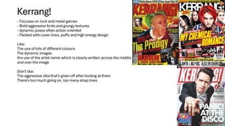
- Focuses onrock and metal genres
- Bold aggressive fonts and grungy textures
- dynamic poses often action oriented
- Packed with cover lines, puffs and high energy design
Like:
The use of lots of different colours
The dynamic images
the use of the artist name which is clearly written across the middle
and over the image
Don’t like:
The aggressive vibe that’s given off after looking at them
There’s too much going on, too many strap lines
Kerrang!
7.
Mojo
Known for indepth features on classic rock and heritage artists
Clean but still heavy cover with traditional hierarchy
Muted colour schemes and more retro aesthetic
Like:
How everything really flows together although there’s lots of information
The images they’ve used are very eye catching
The amount of strap lines and how they are used to create the cover
Don’t like:
The use of the image in the bottom left of most of the magazines
It makes it feel very cramped when you look at ut
8.
Classic rock
• Focuseson legendary rock acts
• Consistent structure, feature heavy covers and vintage magazine look
• Heavily follows the conventions of hero imagery and bold type
• Like:
• The use of space although there’s a lot of information, it’s very well laid out
• The masthead is very eye catching
• The colour theme create brand identity
• The artists at the top of most covers create brand awareness
• The dynamic imagery
9.
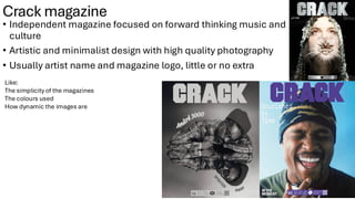
Crack magazine
• Independentmagazine focused on forward thinking music and
culture
• Artistic and minimalist design with high quality photography
• Usually artist name and magazine logo, little or no extra
Like:
The simplicity of the magazines
The colours used
How dynamic the images are
10.
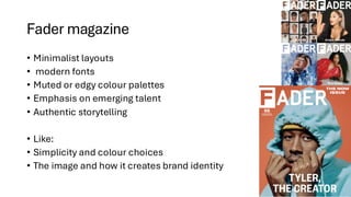
Fader magazine
• Minimalistlayouts
• modern fonts
• Muted or edgy colour palettes
• Emphasis on emerging talent
• Authentic storytelling
• Like:
• Simplicity and colour choices
• The image and how it creates brand identity
11.
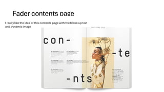
Fader contents page
Ireally like the idea of this contents page with the broke up text
and dynamic image
12.
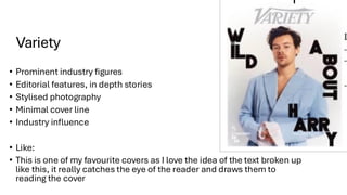
Variety
• Prominent industryfigures
• Editorial features, in depth stories
• Stylised photography
• Minimal cover line
• Industry influence
• Like:
• This is one of my favourite covers as I love the idea of the text broken up
like this, it really catches the eye of the reader and draws them to
reading the cover