This document provides print screens showing the process of making a magazine, including the front cover, CD, contents page, and double page spread. Print screens demonstrate the creation of the magazine's front cover, CD, contents page, and a double page spread.
Peter Andre's music video for "Unconditional" tells a personal narrative through faded film in the background and shots of Andre alone in a cinema. The video uses close-ups of Andre to show emotion and subtle camera movements. Scenes of a faded film depicting Andre's life, as well as shots of him matching lyrics, help illustrate the song's message. While keeping a simple, lonely aesthetic, the video reveals the personal nature of the song through its storytelling and inclusion of Andre's step-son at the end.
The document discusses how the artist addressed their audience in their Classical Music Magazine through direct eye contact with the camera, stereotypical depictions of classical musicians in clothing and with instruments, and formal yet simple language. Superlatives and promises of free music were used to attract readers. The masthead and covers were kept simple to stand out while still appealing to classical music lovers.
The document discusses possible actors for a soul/R&B genre project, including a main female character suited to play a heartbroken girl, a main male character suited to play a heartbreaker who flirts with the female character and a side character, and a side character the male character cheats with who is attractive.
The document describes the process of producing a magazine advertisement. It involved cutting out an image, sizing it for the advert, adding brush effects to simulate tears, adding layers with drop shadows. Text was added promoting the purchase of a smartphone album. Fonts, shadows and glows were used to make elements like the artist name, album title and CD cover stand out. The process involved selecting colors, fonts, effects and positioning elements like images and text to clearly promote the album release in the advert.
The document discusses how the media product represents particular social groups. The magazine represents middle/upper class adults through the sophisticated and elegant font, neat layout, and formal written content without slang. Stereotypical representations are used, including the artist on the cover portrayed in a mature manner with subtle makeup, in a relaxed pose suited to the genre. Pictures also use stereotypes appealing to the target audience.
1 in what ways does your media product usenehajasmine
Our media product uses, develops, and challenges conventions of real media products in the following ways:
1) We develop conventions by adding elements like different fonts, colors, images, and messages that relate the product to the theme or message of the work. However, we also challenge conventions by omitting typical elements or using unconventional designs, layouts, or combinations of elements.
2) For example, on the CD cover we challenge conventions by using multiple images instead of one, and on the back insert we add social media logos and change the background color.
3) Across all elements, we aim to reinforce the themes of being "torn" through subtle design choices while still maintaining clarity of information
This document summarizes the production process for a music video. It describes how stop motion scenes were created in Serif Movie+ and exported to Adobe Premier for further editing. Various effects like black and white, page turns, blurs, split screens, dissolves, and fades were added to reinforce themes and ensure smooth transitions between scenes. The editing was refined based on audience feedback to improve the overall flow and storytelling of the video.
1 in what ways does your media product usenehajasmine
Our media product challenges conventions of real media products in the following ways:
1. Instead of a single picture of the artist, our CD cover uses recurring pictures of the artist becoming more shattered to show the effect of being torn.
2. The inlay leaves the background plain for the message and image to stand out, and adds credits not typically seen.
3. The CD adds a copyright around the edge not typically seen.
4. The back insert adds social media logos and uses the album's red color instead of the front's color.
5. The magazine ad uses two artist pictures in the same clothes and a QR code for mobile access.
6. The music video
2 how effective is the combination of your mainnehajasmine
The document discusses ensuring connections between a main product and ancillary texts through consistent use of color, fonts, images, and mood. Off-white, blue, red, black, and dark reddish black are used throughout to link the CD cover, magazine advert, and other materials. Facial expressions and clothing depict sad emotions, and the black and white color scheme echoes the sad theme of the song and music video. A variety of shots and locations are used to show variety while maintaining the sad tone.
The document discusses changes made to a storyboard based on audience feedback. Scenes were moved, modified or replaced to improve the narrative and emotional impact. Effects and transitions were also adjusted. Feedback indicated that certain scenes were not effective so they were removed or redesigned to better engage the target audience.
3 what have you learnt from your audience feedbacknehajasmine
The document provides feedback from an audience on various marketing materials for a music release, including the CD cover, inlay, back insert, magazine advert, music video, and more. The feedback suggested changes to things like colors, layouts, images, and text to make the materials more visually appealing and clearly convey the intended messages. Suggested changes included adding more color to the CD cover, rearranging elements on the back insert, adjusting colors on the magazine advert to fit the overall scheme, and splitting screens in the music video to show two scenes simultaneously.
4 how did you use new media technologies innehajasmine
The document discusses the various new media technologies used during the planning, research, construction, and evaluation stages of a project. These included Blogger for blogging, USBs for storing files, Hotmail for email communication, Microsoft Word and PowerPoint for creating documents and slides, Slideshare for sharing presentations, Serif Movie+ for video editing, YouTube for uploading and sharing videos, Adobe Photoshop for image editing, Adobe Premiere for video editing, cameras for photographs and stop motion filming.
The document describes the process of producing a magazine advertisement. [1] The first stages involved cutting out an image, converting it to greyscale, and resizing it for the advert. [2] Additional layers were then added using brush tools to create a torn effect on the image. [3] Text and additional design elements like logos and a QR code were incorporated to complete the advert.
The document describes the process of producing a CD. First, a CD template was downloaded and the color of the inlay was matched to the CD. Second, a dark red color was chosen for the background. Research found that most CDs include a copyright, so one was added and colored red to match the theme. Text was added using specific fonts and colors to be consistent with the CD cover design.
The document describes the process of designing a CD cover. The designer began by getting the correct dimensions for the CD cover. They then cut out an image from a magazine advert and placed it on different layers on the CD cover file. The image was duplicated and adjusted to create a "torn" effect, which reinforced the album name. Text was added using fonts that stood out and related to the album name. Finally, the record label's logo was added to complete the conventional CD cover design.
The document summarizes the process for producing an inlay. First, the creator cut out an image of actors hugging from an album cover to use. They then matched the color of the inlay material to the album cover. Finally, the image was placed on the inlay, writing was added, and a credit was included at the bottom in a smaller font.
The document summarizes the process of producing a magazine advertisement. It involves several steps:
1. Cutting out a picture and converting it to greyscale to place on different layers.
2. Resizing the picture to the correct magazine size and choosing a color.
3. Adding a torn/ripped effect using a brush tool and adding layers with less tears and a drop shadow.
4. Adding text and logos, using different fonts like "Monotype Corsiva" and "Trash" to stand out.
5. Placing additional elements like a CD cover above text and adding effects like glows and shadows to make elements pop.
The document describes the process of producing a magazine advertisement. It involves several steps:
1. Cutting out a picture using a magnetic lasso tool to isolate it from the background.
2. Resizing the picture to the correct size for the magazine advert and choosing a color scheme.
3. Adding torn/ripped effects to the background layers using brush tools and drop shadows.
4. Adding text elements like the artist and album names using different fonts along with effects like shadows and glows.
5. Placing additional elements like logos and a CD cover graphic and adjusting their positioning.
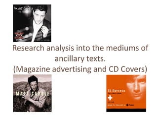
Research analysis into the mediums of ancillary textsnehajasmine
The document analyzes the mediums used to promote albums, including CD covers, CDs themselves, and magazine advertisements. It discusses typical design elements like images of the artist, typography, color schemes, and institutional information. The goal is to attract audiences, visually represent the artist, use standard conventions, and maximize sales. Elements like eye-catching images and clearly stated artist/album names help potential buyers identify and learn about new releases.
This document outlines the equipment and software needed to create a music video, including a tripod to keep the video camera still while filming scenes, a camera to capture animation sequences, and Adobe Premiere Pro and other software to edit together the footage, planning, research, and overall finished video.
Themes that need to be incorporated into the music videonehajasmine
The document discusses themes of confusion, heartbreak, frustration, and sadness that are implied in song lyrics. The lyrics express confusion about why the singer is in a situation again, heartbreak over being left for someone else who meant more, frustration with games and immaturity, and sadness over a broken heart and relationship ending.
The document discusses video camera techniques and editing techniques to consider for filming and editing a music video. Some key video camera techniques include using low and high angles, panning, tilting, tracking shots, and varying shot lengths. Important editing techniques include dissolves, fades, quick cuts, varying playback speeds, and wipes between shots. The goal is to storyboard and produce the music video using these cinematography and post-production methods.
The document discusses several modern art and social movements including modernism, postmodernism, feminism, and post-feminism. Modernism rejected realism, while postmodernism embraced intertextuality and parody. Feminism questioned women's subordinate role in patriarchal societies and the tendency to depict women as sexual objects or in limited domestic roles. Post-feminism argued women have a right to be sexually attractive if in control, challenging the idea of the "male gaze" objectifying women. Gender stereotypes also commonly represent women in a more provocative or subordinate manner compared to men.
The document discusses several modern art and social movements including modernism, postmodernism, feminism, and post-feminism. Modernism rejected realism, while postmodernism embraced intertextuality and parody. Feminism questioned women's subordinate role in patriarchal societies and the tendency to depict women as sexual objects or in limited domestic roles. Post-feminism asserted women's right to be sexually attractive if in control, challenging the idea of the "male gaze" objectifying women. Gender stereotypes also commonly portrayed women in a more provocative or subordinate manner compared to men.
How OTT Players Are Transforming Our TV Viewing Experience.pdfGenny Knight
The advent of Over-The-Top (OTT) players has brought a seismic shift in the television industry, transforming how we consume media. These digital platforms, which deliver content directly over the internet, have outpaced traditional cable and satellite television, offering unparalleled convenience, variety, and personalization. Here’s an in-depth look at how OTT players are revolutionizing the TV viewing experience.
This document summarizes the production process for a music video. It describes how stop motion scenes were created in Serif Movie+ and exported to Adobe Premier for further editing. Various effects like black and white, page turns, blurs, split screens, dissolves, and fades were added to reinforce themes and ensure smooth transitions between scenes. The editing was refined based on audience feedback to improve the overall flow and storytelling of the video.
1 in what ways does your media product usenehajasmine
Our media product challenges conventions of real media products in the following ways:
1. Instead of a single picture of the artist, our CD cover uses recurring pictures of the artist becoming more shattered to show the effect of being torn.
2. The inlay leaves the background plain for the message and image to stand out, and adds credits not typically seen.
3. The CD adds a copyright around the edge not typically seen.
4. The back insert adds social media logos and uses the album's red color instead of the front's color.
5. The magazine ad uses two artist pictures in the same clothes and a QR code for mobile access.
6. The music video
2 how effective is the combination of your mainnehajasmine
The document discusses ensuring connections between a main product and ancillary texts through consistent use of color, fonts, images, and mood. Off-white, blue, red, black, and dark reddish black are used throughout to link the CD cover, magazine advert, and other materials. Facial expressions and clothing depict sad emotions, and the black and white color scheme echoes the sad theme of the song and music video. A variety of shots and locations are used to show variety while maintaining the sad tone.
The document discusses changes made to a storyboard based on audience feedback. Scenes were moved, modified or replaced to improve the narrative and emotional impact. Effects and transitions were also adjusted. Feedback indicated that certain scenes were not effective so they were removed or redesigned to better engage the target audience.
3 what have you learnt from your audience feedbacknehajasmine
The document provides feedback from an audience on various marketing materials for a music release, including the CD cover, inlay, back insert, magazine advert, music video, and more. The feedback suggested changes to things like colors, layouts, images, and text to make the materials more visually appealing and clearly convey the intended messages. Suggested changes included adding more color to the CD cover, rearranging elements on the back insert, adjusting colors on the magazine advert to fit the overall scheme, and splitting screens in the music video to show two scenes simultaneously.
4 how did you use new media technologies innehajasmine
The document discusses the various new media technologies used during the planning, research, construction, and evaluation stages of a project. These included Blogger for blogging, USBs for storing files, Hotmail for email communication, Microsoft Word and PowerPoint for creating documents and slides, Slideshare for sharing presentations, Serif Movie+ for video editing, YouTube for uploading and sharing videos, Adobe Photoshop for image editing, Adobe Premiere for video editing, cameras for photographs and stop motion filming.
The document describes the process of producing a magazine advertisement. [1] The first stages involved cutting out an image, converting it to greyscale, and resizing it for the advert. [2] Additional layers were then added using brush tools to create a torn effect on the image. [3] Text and additional design elements like logos and a QR code were incorporated to complete the advert.
The document describes the process of producing a CD. First, a CD template was downloaded and the color of the inlay was matched to the CD. Second, a dark red color was chosen for the background. Research found that most CDs include a copyright, so one was added and colored red to match the theme. Text was added using specific fonts and colors to be consistent with the CD cover design.
The document describes the process of designing a CD cover. The designer began by getting the correct dimensions for the CD cover. They then cut out an image from a magazine advert and placed it on different layers on the CD cover file. The image was duplicated and adjusted to create a "torn" effect, which reinforced the album name. Text was added using fonts that stood out and related to the album name. Finally, the record label's logo was added to complete the conventional CD cover design.
The document summarizes the process for producing an inlay. First, the creator cut out an image of actors hugging from an album cover to use. They then matched the color of the inlay material to the album cover. Finally, the image was placed on the inlay, writing was added, and a credit was included at the bottom in a smaller font.
The document summarizes the process of producing a magazine advertisement. It involves several steps:
1. Cutting out a picture and converting it to greyscale to place on different layers.
2. Resizing the picture to the correct magazine size and choosing a color.
3. Adding a torn/ripped effect using a brush tool and adding layers with less tears and a drop shadow.
4. Adding text and logos, using different fonts like "Monotype Corsiva" and "Trash" to stand out.
5. Placing additional elements like a CD cover above text and adding effects like glows and shadows to make elements pop.
The document describes the process of producing a magazine advertisement. It involves several steps:
1. Cutting out a picture using a magnetic lasso tool to isolate it from the background.
2. Resizing the picture to the correct size for the magazine advert and choosing a color scheme.
3. Adding torn/ripped effects to the background layers using brush tools and drop shadows.
4. Adding text elements like the artist and album names using different fonts along with effects like shadows and glows.
5. Placing additional elements like logos and a CD cover graphic and adjusting their positioning.
Research analysis into the mediums of ancillary textsnehajasmine
The document analyzes the mediums used to promote albums, including CD covers, CDs themselves, and magazine advertisements. It discusses typical design elements like images of the artist, typography, color schemes, and institutional information. The goal is to attract audiences, visually represent the artist, use standard conventions, and maximize sales. Elements like eye-catching images and clearly stated artist/album names help potential buyers identify and learn about new releases.
This document outlines the equipment and software needed to create a music video, including a tripod to keep the video camera still while filming scenes, a camera to capture animation sequences, and Adobe Premiere Pro and other software to edit together the footage, planning, research, and overall finished video.
Themes that need to be incorporated into the music videonehajasmine
The document discusses themes of confusion, heartbreak, frustration, and sadness that are implied in song lyrics. The lyrics express confusion about why the singer is in a situation again, heartbreak over being left for someone else who meant more, frustration with games and immaturity, and sadness over a broken heart and relationship ending.
The document discusses video camera techniques and editing techniques to consider for filming and editing a music video. Some key video camera techniques include using low and high angles, panning, tilting, tracking shots, and varying shot lengths. Important editing techniques include dissolves, fades, quick cuts, varying playback speeds, and wipes between shots. The goal is to storyboard and produce the music video using these cinematography and post-production methods.
The document discusses several modern art and social movements including modernism, postmodernism, feminism, and post-feminism. Modernism rejected realism, while postmodernism embraced intertextuality and parody. Feminism questioned women's subordinate role in patriarchal societies and the tendency to depict women as sexual objects or in limited domestic roles. Post-feminism argued women have a right to be sexually attractive if in control, challenging the idea of the "male gaze" objectifying women. Gender stereotypes also commonly represent women in a more provocative or subordinate manner compared to men.
The document discusses several modern art and social movements including modernism, postmodernism, feminism, and post-feminism. Modernism rejected realism, while postmodernism embraced intertextuality and parody. Feminism questioned women's subordinate role in patriarchal societies and the tendency to depict women as sexual objects or in limited domestic roles. Post-feminism asserted women's right to be sexually attractive if in control, challenging the idea of the "male gaze" objectifying women. Gender stereotypes also commonly portrayed women in a more provocative or subordinate manner compared to men.
How OTT Players Are Transforming Our TV Viewing Experience.pdfGenny Knight
The advent of Over-The-Top (OTT) players has brought a seismic shift in the television industry, transforming how we consume media. These digital platforms, which deliver content directly over the internet, have outpaced traditional cable and satellite television, offering unparalleled convenience, variety, and personalization. Here’s an in-depth look at how OTT players are revolutionizing the TV viewing experience.
Unlocking the Secrets of IPTV App Development_ A Comprehensive Guide.pdfWHMCS Smarters
With IPTV apps, you can access and stream live TV, on-demand movies, series, and other content you like online. Viewers have more flexibility and customization of content to watch. To develop the best IPTV app that functions, you must combine creative problem-solving skills and technical knowledge. This post will look into the details of IPTV app development, so keep reading to learn more.
Sara Saffari: Turning Underweight into Fitness Success at 23get joys
Uncover the remarkable journey of Sara Saffari, whose transformation from underweight struggles to being recognized as a fitness icon at 23 underscores the importance of perseverance, discipline, and embracing a healthy lifestyle.
SERV is the ideal spot for savory food, refreshing beverages, and exciting entertainment. Each visit promises an unforgettable experience with daily promotions, live music, and engaging games such as pickleball. Offering five distinct food concepts inspired by popular street food, as well as coffee and dessert options, there's something to satisfy every taste. For more information visit our website: https://servfun.com/
Taylor Swift: Conquering Fame, Feuds, and Unmatched Success | CIO Women MagazineCIOWomenMagazine
From country star to global phenomenon, delve into Taylor Swift's incredible journey. Explore chart-topping hits, feuds, & her rise to billionaire status!
Morgan Freeman is Jimi Hendrix: Unveiling the Intriguing Hypothesisgreendigital
In celebrity mysteries and urban legends. Few narratives capture the imagination as the hypothesis that Morgan Freeman is Jimi Hendrix. This fascinating theory posits that the iconic actor and the legendary guitarist are, in fact, the same person. While this might seem like a far-fetched notion at first glance. a deeper exploration reveals a rich tapestry of coincidences, speculative connections. and a surprising alignment of life events fueling this captivating hypothesis.
Follow us on: Pinterest
Introduction to the Hypothesis: Morgan Freeman is Jimi Hendrix
The idea that Morgan Freeman is Jimi Hendrix stems from a mix of historical anomalies, physical resemblances. and a penchant for myth-making that surrounds celebrities. While Jimi Hendrix's official death in 1970 is well-documented. some theorists suggest that Hendrix did not die but instead reinvented himself as Morgan Freeman. a man who would become one of Hollywood's most revered actors. This article aims to delve into the various aspects of this hypothesis. examining its origins, the supporting arguments. and the cultural impact of such a theory.
The Genesis of the Theory
Early Life Parallels
The hypothesis that Morgan Freeman is Jimi Hendrix begins by comparing their early lives. Jimi Hendrix, born Johnny Allen Hendrix in Seattle, Washington, on November 27, 1942. and Morgan Freeman, born on June 1, 1937, in Memphis, Tennessee, have lived very different lives. But, proponents of the theory suggest that the five-year age difference is negligible and point to Freeman's late start in his acting career as evidence of a life lived before under a different identity.
The Disappearance and Reappearance
Jimi Hendrix's death in 1970 at the age of 27 is a well-documented event. But, theorists argue that Hendrix's death staged. and he reemerged as Morgan Freeman. They highlight Freeman's rise to prominence in the early 1970s. coinciding with Hendrix's supposed death. Freeman's first significant acting role came in 1971 on the children's television show "The Electric Company," a mere year after Hendrix's passing.
Physical Resemblances
Facial Structure and Features
One of the most compelling arguments for the hypothesis that Morgan Freeman is Jimi Hendrix lies in the physical resemblance between the two men. Analyzing photographs, proponents point out similarities in facial structure. particularly the cheekbones and jawline. Both men have a distinctive gap between their front teeth. which is rare and often highlighted as a critical point of similarity.
Voice and Mannerisms
Supporters of the theory also draw attention to the similarities in their voices. Jimi Hendrix known for his smooth, distinctive speaking voice. which, according to some, resembles Morgan Freeman's iconic, deep, and soothing voice. Additionally, both men share certain mannerisms. such as their calm demeanor and eloquent speech patterns.
Artistic Parallels
Musical and Acting Talents
Jimi Hendrix was regarded as one of t
Party Photo Booth Prop Trends to Unleash Your Inner StyleBirthday Galore
Are you planning an unforgettable event and looking for the best photo booth props to make it a memorable night? Party photo booth props have become essential to any celebration, allowing guests to capture priceless memories and express their personalities. Here, we'll explore the hottest party photo booth prop trends that will unleash your inner style and create a buzz-worthy experience with Birthday Galore!
For more details visit - birthdaygalore.com
Enhance Your Viewing Experience with Gold IPTV- Tips and Tricks for 2024.pdfXtreame HDTV
In the ever-evolving landscape of digital entertainment, IPTV (Internet Protocol Television) has emerged as a popular alternative to traditional cable and satellite TV services. Offering unparalleled flexibility, a vast selection of channels, and affordability, IPTV services like Gold IPTV have revolutionized the way we consume television content. This comprehensive guide will delve into everything you need to know about Gold IPTV, its features, benefits, setup process, and how it can enhance your viewing experience.
From Teacher to OnlyFans: Brianna Coppage's Story at 28get joys
At 28, Brianna Coppage left her teaching career to become an OnlyFans content creator. This bold move into digital entrepreneurship allowed her to harness her creativity and build a new identity. Brianna's experience highlights the intersection of technology and personal branding in today's economy.
Research analysis into the mediums of ancillary texts
1. Research analysis into the mediums of
ancillary texts.
(Magazine advertising and CD Covers)
2. CD Cover (front)
Main image: Typography:
• Matt is looking at the Matt Cardle (artist)
camera. When We Collide
- By doing this potential (album)
buyers are able to identify • Two different types of
with Matt as this is his first typography is used.
album. - Matt Cardle , this font
• A medium-shot shows Matt could be seen as a
is causally dressed wearing a signature, he’s establishing
jacket. himself after winning.
- This could reinforce his - When We Collide,
‘chilled out’ character. is easy to read and buyers
are able to easily identify
the name of the album.
Colours:
• The black and white colour scheme,
allows ‘The X Factor’ winners logo to stand
out.
- This is important as he's new this is
how potential buyers are to identify him.
3. CD Cover (front)
Main image:
• Matt looks down instead of
looking directly at the
camera. Typography:
- Gazing at the ground MATT CARDLE (artist)
Matt looks pensive. LETTERS (album)
• He's standing clasping his • The typography is simple.
hands together and isn’t - This could relate to
showing much facial Matt’s simplicity and again
expression. his ‘relaxed’ personality.
- This could connote the • The font used is also easy
‘sad’ emotions spread across to read.
various songs. - This is useful as
• A medium-shot shows Matt potential buyers are able to
dressed in a shirt, with scruffy read the wording clearly.
gelled hair.
- This could reinforce his
‘relaxed’ personality. Colours:
• The colour used is fairly dull.
- One colour could suggest he’s feeling
one mood throughout the 13 songs
featured on this CD.
4. CD Cover (back)
Record company and logo. Barcode.
Track listing – Matt has 13
songs featured on this CD.
- Starlight
- Run For Your Life
- All For Nothing
- Pull Me Under
Most common features - Amazing
Institutional information - - Faithless
Who produced it found on the reverse of a - Beat Of A Breaking Heart
- Richard ‘Biff’ Stannard - Stars & Lovers
- Ash Howes CD Cover - Letters
- Gary Barlow - Reflections
- Year it was produced - Walking On Water
- 2011 - Slowly
- When We Collide
Some sort of imagery, though not all the time.
Examples include:
Needs to relate to the - Image of artist
front cover of the CD. - Some sort of location
- Patterns
5. Aim of a CD Cover:
• Attract audiences:
- The cover must be eye catching.
- Audiences must be able to identify the artist/band through image(s) and album name.
• Show a visual representation of the artist:
- Show the personality of the artist/band from images, e.g. Facial expressions.
• Use the typical codes and conventions.
Example on the front CD Cover:
- Simple colour scheme.
- Artist/Band names clearly stated.
- Name of the album clearly identifiable.
Example on the back CD Cover:
- Song titles noticeably listed.
- Barcode.
- Record company/logo.
- Institutional information.
• Maximise sales and revenue.
6. Magazine Advertising
Use of contrasting colours: Image of artist:
- Orange. - The image is slightly faded.
- White. - The image is a close up of
- Black. Ed Sheeran’s (artist) face.
The use of the black and - He is looking directly at the
white text against the orange camera.
background allow it to stand - The close up, and the
out. fact that he is looking
directly at the camera allows
potential buyers to identify
Font: the artist.
- Font is clear/easy to read.
iTunes logo:
Place of wording: - This stands out clearly as
-The wordings are in line and the black contrast with the
placed one after the other. orange.
- This makes it easy to - The iTunes logo signifies,
read, and ensures everything The name of the album is : the producers are taking
is read. - This may look plain and simple, however, it stands into account the changes in
- The word click is underlined, out and potential buyers are to easily remember how people consume music
this suggesting it is easy to be this because of its simplicity. electronically instead of
downloaded on iTunes. buying CD’s.