python plotting's and its types with examples.pptx
1.
Mastering embellishments inPython
• To enhancing and refining various aspects of Python code or its output,
particularly in the context of data visualization, but also in other areas like
object-oriented programming or code structure.
1. Data Visualization Embellishments (Matplotlib/Seaborn):
• Customizing Plot Aesthetics: This involves controlling elements like line
styles, markers, colors, transparency, and background styles to improve
readability and visual appeal.
Adding Annotations andText:
• Including text labels, arrows, and other annotations to highlight specific data
points or trends.
Legends and Colorbars:
• Providing clear explanations for different plot elements and scales.
Subplots and Layouts:
• Arranging multiple plots effectively within a single figure for comparison or
detailed analysis.
Interactive Elements:
• Utilizing libraries like Bokeh or Plotly to create interactive visualizations with
features like zooming, panning, and tooltips.
4.
Plotting with Pandas
Pandasplotting is an interface to Matplotlib, that allows to generate high-quality
plots directly from a DataFrame or Series.
The .plot() method is the core function for plotting data in Pandas.
Depending on the kind of plot we want to create, we can specify various
parameters such as plot type (kind), x and y columns, color, labels, etc.
import pandas as pd
import matplotlib.pyplot as plt
data = {'Year': [2000, 2001, 2002, 2003],'Unemployment Rate': [4.0, 4.7, 5.8, 6.0]}
df = pd.DataFrame(data)
# Plotting a line chart
df.plot(x='Year', y='Unemployment Rate', kind='line')
plt.show()
5.
Creating Scatter Plots
Toget the scatterplot of a dataframe all we have to do is to just call the plot() method by specifying some parameters.
kind='scatter',x= 'some_column',y='some_colum',color='somecolor’
import pandas as pd
import matplotlib.pyplot as plt
d = {
'name': ['p1', 'p2', 'p3', 'p4', 'p5', 'p6'],
'age': [20, 20, 21, 20, 21, 20],
'math_marks': [100, 90, 91, 98, 92, 95],
'physics_marks': [90, 100, 91, 92, 98, 95],
'chem_marks': [93, 89, 99, 92, 94, 92]
}
df = pd.DataFrame(data_dict)
# Scatter plot using pandas
ax = df.plot(kind='scatter', x='math_marks', y='physics_marks', color='red', title='Scatter Plot')
# Customizing plot elements
ax.set_xlabel("Math Marks")
ax.set_ylabel("Physics Marks")
plt.show()
6.
Plotting Bar Chartsfor Categorical Data
Similarly, we have to specify some parameters for plot() method to get the bar plot.
kind='bar',x= 'some_column',y='some_colum',color='somecolor’
import pandas as pd
import matplotlib.pyplot as plt
d = {
'name': ['p1', 'p2', 'p3', 'p4', 'p5', 'p6'],
'age': [20, 20, 21, 20, 21, 20],
'math_marks': [100, 90, 91, 98, 92, 95],
'physics_marks': [90, 100, 91, 92, 98, 95],
'chem_marks': [93, 89, 99, 92, 94, 92]
}
df = pd.DataFrame(d)
ax = df.plot(kind='bar',
x='name',
y='physics_marks',
color='green',
title='BarPlot')
# Customize axis labels (optional, but can be added via 'ax' for more control)
ax.set_xlabel('Name')
ax.set_ylabel('Physics Marks')
7.
Create Plots inPandas using Line Plot
The line plot of a single column is not always useful, to get more insights we have to plot multiple columns on the
same graph. To do so we have to reuse the axes.
kind='line',x= 'some_column',y='some_colum',color='somecolor',ax='someaxes’
import pandas as pd
import matplotlib.pyplot as plt
d = {
'name': ['p1', 'p2', 'p3', 'p4', 'p5', 'p6'],
'age': [20, 20, 21, 20, 21, 20],
'math_marks': [100, 90, 91, 98, 92, 95],
'physics_marks': [90, 100, 91, 92, 98, 95],
'chem_marks': [93, 89, 99, 92, 94, 92]
}
df = pd.DataFrame(d)
# Plot multiple line plots using only pandas
df.plot(x='name', y=['math_marks', 'physics_marks', 'chem_marks'],
kind='line',
title='Line Plots of Marks in Different Subjects')
8.
Create plots inpandas using Box Plot
Box plot is majorly used to identify outliers, we can information like median, maximum,
minimum, quartiles and so on
import pandas as pd
import matplotlib.pyplot as plt
d = {
'name': ['p1', 'p2', 'p3', 'p4', 'p5', 'p6'],
'age': [20, 20, 21, 20, 21, 20],
'math_marks': [100, 90, 91, 98, 92, 95],
'physics_marks': [90, 100, 91, 92, 98, 95],
'chem_marks': [93, 89, 99, 92, 94, 92]
}
df = pd.DataFrame(d)
df.plot.box()
9.
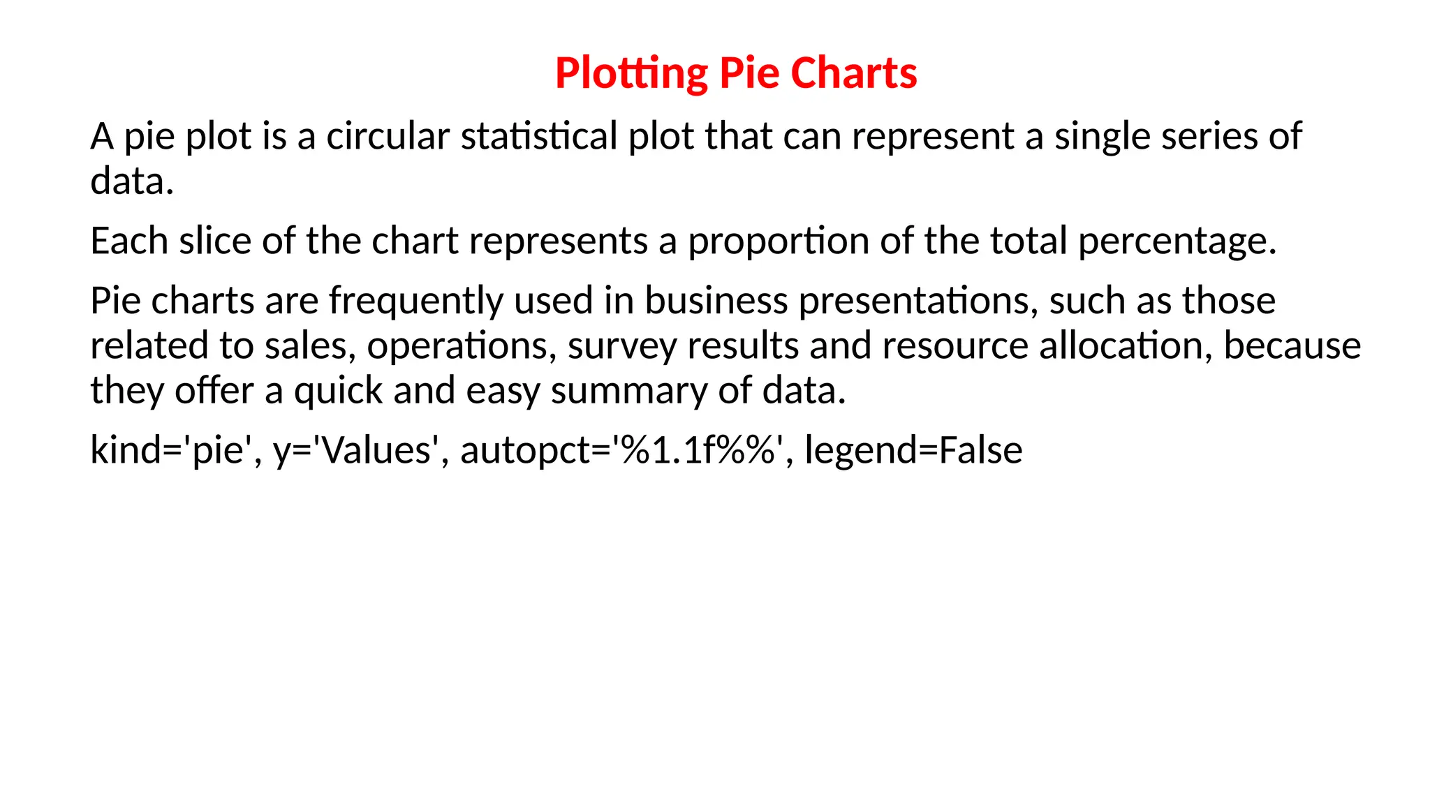
Plotting Pie Charts
Apie plot is a circular statistical plot that can represent a single series of
data.
Each slice of the chart represents a proportion of the total percentage.
Pie charts are frequently used in business presentations, such as those
related to sales, operations, survey results and resource allocation, because
they offer a quick and easy summary of data.
kind='pie', y='Values', autopct='%1.1f%%', legend=False
10.
import pandas aspd
import matplotlib.pyplot as plt
d = {
'name': ['p1', 'p2', 'p3', 'p4', 'p5', 'p6'],
'age': [20, 20, 21, 20, 21, 20],
'math_marks': [100, 90, 91, 98, 92, 95],
'physics_marks': [90, 100, 91, 92, 98, 95],
'chem_marks': [93, 89, 99, 92, 94, 92]
}
df = pd.DataFrame(d)
# Pie chart of math_marks (you can choose another subject like physics_marks or
chem_marks)
df['math_marks'].plot(kind='pie', autopct='%1.1f%%', labels=df['name'], title='Math Marks
Distribution')
![import matplotlib.pyplot as plt
import numpy as np
x = np.linspace(0, 10, 100)
plt.plot(x, np.sin(x), 'r--', linewidth=2, label='Sine Wave')
plt.scatter(x[::10], np.cos(x[::10]), marker='o', color='blue', label='Cosine Points')
plt.xlabel('X-axis')
plt.ylabel('Y-axis')
plt.title('Embellished Plot Example')
plt.grid(True, linestyle=':', alpha=0.7)
plt.legend()
plt.show()](https://image.slidesharecdn.com/plotings-250819072936-30a6c29c/75/python-plotting-s-and-its-types-with-examples-pptx-2-2048.jpg)
![Plotting with Pandas
Pandas plotting is an interface to Matplotlib, that allows to generate high-quality
plots directly from a DataFrame or Series.
The .plot() method is the core function for plotting data in Pandas.
Depending on the kind of plot we want to create, we can specify various
parameters such as plot type (kind), x and y columns, color, labels, etc.
import pandas as pd
import matplotlib.pyplot as plt
data = {'Year': [2000, 2001, 2002, 2003],'Unemployment Rate': [4.0, 4.7, 5.8, 6.0]}
df = pd.DataFrame(data)
# Plotting a line chart
df.plot(x='Year', y='Unemployment Rate', kind='line')
plt.show()](https://image.slidesharecdn.com/plotings-250819072936-30a6c29c/75/python-plotting-s-and-its-types-with-examples-pptx-4-2048.jpg)
![Creating Scatter Plots
To get the scatterplot of a dataframe all we have to do is to just call the plot() method by specifying some parameters.
kind='scatter',x= 'some_column',y='some_colum',color='somecolor’
import pandas as pd
import matplotlib.pyplot as plt
d = {
'name': ['p1', 'p2', 'p3', 'p4', 'p5', 'p6'],
'age': [20, 20, 21, 20, 21, 20],
'math_marks': [100, 90, 91, 98, 92, 95],
'physics_marks': [90, 100, 91, 92, 98, 95],
'chem_marks': [93, 89, 99, 92, 94, 92]
}
df = pd.DataFrame(data_dict)
# Scatter plot using pandas
ax = df.plot(kind='scatter', x='math_marks', y='physics_marks', color='red', title='Scatter Plot')
# Customizing plot elements
ax.set_xlabel("Math Marks")
ax.set_ylabel("Physics Marks")
plt.show()](https://image.slidesharecdn.com/plotings-250819072936-30a6c29c/75/python-plotting-s-and-its-types-with-examples-pptx-5-2048.jpg)
![Plotting Bar Charts for Categorical Data
Similarly, we have to specify some parameters for plot() method to get the bar plot.
kind='bar',x= 'some_column',y='some_colum',color='somecolor’
import pandas as pd
import matplotlib.pyplot as plt
d = {
'name': ['p1', 'p2', 'p3', 'p4', 'p5', 'p6'],
'age': [20, 20, 21, 20, 21, 20],
'math_marks': [100, 90, 91, 98, 92, 95],
'physics_marks': [90, 100, 91, 92, 98, 95],
'chem_marks': [93, 89, 99, 92, 94, 92]
}
df = pd.DataFrame(d)
ax = df.plot(kind='bar',
x='name',
y='physics_marks',
color='green',
title='BarPlot')
# Customize axis labels (optional, but can be added via 'ax' for more control)
ax.set_xlabel('Name')
ax.set_ylabel('Physics Marks')](https://image.slidesharecdn.com/plotings-250819072936-30a6c29c/75/python-plotting-s-and-its-types-with-examples-pptx-6-2048.jpg)
![Create Plots in Pandas using Line Plot
The line plot of a single column is not always useful, to get more insights we have to plot multiple columns on the
same graph. To do so we have to reuse the axes.
kind='line',x= 'some_column',y='some_colum',color='somecolor',ax='someaxes’
import pandas as pd
import matplotlib.pyplot as plt
d = {
'name': ['p1', 'p2', 'p3', 'p4', 'p5', 'p6'],
'age': [20, 20, 21, 20, 21, 20],
'math_marks': [100, 90, 91, 98, 92, 95],
'physics_marks': [90, 100, 91, 92, 98, 95],
'chem_marks': [93, 89, 99, 92, 94, 92]
}
df = pd.DataFrame(d)
# Plot multiple line plots using only pandas
df.plot(x='name', y=['math_marks', 'physics_marks', 'chem_marks'],
kind='line',
title='Line Plots of Marks in Different Subjects')](https://image.slidesharecdn.com/plotings-250819072936-30a6c29c/75/python-plotting-s-and-its-types-with-examples-pptx-7-2048.jpg)
![Create plots in pandas using Box Plot
Box plot is majorly used to identify outliers, we can information like median, maximum,
minimum, quartiles and so on
import pandas as pd
import matplotlib.pyplot as plt
d = {
'name': ['p1', 'p2', 'p3', 'p4', 'p5', 'p6'],
'age': [20, 20, 21, 20, 21, 20],
'math_marks': [100, 90, 91, 98, 92, 95],
'physics_marks': [90, 100, 91, 92, 98, 95],
'chem_marks': [93, 89, 99, 92, 94, 92]
}
df = pd.DataFrame(d)
df.plot.box()](https://image.slidesharecdn.com/plotings-250819072936-30a6c29c/75/python-plotting-s-and-its-types-with-examples-pptx-8-2048.jpg)
![import pandas as pd
import matplotlib.pyplot as plt
d = {
'name': ['p1', 'p2', 'p3', 'p4', 'p5', 'p6'],
'age': [20, 20, 21, 20, 21, 20],
'math_marks': [100, 90, 91, 98, 92, 95],
'physics_marks': [90, 100, 91, 92, 98, 95],
'chem_marks': [93, 89, 99, 92, 94, 92]
}
df = pd.DataFrame(d)
# Pie chart of math_marks (you can choose another subject like physics_marks or
chem_marks)
df['math_marks'].plot(kind='pie', autopct='%1.1f%%', labels=df['name'], title='Math Marks
Distribution')](https://image.slidesharecdn.com/plotings-250819072936-30a6c29c/75/python-plotting-s-and-its-types-with-examples-pptx-10-2048.jpg)