Download to read offline
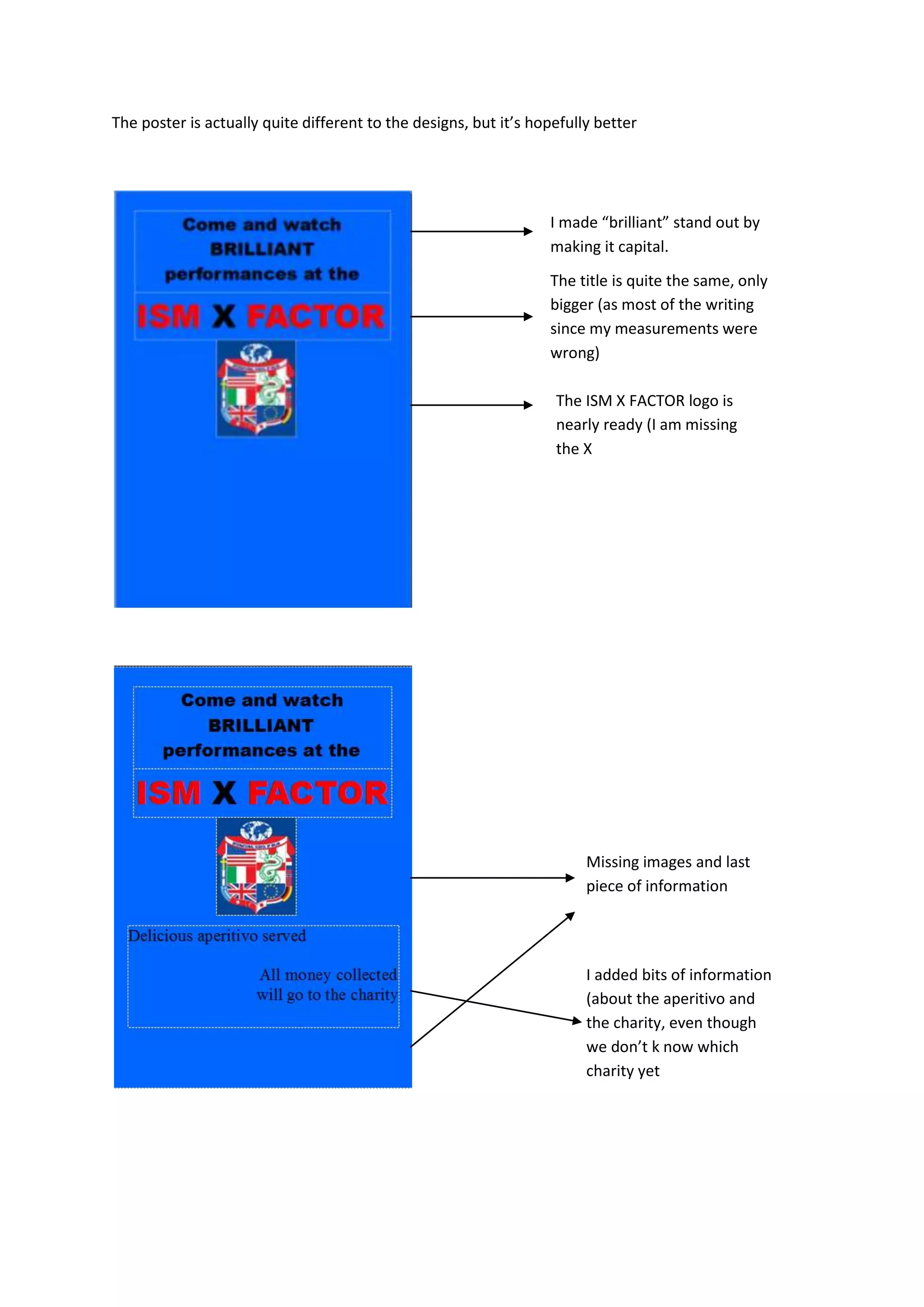
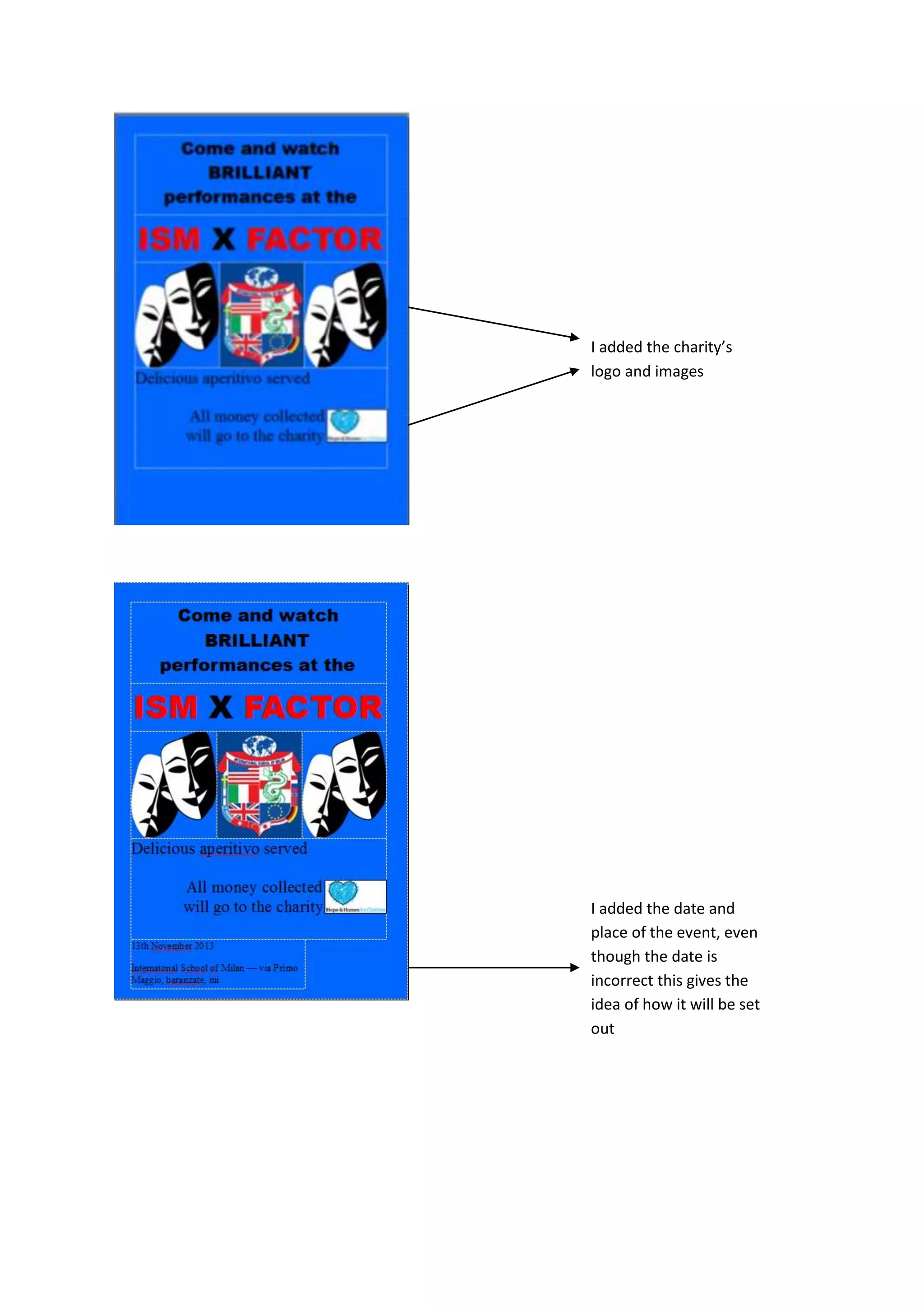
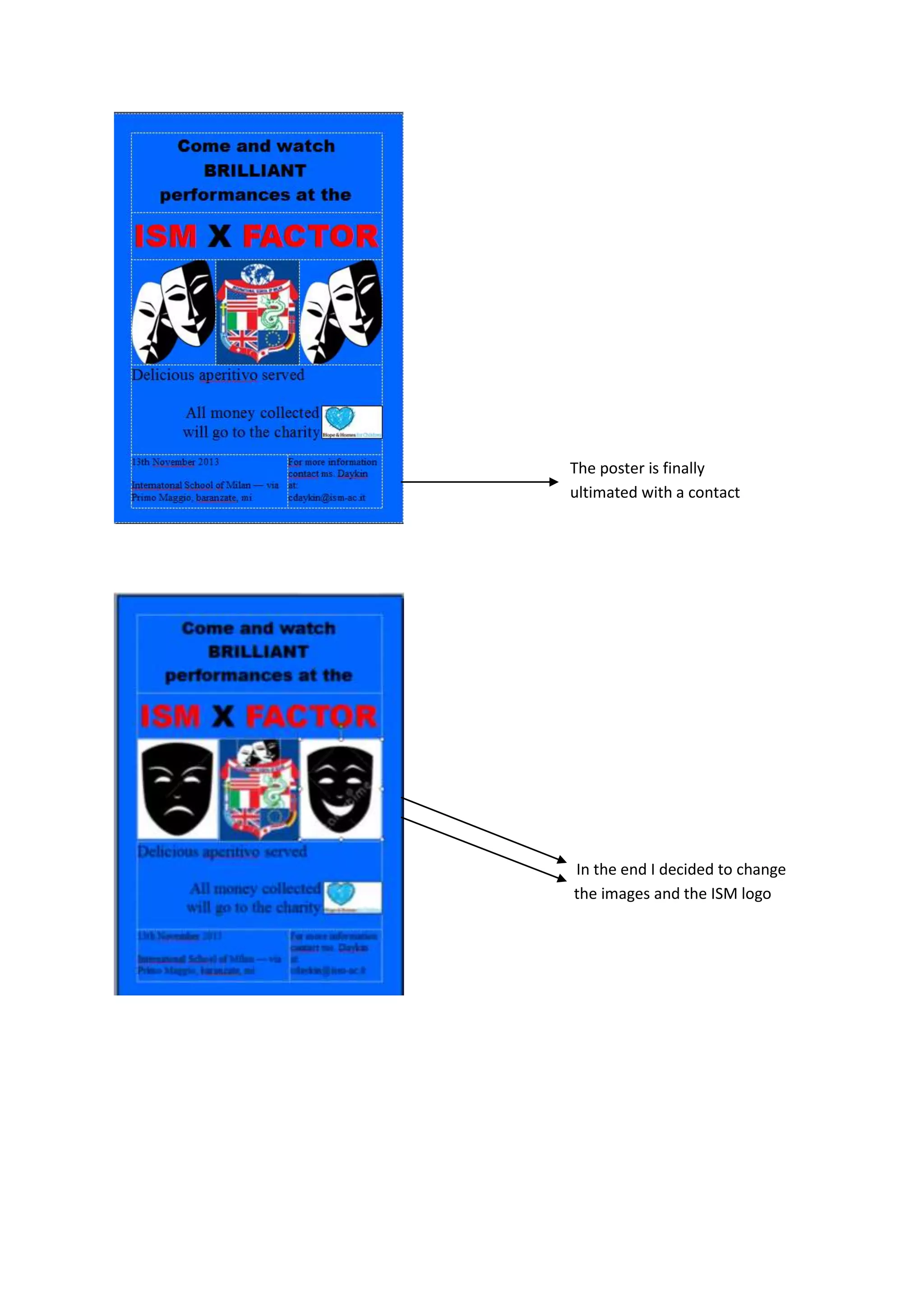

The document describes revisions made to a poster design, including making the word "brilliant" capitalized, increasing the size of the title, adding information about an aperitivo and charity event though details were missing, adding placeholder images and logos, and ultimately changing the images and logo used before finalizing the poster with contact information.


