Report
Share

Recommended
Analyse 6 film posters task 7
The poster focuses on the four main characters from previous "Ice Age" films. It uses a simple blue and white color scheme and large font to prominently display the film title. Minor details like the subtitle "Continental Drift" being placed vertically help distinguish this film without drawing too much attention away from the characters, which are central to engaging young viewers. Overall, the poster prioritizes recognizable characters from the franchise over intricate details, aiming to attract fans through familiarity and simplicity.
Copyright
Copyright is a form of protection granted by law to authors of original creative works. It gives the author exclusive rights over reproduction, distribution, public performance, public display, and creation of derivative works. Copyright protection applies automatically when a work is created and fixed in a tangible form. It covers both published and unpublished works including literary, dramatic, musical, artistic works. Not all creative works are subject to copyright protection which does not extend to facts, ideas, or systems. Copyright's purpose is to promote innovation and creativity by providing incentives for creators while allowing limited use of copyrighted works under exceptions like fair use.
10 Ways to Win at SlideShare SEO & Presentation Optimization
Thank you, SlideShare, for teaching us that PowerPoint presentations don't have to be a total bore. But in order to tap SlideShare's 60 million global users, you must optimize. Here are 10 quick tips to make your next presentation highly engaging, shareable and well worth the effort.
For more content marketing tips: http://www.oneupweb.com/blog/
Masters of SlideShare
No need to wonder how the best on SlideShare do it. The Masters of SlideShare provides storytelling, design, customization and promotion tips from 13 experts of the form. Learn what it takes to master this type of content marketing yourself.
STOP! VIEW THIS! 10-Step Checklist When Uploading to Slideshare
Before you upload your next presentation to Slideshare, here are a few things you might want to implement.
What Makes Great Infographics
SlideShare now has a player specifically designed for infographics. Upload your infographics now and see them take off! Need advice on creating infographics? This presentation includes tips for producing stand-out infographics. Read more about the new SlideShare infographics player here: http://wp.me/p24NNG-2ay
This infographic was designed by Column Five: http://columnfivemedia.com/
How To Get More From SlideShare - Super-Simple Tips For Content Marketing
How To Get More From SlideShare - Super-Simple Tips For Content MarketingContent Marketing Institute
This document provides tips for getting more engagement from content published on SlideShare. It recommends beginning with a clear content marketing strategy that identifies target audiences. Content should be optimized for SlideShare by using compelling visuals, headlines, and calls to action. Analytics and search engine optimization techniques can help increase views and shares. SlideShare features like lead generation and access settings help maximize results.You Suck At PowerPoint!
This document provides tips to avoid common mistakes in PowerPoint presentation design. It identifies the top 5 mistakes as including putting too much information on slides, not using enough visuals, using poor quality or unreadable visuals, having messy slides with poor spacing and alignment, and not properly preparing and practicing the presentation. The document encourages presenters to use fewer words per slide, high quality images and charts, consistent formatting, and to spend significant time crafting an engaging narrative and rehearsing their presentation. It emphasizes that an attractive design is not as important as being an effective storyteller.
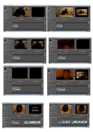
Behind the scenes set, make-up and props
The making of the wall setting for the film was a time-consuming process, so the creator enlisted help with charcoal drawings to speed up the process and add more creative ideas. Pictures associated with death were found online and stuck onto a blanket, which was then nailed to the wall to avoid damaging the wallpaper. Some pictures were left uncovering to show the process was unfinished, and props like tea lights and a vodka bottle were placed on tables to add to the unsettling atmosphere. The makeup was also carefully designed to portray the characters' states of mind, using powder, fake blood, and charcoal to make them appear pale, drained, and tired.
Genre conventions planning task 2
Through research, the author has decided to create a thriller film trailer. Key conventions that will be included are: mystery created through non-diegetic sound and a voiceover; a house setting; and dark, dim lighting. Roland Barthes' hermeneutic code will be used to leave the audience with questions. Flashbacks and a narrator will provide background information while maintaining mystery. Binary oppositions between a spirit and innocent family will incorporate the ideas of theorist Claude Lévi-Strauss. While following genre conventions, the trailer will also challenge expectations through a focus on dramatic sounds and music over dialogue.
Film trailers task 1
The document discusses several key elements that film trailers typically include to advertise and promote films. Trailers usually reveal the basic storyline to entice audiences while maintaining an element of mystery. They introduce main characters, directors, and popular actors/celebrities to draw audiences. Trailers also aim to persuade audiences through techniques like appropriate music, shots, reviews, star ratings, and revealing the release date at the end. The overall purpose is to encourage people to watch the film while only revealing a taste of what to expect.
College mag contents analysis
This document summarizes a college magazine layout. It notes that the simple color scheme and layout make the magazine easy to follow. Only including three images leaves plenty of room for content information. The images above the writing are intended to draw attention to main articles, while the rest of the layout is plain without unnecessary embellishment. The layout is very simple, with main content on the left and regular sections on the right, separated by graphics to avoid crowding. The light blue background provides a soft, friendly appearance.
Flat plan template
The document contains random letters, words and formatting elements with no clear meaning or story. It includes text, headers, images, and advertisements in a disorganized manner without a central topic or theme to summarize.
Bubbl
Bubbl.us es una herramienta en línea gratuita para crear mapas mentales y diagramas de flujo. Los usuarios pueden agregar imágenes, videos, enlaces y notas a sus mapas conceptuales para organizar ideas de manera visual. Bubbl.us ofrece plantillas predefinidas y opciones de formato para que los usuarios diseñen mapas personalizados fácilmente.
The making of my contents page
The document describes the process of designing a contents page for a magazine. It discusses testing different layouts, fonts, images and design elements to attract readers and promote specific articles and competitions. These include adding the magazine's initials in the corner, a competition to incentivize purchases, descriptive article titles, images of featured artists, and continuity with previous issues. The goal was to create an engaging contents page that effectively showcased content and encouraged readers to explore the full magazine.
Questionnaire analysis
Through analyzing survey responses, the author found that choosing a musical artist that appeals to most readers will be difficult. Respondents consistently said that the magazine's color scheme should feature black, blue, and red. Readers primarily want interviews and information about their favorite celebrities. Nearly 90% use YouTube as their main music source, informing the author that the magazine needs an online presence. While chatty language was preferred by 55%, it should only be used sparingly. The majority want a front cover with lots of content information rather than simplicity. Long articles and interviews were the most off-putting elements. This feedback will help guide the magazine's creation and content.
Location recess
The document discusses choosing locations for photo shoots for an R&B/Hip Hop magazine. The author wants to show both the glamorous and realistic sides of the genres. They chose a park to incorporate into a story about an up-and-coming rapper, representing where many youth spend time. They also chose a luxury car location to portray the stereotypical flashy attitude of rappers and show the magazine's professional, high-market side. The park shoot will be at night to capture the natural setting, while the car shoot will involve photoshop to make the background match the model pretending to be a rapper.
Focus group 2
The magazine will focus on hip hop and R&B music, blending the two genres, as feedback showed many artists cross over between them. It will be called "The Beat" as a shorter name was preferred. The front cover will feature a single artist to avoid clutter. The main article will be an interview to maintain reader interest. The color scheme will be black, white, and dark blue to have an "urban" look. The cost will be £3.20 as £3 was deemed too low but it needs to be competitively priced.
The process of making my double page spread
The document describes the iterative process of designing a magazine page layout. The designer made several changes to images, fonts, placement of graphic elements and text to improve the overall professional feel and balance of the page. Key changes included switching the central image, adjusting the header style and text, adding promotional elements like a contest, and simplifying the layout by removing some graphic features. The designer experimented with different fonts and color schemes before deciding on a final design with a white, black and red theme.
The process of making my front cover
The document describes the process of designing a magazine front cover. It discusses choosing a black background and adding the masthead text first to set the theme. Key features like a yellow star and slogan were added to attract attention. Boxes were included as placeholders until photos were chosen. Based on feedback, elements like the star, slogan placement, and pull quote were modified. The font colors, barcode, website, and plus sign were also incorporated to make the cover look more professional and realistic.
The process of making my front cover
The document describes the process of designing a magazine front cover. It discusses choosing a black background and adding the masthead text first to set the design theme. Key features like a yellow star and slogan were then added to attract attention. Feedback was incorporated like moving the slogan and changing the star design. The cover was further refined by adjusting fonts, adding elements like an artist's name and pull quote, and ensuring consistency with the color scheme. The final design was meant to look realistic and professional while enticing readers.
Masthead summary
Through analyzing feedback on various masthead options, the author chose the font Urban Jungle for their magazine masthead. Urban Jungle was described as representing the R&B genre well with its urban and studio-like feel. It stood out the most to feedback providers as bold and individual. While another option was also bold, it was suggested changing its color, and a third option was seen as too basic and not eye-catching enough. The author believes Urban Jungle is the most suitable choice as it captures the R&B/Hip Hop genre feel for the prominent magazine masthead.
Audience feedback for mock ups
The document provides feedback on three mockups for a magazine font cover, contents page, and double page spread. For the front cover, the third mockup was preferred as it separates the central image and text without either dominating. The third contents page mockup advertises a competition to grab attention. The first double page spread received the most positive feedback for including a summary, pull quote over the central image, and large central image to make the page more visual and avoid long articles.
More Related Content
More from Louisha26
Behind the scenes set, make-up and props
The making of the wall setting for the film was a time-consuming process, so the creator enlisted help with charcoal drawings to speed up the process and add more creative ideas. Pictures associated with death were found online and stuck onto a blanket, which was then nailed to the wall to avoid damaging the wallpaper. Some pictures were left uncovering to show the process was unfinished, and props like tea lights and a vodka bottle were placed on tables to add to the unsettling atmosphere. The makeup was also carefully designed to portray the characters' states of mind, using powder, fake blood, and charcoal to make them appear pale, drained, and tired.
Genre conventions planning task 2
Through research, the author has decided to create a thriller film trailer. Key conventions that will be included are: mystery created through non-diegetic sound and a voiceover; a house setting; and dark, dim lighting. Roland Barthes' hermeneutic code will be used to leave the audience with questions. Flashbacks and a narrator will provide background information while maintaining mystery. Binary oppositions between a spirit and innocent family will incorporate the ideas of theorist Claude Lévi-Strauss. While following genre conventions, the trailer will also challenge expectations through a focus on dramatic sounds and music over dialogue.
Film trailers task 1
The document discusses several key elements that film trailers typically include to advertise and promote films. Trailers usually reveal the basic storyline to entice audiences while maintaining an element of mystery. They introduce main characters, directors, and popular actors/celebrities to draw audiences. Trailers also aim to persuade audiences through techniques like appropriate music, shots, reviews, star ratings, and revealing the release date at the end. The overall purpose is to encourage people to watch the film while only revealing a taste of what to expect.
College mag contents analysis
This document summarizes a college magazine layout. It notes that the simple color scheme and layout make the magazine easy to follow. Only including three images leaves plenty of room for content information. The images above the writing are intended to draw attention to main articles, while the rest of the layout is plain without unnecessary embellishment. The layout is very simple, with main content on the left and regular sections on the right, separated by graphics to avoid crowding. The light blue background provides a soft, friendly appearance.
Flat plan template
The document contains random letters, words and formatting elements with no clear meaning or story. It includes text, headers, images, and advertisements in a disorganized manner without a central topic or theme to summarize.
Bubbl
Bubbl.us es una herramienta en línea gratuita para crear mapas mentales y diagramas de flujo. Los usuarios pueden agregar imágenes, videos, enlaces y notas a sus mapas conceptuales para organizar ideas de manera visual. Bubbl.us ofrece plantillas predefinidas y opciones de formato para que los usuarios diseñen mapas personalizados fácilmente.
The making of my contents page
The document describes the process of designing a contents page for a magazine. It discusses testing different layouts, fonts, images and design elements to attract readers and promote specific articles and competitions. These include adding the magazine's initials in the corner, a competition to incentivize purchases, descriptive article titles, images of featured artists, and continuity with previous issues. The goal was to create an engaging contents page that effectively showcased content and encouraged readers to explore the full magazine.
Questionnaire analysis
Through analyzing survey responses, the author found that choosing a musical artist that appeals to most readers will be difficult. Respondents consistently said that the magazine's color scheme should feature black, blue, and red. Readers primarily want interviews and information about their favorite celebrities. Nearly 90% use YouTube as their main music source, informing the author that the magazine needs an online presence. While chatty language was preferred by 55%, it should only be used sparingly. The majority want a front cover with lots of content information rather than simplicity. Long articles and interviews were the most off-putting elements. This feedback will help guide the magazine's creation and content.
Location recess
The document discusses choosing locations for photo shoots for an R&B/Hip Hop magazine. The author wants to show both the glamorous and realistic sides of the genres. They chose a park to incorporate into a story about an up-and-coming rapper, representing where many youth spend time. They also chose a luxury car location to portray the stereotypical flashy attitude of rappers and show the magazine's professional, high-market side. The park shoot will be at night to capture the natural setting, while the car shoot will involve photoshop to make the background match the model pretending to be a rapper.
Focus group 2
The magazine will focus on hip hop and R&B music, blending the two genres, as feedback showed many artists cross over between them. It will be called "The Beat" as a shorter name was preferred. The front cover will feature a single artist to avoid clutter. The main article will be an interview to maintain reader interest. The color scheme will be black, white, and dark blue to have an "urban" look. The cost will be £3.20 as £3 was deemed too low but it needs to be competitively priced.
The process of making my double page spread
The document describes the iterative process of designing a magazine page layout. The designer made several changes to images, fonts, placement of graphic elements and text to improve the overall professional feel and balance of the page. Key changes included switching the central image, adjusting the header style and text, adding promotional elements like a contest, and simplifying the layout by removing some graphic features. The designer experimented with different fonts and color schemes before deciding on a final design with a white, black and red theme.
The process of making my front cover
The document describes the process of designing a magazine front cover. It discusses choosing a black background and adding the masthead text first to set the theme. Key features like a yellow star and slogan were added to attract attention. Boxes were included as placeholders until photos were chosen. Based on feedback, elements like the star, slogan placement, and pull quote were modified. The font colors, barcode, website, and plus sign were also incorporated to make the cover look more professional and realistic.
The process of making my front cover
The document describes the process of designing a magazine front cover. It discusses choosing a black background and adding the masthead text first to set the design theme. Key features like a yellow star and slogan were then added to attract attention. Feedback was incorporated like moving the slogan and changing the star design. The cover was further refined by adjusting fonts, adding elements like an artist's name and pull quote, and ensuring consistency with the color scheme. The final design was meant to look realistic and professional while enticing readers.
Masthead summary
Through analyzing feedback on various masthead options, the author chose the font Urban Jungle for their magazine masthead. Urban Jungle was described as representing the R&B genre well with its urban and studio-like feel. It stood out the most to feedback providers as bold and individual. While another option was also bold, it was suggested changing its color, and a third option was seen as too basic and not eye-catching enough. The author believes Urban Jungle is the most suitable choice as it captures the R&B/Hip Hop genre feel for the prominent magazine masthead.
Audience feedback for mock ups
The document provides feedback on three mockups for a magazine font cover, contents page, and double page spread. For the front cover, the third mockup was preferred as it separates the central image and text without either dominating. The third contents page mockup advertises a competition to grab attention. The first double page spread received the most positive feedback for including a summary, pull quote over the central image, and large central image to make the page more visual and avoid long articles.