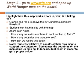
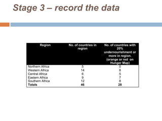
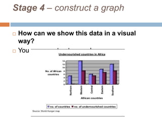
PROVING A
CONTENTION
Learning Intentions
 What we are doing?
 The idea of this lesson to illustrate to you what is
required in your project.
 To give you guidance on how to develop your
contention for your forthcoming assignment.
 Why are we doing it?
 By following the steps here you should begin to
understand how you can complete your
assignment.
 How do I know if I have learnt it?
 I can clearly develop a contention, that is
supported by clear facts and statistics.
Class Contention: Most of the people in Africa
are undernourished (20% and above)
 Stage 1 – explain and understand the
contention
 Identify the key words: most,
undernourished, Africa,
 What does most mean? More than half.
 What does undernourished mean? Use the
table on the assignment sheet to define this.
 What is Africa? A continent of 46 countries.
Stage 2 – go to www.wfp.org and open up
World Hunger map on the board.
Highlight how this map works, zoom in, what is it telling
us?
 Orange and red are above the 20% undernourishment
threshold.
 Students can have a play with the map.
 Zoom in on Africa.
1. How many countries are there in each section of Africa?
2. How many countries are orange or red?
3. How can we record this data?
 Note: Students will have to construct their own map to
support the contention. Sometimes the countries on the
map come up pink eg. Indonesia. Just zoom in closer to
get a proper colour.
Stage 3 – record the data
Stage 4 – construct a graph
 How can we show this data in a visual
way?
 You can construct a graph.
Stage 5 – Writing our conclusion
 The data shows that from 46 African countries
26 are undernourished. Therefore we can
agree with the contention that most of the
people in Africa are undernourished.
Stage 6 – Linking back to the World Hunger
map.
 We have used this map to provide data to
support our class contention but students are
asked in their assignment to then compare the
map they have created with the World Hunger
map.
 It is worth explaining this now and
highlighting the similarities/differences
table on the assignment.
Stage 7 – Editing
 Checklist
 Have you explained the contention?
 Have you included BOLTSS NA on your map?
 Have you included SALTS NA on your graph?
 Have you linked back to the World Hunger
map?
 Does your conclusion support your opinion?

Poverty cycle assessment proving a contention

  • 1.
  • 2.
    Learning Intentions  Whatwe are doing?  The idea of this lesson to illustrate to you what is required in your project.  To give you guidance on how to develop your contention for your forthcoming assignment.  Why are we doing it?  By following the steps here you should begin to understand how you can complete your assignment.  How do I know if I have learnt it?  I can clearly develop a contention, that is supported by clear facts and statistics.
  • 3.
    Class Contention: Mostof the people in Africa are undernourished (20% and above)  Stage 1 – explain and understand the contention  Identify the key words: most, undernourished, Africa,  What does most mean? More than half.  What does undernourished mean? Use the table on the assignment sheet to define this.  What is Africa? A continent of 46 countries.
  • 4.
    Stage 2 –go to www.wfp.org and open up World Hunger map on the board. Highlight how this map works, zoom in, what is it telling us?  Orange and red are above the 20% undernourishment threshold.  Students can have a play with the map.  Zoom in on Africa. 1. How many countries are there in each section of Africa? 2. How many countries are orange or red? 3. How can we record this data?  Note: Students will have to construct their own map to support the contention. Sometimes the countries on the map come up pink eg. Indonesia. Just zoom in closer to get a proper colour.
  • 5.
    Stage 3 –record the data
  • 6.
    Stage 4 –construct a graph  How can we show this data in a visual way?  You can construct a graph.
  • 7.
    Stage 5 –Writing our conclusion  The data shows that from 46 African countries 26 are undernourished. Therefore we can agree with the contention that most of the people in Africa are undernourished.
  • 8.
    Stage 6 –Linking back to the World Hunger map.  We have used this map to provide data to support our class contention but students are asked in their assignment to then compare the map they have created with the World Hunger map.  It is worth explaining this now and highlighting the similarities/differences table on the assignment.
  • 9.
    Stage 7 –Editing  Checklist  Have you explained the contention?  Have you included BOLTSS NA on your map?  Have you included SALTS NA on your graph?  Have you linked back to the World Hunger map?  Does your conclusion support your opinion?