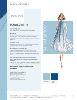
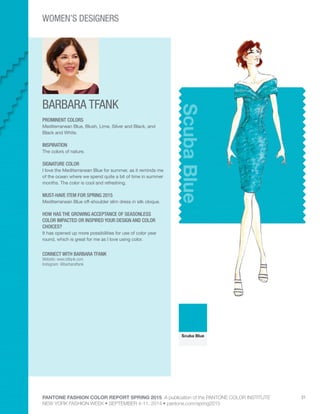
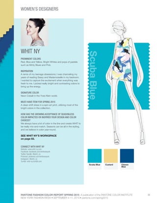
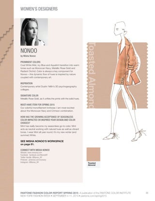
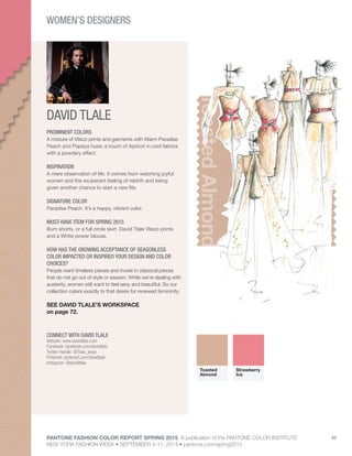
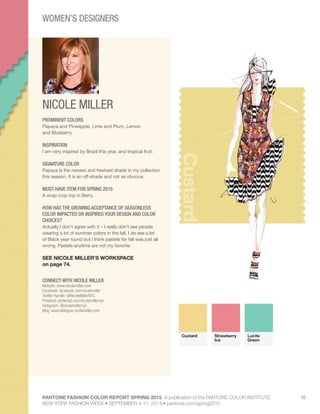
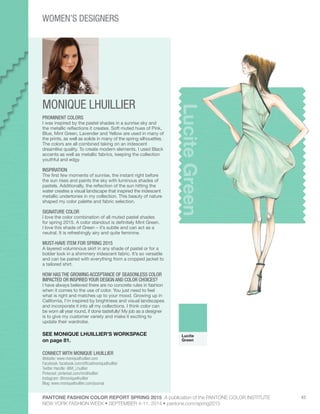
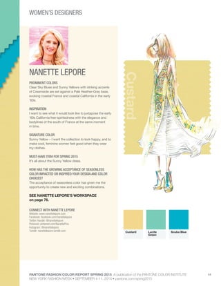
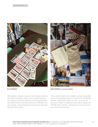
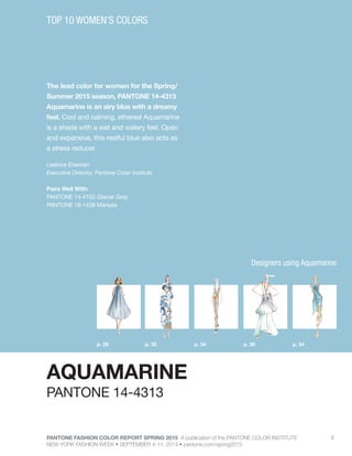
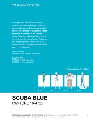
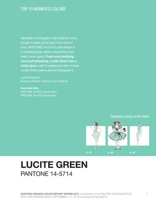
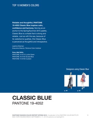
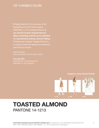
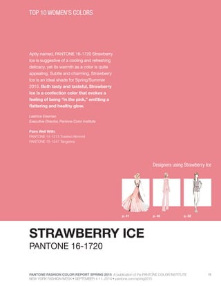
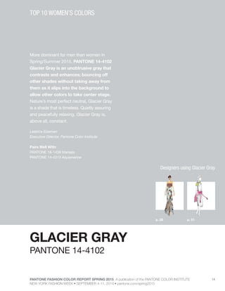
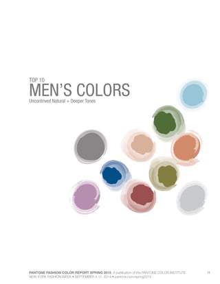
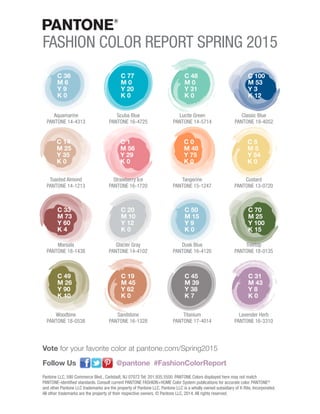
FASHION COLOR REPORT SPRING 2015
Volume 42
September 2014
A PUBLICATION
OF THEDennis Basso
PANTONE FASHION COLOR REPORT SPRING 2015 A publication of the PANTONE COLOR INSTITUTE
NEW YORK FASHION WEEK • SEPTEMBER 4-11, 2014 • pantone.com/spring2015
FASHION COLOR REPORT
SPRING 2015
NEW YORK FASHION WEEK
SEPTEMBER 4-11, 2014
TOP 10 WOMEN’S COLORS	 3
WOMEN’S DESIGNERS	 27
TOP 10 MEN’S COLORS	 15
MEN’S DESIGNERS	 56
THE INFLUENCERS	 60
WORKSPACES	66
COLOR LISTING & VALUES	 85
PANTONE FASHION COLOR REPORT SPRING 2015 A publication of the PANTONE COLOR INSTITUTE
NEW YORK FASHION WEEK • SEPTEMBER 4-11, 2014 • pantone.com/spring2015
3
WOMEN’S COLORSAn Eclectic, Ethereal Mix
TOP 10
4
This season there is a move toward the cooler and
softer side of the color spectrum. An eclectic, ethereal
mix of understated brights, pale pastels and nature-like
neutrals take center stage as designers draw from
daydreams of simpler times. Remembrances of retro
delights, folkloric and floral art, and the magical worlds
of tropical landscapes restore a sense of well-being as
we head into warmer months.
“Many feel compelled to be connected around the
clock because we are afraid we’ll miss something
important. There is a growing movement to step out
and create ‘quiet zones’ to disconnect from technology
and unwind, giving ourselves time to stop and be still,”
said Leatrice Eiseman, executive director of the
Pantone Color Institute®
. “Color choices follow the
same minimalistic, ‘en plein air’ theme, taking a cue
from nature rather than being reinvented or mechanically
manipulated. Soft, cool hues blend with subtle warm
tones to create a soothing escape from the everyday
hustle and bustle.”
On one end of the women’s palette sits Aquamarine,
an airy, ethereal blue with a cool, dreamy feel that mixes
well with the other blues and greens in the Top 10.
Evoking thoughts of soothing, tropical waters, Scuba
Blue restores our sense of carefree playfulness, while
invigorating the body and mind, and Lucite Green, a
soft, serene green offers a fresh sense of clarity.
Pair Lucite Green with bold Classic Blue for a balanced
and refreshed look. As the name implies, Classic Blue
is a strong and reliable anchor and, with its waterborne
qualities, is perceived as thoughtful and introspective.
Bringing balance to the coolness of the Spring/Summer
color range, Toasted Almond, a sun-tanned neutral,
offers timeless, comforting warmth.
Reminiscent of the sun on our skin in the spring and
summer months, Toasted Almond pairs well with both
Strawberry Ice, a light, nurturing coral tone, and
Tangerine, an energizing, non-jarring take on orange
that adds a bold pop of color for spring. Combine all
three for a delicious, almost retro-inspired look.
Emanating warmth and happiness, Custard serves as
an all-encompassing yellow for the spring palette, which
can be combined with Classic Blue for a maritime
look. Much like the fortified wine that gives Marsala its
name, this compelling and cordial hue incorporates the
satisfying richness of a tastefully fulfilling meal while its
grounding red-brown roots point to a sophisticated,
natural earthiness. Marsala works well with Glacier
Gray, a timeless and unobtrusive gray that adds a
sense of graceful relaxation as another practical neutral.
Bring Marsala and Glacier Gray together with Aquamarine
for an unexpected and exciting pairing that is perfect
for spring.
For more than 20 years, Pantone, the global authority
on color, has surveyed the designers of New York
Fashion Week and beyond to bring you the season’s
most important color trends. This report previews the
most prominent hues for spring 2015.
SPRING 2015: EN PLEIN AIR
Top 10 Women’s Colors
PANTONE FASHION COLOR REPORT SPRING 2015 A publication of the PANTONE COLOR INSTITUTE
NEW YORK FASHION WEEK • SEPTEMBER 4-11, 2014 • pantone.com/spring2015
PANTONE FASHION COLOR REPORT SPRING 2015 A publication of the PANTONE COLOR INSTITUTE
NEW YORK FASHION WEEK • SEPTEMBER 4-11, 2014 • pantone.com/spring2015
5
The lead color for women for the Spring/
Summer 2015 season, PANTONE 14-4313
Aquamarine is an airy blue with a dreamy
feel. Cool and calming, ethereal Aquamarine
is a shade with a wet and watery feel. Open
and expansive, this restful blue also acts as
a stress reducer.
Leatrice Eiseman
Executive Director, Pantone Color Institute
Pairs Well With:
PANTONE 14-4102 Glacier Gray
PANTONE 18-1438 Marsala
TOP 10 WOMEN’S COLORS
AQUAMARINE
p. 30p. 29 p. 36p. 34 p. 54
PANTONE 14-4313
Designers using Aquamarine
PANTONE FASHION COLOR REPORT SPRING 2015 A publication of the PANTONE COLOR INSTITUTE
NEW YORK FASHION WEEK • SEPTEMBER 4-11, 2014 • pantone.com/spring2015
6
An invigorating turquoise, PANTONE
16-4725 Scuba Blue conveys a sense of
carefree playfulness. Even though a cool
shade, the vibrancy of Scuba Blue adds a
splash of excitement to the palette.
Scuba Blue offers a feeling of escape as it
is reminiscent of a tropical ocean. This stirring
and energizing shade takes us off to an
exotic paradise that is pleasant and inviting,
even if only a fantasy.
Leatrice Eiseman
Executive Director, Pantone Color Institute
Pairs Well With:
PANTONE 19-4052 Classic Blue
PANTONE 14-5714 Lucite Green
TOP 10 WOMEN’S COLORS
SCUBA BLUE
p. 37p. 32p. 31 p. 38
PANTONE 16-4725
Designers using Scuba Blue
PANTONE FASHION COLOR REPORT SPRING 2015 A publication of the PANTONE COLOR INSTITUTE
NEW YORK FASHION WEEK • SEPTEMBER 4-11, 2014 • pantone.com/spring2015
7
Generally not thought of as a fashion color,
though it does come back from time to
time, PANTONE 14-5714 Lucite Green is
a soothing green shade whose time has
really come again. Fresh and clarifying,
cool and refreshing, Lucite Green has a
minty glow. Light in weight and also in tone,
Lucite Green seems almost transparent.
Leatrice Eiseman
Executive Director, Pantone Color Institute
Pairs Well With:
PANTONE 19-4052 Classic Blue
PANTONE 16-4725 Scuba Blue
TOP 10 WOMEN’S COLORS
LUCITE GREEN
p. 46 p. 49p. 43
PANTONE 14-5714
Designers using Lucite Green
PANTONE FASHION COLOR REPORT SPRING 2015 A publication of the PANTONE COLOR INSTITUTE
NEW YORK FASHION WEEK • SEPTEMBER 4-11, 2014 • pantone.com/spring2015
8
Reliable and thoughtful, PANTONE
19-4052 Classic Blue inspires calm,
confidence and harmony. Serving as an
anchor to the Spring/Summer 2015 palette,
Classic Blue is a shade that is strong and
reliable. Just as with the sea, because of
its waterborne qualities, this Classic Blue
is perceived as thoughtful and introspective.
Leatrice Eiseman
Executive Director, Pantone Color Institute
Pairs Well With:
PANTONE 14-5714 Lucite Green
PANTONE 16-4725 Scuba Blue
PANTONE 13-0720 Custard
TOP 10 WOMEN’S COLORS
CLASSIC BLUE
p. 48 p. 55
PANTONE 19-4052
Designers using Classic Blue
PANTONE FASHION COLOR REPORT SPRING 2015 A publication of the PANTONE COLOR INSTITUTE
NEW YORK FASHION WEEK • SEPTEMBER 4-11, 2014 • pantone.com/spring2015
9
Bringing balance to the coolness of the
Spring/Summer 2015 color range is
PANTONE 14-1213 Toasted Almond. A
sun-tanned neutral, Toasted Almond
offers comforting warmth and is indicative
of a spontaneous spring, summer feeling.
Timeless and versatile, Toasted Almond is
an organic shade that speaks to authenticity
and all that is natural.
Leatrice Eiseman
Executive Director, Pantone Color Institute
Pairs Well With:
PANTONE 16-1720 Strawberry Ice
PANTONE 15-1247 Tangerine
TOP 10 WOMEN’S COLORS
TOASTED ALMOND
p. 35p. 33 p. 40
PANTONE 14-1213
Designers using Toasted Almond
PANTONE FASHION COLOR REPORT SPRING 2015 A publication of the PANTONE COLOR INSTITUTE
NEW YORK FASHION WEEK • SEPTEMBER 4-11, 2014 • pantone.com/spring2015
10
Aptly named, PANTONE 16-1720 Strawberry
Ice is suggestive of a cooling and refreshing
delicacy, yet its warmth as a color is quite
appealing. Subtle and charming, Strawberry
Ice is an ideal shade for Spring/Summer
2015. Both tasty and tasteful, Strawberry
Ice is a confection color that evokes a
feeling of being “in the pink,” emitting a
flattering and healthy glow.
Leatrice Eiseman
Executive Director, Pantone Color Institute
Pairs Well With:
PANTONE 14-1213 Toasted Almond
PANTONE 15-1247 Tangerine
TOP 10 WOMEN’S COLORS
STRAWBERRY ICE
p. 45p. 41 p. 52
PANTONE 16-1720
Designers using Strawberry Ice
PANTONE FASHION COLOR REPORT SPRING 2015 A publication of the PANTONE COLOR INSTITUTE
NEW YORK FASHION WEEK • SEPTEMBER 4-11, 2014 • pantone.com/spring2015
11
Spontaneous and gregarious, PANTONE
15-1247 Tangerine is a juicy orange
shade that is energizing, yet not jarring
to the eye. Versatile Tangerine is striking
enough to stand on its own and adds vitality
to a printed pattern. Good natured and
friendly, but with a tangy edge, this fun-
loving color invites a smile.
Leatrice Eiseman
Executive Director, Pantone Color Institute
Pairs Well With:
PANTONE 14-1213 Toasted Almond
PANTONE 16-1720 Strawberry Ice
TOP 10 WOMEN’S COLORS
TANGERINE
p. 53
PANTONE 15-1247
Designers using Tangerine
PANTONE FASHION COLOR REPORT SPRING 2015 A publication of the PANTONE COLOR INSTITUTE
NEW YORK FASHION WEEK • SEPTEMBER 4-11, 2014 • pantone.com/spring2015
12
Just as the name implies, PANTONE
13-0720 Custard is a delicious and
delectable yellow. Sweet and sunny,
Custard is a cheering tone that brings
thoughts of pleasant relaxation and comfort
food. Engaging with its soft and mellow
warmth and full of good feelings, subtle
Custard has an affable and easy disposition.
Leatrice Eiseman
Executive Director, Pantone Color Institute
Pairs Well With:
PANTONE 19-4052 Classic Blue
TOP 10 WOMEN’S COLORS
CUSTARD
p. 44p. 42 p. 47
PANTONE 13-0720
Designers using Custard
PANTONE FASHION COLOR REPORT SPRING 2015 A publication of the PANTONE COLOR INSTITUTE
NEW YORK FASHION WEEK • SEPTEMBER 4-11, 2014 • pantone.com/spring2015
13
Interesting on its own and a wonderful
contrast for other hues, PANTONE 18-1438
Marsala serves as the foundation to the
Spring/Summer 2015 palette. Sensual and
bold, delicious Marsala is a daringly inviting
tone that nurtures; exuding confidence and
stability while feeding the body, mind and
soul. Much like the fortified wine that
gives Marsala its name, this robust shade
incorporates the warmth and richness
of a tastefully fulfilling meal, while its
grounding red-brown roots point to a
sophisticated, natural earthiness.
Leatrice Eiseman
Executive Director, Pantone Color Institute
Pairs Well With:
PANTONE 14-4102 Glacier Gray
PANTONE 14-4313 Aquamarine
TOP 10 WOMEN’S COLORS
MARSALA
p. 39 p. 50
PANTONE 18-1438
Designers using Marsala
PANTONE FASHION COLOR REPORT SPRING 2015 A publication of the PANTONE COLOR INSTITUTE
NEW YORK FASHION WEEK • SEPTEMBER 4-11, 2014 • pantone.com/spring2015
14
More dominant for men than women in
Spring/Summer 2015, PANTONE 14-4102
Glacier Gray is an unobtrusive gray that
contrasts and enhances; bouncing off
other shades without taking away from
them as it slips into the background to
allow other colors to take center stage.
Nature’s most perfect neutral, Glacier Gray
is a shade that is timeless. Quietly assuring
and peacefully relaxing, Glacier Gray is,
above all, constant.
Leatrice Eiseman
Executive Director, Pantone Color Institute
Pairs Well With:
PANTONE 18-1438 Marsala
PANTONE 14-4313 Aquamarine
TOP 10 WOMEN’S COLORS
GLACIER GRAY
p. 28 p. 51
PANTONE 14-4102
Designers using Glacier Gray
PANTONE FASHION COLOR REPORT SPRING 2015 A publication of the PANTONE COLOR INSTITUTE
NEW YORK FASHION WEEK • SEPTEMBER 4-11, 2014 • pantone.com/spring2015
15
MEN’S COLORSUncontrived Natural + Deeper Tones
TOP 10
16
For spring 2015, the men’s palette takes a surprising
turn, deviating from the women’s palette more than we
have seen in recent seasons. The menswear colors
emphasize the need for uncontrived hues, where
natural tones are interspersed with deep, foundational
colors for an unassuming and sophisticated Top 10.
A perennial favorite for men, dependable Dusk Blue
offers a cool, calm serenity, representative of the sky.
Juxtapose it with Glacier Gray, a masculine and
practical neutral, or Treetop, nature’s healthy,
harmonious green for a happy marriage of adaptable
cool, warm and neutral tones.
Classic Blue remains a core anchoring hue that is
powerful in tailored suits or casual sportswear, while
Toasted Almond continues to serve as another
essential neutral. With its yellow-green tint, Woodbine
is a tropical green best described as nature’s neutral
that pairs well the earthy and rugged associations of
Sandstone.
Masculine and solid, Titanium is a gray that speaks
to timelessness and exudes strength, while Marsala
offers a robust and rich contrast to the other colors in
the palette and combines dramatically with other deep
tones like Classic Blue, as well as neutral Sandstone.
Create a charming mélange with Woodbine, Titanium
and Lavender Herb, the palette’s most fashion-
forward and spirited color. As purple hues continue to
gain popularity in men’s fashion, Lavender Herb’s
mid-tone offers a retro and almost nostalgic element
in the men’s palette.
For more than 20 years, Pantone, the global authority
on color, has surveyed the designers of New York
Fashion Week and beyond to bring you the season’s
most important color trends. This report previews the
most prominent hues for spring 2015.
SPRING 2015: EN PLEIN AIR
Top 10 Men’s Colors
PANTONE FASHION COLOR REPORT SPRING 2015 A publication of the PANTONE COLOR INSTITUTE
NEW YORK FASHION WEEK • SEPTEMBER 4-11, 2014 • pantone.com/spring2015
PANTONE FASHION COLOR REPORT SPRING 2015 A publication of the PANTONE COLOR INSTITUTE
NEW YORK FASHION WEEK • SEPTEMBER 4-11, 2014 • pantone.com/spring2015
17
PANTONE 16-4120 Dusk Blue is perennially
a favorite shade for men. Reminiscent of
the blue sky above, Dusk Blue is ultimately
dependable and faithful. In a world that
has become increasingly chaotic, the
nostalgic Dusk Blue enables us to retreat
into a safe place of quiet blue calm.
Leatrice Eiseman
Executive Director, Pantone Color Institute
Pairs Well With:
PANTONE 14-4102 Glacier Gray
PANTONE 18-0135 Treetop
TOP 10 MEN’S COLORS
DUSK BLUE
PANTONE 16-4120
PANTONE FASHION COLOR REPORT SPRING 2015 A publication of the PANTONE COLOR INSTITUTE
NEW YORK FASHION WEEK • SEPTEMBER 4-11, 2014 • pantone.com/spring2015
18
More dominant for men than women in
Spring/Summer 2015, PANTONE 14-4102
Glacier Gray is an unobtrusive gray that
contrasts and enhances; bouncing off
other shades without taking away from
them as it slips into the background to
allow other colors to take center stage.
Nature’s most perfect neutral, Glacier Gray,
is a shade that is timeless. Quietly assuring
and peacefully relaxing, Glacier Gray is,
above all, constant.
Leatrice Eiseman
Executive Director, Pantone Color Institute
Pairs Well With:
PANTONE 18-0135 Treetop
PANTONE 16-4120 Dusk Blue
TOP 10 MEN’S COLORS
GLACIER GRAY
PANTONE 14-4102
PANTONE FASHION COLOR REPORT SPRING 2015 A publication of the PANTONE COLOR INSTITUTE
NEW YORK FASHION WEEK • SEPTEMBER 4-11, 2014 • pantone.com/spring2015
19
Speaking to restoration and new beginnings,
PANTONE 18-0135 Treetop is a natural
and fertile green. Ideal when used as a
background to other shades, Treetop is
a healthy harmonious green from nature
which offers a reassuring presence.
Physiologically affecting the nervous system,
this soothing green hue causes us to breathe
slowly and deeply, helping the heart to relax
by slowing the production of stress hormones.
Leatrice Eiseman
Executive Director, Pantone Color Institute
Pairs Well With:
PANTONE 14-4102 Glacier Gray
PANTONE 16-4120 Dusk Blue
TOP 10 MEN’S COLORS
TREETOP
p. 57
PANTONE 18-0135
Designers using Treetop
PANTONE FASHION COLOR REPORT SPRING 2015 A publication of the PANTONE COLOR INSTITUTE
NEW YORK FASHION WEEK • SEPTEMBER 4-11, 2014 • pantone.com/spring2015
20
Reliable and thoughtful, PANTONE 19-4052
Classic Blue inspires calm, confidence and
harmony. Serving as an anchor to the
Spring/Summer 2015 palette, Classic
Blue is a shade that is strong and reliable.
Just as with the sea, because of its
waterborne qualities, this Classic Blue is
perceived as thoughtful and introspective.
Leatrice Eiseman
Executive Director, Pantone Color Institute
Pairs Well With:
PANTONE 18-1438 Marsala
PANTONE 16-1328 Sandstone
TOP 10 MEN’S COLORS
CLASSIC BLUE
p. 58 David Hart
PANTONE 19-4052
Designers using Classic Blue
PANTONE FASHION COLOR REPORT SPRING 2015 A publication of the PANTONE COLOR INSTITUTE
NEW YORK FASHION WEEK • SEPTEMBER 4-11, 2014 • pantone.com/spring2015
21
Bringing balance to the coolness of the
Spring/Summer 2015 color range is
PANTONE 14-1213 Toasted Almond. A
sun-tanned neutral, Toasted Almond offers
comforting warmth and is indicative of a
spontaneous spring, summer feeling.
Timeless and versatile, Toasted Almond
is an organic shade that speaks to
authenticity and all that is natural.
Leatrice Eiseman
Executive Director, Pantone Color Institute
Pairs Well With:
PANTONE 16-3310 Lavender Herb
TOP 10 MEN’S COLORS
TOASTED ALMOND
PANTONE 14-1213
David Hart
Designers using Toasted Almond
PANTONE FASHION COLOR REPORT SPRING 2015 A publication of the PANTONE COLOR INSTITUTE
NEW YORK FASHION WEEK • SEPTEMBER 4-11, 2014 • pantone.com/spring2015
22
PANTONE 18-0538 Woodbine is a tropical
green that could best be described as
nature’s neutral. A classic yellow-green
that could be used with anything and
everything, Woodbine is a hue of foliage,
grass and growing plants. Inexorably
linked to our sense of smell, Woodbine
is evocative of a freshly mown lawn or a
flourishing palm frond.
Leatrice Eiseman
Executive Director, Pantone Color Institute
Pairs Well With:
PANTONE 17-4014 Titanium
PANTONE 16-3310 Lavender Herb
TOP 10 MEN’S COLORS
WOODBINE
PANTONE 18-0538
PANTONE FASHION COLOR REPORT SPRING 2015 A publication of the PANTONE COLOR INSTITUTE
NEW YORK FASHION WEEK • SEPTEMBER 4-11, 2014 • pantone.com/spring2015
23
PANTONE 16-1328 Sandstone is a stable
and grounded shade. Rugged and
woodsy, Sandstone is a complex neutral
that has a warming presence. Earthy and
real, Sandstone provides us with a return
to nature and what is beautiful, simple
and memorable.
Leatrice Eiseman
Executive Director, Pantone Color Institute
Pairs Well With:
PANTONE 18-1438 Marsala
PANTONE 19-4052 Classic Blue
TOP 10 MEN’S COLORS
SANDSTONE
PANTONE 16-1328
PANTONE FASHION COLOR REPORT SPRING 2015 A publication of the PANTONE COLOR INSTITUTE
NEW YORK FASHION WEEK • SEPTEMBER 4-11, 2014 • pantone.com/spring2015
24
Strong, masculine and solid, PANTONE
17-4014 Titanium is a gray shade that
speaks to timelessness. Classic and
tasteful, there is an implied quality
attached to anything so long lasting.
Durable and practical, this basic gray
shade has classic appeal.
Leatrice Eiseman
Executive Director, Pantone Color Institute
Pairs Well With:
PANTONE 16-3310 Lavender Herb
PANTONE 18-0538 Woodbine
TOP 10 MEN’S COLORS
TITANIUM
p. 59
PANTONE 17-4014
Designers using Titanium
PANTONE FASHION COLOR REPORT SPRING 2015 A publication of the PANTONE COLOR INSTITUTE
NEW YORK FASHION WEEK • SEPTEMBER 4-11, 2014 • pantone.com/spring2015
25
Interesting on its own and a wonderful
contrast for other hues, PANTONE 18-1438
Marsala serves as the foundation to the
Spring/Summer 2015 palette. Sensual and
bold, delicious Marsala is a daringly inviting
tone that nurtures; exuding confidence
and stability while feeding the body, mind
and soul. Much like the fortified wine
that gives Marsala its name, this robust
shade incorporates the warmth and
richness of a tastefully fulfilling meal while
its grounding red-brown roots point to a
sophisticated, natural earthiness.
Leatrice Eiseman
Executive Director, Pantone Color Institute
Pairs Well With:
PANTONE 19-4052 Classic Blue
PANTONE 16-1328 Sandstone
TOP 10 MEN’S COLORS
MARSALA
PANTONE 18-1438
PANTONE FASHION COLOR REPORT SPRING 2015 A publication of the PANTONE COLOR INSTITUTE
NEW YORK FASHION WEEK • SEPTEMBER 4-11, 2014 • pantone.com/spring2015
26
PANTONE 16-3310 Lavender Herb is a
shade rich in nostalgia. A unique shade
that adds a surprise to the Spring/Summer
2015 palette, Lavender Herb is a shade
that intrigues the eye. Lavender Herb is
also a creative shade; one that will add
a distinctive color pop whether worn on
its own or combined with the other top
Spring/Summer 2015 colors.
Leatrice Eiseman
Executive Director, Pantone Color Institute
Pairs Well With:
PANTONE 14-1213 Toasted Almond
TOP 10 MEN’S COLORS
LAVENDER HERB
PANTONE 16-3310
PANTONE FASHION COLOR REPORT SPRING 2015 A publication of the PANTONE COLOR INSTITUTE
NEW YORK FASHION WEEK • SEPTEMBER 4-11, 2014 • pantone.com/spring2015
27
WOMEN’S DESIGNERSreveal their inspiration and must-have items for Spring 2015.
PANTONE FASHION COLOR REPORT SPRING 2015 A publication of the PANTONE COLOR INSTITUTE
NEW YORK FASHION WEEK • SEPTEMBER 4-11, 2014 • pantone.com/spring2015
28
DENNIS BASSO
CONNECT WITH DENNIS BASSO
Website: www.Dennisbasso.com
Facebook: facebook.com/dennisbasso
Twitter Handle: @DennisBasso
Instagram: @Dennisbasso
GlacierGray
PROMINENT COLORS
Apricot, Blushy Nudes, Olive, Avocado Green, Pale Sherbet
(Orange), Pearl Cool Gray, Charcoal, Soft Whites and Ivories,
and Dusty Rose.
INSPIRATION
International resorts and women in the ‘60s.
SIGNATURE COLOR
Apricot – It lends as a subtly neutral shade of Nude and a
soft warm palette.
MUST-HAVE ITEM FOR SPRING 2015
A strapless silk cloqué gown with hand-embroidered flowers
in shades of Avocado and Cool Gray.
HOW HAS THE GROWING ACCEPTANCE OF SEASONLESS
COLOR IMPACTED OR INSPIRED YOUR DESIGN AND COLOR
CHOICES?
The collection focuses on neutral and soft tones of Grays,
Nudes, Dusty Rose, and Whites, creating an easily
seasonless palette, especially for eveningwear.
SEE DENNIS BASSO’S WORKSPACE
on page 83.
Glacier
Gray
Marsala Strawberry
Ice
WOMEN’S DESIGNERS
®
PANTONE FASHION COLOR REPORT SPRING 2015 A publication of the PANTONE COLOR INSTITUTE
NEW YORK FASHION WEEK • SEPTEMBER 4-11, 2014 • pantone.com/spring2015
29
CYNTHIA STEFFE
CONNECT WITH CYNTHIA STEFFE
Website: www.cynthiasteffe.com
Facebook: facebook.com/cynthiasteffe123
Twitter Handle: @cynthiasteffe
Pinterest: pinterest.com/cynthiasteffe
Instagram: @cynthiasteffe
Blog: cynthiasteffe.com/blog/index.php
Aquamarine
PROMINENT COLORS
Blue Tide, Ice Sky, Frozen Aqua and Violet Cream.
INSPIRATION
The romantic scenery of Provence, France. From the warm
lavender fields in the countryside to the cool waters by
the coast, Provence invokes a subtle, yet vibrant romance
within us.
SIGNATURE COLOR
Ice Sky. It is a refreshing and ethereal shade of Blue and is
a perfect pairing for our entire spring palette.
MUST-HAVE ITEM FOR SPRING 2015
A pleated trapeze dress that interplays our prominent
colors with polka dots that stream through the pleats in a
feminine and playful gesture – it is the perfect day to night
dress.
HOW HAS THE GROWING ACCEPTANCE OF SEASONLESS
COLOR IMPACTED OR INSPIRED YOUR DESIGN AND COLOR
CHOICES?
The fact that color is no longer bound by seasonality allows
us to magnify our palette – our options become limitless.
SEE CYNTHIA STEFFE’S WORKSPACE
on page 78.
Aquamarine Classic
Blue
WOMEN’S DESIGNERS
PANTONE FASHION COLOR REPORT SPRING 2015 A publication of the PANTONE COLOR INSTITUTE
NEW YORK FASHION WEEK • SEPTEMBER 4-11, 2014 • pantone.com/spring2015
30
BANJANAN
CONNECT WITH BANJANAN
Website: www.banjanan.com
Instagram: @banjanan
Tumblr: banjanan.tumblr.com
Aquamarine
by Caroline Weller
PROMINENT COLORS
Tones of the earth and sky: Cool and clear Sky Blues,
Warm Tan and Honey neutrals and warm earth tones such
as Deep Scarlet and Blood Red.
INSPIRATION
Imagining Georgia O’Keeffe’s life on Ghost Ranch, a fantasy
about the American Southwest and a love of birds and
flowers imagined in that landscape.
SIGNATURE COLOR
Crystal Blue. It’s a lovely clear Sky Blue, and it is a perfect
ground for my multi-color prints.
MUST-HAVE ITEM FOR SPRING 2015
The buffalo maxi dress in silk chiffon, in my tree of life print. It
is Sky Blue with shades of Caramel, Imperial and Navy Blues.
HOW HAS THE GROWING ACCEPTANCE OF SEASONLESS
COLOR IMPACTED OR INSPIRED YOUR DESIGN AND COLOR
CHOICES?
I always include a neutral story in the collection as a
complement to the main color palette. I know that it can
be bought by all my international customers that may
have a different climate or season. I also make sure that I
have classic design pieces that can carry forward into the
coming season.
SEE BANJANAN’S WORKSPACE
on page 70.
Aquamarine Classic
Blue
Toasted
Almond
WOMEN’S DESIGNERS
PANTONE FASHION COLOR REPORT SPRING 2015 A publication of the PANTONE COLOR INSTITUTE
NEW YORK FASHION WEEK • SEPTEMBER 4-11, 2014 • pantone.com/spring2015
31
BARBARA TFANK
CONNECT WITH BARBARA TFANK
Website: www.btfank.com
Instagram: @barbaratfank
ScubaBlue
PROMINENT COLORS
Mediterranean Blue, Blush, Lime, Silver and Black, and
Black and White.
INSPIRATION
The colors of nature.
SIGNATURE COLOR
I love the Mediterranean Blue for summer, as it reminds me
of the ocean where we spend quite a bit of time in summer
months. The color is cool and refreshing.
MUST-HAVE ITEM FOR SPRING 2015
Mediterranean Blue off-shoulder slim dress in silk cloque.
HOW HAS THE GROWING ACCEPTANCE OF SEASONLESS
COLOR IMPACTED OR INSPIRED YOUR DESIGN AND COLOR
CHOICES?
It has opened up more possibilities for use of color year
round, which is great for me as I love using color.
Scuba Blue
WOMEN’S DESIGNERS
PANTONE FASHION COLOR REPORT SPRING 2015 A publication of the PANTONE COLOR INSTITUTE
NEW YORK FASHION WEEK • SEPTEMBER 4-11, 2014 • pantone.com/spring2015
32
WHIT NY
CONNECT WITH WHIT NY
Website: www.whit-ny.com
Facebook: facebook.com/whitnewyork
Twitter Handle: @whit_ny
Pinterest: pinterest.com/whitnewyork
Instagram: @whit_ny
Tumblr: whit-ny.tumblr.com
ScubaBlue
PROMINENT COLORS
Red, Blue and Yellow. Bright Whites and pops of pastels
such as Minty Blues and Pink.
INSPIRATION
A remix of my teenage obsessions; I was channeling my
years of reading Sassy and Mademoiselle in my bedroom.
I wanted to capture the excitement when everything was
fresh to me. I picked really bright and contrasting colors to
bring up the energy.
SIGNATURE COLOR
Neon Cobalt in the Yves Klein world.
MUST-HAVE ITEM FOR SPRING 2015
A clean shift dress in a spin-art print, utilizing most of the
bright colors in the collection.
HOW HAS THE GROWING ACCEPTANCE OF SEASONLESS
COLOR IMPACTED OR INSPIRED YOUR DESIGN AND COLOR
CHOICES?
We always have a lot of color in the line and create WHIT to
be really mix-and-match. Seasons can be all in the styling,
and we believe in color year-round.
SEE WHIT NY’S WORKSPACE
on page 83.
Scuba Blue Custard Classic
Blue
WOMEN’S DESIGNERS
PANTONE FASHION COLOR REPORT SPRING 2015 A publication of the PANTONE COLOR INSTITUTE
NEW YORK FASHION WEEK • SEPTEMBER 4-11, 2014 • pantone.com/spring2015
33
NONOO
CONNECT WITH MISHA NONOO
Website: www.nonoony.com
Facebook: facebook.com/NonooNY
Twitter Handle: @Nonoo_NY
Pinterest: pinterest.com/nonoony
Instagram: @Nonoo_NY
ToastedAlmond
by Misha Nonoo
PROMINENT COLORS
Cool White Mist, Icy Blue and Aquatint transition into warm
tones such as Moroccan Navy, Metallic Rose Gold and
Radiant Orchid. Color is always a key component for
Nonoo – this dynamic flow of hues is inspired by nature
coupled with contemporary art.
INSPIRATION
Contemporary artist Dustin Yellin’s 3D psychogeography
collages.
SIGNATURE COLOR
Metallic Rose Gold, as it unifies the prints with the solid hues.
MUST-HAVE ITEM FOR SPRING 2015
Our colorful monofilament knitwear. I am most excited
about the Moroccan Navy and Crimson combination.
HOW HAS THE GROWING ACCEPTANCE OF SEASONLESS
COLOR IMPACTED OR INSPIRED YOUR DESIGN AND COLOR
CHOICES?
Mint has really become my seasonless go-to color. Mint
acts as neutral working with natural hues as well as vibrant
tones. I wear Mint all year round; it’s my new winter (and
summer) White.
SEE MISHA NONOO’S WORKSPACE
on page 81.
Toasted
Almond
WOMEN’S DESIGNERS
PANTONE FASHION COLOR REPORT SPRING 2015 A publication of the PANTONE COLOR INSTITUTE
NEW YORK FASHION WEEK • SEPTEMBER 4-11, 2014 • pantone.com/spring2015
34
RACHEL PALLY
CONNECT WITH RACHEL PALLY
Website: www.rachelpally.com
Facebook: facebook.com/RachelPally
Twitter Handle: @RachelPally
Pinterest: pinterest.com/rachelpallyinc
Instagram: @RachelPally
Tumblr: rachelpally.tumblr.com
Aquamarine
PROMINENT COLORS
Pastels! From Bellini Orange and Ice Blue, to Pastel Pink and
Chamomile Yellow – colors that are a little lighter and brighter.
INSPIRATION
The beauty of California in the spring, the golden hour at
the end of a warm day, the Southwest as painted by Georgia
O’Keeffe and the architecture of Frank Lloyd Wright.
SIGNATURE COLOR
Orange – Bellini Orange is what we’ve called it. It’s the
second color of the Chakra and is associated with
happiness, confidence and resourcefulness.
MUST-HAVE ITEM FOR SPRING 2015
Jumpsuits and rompers! We have a new crisscross back
jumpsuit with a plunging neckline in our stencil print – which
consists of Succulent Green, Dutch Blue and Ice Blue and
Mesa Pink pastels – that I can’t wait to get my hands on.
HOW HAS THE GROWING ACCEPTANCE OF SEASONLESS
COLOR IMPACTED OR INSPIRED YOUR DESIGN AND COLOR
CHOICES?
We’ve always had a seasonless approach to color in our
collections and don’t adhere to guidelines of only using
certain colors at certain times. For example, our fall 2014
collection had rich Samba Reds and dark Hunter Greens,
but also a Dusty Lotus Pink and a Cerulean-like Aquarius
Blue throughout, which may not typically be thought of as
‘fall colors.’ Past and present we try to choose colors that
feel fresh, look beautiful, and tell the story of that season.
SEE RACHEL PALLY’S WORKSPACE
on page 80.
Aquamarine Tangerine
WOMEN’S DESIGNERS
PANTONE FASHION COLOR REPORT SPRING 2015 A publication of the PANTONE COLOR INSTITUTE
NEW YORK FASHION WEEK • SEPTEMBER 4-11, 2014 • pantone.com/spring2015
35
JAY GODFREY
CONNECT WITH JAY GODFREY
Website: www.jaygodfrey.com
Facebook: facebook.com/JayGodfreyPage
Twitter Handle: @JayGodfrey_NYC
Instagram: @JayGodfreynyc
ToastedAlmond
PROMINENT COLORS
The collection explores the contrast between the raw and
the refined – the color scheme is a blend of tea stained
neutrals, bold prints, embellished fabrics, Burnt Oranges
and Teals. Key colors include Pearled Ivory, Mint Leaf, Sunny
Lime, Caviar, Apricot Wash and Living Coral.
INSPIRATION
Classic rock musicians and their infusion of western music
in the late ‘60s and early ‘70s was a key inspiration for the
collection. Similar to The Rolling Stones’, Bob Dylan’s, and
Jimi Hendrix’s interpretation of the glamorous life of the
cowboy culture, Jay Godfrey offers a refined take on the
relaxed and casual silhouettes of the time while staying true
to his New York City aesthetic.
SIGNATURE COLOR
Pearled Ivory – the color is prominent throughout as the
“tea stained” color inspiration. This is the most important
color in the collection; stringing together the storyline of the
Jay Godfrey girl. A consistent color throughout, it grounds
the bolder patterns and colors of the collection.
MUST-HAVE ITEM FOR SPRING 2015
The jumpsuit. It is effortless and transitions easily from day
to night. The jumpsuit is a signature Jay Godfrey piece,
offered each season in various fabrications and colors. It
best exemplifies the JG girl’s effortlessly chic approach to
fashion. Specifically, Pearled Ivory, Caviar and Mint Leaf
were used in jumpsuits in the collection.
HOW HAS THE GROWING ACCEPTANCE OF SEASONLESS
COLOR IMPACTED OR INSPIRED YOUR DESIGN AND COLOR
CHOICES?
The neutrality of this season’s inspiration color allows for
the pieces to be intermixed practically throughout the year.
Cool in the summer, yet an appropriate alternative to Black
for the winter, the tea stained color styles offer a great
investment in versatility. Additionally, the seasonless color
choice reflects the timelessness of Western Americana and
its influence on Rock ’n’ Roll music.
SEE JAY GODFREY’S WORKSPACE
on page 84.
Toasted
Almond
Marsala
WOMEN’S DESIGNERS
PANTONE FASHION COLOR REPORT SPRING 2015 A publication of the PANTONE COLOR INSTITUTE
NEW YORK FASHION WEEK • SEPTEMBER 4-11, 2014 • pantone.com/spring2015
36
BCBGMAXAZRIA
CONNECT WITH BCBGMAXAZRIA
Website: www.bcbg.com
Facebook: facebook.com/BCBGMAXAZRIA
Twitter Handle: @BCBGMAXAZRIA
Pinterest: pinterest.com/bcbgmaxazria
Instagram: @BCBGMAXAZRIA
Blog: www.bonchicblog.com
Aquamarine
Submission by Lubov Azria, Chief Creative Officer
PROMINENT COLORS
Soft shades of Warm Dusty Pinks and Cool Blues are
highlighted by Fresh Aqua and White.
INSPIRATION
The idea of recycling and reclaiming antique rugs and
textiles. The treatments used lend a beautiful patina effect
that influenced our palette and prints, lending a sun-
bleached softness and richness of color that speaks to the
marriage of modern and traditional techniques.
SIGNATURE COLOR
Blue Haze – this Pale Aqua shade is light and airy, bringing
a freshness to the collection.
MUST-HAVE ITEM FOR SPRING 2015
A maxi dress in a muted shade of Aqua.
HOW HAS THE GROWING ACCEPTANCE OF SEASONLESS
COLOR IMPACTED OR INSPIRED YOUR DESIGN AND COLOR
CHOICES?
People are drawn to color, so the freedom of color choices
really lets us express the mood and emotion that we want
to draw people in, regardless of the season. We love the
idea of diversity in color.
Aquamarine
WOMEN’S DESIGNERS
BCBGMAXAZRIAGROUP
PANTONE FASHION COLOR REPORT SPRING 2015 A publication of the PANTONE COLOR INSTITUTE
NEW YORK FASHION WEEK • SEPTEMBER 4-11, 2014 • pantone.com/spring2015
37
DEGEN
CONNECT WITH DEGEN
Website: www.degen-nyc.com
Facebook: facebook.com/DegenNYC
Twitter Handle: @DegenNYC
Pinterest: pinterest.com/degennyc
Instagram: @lindsaydegen
Tumblr: degen-nyc.tumblr.com
ScubaBlue
PROMINENT COLORS
Various shades of Ocean Blues, from Seafoam to Deep
Blue. Bright Orange and Yellow, as well as a Dusty
Pink-Purple.
INSPIRATION
Psychedelic prints, hot dogs and the ocean.
SIGNATURE COLOR
The Seafoam Green-Blue is the most important color in the
collection – it grounds the other colors.
MUST-HAVE ITEM FOR SPRING 2015
A basic knitted Seafoam Green-Blue T-shirt with eyelet lace
details.
HOW HAS THE GROWING ACCEPTANCE OF SEASONLESS
COLOR IMPACTED OR INSPIRED YOUR DESIGN AND COLOR
CHOICES?
I think my colors this season are very summery, but I would
still wear all of this in the winter.
SEE DEGEN’S WORKSPACE
on page 72.
Scuba Blue Glacier
Gray
Tangerine
WOMEN’S DESIGNERS
PANTONE FASHION COLOR REPORT SPRING 2015 A publication of the PANTONE COLOR INSTITUTE
NEW YORK FASHION WEEK • SEPTEMBER 4-11, 2014 • pantone.com/spring2015
38
TADASHI SHOJI
CONNECT WITH TADASHI SHOJI
Website: www.tadashishoji.com
Facebook: facebook.com/tadashishoji
Twitter Handle:@TadashiShoji
Pinterest: pinterest.com/tadashishoji
Instagram: @TadashiShoji
Blog: tadashishoji.com/blog
ScubaBlue
PROMINENT COLORS
Ocean Mist – a rich, mid-tone Blue.
INSPIRATION
The Grand Canal in Venice.
SIGNATURE COLOR
Ivory looks beautiful shown in a variety of fabrics and in
both monochrome and contrasting looks. It is clean
and effortless.
MUST-HAVE ITEM FOR SPRING 2015
A Navy Rose-motif embroidered lace on Ivory neoprene
collared sheath dress.
HOW HAS THE GROWING ACCEPTANCE OF SEASONLESS
COLOR IMPACTED OR INSPIRED YOUR DESIGN AND COLOR
CHOICES?
It has given me the creative freedom to work with any color
necessary to portray my inspiration, rather than feeling
confined to use colors based on the particular season.
SEE TADASHI SHOJI’S WORKSPACE
on page 69.
Scuba Blue Aquamarine
WOMEN’S DESIGNERS
But Sou Lai
PANTONE FASHION COLOR REPORT SPRING 2015 A publication of the PANTONE COLOR INSTITUTE
NEW YORK FASHION WEEK • SEPTEMBER 4-11, 2014 • pantone.com/spring2015
39
DANIEL SILVERSTAIN
CONNECT WITH DANIEL SILVERSTAIN
Website: www.danielsilverstain.com
Facebook: facebook.com/pages/DanielSilverstain/599329153414692
Twitter Handle: @DSilverstainNYC
Pinterest: pinterest.com/danielsilver
Instagram: @danielsilverstain
Marsala
PROMINENT COLORS
Lychee, Blush, Terracotta, Rio Red, Bordeaux, Merlot, Ice
Blue, Crystal Blue, Levis, Lavender, Arctic Blue, Iron Gray
and Navy.
INSPIRATION
Images of tourists in Brazil from 1960s, modern architecture
images from Brazil, and retro anaglyph 3D techniques.
SIGNATURE COLOR
Icy Blues are the main focal point of the collection. They
bring a fresh, cool air to the palette and give natural, warm
colors a twist when combined together.
MUST-HAVE ITEM FOR SPRING 2015
A sheer nylon parka mixed with a 3D floral jacquard. It’s
a perfect combination of clear and opaque, street and
elegant, day and evening.
HOW HAS THE GROWING ACCEPTANCE OF SEASONLESS
COLOR IMPACTED OR INSPIRED YOUR DESIGN AND COLOR
CHOICES?
The whole collection has been designed from a seasonless
point of view. Each garment is a timeless piece, with a
soft-luxury color combination.
SEE DANIEL SILVERSTAIN’S WORKSPACE
on page 71.
Marsala Aquamarine
WOMEN’S DESIGNERS
PANTONE FASHION COLOR REPORT SPRING 2015 A publication of the PANTONE COLOR INSTITUTE
NEW YORK FASHION WEEK • SEPTEMBER 4-11, 2014 • pantone.com/spring2015
40
DAVID TLALE
CONNECT WITH DAVID TLALE
Website: www.davidtlale.com
Facebook: facebook.com/davidtlale
Twitter Handle: @Tlale_large
Pinterest: pinterest.com/davidtlale
Instagram: @davidtlale
ToastedAlmond
PROMINENT COLORS
A mixture of Vlisco prints and garments with Warm Paradise
Peach and Papaya hues; a touch of Apricot in cool fabrics
with a powdery effect.
INSPIRATION
A mere observation of life. It comes from watching joyful
women and the exuberant feeling of rebirth and being
given another chance to start a new life.
SIGNATURE COLOR
Paradise Peach. It’s a happy, vibrant color.
MUST-HAVE ITEM FOR SPRING 2015
Bum shorts, or a full circle skirt. David Tlale Vlisco prints
and a White power blouse.
HOW HAS THE GROWING ACCEPTANCE OF SEASONLESS
COLOR IMPACTED OR INSPIRED YOUR DESIGN AND COLOR
CHOICES?
People want timeless pieces and invest in classical pieces
that do not go out of style or season. While we’re dealing with
austerity, women still want to feel sexy and beautiful. So our
collection caters exactly to that desire for renewed femininity.
SEE DAVID TLALE’S WORKSPACE
on page 72.
Toasted
Almond
Strawberry
Ice
WOMEN’S DESIGNERS
PANTONE FASHION COLOR REPORT SPRING 2015 A publication of the PANTONE COLOR INSTITUTE
NEW YORK FASHION WEEK • SEPTEMBER 4-11, 2014 • pantone.com/spring2015
41
BIBHU MOHAPATRA
CONNECT WITH BIBHU MOHAPATRA
Website: www.bibhu.com
Facebook: facebook.com/bibhumohapatra
Twitter Handle: @bibhumohapatra
Pinterest: pinterest.com/bibhumohapatra
Instagram: @bibhumohapatra
Blog or Tumblr: Bibhu.tumblr.com
StrawberryIce
PROMINENT COLORS
Dusty Rose, Ivory, Stone Gray, Sage, Sky Blue and Coral.
INSPIRATION
Historic eras, such as 1930s Europeans in America.
SIGNATURE COLOR
Rose – it is a color that is both ethereal and confident.
MUST-HAVE ITEM FOR SPRING 2015
Coral and Stone Gray day dress.
HOW HAS THE GROWING ACCEPTANCE OF SEASONLESS
COLOR IMPACTED OR INSPIRED YOUR DESIGN AND COLOR
CHOICES?
The world has become a smaller place. People travel a lot,
they chase the season they want by traveling around, so
colors are really seasonless.
SEE BIBHU MOHAPATRA’S WORKSPACE
on page 72.
Strawberry
Ice
Glacier
Gray
WOMEN’S DESIGNERS
PANTONE FASHION COLOR REPORT SPRING 2015 A publication of the PANTONE COLOR INSTITUTE
NEW YORK FASHION WEEK • SEPTEMBER 4-11, 2014 • pantone.com/spring2015
42
NICOLE MILLER
CONNECT WITH NICOLE MILLER
Website: www.nicolemiller.com
Facebook: facebook.com/nicolemiller
Twitter Handle: @NicoleMillerNYC
Pinterest: pinterest.com/nicolemillernyc
Instagram: @nicolemillernyc
Blog: www.leblogue.nicolemiller.com
Custard
PROMINENT COLORS
Papaya and Pineapple, Lime and Plum, Lemon
and Blueberry.
INSPIRATION
I am very inspired by Brazil this year, and tropical fruit.
SIGNATURE COLOR
Papaya is the newest and freshest shade in my collection
this season. It is an off-shade and not as obvious.
MUST-HAVE ITEM FOR SPRING 2015
A wrap crop top in Berry.
HOW HAS THE GROWING ACCEPTANCE OF SEASONLESS
COLOR IMPACTED OR INSPIRED YOUR DESIGN AND COLOR
CHOICES?
Actually I don’t agree with it – I really don’t see people
wearing a lot of summer colors in the fall. I do see a lot
of Black year round but I think pastels for fall was just all
wrong. Pastels anytime are not my favorite.
SEE NICOLE MILLER’S WORKSPACE
on page 74.
Custard Strawberry
Ice
Lucite
Green
WOMEN’S DESIGNERS
PANTONE FASHION COLOR REPORT SPRING 2015 A publication of the PANTONE COLOR INSTITUTE
NEW YORK FASHION WEEK • SEPTEMBER 4-11, 2014 • pantone.com/spring2015
43
MONIQUE LHUILLIER
CONNECT WITH MONIQUE LHUILLIER
Website: www.moniquelhuillier.com
Facebook: facebook.com/officialmoniquelhuillier
Twitter Handle: @M_Lhuillier
Pinterest: pinterest.com/mrslhuillier
Instagram: @moniquelhuillier
Blog: www.moniquelhuillier.com/journal
LuciteGreen
PROMINENT COLORS
I was inspired by the pastel shades in a sunrise sky and
the metallic reflections it creates. Soft muted hues of Pink,
Blue, Mint Green, Lavender and Yellow are used in many of
the prints, as well as solids in many of the spring silhouettes.
The colors are all combined taking on an iridescent
dreamlike quality. To create modern elements, I used Black
accents as well as metallic fabrics, keeping the collection
youthful and edgy.
INSPIRATION
The first few moments of sunrise, the instant right before
the sun rises and paints the sky with luminous shades of
pastels. Additionally, the reflection of the sun hitting the
water creates a visual landscape that inspired the iridescent
metallic undertones in my collection. This beauty of nature
shaped my color palette and fabric selection.
SIGNATURE COLOR
I love the color combination of all muted pastel shades
for spring 2015. A color standout is definitely Mint Green.
I love this shade of Green – it’s subtle and can act as a
neutral. It is refreshingly airy and quite feminine.
MUST-HAVE ITEM FOR SPRING 2015
A layered voluminous skirt in any shade of pastel or for a
bolder look in a shimmery iridescent fabric. It’s so versatile
and can be paired with everything from a cropped jacket to
a tailored shirt.
HOW HAS THE GROWING ACCEPTANCE OF SEASONLESS COLOR
IMPACTED OR INSPIRED YOUR DESIGN AND COLOR CHOICES?
I have always believed there are no concrete rules in fashion
when it comes to the use of color. You just need to feel
what is right and matches up to your mood. Growing up in
California, I’m inspired by brightness and visual landscapes
and incorporate it into all my collections. I think color can
be worn all year round, if done tastefully! My job as a designer
is to give my customer variety and make it exciting to
update their wardrobe.
SEE MONIQUE LHUILLIER’S WORKSPACE
on page 81.
Lucite
Green
WOMEN’S DESIGNERS
PANTONE FASHION COLOR REPORT SPRING 2015 A publication of the PANTONE COLOR INSTITUTE
NEW YORK FASHION WEEK • SEPTEMBER 4-11, 2014 • pantone.com/spring2015
44
NANETTE LEPORE
CONNECT WITH NANETTE LEPORE
Website: www.nanettelepore.com
Facebook: facebook.com/nanettelepore
Twitter Handle: @nanettelepore
Pinterest: pinterest.com/NanettePins
Instagram: @nanettelepore
Tumblr: nanettelepore.tumblr.com
Custard
PROMINENT COLORS
Clear Sky Blues and Sunny Yellows with striking accents
of Creamsicle are set against a Pale Heather-Gray base,
evoking coastal France and coastal California in the early
‘60s.
INSPIRATION
I want to see what it would look like to juxtapose the early
‘60s California free-spiritedness with the elegance and
bodylines of the south of France at the same moment
in time.
SIGNATURE COLOR
Sunny Yellow – I want the collection to look happy, and to
make cool, feminine women feel good when they wear
my clothes.
MUST-HAVE ITEM FOR SPRING 2015
It’s all about the Sunny Yellow dress.
HOW HAS THE GROWING ACCEPTANCE OF SEASONLESS
COLOR IMPACTED OR INSPIRED YOUR DESIGN AND COLOR
CHOICES?
The acceptance of seasonless color has given me the
opportunity to create new and exciting combinations.
SEE NANETTE LEPORE’S WORKSPACE
on page 76.
Custard Lucite
Green
Scuba Blue
WOMEN’S DESIGNERS
PANTONE FASHION COLOR REPORT SPRING 2015 A publication of the PANTONE COLOR INSTITUTE
NEW YORK FASHION WEEK • SEPTEMBER 4-11, 2014 • pantone.com/spring2015
45
REBECCA MINKOFF
CONNECT WITH REBECCA MINKOFF
Website: www.rebeccaminkoff.com
Facebook: facebook.com/rebeccaminkoff
Twitter Handle: @rebeccaminkoff
Pinterest: pinterest.com/RebeccaMinkoff
Instagram: @rebeccaminkoff
Tumblr: rebeccaminkoff.tumblr.com
Blog: rebeccaminkoff.com/rmedit
StrawberryIce
PROMINENT COLORS
Marshmallow White and Sherbet Pink.
INSPIRATION
I wanted to emulate the colors prominent in the ‘70s
photography of Deborah Turbeville, who is the inspiration
behind the entire collection. Much of her work during the
boho chic era of fashion included soft faded hues and
sepia tones, and you’ll see colors similar to these on the
spring ready-to-wear and handbags.
SIGNATURE COLOR
White – spring is always fresh and I like the idea of
new beginnings.
MUST-HAVE ITEM FOR SPRING 2015
Jumpsuits! We’re showing a great one in Pink.
HOW HAS THE GROWING ACCEPTANCE OF SEASONLESS
COLOR IMPACTED OR INSPIRED YOUR DESIGN AND COLOR
CHOICES?
I love the idea of playing around with color every season,
and I never feel tied to show light colors for spring and
dark colors for fall. For my show last season, I showed lots
of lighter colored coats for fall. This season, you’ll have to
watch to find out! Stay tuned!
Strawberry
Ice
WOMEN’S DESIGNERS
DanielleKosann,TheNewPotato
PANTONE FASHION COLOR REPORT SPRING 2015 A publication of the PANTONE COLOR INSTITUTE
NEW YORK FASHION WEEK • SEPTEMBER 4-11, 2014 • pantone.com/spring2015
46
BETSEY JOHNSON
CONNECT WITH BETSEY JOHNSON
Website: www.betseyjohnson.com
Facebook: facebook.com/xobetseyjohnson
Twitter Handle: @xobetseyjohnson
Pinterest: pinterest.com/xobetseyjohnson
Instagram: @xobetseyjohnson
LuciteGreen
PROMINENT COLORS
A fun mix of cool tone pastels. Think of a bag of Jordan
Almonds mixed with Ivory and White.
INSPIRATION
Imagine a bowl of mints at your best reception or a bag of
Jordan Almonds in your Easter basket. Old movies on TCM
always inspire ideas and colors for my shows as well.
SIGNATURE COLOR
Mint Julep. Beautiful pastels for social occasion dressing,
and who doesn’t love a good cocktail that freshens
your breath?!
MUST-HAVE ITEM FOR SPRING 2015
A neoprene babydoll dress in White.
HOW HAS THE GROWING ACCEPTANCE OF SEASONLESS
COLOR IMPACTED OR INSPIRED YOUR DESIGN AND COLOR
CHOICES?
I’ve always loved all colors for all seasons and have tried
not to stick to the industry standard for color palettes. I like
making my own color rules.
SEE BETSEY JOHNSON’S WORKSPACE
on page 82.
Lucite
Green
WOMEN’S DESIGNERS
PANTONE FASHION COLOR REPORT SPRING 2015 A publication of the PANTONE COLOR INSTITUTE
NEW YORK FASHION WEEK • SEPTEMBER 4-11, 2014 • pantone.com/spring2015
47
ALICE & TRIXIE
CONNECT WITH ALICE & TRIXIE
Website: www.aliceandtrixie.com
Facebook: facebook.com/AliceandtrixieNYC
Twitter Handle: @aliceandtrixie
Pinterest: pinterest.com/aliceandtrixie
Instagram: @Aliceandtrixie
Tumblr: Aliceandtrixie.tumblr.com
Custard
by Angela George
PROMINENT COLORS
Bright Sunshine Yellow, Neon Pink, along with Jade Green
and cool, refreshing shades of Purple and Turquoise.
INSPIRATION
We are ever-inspired by the past – pulling from vintage
shops and works of art – but for spring 2015 our inspiration
was really drawn specifically from Capri, Italy in the ‘60s.
SIGNATURE COLOR
Sunshine Yellow – it adds a distinguishing characteristic to
different palettes throughout the entire collection.
MUST-HAVE ITEM FOR SPRING 2015
Since we can only choose one – we would have to say our
must-have piece for spring 2015 is the Riviera Maxi. This
piece is the epitome of all of our inspiration and incorporates
all of our prominent colors – not to mention the body, which
is a column tank maxi dress that stuns with beautiful cut
outs on the back.
HOW HAS THE GROWING ACCEPTANCE OF SEASONLESS
COLOR IMPACTED OR INSPIRED YOUR DESIGN AND COLOR
CHOICES?
It’s exciting to see that the industry is beginning to accept
a practice that we have followed since I first began Alice &
Trixie. We have always been seasonless in our color palettes
and our customers expect, and come to us, for bold designs
that are bright and energetic year round!
SEE ALICE & TRIXIE’S WORKSPACE
on page 78.
Custard Lucite
Green
Tangerine
WOMEN’S DESIGNERS
PANTONE FASHION COLOR REPORT SPRING 2015 A publication of the PANTONE COLOR INSTITUTE
NEW YORK FASHION WEEK • SEPTEMBER 4-11, 2014 • pantone.com/spring2015
48
TiA CiBANi
CONNECT WITH TiA CiBANi
Website: www.tiacibani.com
Facebook: facebook.com/tiacibani
Twitter Handle: @TiA_CiBANi
Instagram: @TiACiBANi
ClassicBlue
PROMINENT COLORS
Spice Saffron, Inky Indigo, Taro Red, Purple Orchid,
Antique White, Tangy Tangerine, Ripe Apricot, Earthy
Tamarind, Warm Cocoa, and Deep Java.
INSPIRATION
Glamorous ‘70s, Bianca Jagger, Bali, Java, Batik, and
Indonesia exoticism.
SIGNATURE COLOR
Inky Indigo in solid form and as a placement dip-dye
technique, representing traditional treatment.
MUST-HAVE ITEM FOR SPRING 2015
A bandeau ruffled and tiered asymmetric gown in
stamped-jacquard linen, layered over Indigo taffeta. The
combination makes it light and breezy, as well as richly
textured through hand-applied dip dye.
HOW HAS THE GROWING ACCEPTANCE OF SEASONLESS
COLOR IMPACTED OR INSPIRED YOUR DESIGN AND COLOR
CHOICES?
Seasonless color has impacted my design inspiration in
that I use bright colors through all of the seasons. The
consumer has embraced color all year around, not just for
the spring or summer collections.
SEE TiA CiBANi’S WORKSPACE
on page 84.
Classic
Blue
Glacier
Gray
WOMEN’S DESIGNERS
PANTONE FASHION COLOR REPORT SPRING 2015 A publication of the PANTONE COLOR INSTITUTE
NEW YORK FASHION WEEK • SEPTEMBER 4-11, 2014 • pantone.com/spring2015
49
CHRISTIAN SIRIANO
CONNECT WITH CHRISTIAN SIRIANO
Website: www.christiansiriano.com
Facebook: facebook.com/christiansiriano
Twitter Handle: @CSiriano
Pinterest: pinterest.com/csiriano
Instagram: @csiriano
Tumblr: csiriano.tumblr.com
LuciteGreen
PROMINENT COLORS
Blue Seafoam, Cool Aqua, Icy Blue, crisp and clean White
and Deep Navy.
INSPIRATION
The glass sculptures of Sergio Redegalli. I was drawn to
the diffusion of light and reflective transparency of his work
installed at the Adelaide Botanic Garden, where his
sculptures have an almost long, liquid quality to them atop
the dark water on which they sit. This is echoed in the
collection in the form of reflective fabrication. Inspired by
the glass itself are some of the icy arctic Blues and Greens,
the sharp laser cut patterns and intricate, sometimes
voluminous, crystal embroidery. I wanted this collection to
feel light, clean, and crisp – tranquil like a Japanese Zen
rock garden, modern for today’s woman. The collection
combines simple elegant separates for day, and lustrous,
long dresses for evening, to outfit the Christian Siriano
customer with something light, feminine, clean and crisp.
SIGNATURE COLOR
Blue Seafoam and Serenity, as they represent the tone from
my inspiration.
MUST-HAVE ITEM FOR SPRING 2015
A Blue Seafoam strapless crystal embroidered dress with a
Cool Aqua, Turquoise silk flounce collar coat.
HOW HAS THE GROWING ACCEPTANCE OF SEASONLESS
COLOR IMPACTED OR INSPIRED YOUR DESIGN AND COLOR
CHOICES?
When working on a collection the first thing we think about
is how to use color and how our customer can wear it.
Seasonless colors are so important to our consumer who
is investing in luxury eveningwear. She needs to be able to
wear something from the collection that is new and fresh,
but will be timeless in years to come.
SEE CHRISTIAN SIRIANO’S WORKSPACE
on page 67. Lucite
Green
WOMEN’S DESIGNERS
PANTONE FASHION COLOR REPORT SPRING 2015 A publication of the PANTONE COLOR INSTITUTE
NEW YORK FASHION WEEK • SEPTEMBER 4-11, 2014 • pantone.com/spring2015
50
HERVÉ LÉGER by Max Azria
CONNECT WITH HERVÉ LÉGER
Website: www.herveleger.com
Facebook: facebook.com/herveleger
Twitter Handle: @herverleger
Instagram: @herveleger
Pinterest: pinterest.com/herveleger
Marsala
Submission by Lubov Azria, Chief Creative Officer
PROMINENT COLORS
Hibiscus Coral Pink.
INSPIRATION
Cultures and undertones from the East that are captured in
the use of color and surface details.
SIGNATURE COLOR
Like its inspiration, the collection is a mix of colors and
hues in a palette that evokes glamour and sensuality.
MUST-HAVE ITEM FOR SPRING 2015
The Hervé Léger iconic bodycon dress.
HOW HAS THE GROWING ACCEPTANCE OF SEASONLESS
COLOR IMPACTED OR INSPIRED YOUR DESIGN AND COLOR
CHOICES?
Seasonality of shape and color is transcended by our
iconic and exclusive design.
SEE HERVÉ LÉGER’S WORKSPACE
on page 76.
Marsala Strawberry
Ice
WOMEN’S DESIGNERS
BCBGMAXAZRIAGROUP
PANTONE FASHION COLOR REPORT SPRING 2015 A publication of the PANTONE COLOR INSTITUTE
NEW YORK FASHION WEEK • SEPTEMBER 4-11, 2014 • pantone.com/spring2015
51
M.PATMOS
CONNECT WITH M.PATMOS
Website: www.mpatmos.com
Facebook: facebook.com/mpatmos
Twitter Handle: @mpatmos
Pinterest: pinterest.com/marciapatmos
Instagram: @mpatmos
Tumblr: mpatmos.tumblr.com
GlacierGray
by Marcia Patmos
PROMINENT COLORS
We have folkloric brights, such as a super bright almost
fluorescent Hot Pink, Bright Poppy, Sunshine Yellow,
Mango, and Pale Aqua offset by easy summery shades of
Indigo and Ivory and accented by hints of Metallic Copper,
Silver and Gold.
INSPIRATION
Color and pattern mixing in central and eastern Asian
textiles – folkloric patterns and colorways from Uzbekistan,
Turkistan, Kazakhstan, Vietnam, and Japan. We are also
doing a collaboration with artist Ryan McGuinness, so I
was looking at his art and color combos and thinking about
it all together.
SIGNATURE COLOR
Hot, almost fluorescent, Pink and Indigo – we have shades
from Deep Ink to Pale Chambray that look fresh and
summery against any color combo.
MUST-HAVE ITEM FOR SPRING 2015
A fluorescent Hot Pink featherweight cashmere crew neck
– we are using a fun and crazy color in an updated classic
style.
HOW HAS THE GROWING ACCEPTANCE OF SEASONLESS
COLOR IMPACTED OR INSPIRED YOUR DESIGN AND COLOR
CHOICES?
It makes it fun and not constrained. I always love chic base
neutrals with a pop of color – what they are changes from
season to season.
SEE M.PATMOS’ WORKSPACE
on page 77. Glacier
Gray
Custard Aquamarine
WOMEN’S DESIGNERS
PANTONE FASHION COLOR REPORT SPRING 2015 A publication of the PANTONE COLOR INSTITUTE
NEW YORK FASHION WEEK • SEPTEMBER 4-11, 2014 • pantone.com/spring2015
52
ELLA MOSS
CONNECT WITH ELLA MOSS
Website: www.ellamoss.com
Facebook: facebook.com/ellamoss
Twitter Handle: @ellamoss
Pinterest: pinterest.com/ellamoss
Instagram: @ellamoss
StrawberryIce
by Pamela Protzel-Scott
PROMINENT COLORS
Raspberry Rose, Sky Blue, Sunflower Yellow, and Icy Mint
are paired back to Deep Marine, Soft Nude, and Safari Green.
INSPIRATION
The theme is City of Angels. Colors were inspired by
dreamy romantic moods of the ‘60s.
SIGNATURE COLOR
Raspberry Rose. This shade of Pink is romantic and pretty,
but has depth and strength in its color. It looks beautiful
back to faded denim, chambrays, and neutrals.
MUST-HAVE ITEM FOR SPRING 2015
The printed set, whether in mixed prints, scale, or color
mixing. The two pieces look fresh and modern for spring.
HOW HAS THE GROWING ACCEPTANCE OF SEASONLESS
COLOR IMPACTED OR INSPIRED YOUR DESIGN AND COLOR
CHOICES?
I love it. Right now, I think it makes fall feel less serious and
allows for more seasonless dressing.
SEE ELLA MOSS’ WORKSPACE
on page 70.
Strawberry
Ice
Glacier
Gray
WOMEN’S DESIGNERS
PANTONE FASHION COLOR REPORT SPRING 2015 A publication of the PANTONE COLOR INSTITUTE
NEW YORK FASHION WEEK • SEPTEMBER 4-11, 2014 • pantone.com/spring2015
53
YOANA BARASCHI
CONNECT WITH YOANA BARASCHI
Website: www.yoanabaraschi.com
Facebook: facebook.com/yb.fan
Twitter Handle: @yoanabaraschi
Pinterest: pinterest.com/yoanabaraschi
Instagram: @yoanabaraschi
Blog: yoanabaraschi.com/pages
Tangerine
PROMINENT COLORS
Sunset Colors – Yellow, Gold, and Saffron tones – combined
with Purple tints, such as Camellia Rose, Peony and Lilac
Snow. Poppy and Nectarine accented with Sangria and
Dark Purple.
INSPIRATION
African Sunsets and the bold mix of colors; the aesthetic of
the African continent.
SIGNATURE COLOR
Coral Rose, which is both fiery and soft – the color of spice
and warmth.
MUST-HAVE ITEM FOR SPRING 2015
A Coral Rose shrunken jacket accent piece to be worn over
an African mixed media printed dress or jumpsuit.
HOW HAS THE GROWING ACCEPTANCE OF SEASONLESS
COLOR IMPACTED OR INSPIRED YOUR DESIGN AND COLOR
CHOICES?
Black, White, and Coral Rose are the backbone of our
strong graphic palette. They are universal and seasonless.
SEE YOANA BARASCHI’S WORKSPACE
on page 75.
Tangerine Strawberry
Ice
Custard
WOMEN’S DESIGNERS
PANTONE FASHION COLOR REPORT SPRING 2015 A publication of the PANTONE COLOR INSTITUTE
NEW YORK FASHION WEEK • SEPTEMBER 4-11, 2014 • pantone.com/spring2015
54
PAMELLA ROLAND
CONNECT WITH PAMELLA ROLAND
Website: www.pamellaroland.com
Facebook: facebook.com/pamellaroland
Twitter Handle: @pamellaroland
Pinterest: pinterest.com/pamellaroland
Instagram: @pamellaroland
Blog: pamellaroland.com/meet-pamella-roland/pamellas-diary
Aquamarine
PROMINENT COLORS
Koi Blue, Stone Blue, Indigo, Bonsai Green, Sand, Blush,
Lilac and Cherry Blossom Red.
INSPIRATION
My memories of living in Japan, specifically the tranquil
rock gardens of Kyoto.
SIGNATURE COLOR
Koi Blue is essential to my spring collection, its calming
hue captures the Zen atmosphere of the Kyoto gardens
and is easily worn from day to evening.
MUST-HAVE ITEM FOR SPRING 2015
One of my favorite pieces from this season is a Koi Blue
double-face satin dress with an obi-like peplum. It’s the
perfect spring look.
HOW HAS THE GROWING ACCEPTANCE OF SEASONLESS
COLOR IMPACTED OR INSPIRED YOUR DESIGN AND COLOR
CHOICES?
Pamella Roland customers live (and travel) in a variety of
climates, and she loves color year round. The buy-now-
wear-now shopper has redefined the color selection that
designers need to offer the customers at any given season.
SEE PAMELLA ROLAND’S WORKSPACE
on page 74.
Aquamarine
WOMEN’S DESIGNERS
PANTONE FASHION COLOR REPORT SPRING 2015 A publication of the PANTONE COLOR INSTITUTE
NEW YORK FASHION WEEK • SEPTEMBER 4-11, 2014 • pantone.com/spring2015
55
TRINA TURK
CONNECT WITH TRINA TURK
Website: www.trinaturk.com
Facebook: facebook.com/trinaturk
Twitter Handle: @shoptrinaturk
Pinterest: pinterest.com/trinaturk
Instagram: @trinaturk
Tumblr: trinaturk.tumblr.com
ClassicBlue
PROMINENT COLORS
We’re using tonal combinations of an Orange-y Red, we’re
calling Red Hot, Coral, with bright, almost Neon Orange
pop, contrasted with Aquarius and Blueprint Blues. We are
also using Spearmint, Limeade and Lilac combinations in
another grouping of floral prints.
INSPIRATION
Our vibrant palette is inspired by the LA Flower Mart – lush
flowers and foliage in a decidedly non-glamorous setting
that includes generic, sometimes neon signage, and the
utilitarian “tools” of a working flower market. Precious,
exotic blooms from all over the world contrast with kitschy,
pre-arranged bouquets tinted by the sheer hues of their
cellophane wrappings.
SIGNATURE COLOR
Red Hot is our most important color because it is key in our
“Poppy” print, which the collection revolves around.
MUST-HAVE ITEM FOR SPRING 2015
A one piece – either a romper or jumpsuit, in a print or solid
color. It is Red Hot or Whitewash, a White that is just a few
shades more creamy than Optic White.
HOW HAS THE GROWING ACCEPTANCE OF SEASONLESS
COLOR IMPACTED OR INSPIRED YOUR DESIGN AND COLOR
CHOICES?
Our customer demands color year round, so we always
incorporate bright, clear color in all collections.
SEE TRINA TURK’S WORKSPACE
on page 73.
Classic
Blue
Tangerine Strawberry
Ice
WOMEN’S DESIGNERS
PANTONE FASHION COLOR REPORT SPRING 2015 A publication of the PANTONE COLOR INSTITUTE
NEW YORK FASHION WEEK • SEPTEMBER 4-11, 2014 • pantone.com/spring2015
56
MEN’S DESIGNERSreveal their inspiration and must-have items for Spring 2015.
PANTONE FASHION COLOR REPORT SPRING 2015 A publication of the PANTONE COLOR INSTITUTE
NEW YORK FASHION WEEK • SEPTEMBER 4-11, 2014 • pantone.com/spring2015
57
DAVID HART
CONNECT WITH DAVID HART
Website: www.davidhartnyc.com
Facebook: facebook.com/pages/David-Hart-Co/107582295944969?ref=hl
Twitter Handle: @davidhartnyc
Pinterest: pinterest.com/davidhartnyc
Instagram: @davidhartnyc
Treetop
PROMINENT COLORS
A combination of rich earthy tones and nostalgic pastels.
We are combining colors like rich Terra Cotta, Bordeaux,
Oregano, and New Indigo with Dusty Pink, Seafoam, Butter
Yellow, and Pistachio.
INSPIRATION
The natural landscape of Palm Springs along with the
colors used in the Modernist architecture. We pulled colors
from the color photography of Julius Schulman and our
Yellow was picked by matching the curtains of the Albert
Frey house in Palm Springs.
SIGNATURE COLOR
Dusty Pink. The color is present throughout the collection
in solid linen, mohair, and incorporated into our atomic and
desert landscape yucca prints.
MUST-HAVE ITEM FOR SPRING 2015
Our linen suit – We are offering it in Dusty Pink, New Indigo,
Seafoam, Terra Cotta, and Bordeaux.
HOW HAS THE GROWING ACCEPTANCE OF SEASONLESS
COLOR IMPACTED OR INSPIRED YOUR DESIGN AND COLOR
CHOICES?
I’ve always used color in my collection. I think what makes
my collection special is our use of color and how we use it
unexpectedly. I love using darker colors in spring by pairing
them with lighter crisper fabrics and doing the opposite in fall.
SEE DAVID HART’S WORKSPACE
on page 68.
Treetop Woodbine Lavender
Herb
MEN’S DESIGNERS
PANTONE FASHION COLOR REPORT SPRING 2015 A publication of the PANTONE COLOR INSTITUTE
NEW YORK FASHION WEEK • SEPTEMBER 4-11, 2014 • pantone.com/spring2015
58
PERRY ELLIS
CONNECT WITH PERRY ELLIS
Website: www.perryellis.com
Facebook: facebook.com/PerryEllis
Twitter Handle: @PerryEllis
Pinterest: pinterest.com/perryellis
Instagram: @perryellis
ClassicBlue
Submission by Michael Maccari, creative director of Perry Ellis
PROMINENT COLORS
All levels of Blue – from Navy to Coastal Fjord – mixed with
bright Orangy Reds and Deep Burgundy.
INSPIRATION
The works of the artist Sean Scully and his usage of color
on color and pattern mixing.
SIGNATURE COLOR
Blue—it flows through all color groups in the collection and
works with every color.
MUST-HAVE ITEM FOR SPRING 2015
Nylon hoodie comes in a variety of colors – Black, Khaki,
Burgundy, Blue – and can layer under and over your
spring essentials.
HOW HAS THE GROWING ACCEPTANCE OF SEASONLESS
COLOR IMPACTED OR INSPIRED YOUR DESIGN AND COLOR
CHOICES?
We use a lot more dark colors in the spring and bright
colors in the fall to complement the unexpected nature of
the brand.
SEE PERRY ELLIS’ WORKSPACE
on page 80.
Classic
Blue
Dusk Blue Marsala
MEN’S DESIGNERS
Eli Schmidt
PANTONE FASHION COLOR REPORT SPRING 2015 A publication of the PANTONE COLOR INSTITUTE
NEW YORK FASHION WEEK • SEPTEMBER 4-11, 2014 • pantone.com/spring2015
59
GENTS
CONNECT WITH GENTS
Website: www.gentsco.com
Facebook: facebook.com/gentsco
Twitter: @gentsco
Pinterest: pinterest.com/gentsco
Instagram: @gentsco
Titanium
PROMINENT COLORS
Warm undertones of Blue, Gray, Navy and Sangre (Red).
Color combinations to look forward to will be Black/Navy
and Sangre/Black.
INSPIRATION
The athletic and masculine elements of the sport of boxing
and the clean lines and colors of Formula One racing.
SIGNATURE COLOR
The warm undertone of Sangre is a positive color associated
with the need and will to survive. It shows a powerful
masculine energy and conveys strength and courage. It’s
very present with the inspirations for our collection – boxing
and Formula One racing.
MUST-HAVE ITEM FOR SPRING 2015
The gym and swim trunk in Black with Red and White trim
and detailing.
HOW HAS THE GROWING ACCEPTANCE OF SEASONLESS
COLOR IMPACTED OR INSPIRED YOUR DESIGN AND COLOR
CHOICES?
Seasonless color has had a major impact on the
collection because the Gents brand stands for minimalism,
sophistication and a classic aesthetic that encompasses
seasonless colors such as Gray (Heather Ash), Navy, Black
and White. Styles and colors that surpass trends and are
universally classic are what every man will always want in
his closet.
SEE GENTS’ WORKSPACE
on page 79.
Titanium Marsala Glacier
Gray
MEN’S DESIGNERS
THE INFLUENCERS
PANTONE FASHION COLOR REPORT SPRING 2015 A publication of the PANTONE COLOR INSTITUTE
NEW YORK FASHION WEEK • SEPTEMBER 4-11, 2014 • pantone.com/spring2015
61
THE INFLUENCERS
ARIEL FOXMAN
Editor, InStyle
HOW HAS THE GROWING ACCEPTANCE
OF SEASONLESS COLOR IMPACTED
YOUR BUSINESS?
We encourage our readers to play
with color all year, especially hues that
might seem hard to wear, like Winter
Whites or a Buttery Marigold. In
addition to our “Color Crash Course”
feature in the magazine, which readers
love, we actually produce a color
report and app each season called,
“What to Wear with Every Color.” The
app showcases complementary color
pairings, style advice and tips from
designers themselves. The idea that
you can only wear a certain color in
summer or winter feels archaic;
unexpected color combinations are
stunning and can change the whole
mood of a look. Seasonless color
is about having fun with color all
year long.
CONNECT WITH INSTYLE
Website: www.instyle.com
Facebook: facebook.com/InStyle
Twitter Handle: @arielfoxman
Pinterest: Pinterest.com/InStyleMag
Instagram: @afoxman
Tumblr: instyle.tumblr.com
DALLAS SHAW
Fashion Illustrator
HOW HAS THE GROWING ACCEPTANCE
OF SEASONLESS COLOR IMPACTED OR
INSPIRED YOUR DESIGN AND COLOR
CHOICES?
I’m an artist first, so I’ve always
viewed color as seasonless. With my
role as a tastemaker, the concept of
seasonless color has impacted the
business because people are open to
trying new styles and stepping out of
their comfort zone to find their personal
style rather than following the rules.
CONNECT WITH DALLAS SHAW
Website: www.dallasshaw.com
Facebook: facebook.com/dallasshaw
Twitter Handle: @dallasshaw
Pinterest: pinterest.com/dallasshaw
Instagram: @dallasshaw
Blog: blog.dallasshaw.com
JAURETSI SAIZARBITORIA
Chief Curator for The Inside
Source, eBay
HOW HAS THE GROWING ACCEPTANCE
OF SEASONLESS COLOR IMPACTED OR
INSPIRED YOUR DESIGN AND COLOR
CHOICES?
The trend of seasonless color is an
extension of a larger philosophy
growing worldwide, which is the
breaking of limitations as well as the
practicality of wearing all your colors
year round. When I worked at Jane
Magazine in early 2000s, we had a
column called “Do This Don’t,” which
essentially was a fashion rule-breaking
suggestion – for example, “wearing
White after labor day.” It was popular
and hit a nerve with our readers. I
believe traditional dogmas are melting
away and the consumer not only
craves being “out of box,” but more
importantly, prefers permission to be
themselves, without fashion judgment.
CONNECT WITH JAURETSI
Website: www.ebay.com and www.jauretsi.com
Facebook: facebook.com/jauretsi
Twitter Handle: @jauretsi
Pinterest: pinterest.com/jauretsi
Instagram: @jauretsi
Blog: www.theinsidesource.com
PANTONE FASHION COLOR REPORT SPRING 2015 A publication of the PANTONE COLOR INSTITUTE
NEW YORK FASHION WEEK • SEPTEMBER 4-11, 2014 • pantone.com/spring2015
62
THE INFLUENCERS
KENDRA SCOTT
Founder and CEO,
Kendra Scott Jewelry
HOW HAS THE GROWING ACCEPTANCE
OF SEASONLESS COLOR IMPACTED
YOUR BUSINESS?
Color has always been at the heart
of my brand. Even in the days of
fall’s darker patterns or spring’s soft,
feminine palette, we have never been
afraid to push the boundaries and
embrace vibrant neons, bold designs
or pattern play, no matter the season.
A significant portion of our business,
however, is dedicated to metallic
styles and neutral colors. The growing
acceptance of seasonless color has
allowed us to dive headfirst into the
world of mixed metals and neutral
stones that give our jewelry a fresh
look. To me, seasonless neutrals with
a dash of bold color make for the
perfect style combination.
CONNECT WITH KENDRA SCOTT
Website: www.kendrascott.com
Facebook: facebook.com/kendrascottjewelry
Twitter Handle: @kendrascott
Instagram: @kendrascott
LEATRICE EISEMAN
Executive Director,
Pantone Color Institute®
HOW HAS THE GROWING ACCEPTANCE
OF SEASONLESS COLOR IMPACTED
YOUR BUSINESS?
As a colorist, I have always found
all hues to be seasonless. Nature is
the best teacher – a glowing zinnia
is a welcome addition to a garden
in springtime and perfectly at home
when residing on a pumpkin in the fall.
An Icy Blue cools us in summer while
equally breathtaking and bracing in a
winter sky. It’s all a matter of context,
and I feel that pertains to clothing
as well – it’s all about how the color
makes us feel, regardless of season.
CONNECT WITH LEATRICE EISEMAN
Website: www.colorexpert.com
Facebook: facebook.com/leatriceeiseman
Twitter Handle: @leatriceeiseman
Pinterest: pinterest.com/LeatriceEiseman
Blog: eisemancolorblog.com
LINDSAY MORRIS
Manager of Creative Planning,
Getty Images
HOW HAS THE GROWING ACCEPTANCE
OF SEASONLESS COLOR IMPACTED
YOUR BUSINESS?
In our technical, turned-on world,
people are hungry for tactile, visceral,
and experiential images – and color
plays a huge role in that. It’s an exciting
time where the desire for authenticity
and sensory experience allows us to
break any ‘rules’ we’ve had in the past
about color and aesthetics. Seasonless
color to us, means brands are free to
tell richer, juicier stories and people are
empowered to re-picture the world.
CONNECT WITH GETTY IMAGES
Website: www.gettyimages.com
Facebook: facebook.com/gettyimages
Twitter Handle: @gettyimages
Instagram: @gettyfashion
David Heisler
PANTONE FASHION COLOR REPORT SPRING 2015 A publication of the PANTONE COLOR INSTITUTE
NEW YORK FASHION WEEK • SEPTEMBER 4-11, 2014 • pantone.com/spring2015
63
THE INFLUENCERS
LYN PAOLO
Costume Designer
HOW HAS THE GROWING ACCEPTANCE
OF SEASONLESS COLOR IMPACTED
YOUR BUSINESS?
For me it has been an encouraging
trend. The ready availability of lighter
tones has meant that my capacity to
tell a story with color has widened;
I am no longer confined by what is
available. The narrower color palette
of times gone by which was strictly
dictated by season was often confining
to me personally and professionally.
The softer hues of light Greens and
Periwinkles that I am seeing for fall this
season are encouraging and I hope that
this trend will continue for some time.
CONNECT WITH LYN PAOLO
Facebook: facebook.com/lynelizabethdesigns
Twitter Handle: @LynPaolo
Instagram: @lynelizabethdesigns
Tumblr: lynelizabethdesigns.tumblr.com
MARGARITA ARRIAGADA
SEPHORA Chief Merchant
HOW HAS THE GROWING ACCEPTANCE
OF SEASONLESS COLOR IMPACTED
YOUR BUSINESS?
Like fashion, cosmetics will always
have seasonal colors and trend looks.
What remains constant at SEPHORA,
regardless of season, is client demand
for an expansive neutral palette. With
the reemergence of natural makeup,
clean and contoured complexion and
the no-makeup look, there remains
a strong need for a range of nude
shades for eyes, cheeks and lip.
CONNECT WITH SEPHORA
Website: www.sephora.com
Facebook: facebook.com/sephora
Twitter Handle: @sephora
Pinterest: pinterest.com/sephora
Instagram: @sephora
Blog: theglossy.sephora.com
NICOLE FISCHELIS
Group Vice President and Fashion
Director, Macy’s
HOW HAS THE GROWING ACCEPTANCE
OF SEASONLESS COLOR IMPACTED
YOUR BUSINESS?
At Macy’s, we create seasonal and
monthly color palettes which are used
company-wide. Each season, our
“must-have” color story is reflected
across every category of business –
from fashion and accessories to home.
In terms of a growing acceptance, the
trend toward fashion colors rather than
seasonless remains important to our
customer. While she may own items
in a seasonless palette, she reacts
very positively to fashion colors. Color
also creates an emotional reaction and
stimulates the impulse to buy.
CONNECT WITH MACY’S
Website: www.macys.com
Facebook: facebook.com/macys
Twitter Handle: @macys
Pinterest: pinterest.com/macys
Instagram: @macys
Tumblr: macys.tumblr.com
Pasquale Paolo
PANTONE FASHION COLOR REPORT SPRING 2015 A publication of the PANTONE COLOR INSTITUTE
NEW YORK FASHION WEEK • SEPTEMBER 4-11, 2014 • pantone.com/spring2015
64
THE INFLUENCERS
MICHAEL PHILLIPS
MOSKOWITZ
Chief Curator and Editorial
Director, eBay
HOW HAS THE GROWING ACCEPTANCE
OF SEASONLESS COLOR IMPACTED OR
INSPIRED YOUR DESIGN AND COLOR
CHOICES?
The real challenge, in an era of ever-
expanding color placement (from
digital screens to physical products)
is learning to account for the very
different emotional and psychological
responses that a single color can
trigger. It changes dramatically from
country to country. Red might symbolize
‘luck’ or ‘good fortune’ in China, but it
telegraphs precisely the opposite
message in Germany and Nigeria.
That’s why designing in and for
digital encounters presents a host of
challenges that many great creatives
– who typically (and thankfully) design
more by eye and by instinct, rather
than by data-driven signals – are
sometimes less prepared to address.
Consider something as simple as a
BUY button, on a commerce site. In
Yellow, it might feel ‘optimistic’ and
according to research ‘youthful,’ but it
typically fails to convert into sales. In
Red, that same BUY button can pulse
with energy and urgency, but most
people (based on testing) are far less
inclined to click a Red button than a
Blue one.
You might, therefore say that this
notion of seasonless color matters to
me and too many of my colleagues in
tech who are trying to solve behavioral
challenges or emotional needs with
chromatic reasoning. Not with rules,
but with tools. One of these tools is
eBay Today, which curates and
editorializes the things people need
and love from the marketplace – for all
seasons and a multitude of colors.
CONNECT WITH EBAY
Website: www.ebay.com
Facebook: facebook.com/eBay
Twitter Handle: @ebay
Instagram: @ebay
MICHELLE GELLER
Vice President of Merchandising,
11 Main
HOW HAS THE GROWING ACCEPTANCE
OF SEASONLESS COLOR IMPACTED
YOUR BUSINESS?
Color can be a powerful storyteller.
Oftentimes, color is an integral part
of a person’s selection process. At
11 Main, our goal is to inspire and
empower shoppers to express their
personal style and there’s no better
way to do that than through color.
The shops and boutiques at 11 Main
represent Main Street. Therefore,
the impact of the economy, climate
change and the environment has a
direct impact on our business and
the way people shop. Blurred lines
within seasons provide our shoppers
and shop owners alike versatility and
timelessness and with seasonless
color, a shopper’s style is
never compromised.
CONNECT WITH 11 MAIN
Website: www.11Main.com
Facebook: facebook.com/11Main
Twitter Handle: @11Main
Pinterest: pinterest.com/11main
Instagram: @11Main
PANTONE FASHION COLOR REPORT SPRING 2015 A publication of the PANTONE COLOR INSTITUTE
NEW YORK FASHION WEEK • SEPTEMBER 4-11, 2014 • pantone.com/spring2015
65
THE INFLUENCERS
VALERIE STEELE
Director and Chief Curator of The
Museum at the Fashion Institute of
Technology (FIT)
HOW HAS THE GROWING ACCEPTANCE
OF SEASONLESS COLOR IMPACTED OR
INSPIRED YOUR DESIGN AND COLOR
CHOICES?
As director of The Museum at FIT, I
look at the history of fashion –
including the history of color. As I
look at the growing acceptance of
“seasonless” color, I interpret it as
being related to the globalization of
fashion and probably also the issue
of climate change.
CONNECT WITH THE MUSEUM AT FIT
Website: www.fitnyc.edu/museum
Facebook: facebook.com/TheMuseumAtFIT
Twitter Handle: @museumatFIT
Pinterest: pinterest.com/museumatfit
Tumblr: museumatfit.tumblr.com
WIRA QUESADA
Home Department Manager,
Mood Fabrics
HOW HAS THE GROWING ACCEPTANCE
OF SEASONLESS COLOR IMPACTED OR
INSPIRED YOUR DESIGN AND COLOR
CHOICES?
At Mood, our clients have an insatiable
appetite for what’s new and current
in fashion, especially when it comes
to color. Analogous color palettes
and neutral tones are very popular
amongst our clientele, because they
look great and especially because they
easily transition to changing seasons.
Staying on top of color trends is one
of our priorities when choosing new
fabrics. Having these sorts of colors
in stock inspires our customers to
continue to create new collections and
also helps the business to flourish.
Yellow hues, jewel and Purple tones
have been very popular for us here
at Mood fabrics throughout this last
season, including the Color of the Year
Radiant Orchid. When paired with
neutrals these colors can really stand
out, they can also be great accent
colors to pull a collection together.
CONNECT WITH MOOD FABRICS
Website: www.moodfabrics.com
Facebook: facebook.com/moodfabrics
Twitter Handle: @mood_fabrics
Pinterest: pinterest.com/moodfabrics
Instagram: @moodfabrics @moodhome
AaronCobbett
PANTONE FASHION COLOR REPORT SPRING 2015 A publication of the PANTONE COLOR INSTITUTE
NEW YORK FASHION WEEK • SEPTEMBER 4-11, 2014 • pantone.com/spring2015
66
WORKSPACESTake a glimpse into the sometimes intimate, closely guarded spaces
where designers bring their ideas and dreams into reality.
PANTONE FASHION COLOR REPORT SPRING 2015 A publication of the PANTONE COLOR INSTITUTE
NEW YORK FASHION WEEK • SEPTEMBER 4-11, 2014 • pantone.com/spring2015
67
WORKSPACES
CHRISTIAN SIRIANO
“In the studio, creating a custom black beaded feather gown for a client.”
PANTONE FASHION COLOR REPORT SPRING 2015 A publication of the PANTONE COLOR INSTITUTE
NEW YORK FASHION WEEK • SEPTEMBER 4-11, 2014 • pantone.com/spring2015
68
WORKSPACES
DAVID HART
“The modern workspace is designed to maximize creativity and promote engagement amongst the staff.The glass work
table is furnished with Red Eames dow-based shell chairs and David’s vintage DCM chair. David’s seasonal mood board
leans against the back wall. Cacti, a George Nelson eye clock, and a painting by Ernest Trova add color to the work room and
promote a creative environment for all to work in.”
PANTONE FASHION COLOR REPORT SPRING 2015 A publication of the PANTONE COLOR INSTITUTE
NEW YORK FASHION WEEK • SEPTEMBER 4-11, 2014 • pantone.com/spring2015
69
WORKSPACES
TADASHI SHOJI
“Working with hand beaded applique on striped silk chiffon that emulates the Venetian canals.”
PANTONE FASHION COLOR REPORT SPRING 2015 A publication of the PANTONE COLOR INSTITUTE
NEW YORK FASHION WEEK • SEPTEMBER 4-11, 2014 • pantone.com/spring2015
70
WORKSPACES
ELLA MOSS BANJANAN by Caroline Weller
“My workspace is organized chaos with a mix of inspiration materials,
CADs, fabrics and samples. I prefer to work at a large table where I
can spread out, play with color swatches and create vignettes within
each collection. My can’t-live-without items are my PANTONE Fan for
color inspiration, colored pencils/pens for quick sketches and an iced
black tea to keep me going.”
“I like to surround myself by all my inspiration and fabric developments
as I pull my final collections together, in this case SP15. My PANTONE
FASHION + HOME Guide is always at my side – you can see how
dog-eared it is! When I’m working with several different suppliers, the
PANTONE Guide is essential – we all work from it and that way we all
have the same color references.”
PANTONE FASHION COLOR REPORT SPRING 2015 A publication of the PANTONE COLOR INSTITUTE
NEW YORK FASHION WEEK • SEPTEMBER 4-11, 2014 • pantone.com/spring2015
71
WORKSPACES
DANIEL SILVERSTAIN
“Located in the flower district of New York City, the Daniel Silverstain studio is an open, creative space, full of soft natural
light and industrial features. It is a wide and versatile canvas that is constantly evolving based on seasonal inspirations.”
PANTONE FASHION COLOR REPORT SPRING 2015 A publication of the PANTONE COLOR INSTITUTE
NEW YORK FASHION WEEK • SEPTEMBER 4-11, 2014 • pantone.com/spring2015
72
WORKSPACES
DAVID TLALE DEGEN
BCBGMAXAZRIAWHIT NY
PANTONE FASHION COLOR REPORT SPRING 2015 A publication of the PANTONE COLOR INSTITUTE
NEW YORK FASHION WEEK • SEPTEMBER 4-11, 2014 • pantone.com/spring2015
73
WORKSPACES
ALICE & TRIXIE
“The creative director, designers and sales teams all sit in an open space – bringing creativity and input to all areas of the
company, while the production team and sewers (not pictured) help create amazing garments that are produced right here in
New York.”
PANTONE FASHION COLOR REPORT SPRING 2015 A publication of the PANTONE COLOR INSTITUTE
NEW YORK FASHION WEEK • SEPTEMBER 4-11, 2014 • pantone.com/spring2015
74
WORKSPACES
PAMELLA ROLAND
NICOLE MILLER
“Since our customer is always looking for beautiful colors, we begin our collections by developing the most unique and
special color palette every season.”
“This is a collage from the wall in the designers’ conference room – it includes potential prints from the upcoming collection,
inspiration shots, silhouettes, embellishments and accessory ideations.”
PANTONE FASHION COLOR REPORT SPRING 2015 A publication of the PANTONE COLOR INSTITUTE
NEW YORK FASHION WEEK • SEPTEMBER 4-11, 2014 • pantone.com/spring2015
75
WORKSPACES
YOANA BARASCHI
“A strong PANTONE Color palette is our starting point in every collection. It helps you take off!!”
PANTONE FASHION COLOR REPORT SPRING 2015 A publication of the PANTONE COLOR INSTITUTE
NEW YORK FASHION WEEK • SEPTEMBER 4-11, 2014 • pantone.com/spring2015
76
WORKSPACES
NANETTE LEPORE
HERVÉ LÉGER BY MAX AZRIA
PANTONE FASHION COLOR REPORT SPRING 2015 A publication of the PANTONE COLOR INSTITUTE
NEW YORK FASHION WEEK • SEPTEMBER 4-11, 2014 • pantone.com/spring2015
77
WORKSPACES
M.PATMOS
“Inspired by the happy look of the fresh jolts of mixed color used in Southeast Asian textiles.”
PANTONE FASHION COLOR REPORT SPRING 2015 A publication of the PANTONE COLOR INSTITUTE
NEW YORK FASHION WEEK • SEPTEMBER 4-11, 2014 • pantone.com/spring2015
78
WORKSPACES
CYNTHIA STEFFE
TRINA TURK
PANTONE FASHION COLOR REPORT SPRING 2015 A publication of the PANTONE COLOR INSTITUTE
NEW YORK FASHION WEEK • SEPTEMBER 4-11, 2014 • pantone.com/spring2015
79
WORKSPACES
GENTS
“The PANTONE FORMULA GUIDE is our go-to every season whether for design or inspiration. For Spring ’15 you can expect
a lot of references on the Blue and Red spectrums.”
PANTONE FASHION COLOR REPORT SPRING 2015 A publication of the PANTONE COLOR INSTITUTE
NEW YORK FASHION WEEK • SEPTEMBER 4-11, 2014 • pantone.com/spring2015
80
WORKSPACES
PERRY ELLIS
RACHEL PALLY
“Our PANTONE Swatches are the starting point of our
seasons as color sets the tone of our collections –
whether bright and vibrant for spring and summer or
dark and edgy for fall and holiday – it quickly influences
the designs each season.The board with our PANTONE
Swatches and fabric swatches lives right in the middle
of our design room and it’s hard not to be inspired by it
when you walk past multiple times a day – for example,
we chose our Bellini Orange (PANTONE Golden Ochre
16-1346) and it inspired our flirty short dresses and
easy weekend jumpsuits because the color had such a
great energy to it.We also tend to cast our models a few
seasons ahead, so it’s nice to have a face attached to the
collection we’re designing at the time so we can imagine
her in those pieces.”
“The collection was inspired by Michael’s surroundings
and the work of artist Sean Scully with his repetitive
stripe sequences and bold color.”
PANTONE FASHION COLOR REPORT SPRING 2015 A publication of the PANTONE COLOR INSTITUTE
NEW YORK FASHION WEEK • SEPTEMBER 4-11, 2014 • pantone.com/spring2015
81
WORKSPACES
NONOO by Misha Nonoo
MONIQUE LHUILLIER
PANTONE FASHION COLOR REPORT SPRING 2015 A publication of the PANTONE COLOR INSTITUTE
NEW YORK FASHION WEEK • SEPTEMBER 4-11, 2014 • pantone.com/spring2015
82
WORKSPACES
BETSEY JOHNSON
PANTONE FASHION COLOR REPORT SPRING 2015 A publication of the PANTONE COLOR INSTITUTE
NEW YORK FASHION WEEK • SEPTEMBER 4-11, 2014 • pantone.com/spring2015
83
WORKSPACES
DENNIS BASSO
BIBHU MOHAPATRA
“My desk is my drawing board – a creative sanctuary where
all ideas come to life with my drafting pencil and paper.”
“Spring is all about multi-color florals and shades of romantic neutrals, especially when combining the right shades of nude
and blush seen in PANTONE 7611 U and just a pop of green 606 U.”
PANTONE FASHION COLOR REPORT SPRING 2015 A publication of the PANTONE COLOR INSTITUTE
NEW YORK FASHION WEEK • SEPTEMBER 4-11, 2014 • pantone.com/spring2015
84
WORKSPACES
JAY GODFREY
TiA CiBANi
“Sunset shades on
our minds and on
our desks.”
FASHION COLOR REPORT SPRING 2015
Aquamarine
PANTONE 14-4313
Toasted Almond
PANTONE 14-1213
Marsala
PANTONE 18-1438
Woodbine
PANTONE 18-0538
Scuba Blue
PANTONE 16-4725
Strawberry Ice
PANTONE 16-1720
Glacier Gray
PANTONE 14-4102
Sandstone
PANTONE 16-1328
Lucite Green
PANTONE 14-5714
Tangerine
PANTONE 15-1247
Dusk Blue
PANTONE 16-4120
Titanium
PANTONE 17-4014
Classic Blue
PANTONE 19-4052
Custard
PANTONE 13-0720
Treetop
PANTONE 18-0135
Lavender Herb
PANTONE 16-3310
C 36
M 6
Y 9
K 0
C 14
M 25
Y 35
K 0
C 33
M 73
Y 60
K 4
C 49
M 26
Y 90
K 10
C 77
M 0
Y 20
K 0
C 1
M 56
Y 29
K 0
C 20
M 10
Y 12
K 0
C 19
M 45
Y 62
K 0
C 48
M 0
Y 31
K 0
C 0
M 48
Y 75
K 0
C 50
M 15
Y 9
K 0
C 45
M 39
Y 38
K 7
C 100
M 53
Y 3
K 12
C 5
M 5
Y 54
K 0
C 70
M 25
Y 100
K 15
C 31
M 43
Y 8
K 0
Vote for your favorite color at pantone.com/Spring2015
Follow Us @pantone #FashionColorReport
Pantone LLC, 590 Commerce Blvd., Carlstadt, NJ 07072 Tel: 201.935.5500. PANTONE Colors displayed here may not match
PANTONE-identified standards. Consult current PANTONE FASHION+HOME Color System publications for accurate color. PANTONE®
and other Pantone LLC trademarks are the property of Pantone LLC. Pantone LLC is a wholly owned subsidiary of X-Rite, Incorporated.
All other trademarks are the property of their respective owners. © Pantone LLC, 2014. All rights reserved.

Pantone fashion Color Palette spring 2015

  • 1.
    FASHION COLOR REPORTSPRING 2015 Volume 42 September 2014 A PUBLICATION OF THEDennis Basso
  • 2.
    PANTONE FASHION COLORREPORT SPRING 2015 A publication of the PANTONE COLOR INSTITUTE NEW YORK FASHION WEEK • SEPTEMBER 4-11, 2014 • pantone.com/spring2015 FASHION COLOR REPORT SPRING 2015 NEW YORK FASHION WEEK SEPTEMBER 4-11, 2014 TOP 10 WOMEN’S COLORS 3 WOMEN’S DESIGNERS 27 TOP 10 MEN’S COLORS 15 MEN’S DESIGNERS 56 THE INFLUENCERS 60 WORKSPACES 66 COLOR LISTING & VALUES 85
  • 3.
    PANTONE FASHION COLORREPORT SPRING 2015 A publication of the PANTONE COLOR INSTITUTE NEW YORK FASHION WEEK • SEPTEMBER 4-11, 2014 • pantone.com/spring2015 3 WOMEN’S COLORSAn Eclectic, Ethereal Mix TOP 10
  • 4.
    4 This season thereis a move toward the cooler and softer side of the color spectrum. An eclectic, ethereal mix of understated brights, pale pastels and nature-like neutrals take center stage as designers draw from daydreams of simpler times. Remembrances of retro delights, folkloric and floral art, and the magical worlds of tropical landscapes restore a sense of well-being as we head into warmer months. “Many feel compelled to be connected around the clock because we are afraid we’ll miss something important. There is a growing movement to step out and create ‘quiet zones’ to disconnect from technology and unwind, giving ourselves time to stop and be still,” said Leatrice Eiseman, executive director of the Pantone Color Institute® . “Color choices follow the same minimalistic, ‘en plein air’ theme, taking a cue from nature rather than being reinvented or mechanically manipulated. Soft, cool hues blend with subtle warm tones to create a soothing escape from the everyday hustle and bustle.” On one end of the women’s palette sits Aquamarine, an airy, ethereal blue with a cool, dreamy feel that mixes well with the other blues and greens in the Top 10. Evoking thoughts of soothing, tropical waters, Scuba Blue restores our sense of carefree playfulness, while invigorating the body and mind, and Lucite Green, a soft, serene green offers a fresh sense of clarity. Pair Lucite Green with bold Classic Blue for a balanced and refreshed look. As the name implies, Classic Blue is a strong and reliable anchor and, with its waterborne qualities, is perceived as thoughtful and introspective. Bringing balance to the coolness of the Spring/Summer color range, Toasted Almond, a sun-tanned neutral, offers timeless, comforting warmth. Reminiscent of the sun on our skin in the spring and summer months, Toasted Almond pairs well with both Strawberry Ice, a light, nurturing coral tone, and Tangerine, an energizing, non-jarring take on orange that adds a bold pop of color for spring. Combine all three for a delicious, almost retro-inspired look. Emanating warmth and happiness, Custard serves as an all-encompassing yellow for the spring palette, which can be combined with Classic Blue for a maritime look. Much like the fortified wine that gives Marsala its name, this compelling and cordial hue incorporates the satisfying richness of a tastefully fulfilling meal while its grounding red-brown roots point to a sophisticated, natural earthiness. Marsala works well with Glacier Gray, a timeless and unobtrusive gray that adds a sense of graceful relaxation as another practical neutral. Bring Marsala and Glacier Gray together with Aquamarine for an unexpected and exciting pairing that is perfect for spring. For more than 20 years, Pantone, the global authority on color, has surveyed the designers of New York Fashion Week and beyond to bring you the season’s most important color trends. This report previews the most prominent hues for spring 2015. SPRING 2015: EN PLEIN AIR Top 10 Women’s Colors PANTONE FASHION COLOR REPORT SPRING 2015 A publication of the PANTONE COLOR INSTITUTE NEW YORK FASHION WEEK • SEPTEMBER 4-11, 2014 • pantone.com/spring2015
  • 5.
    PANTONE FASHION COLORREPORT SPRING 2015 A publication of the PANTONE COLOR INSTITUTE NEW YORK FASHION WEEK • SEPTEMBER 4-11, 2014 • pantone.com/spring2015 5 The lead color for women for the Spring/ Summer 2015 season, PANTONE 14-4313 Aquamarine is an airy blue with a dreamy feel. Cool and calming, ethereal Aquamarine is a shade with a wet and watery feel. Open and expansive, this restful blue also acts as a stress reducer. Leatrice Eiseman Executive Director, Pantone Color Institute Pairs Well With: PANTONE 14-4102 Glacier Gray PANTONE 18-1438 Marsala TOP 10 WOMEN’S COLORS AQUAMARINE p. 30p. 29 p. 36p. 34 p. 54 PANTONE 14-4313 Designers using Aquamarine
  • 6.
    PANTONE FASHION COLORREPORT SPRING 2015 A publication of the PANTONE COLOR INSTITUTE NEW YORK FASHION WEEK • SEPTEMBER 4-11, 2014 • pantone.com/spring2015 6 An invigorating turquoise, PANTONE 16-4725 Scuba Blue conveys a sense of carefree playfulness. Even though a cool shade, the vibrancy of Scuba Blue adds a splash of excitement to the palette. Scuba Blue offers a feeling of escape as it is reminiscent of a tropical ocean. This stirring and energizing shade takes us off to an exotic paradise that is pleasant and inviting, even if only a fantasy. Leatrice Eiseman Executive Director, Pantone Color Institute Pairs Well With: PANTONE 19-4052 Classic Blue PANTONE 14-5714 Lucite Green TOP 10 WOMEN’S COLORS SCUBA BLUE p. 37p. 32p. 31 p. 38 PANTONE 16-4725 Designers using Scuba Blue
  • 7.
    PANTONE FASHION COLORREPORT SPRING 2015 A publication of the PANTONE COLOR INSTITUTE NEW YORK FASHION WEEK • SEPTEMBER 4-11, 2014 • pantone.com/spring2015 7 Generally not thought of as a fashion color, though it does come back from time to time, PANTONE 14-5714 Lucite Green is a soothing green shade whose time has really come again. Fresh and clarifying, cool and refreshing, Lucite Green has a minty glow. Light in weight and also in tone, Lucite Green seems almost transparent. Leatrice Eiseman Executive Director, Pantone Color Institute Pairs Well With: PANTONE 19-4052 Classic Blue PANTONE 16-4725 Scuba Blue TOP 10 WOMEN’S COLORS LUCITE GREEN p. 46 p. 49p. 43 PANTONE 14-5714 Designers using Lucite Green
  • 8.
    PANTONE FASHION COLORREPORT SPRING 2015 A publication of the PANTONE COLOR INSTITUTE NEW YORK FASHION WEEK • SEPTEMBER 4-11, 2014 • pantone.com/spring2015 8 Reliable and thoughtful, PANTONE 19-4052 Classic Blue inspires calm, confidence and harmony. Serving as an anchor to the Spring/Summer 2015 palette, Classic Blue is a shade that is strong and reliable. Just as with the sea, because of its waterborne qualities, this Classic Blue is perceived as thoughtful and introspective. Leatrice Eiseman Executive Director, Pantone Color Institute Pairs Well With: PANTONE 14-5714 Lucite Green PANTONE 16-4725 Scuba Blue PANTONE 13-0720 Custard TOP 10 WOMEN’S COLORS CLASSIC BLUE p. 48 p. 55 PANTONE 19-4052 Designers using Classic Blue
  • 9.
    PANTONE FASHION COLORREPORT SPRING 2015 A publication of the PANTONE COLOR INSTITUTE NEW YORK FASHION WEEK • SEPTEMBER 4-11, 2014 • pantone.com/spring2015 9 Bringing balance to the coolness of the Spring/Summer 2015 color range is PANTONE 14-1213 Toasted Almond. A sun-tanned neutral, Toasted Almond offers comforting warmth and is indicative of a spontaneous spring, summer feeling. Timeless and versatile, Toasted Almond is an organic shade that speaks to authenticity and all that is natural. Leatrice Eiseman Executive Director, Pantone Color Institute Pairs Well With: PANTONE 16-1720 Strawberry Ice PANTONE 15-1247 Tangerine TOP 10 WOMEN’S COLORS TOASTED ALMOND p. 35p. 33 p. 40 PANTONE 14-1213 Designers using Toasted Almond
  • 10.
    PANTONE FASHION COLORREPORT SPRING 2015 A publication of the PANTONE COLOR INSTITUTE NEW YORK FASHION WEEK • SEPTEMBER 4-11, 2014 • pantone.com/spring2015 10 Aptly named, PANTONE 16-1720 Strawberry Ice is suggestive of a cooling and refreshing delicacy, yet its warmth as a color is quite appealing. Subtle and charming, Strawberry Ice is an ideal shade for Spring/Summer 2015. Both tasty and tasteful, Strawberry Ice is a confection color that evokes a feeling of being “in the pink,” emitting a flattering and healthy glow. Leatrice Eiseman Executive Director, Pantone Color Institute Pairs Well With: PANTONE 14-1213 Toasted Almond PANTONE 15-1247 Tangerine TOP 10 WOMEN’S COLORS STRAWBERRY ICE p. 45p. 41 p. 52 PANTONE 16-1720 Designers using Strawberry Ice
  • 11.
    PANTONE FASHION COLORREPORT SPRING 2015 A publication of the PANTONE COLOR INSTITUTE NEW YORK FASHION WEEK • SEPTEMBER 4-11, 2014 • pantone.com/spring2015 11 Spontaneous and gregarious, PANTONE 15-1247 Tangerine is a juicy orange shade that is energizing, yet not jarring to the eye. Versatile Tangerine is striking enough to stand on its own and adds vitality to a printed pattern. Good natured and friendly, but with a tangy edge, this fun- loving color invites a smile. Leatrice Eiseman Executive Director, Pantone Color Institute Pairs Well With: PANTONE 14-1213 Toasted Almond PANTONE 16-1720 Strawberry Ice TOP 10 WOMEN’S COLORS TANGERINE p. 53 PANTONE 15-1247 Designers using Tangerine
  • 12.
    PANTONE FASHION COLORREPORT SPRING 2015 A publication of the PANTONE COLOR INSTITUTE NEW YORK FASHION WEEK • SEPTEMBER 4-11, 2014 • pantone.com/spring2015 12 Just as the name implies, PANTONE 13-0720 Custard is a delicious and delectable yellow. Sweet and sunny, Custard is a cheering tone that brings thoughts of pleasant relaxation and comfort food. Engaging with its soft and mellow warmth and full of good feelings, subtle Custard has an affable and easy disposition. Leatrice Eiseman Executive Director, Pantone Color Institute Pairs Well With: PANTONE 19-4052 Classic Blue TOP 10 WOMEN’S COLORS CUSTARD p. 44p. 42 p. 47 PANTONE 13-0720 Designers using Custard
  • 13.
    PANTONE FASHION COLORREPORT SPRING 2015 A publication of the PANTONE COLOR INSTITUTE NEW YORK FASHION WEEK • SEPTEMBER 4-11, 2014 • pantone.com/spring2015 13 Interesting on its own and a wonderful contrast for other hues, PANTONE 18-1438 Marsala serves as the foundation to the Spring/Summer 2015 palette. Sensual and bold, delicious Marsala is a daringly inviting tone that nurtures; exuding confidence and stability while feeding the body, mind and soul. Much like the fortified wine that gives Marsala its name, this robust shade incorporates the warmth and richness of a tastefully fulfilling meal, while its grounding red-brown roots point to a sophisticated, natural earthiness. Leatrice Eiseman Executive Director, Pantone Color Institute Pairs Well With: PANTONE 14-4102 Glacier Gray PANTONE 14-4313 Aquamarine TOP 10 WOMEN’S COLORS MARSALA p. 39 p. 50 PANTONE 18-1438 Designers using Marsala
  • 14.
    PANTONE FASHION COLORREPORT SPRING 2015 A publication of the PANTONE COLOR INSTITUTE NEW YORK FASHION WEEK • SEPTEMBER 4-11, 2014 • pantone.com/spring2015 14 More dominant for men than women in Spring/Summer 2015, PANTONE 14-4102 Glacier Gray is an unobtrusive gray that contrasts and enhances; bouncing off other shades without taking away from them as it slips into the background to allow other colors to take center stage. Nature’s most perfect neutral, Glacier Gray is a shade that is timeless. Quietly assuring and peacefully relaxing, Glacier Gray is, above all, constant. Leatrice Eiseman Executive Director, Pantone Color Institute Pairs Well With: PANTONE 18-1438 Marsala PANTONE 14-4313 Aquamarine TOP 10 WOMEN’S COLORS GLACIER GRAY p. 28 p. 51 PANTONE 14-4102 Designers using Glacier Gray
  • 15.
    PANTONE FASHION COLORREPORT SPRING 2015 A publication of the PANTONE COLOR INSTITUTE NEW YORK FASHION WEEK • SEPTEMBER 4-11, 2014 • pantone.com/spring2015 15 MEN’S COLORSUncontrived Natural + Deeper Tones TOP 10
  • 16.
    16 For spring 2015,the men’s palette takes a surprising turn, deviating from the women’s palette more than we have seen in recent seasons. The menswear colors emphasize the need for uncontrived hues, where natural tones are interspersed with deep, foundational colors for an unassuming and sophisticated Top 10. A perennial favorite for men, dependable Dusk Blue offers a cool, calm serenity, representative of the sky. Juxtapose it with Glacier Gray, a masculine and practical neutral, or Treetop, nature’s healthy, harmonious green for a happy marriage of adaptable cool, warm and neutral tones. Classic Blue remains a core anchoring hue that is powerful in tailored suits or casual sportswear, while Toasted Almond continues to serve as another essential neutral. With its yellow-green tint, Woodbine is a tropical green best described as nature’s neutral that pairs well the earthy and rugged associations of Sandstone. Masculine and solid, Titanium is a gray that speaks to timelessness and exudes strength, while Marsala offers a robust and rich contrast to the other colors in the palette and combines dramatically with other deep tones like Classic Blue, as well as neutral Sandstone. Create a charming mélange with Woodbine, Titanium and Lavender Herb, the palette’s most fashion- forward and spirited color. As purple hues continue to gain popularity in men’s fashion, Lavender Herb’s mid-tone offers a retro and almost nostalgic element in the men’s palette. For more than 20 years, Pantone, the global authority on color, has surveyed the designers of New York Fashion Week and beyond to bring you the season’s most important color trends. This report previews the most prominent hues for spring 2015. SPRING 2015: EN PLEIN AIR Top 10 Men’s Colors PANTONE FASHION COLOR REPORT SPRING 2015 A publication of the PANTONE COLOR INSTITUTE NEW YORK FASHION WEEK • SEPTEMBER 4-11, 2014 • pantone.com/spring2015
  • 17.
    PANTONE FASHION COLORREPORT SPRING 2015 A publication of the PANTONE COLOR INSTITUTE NEW YORK FASHION WEEK • SEPTEMBER 4-11, 2014 • pantone.com/spring2015 17 PANTONE 16-4120 Dusk Blue is perennially a favorite shade for men. Reminiscent of the blue sky above, Dusk Blue is ultimately dependable and faithful. In a world that has become increasingly chaotic, the nostalgic Dusk Blue enables us to retreat into a safe place of quiet blue calm. Leatrice Eiseman Executive Director, Pantone Color Institute Pairs Well With: PANTONE 14-4102 Glacier Gray PANTONE 18-0135 Treetop TOP 10 MEN’S COLORS DUSK BLUE PANTONE 16-4120
  • 18.
    PANTONE FASHION COLORREPORT SPRING 2015 A publication of the PANTONE COLOR INSTITUTE NEW YORK FASHION WEEK • SEPTEMBER 4-11, 2014 • pantone.com/spring2015 18 More dominant for men than women in Spring/Summer 2015, PANTONE 14-4102 Glacier Gray is an unobtrusive gray that contrasts and enhances; bouncing off other shades without taking away from them as it slips into the background to allow other colors to take center stage. Nature’s most perfect neutral, Glacier Gray, is a shade that is timeless. Quietly assuring and peacefully relaxing, Glacier Gray is, above all, constant. Leatrice Eiseman Executive Director, Pantone Color Institute Pairs Well With: PANTONE 18-0135 Treetop PANTONE 16-4120 Dusk Blue TOP 10 MEN’S COLORS GLACIER GRAY PANTONE 14-4102
  • 19.
    PANTONE FASHION COLORREPORT SPRING 2015 A publication of the PANTONE COLOR INSTITUTE NEW YORK FASHION WEEK • SEPTEMBER 4-11, 2014 • pantone.com/spring2015 19 Speaking to restoration and new beginnings, PANTONE 18-0135 Treetop is a natural and fertile green. Ideal when used as a background to other shades, Treetop is a healthy harmonious green from nature which offers a reassuring presence. Physiologically affecting the nervous system, this soothing green hue causes us to breathe slowly and deeply, helping the heart to relax by slowing the production of stress hormones. Leatrice Eiseman Executive Director, Pantone Color Institute Pairs Well With: PANTONE 14-4102 Glacier Gray PANTONE 16-4120 Dusk Blue TOP 10 MEN’S COLORS TREETOP p. 57 PANTONE 18-0135 Designers using Treetop
  • 20.
    PANTONE FASHION COLORREPORT SPRING 2015 A publication of the PANTONE COLOR INSTITUTE NEW YORK FASHION WEEK • SEPTEMBER 4-11, 2014 • pantone.com/spring2015 20 Reliable and thoughtful, PANTONE 19-4052 Classic Blue inspires calm, confidence and harmony. Serving as an anchor to the Spring/Summer 2015 palette, Classic Blue is a shade that is strong and reliable. Just as with the sea, because of its waterborne qualities, this Classic Blue is perceived as thoughtful and introspective. Leatrice Eiseman Executive Director, Pantone Color Institute Pairs Well With: PANTONE 18-1438 Marsala PANTONE 16-1328 Sandstone TOP 10 MEN’S COLORS CLASSIC BLUE p. 58 David Hart PANTONE 19-4052 Designers using Classic Blue
  • 21.
    PANTONE FASHION COLORREPORT SPRING 2015 A publication of the PANTONE COLOR INSTITUTE NEW YORK FASHION WEEK • SEPTEMBER 4-11, 2014 • pantone.com/spring2015 21 Bringing balance to the coolness of the Spring/Summer 2015 color range is PANTONE 14-1213 Toasted Almond. A sun-tanned neutral, Toasted Almond offers comforting warmth and is indicative of a spontaneous spring, summer feeling. Timeless and versatile, Toasted Almond is an organic shade that speaks to authenticity and all that is natural. Leatrice Eiseman Executive Director, Pantone Color Institute Pairs Well With: PANTONE 16-3310 Lavender Herb TOP 10 MEN’S COLORS TOASTED ALMOND PANTONE 14-1213 David Hart Designers using Toasted Almond
  • 22.
    PANTONE FASHION COLORREPORT SPRING 2015 A publication of the PANTONE COLOR INSTITUTE NEW YORK FASHION WEEK • SEPTEMBER 4-11, 2014 • pantone.com/spring2015 22 PANTONE 18-0538 Woodbine is a tropical green that could best be described as nature’s neutral. A classic yellow-green that could be used with anything and everything, Woodbine is a hue of foliage, grass and growing plants. Inexorably linked to our sense of smell, Woodbine is evocative of a freshly mown lawn or a flourishing palm frond. Leatrice Eiseman Executive Director, Pantone Color Institute Pairs Well With: PANTONE 17-4014 Titanium PANTONE 16-3310 Lavender Herb TOP 10 MEN’S COLORS WOODBINE PANTONE 18-0538
  • 23.
    PANTONE FASHION COLORREPORT SPRING 2015 A publication of the PANTONE COLOR INSTITUTE NEW YORK FASHION WEEK • SEPTEMBER 4-11, 2014 • pantone.com/spring2015 23 PANTONE 16-1328 Sandstone is a stable and grounded shade. Rugged and woodsy, Sandstone is a complex neutral that has a warming presence. Earthy and real, Sandstone provides us with a return to nature and what is beautiful, simple and memorable. Leatrice Eiseman Executive Director, Pantone Color Institute Pairs Well With: PANTONE 18-1438 Marsala PANTONE 19-4052 Classic Blue TOP 10 MEN’S COLORS SANDSTONE PANTONE 16-1328
  • 24.
    PANTONE FASHION COLORREPORT SPRING 2015 A publication of the PANTONE COLOR INSTITUTE NEW YORK FASHION WEEK • SEPTEMBER 4-11, 2014 • pantone.com/spring2015 24 Strong, masculine and solid, PANTONE 17-4014 Titanium is a gray shade that speaks to timelessness. Classic and tasteful, there is an implied quality attached to anything so long lasting. Durable and practical, this basic gray shade has classic appeal. Leatrice Eiseman Executive Director, Pantone Color Institute Pairs Well With: PANTONE 16-3310 Lavender Herb PANTONE 18-0538 Woodbine TOP 10 MEN’S COLORS TITANIUM p. 59 PANTONE 17-4014 Designers using Titanium
  • 25.
    PANTONE FASHION COLORREPORT SPRING 2015 A publication of the PANTONE COLOR INSTITUTE NEW YORK FASHION WEEK • SEPTEMBER 4-11, 2014 • pantone.com/spring2015 25 Interesting on its own and a wonderful contrast for other hues, PANTONE 18-1438 Marsala serves as the foundation to the Spring/Summer 2015 palette. Sensual and bold, delicious Marsala is a daringly inviting tone that nurtures; exuding confidence and stability while feeding the body, mind and soul. Much like the fortified wine that gives Marsala its name, this robust shade incorporates the warmth and richness of a tastefully fulfilling meal while its grounding red-brown roots point to a sophisticated, natural earthiness. Leatrice Eiseman Executive Director, Pantone Color Institute Pairs Well With: PANTONE 19-4052 Classic Blue PANTONE 16-1328 Sandstone TOP 10 MEN’S COLORS MARSALA PANTONE 18-1438
  • 26.
    PANTONE FASHION COLORREPORT SPRING 2015 A publication of the PANTONE COLOR INSTITUTE NEW YORK FASHION WEEK • SEPTEMBER 4-11, 2014 • pantone.com/spring2015 26 PANTONE 16-3310 Lavender Herb is a shade rich in nostalgia. A unique shade that adds a surprise to the Spring/Summer 2015 palette, Lavender Herb is a shade that intrigues the eye. Lavender Herb is also a creative shade; one that will add a distinctive color pop whether worn on its own or combined with the other top Spring/Summer 2015 colors. Leatrice Eiseman Executive Director, Pantone Color Institute Pairs Well With: PANTONE 14-1213 Toasted Almond TOP 10 MEN’S COLORS LAVENDER HERB PANTONE 16-3310
  • 27.
    PANTONE FASHION COLORREPORT SPRING 2015 A publication of the PANTONE COLOR INSTITUTE NEW YORK FASHION WEEK • SEPTEMBER 4-11, 2014 • pantone.com/spring2015 27 WOMEN’S DESIGNERSreveal their inspiration and must-have items for Spring 2015.
  • 28.
    PANTONE FASHION COLORREPORT SPRING 2015 A publication of the PANTONE COLOR INSTITUTE NEW YORK FASHION WEEK • SEPTEMBER 4-11, 2014 • pantone.com/spring2015 28 DENNIS BASSO CONNECT WITH DENNIS BASSO Website: www.Dennisbasso.com Facebook: facebook.com/dennisbasso Twitter Handle: @DennisBasso Instagram: @Dennisbasso GlacierGray PROMINENT COLORS Apricot, Blushy Nudes, Olive, Avocado Green, Pale Sherbet (Orange), Pearl Cool Gray, Charcoal, Soft Whites and Ivories, and Dusty Rose. INSPIRATION International resorts and women in the ‘60s. SIGNATURE COLOR Apricot – It lends as a subtly neutral shade of Nude and a soft warm palette. MUST-HAVE ITEM FOR SPRING 2015 A strapless silk cloqué gown with hand-embroidered flowers in shades of Avocado and Cool Gray. HOW HAS THE GROWING ACCEPTANCE OF SEASONLESS COLOR IMPACTED OR INSPIRED YOUR DESIGN AND COLOR CHOICES? The collection focuses on neutral and soft tones of Grays, Nudes, Dusty Rose, and Whites, creating an easily seasonless palette, especially for eveningwear. SEE DENNIS BASSO’S WORKSPACE on page 83. Glacier Gray Marsala Strawberry Ice WOMEN’S DESIGNERS ®
  • 29.
    PANTONE FASHION COLORREPORT SPRING 2015 A publication of the PANTONE COLOR INSTITUTE NEW YORK FASHION WEEK • SEPTEMBER 4-11, 2014 • pantone.com/spring2015 29 CYNTHIA STEFFE CONNECT WITH CYNTHIA STEFFE Website: www.cynthiasteffe.com Facebook: facebook.com/cynthiasteffe123 Twitter Handle: @cynthiasteffe Pinterest: pinterest.com/cynthiasteffe Instagram: @cynthiasteffe Blog: cynthiasteffe.com/blog/index.php Aquamarine PROMINENT COLORS Blue Tide, Ice Sky, Frozen Aqua and Violet Cream. INSPIRATION The romantic scenery of Provence, France. From the warm lavender fields in the countryside to the cool waters by the coast, Provence invokes a subtle, yet vibrant romance within us. SIGNATURE COLOR Ice Sky. It is a refreshing and ethereal shade of Blue and is a perfect pairing for our entire spring palette. MUST-HAVE ITEM FOR SPRING 2015 A pleated trapeze dress that interplays our prominent colors with polka dots that stream through the pleats in a feminine and playful gesture – it is the perfect day to night dress. HOW HAS THE GROWING ACCEPTANCE OF SEASONLESS COLOR IMPACTED OR INSPIRED YOUR DESIGN AND COLOR CHOICES? The fact that color is no longer bound by seasonality allows us to magnify our palette – our options become limitless. SEE CYNTHIA STEFFE’S WORKSPACE on page 78. Aquamarine Classic Blue WOMEN’S DESIGNERS
  • 30.
    PANTONE FASHION COLORREPORT SPRING 2015 A publication of the PANTONE COLOR INSTITUTE NEW YORK FASHION WEEK • SEPTEMBER 4-11, 2014 • pantone.com/spring2015 30 BANJANAN CONNECT WITH BANJANAN Website: www.banjanan.com Instagram: @banjanan Tumblr: banjanan.tumblr.com Aquamarine by Caroline Weller PROMINENT COLORS Tones of the earth and sky: Cool and clear Sky Blues, Warm Tan and Honey neutrals and warm earth tones such as Deep Scarlet and Blood Red. INSPIRATION Imagining Georgia O’Keeffe’s life on Ghost Ranch, a fantasy about the American Southwest and a love of birds and flowers imagined in that landscape. SIGNATURE COLOR Crystal Blue. It’s a lovely clear Sky Blue, and it is a perfect ground for my multi-color prints. MUST-HAVE ITEM FOR SPRING 2015 The buffalo maxi dress in silk chiffon, in my tree of life print. It is Sky Blue with shades of Caramel, Imperial and Navy Blues. HOW HAS THE GROWING ACCEPTANCE OF SEASONLESS COLOR IMPACTED OR INSPIRED YOUR DESIGN AND COLOR CHOICES? I always include a neutral story in the collection as a complement to the main color palette. I know that it can be bought by all my international customers that may have a different climate or season. I also make sure that I have classic design pieces that can carry forward into the coming season. SEE BANJANAN’S WORKSPACE on page 70. Aquamarine Classic Blue Toasted Almond WOMEN’S DESIGNERS
  • 31.
    PANTONE FASHION COLORREPORT SPRING 2015 A publication of the PANTONE COLOR INSTITUTE NEW YORK FASHION WEEK • SEPTEMBER 4-11, 2014 • pantone.com/spring2015 31 BARBARA TFANK CONNECT WITH BARBARA TFANK Website: www.btfank.com Instagram: @barbaratfank ScubaBlue PROMINENT COLORS Mediterranean Blue, Blush, Lime, Silver and Black, and Black and White. INSPIRATION The colors of nature. SIGNATURE COLOR I love the Mediterranean Blue for summer, as it reminds me of the ocean where we spend quite a bit of time in summer months. The color is cool and refreshing. MUST-HAVE ITEM FOR SPRING 2015 Mediterranean Blue off-shoulder slim dress in silk cloque. HOW HAS THE GROWING ACCEPTANCE OF SEASONLESS COLOR IMPACTED OR INSPIRED YOUR DESIGN AND COLOR CHOICES? It has opened up more possibilities for use of color year round, which is great for me as I love using color. Scuba Blue WOMEN’S DESIGNERS
  • 32.
    PANTONE FASHION COLORREPORT SPRING 2015 A publication of the PANTONE COLOR INSTITUTE NEW YORK FASHION WEEK • SEPTEMBER 4-11, 2014 • pantone.com/spring2015 32 WHIT NY CONNECT WITH WHIT NY Website: www.whit-ny.com Facebook: facebook.com/whitnewyork Twitter Handle: @whit_ny Pinterest: pinterest.com/whitnewyork Instagram: @whit_ny Tumblr: whit-ny.tumblr.com ScubaBlue PROMINENT COLORS Red, Blue and Yellow. Bright Whites and pops of pastels such as Minty Blues and Pink. INSPIRATION A remix of my teenage obsessions; I was channeling my years of reading Sassy and Mademoiselle in my bedroom. I wanted to capture the excitement when everything was fresh to me. I picked really bright and contrasting colors to bring up the energy. SIGNATURE COLOR Neon Cobalt in the Yves Klein world. MUST-HAVE ITEM FOR SPRING 2015 A clean shift dress in a spin-art print, utilizing most of the bright colors in the collection. HOW HAS THE GROWING ACCEPTANCE OF SEASONLESS COLOR IMPACTED OR INSPIRED YOUR DESIGN AND COLOR CHOICES? We always have a lot of color in the line and create WHIT to be really mix-and-match. Seasons can be all in the styling, and we believe in color year-round. SEE WHIT NY’S WORKSPACE on page 83. Scuba Blue Custard Classic Blue WOMEN’S DESIGNERS
  • 33.
    PANTONE FASHION COLORREPORT SPRING 2015 A publication of the PANTONE COLOR INSTITUTE NEW YORK FASHION WEEK • SEPTEMBER 4-11, 2014 • pantone.com/spring2015 33 NONOO CONNECT WITH MISHA NONOO Website: www.nonoony.com Facebook: facebook.com/NonooNY Twitter Handle: @Nonoo_NY Pinterest: pinterest.com/nonoony Instagram: @Nonoo_NY ToastedAlmond by Misha Nonoo PROMINENT COLORS Cool White Mist, Icy Blue and Aquatint transition into warm tones such as Moroccan Navy, Metallic Rose Gold and Radiant Orchid. Color is always a key component for Nonoo – this dynamic flow of hues is inspired by nature coupled with contemporary art. INSPIRATION Contemporary artist Dustin Yellin’s 3D psychogeography collages. SIGNATURE COLOR Metallic Rose Gold, as it unifies the prints with the solid hues. MUST-HAVE ITEM FOR SPRING 2015 Our colorful monofilament knitwear. I am most excited about the Moroccan Navy and Crimson combination. HOW HAS THE GROWING ACCEPTANCE OF SEASONLESS COLOR IMPACTED OR INSPIRED YOUR DESIGN AND COLOR CHOICES? Mint has really become my seasonless go-to color. Mint acts as neutral working with natural hues as well as vibrant tones. I wear Mint all year round; it’s my new winter (and summer) White. SEE MISHA NONOO’S WORKSPACE on page 81. Toasted Almond WOMEN’S DESIGNERS
  • 34.
    PANTONE FASHION COLORREPORT SPRING 2015 A publication of the PANTONE COLOR INSTITUTE NEW YORK FASHION WEEK • SEPTEMBER 4-11, 2014 • pantone.com/spring2015 34 RACHEL PALLY CONNECT WITH RACHEL PALLY Website: www.rachelpally.com Facebook: facebook.com/RachelPally Twitter Handle: @RachelPally Pinterest: pinterest.com/rachelpallyinc Instagram: @RachelPally Tumblr: rachelpally.tumblr.com Aquamarine PROMINENT COLORS Pastels! From Bellini Orange and Ice Blue, to Pastel Pink and Chamomile Yellow – colors that are a little lighter and brighter. INSPIRATION The beauty of California in the spring, the golden hour at the end of a warm day, the Southwest as painted by Georgia O’Keeffe and the architecture of Frank Lloyd Wright. SIGNATURE COLOR Orange – Bellini Orange is what we’ve called it. It’s the second color of the Chakra and is associated with happiness, confidence and resourcefulness. MUST-HAVE ITEM FOR SPRING 2015 Jumpsuits and rompers! We have a new crisscross back jumpsuit with a plunging neckline in our stencil print – which consists of Succulent Green, Dutch Blue and Ice Blue and Mesa Pink pastels – that I can’t wait to get my hands on. HOW HAS THE GROWING ACCEPTANCE OF SEASONLESS COLOR IMPACTED OR INSPIRED YOUR DESIGN AND COLOR CHOICES? We’ve always had a seasonless approach to color in our collections and don’t adhere to guidelines of only using certain colors at certain times. For example, our fall 2014 collection had rich Samba Reds and dark Hunter Greens, but also a Dusty Lotus Pink and a Cerulean-like Aquarius Blue throughout, which may not typically be thought of as ‘fall colors.’ Past and present we try to choose colors that feel fresh, look beautiful, and tell the story of that season. SEE RACHEL PALLY’S WORKSPACE on page 80. Aquamarine Tangerine WOMEN’S DESIGNERS
  • 35.
    PANTONE FASHION COLORREPORT SPRING 2015 A publication of the PANTONE COLOR INSTITUTE NEW YORK FASHION WEEK • SEPTEMBER 4-11, 2014 • pantone.com/spring2015 35 JAY GODFREY CONNECT WITH JAY GODFREY Website: www.jaygodfrey.com Facebook: facebook.com/JayGodfreyPage Twitter Handle: @JayGodfrey_NYC Instagram: @JayGodfreynyc ToastedAlmond PROMINENT COLORS The collection explores the contrast between the raw and the refined – the color scheme is a blend of tea stained neutrals, bold prints, embellished fabrics, Burnt Oranges and Teals. Key colors include Pearled Ivory, Mint Leaf, Sunny Lime, Caviar, Apricot Wash and Living Coral. INSPIRATION Classic rock musicians and their infusion of western music in the late ‘60s and early ‘70s was a key inspiration for the collection. Similar to The Rolling Stones’, Bob Dylan’s, and Jimi Hendrix’s interpretation of the glamorous life of the cowboy culture, Jay Godfrey offers a refined take on the relaxed and casual silhouettes of the time while staying true to his New York City aesthetic. SIGNATURE COLOR Pearled Ivory – the color is prominent throughout as the “tea stained” color inspiration. This is the most important color in the collection; stringing together the storyline of the Jay Godfrey girl. A consistent color throughout, it grounds the bolder patterns and colors of the collection. MUST-HAVE ITEM FOR SPRING 2015 The jumpsuit. It is effortless and transitions easily from day to night. The jumpsuit is a signature Jay Godfrey piece, offered each season in various fabrications and colors. It best exemplifies the JG girl’s effortlessly chic approach to fashion. Specifically, Pearled Ivory, Caviar and Mint Leaf were used in jumpsuits in the collection. HOW HAS THE GROWING ACCEPTANCE OF SEASONLESS COLOR IMPACTED OR INSPIRED YOUR DESIGN AND COLOR CHOICES? The neutrality of this season’s inspiration color allows for the pieces to be intermixed practically throughout the year. Cool in the summer, yet an appropriate alternative to Black for the winter, the tea stained color styles offer a great investment in versatility. Additionally, the seasonless color choice reflects the timelessness of Western Americana and its influence on Rock ’n’ Roll music. SEE JAY GODFREY’S WORKSPACE on page 84. Toasted Almond Marsala WOMEN’S DESIGNERS
  • 36.
    PANTONE FASHION COLORREPORT SPRING 2015 A publication of the PANTONE COLOR INSTITUTE NEW YORK FASHION WEEK • SEPTEMBER 4-11, 2014 • pantone.com/spring2015 36 BCBGMAXAZRIA CONNECT WITH BCBGMAXAZRIA Website: www.bcbg.com Facebook: facebook.com/BCBGMAXAZRIA Twitter Handle: @BCBGMAXAZRIA Pinterest: pinterest.com/bcbgmaxazria Instagram: @BCBGMAXAZRIA Blog: www.bonchicblog.com Aquamarine Submission by Lubov Azria, Chief Creative Officer PROMINENT COLORS Soft shades of Warm Dusty Pinks and Cool Blues are highlighted by Fresh Aqua and White. INSPIRATION The idea of recycling and reclaiming antique rugs and textiles. The treatments used lend a beautiful patina effect that influenced our palette and prints, lending a sun- bleached softness and richness of color that speaks to the marriage of modern and traditional techniques. SIGNATURE COLOR Blue Haze – this Pale Aqua shade is light and airy, bringing a freshness to the collection. MUST-HAVE ITEM FOR SPRING 2015 A maxi dress in a muted shade of Aqua. HOW HAS THE GROWING ACCEPTANCE OF SEASONLESS COLOR IMPACTED OR INSPIRED YOUR DESIGN AND COLOR CHOICES? People are drawn to color, so the freedom of color choices really lets us express the mood and emotion that we want to draw people in, regardless of the season. We love the idea of diversity in color. Aquamarine WOMEN’S DESIGNERS BCBGMAXAZRIAGROUP
  • 37.
    PANTONE FASHION COLORREPORT SPRING 2015 A publication of the PANTONE COLOR INSTITUTE NEW YORK FASHION WEEK • SEPTEMBER 4-11, 2014 • pantone.com/spring2015 37 DEGEN CONNECT WITH DEGEN Website: www.degen-nyc.com Facebook: facebook.com/DegenNYC Twitter Handle: @DegenNYC Pinterest: pinterest.com/degennyc Instagram: @lindsaydegen Tumblr: degen-nyc.tumblr.com ScubaBlue PROMINENT COLORS Various shades of Ocean Blues, from Seafoam to Deep Blue. Bright Orange and Yellow, as well as a Dusty Pink-Purple. INSPIRATION Psychedelic prints, hot dogs and the ocean. SIGNATURE COLOR The Seafoam Green-Blue is the most important color in the collection – it grounds the other colors. MUST-HAVE ITEM FOR SPRING 2015 A basic knitted Seafoam Green-Blue T-shirt with eyelet lace details. HOW HAS THE GROWING ACCEPTANCE OF SEASONLESS COLOR IMPACTED OR INSPIRED YOUR DESIGN AND COLOR CHOICES? I think my colors this season are very summery, but I would still wear all of this in the winter. SEE DEGEN’S WORKSPACE on page 72. Scuba Blue Glacier Gray Tangerine WOMEN’S DESIGNERS
  • 38.
    PANTONE FASHION COLORREPORT SPRING 2015 A publication of the PANTONE COLOR INSTITUTE NEW YORK FASHION WEEK • SEPTEMBER 4-11, 2014 • pantone.com/spring2015 38 TADASHI SHOJI CONNECT WITH TADASHI SHOJI Website: www.tadashishoji.com Facebook: facebook.com/tadashishoji Twitter Handle:@TadashiShoji Pinterest: pinterest.com/tadashishoji Instagram: @TadashiShoji Blog: tadashishoji.com/blog ScubaBlue PROMINENT COLORS Ocean Mist – a rich, mid-tone Blue. INSPIRATION The Grand Canal in Venice. SIGNATURE COLOR Ivory looks beautiful shown in a variety of fabrics and in both monochrome and contrasting looks. It is clean and effortless. MUST-HAVE ITEM FOR SPRING 2015 A Navy Rose-motif embroidered lace on Ivory neoprene collared sheath dress. HOW HAS THE GROWING ACCEPTANCE OF SEASONLESS COLOR IMPACTED OR INSPIRED YOUR DESIGN AND COLOR CHOICES? It has given me the creative freedom to work with any color necessary to portray my inspiration, rather than feeling confined to use colors based on the particular season. SEE TADASHI SHOJI’S WORKSPACE on page 69. Scuba Blue Aquamarine WOMEN’S DESIGNERS But Sou Lai
  • 39.
    PANTONE FASHION COLORREPORT SPRING 2015 A publication of the PANTONE COLOR INSTITUTE NEW YORK FASHION WEEK • SEPTEMBER 4-11, 2014 • pantone.com/spring2015 39 DANIEL SILVERSTAIN CONNECT WITH DANIEL SILVERSTAIN Website: www.danielsilverstain.com Facebook: facebook.com/pages/DanielSilverstain/599329153414692 Twitter Handle: @DSilverstainNYC Pinterest: pinterest.com/danielsilver Instagram: @danielsilverstain Marsala PROMINENT COLORS Lychee, Blush, Terracotta, Rio Red, Bordeaux, Merlot, Ice Blue, Crystal Blue, Levis, Lavender, Arctic Blue, Iron Gray and Navy. INSPIRATION Images of tourists in Brazil from 1960s, modern architecture images from Brazil, and retro anaglyph 3D techniques. SIGNATURE COLOR Icy Blues are the main focal point of the collection. They bring a fresh, cool air to the palette and give natural, warm colors a twist when combined together. MUST-HAVE ITEM FOR SPRING 2015 A sheer nylon parka mixed with a 3D floral jacquard. It’s a perfect combination of clear and opaque, street and elegant, day and evening. HOW HAS THE GROWING ACCEPTANCE OF SEASONLESS COLOR IMPACTED OR INSPIRED YOUR DESIGN AND COLOR CHOICES? The whole collection has been designed from a seasonless point of view. Each garment is a timeless piece, with a soft-luxury color combination. SEE DANIEL SILVERSTAIN’S WORKSPACE on page 71. Marsala Aquamarine WOMEN’S DESIGNERS
  • 40.
    PANTONE FASHION COLORREPORT SPRING 2015 A publication of the PANTONE COLOR INSTITUTE NEW YORK FASHION WEEK • SEPTEMBER 4-11, 2014 • pantone.com/spring2015 40 DAVID TLALE CONNECT WITH DAVID TLALE Website: www.davidtlale.com Facebook: facebook.com/davidtlale Twitter Handle: @Tlale_large Pinterest: pinterest.com/davidtlale Instagram: @davidtlale ToastedAlmond PROMINENT COLORS A mixture of Vlisco prints and garments with Warm Paradise Peach and Papaya hues; a touch of Apricot in cool fabrics with a powdery effect. INSPIRATION A mere observation of life. It comes from watching joyful women and the exuberant feeling of rebirth and being given another chance to start a new life. SIGNATURE COLOR Paradise Peach. It’s a happy, vibrant color. MUST-HAVE ITEM FOR SPRING 2015 Bum shorts, or a full circle skirt. David Tlale Vlisco prints and a White power blouse. HOW HAS THE GROWING ACCEPTANCE OF SEASONLESS COLOR IMPACTED OR INSPIRED YOUR DESIGN AND COLOR CHOICES? People want timeless pieces and invest in classical pieces that do not go out of style or season. While we’re dealing with austerity, women still want to feel sexy and beautiful. So our collection caters exactly to that desire for renewed femininity. SEE DAVID TLALE’S WORKSPACE on page 72. Toasted Almond Strawberry Ice WOMEN’S DESIGNERS
  • 41.
    PANTONE FASHION COLORREPORT SPRING 2015 A publication of the PANTONE COLOR INSTITUTE NEW YORK FASHION WEEK • SEPTEMBER 4-11, 2014 • pantone.com/spring2015 41 BIBHU MOHAPATRA CONNECT WITH BIBHU MOHAPATRA Website: www.bibhu.com Facebook: facebook.com/bibhumohapatra Twitter Handle: @bibhumohapatra Pinterest: pinterest.com/bibhumohapatra Instagram: @bibhumohapatra Blog or Tumblr: Bibhu.tumblr.com StrawberryIce PROMINENT COLORS Dusty Rose, Ivory, Stone Gray, Sage, Sky Blue and Coral. INSPIRATION Historic eras, such as 1930s Europeans in America. SIGNATURE COLOR Rose – it is a color that is both ethereal and confident. MUST-HAVE ITEM FOR SPRING 2015 Coral and Stone Gray day dress. HOW HAS THE GROWING ACCEPTANCE OF SEASONLESS COLOR IMPACTED OR INSPIRED YOUR DESIGN AND COLOR CHOICES? The world has become a smaller place. People travel a lot, they chase the season they want by traveling around, so colors are really seasonless. SEE BIBHU MOHAPATRA’S WORKSPACE on page 72. Strawberry Ice Glacier Gray WOMEN’S DESIGNERS
  • 42.
    PANTONE FASHION COLORREPORT SPRING 2015 A publication of the PANTONE COLOR INSTITUTE NEW YORK FASHION WEEK • SEPTEMBER 4-11, 2014 • pantone.com/spring2015 42 NICOLE MILLER CONNECT WITH NICOLE MILLER Website: www.nicolemiller.com Facebook: facebook.com/nicolemiller Twitter Handle: @NicoleMillerNYC Pinterest: pinterest.com/nicolemillernyc Instagram: @nicolemillernyc Blog: www.leblogue.nicolemiller.com Custard PROMINENT COLORS Papaya and Pineapple, Lime and Plum, Lemon and Blueberry. INSPIRATION I am very inspired by Brazil this year, and tropical fruit. SIGNATURE COLOR Papaya is the newest and freshest shade in my collection this season. It is an off-shade and not as obvious. MUST-HAVE ITEM FOR SPRING 2015 A wrap crop top in Berry. HOW HAS THE GROWING ACCEPTANCE OF SEASONLESS COLOR IMPACTED OR INSPIRED YOUR DESIGN AND COLOR CHOICES? Actually I don’t agree with it – I really don’t see people wearing a lot of summer colors in the fall. I do see a lot of Black year round but I think pastels for fall was just all wrong. Pastels anytime are not my favorite. SEE NICOLE MILLER’S WORKSPACE on page 74. Custard Strawberry Ice Lucite Green WOMEN’S DESIGNERS
  • 43.
    PANTONE FASHION COLORREPORT SPRING 2015 A publication of the PANTONE COLOR INSTITUTE NEW YORK FASHION WEEK • SEPTEMBER 4-11, 2014 • pantone.com/spring2015 43 MONIQUE LHUILLIER CONNECT WITH MONIQUE LHUILLIER Website: www.moniquelhuillier.com Facebook: facebook.com/officialmoniquelhuillier Twitter Handle: @M_Lhuillier Pinterest: pinterest.com/mrslhuillier Instagram: @moniquelhuillier Blog: www.moniquelhuillier.com/journal LuciteGreen PROMINENT COLORS I was inspired by the pastel shades in a sunrise sky and the metallic reflections it creates. Soft muted hues of Pink, Blue, Mint Green, Lavender and Yellow are used in many of the prints, as well as solids in many of the spring silhouettes. The colors are all combined taking on an iridescent dreamlike quality. To create modern elements, I used Black accents as well as metallic fabrics, keeping the collection youthful and edgy. INSPIRATION The first few moments of sunrise, the instant right before the sun rises and paints the sky with luminous shades of pastels. Additionally, the reflection of the sun hitting the water creates a visual landscape that inspired the iridescent metallic undertones in my collection. This beauty of nature shaped my color palette and fabric selection. SIGNATURE COLOR I love the color combination of all muted pastel shades for spring 2015. A color standout is definitely Mint Green. I love this shade of Green – it’s subtle and can act as a neutral. It is refreshingly airy and quite feminine. MUST-HAVE ITEM FOR SPRING 2015 A layered voluminous skirt in any shade of pastel or for a bolder look in a shimmery iridescent fabric. It’s so versatile and can be paired with everything from a cropped jacket to a tailored shirt. HOW HAS THE GROWING ACCEPTANCE OF SEASONLESS COLOR IMPACTED OR INSPIRED YOUR DESIGN AND COLOR CHOICES? I have always believed there are no concrete rules in fashion when it comes to the use of color. You just need to feel what is right and matches up to your mood. Growing up in California, I’m inspired by brightness and visual landscapes and incorporate it into all my collections. I think color can be worn all year round, if done tastefully! My job as a designer is to give my customer variety and make it exciting to update their wardrobe. SEE MONIQUE LHUILLIER’S WORKSPACE on page 81. Lucite Green WOMEN’S DESIGNERS
  • 44.
    PANTONE FASHION COLORREPORT SPRING 2015 A publication of the PANTONE COLOR INSTITUTE NEW YORK FASHION WEEK • SEPTEMBER 4-11, 2014 • pantone.com/spring2015 44 NANETTE LEPORE CONNECT WITH NANETTE LEPORE Website: www.nanettelepore.com Facebook: facebook.com/nanettelepore Twitter Handle: @nanettelepore Pinterest: pinterest.com/NanettePins Instagram: @nanettelepore Tumblr: nanettelepore.tumblr.com Custard PROMINENT COLORS Clear Sky Blues and Sunny Yellows with striking accents of Creamsicle are set against a Pale Heather-Gray base, evoking coastal France and coastal California in the early ‘60s. INSPIRATION I want to see what it would look like to juxtapose the early ‘60s California free-spiritedness with the elegance and bodylines of the south of France at the same moment in time. SIGNATURE COLOR Sunny Yellow – I want the collection to look happy, and to make cool, feminine women feel good when they wear my clothes. MUST-HAVE ITEM FOR SPRING 2015 It’s all about the Sunny Yellow dress. HOW HAS THE GROWING ACCEPTANCE OF SEASONLESS COLOR IMPACTED OR INSPIRED YOUR DESIGN AND COLOR CHOICES? The acceptance of seasonless color has given me the opportunity to create new and exciting combinations. SEE NANETTE LEPORE’S WORKSPACE on page 76. Custard Lucite Green Scuba Blue WOMEN’S DESIGNERS
  • 45.
    PANTONE FASHION COLORREPORT SPRING 2015 A publication of the PANTONE COLOR INSTITUTE NEW YORK FASHION WEEK • SEPTEMBER 4-11, 2014 • pantone.com/spring2015 45 REBECCA MINKOFF CONNECT WITH REBECCA MINKOFF Website: www.rebeccaminkoff.com Facebook: facebook.com/rebeccaminkoff Twitter Handle: @rebeccaminkoff Pinterest: pinterest.com/RebeccaMinkoff Instagram: @rebeccaminkoff Tumblr: rebeccaminkoff.tumblr.com Blog: rebeccaminkoff.com/rmedit StrawberryIce PROMINENT COLORS Marshmallow White and Sherbet Pink. INSPIRATION I wanted to emulate the colors prominent in the ‘70s photography of Deborah Turbeville, who is the inspiration behind the entire collection. Much of her work during the boho chic era of fashion included soft faded hues and sepia tones, and you’ll see colors similar to these on the spring ready-to-wear and handbags. SIGNATURE COLOR White – spring is always fresh and I like the idea of new beginnings. MUST-HAVE ITEM FOR SPRING 2015 Jumpsuits! We’re showing a great one in Pink. HOW HAS THE GROWING ACCEPTANCE OF SEASONLESS COLOR IMPACTED OR INSPIRED YOUR DESIGN AND COLOR CHOICES? I love the idea of playing around with color every season, and I never feel tied to show light colors for spring and dark colors for fall. For my show last season, I showed lots of lighter colored coats for fall. This season, you’ll have to watch to find out! Stay tuned! Strawberry Ice WOMEN’S DESIGNERS DanielleKosann,TheNewPotato
  • 46.
    PANTONE FASHION COLORREPORT SPRING 2015 A publication of the PANTONE COLOR INSTITUTE NEW YORK FASHION WEEK • SEPTEMBER 4-11, 2014 • pantone.com/spring2015 46 BETSEY JOHNSON CONNECT WITH BETSEY JOHNSON Website: www.betseyjohnson.com Facebook: facebook.com/xobetseyjohnson Twitter Handle: @xobetseyjohnson Pinterest: pinterest.com/xobetseyjohnson Instagram: @xobetseyjohnson LuciteGreen PROMINENT COLORS A fun mix of cool tone pastels. Think of a bag of Jordan Almonds mixed with Ivory and White. INSPIRATION Imagine a bowl of mints at your best reception or a bag of Jordan Almonds in your Easter basket. Old movies on TCM always inspire ideas and colors for my shows as well. SIGNATURE COLOR Mint Julep. Beautiful pastels for social occasion dressing, and who doesn’t love a good cocktail that freshens your breath?! MUST-HAVE ITEM FOR SPRING 2015 A neoprene babydoll dress in White. HOW HAS THE GROWING ACCEPTANCE OF SEASONLESS COLOR IMPACTED OR INSPIRED YOUR DESIGN AND COLOR CHOICES? I’ve always loved all colors for all seasons and have tried not to stick to the industry standard for color palettes. I like making my own color rules. SEE BETSEY JOHNSON’S WORKSPACE on page 82. Lucite Green WOMEN’S DESIGNERS
  • 47.
    PANTONE FASHION COLORREPORT SPRING 2015 A publication of the PANTONE COLOR INSTITUTE NEW YORK FASHION WEEK • SEPTEMBER 4-11, 2014 • pantone.com/spring2015 47 ALICE & TRIXIE CONNECT WITH ALICE & TRIXIE Website: www.aliceandtrixie.com Facebook: facebook.com/AliceandtrixieNYC Twitter Handle: @aliceandtrixie Pinterest: pinterest.com/aliceandtrixie Instagram: @Aliceandtrixie Tumblr: Aliceandtrixie.tumblr.com Custard by Angela George PROMINENT COLORS Bright Sunshine Yellow, Neon Pink, along with Jade Green and cool, refreshing shades of Purple and Turquoise. INSPIRATION We are ever-inspired by the past – pulling from vintage shops and works of art – but for spring 2015 our inspiration was really drawn specifically from Capri, Italy in the ‘60s. SIGNATURE COLOR Sunshine Yellow – it adds a distinguishing characteristic to different palettes throughout the entire collection. MUST-HAVE ITEM FOR SPRING 2015 Since we can only choose one – we would have to say our must-have piece for spring 2015 is the Riviera Maxi. This piece is the epitome of all of our inspiration and incorporates all of our prominent colors – not to mention the body, which is a column tank maxi dress that stuns with beautiful cut outs on the back. HOW HAS THE GROWING ACCEPTANCE OF SEASONLESS COLOR IMPACTED OR INSPIRED YOUR DESIGN AND COLOR CHOICES? It’s exciting to see that the industry is beginning to accept a practice that we have followed since I first began Alice & Trixie. We have always been seasonless in our color palettes and our customers expect, and come to us, for bold designs that are bright and energetic year round! SEE ALICE & TRIXIE’S WORKSPACE on page 78. Custard Lucite Green Tangerine WOMEN’S DESIGNERS
  • 48.
    PANTONE FASHION COLORREPORT SPRING 2015 A publication of the PANTONE COLOR INSTITUTE NEW YORK FASHION WEEK • SEPTEMBER 4-11, 2014 • pantone.com/spring2015 48 TiA CiBANi CONNECT WITH TiA CiBANi Website: www.tiacibani.com Facebook: facebook.com/tiacibani Twitter Handle: @TiA_CiBANi Instagram: @TiACiBANi ClassicBlue PROMINENT COLORS Spice Saffron, Inky Indigo, Taro Red, Purple Orchid, Antique White, Tangy Tangerine, Ripe Apricot, Earthy Tamarind, Warm Cocoa, and Deep Java. INSPIRATION Glamorous ‘70s, Bianca Jagger, Bali, Java, Batik, and Indonesia exoticism. SIGNATURE COLOR Inky Indigo in solid form and as a placement dip-dye technique, representing traditional treatment. MUST-HAVE ITEM FOR SPRING 2015 A bandeau ruffled and tiered asymmetric gown in stamped-jacquard linen, layered over Indigo taffeta. The combination makes it light and breezy, as well as richly textured through hand-applied dip dye. HOW HAS THE GROWING ACCEPTANCE OF SEASONLESS COLOR IMPACTED OR INSPIRED YOUR DESIGN AND COLOR CHOICES? Seasonless color has impacted my design inspiration in that I use bright colors through all of the seasons. The consumer has embraced color all year around, not just for the spring or summer collections. SEE TiA CiBANi’S WORKSPACE on page 84. Classic Blue Glacier Gray WOMEN’S DESIGNERS
  • 49.
    PANTONE FASHION COLORREPORT SPRING 2015 A publication of the PANTONE COLOR INSTITUTE NEW YORK FASHION WEEK • SEPTEMBER 4-11, 2014 • pantone.com/spring2015 49 CHRISTIAN SIRIANO CONNECT WITH CHRISTIAN SIRIANO Website: www.christiansiriano.com Facebook: facebook.com/christiansiriano Twitter Handle: @CSiriano Pinterest: pinterest.com/csiriano Instagram: @csiriano Tumblr: csiriano.tumblr.com LuciteGreen PROMINENT COLORS Blue Seafoam, Cool Aqua, Icy Blue, crisp and clean White and Deep Navy. INSPIRATION The glass sculptures of Sergio Redegalli. I was drawn to the diffusion of light and reflective transparency of his work installed at the Adelaide Botanic Garden, where his sculptures have an almost long, liquid quality to them atop the dark water on which they sit. This is echoed in the collection in the form of reflective fabrication. Inspired by the glass itself are some of the icy arctic Blues and Greens, the sharp laser cut patterns and intricate, sometimes voluminous, crystal embroidery. I wanted this collection to feel light, clean, and crisp – tranquil like a Japanese Zen rock garden, modern for today’s woman. The collection combines simple elegant separates for day, and lustrous, long dresses for evening, to outfit the Christian Siriano customer with something light, feminine, clean and crisp. SIGNATURE COLOR Blue Seafoam and Serenity, as they represent the tone from my inspiration. MUST-HAVE ITEM FOR SPRING 2015 A Blue Seafoam strapless crystal embroidered dress with a Cool Aqua, Turquoise silk flounce collar coat. HOW HAS THE GROWING ACCEPTANCE OF SEASONLESS COLOR IMPACTED OR INSPIRED YOUR DESIGN AND COLOR CHOICES? When working on a collection the first thing we think about is how to use color and how our customer can wear it. Seasonless colors are so important to our consumer who is investing in luxury eveningwear. She needs to be able to wear something from the collection that is new and fresh, but will be timeless in years to come. SEE CHRISTIAN SIRIANO’S WORKSPACE on page 67. Lucite Green WOMEN’S DESIGNERS
  • 50.
    PANTONE FASHION COLORREPORT SPRING 2015 A publication of the PANTONE COLOR INSTITUTE NEW YORK FASHION WEEK • SEPTEMBER 4-11, 2014 • pantone.com/spring2015 50 HERVÉ LÉGER by Max Azria CONNECT WITH HERVÉ LÉGER Website: www.herveleger.com Facebook: facebook.com/herveleger Twitter Handle: @herverleger Instagram: @herveleger Pinterest: pinterest.com/herveleger Marsala Submission by Lubov Azria, Chief Creative Officer PROMINENT COLORS Hibiscus Coral Pink. INSPIRATION Cultures and undertones from the East that are captured in the use of color and surface details. SIGNATURE COLOR Like its inspiration, the collection is a mix of colors and hues in a palette that evokes glamour and sensuality. MUST-HAVE ITEM FOR SPRING 2015 The Hervé Léger iconic bodycon dress. HOW HAS THE GROWING ACCEPTANCE OF SEASONLESS COLOR IMPACTED OR INSPIRED YOUR DESIGN AND COLOR CHOICES? Seasonality of shape and color is transcended by our iconic and exclusive design. SEE HERVÉ LÉGER’S WORKSPACE on page 76. Marsala Strawberry Ice WOMEN’S DESIGNERS BCBGMAXAZRIAGROUP
  • 51.
    PANTONE FASHION COLORREPORT SPRING 2015 A publication of the PANTONE COLOR INSTITUTE NEW YORK FASHION WEEK • SEPTEMBER 4-11, 2014 • pantone.com/spring2015 51 M.PATMOS CONNECT WITH M.PATMOS Website: www.mpatmos.com Facebook: facebook.com/mpatmos Twitter Handle: @mpatmos Pinterest: pinterest.com/marciapatmos Instagram: @mpatmos Tumblr: mpatmos.tumblr.com GlacierGray by Marcia Patmos PROMINENT COLORS We have folkloric brights, such as a super bright almost fluorescent Hot Pink, Bright Poppy, Sunshine Yellow, Mango, and Pale Aqua offset by easy summery shades of Indigo and Ivory and accented by hints of Metallic Copper, Silver and Gold. INSPIRATION Color and pattern mixing in central and eastern Asian textiles – folkloric patterns and colorways from Uzbekistan, Turkistan, Kazakhstan, Vietnam, and Japan. We are also doing a collaboration with artist Ryan McGuinness, so I was looking at his art and color combos and thinking about it all together. SIGNATURE COLOR Hot, almost fluorescent, Pink and Indigo – we have shades from Deep Ink to Pale Chambray that look fresh and summery against any color combo. MUST-HAVE ITEM FOR SPRING 2015 A fluorescent Hot Pink featherweight cashmere crew neck – we are using a fun and crazy color in an updated classic style. HOW HAS THE GROWING ACCEPTANCE OF SEASONLESS COLOR IMPACTED OR INSPIRED YOUR DESIGN AND COLOR CHOICES? It makes it fun and not constrained. I always love chic base neutrals with a pop of color – what they are changes from season to season. SEE M.PATMOS’ WORKSPACE on page 77. Glacier Gray Custard Aquamarine WOMEN’S DESIGNERS
  • 52.
    PANTONE FASHION COLORREPORT SPRING 2015 A publication of the PANTONE COLOR INSTITUTE NEW YORK FASHION WEEK • SEPTEMBER 4-11, 2014 • pantone.com/spring2015 52 ELLA MOSS CONNECT WITH ELLA MOSS Website: www.ellamoss.com Facebook: facebook.com/ellamoss Twitter Handle: @ellamoss Pinterest: pinterest.com/ellamoss Instagram: @ellamoss StrawberryIce by Pamela Protzel-Scott PROMINENT COLORS Raspberry Rose, Sky Blue, Sunflower Yellow, and Icy Mint are paired back to Deep Marine, Soft Nude, and Safari Green. INSPIRATION The theme is City of Angels. Colors were inspired by dreamy romantic moods of the ‘60s. SIGNATURE COLOR Raspberry Rose. This shade of Pink is romantic and pretty, but has depth and strength in its color. It looks beautiful back to faded denim, chambrays, and neutrals. MUST-HAVE ITEM FOR SPRING 2015 The printed set, whether in mixed prints, scale, or color mixing. The two pieces look fresh and modern for spring. HOW HAS THE GROWING ACCEPTANCE OF SEASONLESS COLOR IMPACTED OR INSPIRED YOUR DESIGN AND COLOR CHOICES? I love it. Right now, I think it makes fall feel less serious and allows for more seasonless dressing. SEE ELLA MOSS’ WORKSPACE on page 70. Strawberry Ice Glacier Gray WOMEN’S DESIGNERS
  • 53.
    PANTONE FASHION COLORREPORT SPRING 2015 A publication of the PANTONE COLOR INSTITUTE NEW YORK FASHION WEEK • SEPTEMBER 4-11, 2014 • pantone.com/spring2015 53 YOANA BARASCHI CONNECT WITH YOANA BARASCHI Website: www.yoanabaraschi.com Facebook: facebook.com/yb.fan Twitter Handle: @yoanabaraschi Pinterest: pinterest.com/yoanabaraschi Instagram: @yoanabaraschi Blog: yoanabaraschi.com/pages Tangerine PROMINENT COLORS Sunset Colors – Yellow, Gold, and Saffron tones – combined with Purple tints, such as Camellia Rose, Peony and Lilac Snow. Poppy and Nectarine accented with Sangria and Dark Purple. INSPIRATION African Sunsets and the bold mix of colors; the aesthetic of the African continent. SIGNATURE COLOR Coral Rose, which is both fiery and soft – the color of spice and warmth. MUST-HAVE ITEM FOR SPRING 2015 A Coral Rose shrunken jacket accent piece to be worn over an African mixed media printed dress or jumpsuit. HOW HAS THE GROWING ACCEPTANCE OF SEASONLESS COLOR IMPACTED OR INSPIRED YOUR DESIGN AND COLOR CHOICES? Black, White, and Coral Rose are the backbone of our strong graphic palette. They are universal and seasonless. SEE YOANA BARASCHI’S WORKSPACE on page 75. Tangerine Strawberry Ice Custard WOMEN’S DESIGNERS
  • 54.
    PANTONE FASHION COLORREPORT SPRING 2015 A publication of the PANTONE COLOR INSTITUTE NEW YORK FASHION WEEK • SEPTEMBER 4-11, 2014 • pantone.com/spring2015 54 PAMELLA ROLAND CONNECT WITH PAMELLA ROLAND Website: www.pamellaroland.com Facebook: facebook.com/pamellaroland Twitter Handle: @pamellaroland Pinterest: pinterest.com/pamellaroland Instagram: @pamellaroland Blog: pamellaroland.com/meet-pamella-roland/pamellas-diary Aquamarine PROMINENT COLORS Koi Blue, Stone Blue, Indigo, Bonsai Green, Sand, Blush, Lilac and Cherry Blossom Red. INSPIRATION My memories of living in Japan, specifically the tranquil rock gardens of Kyoto. SIGNATURE COLOR Koi Blue is essential to my spring collection, its calming hue captures the Zen atmosphere of the Kyoto gardens and is easily worn from day to evening. MUST-HAVE ITEM FOR SPRING 2015 One of my favorite pieces from this season is a Koi Blue double-face satin dress with an obi-like peplum. It’s the perfect spring look. HOW HAS THE GROWING ACCEPTANCE OF SEASONLESS COLOR IMPACTED OR INSPIRED YOUR DESIGN AND COLOR CHOICES? Pamella Roland customers live (and travel) in a variety of climates, and she loves color year round. The buy-now- wear-now shopper has redefined the color selection that designers need to offer the customers at any given season. SEE PAMELLA ROLAND’S WORKSPACE on page 74. Aquamarine WOMEN’S DESIGNERS
  • 55.
    PANTONE FASHION COLORREPORT SPRING 2015 A publication of the PANTONE COLOR INSTITUTE NEW YORK FASHION WEEK • SEPTEMBER 4-11, 2014 • pantone.com/spring2015 55 TRINA TURK CONNECT WITH TRINA TURK Website: www.trinaturk.com Facebook: facebook.com/trinaturk Twitter Handle: @shoptrinaturk Pinterest: pinterest.com/trinaturk Instagram: @trinaturk Tumblr: trinaturk.tumblr.com ClassicBlue PROMINENT COLORS We’re using tonal combinations of an Orange-y Red, we’re calling Red Hot, Coral, with bright, almost Neon Orange pop, contrasted with Aquarius and Blueprint Blues. We are also using Spearmint, Limeade and Lilac combinations in another grouping of floral prints. INSPIRATION Our vibrant palette is inspired by the LA Flower Mart – lush flowers and foliage in a decidedly non-glamorous setting that includes generic, sometimes neon signage, and the utilitarian “tools” of a working flower market. Precious, exotic blooms from all over the world contrast with kitschy, pre-arranged bouquets tinted by the sheer hues of their cellophane wrappings. SIGNATURE COLOR Red Hot is our most important color because it is key in our “Poppy” print, which the collection revolves around. MUST-HAVE ITEM FOR SPRING 2015 A one piece – either a romper or jumpsuit, in a print or solid color. It is Red Hot or Whitewash, a White that is just a few shades more creamy than Optic White. HOW HAS THE GROWING ACCEPTANCE OF SEASONLESS COLOR IMPACTED OR INSPIRED YOUR DESIGN AND COLOR CHOICES? Our customer demands color year round, so we always incorporate bright, clear color in all collections. SEE TRINA TURK’S WORKSPACE on page 73. Classic Blue Tangerine Strawberry Ice WOMEN’S DESIGNERS
  • 56.
    PANTONE FASHION COLORREPORT SPRING 2015 A publication of the PANTONE COLOR INSTITUTE NEW YORK FASHION WEEK • SEPTEMBER 4-11, 2014 • pantone.com/spring2015 56 MEN’S DESIGNERSreveal their inspiration and must-have items for Spring 2015.
  • 57.
    PANTONE FASHION COLORREPORT SPRING 2015 A publication of the PANTONE COLOR INSTITUTE NEW YORK FASHION WEEK • SEPTEMBER 4-11, 2014 • pantone.com/spring2015 57 DAVID HART CONNECT WITH DAVID HART Website: www.davidhartnyc.com Facebook: facebook.com/pages/David-Hart-Co/107582295944969?ref=hl Twitter Handle: @davidhartnyc Pinterest: pinterest.com/davidhartnyc Instagram: @davidhartnyc Treetop PROMINENT COLORS A combination of rich earthy tones and nostalgic pastels. We are combining colors like rich Terra Cotta, Bordeaux, Oregano, and New Indigo with Dusty Pink, Seafoam, Butter Yellow, and Pistachio. INSPIRATION The natural landscape of Palm Springs along with the colors used in the Modernist architecture. We pulled colors from the color photography of Julius Schulman and our Yellow was picked by matching the curtains of the Albert Frey house in Palm Springs. SIGNATURE COLOR Dusty Pink. The color is present throughout the collection in solid linen, mohair, and incorporated into our atomic and desert landscape yucca prints. MUST-HAVE ITEM FOR SPRING 2015 Our linen suit – We are offering it in Dusty Pink, New Indigo, Seafoam, Terra Cotta, and Bordeaux. HOW HAS THE GROWING ACCEPTANCE OF SEASONLESS COLOR IMPACTED OR INSPIRED YOUR DESIGN AND COLOR CHOICES? I’ve always used color in my collection. I think what makes my collection special is our use of color and how we use it unexpectedly. I love using darker colors in spring by pairing them with lighter crisper fabrics and doing the opposite in fall. SEE DAVID HART’S WORKSPACE on page 68. Treetop Woodbine Lavender Herb MEN’S DESIGNERS
  • 58.
    PANTONE FASHION COLORREPORT SPRING 2015 A publication of the PANTONE COLOR INSTITUTE NEW YORK FASHION WEEK • SEPTEMBER 4-11, 2014 • pantone.com/spring2015 58 PERRY ELLIS CONNECT WITH PERRY ELLIS Website: www.perryellis.com Facebook: facebook.com/PerryEllis Twitter Handle: @PerryEllis Pinterest: pinterest.com/perryellis Instagram: @perryellis ClassicBlue Submission by Michael Maccari, creative director of Perry Ellis PROMINENT COLORS All levels of Blue – from Navy to Coastal Fjord – mixed with bright Orangy Reds and Deep Burgundy. INSPIRATION The works of the artist Sean Scully and his usage of color on color and pattern mixing. SIGNATURE COLOR Blue—it flows through all color groups in the collection and works with every color. MUST-HAVE ITEM FOR SPRING 2015 Nylon hoodie comes in a variety of colors – Black, Khaki, Burgundy, Blue – and can layer under and over your spring essentials. HOW HAS THE GROWING ACCEPTANCE OF SEASONLESS COLOR IMPACTED OR INSPIRED YOUR DESIGN AND COLOR CHOICES? We use a lot more dark colors in the spring and bright colors in the fall to complement the unexpected nature of the brand. SEE PERRY ELLIS’ WORKSPACE on page 80. Classic Blue Dusk Blue Marsala MEN’S DESIGNERS Eli Schmidt
  • 59.
    PANTONE FASHION COLORREPORT SPRING 2015 A publication of the PANTONE COLOR INSTITUTE NEW YORK FASHION WEEK • SEPTEMBER 4-11, 2014 • pantone.com/spring2015 59 GENTS CONNECT WITH GENTS Website: www.gentsco.com Facebook: facebook.com/gentsco Twitter: @gentsco Pinterest: pinterest.com/gentsco Instagram: @gentsco Titanium PROMINENT COLORS Warm undertones of Blue, Gray, Navy and Sangre (Red). Color combinations to look forward to will be Black/Navy and Sangre/Black. INSPIRATION The athletic and masculine elements of the sport of boxing and the clean lines and colors of Formula One racing. SIGNATURE COLOR The warm undertone of Sangre is a positive color associated with the need and will to survive. It shows a powerful masculine energy and conveys strength and courage. It’s very present with the inspirations for our collection – boxing and Formula One racing. MUST-HAVE ITEM FOR SPRING 2015 The gym and swim trunk in Black with Red and White trim and detailing. HOW HAS THE GROWING ACCEPTANCE OF SEASONLESS COLOR IMPACTED OR INSPIRED YOUR DESIGN AND COLOR CHOICES? Seasonless color has had a major impact on the collection because the Gents brand stands for minimalism, sophistication and a classic aesthetic that encompasses seasonless colors such as Gray (Heather Ash), Navy, Black and White. Styles and colors that surpass trends and are universally classic are what every man will always want in his closet. SEE GENTS’ WORKSPACE on page 79. Titanium Marsala Glacier Gray MEN’S DESIGNERS
  • 60.
  • 61.
    PANTONE FASHION COLORREPORT SPRING 2015 A publication of the PANTONE COLOR INSTITUTE NEW YORK FASHION WEEK • SEPTEMBER 4-11, 2014 • pantone.com/spring2015 61 THE INFLUENCERS ARIEL FOXMAN Editor, InStyle HOW HAS THE GROWING ACCEPTANCE OF SEASONLESS COLOR IMPACTED YOUR BUSINESS? We encourage our readers to play with color all year, especially hues that might seem hard to wear, like Winter Whites or a Buttery Marigold. In addition to our “Color Crash Course” feature in the magazine, which readers love, we actually produce a color report and app each season called, “What to Wear with Every Color.” The app showcases complementary color pairings, style advice and tips from designers themselves. The idea that you can only wear a certain color in summer or winter feels archaic; unexpected color combinations are stunning and can change the whole mood of a look. Seasonless color is about having fun with color all year long. CONNECT WITH INSTYLE Website: www.instyle.com Facebook: facebook.com/InStyle Twitter Handle: @arielfoxman Pinterest: Pinterest.com/InStyleMag Instagram: @afoxman Tumblr: instyle.tumblr.com DALLAS SHAW Fashion Illustrator HOW HAS THE GROWING ACCEPTANCE OF SEASONLESS COLOR IMPACTED OR INSPIRED YOUR DESIGN AND COLOR CHOICES? I’m an artist first, so I’ve always viewed color as seasonless. With my role as a tastemaker, the concept of seasonless color has impacted the business because people are open to trying new styles and stepping out of their comfort zone to find their personal style rather than following the rules. CONNECT WITH DALLAS SHAW Website: www.dallasshaw.com Facebook: facebook.com/dallasshaw Twitter Handle: @dallasshaw Pinterest: pinterest.com/dallasshaw Instagram: @dallasshaw Blog: blog.dallasshaw.com JAURETSI SAIZARBITORIA Chief Curator for The Inside Source, eBay HOW HAS THE GROWING ACCEPTANCE OF SEASONLESS COLOR IMPACTED OR INSPIRED YOUR DESIGN AND COLOR CHOICES? The trend of seasonless color is an extension of a larger philosophy growing worldwide, which is the breaking of limitations as well as the practicality of wearing all your colors year round. When I worked at Jane Magazine in early 2000s, we had a column called “Do This Don’t,” which essentially was a fashion rule-breaking suggestion – for example, “wearing White after labor day.” It was popular and hit a nerve with our readers. I believe traditional dogmas are melting away and the consumer not only craves being “out of box,” but more importantly, prefers permission to be themselves, without fashion judgment. CONNECT WITH JAURETSI Website: www.ebay.com and www.jauretsi.com Facebook: facebook.com/jauretsi Twitter Handle: @jauretsi Pinterest: pinterest.com/jauretsi Instagram: @jauretsi Blog: www.theinsidesource.com
  • 62.
    PANTONE FASHION COLORREPORT SPRING 2015 A publication of the PANTONE COLOR INSTITUTE NEW YORK FASHION WEEK • SEPTEMBER 4-11, 2014 • pantone.com/spring2015 62 THE INFLUENCERS KENDRA SCOTT Founder and CEO, Kendra Scott Jewelry HOW HAS THE GROWING ACCEPTANCE OF SEASONLESS COLOR IMPACTED YOUR BUSINESS? Color has always been at the heart of my brand. Even in the days of fall’s darker patterns or spring’s soft, feminine palette, we have never been afraid to push the boundaries and embrace vibrant neons, bold designs or pattern play, no matter the season. A significant portion of our business, however, is dedicated to metallic styles and neutral colors. The growing acceptance of seasonless color has allowed us to dive headfirst into the world of mixed metals and neutral stones that give our jewelry a fresh look. To me, seasonless neutrals with a dash of bold color make for the perfect style combination. CONNECT WITH KENDRA SCOTT Website: www.kendrascott.com Facebook: facebook.com/kendrascottjewelry Twitter Handle: @kendrascott Instagram: @kendrascott LEATRICE EISEMAN Executive Director, Pantone Color Institute® HOW HAS THE GROWING ACCEPTANCE OF SEASONLESS COLOR IMPACTED YOUR BUSINESS? As a colorist, I have always found all hues to be seasonless. Nature is the best teacher – a glowing zinnia is a welcome addition to a garden in springtime and perfectly at home when residing on a pumpkin in the fall. An Icy Blue cools us in summer while equally breathtaking and bracing in a winter sky. It’s all a matter of context, and I feel that pertains to clothing as well – it’s all about how the color makes us feel, regardless of season. CONNECT WITH LEATRICE EISEMAN Website: www.colorexpert.com Facebook: facebook.com/leatriceeiseman Twitter Handle: @leatriceeiseman Pinterest: pinterest.com/LeatriceEiseman Blog: eisemancolorblog.com LINDSAY MORRIS Manager of Creative Planning, Getty Images HOW HAS THE GROWING ACCEPTANCE OF SEASONLESS COLOR IMPACTED YOUR BUSINESS? In our technical, turned-on world, people are hungry for tactile, visceral, and experiential images – and color plays a huge role in that. It’s an exciting time where the desire for authenticity and sensory experience allows us to break any ‘rules’ we’ve had in the past about color and aesthetics. Seasonless color to us, means brands are free to tell richer, juicier stories and people are empowered to re-picture the world. CONNECT WITH GETTY IMAGES Website: www.gettyimages.com Facebook: facebook.com/gettyimages Twitter Handle: @gettyimages Instagram: @gettyfashion David Heisler
  • 63.
    PANTONE FASHION COLORREPORT SPRING 2015 A publication of the PANTONE COLOR INSTITUTE NEW YORK FASHION WEEK • SEPTEMBER 4-11, 2014 • pantone.com/spring2015 63 THE INFLUENCERS LYN PAOLO Costume Designer HOW HAS THE GROWING ACCEPTANCE OF SEASONLESS COLOR IMPACTED YOUR BUSINESS? For me it has been an encouraging trend. The ready availability of lighter tones has meant that my capacity to tell a story with color has widened; I am no longer confined by what is available. The narrower color palette of times gone by which was strictly dictated by season was often confining to me personally and professionally. The softer hues of light Greens and Periwinkles that I am seeing for fall this season are encouraging and I hope that this trend will continue for some time. CONNECT WITH LYN PAOLO Facebook: facebook.com/lynelizabethdesigns Twitter Handle: @LynPaolo Instagram: @lynelizabethdesigns Tumblr: lynelizabethdesigns.tumblr.com MARGARITA ARRIAGADA SEPHORA Chief Merchant HOW HAS THE GROWING ACCEPTANCE OF SEASONLESS COLOR IMPACTED YOUR BUSINESS? Like fashion, cosmetics will always have seasonal colors and trend looks. What remains constant at SEPHORA, regardless of season, is client demand for an expansive neutral palette. With the reemergence of natural makeup, clean and contoured complexion and the no-makeup look, there remains a strong need for a range of nude shades for eyes, cheeks and lip. CONNECT WITH SEPHORA Website: www.sephora.com Facebook: facebook.com/sephora Twitter Handle: @sephora Pinterest: pinterest.com/sephora Instagram: @sephora Blog: theglossy.sephora.com NICOLE FISCHELIS Group Vice President and Fashion Director, Macy’s HOW HAS THE GROWING ACCEPTANCE OF SEASONLESS COLOR IMPACTED YOUR BUSINESS? At Macy’s, we create seasonal and monthly color palettes which are used company-wide. Each season, our “must-have” color story is reflected across every category of business – from fashion and accessories to home. In terms of a growing acceptance, the trend toward fashion colors rather than seasonless remains important to our customer. While she may own items in a seasonless palette, she reacts very positively to fashion colors. Color also creates an emotional reaction and stimulates the impulse to buy. CONNECT WITH MACY’S Website: www.macys.com Facebook: facebook.com/macys Twitter Handle: @macys Pinterest: pinterest.com/macys Instagram: @macys Tumblr: macys.tumblr.com Pasquale Paolo
  • 64.
    PANTONE FASHION COLORREPORT SPRING 2015 A publication of the PANTONE COLOR INSTITUTE NEW YORK FASHION WEEK • SEPTEMBER 4-11, 2014 • pantone.com/spring2015 64 THE INFLUENCERS MICHAEL PHILLIPS MOSKOWITZ Chief Curator and Editorial Director, eBay HOW HAS THE GROWING ACCEPTANCE OF SEASONLESS COLOR IMPACTED OR INSPIRED YOUR DESIGN AND COLOR CHOICES? The real challenge, in an era of ever- expanding color placement (from digital screens to physical products) is learning to account for the very different emotional and psychological responses that a single color can trigger. It changes dramatically from country to country. Red might symbolize ‘luck’ or ‘good fortune’ in China, but it telegraphs precisely the opposite message in Germany and Nigeria. That’s why designing in and for digital encounters presents a host of challenges that many great creatives – who typically (and thankfully) design more by eye and by instinct, rather than by data-driven signals – are sometimes less prepared to address. Consider something as simple as a BUY button, on a commerce site. In Yellow, it might feel ‘optimistic’ and according to research ‘youthful,’ but it typically fails to convert into sales. In Red, that same BUY button can pulse with energy and urgency, but most people (based on testing) are far less inclined to click a Red button than a Blue one. You might, therefore say that this notion of seasonless color matters to me and too many of my colleagues in tech who are trying to solve behavioral challenges or emotional needs with chromatic reasoning. Not with rules, but with tools. One of these tools is eBay Today, which curates and editorializes the things people need and love from the marketplace – for all seasons and a multitude of colors. CONNECT WITH EBAY Website: www.ebay.com Facebook: facebook.com/eBay Twitter Handle: @ebay Instagram: @ebay MICHELLE GELLER Vice President of Merchandising, 11 Main HOW HAS THE GROWING ACCEPTANCE OF SEASONLESS COLOR IMPACTED YOUR BUSINESS? Color can be a powerful storyteller. Oftentimes, color is an integral part of a person’s selection process. At 11 Main, our goal is to inspire and empower shoppers to express their personal style and there’s no better way to do that than through color. The shops and boutiques at 11 Main represent Main Street. Therefore, the impact of the economy, climate change and the environment has a direct impact on our business and the way people shop. Blurred lines within seasons provide our shoppers and shop owners alike versatility and timelessness and with seasonless color, a shopper’s style is never compromised. CONNECT WITH 11 MAIN Website: www.11Main.com Facebook: facebook.com/11Main Twitter Handle: @11Main Pinterest: pinterest.com/11main Instagram: @11Main
  • 65.
    PANTONE FASHION COLORREPORT SPRING 2015 A publication of the PANTONE COLOR INSTITUTE NEW YORK FASHION WEEK • SEPTEMBER 4-11, 2014 • pantone.com/spring2015 65 THE INFLUENCERS VALERIE STEELE Director and Chief Curator of The Museum at the Fashion Institute of Technology (FIT) HOW HAS THE GROWING ACCEPTANCE OF SEASONLESS COLOR IMPACTED OR INSPIRED YOUR DESIGN AND COLOR CHOICES? As director of The Museum at FIT, I look at the history of fashion – including the history of color. As I look at the growing acceptance of “seasonless” color, I interpret it as being related to the globalization of fashion and probably also the issue of climate change. CONNECT WITH THE MUSEUM AT FIT Website: www.fitnyc.edu/museum Facebook: facebook.com/TheMuseumAtFIT Twitter Handle: @museumatFIT Pinterest: pinterest.com/museumatfit Tumblr: museumatfit.tumblr.com WIRA QUESADA Home Department Manager, Mood Fabrics HOW HAS THE GROWING ACCEPTANCE OF SEASONLESS COLOR IMPACTED OR INSPIRED YOUR DESIGN AND COLOR CHOICES? At Mood, our clients have an insatiable appetite for what’s new and current in fashion, especially when it comes to color. Analogous color palettes and neutral tones are very popular amongst our clientele, because they look great and especially because they easily transition to changing seasons. Staying on top of color trends is one of our priorities when choosing new fabrics. Having these sorts of colors in stock inspires our customers to continue to create new collections and also helps the business to flourish. Yellow hues, jewel and Purple tones have been very popular for us here at Mood fabrics throughout this last season, including the Color of the Year Radiant Orchid. When paired with neutrals these colors can really stand out, they can also be great accent colors to pull a collection together. CONNECT WITH MOOD FABRICS Website: www.moodfabrics.com Facebook: facebook.com/moodfabrics Twitter Handle: @mood_fabrics Pinterest: pinterest.com/moodfabrics Instagram: @moodfabrics @moodhome AaronCobbett
  • 66.
    PANTONE FASHION COLORREPORT SPRING 2015 A publication of the PANTONE COLOR INSTITUTE NEW YORK FASHION WEEK • SEPTEMBER 4-11, 2014 • pantone.com/spring2015 66 WORKSPACESTake a glimpse into the sometimes intimate, closely guarded spaces where designers bring their ideas and dreams into reality.
  • 67.
    PANTONE FASHION COLORREPORT SPRING 2015 A publication of the PANTONE COLOR INSTITUTE NEW YORK FASHION WEEK • SEPTEMBER 4-11, 2014 • pantone.com/spring2015 67 WORKSPACES CHRISTIAN SIRIANO “In the studio, creating a custom black beaded feather gown for a client.”
  • 68.
    PANTONE FASHION COLORREPORT SPRING 2015 A publication of the PANTONE COLOR INSTITUTE NEW YORK FASHION WEEK • SEPTEMBER 4-11, 2014 • pantone.com/spring2015 68 WORKSPACES DAVID HART “The modern workspace is designed to maximize creativity and promote engagement amongst the staff.The glass work table is furnished with Red Eames dow-based shell chairs and David’s vintage DCM chair. David’s seasonal mood board leans against the back wall. Cacti, a George Nelson eye clock, and a painting by Ernest Trova add color to the work room and promote a creative environment for all to work in.”
  • 69.
    PANTONE FASHION COLORREPORT SPRING 2015 A publication of the PANTONE COLOR INSTITUTE NEW YORK FASHION WEEK • SEPTEMBER 4-11, 2014 • pantone.com/spring2015 69 WORKSPACES TADASHI SHOJI “Working with hand beaded applique on striped silk chiffon that emulates the Venetian canals.”
  • 70.
    PANTONE FASHION COLORREPORT SPRING 2015 A publication of the PANTONE COLOR INSTITUTE NEW YORK FASHION WEEK • SEPTEMBER 4-11, 2014 • pantone.com/spring2015 70 WORKSPACES ELLA MOSS BANJANAN by Caroline Weller “My workspace is organized chaos with a mix of inspiration materials, CADs, fabrics and samples. I prefer to work at a large table where I can spread out, play with color swatches and create vignettes within each collection. My can’t-live-without items are my PANTONE Fan for color inspiration, colored pencils/pens for quick sketches and an iced black tea to keep me going.” “I like to surround myself by all my inspiration and fabric developments as I pull my final collections together, in this case SP15. My PANTONE FASHION + HOME Guide is always at my side – you can see how dog-eared it is! When I’m working with several different suppliers, the PANTONE Guide is essential – we all work from it and that way we all have the same color references.”
  • 71.
    PANTONE FASHION COLORREPORT SPRING 2015 A publication of the PANTONE COLOR INSTITUTE NEW YORK FASHION WEEK • SEPTEMBER 4-11, 2014 • pantone.com/spring2015 71 WORKSPACES DANIEL SILVERSTAIN “Located in the flower district of New York City, the Daniel Silverstain studio is an open, creative space, full of soft natural light and industrial features. It is a wide and versatile canvas that is constantly evolving based on seasonal inspirations.”
  • 72.
    PANTONE FASHION COLORREPORT SPRING 2015 A publication of the PANTONE COLOR INSTITUTE NEW YORK FASHION WEEK • SEPTEMBER 4-11, 2014 • pantone.com/spring2015 72 WORKSPACES DAVID TLALE DEGEN BCBGMAXAZRIAWHIT NY
  • 73.
    PANTONE FASHION COLORREPORT SPRING 2015 A publication of the PANTONE COLOR INSTITUTE NEW YORK FASHION WEEK • SEPTEMBER 4-11, 2014 • pantone.com/spring2015 73 WORKSPACES ALICE & TRIXIE “The creative director, designers and sales teams all sit in an open space – bringing creativity and input to all areas of the company, while the production team and sewers (not pictured) help create amazing garments that are produced right here in New York.”
  • 74.
    PANTONE FASHION COLORREPORT SPRING 2015 A publication of the PANTONE COLOR INSTITUTE NEW YORK FASHION WEEK • SEPTEMBER 4-11, 2014 • pantone.com/spring2015 74 WORKSPACES PAMELLA ROLAND NICOLE MILLER “Since our customer is always looking for beautiful colors, we begin our collections by developing the most unique and special color palette every season.” “This is a collage from the wall in the designers’ conference room – it includes potential prints from the upcoming collection, inspiration shots, silhouettes, embellishments and accessory ideations.”
  • 75.
    PANTONE FASHION COLORREPORT SPRING 2015 A publication of the PANTONE COLOR INSTITUTE NEW YORK FASHION WEEK • SEPTEMBER 4-11, 2014 • pantone.com/spring2015 75 WORKSPACES YOANA BARASCHI “A strong PANTONE Color palette is our starting point in every collection. It helps you take off!!”
  • 76.
    PANTONE FASHION COLORREPORT SPRING 2015 A publication of the PANTONE COLOR INSTITUTE NEW YORK FASHION WEEK • SEPTEMBER 4-11, 2014 • pantone.com/spring2015 76 WORKSPACES NANETTE LEPORE HERVÉ LÉGER BY MAX AZRIA
  • 77.
    PANTONE FASHION COLORREPORT SPRING 2015 A publication of the PANTONE COLOR INSTITUTE NEW YORK FASHION WEEK • SEPTEMBER 4-11, 2014 • pantone.com/spring2015 77 WORKSPACES M.PATMOS “Inspired by the happy look of the fresh jolts of mixed color used in Southeast Asian textiles.”
  • 78.
    PANTONE FASHION COLORREPORT SPRING 2015 A publication of the PANTONE COLOR INSTITUTE NEW YORK FASHION WEEK • SEPTEMBER 4-11, 2014 • pantone.com/spring2015 78 WORKSPACES CYNTHIA STEFFE TRINA TURK
  • 79.
    PANTONE FASHION COLORREPORT SPRING 2015 A publication of the PANTONE COLOR INSTITUTE NEW YORK FASHION WEEK • SEPTEMBER 4-11, 2014 • pantone.com/spring2015 79 WORKSPACES GENTS “The PANTONE FORMULA GUIDE is our go-to every season whether for design or inspiration. For Spring ’15 you can expect a lot of references on the Blue and Red spectrums.”
  • 80.
    PANTONE FASHION COLORREPORT SPRING 2015 A publication of the PANTONE COLOR INSTITUTE NEW YORK FASHION WEEK • SEPTEMBER 4-11, 2014 • pantone.com/spring2015 80 WORKSPACES PERRY ELLIS RACHEL PALLY “Our PANTONE Swatches are the starting point of our seasons as color sets the tone of our collections – whether bright and vibrant for spring and summer or dark and edgy for fall and holiday – it quickly influences the designs each season.The board with our PANTONE Swatches and fabric swatches lives right in the middle of our design room and it’s hard not to be inspired by it when you walk past multiple times a day – for example, we chose our Bellini Orange (PANTONE Golden Ochre 16-1346) and it inspired our flirty short dresses and easy weekend jumpsuits because the color had such a great energy to it.We also tend to cast our models a few seasons ahead, so it’s nice to have a face attached to the collection we’re designing at the time so we can imagine her in those pieces.” “The collection was inspired by Michael’s surroundings and the work of artist Sean Scully with his repetitive stripe sequences and bold color.”
  • 81.
    PANTONE FASHION COLORREPORT SPRING 2015 A publication of the PANTONE COLOR INSTITUTE NEW YORK FASHION WEEK • SEPTEMBER 4-11, 2014 • pantone.com/spring2015 81 WORKSPACES NONOO by Misha Nonoo MONIQUE LHUILLIER
  • 82.
    PANTONE FASHION COLORREPORT SPRING 2015 A publication of the PANTONE COLOR INSTITUTE NEW YORK FASHION WEEK • SEPTEMBER 4-11, 2014 • pantone.com/spring2015 82 WORKSPACES BETSEY JOHNSON
  • 83.
    PANTONE FASHION COLORREPORT SPRING 2015 A publication of the PANTONE COLOR INSTITUTE NEW YORK FASHION WEEK • SEPTEMBER 4-11, 2014 • pantone.com/spring2015 83 WORKSPACES DENNIS BASSO BIBHU MOHAPATRA “My desk is my drawing board – a creative sanctuary where all ideas come to life with my drafting pencil and paper.” “Spring is all about multi-color florals and shades of romantic neutrals, especially when combining the right shades of nude and blush seen in PANTONE 7611 U and just a pop of green 606 U.”
  • 84.
    PANTONE FASHION COLORREPORT SPRING 2015 A publication of the PANTONE COLOR INSTITUTE NEW YORK FASHION WEEK • SEPTEMBER 4-11, 2014 • pantone.com/spring2015 84 WORKSPACES JAY GODFREY TiA CiBANi “Sunset shades on our minds and on our desks.”
  • 85.
    FASHION COLOR REPORTSPRING 2015 Aquamarine PANTONE 14-4313 Toasted Almond PANTONE 14-1213 Marsala PANTONE 18-1438 Woodbine PANTONE 18-0538 Scuba Blue PANTONE 16-4725 Strawberry Ice PANTONE 16-1720 Glacier Gray PANTONE 14-4102 Sandstone PANTONE 16-1328 Lucite Green PANTONE 14-5714 Tangerine PANTONE 15-1247 Dusk Blue PANTONE 16-4120 Titanium PANTONE 17-4014 Classic Blue PANTONE 19-4052 Custard PANTONE 13-0720 Treetop PANTONE 18-0135 Lavender Herb PANTONE 16-3310 C 36 M 6 Y 9 K 0 C 14 M 25 Y 35 K 0 C 33 M 73 Y 60 K 4 C 49 M 26 Y 90 K 10 C 77 M 0 Y 20 K 0 C 1 M 56 Y 29 K 0 C 20 M 10 Y 12 K 0 C 19 M 45 Y 62 K 0 C 48 M 0 Y 31 K 0 C 0 M 48 Y 75 K 0 C 50 M 15 Y 9 K 0 C 45 M 39 Y 38 K 7 C 100 M 53 Y 3 K 12 C 5 M 5 Y 54 K 0 C 70 M 25 Y 100 K 15 C 31 M 43 Y 8 K 0 Vote for your favorite color at pantone.com/Spring2015 Follow Us @pantone #FashionColorReport Pantone LLC, 590 Commerce Blvd., Carlstadt, NJ 07072 Tel: 201.935.5500. PANTONE Colors displayed here may not match PANTONE-identified standards. Consult current PANTONE FASHION+HOME Color System publications for accurate color. PANTONE® and other Pantone LLC trademarks are the property of Pantone LLC. Pantone LLC is a wholly owned subsidiary of X-Rite, Incorporated. All other trademarks are the property of their respective owners. © Pantone LLC, 2014. All rights reserved.