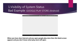
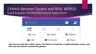
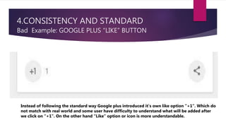
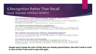
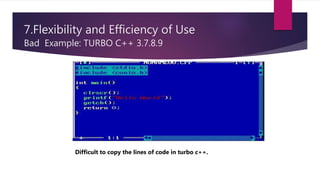
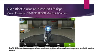
Neilson’s Heuristic Interface
Examples Presentation By
Muhammad Hassaan
SUBJECT: HUMAN COMPUTER INTERACTION
LECTURER: SIR MEHMOOD ASHRAF
1.Visibility of System Status
Good Example :RACE THE TRAFFIC(Android Game)
Progress bar showing that system is in loading state.
1.Visibility of System Status
Bad Example :GOOGLE PLAY STORE (Android)
When you have slow internet and you open google play store then this blank screen
appears and you don’t know when play store will open.
2.Match Between System and REAL WORLD
Good Example :FACEBOOK(Android Application)
The Live icon look like a video camera, The Photo icon look like a traditional photo camera, and
Like icon look like the common like gesture.
2.Match Between System and REAL WORLD
Bad Example :ZAPYA(Android Application)
No suitable icons in Horizontal navigation bar. There must be icons for App, Gallery and Video.
3.User Control and Freedom
Good Example :GMAIL UNDO ACTION
The above gmail flash message giving the freedom to user to undo delete action if he/she clicked
on delete accidently.
3.User Control and Freedom
Bad Example :TYPING MASTER 10 (Typing Test)
If user took the typing test in typing tutor 10 and accidently click on next button. Then user can
not undo it. Typing tutor will directly show the typing results.
4.CONSISTENCY AND STANDARD
Good Example: FACEBOOK FOLLOWED BY LINKEDIN
Facebook introduced efficient way to Like a post, Comment on Post and also share a post and this
way become a standard. So Sites like Linkedin followed the standard.
4.CONSISTENCY AND STANDARD
Bad Example: GOOGLE PLUS “LIKE” BUTTON
Instead of following the standard way Google plus introduced it’s own like option “+1”. Which do
not match with real world and some user have difficulty to understand what will be added after
we click on “+1”. On the other hand “Like” option or icon is more understandable.
5.Error Prevention
Good Example: GMAIL SIGN UP PAGE
Instead of checking errors when user click on “submit” button. Gmail prevent the error by helping
user to achieve valid password length.
5.Error Prevention
Bad Example: TWITTER SIGN UP
On twitter main page there are some fields for sign up. At main page there is no guide for user
that password length must be of at least 6 characters. But after clicking on “Sign up” it checks the
password field for errors.
6.Recognition Rather Than Recall
Good Example: GOOGLE SEARCH
Google search change the color of links that user already opened before. User don’t need to recall
or stare at links if user want to open link again.
6.Recognition Rather Than Recall
Bad Example: Delta Search
User have to recall the link he has opened before. No recognition facility.
7.Flexibility and Efficiency of Use
Good Example: GOOGLE IMAGE SEARCH
Google gives the facility of various filters on search to find best results for user.
7.Flexibility and Efficiency of Use
Bad Example: TURBO C++ 3.7.8.9
Difficult to copy the lines of code in turbo c++.
8.Aesthetic and Minimalist Design
Good Example: TRAFFIC RIDER (Android Game)
Traffic Rider moto racing game have minimum options with maximum usage and aesthetic design
as well.
8.Aesthetic and Minimalist Design
Bad Example: ADOBE PHOTOSHOP 7.0
Cluster of controls, Confusing the user, User has to stare and focus deeply to perform required
action.
9.Help users recognize , diagnose and recover from errors
Good Example: GMAIL SIGN UP PAGE
Gmail provide help for user to choose valid password and avoid errors.
9.Help users recognize , diagnose and recover from errors
Bad Example: TWITTER SIGN UP
No help for user to choose valid password and prevent error
10.Help and Documentation
Good Example: ANDROID SATUDIO
The “Tips” window in android studio. Providing help for user to use the software.
10.Help and Documentation
Bad Example: TURBO C++ 3.7.8.9
No help for user, no tips window for user in turbo c++ . Turbo c++ just display the blank screen
with blue background and user need to learn using turbo by itself.

Neison,s Heuristic Examples

  • 1.
    Neilson’s Heuristic Interface ExamplesPresentation By Muhammad Hassaan SUBJECT: HUMAN COMPUTER INTERACTION LECTURER: SIR MEHMOOD ASHRAF
  • 2.
    1.Visibility of SystemStatus Good Example :RACE THE TRAFFIC(Android Game) Progress bar showing that system is in loading state.
  • 3.
    1.Visibility of SystemStatus Bad Example :GOOGLE PLAY STORE (Android) When you have slow internet and you open google play store then this blank screen appears and you don’t know when play store will open.
  • 4.
    2.Match Between Systemand REAL WORLD Good Example :FACEBOOK(Android Application) The Live icon look like a video camera, The Photo icon look like a traditional photo camera, and Like icon look like the common like gesture.
  • 5.
    2.Match Between Systemand REAL WORLD Bad Example :ZAPYA(Android Application) No suitable icons in Horizontal navigation bar. There must be icons for App, Gallery and Video.
  • 6.
    3.User Control andFreedom Good Example :GMAIL UNDO ACTION The above gmail flash message giving the freedom to user to undo delete action if he/she clicked on delete accidently.
  • 7.
    3.User Control andFreedom Bad Example :TYPING MASTER 10 (Typing Test) If user took the typing test in typing tutor 10 and accidently click on next button. Then user can not undo it. Typing tutor will directly show the typing results.
  • 8.
    4.CONSISTENCY AND STANDARD GoodExample: FACEBOOK FOLLOWED BY LINKEDIN Facebook introduced efficient way to Like a post, Comment on Post and also share a post and this way become a standard. So Sites like Linkedin followed the standard.
  • 9.
    4.CONSISTENCY AND STANDARD BadExample: GOOGLE PLUS “LIKE” BUTTON Instead of following the standard way Google plus introduced it’s own like option “+1”. Which do not match with real world and some user have difficulty to understand what will be added after we click on “+1”. On the other hand “Like” option or icon is more understandable.
  • 10.
    5.Error Prevention Good Example:GMAIL SIGN UP PAGE Instead of checking errors when user click on “submit” button. Gmail prevent the error by helping user to achieve valid password length.
  • 11.
    5.Error Prevention Bad Example:TWITTER SIGN UP On twitter main page there are some fields for sign up. At main page there is no guide for user that password length must be of at least 6 characters. But after clicking on “Sign up” it checks the password field for errors.
  • 12.
    6.Recognition Rather ThanRecall Good Example: GOOGLE SEARCH Google search change the color of links that user already opened before. User don’t need to recall or stare at links if user want to open link again.
  • 13.
    6.Recognition Rather ThanRecall Bad Example: Delta Search User have to recall the link he has opened before. No recognition facility.
  • 14.
    7.Flexibility and Efficiencyof Use Good Example: GOOGLE IMAGE SEARCH Google gives the facility of various filters on search to find best results for user.
  • 15.
    7.Flexibility and Efficiencyof Use Bad Example: TURBO C++ 3.7.8.9 Difficult to copy the lines of code in turbo c++.
  • 16.
    8.Aesthetic and MinimalistDesign Good Example: TRAFFIC RIDER (Android Game) Traffic Rider moto racing game have minimum options with maximum usage and aesthetic design as well.
  • 17.
    8.Aesthetic and MinimalistDesign Bad Example: ADOBE PHOTOSHOP 7.0 Cluster of controls, Confusing the user, User has to stare and focus deeply to perform required action.
  • 18.
    9.Help users recognize, diagnose and recover from errors Good Example: GMAIL SIGN UP PAGE Gmail provide help for user to choose valid password and avoid errors.
  • 19.
    9.Help users recognize, diagnose and recover from errors Bad Example: TWITTER SIGN UP No help for user to choose valid password and prevent error
  • 20.
    10.Help and Documentation GoodExample: ANDROID SATUDIO The “Tips” window in android studio. Providing help for user to use the software.
  • 21.
    10.Help and Documentation BadExample: TURBO C++ 3.7.8.9 No help for user, no tips window for user in turbo c++ . Turbo c++ just display the blank screen with blue background and user need to learn using turbo by itself.