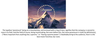
1. The typeface ‘paramount’ being on a mountaintop, and enclosed with a ring of stars, signifies that the company, is second to
none in its field. And the field of course, being moviemaking. But even before this, the name paramount in itself, by definition(s),
(‘’More important than anything else; supreme.’’ or ‘’Having supreme power.’’) indubitably bring to the audience, that it is the
best movie franchise; bar none.
2. The big block letters in 20th Century’s typographic building, demonstrate colossal mass; in that the font size of:
20th
CENTURY
FOX
TELEVISION
Is excessively bold and broad, and drawn out from the sides of the lettering. This was done - to have the audience have a sense
for how grand and proud, 20th Century is of themselves as a whole. Not only this, but to have the audience think of 20th century,
as being prestigious and acclaimed in its gold colouring; and differing building designs in its thick ridges forming from the sides
and fronts of each row of lettering. And from nearby searchlights (when animated), as they swivel and swerve around the
proximity of the bulk of the lettering, to call attention to 20th’s magnificence.
3. ‘’A historical and poetic name used for the United States of America’’
‘’The name of its female personification’’
Columbia in which case, must be something of a patriotic symbol for an American audience; as it is steeped in historical
importance of the prime and founding principles of The U.S. I think this logo stands for wholesomeness - relatable to the
patriotic-American, that warm to the movie releases that show America in a good light. This sort of market, ascertains this, by all
of the individual elements of this logo, coming together, and making up an even greater representation. The narrowing stairs,
profound and bolstered clouds, worn gown and cloak and raised arm akin to the Statue of Liberty. All of these qualities then,
garner and pander to the conservative American. The Narrowing stairs as they rise in height, symbolises a raised toughness and
exclusivity to Columbia. That she is the pinnacle and crème de la crème of anything below. The bunched and stacked clouds,
portray substance and oomph within them. A lot of them having taken up almost a pyramidal design. This shows strength in that
the clouds have enough of a foundation, to ascend and peak in triangular ending. Further, a white cloud of this pyramidal
structure, splitting a pair of harvest gold ones, clearly exemplify – that surpassing grandeur and prestige, is a solemn and
unaccompanied purity. A pureness that needs not the aid of any backup so to speak. Being that the gown and cloak and arm
gesture of Columbia are so much alike to that of the Statue of Liberty's appearance and disposition, one can gather then, that
Columbia films - stands for formative American values, that are at the heart of the U.S.A’s formation as a starting country.
4. A roaring lion, visible behind bunches of horizontal, wavered, gold incrusted strips of film, with in front of the aforementioned
strips, gold leafs - aligned so that amassed, they form an even bigger gold leaf; by them all taking part in its outline. Inside of the
now larger gold leaf, is placed a golden mask, looking like that of one - seen decorating drama institutions’ emblems. Not to
mention, the Latin: ‘Ars gratia artis’, translated to English being: ‘Art for Art’s sake’, that presenting MGM, makes the company an
extra bit credible; due to Latin of course, being a founding language of comprehension, one heavily involved in invention in the
Renaissance. All in all, from all of the elements that make up MGM’s logo, I can gather that the company is an illustrious and
fruitful one.
5. The multi-coloured title, the Moon visible in daylight, with accompanying clouds, a hologram-looking boy sitting on the
outermost part of the Moon with a fishing rod in hand, all connote – along with the name ‘Dreamworks’ in itself: That this
company doesn’t exactly pertain to the realm of realism. And in that, have fun with unrealism through quirkiness. However, the
font used in its typography also shows, that this fun, also has stable roots in solidarity, given its pointed font. And with this
pointed font, one would usually expect to find it, somewhere other than a movie company’s use; aimed only more or less, at
children.
6. Universal's logo is quite basic in the amount of designs used, in that its background for the globe and Universal typography and
greyed walls of light reaching out of the Earth’s atmospheric borders, is a solid black. But - given that with the Earth and
blackness being together, it resembles outer-space, it then makes for a decent logo; despite the minimalism involved in
producing it.
7. Pixar’s logo here, is very much visual-representation driven; in how space is negotiated, between the ‘PIXAR’ title sequence, and
the bits of grayish, baby blue space, above and below it. I think the amount of space above is made, to contextualise the
possibility, of broadening horizons for when to advance toward that horizon to make up the distance. Advancement to bigger and
better things, say. The bendy lamp also facing off into the direction of the audience, shows the audience’s importance; since the
animated lamp, decides on shining its light on the audience, as opposed to elsewhere. In that, one could say with validity, that
the shone light on the audience, as opposed to anywhere else, shows humility on the part of Pixar. A proverbial on the ‘’We
wouldn’t be anything, without your support!’’ truism. And with its sturdy-looking, but playful font, it really epitomises what Pixar
is all about: A reputable, yet fun-loving corporation. It’s sturdy in all of the pointy lines that jut out of the letters themselves, and
playful in the slight abnormalities in the lettering, like the none-pointed lines of the x and r, kicking out an extra distance between
the other lengths, ever so slightly.