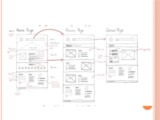
UNIT 2
PLANNING WEBSITE DESIGN
 Unit Coverage
This unit is designed to provide you the necessary information
and practice regarding the following content
 Understanding User Needs
 Defining Business Objectives
 Conducting Competitive Analysis
 Creating Content Inventory
This unit focuses on the foundational steps in
designing a website by aligning user needs,
business objectives, and content strategy.
UNDERSTANDING USER NEEDS
 Creating a website that meets user needs
requires understanding user backgrounds, goals,
and expectations.
 • Identify user personas
 • Conduct user research
 • Analyze user goals and usability factors.
DEFINING USER PERSONAS
 A user persona is a fictional representation of a
website user.
 It helps understand audience behavior by
summarizing key characteristics such as
 Key Characteristics:
 Age
 Profession
 Interests
 Technical Skills
CONDUCTING USER RESEARCH
 To better understand the need of users, web
designers gather information through research
methods such as surveys and interviews:
Methods:
 Surveys – collect data from many users
 Interviews – deeper insights into user experience
Sample Questions:
 How often do you visit educational websites?
 What difficulties do you face?
 What features are most useful?
 Do you prefer mobile or desktop? Why?
IDENTIFYING GOALS, PROBLEMS,
AND FUNCTIONALITIES
 User Goals: What users want to achieve
 Problems: Issues users face
 Functionalities: Features that meet user goals
 Example: Small business owner needs easy setup
→ site should offer guides, templates, support.
USABILITY AND ACCESSIBILITY
 Usability: How easy a website is to use.
 Accessibility: Ensuring use by people with
disabilities.
 Good practices:
 Clear navigation
 High-contrast colors
 Alternative text for images
 Keyboard navigation
DEFINING BUSINESS OBJECTIVES
 Websites must align business goals with user
needs.
 Purpose examples:
 E-commerce – sell products (e.g., Amazon)
 Blog – share content (e.g., Medium)
 Portfolio – showcase work
 Service-based – describe services
CONT…
ALIGNING OBJECTIVES WITH USER
NEEDS
 Example alignments:
 E-commerce → Easy checkout
 Blog → Well-organized articles
 Service site → Clear contact forms
 Portfolio → High-quality visuals
CONT…
CONDUCTING COMPETITIVE
ANALYSIS
 Competitive analysis helps identify strengths,
weaknesses, and opportunities.
 Benefits:
 Learn from competitors
 Avoid weaknesses
 Discover new opportunities
 Stay ahead of trends
DIRECT VS INDIRECT
COMPETITORS
 Direct: Same products/services (e.g., Nike vs
Adidas)
 Indirect: Different products but same audience
(e.g., gym vs fitness app)
 Steps:
1. Search competitors
2. Review social media
3. Check search rankings
EVALUATING COMPETITOR
WEBSITES
Key aspects:
 Features – navigation, search, responsiveness
 Design – visual appeal, readability
 Content – quality, updates, reviews, CTAs
CREATING CONTENT INVENTORY
A content inventory lists all content elements.
Helps:
 Organize and manage content
 Maintain consistency
 Identify missing or outdated content
 Improve user experience
DEFINING DIFFERENT TYPES OF
WEBSITE CONTENT
IDENTIFYING NECESSARY
CONTENT CATEGORIES
UNIT 3
DEVELOPING INFORMATION ARCHITECTURE
Unit Coverage:
 Introduction to Information Architecture
 Creating Sitemaps
 Creating Wireframes
 Mockups and Prototypes
 Validating Designs Through User Testing
Learning Outcomes:
 Design web page architecture
 Evaluate designs through usability testing
INTRODUCTION TO INFORMATION
ARCHITECTURE
 A practical UX/UI design workflow begins with
understanding user needs through personas and
journey mapping.
 Developing information architecture ensures
logical content organization, and sitemaps
provide a clear framework for navigation.
WHAT IS INFORMATION
ARCHITECTURE?
 Information architecture (IA) refers to the
process of organizing, structuring, and labeling
content in a way that makes it easy for users to
find and interact with information on a website.
 It involves creating a blueprint of the website’s
content, which guides the overall design and
navigation.
KEY ASPECTS OF IA IN WEB
DEVELOPMENT
 Content Organization: Grouping related content
together and determining how it should be
structured (e.g., pages, sections, categories).
 Navigation Design: Creating clear menus and
pathways so users can move through the site
smoothly.
 Labeling Systems: Using consistent and
understandable names for menus, buttons, and
sections.
 Search Systems: Designing how users can search
and retrieve content easily.
IMPORTANCE OF INFORMATION
ARCHITECTURE
 Provides structure and organization
 Prioritizes and arranges content
 Supports user-centered design
 Improves navigation and usability
 Boosts SEO and supports business goals
PRINCIPLES OF INFORMATION
ARCHITECTURE
1. Hierarchy
2. Organization
3. Labeling
4. Navigation
5. Consistency
6. Accessibility
7. Searchability
1. SITEMAPS
1. Sitemaps: : A visual or text-based map that
shows the structure and hierarchy of a website.
 Helps plan the overall layout and page
organization
2. WIREFRAMES
 Wireframes: A low-fidelity visual layout of a
web page or screen, showing where content and
elements will appear (e.g., menus, images, text
areas, buttons).
 Focuses on layout, structure, and functionality
3USER FLOWS:
 A diagram showing the path a user takes
to complete a task on a website or app
(e.g., buying a product, signing up for a
newsletter).
 it shows the step-by-step journey of a user
through a website.
 Helps identify each step a user goes
through
TOOLS FOR CREATING SITEMAPS &
WIREFRAMES
 Lucidchart – for collaboration
 Draw.io – free and open-source
 Figma – real-time collaboration
 Adobe XD – interactive prototyping
 Pencil Project – open-source wireframing
DESIGNING INFORMATION
ARCHITECTURE – KEY STEPS
1. Define goals and user needs
2. Conduct content inventory and audit
3. Organize and categorize content
4. Create site map and navigation structure
5. Develop user flows and wireframes
6. Validate with user testing
7. Document and communicate IA
8. Monitor and evolve
BENEFITS OF GOOD IA
 Enhances user satisfaction
 Reduces confusion and bounce rates
 Aligns with business objectives
 Forms foundation for UI/UX design
 Ensures accessibility and findability
MODULE 2
UNIT 1
Responsive Web Design
UNIT COVERAGE
 1. Overview of Responsive Web Design
 2. Popular CSS Frameworks
 3. Introduction to Bootstrap
UNIT LEARNING OUTCOMES
 After completing this unit, students will
be able to:
 Describe responsive web design
 Use browser/device compatibility tools
 List popular CSS frameworks
 Familiarize themselves with Bootstrap
KEY TERMS
 Responsive Web Design, Browser Compatibility,
CSS, CSS Frameworks, Bootstrap
WHAT IS RESPONSIVE WEB DESIGN
(RWD)?
 Responsive Web Design (RWD) is
designing websites that adapt to different
devices and screen sizes.
 Goal: Maintain usability and appearance
on all devices.
 Uses flexible grids, responsive images,
and media queries.
WHY RESPONSIVE DESIGN
MATTERS
 Users access the web from phones, tablets,
and computers.
 Websites must look good and function
properly on all devices.
 Enhances user experience and
accessibility.
 Google ranks mobile-friendly sites higher
in search results.
ORIGINS OF RWD
 Introduced by Ethan Marcotte in 2010.
 Focused on flexibility instead of fixed
width.
 Encouraged fluid grids, flexible images,
and media queries.
ELEMENTS OF RESPONSIVE WEB
DESIGN
 1. Media Queries – Apply styles based on
screen size or orientation.
 2. Flexible Images – Resize to fit different
screens.
 3. Fluid Grids/Layout – Use percentages
instead of fixed pixels.
 4. Flexible Layout Code – HTML + CSS
adapt layouts.
 5. HTML – Defines structure and content.
 6. CSS – Defines visual design.
DEVICE LANDSCAPE
 Past: Fixed-width layouts (960px) were
standard.
 Now: Many screen sizes and devices.
 Challenge: Consistency across devices.
 Solution: Responsive design using HTML
& CSS.
BROWSER SUPPORT
 Websites are viewed using many browsers
(Chrome, Firefox, Safari, Edge, Opera).
 Older browsers may lack modern features.
 Focus on modern evergreen browsers.
 A modern evergreen browsers are web
browsers that automatically updates itself
to the latest version
CHECKING BROWSER
COMPATIBILITY
 Use https://caniuse.com to:
 - Check browser support for CSS/HTML
features.
 Purpose: Ensure websites work properly
on all devices and browsers.
 Types: Online testing tools and built-in
browser tools.
DEVELOPER TOOLS
 Found in Chrome, Firefox, Edge.
 Inspect CSS and analyze performance.
 Simulate devices and debug layouts.
CSS FRAMEWORKS AND
BOOTSTRAP
INTRODUCTION TO CSS
FRAMEWORKS
 A CSS framework is a pre-prepared library of
CSS (and sometimes JavaScript) code that helps
developers build responsive, consistent, and
visually appealing websites quickly.
 Instead of writing all the CSS styles from
scratch, you can use ready-made classes and
components provided by a framework
KEY FEATURES OF CSS
FRAMEWORKS
 Responsive grid system for adaptable layouts
 Pre-designed components like buttons, forms,
and menus
 Built-in media queries for mobile-friendliness
 Consistent design styles for typography and
colors
 Cross-browser compatibility
 Customization options for themes and colors
WHY USE CSS FRAMEWORKS
 Speed – Speeds up development with pre-
designed elements
 Consistency – Ensures a unified design across
pages
 Cross-Browser Compatibility – Works across all
modern browsers
 Responsiveness – Adapts to all screen sizes
 Flexibility – Can be customized to fit design
needs
DRAWBACKS OF CSS FRAMEWORKS
 Overhead from unused code
 Learning curve for beginners
 Lack of uniqueness (websites may look similar)
 Dependence on framework reduces learning of
raw CSS
POPULAR CSS FRAMEWORKS
 • Bootstrap – Grid system and pre-built
components
 • Tailwind CSS – Utility-first, customizable
design
 • Foundation – Responsive and flexible
 • Bulma – Flexbox-based and lightweight
 • Materialize CSS – Based on Google’s Material
Design
INTRODUCTION TO BOOTSTRAP
 Bootstrap is a free, open-source CSS framework
for creating responsive, mobile-first web pages. It
simplifies web development with built-in grids,
responsive utilities, and pre-designed
components.
MOBILE-FIRST DESIGN
 Bootstrap focuses on mobile-first development,
ensuring that web pages work well on
smartphones and tablets. Most internet users
access websites via mobile devices, making this
approach essential.
BOOTSTRAP VERSIONS
 • Developed by Mark Otto and Jacob Thornton at
Twitter
 • Released in August 2011 as 'Twitter Blueprint'
 • Later renamed Bootstrap and made open-
source
 • Latest version: Bootstrap 5 (released October
2021)
OVERVIEW OF BOOTSTRAP 5
 • Removed jQuery dependency, uses vanilla
JavaScript
 • Easier customization and improved
performance
 • Responsive utilities and modern design
components
 • Ideal for building responsive, dynamic websites
WHAT YOU CAN DO WITH
BOOTSTRAP
 • Build complete responsive websites
 • Create dynamic pages and toolkits
 • Add carousels, popovers, and forms easily
 • Manage large content efficiently
UNIT SUMMARY
 This unit explored responsive web design, CSS
frameworks, and the importance of Bootstrap in
modern web development. Students learned
about framework features, Bootstrap’s evolution,
and how it simplifies building responsive, user-
friendly websites.
BOOTSTRAP
 Bootstrap is the most popular and powerful
front-end (HTML, CSS, and JavaScript)
framework for faster and easier responsive web
development.
 Bootstrap is a powerful front-end framework for
faster and easier web development.
 It includes HTML and CSS based design
templates for creating common user interface
components like forms, buttons, navigations,
dropdowns, alerts, modals, tabs, accordions,
carousels, tooltips, and so on.
…CONT
 Bootstrap gives you ability to create flexible and
responsive web layouts with much less efforts.
 Bootstrap was originally created by a designer
and a developer at Twitter in mid 2010.
 Before being an open-sourced framework,
Bootstrap was known as Twitter Blueprint.
WHAT YOU CAN DO WITH
BOOTSTRAP
 There are lot more things you can do with
Bootstrap.
 You can easily create responsive websites.
 You can quickly create multi-column layout with
pre-defined classes.
 You can quickly create different types of form
layouts.
 You can quickly create different variation of
navigation bar.
…CONT
 You can easily create components like accordions,
modals, etc. without writing any JS code.
 You can easily create dynamic tabs to manage
large amount of content.
 You can quickly create different types of alert
boxes.
ADVANTAGES OF USING
BOOTSTRAP
 Save lots of time — You can save lots of time
and efforts using the Bootstrap predefined design
templates and classes and concentrate on other
development work.
 Responsive features — Using Bootstrap you
can easily create responsive websites that appear
more appropriately on different devices and
screen resolutions without any change in
markup.
…CONT
 Consistent design — All Bootstrap components
share the same design templates and styles
through a central library, so the design and
layout of your web pages will be consistent.
 Easy to use — Bootstrap is very easy to use.
Anybody with the basic working knowledge of
HTML, CSS and JavaScript can start
development with Bootstrap.
 Compatible with browsers — Bootstrap is
created with modern web browsers in mind and
it is compatible with all modern browsers such as
Chrome, Firefox, Safari, Internet Explorer, etc.
 Open Source — it is completely free to
download and use.
BOOTSTRAP VERSIONS
 Bootstrap 5 (released 2021) is the newest version
of Bootstrap (released 2013); with new
components, faster stylesheet and more
responsiveness.
 Bootstrap 5 supports the latest, stable releases of
all major browsers and platforms. However,
Internet Explorer 11 and down is not supported.
 The main differences between Bootstrap 5 and
Bootstrap 3 & 4, is that Bootstrap 5 has switched
to vanilla JavaScript instead of jQuery.
 Note: Bootstrap 3 and Bootstrap 4 is still
supported by the team for critical bugfixes and
documentation changes, and it is perfectly safe to
continue to use them. However, new features will
NOT be added to them.
BOOTSTRAP 5 CDN
 If you don't want to download and host Bootstrap
5 yourself, you can include it from a CDN
(Content Delivery Network)
 <!-- Latest compiled and minified CSS -->
<link href="https://cdn.jsdelivr.net/npm/bootstra
p@5.3.3/dist/css/
bootstrap.min.css" rel="stylesheet">
DOWNLOADING BOOTSTRAP 5
 If you want to download and host Bootstrap 5
yourself, go to https://getbootstrap.com/, and
follow the instructions ther
CONTAINERS
 Bootstrap 5 also requires a containing element to
wrap site contents.
 There are two container classes to choose from:
1. The .container class provides a responsive fixed
width container
2. The .container-fluid class provides a full width
container, spanning the entire width of the
viewport
1. FIXED-WIDTH CONTAINER:
 <div class="container bg-primary text-white">
 <h2>Fixed-width container</h2>
 <p>This container adjusts its width based on
the screen size.</p>
 </div>
2. FULL-WIDTH CONTAINER:
 <div class="container-fluid bg-success text-
white">
 <h2>Full-width container</h2>
 <p>This container always takes up the full
width of the screen.</p>
 </div>
ADDING BACKGROUND AND
BORDERS TO CONTAINERS
 By default, container doesn't have any
background-color or border. But if you need you
can apply your own styles, or simply use the
Bootstrap background-color and border utility
classes to add background-color or border on
them, as shown in the following example.
 <!-- Container with dark background and white text color -->
 <!-- <div class="container bg-dark text-white">
 <h1>This is a heading</h1>
 <p>This is a paragraph of text.</p>
 </div> -->
 <!-- Container with light background -->
 <!-- <div class="container bg-light">
 <h1>This is a heading</h1>
 <p>This is a paragraph of text.</p>
 </div> -->
 <!-- Container with border -->
 <!-- <div class="container border">
 <h1 class="text-primary">This is a heading</h1>
 <p>This is a paragraph of text.</p>
 </div> -->
COLOR CLASSES
 You can use the contextual color classes to
emphasize the text and convey meaning through
color. Here's the complete list of available
contextual color classes.
BACKGROUND COLOR CLASSES
 Similar to the contextual color classes, you can
use the contextual background color classes to set
the background-color of an element to apply extra
emphasis on them.
TEXT ALIGNMENT CLASSES
 You can use these text alignment classes to align
and format your text content.
BORDER CLASSES
 You can use the border utility classes to quickly
style the border and border radius of an element.
They are very useful for images, buttons, or any
other element.
SPACING CLASSES
 You can use the spacing utility classes to quickly
adjust the margin and padding of an element.
The # character in the classes .mt-#, .pt-#, etc.
represents the size of the margin or padding. The
value of the size can be an integer from 0 to 5, or
auto. The size 0 completely removes the margin
or padding by setting it to 0, whereas the value
auto sets the margin to auto. The integer
numbers from 1 to 5 sets the margin or padding
incrementally (ranging from 0.25rem to 3rem).
Try out the examples to see how it works:
moduleeeeeeeeeeeeeeeeeeeeeeeeeeeeeeeeeee

moduleeeeeeeeeeeeeeeeeeeeeeeeeeeeeeeeeee

  • 1.
    UNIT 2 PLANNING WEBSITEDESIGN  Unit Coverage This unit is designed to provide you the necessary information and practice regarding the following content  Understanding User Needs  Defining Business Objectives  Conducting Competitive Analysis  Creating Content Inventory This unit focuses on the foundational steps in designing a website by aligning user needs, business objectives, and content strategy.
  • 2.
    UNDERSTANDING USER NEEDS Creating a website that meets user needs requires understanding user backgrounds, goals, and expectations.  • Identify user personas  • Conduct user research  • Analyze user goals and usability factors.
  • 3.
    DEFINING USER PERSONAS A user persona is a fictional representation of a website user.  It helps understand audience behavior by summarizing key characteristics such as  Key Characteristics:  Age  Profession  Interests  Technical Skills
  • 4.
    CONDUCTING USER RESEARCH To better understand the need of users, web designers gather information through research methods such as surveys and interviews: Methods:  Surveys – collect data from many users  Interviews – deeper insights into user experience Sample Questions:  How often do you visit educational websites?  What difficulties do you face?  What features are most useful?  Do you prefer mobile or desktop? Why?
  • 5.
    IDENTIFYING GOALS, PROBLEMS, ANDFUNCTIONALITIES  User Goals: What users want to achieve  Problems: Issues users face  Functionalities: Features that meet user goals  Example: Small business owner needs easy setup → site should offer guides, templates, support.
  • 6.
    USABILITY AND ACCESSIBILITY Usability: How easy a website is to use.  Accessibility: Ensuring use by people with disabilities.  Good practices:  Clear navigation  High-contrast colors  Alternative text for images  Keyboard navigation
  • 7.
    DEFINING BUSINESS OBJECTIVES Websites must align business goals with user needs.  Purpose examples:  E-commerce – sell products (e.g., Amazon)  Blog – share content (e.g., Medium)  Portfolio – showcase work  Service-based – describe services
  • 8.
  • 9.
    ALIGNING OBJECTIVES WITHUSER NEEDS  Example alignments:  E-commerce → Easy checkout  Blog → Well-organized articles  Service site → Clear contact forms  Portfolio → High-quality visuals
  • 10.
  • 11.
    CONDUCTING COMPETITIVE ANALYSIS  Competitiveanalysis helps identify strengths, weaknesses, and opportunities.  Benefits:  Learn from competitors  Avoid weaknesses  Discover new opportunities  Stay ahead of trends
  • 12.
    DIRECT VS INDIRECT COMPETITORS Direct: Same products/services (e.g., Nike vs Adidas)  Indirect: Different products but same audience (e.g., gym vs fitness app)  Steps: 1. Search competitors 2. Review social media 3. Check search rankings
  • 13.
    EVALUATING COMPETITOR WEBSITES Key aspects: Features – navigation, search, responsiveness  Design – visual appeal, readability  Content – quality, updates, reviews, CTAs
  • 14.
    CREATING CONTENT INVENTORY Acontent inventory lists all content elements. Helps:  Organize and manage content  Maintain consistency  Identify missing or outdated content  Improve user experience
  • 15.
    DEFINING DIFFERENT TYPESOF WEBSITE CONTENT
  • 16.
  • 17.
    UNIT 3 DEVELOPING INFORMATIONARCHITECTURE Unit Coverage:  Introduction to Information Architecture  Creating Sitemaps  Creating Wireframes  Mockups and Prototypes  Validating Designs Through User Testing Learning Outcomes:  Design web page architecture  Evaluate designs through usability testing
  • 18.
    INTRODUCTION TO INFORMATION ARCHITECTURE A practical UX/UI design workflow begins with understanding user needs through personas and journey mapping.  Developing information architecture ensures logical content organization, and sitemaps provide a clear framework for navigation.
  • 19.
    WHAT IS INFORMATION ARCHITECTURE? Information architecture (IA) refers to the process of organizing, structuring, and labeling content in a way that makes it easy for users to find and interact with information on a website.  It involves creating a blueprint of the website’s content, which guides the overall design and navigation.
  • 20.
    KEY ASPECTS OFIA IN WEB DEVELOPMENT  Content Organization: Grouping related content together and determining how it should be structured (e.g., pages, sections, categories).  Navigation Design: Creating clear menus and pathways so users can move through the site smoothly.  Labeling Systems: Using consistent and understandable names for menus, buttons, and sections.  Search Systems: Designing how users can search and retrieve content easily.
  • 21.
    IMPORTANCE OF INFORMATION ARCHITECTURE Provides structure and organization  Prioritizes and arranges content  Supports user-centered design  Improves navigation and usability  Boosts SEO and supports business goals
  • 22.
    PRINCIPLES OF INFORMATION ARCHITECTURE 1.Hierarchy 2. Organization 3. Labeling 4. Navigation 5. Consistency 6. Accessibility 7. Searchability
  • 23.
    1. SITEMAPS 1. Sitemaps:: A visual or text-based map that shows the structure and hierarchy of a website.  Helps plan the overall layout and page organization
  • 25.
    2. WIREFRAMES  Wireframes:A low-fidelity visual layout of a web page or screen, showing where content and elements will appear (e.g., menus, images, text areas, buttons).  Focuses on layout, structure, and functionality
  • 27.
    3USER FLOWS:  Adiagram showing the path a user takes to complete a task on a website or app (e.g., buying a product, signing up for a newsletter).  it shows the step-by-step journey of a user through a website.  Helps identify each step a user goes through
  • 29.
    TOOLS FOR CREATINGSITEMAPS & WIREFRAMES  Lucidchart – for collaboration  Draw.io – free and open-source  Figma – real-time collaboration  Adobe XD – interactive prototyping  Pencil Project – open-source wireframing
  • 30.
    DESIGNING INFORMATION ARCHITECTURE –KEY STEPS 1. Define goals and user needs 2. Conduct content inventory and audit 3. Organize and categorize content 4. Create site map and navigation structure 5. Develop user flows and wireframes 6. Validate with user testing 7. Document and communicate IA 8. Monitor and evolve
  • 31.
    BENEFITS OF GOODIA  Enhances user satisfaction  Reduces confusion and bounce rates  Aligns with business objectives  Forms foundation for UI/UX design  Ensures accessibility and findability
  • 32.
  • 33.
    UNIT COVERAGE  1.Overview of Responsive Web Design  2. Popular CSS Frameworks  3. Introduction to Bootstrap
  • 34.
    UNIT LEARNING OUTCOMES After completing this unit, students will be able to:  Describe responsive web design  Use browser/device compatibility tools  List popular CSS frameworks  Familiarize themselves with Bootstrap
  • 35.
    KEY TERMS  ResponsiveWeb Design, Browser Compatibility, CSS, CSS Frameworks, Bootstrap
  • 36.
    WHAT IS RESPONSIVEWEB DESIGN (RWD)?  Responsive Web Design (RWD) is designing websites that adapt to different devices and screen sizes.  Goal: Maintain usability and appearance on all devices.  Uses flexible grids, responsive images, and media queries.
  • 37.
    WHY RESPONSIVE DESIGN MATTERS Users access the web from phones, tablets, and computers.  Websites must look good and function properly on all devices.  Enhances user experience and accessibility.  Google ranks mobile-friendly sites higher in search results.
  • 38.
    ORIGINS OF RWD Introduced by Ethan Marcotte in 2010.  Focused on flexibility instead of fixed width.  Encouraged fluid grids, flexible images, and media queries.
  • 39.
    ELEMENTS OF RESPONSIVEWEB DESIGN  1. Media Queries – Apply styles based on screen size or orientation.  2. Flexible Images – Resize to fit different screens.
  • 40.
     3. FluidGrids/Layout – Use percentages instead of fixed pixels.  4. Flexible Layout Code – HTML + CSS adapt layouts.  5. HTML – Defines structure and content.  6. CSS – Defines visual design.
  • 41.
    DEVICE LANDSCAPE  Past:Fixed-width layouts (960px) were standard.  Now: Many screen sizes and devices.  Challenge: Consistency across devices.  Solution: Responsive design using HTML & CSS.
  • 42.
    BROWSER SUPPORT  Websitesare viewed using many browsers (Chrome, Firefox, Safari, Edge, Opera).  Older browsers may lack modern features.  Focus on modern evergreen browsers.  A modern evergreen browsers are web browsers that automatically updates itself to the latest version
  • 43.
    CHECKING BROWSER COMPATIBILITY  Usehttps://caniuse.com to:  - Check browser support for CSS/HTML features.  Purpose: Ensure websites work properly on all devices and browsers.  Types: Online testing tools and built-in browser tools.
  • 44.
    DEVELOPER TOOLS  Foundin Chrome, Firefox, Edge.  Inspect CSS and analyze performance.  Simulate devices and debug layouts.
  • 45.
  • 46.
    INTRODUCTION TO CSS FRAMEWORKS A CSS framework is a pre-prepared library of CSS (and sometimes JavaScript) code that helps developers build responsive, consistent, and visually appealing websites quickly.  Instead of writing all the CSS styles from scratch, you can use ready-made classes and components provided by a framework
  • 47.
    KEY FEATURES OFCSS FRAMEWORKS  Responsive grid system for adaptable layouts  Pre-designed components like buttons, forms, and menus  Built-in media queries for mobile-friendliness  Consistent design styles for typography and colors  Cross-browser compatibility  Customization options for themes and colors
  • 48.
    WHY USE CSSFRAMEWORKS  Speed – Speeds up development with pre- designed elements  Consistency – Ensures a unified design across pages  Cross-Browser Compatibility – Works across all modern browsers  Responsiveness – Adapts to all screen sizes  Flexibility – Can be customized to fit design needs
  • 49.
    DRAWBACKS OF CSSFRAMEWORKS  Overhead from unused code  Learning curve for beginners  Lack of uniqueness (websites may look similar)  Dependence on framework reduces learning of raw CSS
  • 50.
    POPULAR CSS FRAMEWORKS • Bootstrap – Grid system and pre-built components  • Tailwind CSS – Utility-first, customizable design  • Foundation – Responsive and flexible  • Bulma – Flexbox-based and lightweight  • Materialize CSS – Based on Google’s Material Design
  • 52.
    INTRODUCTION TO BOOTSTRAP Bootstrap is a free, open-source CSS framework for creating responsive, mobile-first web pages. It simplifies web development with built-in grids, responsive utilities, and pre-designed components.
  • 53.
    MOBILE-FIRST DESIGN  Bootstrapfocuses on mobile-first development, ensuring that web pages work well on smartphones and tablets. Most internet users access websites via mobile devices, making this approach essential.
  • 54.
    BOOTSTRAP VERSIONS  •Developed by Mark Otto and Jacob Thornton at Twitter  • Released in August 2011 as 'Twitter Blueprint'  • Later renamed Bootstrap and made open- source  • Latest version: Bootstrap 5 (released October 2021)
  • 55.
    OVERVIEW OF BOOTSTRAP5  • Removed jQuery dependency, uses vanilla JavaScript  • Easier customization and improved performance  • Responsive utilities and modern design components  • Ideal for building responsive, dynamic websites
  • 56.
    WHAT YOU CANDO WITH BOOTSTRAP  • Build complete responsive websites  • Create dynamic pages and toolkits  • Add carousels, popovers, and forms easily  • Manage large content efficiently
  • 57.
    UNIT SUMMARY  Thisunit explored responsive web design, CSS frameworks, and the importance of Bootstrap in modern web development. Students learned about framework features, Bootstrap’s evolution, and how it simplifies building responsive, user- friendly websites.
  • 58.
    BOOTSTRAP  Bootstrap isthe most popular and powerful front-end (HTML, CSS, and JavaScript) framework for faster and easier responsive web development.  Bootstrap is a powerful front-end framework for faster and easier web development.  It includes HTML and CSS based design templates for creating common user interface components like forms, buttons, navigations, dropdowns, alerts, modals, tabs, accordions, carousels, tooltips, and so on.
  • 59.
    …CONT  Bootstrap givesyou ability to create flexible and responsive web layouts with much less efforts.  Bootstrap was originally created by a designer and a developer at Twitter in mid 2010.  Before being an open-sourced framework, Bootstrap was known as Twitter Blueprint.
  • 60.
    WHAT YOU CANDO WITH BOOTSTRAP  There are lot more things you can do with Bootstrap.  You can easily create responsive websites.  You can quickly create multi-column layout with pre-defined classes.  You can quickly create different types of form layouts.  You can quickly create different variation of navigation bar.
  • 61.
    …CONT  You caneasily create components like accordions, modals, etc. without writing any JS code.  You can easily create dynamic tabs to manage large amount of content.  You can quickly create different types of alert boxes.
  • 62.
    ADVANTAGES OF USING BOOTSTRAP Save lots of time — You can save lots of time and efforts using the Bootstrap predefined design templates and classes and concentrate on other development work.  Responsive features — Using Bootstrap you can easily create responsive websites that appear more appropriately on different devices and screen resolutions without any change in markup.
  • 63.
    …CONT  Consistent design— All Bootstrap components share the same design templates and styles through a central library, so the design and layout of your web pages will be consistent.  Easy to use — Bootstrap is very easy to use. Anybody with the basic working knowledge of HTML, CSS and JavaScript can start development with Bootstrap.  Compatible with browsers — Bootstrap is created with modern web browsers in mind and it is compatible with all modern browsers such as Chrome, Firefox, Safari, Internet Explorer, etc.
  • 64.
     Open Source— it is completely free to download and use.
  • 65.
    BOOTSTRAP VERSIONS  Bootstrap5 (released 2021) is the newest version of Bootstrap (released 2013); with new components, faster stylesheet and more responsiveness.  Bootstrap 5 supports the latest, stable releases of all major browsers and platforms. However, Internet Explorer 11 and down is not supported.  The main differences between Bootstrap 5 and Bootstrap 3 & 4, is that Bootstrap 5 has switched to vanilla JavaScript instead of jQuery.
  • 66.
     Note: Bootstrap3 and Bootstrap 4 is still supported by the team for critical bugfixes and documentation changes, and it is perfectly safe to continue to use them. However, new features will NOT be added to them.
  • 67.
    BOOTSTRAP 5 CDN If you don't want to download and host Bootstrap 5 yourself, you can include it from a CDN (Content Delivery Network)  <!-- Latest compiled and minified CSS --> <link href="https://cdn.jsdelivr.net/npm/bootstra p@5.3.3/dist/css/ bootstrap.min.css" rel="stylesheet">
  • 68.
    DOWNLOADING BOOTSTRAP 5 If you want to download and host Bootstrap 5 yourself, go to https://getbootstrap.com/, and follow the instructions ther
  • 69.
    CONTAINERS  Bootstrap 5also requires a containing element to wrap site contents.  There are two container classes to choose from: 1. The .container class provides a responsive fixed width container 2. The .container-fluid class provides a full width container, spanning the entire width of the viewport
  • 70.
    1. FIXED-WIDTH CONTAINER: <div class="container bg-primary text-white">  <h2>Fixed-width container</h2>  <p>This container adjusts its width based on the screen size.</p>  </div>
  • 71.
    2. FULL-WIDTH CONTAINER: <div class="container-fluid bg-success text- white">  <h2>Full-width container</h2>  <p>This container always takes up the full width of the screen.</p>  </div>
  • 73.
    ADDING BACKGROUND AND BORDERSTO CONTAINERS  By default, container doesn't have any background-color or border. But if you need you can apply your own styles, or simply use the Bootstrap background-color and border utility classes to add background-color or border on them, as shown in the following example.
  • 74.
     <!-- Containerwith dark background and white text color -->  <!-- <div class="container bg-dark text-white">  <h1>This is a heading</h1>  <p>This is a paragraph of text.</p>  </div> -->  <!-- Container with light background -->  <!-- <div class="container bg-light">  <h1>This is a heading</h1>  <p>This is a paragraph of text.</p>  </div> -->  <!-- Container with border -->  <!-- <div class="container border">  <h1 class="text-primary">This is a heading</h1>  <p>This is a paragraph of text.</p>  </div> -->
  • 75.
    COLOR CLASSES  Youcan use the contextual color classes to emphasize the text and convey meaning through color. Here's the complete list of available contextual color classes.
  • 77.
    BACKGROUND COLOR CLASSES Similar to the contextual color classes, you can use the contextual background color classes to set the background-color of an element to apply extra emphasis on them.
  • 79.
    TEXT ALIGNMENT CLASSES You can use these text alignment classes to align and format your text content.
  • 80.
    BORDER CLASSES  Youcan use the border utility classes to quickly style the border and border radius of an element. They are very useful for images, buttons, or any other element.
  • 82.
    SPACING CLASSES  Youcan use the spacing utility classes to quickly adjust the margin and padding of an element. The # character in the classes .mt-#, .pt-#, etc. represents the size of the margin or padding. The value of the size can be an integer from 0 to 5, or auto. The size 0 completely removes the margin or padding by setting it to 0, whereas the value auto sets the margin to auto. The integer numbers from 1 to 5 sets the margin or padding incrementally (ranging from 0.25rem to 3rem). Try out the examples to see how it works: