Mian image black and white
•Download as DOCX, PDF•
0 likes•48 views
main image black and wite
Report
Share
Report
Share
Recommended
Contents page plan
This document appears to be a table of contents or index page that lists various sections including "Main", "News", "Features", and "Other imagescontests". It does not contain substantial content to summarize in 3 sentences or less.
Preliminary task checklist
This document contains a checklist for the conventions of a magazine cover page. It lists conventions like a clear masthead, central image, feature story coverline, additional coverlines, date, issue number, barcode, and appropriate color scheme. It also includes a reflection section where the author notes strengths like a color scheme that matches fonts, a central image that fits the magazine style, and eye-catching cover stories. Areas for improvement include more sophisticated fonts and an image with less background. If they could change one thing, the author would select a photo with empty bleed areas to allow more cover stories and intrigue readers.
Double page spread
The document describes the layout and design elements used across three magazine spreads featuring different artists. These include columns for text, headlines that relate to the featured artist, large central images, dropped caps to indicate the start of articles, stand first paragraphs to introduce the topic, and pull quotes to break up the text. The sizes and placements of these elements vary across the spreads depending on the artist and theme, but collectively they follow magazine design conventions to highlight key information and guide the reader through the content.
House Style - Media
The document summarizes key differences and similarities between three Rolling Stone magazine covers. The differences are: 1) Only one magazine has a skyline indicating a special edition, 2) The style, color scheme and fonts used on the covers are different depending on the artist or edition, 3) The font sizes differ based on the status of the artist. The similarities are: 1) All mastheads use the same font style and color behind the subject, 2) A white background is used for all magazines, 3) All subjects wear bright, expensive jewelry as a significant part of their appearance.
Music genres
This is my powerpoint analysing my stye of music. This is one idea that i have however i so have another one.
Media covers for blog copy
This is my media analysis of two covers from the same Magazine Publication. As well as both having similarities and differences explained below.
Editing process
The document provides steps for editing an image for a front cover using Photoshop tools. It describes selecting areas of the image and using the paint brush tool to color in details. The selection tool is used to remove unwanted areas and give a cleaner edge. Once an area is selected and copied, it can be pasted onto a new background image on a separate layer to create the cover design.
Magazine Cover Annotations
The document summarizes the design elements of the magazine cover for Billboard featuring Rihanna. Key elements include the masthead in red and yellow fonts to appeal to both genders, coverlines that highlight article titles and provide perspective on the stories, a skyline promoting other magazine features, the main coverline drawing attention to Rihanna's new red hair, and a pull quote from Rihanna revealing exclusive information to readers. The main image of Rihanna in a mysterious pose links to the quote and suggests the interview will reveal more about who she is. Overall the cover is designed to attract readers with Rihanna's exclusive insights and transformation.
Conventions double page spread
The document describes the typical layout and elements of a magazine article, including a dropped capital letter to start the article and stand out, a headline title, columns of small font text arranged neatly, an image of the subject of the article, introductory leading text, and an extra information box.
Magazine annotations
This document summarizes the key design features of two double page magazine spreads. The first spread uses techniques like pull quotes, bold text, large headline and images to draw attention to important information. Columns separate information neatly and drop caps highlight paragraph starts. The second spread also uses bold text, large images and colored text to emphasize certain elements. Photos across the top provide context and the layout aims to attract a young audience with fashionable representations.
Front cover feedback
The document provides feedback on a magazine cover design, praising the central band image, use of individual band member photos as posters, and consistent color scheme. Areas for improvement include making the font clearer, placing the masthead behind the image rather than over it, adjusting the font style, repositioning text, making the main story more prominent, and ensuring the background image fits the magazine's conventions.
Magazine title and font research
This document lists potential magazine title options and font styles related to music genres including headbangers, blues, and rock. It includes title ideas like Headbangers, Plectrum, and Telecaster that reference rock and blues music as well as font styles evoking those genres such as twang and delta blues.
Conetents page analysis 2
The magazine's masthead is large but in a color that blends into the white background, making it subtle and not distracting. It is layered under the main image so readers are drawn to the logo when seeing the brightest part of the page. The formal font chosen for the content page conveys that the magazine aims to deliver compelling, factual articles, despite showing rap artists on the cover. The content page uses the same color palette as the cover to maintain the magazine's house style and signal upbeat topics. Captions provide information about the images and artists.
Contents page layout example
This magazine document contains the standard layout sections including a masthead showing the publication name, small images with captions of related stories, a main large image featuring the primary artist being covered, and a brief overview story summarizing all the artists mentioned in the issue along with page numbers to find more details.
Contents page analysis 3
The document provides information from the editor on the layout and purpose of different elements in a magazine. It explains that the editor's notes are in small font to not distract from the main content. Most articles have small accompanying images to help readers understand them better, though a larger image on one article shows it is likely the main feature. Date and issue details help with finding current and worthwhile issues to buy. Subheadings down the right side categorize content to aid navigation. The subscription box at the front aims to encourage ordering more issues through a deal.
Evaluation question 2
The document discusses the effectiveness of combining a film poster and magazine cover for promoting a crime film. It analyzes how both the poster and magazine cover use similar images of the main character in a suit, with a gun, reflecting the crime genre. Both include the film's stars and production companies to attract audiences. The poster and magazine also share a color scheme of orange/yellow. Positive reviews on the poster further encourage audiences. Overall, the document argues that the poster and magazine complement each other well in promoting the film through their consistent imagery and details related to the crime genre.
Evaluation question 3
The student learned the following from audience feedback on their magazine and poster:
- The print tasks met genre conventions according to most feedback. However, the poster tagline was not effective for some and needed changing.
- The backgrounds used were suitable according to all feedback.
- The magazine cover lines were not very appealing and were moved to increase appeal.
- The main images were appealing to all feedback.
- While the magazine cover was not appealing to most, changes to cover lines and added material should increase its charm.
- The film poster was appealing to all feedback, though the tagline needs changing as mentioned earlier.
Todorovs theory
Todorov's theory is used to analyze the stages of a crime film called "The Informant". The stages include:
1) Equilibrium: shown through childhood friends Ronnie and Harry playing football together.
2) Disruption: when Detective Wilson confronts Ronnie with information and offers for him to become a police informant.
3) Realization: the mob realizes they have a mole as their operations are being busted by police.
4) Restored order: Harry agrees to help his friend Ronnie deal with the situation, taking down what they built.
5) New equilibrium: Ronnie and Harry start their own gang to establish a new set of rules.
Shot list full
The document outlines 39 shots from a film scene depicting a fight between friends Ronnie and Harry. Shot 1 establishes kids playing football in a park. In shot 5, Ronnie gets in a fight after being tackled, which Harry breaks up. Later shots show Ronnie and Harry entering a pub to meet their boss and being praised. Photos are then shown revealing their criminal activities, straining their friendship. Later shots depict the friends arguing in a parking lot which leads to a physical altercation where they attack each other until Ronnie knocks Harry unconscious.
Shot list
The document outlines 17 shots for a scene involving characters Ronnie and Harry. Shot 1 shows Ronnie distressed in a mob office. Shot 2 shows him looking up as mobsters speak to him. Shot 3 shows him standing and punching a wall. Shots 4-10 depict Ronnie and Harry talking tensely in a parking lot. Shot 11 shows a detective investigating at a police station. Shot 12-16 show Ronnie and Harry fighting in the parking lot, with Ronnie ultimately knocking Harry out. Shot 17 shows an unconscious Harry tied to a chair in Ronnie's house.
Script the infromant 2
1. Ronnie and Harry get into a fight while playing football as children. Harry tries to diffuse the situation and take Ronnie home.
2. As adults, Ronnie and Harry deliver a briefcase of drugs to a mobster at a pub as part of their criminal activities.
3. Detectives confront Harry at his home and threaten to imprison him for life unless he becomes a police informant against Ronnie's criminal organization. Reluctantly, Harry agrees to help the detectives.
Black mass analysis
The trailer uses lighting, editing, cinematography, and text to build tension around Johnny Depp's character Whitey Bulger. Scenes shift between well-lit conversations and dark, shadowy scenes to show Whitey's friendly and threatening sides. Precise editing maintains pace without revealing the plot, and close-ups after violence leave viewers questioning how justice will be served. Only a few title cards emphasize that the story is based on a true notorious gangster.
Goodfellas analysis
The Goodfellas trailer uses costume, lighting, cinematography, editing, and sound to set the tone and provide context. Costume shows the characters' wealth and profession. Lighting remains high key except for one low key scene showing secrecy. Cinematography uses pan shots to show fast action and the environment. One shot of Joe Pesci firing at the audience references a classic film. The trailer has three acts that change the feel through Henry Hill's narration and era-appropriate music to demonstrate the progression of time and the characters.
More Related Content
Viewers also liked
Editing process
The document provides steps for editing an image for a front cover using Photoshop tools. It describes selecting areas of the image and using the paint brush tool to color in details. The selection tool is used to remove unwanted areas and give a cleaner edge. Once an area is selected and copied, it can be pasted onto a new background image on a separate layer to create the cover design.
Magazine Cover Annotations
The document summarizes the design elements of the magazine cover for Billboard featuring Rihanna. Key elements include the masthead in red and yellow fonts to appeal to both genders, coverlines that highlight article titles and provide perspective on the stories, a skyline promoting other magazine features, the main coverline drawing attention to Rihanna's new red hair, and a pull quote from Rihanna revealing exclusive information to readers. The main image of Rihanna in a mysterious pose links to the quote and suggests the interview will reveal more about who she is. Overall the cover is designed to attract readers with Rihanna's exclusive insights and transformation.
Conventions double page spread
The document describes the typical layout and elements of a magazine article, including a dropped capital letter to start the article and stand out, a headline title, columns of small font text arranged neatly, an image of the subject of the article, introductory leading text, and an extra information box.
Magazine annotations
This document summarizes the key design features of two double page magazine spreads. The first spread uses techniques like pull quotes, bold text, large headline and images to draw attention to important information. Columns separate information neatly and drop caps highlight paragraph starts. The second spread also uses bold text, large images and colored text to emphasize certain elements. Photos across the top provide context and the layout aims to attract a young audience with fashionable representations.
Front cover feedback
The document provides feedback on a magazine cover design, praising the central band image, use of individual band member photos as posters, and consistent color scheme. Areas for improvement include making the font clearer, placing the masthead behind the image rather than over it, adjusting the font style, repositioning text, making the main story more prominent, and ensuring the background image fits the magazine's conventions.
Magazine title and font research
This document lists potential magazine title options and font styles related to music genres including headbangers, blues, and rock. It includes title ideas like Headbangers, Plectrum, and Telecaster that reference rock and blues music as well as font styles evoking those genres such as twang and delta blues.
Conetents page analysis 2
The magazine's masthead is large but in a color that blends into the white background, making it subtle and not distracting. It is layered under the main image so readers are drawn to the logo when seeing the brightest part of the page. The formal font chosen for the content page conveys that the magazine aims to deliver compelling, factual articles, despite showing rap artists on the cover. The content page uses the same color palette as the cover to maintain the magazine's house style and signal upbeat topics. Captions provide information about the images and artists.
Contents page layout example
This magazine document contains the standard layout sections including a masthead showing the publication name, small images with captions of related stories, a main large image featuring the primary artist being covered, and a brief overview story summarizing all the artists mentioned in the issue along with page numbers to find more details.
Contents page analysis 3
The document provides information from the editor on the layout and purpose of different elements in a magazine. It explains that the editor's notes are in small font to not distract from the main content. Most articles have small accompanying images to help readers understand them better, though a larger image on one article shows it is likely the main feature. Date and issue details help with finding current and worthwhile issues to buy. Subheadings down the right side categorize content to aid navigation. The subscription box at the front aims to encourage ordering more issues through a deal.
Viewers also liked (13)
More from matt perki
Evaluation question 2
The document discusses the effectiveness of combining a film poster and magazine cover for promoting a crime film. It analyzes how both the poster and magazine cover use similar images of the main character in a suit, with a gun, reflecting the crime genre. Both include the film's stars and production companies to attract audiences. The poster and magazine also share a color scheme of orange/yellow. Positive reviews on the poster further encourage audiences. Overall, the document argues that the poster and magazine complement each other well in promoting the film through their consistent imagery and details related to the crime genre.
Evaluation question 3
The student learned the following from audience feedback on their magazine and poster:
- The print tasks met genre conventions according to most feedback. However, the poster tagline was not effective for some and needed changing.
- The backgrounds used were suitable according to all feedback.
- The magazine cover lines were not very appealing and were moved to increase appeal.
- The main images were appealing to all feedback.
- While the magazine cover was not appealing to most, changes to cover lines and added material should increase its charm.
- The film poster was appealing to all feedback, though the tagline needs changing as mentioned earlier.
Todorovs theory
Todorov's theory is used to analyze the stages of a crime film called "The Informant". The stages include:
1) Equilibrium: shown through childhood friends Ronnie and Harry playing football together.
2) Disruption: when Detective Wilson confronts Ronnie with information and offers for him to become a police informant.
3) Realization: the mob realizes they have a mole as their operations are being busted by police.
4) Restored order: Harry agrees to help his friend Ronnie deal with the situation, taking down what they built.
5) New equilibrium: Ronnie and Harry start their own gang to establish a new set of rules.
Shot list full
The document outlines 39 shots from a film scene depicting a fight between friends Ronnie and Harry. Shot 1 establishes kids playing football in a park. In shot 5, Ronnie gets in a fight after being tackled, which Harry breaks up. Later shots show Ronnie and Harry entering a pub to meet their boss and being praised. Photos are then shown revealing their criminal activities, straining their friendship. Later shots depict the friends arguing in a parking lot which leads to a physical altercation where they attack each other until Ronnie knocks Harry unconscious.
Shot list
The document outlines 17 shots for a scene involving characters Ronnie and Harry. Shot 1 shows Ronnie distressed in a mob office. Shot 2 shows him looking up as mobsters speak to him. Shot 3 shows him standing and punching a wall. Shots 4-10 depict Ronnie and Harry talking tensely in a parking lot. Shot 11 shows a detective investigating at a police station. Shot 12-16 show Ronnie and Harry fighting in the parking lot, with Ronnie ultimately knocking Harry out. Shot 17 shows an unconscious Harry tied to a chair in Ronnie's house.
Script the infromant 2
1. Ronnie and Harry get into a fight while playing football as children. Harry tries to diffuse the situation and take Ronnie home.
2. As adults, Ronnie and Harry deliver a briefcase of drugs to a mobster at a pub as part of their criminal activities.
3. Detectives confront Harry at his home and threaten to imprison him for life unless he becomes a police informant against Ronnie's criminal organization. Reluctantly, Harry agrees to help the detectives.
Black mass analysis
The trailer uses lighting, editing, cinematography, and text to build tension around Johnny Depp's character Whitey Bulger. Scenes shift between well-lit conversations and dark, shadowy scenes to show Whitey's friendly and threatening sides. Precise editing maintains pace without revealing the plot, and close-ups after violence leave viewers questioning how justice will be served. Only a few title cards emphasize that the story is based on a true notorious gangster.
Goodfellas analysis
The Goodfellas trailer uses costume, lighting, cinematography, editing, and sound to set the tone and provide context. Costume shows the characters' wealth and profession. Lighting remains high key except for one low key scene showing secrecy. Cinematography uses pan shots to show fast action and the environment. One shot of Joe Pesci firing at the audience references a classic film. The trailer has three acts that change the feel through Henry Hill's narration and era-appropriate music to demonstrate the progression of time and the characters.
Film trailer script complete 2
Ronnie and Harry get into a fight with bullies as children. As adults, they work for a criminal organization, but Harry becomes a police informant to avoid jail time. This puts him at odds with his friend Ronnie, who sees it as betrayal. As Harry continues providing information to the police, the criminal organization faces losses and setbacks. The trailer shows the growing tension between Harry and Ronnie escalating into physical violence and threats, with Harry's life in danger as a result of his decision to turn informant.
Script draft 1
Ronnie is the head of a mob that has lost another drug deal and two members, Joey and Conor. In frustration over the failed deal, Ronnie punches a wall. Detective Richard Wilson is struggling to make progress on his case against the mob. Ronnie and Harry then get into a fist fight in a parking lot that ends with Ronnie knocking Harry unconscious. Later, at Ronnie's house, a bound and bruised Harry has a gun held to his head by Ronnie.
Evaluation question 5
The document discusses how the magazine attracts its audience. It uses a red and gold color scheme throughout to relate to rock music. The skyline advertises free posters inside to incentivize purchases. The front cover features a model looking directly at the camera to create a connection with readers and entice them to learn more about his story. The main headline introduces intrigue about the model's past, present and future. A sticker also promotes a free CD insert, adding value compared to other magazines.
Evaluation question 2
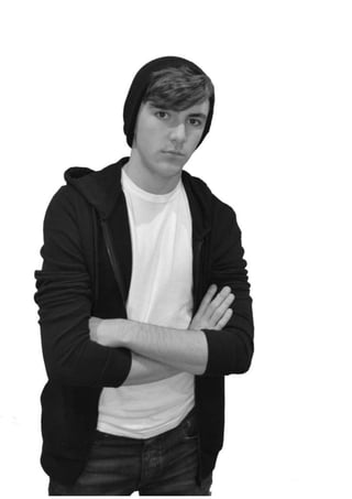
This document discusses how social groups are represented in the author's music magazine. The magazine targets middle and lower class males aged 15-25, who are the primary audiences for similar rock magazines. Photos in the magazine represent this group through clothing, poses, and props associated with rock music. The featured artist is presented as a grungy rocker through his dark clothing, beanie, and serious expression in posed photos. His crossed arms imply dominance, fitting the often male-dominated rock genre. Poses and a guitar further enhance his image as a rock artist who tells fans what to think.
Evaluation question 5
The document discusses how the magazine attracts its audience. It uses a red and gold color scheme throughout to relate to rock music. The skyline advertises free posters inside to entice purchases. The front cover model looks directly at the camera to create a connection with readers and intrigue them to learn more about his story. The main headline poses questions about his life to generate interest in reading more. A free CD sticker adds another unique selling point to encourage people to buy the magazine for extras without paying more.
Evaluation question 1
This document summarizes the key elements of a mock rock music magazine the author created for a class assignment. The summary includes:
The masthead "Plectrum" was chosen to represent the genre and is displayed in a rugged font. A color scheme of red, gold, and black was selected.
The cover features a model challenging conventions by lacking tattoos but dressing appropriately in a white t-shirt and black hoodie.
Inside, the contents page layout and repeated use of the masthead and colors maintain consistency. A double-page spread tells the artist's backstory rather than a typical Q&A.
Homefront trailer
The Homefront trailer includes around 150 shot changes to show off the plot and entice viewers. It depicts 6 different settings that provide context about the characters and their environment. Key props like guns, a baseball bat, and crystal meth appear constantly to convey the action genre. The main characters, played by Jason Statham and James Franco, change costumes several times to indicate the story takes place over a longer period of time. Along with dialogue, the trailer features music, gun sounds, explosions, and punch effects that change 4 times to build tension and pace the action scenes. Text includes the title, actors' names, and credits to promote the big-name cast and entice viewers to watch. Special effects like explosions and crashes keep
Audience research
This document discusses researching the target audience for a film. It notes that the crime and thriller genres typically attract different demographic groups. For a crime-thriller film, the target audience would be ages 15-35 to include fans of both genres. Both men and women are likely to be interested in a crime-thriller, as the genre provides suspense for men and mysteries for women to ponder. Considering elements like content, actors, and genre is important to determine which groups will be drawn to the film.
Todorovs theory
The document summarizes Todorov's theory of narrative structure through the plot points of an organized crime film. It describes the equilibrium as the main characters Ronnie and Harry playing football as boys, showing their lifelong friendship. The disruption occurs when Detective Wilson confronts Ronnie with information only an insider would know, blackmailing him into becoming a police informant. The realization happens as the mob's operations are busted and they learn of the mole. Order is restored when Harry agrees to help Ronnie by taking down the criminal organization. A new equilibrium emerges with Ronnie and Harry starting their own gang with fairer rules to prevent further disruption.
Barthe’s hermeneutic code
The document discusses Barthe's Hermeneutic Code, which refers to unexplained elements in a story that raise questions for the reader. Most films answer these questions at the end to maintain audience engagement. The code is especially noticeable in crime/detective genres, which lead audiences through clues and misdirection before revealing the criminal.
The response proposes three enigmas for a film trailer: 1) Referencing a mob boss without showing him to build fear and anticipation, 2) A mysterious gunshot leaving the shooter and target unknown, 3) Keeping a character's past secret but implying it threatens him. It says the mob boss and gunshot perpetrator will be revealed, while the character's past will remain
Oceans eleven trailer analysis
The trailer uses various costumes to characterize the main character Mr. Ocean, showing him in a prison uniform at first to indicate his criminal past, and later in a suit in an expensive restaurant to show that he is now wealthy. It also shows the traditional robbers' outfits of black clothes and gloves. The characters are portrayed in a lighthearted and humorous way to develop a connection with the audience. Long shots are used during action scenes to immerse the viewer, while close-ups introduce the starring actors to market the film. The music and dialogue create tension and clarify the characters' discussion. Despite consistent shot lengths, the fast-paced music creates a sense of urgency for the heist.
More from matt perki (20)
Recently uploaded
BBR 2024 Summer Sessions Interview Training
Qualitative research interview training by Professor Katrina Pritchard and Dr Helen Williams
Traditional Musical Instruments of Arunachal Pradesh and Uttar Pradesh - RAYH...
Traditional Musical Instruments of Arunachal Pradesh and Uttar Pradesh
clinical examination of hip joint (1).pdf
described clinical examination all orthopeadic conditions .
What is Digital Literacy? A guest blog from Andy McLaughlin, University of Ab...
What is Digital Literacy? A guest blog from Andy McLaughlin, University of Aberdeen
বাংলাদেশ অর্থনৈতিক সমীক্ষা (Economic Review) ২০২৪ UJS App.pdf
বাংলাদেশের অর্থনৈতিক সমীক্ষা ২০২৪ [Bangladesh Economic Review 2024 Bangla.pdf] কম্পিউটার , ট্যাব ও স্মার্ট ফোন ভার্সন সহ সম্পূর্ণ বাংলা ই-বুক বা pdf বই " সুচিপত্র ...বুকমার্ক মেনু 🔖 ও হাইপার লিংক মেনু 📝👆 যুক্ত ..
আমাদের সবার জন্য খুব খুব গুরুত্বপূর্ণ একটি বই ..বিসিএস, ব্যাংক, ইউনিভার্সিটি ভর্তি ও যে কোন প্রতিযোগিতা মূলক পরীক্ষার জন্য এর খুব ইম্পরট্যান্ট একটি বিষয় ...তাছাড়া বাংলাদেশের সাম্প্রতিক যে কোন ডাটা বা তথ্য এই বইতে পাবেন ...
তাই একজন নাগরিক হিসাবে এই তথ্য গুলো আপনার জানা প্রয়োজন ...।
বিসিএস ও ব্যাংক এর লিখিত পরীক্ষা ...+এছাড়া মাধ্যমিক ও উচ্চমাধ্যমিকের স্টুডেন্টদের জন্য অনেক কাজে আসবে ...
BÀI TẬP BỔ TRỢ TIẾNG ANH LỚP 9 CẢ NĂM - GLOBAL SUCCESS - NĂM HỌC 2024-2025 - ...
BÀI TẬP BỔ TRỢ TIẾNG ANH LỚP 9 CẢ NĂM - GLOBAL SUCCESS - NĂM HỌC 2024-2025 - ...Nguyen Thanh Tu Collection
https://app.box.com/s/tacvl9ekroe9hqupdnjruiypvm9rdaneANATOMY AND BIOMECHANICS OF HIP JOINT.pdf
it describes the bony anatomy including the femoral head , acetabulum, labrum . also discusses the capsule , ligaments . muscle that act on the hip joint and the range of motion are outlined. factors affecting hip joint stability and weight transmission through the joint are summarized.
Your Skill Boost Masterclass: Strategies for Effective Upskilling
Your Skill Boost Masterclass: Strategies for Effective UpskillingExcellence Foundation for South Sudan
Strategies for Effective Upskilling is a presentation by Chinwendu Peace in a Your Skill Boost Masterclass organisation by the Excellence Foundation for South Sudan on 08th and 09th June 2024 from 1 PM to 3 PM on each day.How to deliver Powerpoint Presentations.pptx
"How to make and deliver dynamic presentations by making it more interactive to captivate your audience attention"
Solutons Maths Escape Room Spatial .pptx
Solutions of Puzzles of Mathematics Escape Room Game in Spatial.io
Constructing Your Course Container for Effective Communication
Communicating effectively and consistently with students can help them feel at ease during their learning experience and provide the instructor with a communication trail to track the course's progress. This workshop will take you through constructing an engaging course container to facilitate effective communication.
Philippine Edukasyong Pantahanan at Pangkabuhayan (EPP) Curriculum
(𝐓𝐋𝐄 𝟏𝟎𝟎) (𝐋𝐞𝐬𝐬𝐨𝐧 𝟏)-𝐏𝐫𝐞𝐥𝐢𝐦𝐬
𝐃𝐢𝐬𝐜𝐮𝐬𝐬 𝐭𝐡𝐞 𝐄𝐏𝐏 𝐂𝐮𝐫𝐫𝐢𝐜𝐮𝐥𝐮𝐦 𝐢𝐧 𝐭𝐡𝐞 𝐏𝐡𝐢𝐥𝐢𝐩𝐩𝐢𝐧𝐞𝐬:
- Understand the goals and objectives of the Edukasyong Pantahanan at Pangkabuhayan (EPP) curriculum, recognizing its importance in fostering practical life skills and values among students. Students will also be able to identify the key components and subjects covered, such as agriculture, home economics, industrial arts, and information and communication technology.
𝐄𝐱𝐩𝐥𝐚𝐢𝐧 𝐭𝐡𝐞 𝐍𝐚𝐭𝐮𝐫𝐞 𝐚𝐧𝐝 𝐒𝐜𝐨𝐩𝐞 𝐨𝐟 𝐚𝐧 𝐄𝐧𝐭𝐫𝐞𝐩𝐫𝐞𝐧𝐞𝐮𝐫:
-Define entrepreneurship, distinguishing it from general business activities by emphasizing its focus on innovation, risk-taking, and value creation. Students will describe the characteristics and traits of successful entrepreneurs, including their roles and responsibilities, and discuss the broader economic and social impacts of entrepreneurial activities on both local and global scales.
Mule event processing models | MuleSoft Mysore Meetup #47
Mule event processing models | MuleSoft Mysore Meetup #47
Event Link:- https://meetups.mulesoft.com/events/details/mulesoft-mysore-presents-mule-event-processing-models/
Agenda
● What is event processing in MuleSoft?
● Types of event processing models in Mule 4
● Distinction between the reactive, parallel, blocking & non-blocking processing
For Upcoming Meetups Join Mysore Meetup Group - https://meetups.mulesoft.com/mysore/YouTube:- youtube.com/@mulesoftmysore
Mysore WhatsApp group:- https://chat.whatsapp.com/EhqtHtCC75vCAX7gaO842N
Speaker:-
Shivani Yasaswi - https://www.linkedin.com/in/shivaniyasaswi/
Organizers:-
Shubham Chaurasia - https://www.linkedin.com/in/shubhamchaurasia1/
Giridhar Meka - https://www.linkedin.com/in/giridharmeka
Priya Shaw - https://www.linkedin.com/in/priya-shaw
Hindi varnamala | hindi alphabet PPT.pdf
हिंदी वर्णमाला पीपीटी, hindi alphabet PPT presentation, hindi varnamala PPT, Hindi Varnamala pdf, हिंदी स्वर, हिंदी व्यंजन, sikhiye hindi varnmala, dr. mulla adam ali, hindi language and literature, hindi alphabet with drawing, hindi alphabet pdf, hindi varnamala for childrens, hindi language, hindi varnamala practice for kids, https://www.drmullaadamali.com
Leveraging Generative AI to Drive Nonprofit Innovation
In this webinar, participants learned how to utilize Generative AI to streamline operations and elevate member engagement. Amazon Web Service experts provided a customer specific use cases and dived into low/no-code tools that are quick and easy to deploy through Amazon Web Service (AWS.)
Main Java[All of the Base Concepts}.docx
This is part 1 of my Java Learning Journey. This Contains Custom methods, classes, constructors, packages, multithreading , try- catch block, finally block and more.
Recently uploaded (20)
Traditional Musical Instruments of Arunachal Pradesh and Uttar Pradesh - RAYH...
Traditional Musical Instruments of Arunachal Pradesh and Uttar Pradesh - RAYH...
B. Ed Syllabus for babasaheb ambedkar education university.pdf
B. Ed Syllabus for babasaheb ambedkar education university.pdf
What is Digital Literacy? A guest blog from Andy McLaughlin, University of Ab...
What is Digital Literacy? A guest blog from Andy McLaughlin, University of Ab...
বাংলাদেশ অর্থনৈতিক সমীক্ষা (Economic Review) ২০২৪ UJS App.pdf
বাংলাদেশ অর্থনৈতিক সমীক্ষা (Economic Review) ২০২৪ UJS App.pdf
BÀI TẬP BỔ TRỢ TIẾNG ANH LỚP 9 CẢ NĂM - GLOBAL SUCCESS - NĂM HỌC 2024-2025 - ...
BÀI TẬP BỔ TRỢ TIẾNG ANH LỚP 9 CẢ NĂM - GLOBAL SUCCESS - NĂM HỌC 2024-2025 - ...
Your Skill Boost Masterclass: Strategies for Effective Upskilling
Your Skill Boost Masterclass: Strategies for Effective Upskilling
Constructing Your Course Container for Effective Communication
Constructing Your Course Container for Effective Communication
Philippine Edukasyong Pantahanan at Pangkabuhayan (EPP) Curriculum
Philippine Edukasyong Pantahanan at Pangkabuhayan (EPP) Curriculum
Mule event processing models | MuleSoft Mysore Meetup #47
Mule event processing models | MuleSoft Mysore Meetup #47
IGCSE Biology Chapter 14- Reproduction in Plants.pdf
IGCSE Biology Chapter 14- Reproduction in Plants.pdf
Leveraging Generative AI to Drive Nonprofit Innovation
Leveraging Generative AI to Drive Nonprofit Innovation