NO1 Pandit Black Magic Specialist Expert In Bahawalpur, Sargodha, Sialkot, Sh...
Media 11
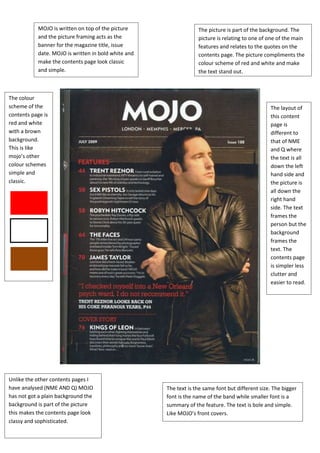
1. MOJO is written on top of the picture The picture is part of the background. The
and the picture framing acts as the picture is relating to one of one of the main
banner for the magazine title, issue features and relates to the quotes on the
date. MOJO is written in bold white and contents page. The picture compliments the
make the contents page look classic colour scheme of red and white and make
and simple. the text stand out.
The colour
scheme of the The layout of
contents page is this content
red and white page is
with a brown different to
background. that of NME
This is like and Q where
mojo’s other the text is all
colour schemes down the left
simple and hand side and
classic. the picture is
all down the
right hand
side. The text
frames the
person but the
background
frames the
text. The
contents page
is simpler less
clutter and
easier to read.
Unlike the other contents pages I
have analysed (NME AND Q) MOJO The text is the same font but different size. The bigger
has not got a plain background the font is the name of the band while smaller font is a
background is part of the picture summary of the feature. The text is bole and simple.
this makes the contents page look Like MOJO’s front covers.
classy and sophisticated.