Download as PDF, PPTX
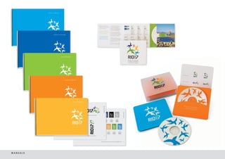
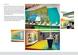
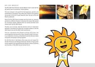
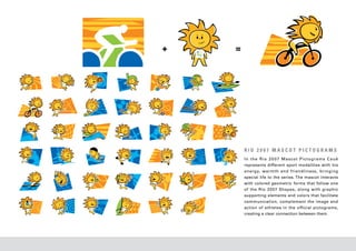
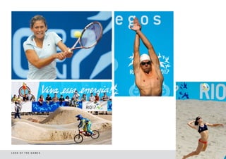
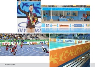
![The Rio 2007 Pan and Parapan-American
Games Look and Feel Programme is
ac k nowledged even today, several
p r o d u c t s h a ve a p p e a r e d in m a j o r
national design exhibitions and it is often
used as an example by publications in
Brazil and internationally.
➝ elected for the Exhibition
S ➝ ublished on the website
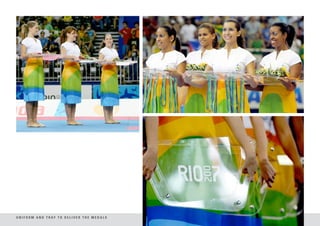
P ➝ io 2007 Medals
R ➝ L icensing Manual
➝ io 2007 Brand
R
“Brazilian Design Today: www.designbrasil.org.br Selected for the 9 th Selected for the 8th Published in the book
Frontiers” – São Paulo [Brazil, 2007] Biennial of Graphic Biennial of Graphic “Logo Design” - Taschen
Museum of Modern Art Design [Brazil, 2009] Design [Brazil, 2006] [Germany, 2007]
➝ arapan Brand
P
[Brazil, 2009]
Selected for the 9 th ➝ io 2007 Mascot
R ➝ fficial Poster Rio 2007
O ➝ io 2007 Pictograms
R
➝ ublished in Identity
P Biennial of Graphic Selected for the 9 th
Selected for the 8 Biennial
th
Published in the book
– Branding and Design Design [Brazil, 2009] Biennial of Graphic of Graphic Design [Brazil, “Logo Design” - Taschen
Journal [Russia, 2008] Design [Brazil, 2009] 2006] and published in [Germany, 2007]
➝ ocha Brand Rio 2007
T
the book “Logo Design”
➝ ublished in the magazine
P Selected for the 9 th ➝ fficial Mascot
O
– Taschen [Germany, 2007]
Design Gráfico, year 13, Biennial of Graphic Poster Rio 2007
nº 98 [Brazil, 2008] Design [Brazil, 2009] Selected for the 9 th ➝ io 2007 Manuals
R
Biennial of Graphic Published in the book
Design [Brazil, 2009] “Logo Design” - Taschen
[Germany, 2007]](https://image.slidesharecdn.com/lookrio2007-121204070151-phpapp01/85/Look-Rio-2007-3-320.jpg)
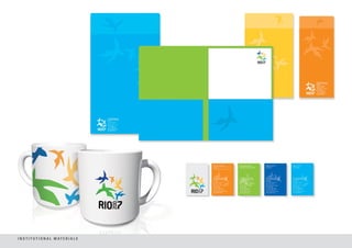
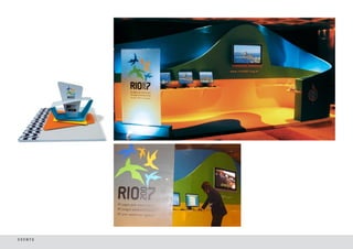
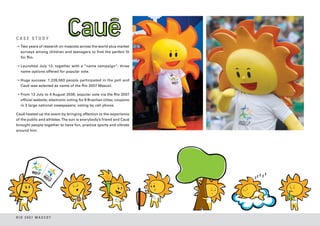
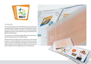
![BRAND ARQUITECTURE
1 2
3 4 5 6 7 8
1] Rio 2007 Pan American Games
2] Rio 2007 Parapan American Games
3] Rio 2007 Parapan American Games Club
4] Rio 2007 Pan American Games Business Fair
5] Rio 2007 Pan American Games Medical Meeting
6] I am Rio 2007
7] Work Force Rio 2007
8] Torch Rio 2007
9] Rio 2007 Calendar Event
9 10
10] Rio 2007 Official Licensed Product](https://image.slidesharecdn.com/lookrio2007-121204070151-phpapp01/85/Look-Rio-2007-6-320.jpg)
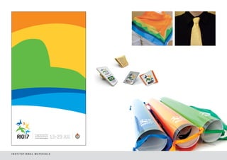
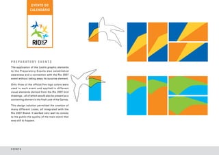
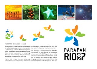
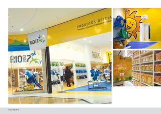
![RIO 2007 PICTOGRAMS
The creation of Rio 2007 Pictograms were inspired by the mosaics
that are present in Rio’s landscape and in the everyday lives of
Cariocas, beautifully decorating the sidewalks of Copacabana by
the sea, the stairs that go up to the neighborhood of Santa Teresa
and the glass work in churches.
The result was a series of mosaic pictograms integrated by the
main concepts used in the Rio 2007 Brand.
While the borders of each colored bird in the Rio 2007 Brand
form the shape of the Sugar Loaf Mountain against their white
background on the outside, in the Rio 2007 Pictograms this same
resource was applied reversely: the colored mosaic pieces outline
a white space representing athletes in movement.
This original solution permits the full representation of different
sports modalities [including the triathlon and the pentathlon], is
easy to understand and keeps the athlete’s performance in focus.](https://image.slidesharecdn.com/lookrio2007-121204070151-phpapp01/85/Look-Rio-2007-15-320.jpg)
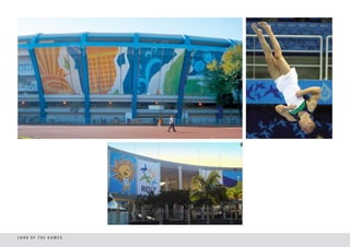
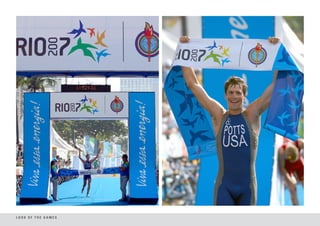
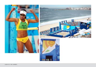


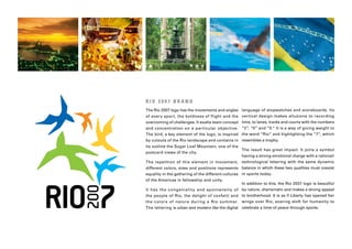
The Rio 2007 Pan and Parapan American Games branding project sought to convey the spontaneity and warmth of Rio de Janeiro through its visual identity. Over 5,500 athletes from 42 countries competed in 41 sports at the Games, which were broadcast to over 150 countries and drew over 1 million spectators. The branding incorporated elements representing Rio like landscapes and birds to create a unified visual language for promoting the Games.


