Downloaded 25 times
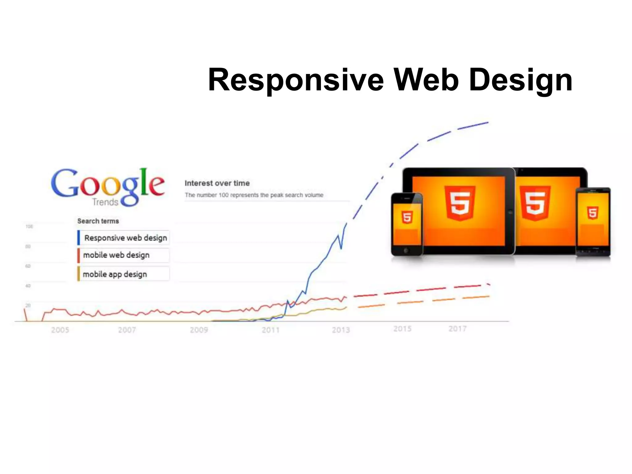
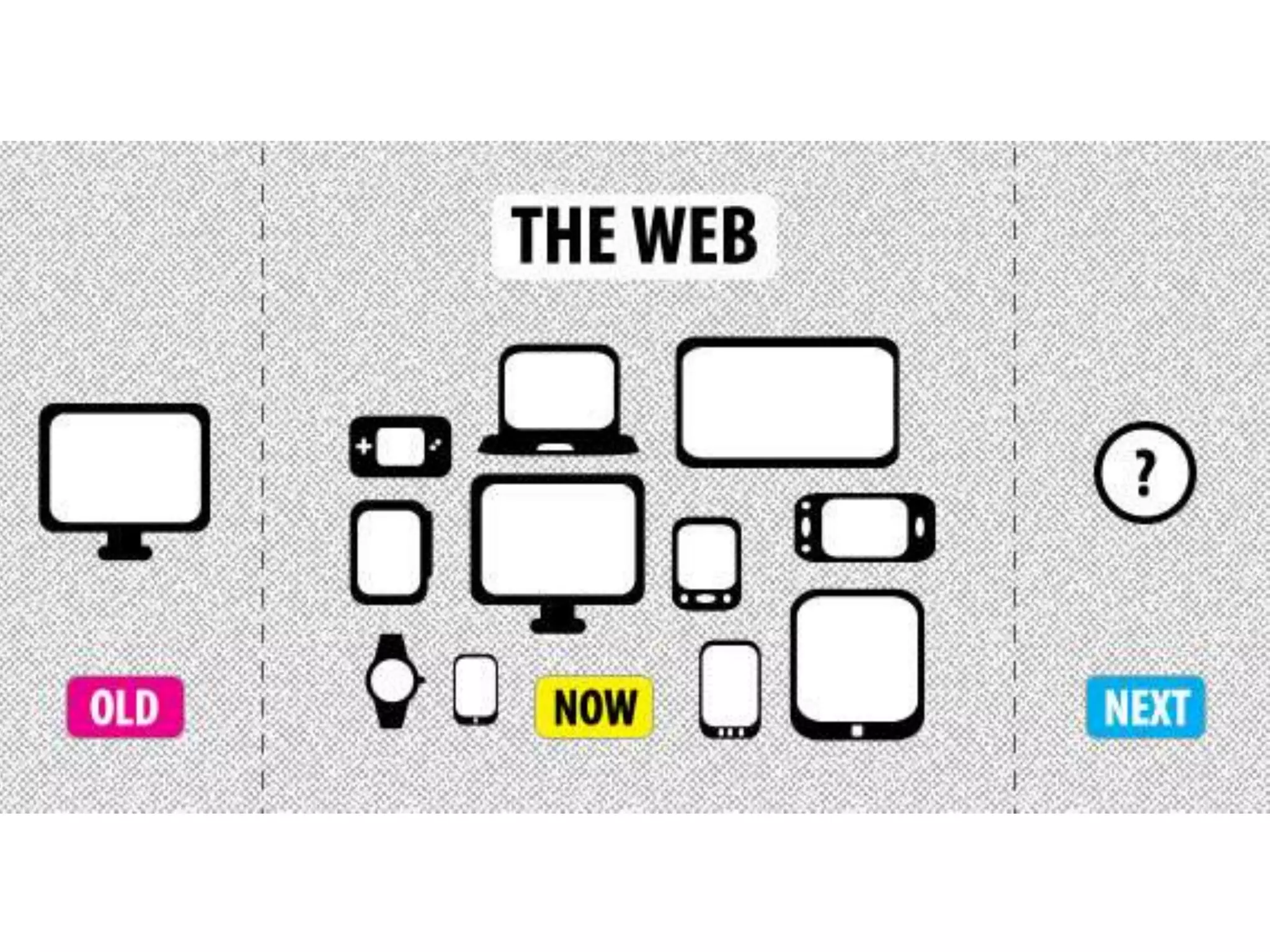
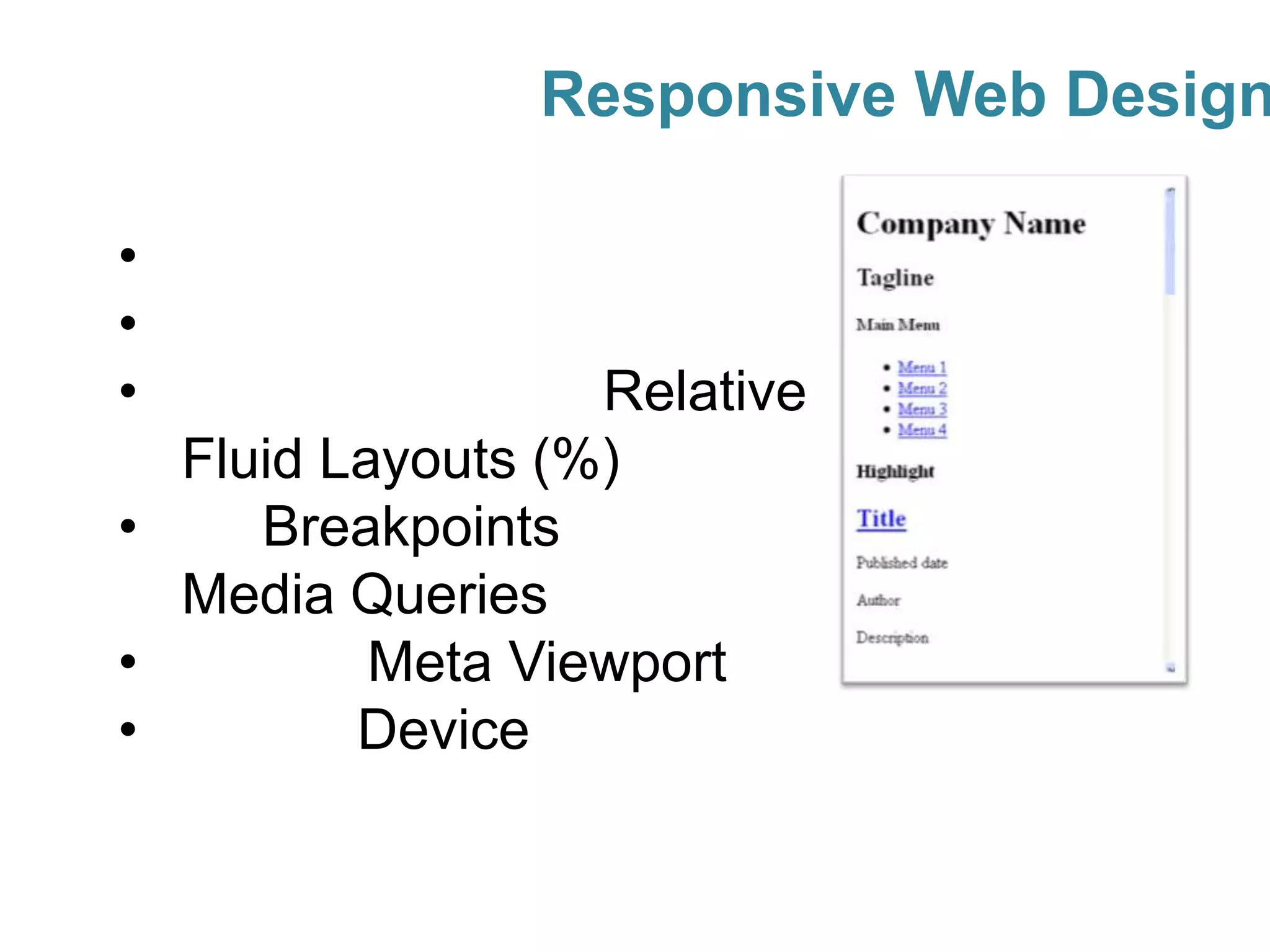

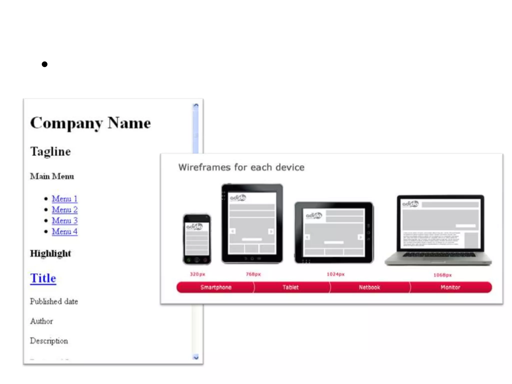
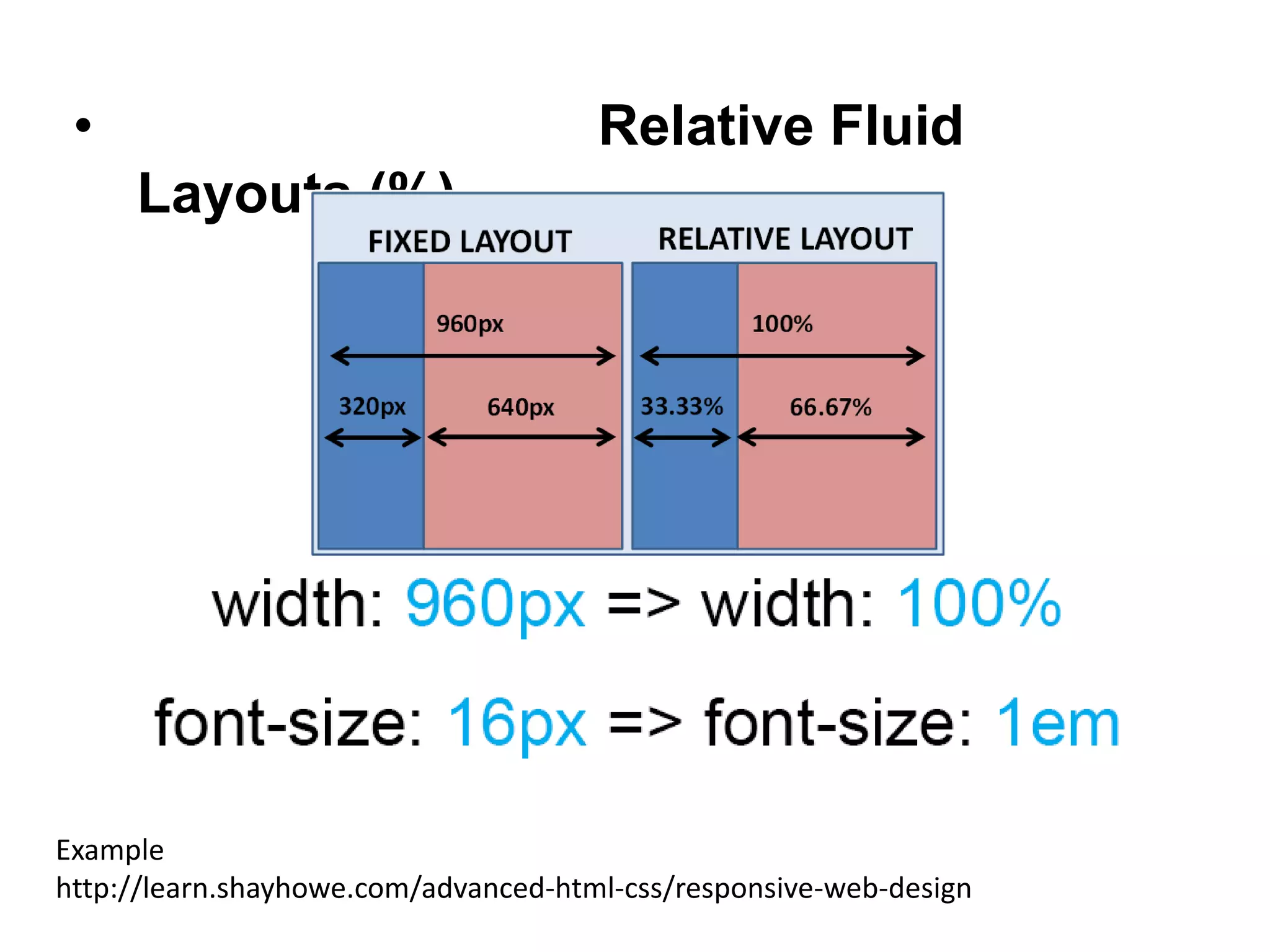
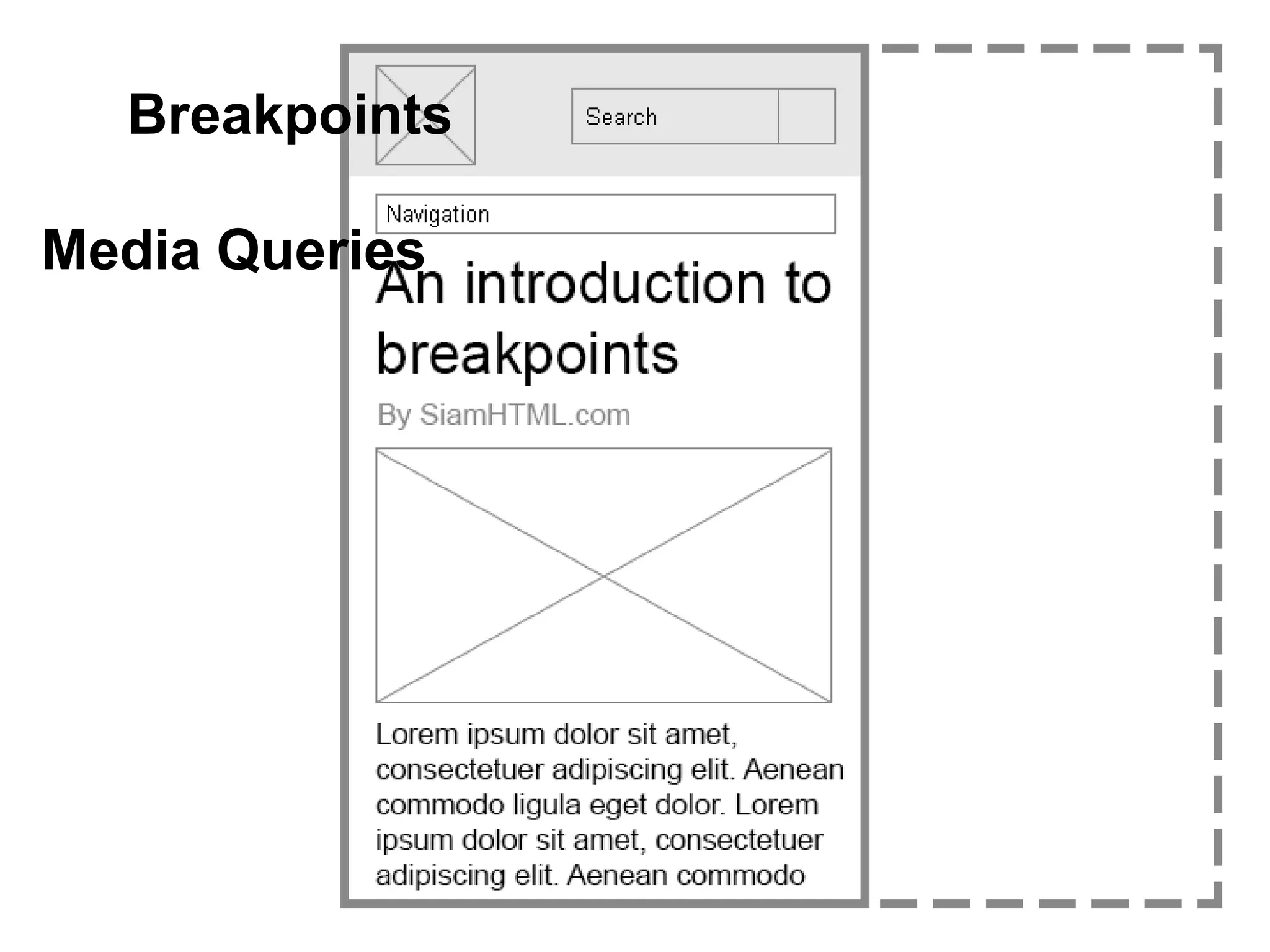
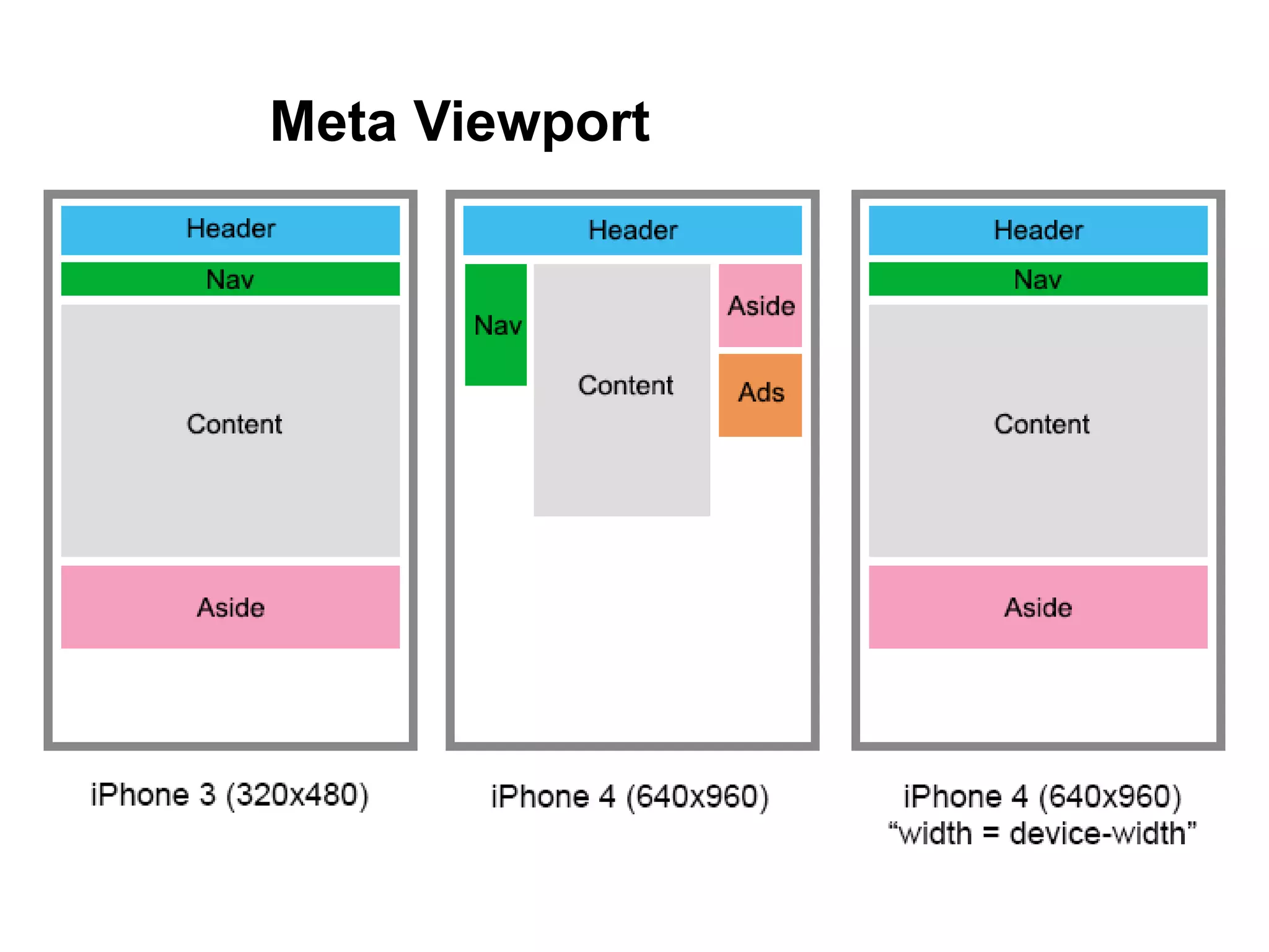
Responsive web design allows websites to automatically adapt their layout to different screen sizes and devices using fluid grids, breakpoints, and media queries. Websites use relative units like percentages for layouts, breakpoints to specify CSS for different screen widths, and media queries to apply distinct styles based on screen size or device. Examples demonstrate how responsive design adapts content for different devices like mobile phones and desktops.


![วิชาการผลิตมัลติมีเดีย 1 [Multimedia I]](https://cdn.slidesharecdn.com/ss_thumbnails/1-140522010448-phpapp01-thumbnail.jpg?width=640&height=640&fit=bounds)