More Related Content
Similar to L7-587_Alchemy-of-Color-White-Paper_EN (20)
L7-587_Alchemy-of-Color-White-Paper_EN
- 1. White Paper
Page 1
X-Rite World Headquarters
Grand Rapids, Michigan USA • +1 800 248 9748 • +1 616 803 2100 • xrite.com
© 2015 X-Rite, Incorporated. All rights reserved. L7-587-EN (03/15)
Introduction
One of the greatest challenges faced by brand owners is ensuring accurate, consistent and reliable color across what
is often a complex global supply chain. This continues to be an issue for them despite the time and attention that
has been paid to color measurement and management in the printing and packaging industries. Considering that
accurate color consistently surfaces as a primary challenge for brand owners across a variety of market studies, it is
not surprising to find similar challenges among print service providers.
In the study, struggling firms were found to be slow to adapt to the fundamental changes in the market, with many
idealizing, but not always practicing, an old-school “craftsman” approach to high color quality standards while
yielding to pressure on price and turnaround times. The same study reflected that growing companies were working to
meet or exceed customer expectations and focused on managing communications at both the front- and back-end
of the process. Printers across the board, though, claim to be better than their competition in terms of the ability to
produce accurate color. Some verbatim comments include:
“Color accuracy is everything—you can’t produce a good job without it being accurate. We do a lot of high-end
work and often have to match printed images to physical objects like bed sheets or shoes. We have to make sure
that what’s on the piece of paper matches.”
“Huge! We’re a high-end commercial printer so they expect our proofs to match exactly.”
However, the study revealed that the definition of the term “color accuracy” varied dramatically, with many providers
stating that color requirements were significantly different by job, customer and technology. Many printers who
participated in the study were not leveraging benchmark processes and technologies to reduce costs and streamline
color measurement and management in a way that reduced waste and rework. All printers in the study, however, did
agree that streamlining processes had the potential to bring a higher level of efficiency to their businesses and drive
production to the color consistency they wanted—and their customers expected—to achieve.
By Shoshana Burgett
Director, World-Wide Marketing Communications
X-Rite Pantone
THE ALCHEMY OF COLOR
TURNING LEAD INTO GOLD WITH
AN EFFECTIVE COLOR SUPPLY CHAIN
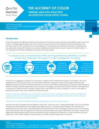
In a recent study commissioned by X-Rite, printing professionals identified a number
of their own challenges with respect to color management, including:
Ensuring color
accuracy with
aging equipment
and keeping up
with new technology
Managing
environmental
variables that
cause fluctuations
in color accuracy
Maintaining color
consistency across
devices, including
digital devices,
and repeatability
from job to job
Maintain color
consistency
across devices,
job to job
and day to day
- 2. White Paper
Page 2
X-Rite World Headquarters
Grand Rapids, Michigan USA • +1 800 248 9748 • +1 616 803 2100 • xrite.com
© 2015 X-Rite, Incorporated. All rights reserved. L7-587-EN (03/15)
In the Beginning…
In the Western world, we often date the origin of what
we know today as commercial printing to 1436, when
Johannes Gutenberg came up with the idea of movable
type, and a little later, oil-based inks. But movable type
dates back much further, in fact to 1040 AD in China, and
a couple hundred years later in Korea, using ceramic and
metal blocks, respectively, although wood block printing
dates back even further—almost 1,000 years further back!
Jumping ahead a few hundred years, we started seeing
color presses on the scene. There was a color newspaper
press operating in Chicago as early as 1892, with color
cartoon strips appearing for the first time the following year.
In those days, mechanically printed color was a novelty,
and no one was likely stressing over the exact match to a
standard color reference like PANTONE!
Following World War II, more craft-oriented and family-
owned businesses began forming, and the offset press
entered the stage. Apprentices learned the craft of
setting type or hanging plates. Designers would demand a
specific color, and there was generally “a guy” in the shop
who could deploy his color wizardry to get to the desired
color… sometimes a tedious and time-consuming process.
Many printers today are second or third generation in
the business. Many are still operating the same way their
fathers did, in an analog and regionally segmented world.
Printing operations typically had one brand of equipment
and one or two printing technologies, and many brands
were regionally focused with few having a global
presence. In addition, brands had access to a limited
range of packaging types and substrates.
But times have changed, and so must our color habits.
In a sense, color management was considered alchemy,
which Merriam Webster defines as “a power or process
that changes or transforms something in a mysterious or
impressive way.”
But today there is an increasing availability of affordable
ways to turn the lead of poor color into the gold of
perfect color and to ensure an effective color supply
chain, no matter how complex or distributed it is.
This white paper addresses the developments that have
occurred in the world of specification, measurement,
management and reporting of color that are taking the
mystery out of color management and enabling brand
owners and print service providers alike to leverage the
science of color.
In the new world of color, there is no more alchemy—it
is moving to the science that has the ability to remove
subjectivity and emotion from the process. The alchemy
remains in the minds and hearts of design professionals,
whose innovation and creativity continues to challenge
manufacturers. Even there, science can help streamline
the process and take the confusion out of color
communication, from ideation through production to
the final product.
- 3. White Paper
Page 3
X-Rite World Headquarters
Grand Rapids, Michigan USA • +1 800 248 9748 • +1 616 803 2100 • xrite.com
© 2015 X-Rite, Incorporated. All rights reserved. L7-587-EN (03/15)
No Compromise to Creativity
As we said earlier, the alchemy of color remains in the minds
and hearts of design professionals. This is where the magic
truly happens, and there is no value in constraining that
creativity. Though best known for its Pantone Management
System (PMS) and fan books, Pantone also offers color trend
reports, color consulting services and color references in print,
plastics and textiles to inspire and assist creative professionals.
Creatives have been specifying Pantone colors for more than
50 years.
While not generally thought of as a creative professional,
there can be no argument that Steve Jobs was the
embodiment of creative genius. When looking for the right
color for the case of the Apple II computer, according to
Walter Isaacson’s seminal biography of Jobs, “Pantone had
2,000 shades of beige, but ‘none of them were good enough
for Steve,” and he worked with Pantone to come up with
a custom beige. While this example may be a little more
extreme than the demands of your typical brand owner, it
does demonstrate how critical color is to the creative mind.
Later, Leatrice Eiseman, Executive Director of the Pantone
Color Institute, consulted with Apple to analyze how colors
corresponded to particular personality profiles to come up
with each of the iMac’s five “fruit flavor” colors.
Designers, whether in the graphic arts or working in industrial
applications, understand that color is important; and they
bring a passion to the colors they specify. Oftentimes,
however, designers are using their preferred tactile color
reference tool set, such as the paper-based Pantone Guides,
still valuable but not as accurate as the digital standards
available today. Add the complexity of a global dispersed
and collaborative workforce, and paper based references,
which can vary due to age, environmental conditions,
wear and tear and more, leave much to be desired when
communicating color across a global supply chain. Rather,
designers and other creative professionals now have
available affordable, modern, digital technology to augment
their creativity, and in many cases, even give them
additional, fresh ideas.
Inspiration for a design’s color palette may start with a digital
photograph or measurement of a physical sample with an
affordable handheld spectrophotometer such
as Pantone CAPSURE.
Meeting a client’s or designer’s color expectations
has historically been a challenging task attained only
with the application of significant expertise, time and
expense. Automated color matching is still the holy
grail, and as an industry we are continuing to work hard
at achieving it. X-Rite Pantone has gone a long way
towards helping the industry reach this goal with its broad
portfolio of hardware, software and services offerings. —
DavidZwang, Zwang and Company
With brand owner approval, designers may also gain
access to approved brand owner color palettes through
PantoneLIVE, a cloud-based ecosystem for the storage
and communication of approved spectral values for
brand and Pantone colors.
The final step in selection of colors is ascertaining that
they will actually reproduce accurately regardless of
how, when or where they are being produced. In a
PantoneLIVE™-based scenario, when a brand owner has
Meeting a client’s or designer’s color
expectations has historically been a
challenging task attained only with the
application of significant expertise, time
and expense. Automated color matching
is still the holy grail, and as an industry we
are continuing to work hard at achieving
it. X-Rite Pantone has gone a long way
towards helping the industry reach this
goal with its broad portfolio of hardware,
software and services offerings.
—David Zwang, Zwang and Company
- 4. White Paper
Page 4
X-Rite World Headquarters
Grand Rapids, Michigan USA • +1 800 248 9748 • +1 616 803 2100 • xrite.com
© 2015 X-Rite, Incorporated. All rights reserved. L7-587-EN (03/15)
provided access, designers and production teams can
instantly connect to a brand’s digital color palette. Using
Adobe® Illustrator® and the PantoneLIVE Color Book
& Viewer, design teams can work with brand color or
Pantone colors specified by the brand before going to
press. These tools allow designers to incorporate digital
color standards directly from within their preferred design
software right into their designs. In addition, these tools
offer designers the ability to accurately render the final
proof on screen, taking into account the behavior of the
color when produced on the intended substrate using a
designated printing technology.
The core challenge is that colors can’t always be
produced accurately or consistently across technologies
and substrates. To alleviate
this situation and to help
better communicate and
manage color expectations,
PantoneLIVE incorporates
both Master and Dependent
Standards to accurately
specify and communicate
color. A Master Standard is all
of the spectral data for that
color, analogous to the DNA
of a color. As everyone has
experienced at one time or
another, what you see is not
always what you get, and this
is where Dependent Standards
come in. Dependent
Standards are dependent on
a specific technology and
substrate. PantoneLIVE uses
Dependent Standards to
ensure stakeholders the right
and relevant color experience.
Dependent Standards are
expressly designed to represent
the desired Master Standard,
while taking into account
the effect on color outcome of using various different
substrates, inks and printing processes. The combination
of PantoneLIVE Master and Dependent Standards
provides everyone in the product life cycle with the
means to define, understand and communicate both the
ideal color and the color expected at production. This is
especially important in package design, since colors may
be perceived differently depending upon inks, substrates
and printing technologies used.
In addition, colors can drift over time due to a number
of conditions ranging from accumulated errors over
time to instruments that are not calibrated and paper-
based references whose color has faded due to age,
environmental conditions or wear and tear. This can result
in mismatched colors when products reach the final
assembly or distribution point.
Factors that can affect the accuracy
of colors over time
“The ability to consistently
specify, measure, produce
and communicate color from
ideation through production
is critical to an efficient
packaging supply chain.
X-Rite Pantone is playing a
leadership role in providing
tools, technologies, services
and education that make this
not only possible but easier
than ever before,” said Peter
Muir, President, Bizucate, Inc.
Other tools are available to
designers through applications
such as myPANTONE and
PANTONE COLOR MANAGER
that help determine whether
a selected color can be
accurately reproduced.
Ideally, tools that integrate
directly with the design
software of choice, such as
Adobe Illustrator or Photoshop,
can be used to streamline the
process from within a familiar design environment.
As mentioned earlier, designers prefer a tactile tool set that
can be used in combination with the digital world they are
increasingly working within. PantoneLIVE Digital Drawdowns
allow creatives to have an actual physical swatch that
“The ability to consistently specify, measure,
produce and communicate color from
ideation through production is critical to
an efficient packaging supply chain. X-Rite
Pantone is playing a leadership role in
providing tools, technologies, services and
education that make this not only possible
but easier than ever before.”
—Peter Muir, President, Bizucate, Inc.
- 5. White Paper
Page 5
X-Rite World Headquarters
Grand Rapids, Michigan USA • +1 800 248 9748 • +1 616 803 2100 • xrite.com
© 2015 X-Rite, Incorporated. All rights reserved. L7-587-EN (03/15)
simulates the final color that will be achieved based
upon all known factors. A Digital Drawdown is a printed
sheet produced by Pantone with peel-off labels based
on a digital dependent standard. Digital Drawdowns can
be created in one color or multiple colors and can be
shared with stakeholders as a physical reference to the
PantoneLIVE identities stored in the cloud.
The bottom line at this stage is to take the final output
mode into consideration at the very beginning of the
design stage to reduce cost, time, waste and frustration
once the design reaches the production stage. Using
today’s technologies, this can be incorporated into
the designer’s workflow without stifling creativity—in
fact, these tools and technologies can often provide
additional inspiration.
Premedia and Ink
Once a properly prepared file, one that includes spectral
values for all of the specified colors, has been received,
premedia professionals can more easily generate
accurate proofs as appropriate, and ensure that displays
and proofers are profiled using a spectrophotometer
such as the X-Rite i1Pro 2 or the X-Rite eXact. In the
case of conventional printing, inks can be formulated
to deliver optimal and achievable colors, based on the
spectral values and using specialized software such as
X-Rite InkFormulation Software or ColorCert Ink Tools,
with both wet and dry spectral measurements taken
of ink drawdowns. One consideration in taking these
and other color measurements is whether or not
optical brightening agents (OBAs) have been used in
the inks or substrates. Since that practice has become
more common, it is important to ensure that color
measurement instruments can take this into account and
deliver consistent measurements.
Many ink kitchens, where inks are formulated and mixed,
are managing thousands of colors. And it is not the
norm to evaluate the accuracy of new colors as ink is
received, nor to assess whether a new customer-specific
color can be met by existing ink inventories. A new color
requirement is received, the ink is formulated and stored,
and the data is added to the inventory. Ink kitchens and
labs can now evaluate and map their database of ink
colors. If a color is within a certain tolerance of a Pantone
color, then an ink lab can have that new ink color mapped
to the Pantone Color. There is no need to recreate multiple
databases, nor to create a unique company reference
book. An ink draw down is a reference, no different than
a Pantone book is. It reflects color performance at a point
in time on a given press and a particular substrate. Several
colors could be with a ΔE of 1 to a Pantone color. With this
new process, an ink kitchen can now substantially reduce
costs by migrating to de facto color references and
optimizing ink inventory. Even if ink is not within tolerance,
a range of colors can still be harmonized into a single
color reference with unique naming conventions, saving
on inventory and costs. The overall process standardizes
the inventory around brand-specific and Pantone colors,
providing increased control over and flexibility in how ink
is formulated. This makes for more efficient use of inks,
including the ability to more easily use leftover inks.
In the Pressroom
Are your prepress and press operators still relying primarily
on ink density measurements or have they migrated to
more accurate spectral measurements? Measuring ink
density has historically been the preferred method of
checking on-press quality (next to the “by-eye” method
often preferred by long-time press operators). According
to Brian Ashe, solutions architect for the Pantone Digital
Business unit of X-Rite, “A densitometer is very good at
reading process colors—cyan, magenta, yellow and
black, the CMYK of the four-color process—because it
basically is looking at the ink film that is being laid down
on the substrate. But while densitometers are very good
at checking density, they are not very good at looking
at color. Actually, they don’t see colors at all.” It is also
important to consider the fact that ink failures due to
contamination can also cause issues. In these cases,
density readings may appear fine, but these failures can
only be detected by monitoring spectral values. If the ink
failure is not caught until press time, significant waste and
the potential for customer dissatisfaction occurs.
Michael Clark, President of Cedar Graphics, an EarthColor
company and a Pantone Certified Printer, said, “You
can make it work using ink density, but there are other
variations that come into play that ink density alone won’t
address. We now take spectral measurements of both
- 6. White Paper
Page 6
X-Rite World Headquarters
Grand Rapids, Michigan USA • +1 800 248 9748 • +1 616 803 2100 • xrite.com
© 2015 X-Rite, Incorporated. All rights reserved. L7-587-EN (03/15)
wet and dry ink. We have a library of spectral values,
and we match each and every job to those. And we
have conformity between the ink room and the press
room that we didn’t have before. That gives us the
repeatability that clients demand.”
With today’s spectrophotometers, not only can more
accurate spectral values be measured, but companion
software can inform the press operator exactly what
needs to be done with ink key settings in order to
ensure appropriate ink densities and/or to bring color
back into tolerance, often before shifts are even visible
to the human eye. Using these processes also ensures
that everyone in the production process is speaking the
same language.
Clark also emphasizes the importance of consistent
standard operating
procedures, saying, “Like
many businesses, we had a
Tower of Babel effect. You
think everyone is doing the
same thing, but until someone
comes in and looks under
the hood, you don’t really
know. It’s not about what
you are doing wrong; it’s
about everyone being on the
same page and speaking
the same language.” This
miscommunication can be
exacerbated even further
when products are printed
across multiple plants. Very
few print operations run as a single site these days. With
accelerated industry consolidation and more printers
participating in partnerships to accommodate clients’
global needs, managing a base of diverse equipment
can be a challenge. Even if each site has similar
equipment, consistent operating procedures may not be
in place to ensure they are all running at optimal levels.
Software such as X-Rite’s NetProfiler allows operations
to verify and optimize the performance of their color
measurement devices, across the plant or around
the globe, which also helps to ensure that presses are
delivering consistent color. NetProfiler includes a track-
and trace audit trail and enables the standardization of
color acceptance criteria across locations and across a
family of spectrophotometric devices.
“NetProfiler allows us to know that a device in Shenzhen
is in a particular range compared with a similar device in
the U.S.,” said Paul Biernat, Director of Global Operations
for Graphic Measures International (GMI). “That’s very
powerful because it gives continuity in measurements
when packaging work is split up among vendors in the U.S.,
China, India or other parts of the world.”
The end result of these types of standard operating
procedures is the reduction in variances among
multiple measurement devices caused by age, wear
or environment. Investing a few minutes each month in
certifying the accuracy of instruments reduces rework,
speeds time to market, improves quality and repeatability
and has a direct impact on
profits.
Today there are so many
programs and certifications
related to the printing and
packaging industries. Some
certifications are quite limited
in scope, and many are point-
in-time proof points, rarely
with ongoing monitoring.
IDEAlliance has its G7
programs, which help printers
verify that they can meet
certain standardized targets.
Manufactures have their own
certification programs, and
ISO works to drive recommendations and processes into
the complex environment of alchemists and scientists,
as well as into production environments. There are also
great consultants who can work with printing operations
to analyze workflow and provide recommendations
for changes in process and additional investments to
help production operations run more smoothly. Some
of the more recent programs work to validate that the
investments made are still being used. With the Pantone
Certified Printer Program, consultants come on site to
evaluate current processes and procedures. The goal
is not to replace current investments; rather, the goal
is to evaluate what it will take to implement Standard
Operating Procedures within existing infrastructures to
“NetProfiler allows us to know that a
device in Shenzhen is in a particular
range compared with a similar device
in the U.S. That’s very powerful because
it gives continuity in measurements
when packaging work is split up among
vendors in the U.S., China, India or other
parts of the world.”
- Paul Biernat, Director of Global Operations for
Graphic Measures International (GMI)
- 7. White Paper
Page 7
X-Rite World Headquarters
Grand Rapids, Michigan USA • +1 800 248 9748 • +1 616 803 2100 • xrite.com
© 2015 X-Rite, Incorporated. All rights reserved. L7-587-EN (03/15)
drive consistency and then to measure that consistency
quarterly to ensure ongoing compliance.
X-Rite/Pantone has brought packaging color
out of the dark ages. Their suite of innovative
tools integrates with industry standards to
make variability consistent. From the brand
manager to the designer to the ink maker to
the pressroom, color quality is communicated
by the numbers. They make color work.
—Frank Romano, RIT Professor Emeritus
All of this adds up to a more efficient operation, from
ideation through production. Communicating color
requirements digitally and incorporating proper color
measurement and management processes throughout
the entire product life cycle means less time spent
ensuring that what comes off the press is in line with the
design intent. It also means less waste, less rework and
fewer customer complaints. This approach has been
a game-changer for Chesapeake Pharmaceutical
& Healthcare Packaging, the largest consumer of
paperboard packaging in Europe, producing about 15
billion units of packaging per annum. The company has
seen an 80% reduction in customer complaints and a
99.82% acceptance of first proofs. Tetra Pak, the leading
and largest supplier of packaging material, leverages
many of the PantoneLIVE technology across several
plants. Peter Stolt Global Design Handling Manager, said,
“In our business, the process of getting to approved color
has always been difficult within a global supply chain. We
have four major considerations we must keep in mind.
The first is the substrate; the second is pigment choice—all
pigments that we use must be approved for direct food
contact. Third is the print method, and fourth is to have
local best matches that standardize this one single target
regardless of geography. Since we have been working
with PantoneLIVE, we have been able to make this much
easier on a global basis. When we need to add a specific
color to the PantoneLIVE database, Pantone works
with us to see how best to match that color using our
substrates and our food-approved pigments. We are then
able to distribute that color data out to the brand owners
and designers in our color network, using integrated
software solutions such as those from Adobe and Esko,
placing these colors in their color libraries. Proofs and prints
are measured and verified, with data collected, to control
and monitor that we are delivering as promised.”
It is also important to note that the techniques and
technologies discussed in this white paper apply to printers
and packaging converters of all sizes.
One such printer, Montreal-based Pazazz, has achieved
significant benefits by apply these techniques and
technologies to its business. As a mid-sized printer,
Pazazz’s CEO Warren Werbitt believes that it is important
to invest in the latest technologies for color measure and
management and has given significant thought to the ROI
of such investments. He estimates that, for the average
shop, the cost of purchasing a spectrophotometer such as
eXact adds up to an additional cost of about $3 per job
for the first year the instrument is in place, adding, “Clearly,
the ability to reduce waste on each and every job by using
proper instrumentation to measure and manage color will
save much more than $3 per job in paper alone, to say
nothing of labor and other related costs.”
Achieving Operational Transparency
Most organizations rely on data to make business
decisions. From marketing and sales to operations, data
provides insight into areas of improvement that will help
any business operate more efficiently. For brand owners,
it’s about managing and controlling the look and feel
of the final product, including its packaging, across a
complex supply chain and to meet the varying needs
of a global consumer base. Tools like ColorCert: X-Rite
Edition gives brand owners the ability to understand how
their brand is being managed and produced across their
supplier base. Reporting mechanisms are in place to
generate scorecards and to report on how suppliers are
operating. Rejection of a product due to quality issues is
costly enough, but even more costly can be losses due
to counterfeiting or competition if a brand color is not
correctly produced. Brands typically have an array of
suppliers, and the ColorCert scorecard helps them develop
deeper relationships with suppliers and, ultimately, benefit
from a better final product.
Suppliers also want to enhance their relationships with
- 8. White Paper
Page 8
X-Rite World Headquarters
Grand Rapids, Michigan USA • +1 800 248 9748 • +1 616 803 2100 • xrite.com
© 2015 X-Rite, Incorporated. All rights reserved. L7-587-EN (03/15)
“The single biggest problem in communication is the illusion
that it has taken place.”
—George Bernard Shaw,
Leadership Skills for Managers
customers. They are increasingly being pressured by their
customers to demonstrate that they are in compliance
with specifications. Reporting systems like those
embodied in ColorCert enable production operations
to work with customers with a high level of operational
transparency, demonstrating on an ongoing basis that
their work is within acceptable tolerances. In addition,
these tools bring visibility into other areas. Now operations
can evaluate how their own suppliers are performing,
whether it be plates, inks or proofs. In today’s world of
shorter runs and the need for consistent reprints, being
able to drive a higher level of consistency throughout the
plant and across plants is critical.
This approach can often also eliminate the time and
expense of having individuals travel to be present for a
press run, with the strong possibility that arbitrary changes
will be made based on subjective evaluation. By working
from a common digital color reference such as offered
by PantoneLIVE, combined with consistent and accurate
measurement and a common reporting mechanism,
everyone is speaking the same language and the Tower
of Babel effect disappears. There are fewer surprises when
everyone is speaking the same language. This not only
applies to communication between producer and client,
but it also applies to operations within a single plant and/
or across multiple plants, helping managers and owners
identify areas where productivity could be improved and
waste reduced.
From ideation through design and production, failures
most often occur for two reasons: lack of clear
communication and technology limitations. Color creates
an emotional reaction for most individuals and this often
results in subjective decisions. By using consistent and
accurate digital color references, subjectivity is removed
and a more efficient and predictable workflow is possible.
As more organizations adopt these modern tools and
procedures, they are truly able to “print to the numbers,”
taking the mystery out of color management and
turning the lead of poor color into the gold of perfect
color, leaving the alchemy in the minds and hearts
of the creative community as they continue to
increasingly stretch the bounds of technology with
more interesting, effective and creative designs—that
can be printed flawlessly!
Brands should contact esko at info.brand@esko.com
Print, Packaging and Ink Suppliers can contact us at: xrite.com/contact-us