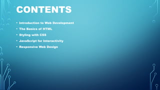
CONTENTS
• Introduction toWeb Development
• The Basics of HTML
• Styling with CSS
• JavaScript for Interactivity
• Responsive Web Design
3.
INTRODUCTION TO
WEB DEVELOPMENT
Webdevelopment is the process of creating
and maintaining websites. It involves a
combination of skills, including coding,
design, and user experience.
4.
THE BASICS OFHTML
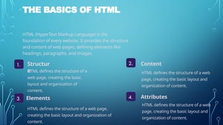
HTML (HyperText Markup Language) is the
foundation of every website. It provides the structure
and content of web pages, defining elements like
headings, paragraphs, and images.
1. Structur
e
4.
2.
3.
Content
Elements Attributes
HTML defines the structure of a
web page, creating the basic
layout and organization of
content.
HTML defines the structure of a web
page, creating the basic layout and
organization of content.
HTML defines the structure of a web page,
creating the basic layout and organization of
content.
HTML defines the structure of a web
page, creating the basic layout and
organization of content.
5.
STYLING WITH CSS
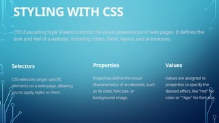
CSS(Cascading Style Sheets) controls the visual presentation of web pages. It defines the
look and feel of a website, including colors, fonts, layout, and animations.
Selectors Properties Values
CSS selectors target specific
elements on a web page, allowing
you to apply styles to them.
Properties define the visual
characteristics of an element, such
as its color, font size, or
background image.
Values are assigned to
properties to specify the
desired effect, like "red" for
color or "16px" for font size.
6.
JAVASCRIPT FOR INTERACTIVITY
JavaScriptis a programming language that adds interactivity and dynamic behavior to
web pages. It allows you to create responsive elements, animations, and user
interactions.
Events
Functions
DOM Manipulation
JavaScript handles user actions, such as clicks, mouseovers, or form submissions.
Functions are blocks of reusable code that perform specific tasks based on events or
conditions.
JavaScript can modify the HTML structure of a web page, updating content or styling in
real-time.
7.
RESPONSIVE WEB DESIGN
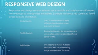
Responsiveweb design ensures websites are accessible and usable across all devices,
from desktops to smartphones and tablets. It adapts the layout and content to fit the
screen size and orientation.
Media Queries
Flexible Layouts
Fluid Images
Use CSS media queries to apply
different styles based on screen
size and orientation.
Employ flexible units like percentages and
ems to allow content to adjust to different
screen widths.
Use responsive images that scale
with the screen size, maintaining
image quality without distortion.