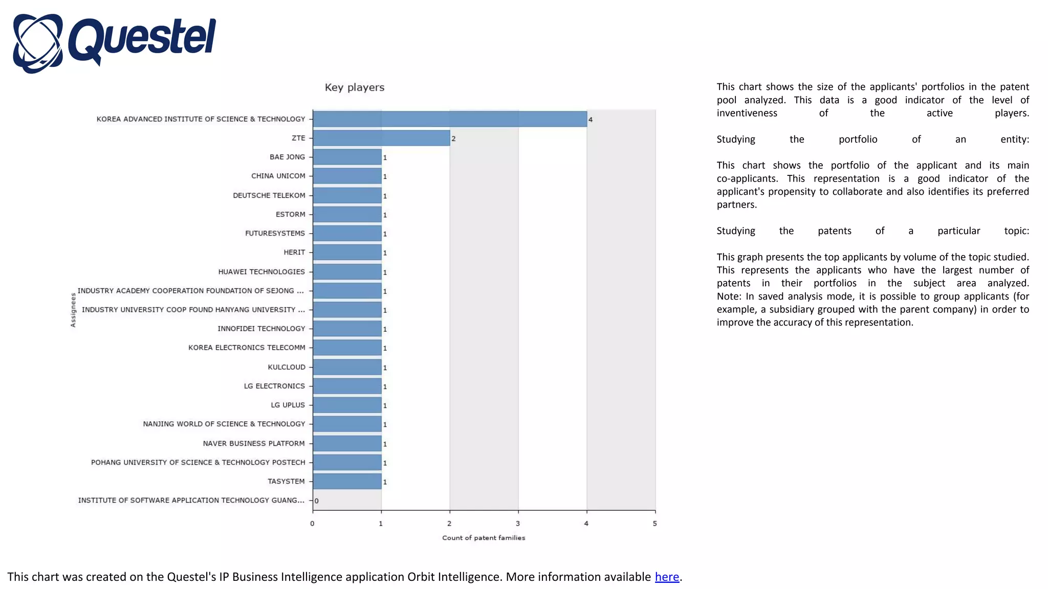
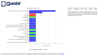
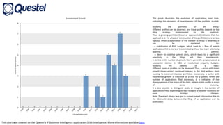
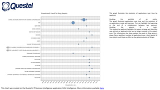
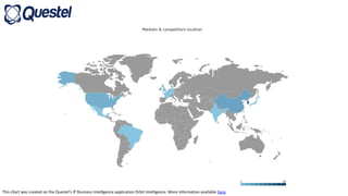
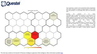
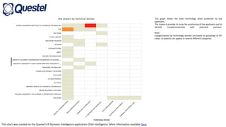
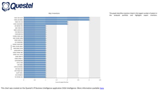
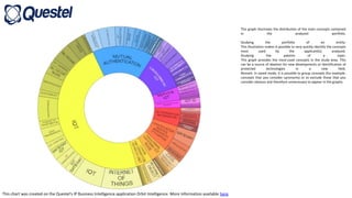
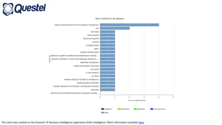
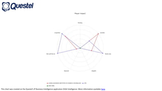
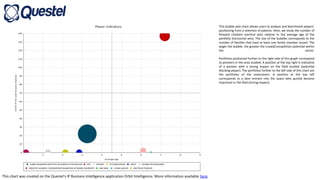
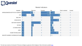
This chart was created on the Questel's IP Business Intelligence application Orbit Intelligence. More information available here.
This chart shows the size of the applicants' portfolios in the patent
pool analyzed. This data is a good indicator of the level of
inventiveness of the active players.
Studying the portfolio of an entity:
This chart shows the portfolio of the applicant and its main
co-applicants. This representation is a good indicator of the
applicant's propensity to collaborate and also identifies its preferred
partners.
Studying the patents of a particular topic:
This graph presents the top applicants by volume of the topic studied.
This represents the applicants who have the largest number of
patents in their portfolios in the subject area analyzed.
Note: In saved analysis mode, it is possible to group applicants (for
example, a subsidiary grouped with the parent company) in order to
improve the accuracy of this representation.
This chart was created on the Questel's IP Business Intelligence application Orbit Intelligence. More information available here.
This chart illustrates the top applicants in the group of patents
analyzed according to their legal status.
This information makes it possible to identify applicants who have
already withdrawn from the sector (abandonment, lapse and/or
expiration of their patents) and those who are still active (applications
and patents granted still in force).
This chart was created on the Questel's IP Business Intelligence application Orbit Intelligence. More information available here.
This graph illustrates the evolution of applications over time,
indicating the dynamics of inventiveness of the portfolio studied.
Studying the portfolio of an entity:
Different profiles can be observed, and these profiles depend on the
filing strategy implemented by the applicant.
Thus, a growing portfolio (linear or exponential) indicates that the
applicant is in the phase of construction of his portfolio (more or less
rapidly). When a stabilization of the number of filings is observed, it
can be explained by:
- a stabilization of R&D budgets, which leads to a flow of patent
applications that is more or less constant without too much selectivity
applying for patents.
- a desire to stabilize patent costs, which leads to a significant
selectivity in the filings and their maintenance.
A decline in the number of patents filed is generally symptomatic of a
substantial decline in R&D or intellectual property budgets.
Studying the patents of a topic:
Different types of profiles can be observed. Thus, a sector with linear
growth shows actors' continued interest in the field without their
needing to construct massive portfolios. Conversely, a sector with
exponential growth is indicative of a race for a patent. When the
number of applications filed decreases, it is indicative of the
disengagement of the actors of the field, while a stable profile is a sign
of sector maturity.
It is also possible to distinguish peaks or troughs in the number of
applications filed, depending on R&D budgets or broader economic or
even strategic changes.
Note: There will always be a gap in current patent information due to
the 18-month delay between the filing of an application and its
publication.
This chart was created on the Questel's IP Business Intelligence application Orbit Intelligence. More information available here.
This graph illustrates the evolution of applications over time by
applicant.
Studying the portfolio of an entity:
This graph illustrates applications over time and the evolution of
co-applications made with partners. This can highlight the beginning
or the end of a collaboration between two partners.
Studying the patents of a topic:
This analysis by applicant highlights the patent strategy and identifies
new entrants or applicants who are no longer involved in this subject
area. This information also helps explain the peaks in filing when a
player files a significant number of applications over a short period of
time (which could have an effect on the global evolution of filings).
This chart was created on the Questel's IP Business Intelligence application Orbit Intelligence. More information available here.
This visualization is based on the International Patent Classification
(IPC) codes contained in a patent set being analyzed. The IPC codes
have been grouped in 35 technology fields, which are represented
here.
Studying the portfolio of an entity:
This graph helps to identify the diversity or the specificity of an
applicant’s patent portfolio. This illustration enables users to very
quickly identify the core business of the player being studied. The
least represented categories also serve as a means to identify other
potential applications of this actor's patents.
Studying the patents of a topic:
This graph is useful in identifying patents in a domain and in a field
that may have multiple uses. It can be a good way to identify new
uses for patents already filed.
Note: Categorizations by technology domain are based on IPC code
groupings, so patents can appear in several different categories.
This chart was created on the Questel's IP Business Intelligence application Orbit Intelligence. More information available here.
This graph shows the main technology areas protected by top
applicants.
This makes it possible to study the positioning of the applicants and to
identify complementarities with potential partners.
Note:
Categorizations by technology domain are based on groupings of IPC
codes, so patents can appear in several different categories.
This chart was created on the Questel's IP Business Intelligence application Orbit Intelligence. More information available here.
This graph identifies inventors listed in the largest number of patent in
the analyzed portfolio and highlights expert inventors.
This chart was created on the Questel's IP Business Intelligence application Orbit Intelligence. More information available here.
This graph illustrates the distribution of the main concepts contained
in the analyzed portfolio.
Studying the portfolio of an entity:
This illustration makes it possible to very quickly identify the concepts
most used by the applicant(s) analyzed.
Studying the patents of a topic:
This graph provides the most-used concepts in the study area. This
can be a source of ideation for new developments or identification of
protected technologies in a new field.
Remark: In saved mode, it is possible to group concepts (for example,
concepts that you consider synonyms) or to exclude those that you
consider obvious and therefore unnecessary to appear in the graphs.
This chart was created on the Questel's IP Business Intelligence application Orbit Intelligence. More information available here.
This bubble plot chart allows users to analyze and benchmark players’
positioning from a selection of patents. Here, we study the number of
forward citations (vertical axis) relative to the average age of the
portfolio (horizontal axis). The size of the bubbles corresponds to the
number of families that have at least one family member issued. The
larger the bubble, the greater the crowd/competition potential within
the sector.
Portfolios positioned further to the right side of this graph correspond
to pioneers in the area studied. A position at the top right is indicative
of a pioneer with a strong impact on the field studied (potential
blocking player). The portfolios further to the left side of this chart are
the portfolios of the newcomers. A position at the top left
corresponds to a later entrant into the space who quickly became
important in the field (strong impact).
This chart was created on the Questel's IP Business Intelligence application Orbit Intelligence. More information available here.
This graph illustrates citations between applicants. This information
identifies portfolios that have strong interactions with each other.
A portfolio that is strongly cited by most players is likely to be a
pioneering or a blocking portfolio.

Internet das Coisas

  • 1.
    This chart wascreated on the Questel's IP Business Intelligence application Orbit Intelligence. More information available here. This chart shows the size of the applicants' portfolios in the patent pool analyzed. This data is a good indicator of the level of inventiveness of the active players. Studying the portfolio of an entity: This chart shows the portfolio of the applicant and its main co-applicants. This representation is a good indicator of the applicant's propensity to collaborate and also identifies its preferred partners. Studying the patents of a particular topic: This graph presents the top applicants by volume of the topic studied. This represents the applicants who have the largest number of patents in their portfolios in the subject area analyzed. Note: In saved analysis mode, it is possible to group applicants (for example, a subsidiary grouped with the parent company) in order to improve the accuracy of this representation.
  • 2.
    This chart wascreated on the Questel's IP Business Intelligence application Orbit Intelligence. More information available here. This chart illustrates the top applicants in the group of patents analyzed according to their legal status. This information makes it possible to identify applicants who have already withdrawn from the sector (abandonment, lapse and/or expiration of their patents) and those who are still active (applications and patents granted still in force).
  • 3.
    This chart wascreated on the Questel's IP Business Intelligence application Orbit Intelligence. More information available here. This graph illustrates the evolution of applications over time, indicating the dynamics of inventiveness of the portfolio studied. Studying the portfolio of an entity: Different profiles can be observed, and these profiles depend on the filing strategy implemented by the applicant. Thus, a growing portfolio (linear or exponential) indicates that the applicant is in the phase of construction of his portfolio (more or less rapidly). When a stabilization of the number of filings is observed, it can be explained by: - a stabilization of R&D budgets, which leads to a flow of patent applications that is more or less constant without too much selectivity applying for patents. - a desire to stabilize patent costs, which leads to a significant selectivity in the filings and their maintenance. A decline in the number of patents filed is generally symptomatic of a substantial decline in R&D or intellectual property budgets. Studying the patents of a topic: Different types of profiles can be observed. Thus, a sector with linear growth shows actors' continued interest in the field without their needing to construct massive portfolios. Conversely, a sector with exponential growth is indicative of a race for a patent. When the number of applications filed decreases, it is indicative of the disengagement of the actors of the field, while a stable profile is a sign of sector maturity. It is also possible to distinguish peaks or troughs in the number of applications filed, depending on R&D budgets or broader economic or even strategic changes. Note: There will always be a gap in current patent information due to the 18-month delay between the filing of an application and its publication.
  • 4.
    This chart wascreated on the Questel's IP Business Intelligence application Orbit Intelligence. More information available here. This graph illustrates the evolution of applications over time by applicant. Studying the portfolio of an entity: This graph illustrates applications over time and the evolution of co-applications made with partners. This can highlight the beginning or the end of a collaboration between two partners. Studying the patents of a topic: This analysis by applicant highlights the patent strategy and identifies new entrants or applicants who are no longer involved in this subject area. This information also helps explain the peaks in filing when a player files a significant number of applications over a short period of time (which could have an effect on the global evolution of filings).
  • 5.
    This chart wascreated on the Questel's IP Business Intelligence application Orbit Intelligence. More information available here.
  • 6.
    This chart wascreated on the Questel's IP Business Intelligence application Orbit Intelligence. More information available here. This visualization is based on the International Patent Classification (IPC) codes contained in a patent set being analyzed. The IPC codes have been grouped in 35 technology fields, which are represented here. Studying the portfolio of an entity: This graph helps to identify the diversity or the specificity of an applicant’s patent portfolio. This illustration enables users to very quickly identify the core business of the player being studied. The least represented categories also serve as a means to identify other potential applications of this actor's patents. Studying the patents of a topic: This graph is useful in identifying patents in a domain and in a field that may have multiple uses. It can be a good way to identify new uses for patents already filed. Note: Categorizations by technology domain are based on IPC code groupings, so patents can appear in several different categories.
  • 7.
    This chart wascreated on the Questel's IP Business Intelligence application Orbit Intelligence. More information available here. This graph shows the main technology areas protected by top applicants. This makes it possible to study the positioning of the applicants and to identify complementarities with potential partners. Note: Categorizations by technology domain are based on groupings of IPC codes, so patents can appear in several different categories.
  • 8.
    This chart wascreated on the Questel's IP Business Intelligence application Orbit Intelligence. More information available here. This graph identifies inventors listed in the largest number of patent in the analyzed portfolio and highlights expert inventors.
  • 9.
    This chart wascreated on the Questel's IP Business Intelligence application Orbit Intelligence. More information available here. This graph illustrates the distribution of the main concepts contained in the analyzed portfolio. Studying the portfolio of an entity: This illustration makes it possible to very quickly identify the concepts most used by the applicant(s) analyzed. Studying the patents of a topic: This graph provides the most-used concepts in the study area. This can be a source of ideation for new developments or identification of protected technologies in a new field. Remark: In saved mode, it is possible to group concepts (for example, concepts that you consider synonyms) or to exclude those that you consider obvious and therefore unnecessary to appear in the graphs.
  • 10.
    This chart wascreated on the Questel's IP Business Intelligence application Orbit Intelligence. More information available here.
  • 11.
    This chart wascreated on the Questel's IP Business Intelligence application Orbit Intelligence. More information available here.
  • 12.
    This chart wascreated on the Questel's IP Business Intelligence application Orbit Intelligence. More information available here. This bubble plot chart allows users to analyze and benchmark players’ positioning from a selection of patents. Here, we study the number of forward citations (vertical axis) relative to the average age of the portfolio (horizontal axis). The size of the bubbles corresponds to the number of families that have at least one family member issued. The larger the bubble, the greater the crowd/competition potential within the sector. Portfolios positioned further to the right side of this graph correspond to pioneers in the area studied. A position at the top right is indicative of a pioneer with a strong impact on the field studied (potential blocking player). The portfolios further to the left side of this chart are the portfolios of the newcomers. A position at the top left corresponds to a later entrant into the space who quickly became important in the field (strong impact).
  • 13.
    This chart wascreated on the Questel's IP Business Intelligence application Orbit Intelligence. More information available here.
  • 14.
    This chart wascreated on the Questel's IP Business Intelligence application Orbit Intelligence. More information available here. This graph illustrates citations between applicants. This information identifies portfolios that have strong interactions with each other. A portfolio that is strongly cited by most players is likely to be a pioneering or a blocking portfolio.