Report
Share

Recommended
Homework two
Kerrang! is a UK-based magazine devoted to rock music that is currently published by Bauer Media Group, a large European publishing company. Originally focused on British heavy metal, Kerrang! became the best-selling British music newspaper in the early 2000s. Bauer Media owns over 300 magazines across 15 countries and various media properties. As one of Bauer Media's music and entertainment titles, Kerrang! delivers rock news, reviews, and features to its passionate audience each week.
Homework one
Homework assignment one involves conducting a content analysis. Students are tasked with analyzing the content of a chosen text, such as a news article, blog post, or social media feed. The analysis should code and categorize the major themes, topics, and concepts discussed in the chosen text and present the findings in a brief report.
Planning
The document provides tips for designing a successful magazine cover, including key elements like the magazine name masthead, cover image, barcode and price, cover line, and images of featured artists or bands. The inside pages should include a table of contents, articles on trending topics, interviews, and advertisements to promote subscription opportunities. Ensuring the cover catches the eye of readers with vibrant graphics and highlighting popular artists/bands and new content inside can help magazines succeed.
Homework 5 feedback
The document summarizes feedback received from a questionnaire on a project. For the front cover, the feedback was that the correct colors were used but the layout could be improved using the rule of thirds. The contents page was found to be conventional but could list more content to fill the page. The double page spread was deemed to have a suitable image to match the genre but the text columns could be smaller and have more text added.
Top 3 music magazines in the uk
The document discusses three popular UK music magazines - Q, Mojo, and NME. Q magazine targets those over 25 years old and focuses on older genres of pop and rock music. It uses red, black, and white colors and is published monthly. Mojo covers various genres including indie and 1960s music, and targets 15-25 year old males with its sans-serif bold font. NME targets 13-19 year olds and focuses on rock and progressive rock music through interviews and articles about upcoming artists and releases. It uses a bold block font to catch the attention of its target audience.
Questionnaire summary
The target audience for the magazine is 11-20 year olds, mainly male, based on a questionnaire. While mostly male, females are also interested. The audience enjoys a wide range of interests and would be attracted to interviews, articles, images of bands and artists, posters, and free items in the magazine. Bold colors and fonts will make the text easy to read. Featured artists and bands will attract the target audience, based on the most popular names identified in the questionnaire.
Draft text
For a magazine double page spread, the writer plans to use a large eye-catching image to entice readers. They will include bold, simple text in columns to introduce the artist being interviewed. A controversial quote from the artist in colorful large writing is intended to grip readers and make them want to learn more about the person from the standfirst and text.
Photography plan
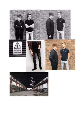
This photography planning document outlines four photo shoots taking place on October 30th and November 1st in various locations like an alleyway, graveyard, and abandoned warehouse. It specifies the dates, locations, props, costumes, and personnel for each shoot, with equipment like lighting also noted. The goal is to capture different scenes and styles across the four planned photos.
Recommended
Homework two
Kerrang! is a UK-based magazine devoted to rock music that is currently published by Bauer Media Group, a large European publishing company. Originally focused on British heavy metal, Kerrang! became the best-selling British music newspaper in the early 2000s. Bauer Media owns over 300 magazines across 15 countries and various media properties. As one of Bauer Media's music and entertainment titles, Kerrang! delivers rock news, reviews, and features to its passionate audience each week.
Homework one
Homework assignment one involves conducting a content analysis. Students are tasked with analyzing the content of a chosen text, such as a news article, blog post, or social media feed. The analysis should code and categorize the major themes, topics, and concepts discussed in the chosen text and present the findings in a brief report.
Planning
The document provides tips for designing a successful magazine cover, including key elements like the magazine name masthead, cover image, barcode and price, cover line, and images of featured artists or bands. The inside pages should include a table of contents, articles on trending topics, interviews, and advertisements to promote subscription opportunities. Ensuring the cover catches the eye of readers with vibrant graphics and highlighting popular artists/bands and new content inside can help magazines succeed.
Homework 5 feedback
The document summarizes feedback received from a questionnaire on a project. For the front cover, the feedback was that the correct colors were used but the layout could be improved using the rule of thirds. The contents page was found to be conventional but could list more content to fill the page. The double page spread was deemed to have a suitable image to match the genre but the text columns could be smaller and have more text added.
Top 3 music magazines in the uk
The document discusses three popular UK music magazines - Q, Mojo, and NME. Q magazine targets those over 25 years old and focuses on older genres of pop and rock music. It uses red, black, and white colors and is published monthly. Mojo covers various genres including indie and 1960s music, and targets 15-25 year old males with its sans-serif bold font. NME targets 13-19 year olds and focuses on rock and progressive rock music through interviews and articles about upcoming artists and releases. It uses a bold block font to catch the attention of its target audience.
Questionnaire summary
The target audience for the magazine is 11-20 year olds, mainly male, based on a questionnaire. While mostly male, females are also interested. The audience enjoys a wide range of interests and would be attracted to interviews, articles, images of bands and artists, posters, and free items in the magazine. Bold colors and fonts will make the text easy to read. Featured artists and bands will attract the target audience, based on the most popular names identified in the questionnaire.
Draft text
For a magazine double page spread, the writer plans to use a large eye-catching image to entice readers. They will include bold, simple text in columns to introduce the artist being interviewed. A controversial quote from the artist in colorful large writing is intended to grip readers and make them want to learn more about the person from the standfirst and text.
Photography plan
This photography planning document outlines four photo shoots taking place on October 30th and November 1st in various locations like an alleyway, graveyard, and abandoned warehouse. It specifies the dates, locations, props, costumes, and personnel for each shoot, with equipment like lighting also noted. The goal is to capture different scenes and styles across the four planned photos.
Analysing a relevant media pack
This media pack provides statistics about its target audience that would be relevant for a new magazine. The target audience spends heavily on items like cosmetics, clothing, and gaming accessories, indicating they value appearance and gaming. As Kerrang magazine shares a similar audience focused on rock music, the target audience for a new magazine would likely value quality, appearance, and gaming like Kerrang's readership.
Media pack
This new rock magazine called Anarchy aims to create a community for young rock enthusiasts to bring them together as one. It is passionate about rock music and wants to take over the rock scene by inspiring young people to start producing their own rock music.
Analysis of music magazine
The document analyzes the design conventions used in two different magazine spreads. For the first magazine cover: The serif font relates to an older target audience. Bright colors and the red masthead draw attention. A mid-shot image of an artist holding a gun represents danger associated with rock music. Short, straightforward language grabs readers' attention. For the second magazine spread: Serif fonts seem formal rather than fitting the rock genre. Images and colors convey masculinity and aggression through rebellious poses and attire, fitting rock music conventions.
Question 2 representations
The magazine represents its target audience of 11-20 year old males as aggressive and careless. On the front cover, the artist wears a leather jacket associated with rock stars. The contents page shows the artist looking relaxed and careless. On the double page spread, bold but distressed fonts, dark gloomy colors, and a sinister setting portray the target group as destructive rule breakers, in line with stereotypes of the social group.
My pitch to bauer media group
My magazine will focus on rock music and appeal to readers aged 11-20. It will include interviews with famous artists, the latest music charts and news, and stories profiling both established and up-and-coming bands. The magazine's design will use a bold masthead and rebellious imagery on the cover in black, red, and yellow to match the genre. Double page spreads will feature large main images and pull quotes to draw readers in. The contents page will clearly list sections and include a small captioned image related to the target audience. The informal tone and focus on concerts, reviews, and artist profiles aim to directly connect with younger readers interested in the rock scene.
Task 1
Mojo is a UK music magazine first published in 1993 that focuses on rock and indie music. It has varying cover designs but always displays "free cd inside" to attract readers. The target audience is older male music fans interested in music history.
Q Magazine, first published in 1986, focuses on rock and pop music. It has a consistent design with the letter Q always in red on a white background. The target audience is males aged 15-25 interested in current music.
NME Magazine has been published since 1949 focusing on pop music. It always prominently displays its masthead in a large, bold font to stand out on its usually busy, informal covers aimed at attracting men aged 17-30.
Task 5
The document discusses conventions of magazine layout and genre in rock magazines. It notes that rock magazine layouts are typically busy with a lot of information organized to follow the reader's eye path. The masthead is usually in a bold sans-serif font at the top of the page to appeal to the target male audience. Cover images usually feature a mid-shot of a band from the genre to attract fans of that music. Font, images, and colors in rock magazines also aim to fit the genre and target male readers through use of sans-serif fonts, colors like black and red that imply darkness and energy, and photos edited into black and white to match the color scheme.
Task 2
The document summarizes the key design elements of magazine covers and spreads for the magazine Kerrang. It discusses the typography, layout, color, language, and conventions used on the cover and in spreads. On covers, a bold sans-serif font is used to appeal to the target male audience aged 15-35. Bright colors like yellow and black are used to stand out. Inside spreads vary font sizes to draw attention and follow a bottom-heavy layout. Color, fonts, and images of bands are used to match the rock genre. Language like "Win!" increases reader interest.
Homework 2
Bauer Media Group owns many magazines, radio stations, and TV channels across different countries, including brands like Kerrang!, Empire, Mojo, Q, and Kiss. While they appeal to a wide range of ages and genders overall, each individual brand targets specific demographics - for example, Kerrang! aims at a different audience than Q. Bauer Media Group is an example of media cross-ownership, as they own multiple media businesses across 15 countries, with over 300 magazine titles. The privately-held company is currently 85% owned by Yvonne Bauer and has been managed by five generations of the Bauer family.
Focus group answer 4
A focus group participant was asked questions about magazine purchasing habits. The 20-year-old male has previously purchased the music magazine Kerrang and bases his magazine buying decisions primarily on the appearance of the front cover. He prefers covers that use bright colors that catch his eye and look interesting. The most he is willing to spend on a single magazine is £3 since he has a limited budget for magazines.
Focus group answer 5
A male focus group participant aged 21 was asked questions about his magazine buying habits. He has previously purchased the Classic Rock magazine and looks for information about charting bands when choosing a magazine. He prefers magazine covers that attract attention and look interesting. He is willing to spend up to £4 on a magazine as he doesn't expect high quality magazines to be cheap.
Question 2
The magazine represents people in a way that conveys themes of the rock genre such as aggression and violence. On the front cover, a model is biting a guitar neck, displaying aggression. In the contents page, a model with closed body language and an aggressive stare implies they keep to themselves. In a double page spread, a model's blank stare gives an intimidating impression. Technical elements like camera work using shadowing, mise-en-scene featuring tattoos, and colors like red and black associated with danger are used to create representations that relate to the rock genre and imply aggression.
Focus group questions
This focus group survey asks participants for their demographic information like gender and age, as well as questions about their magazine buying habits such as what publications they have purchased before, what factors influence their magazine purchases, their preferred magazine cover styles, and how much money they are willing to spend on a magazine.
Question 4 and 5
The target audience for this magazine is males aged 11-29 who enjoy masculine hobbies like mountain biking, rugby, and football. The magazine appeals to this audience by featuring content they care about, such as exclusive band interviews, information about guitars, and using language and designs they can relate to. Promotional deals, appealing cover designs with band names and "exclusive" text, and color palettes associated with rock music are also used to attract the target readership.
Focus group answer 3
A focus group was conducted with a 17-year-old female participant. She has previously purchased the music magazine Kerrang and looks for the artist on the front cover when buying magazines. Her preferred magazine cover is one featuring Green Day as she is a fan of that band. The most she would spend on a magazine is £4 depending on its perceived quality.
Focus group answer 1
A focus group participant was asked questions about magazine purchasing habits. The 18-year-old male has previously purchased the Classic Rock magazine and looks for artists he enjoys when choosing a magazine. He prefers a colorful magazine cover because it looks interesting and would spend up to £3.50 on a magazine depending on its quality.
Focus group answer 2
A focus group participant was asked questions about magazine purchasing habits. The male participant, age 21, had previously purchased Rolling Stone magazine because it contained interesting articles on bands he liked. When asked about magazine covers, he preferred ones that stood out, such as one featuring Pink Floyd, and said he would spend up to £4 on a magazine.
Front cover layout
This document appears to be from a magazine or newspaper and contains several short news stories and articles, as well as images and identifying information like a masthead and barcode. A longer cover story is the primary focus, with supplementary smaller stories and visuals to round out the publication's content.
How to Manage Your Lost Opportunities in Odoo 17 CRM
Odoo 17 CRM allows us to track why we lose sales opportunities with "Lost Reasons." This helps analyze our sales process and identify areas for improvement. Here's how to configure lost reasons in Odoo 17 CRM
Exploiting Artificial Intelligence for Empowering Researchers and Faculty, In...
Exploiting Artificial Intelligence for Empowering Researchers and Faculty, In...Dr. Vinod Kumar Kanvaria
Exploiting Artificial Intelligence for Empowering Researchers and Faculty,
International FDP on Fundamentals of Research in Social Sciences
at Integral University, Lucknow, 06.06.2024
By Dr. Vinod Kumar KanvariaMore Related Content
Viewers also liked
Analysing a relevant media pack
This media pack provides statistics about its target audience that would be relevant for a new magazine. The target audience spends heavily on items like cosmetics, clothing, and gaming accessories, indicating they value appearance and gaming. As Kerrang magazine shares a similar audience focused on rock music, the target audience for a new magazine would likely value quality, appearance, and gaming like Kerrang's readership.
Media pack
This new rock magazine called Anarchy aims to create a community for young rock enthusiasts to bring them together as one. It is passionate about rock music and wants to take over the rock scene by inspiring young people to start producing their own rock music.
Analysis of music magazine
The document analyzes the design conventions used in two different magazine spreads. For the first magazine cover: The serif font relates to an older target audience. Bright colors and the red masthead draw attention. A mid-shot image of an artist holding a gun represents danger associated with rock music. Short, straightforward language grabs readers' attention. For the second magazine spread: Serif fonts seem formal rather than fitting the rock genre. Images and colors convey masculinity and aggression through rebellious poses and attire, fitting rock music conventions.
Question 2 representations
The magazine represents its target audience of 11-20 year old males as aggressive and careless. On the front cover, the artist wears a leather jacket associated with rock stars. The contents page shows the artist looking relaxed and careless. On the double page spread, bold but distressed fonts, dark gloomy colors, and a sinister setting portray the target group as destructive rule breakers, in line with stereotypes of the social group.
My pitch to bauer media group
My magazine will focus on rock music and appeal to readers aged 11-20. It will include interviews with famous artists, the latest music charts and news, and stories profiling both established and up-and-coming bands. The magazine's design will use a bold masthead and rebellious imagery on the cover in black, red, and yellow to match the genre. Double page spreads will feature large main images and pull quotes to draw readers in. The contents page will clearly list sections and include a small captioned image related to the target audience. The informal tone and focus on concerts, reviews, and artist profiles aim to directly connect with younger readers interested in the rock scene.
Task 1
Mojo is a UK music magazine first published in 1993 that focuses on rock and indie music. It has varying cover designs but always displays "free cd inside" to attract readers. The target audience is older male music fans interested in music history.
Q Magazine, first published in 1986, focuses on rock and pop music. It has a consistent design with the letter Q always in red on a white background. The target audience is males aged 15-25 interested in current music.
NME Magazine has been published since 1949 focusing on pop music. It always prominently displays its masthead in a large, bold font to stand out on its usually busy, informal covers aimed at attracting men aged 17-30.
Task 5
The document discusses conventions of magazine layout and genre in rock magazines. It notes that rock magazine layouts are typically busy with a lot of information organized to follow the reader's eye path. The masthead is usually in a bold sans-serif font at the top of the page to appeal to the target male audience. Cover images usually feature a mid-shot of a band from the genre to attract fans of that music. Font, images, and colors in rock magazines also aim to fit the genre and target male readers through use of sans-serif fonts, colors like black and red that imply darkness and energy, and photos edited into black and white to match the color scheme.
Task 2
The document summarizes the key design elements of magazine covers and spreads for the magazine Kerrang. It discusses the typography, layout, color, language, and conventions used on the cover and in spreads. On covers, a bold sans-serif font is used to appeal to the target male audience aged 15-35. Bright colors like yellow and black are used to stand out. Inside spreads vary font sizes to draw attention and follow a bottom-heavy layout. Color, fonts, and images of bands are used to match the rock genre. Language like "Win!" increases reader interest.
Homework 2
Bauer Media Group owns many magazines, radio stations, and TV channels across different countries, including brands like Kerrang!, Empire, Mojo, Q, and Kiss. While they appeal to a wide range of ages and genders overall, each individual brand targets specific demographics - for example, Kerrang! aims at a different audience than Q. Bauer Media Group is an example of media cross-ownership, as they own multiple media businesses across 15 countries, with over 300 magazine titles. The privately-held company is currently 85% owned by Yvonne Bauer and has been managed by five generations of the Bauer family.
Focus group answer 4
A focus group participant was asked questions about magazine purchasing habits. The 20-year-old male has previously purchased the music magazine Kerrang and bases his magazine buying decisions primarily on the appearance of the front cover. He prefers covers that use bright colors that catch his eye and look interesting. The most he is willing to spend on a single magazine is £3 since he has a limited budget for magazines.
Focus group answer 5
A male focus group participant aged 21 was asked questions about his magazine buying habits. He has previously purchased the Classic Rock magazine and looks for information about charting bands when choosing a magazine. He prefers magazine covers that attract attention and look interesting. He is willing to spend up to £4 on a magazine as he doesn't expect high quality magazines to be cheap.
Question 2
The magazine represents people in a way that conveys themes of the rock genre such as aggression and violence. On the front cover, a model is biting a guitar neck, displaying aggression. In the contents page, a model with closed body language and an aggressive stare implies they keep to themselves. In a double page spread, a model's blank stare gives an intimidating impression. Technical elements like camera work using shadowing, mise-en-scene featuring tattoos, and colors like red and black associated with danger are used to create representations that relate to the rock genre and imply aggression.
Focus group questions
This focus group survey asks participants for their demographic information like gender and age, as well as questions about their magazine buying habits such as what publications they have purchased before, what factors influence their magazine purchases, their preferred magazine cover styles, and how much money they are willing to spend on a magazine.
Question 4 and 5
The target audience for this magazine is males aged 11-29 who enjoy masculine hobbies like mountain biking, rugby, and football. The magazine appeals to this audience by featuring content they care about, such as exclusive band interviews, information about guitars, and using language and designs they can relate to. Promotional deals, appealing cover designs with band names and "exclusive" text, and color palettes associated with rock music are also used to attract the target readership.
Focus group answer 3
A focus group was conducted with a 17-year-old female participant. She has previously purchased the music magazine Kerrang and looks for the artist on the front cover when buying magazines. Her preferred magazine cover is one featuring Green Day as she is a fan of that band. The most she would spend on a magazine is £4 depending on its perceived quality.
Focus group answer 1
A focus group participant was asked questions about magazine purchasing habits. The 18-year-old male has previously purchased the Classic Rock magazine and looks for artists he enjoys when choosing a magazine. He prefers a colorful magazine cover because it looks interesting and would spend up to £3.50 on a magazine depending on its quality.
Focus group answer 2
A focus group participant was asked questions about magazine purchasing habits. The male participant, age 21, had previously purchased Rolling Stone magazine because it contained interesting articles on bands he liked. When asked about magazine covers, he preferred ones that stood out, such as one featuring Pink Floyd, and said he would spend up to £4 on a magazine.
Front cover layout
This document appears to be from a magazine or newspaper and contains several short news stories and articles, as well as images and identifying information like a masthead and barcode. A longer cover story is the primary focus, with supplementary smaller stories and visuals to round out the publication's content.
Viewers also liked (20)
Recently uploaded
How to Manage Your Lost Opportunities in Odoo 17 CRM
Odoo 17 CRM allows us to track why we lose sales opportunities with "Lost Reasons." This helps analyze our sales process and identify areas for improvement. Here's how to configure lost reasons in Odoo 17 CRM
Exploiting Artificial Intelligence for Empowering Researchers and Faculty, In...
Exploiting Artificial Intelligence for Empowering Researchers and Faculty, In...Dr. Vinod Kumar Kanvaria
Exploiting Artificial Intelligence for Empowering Researchers and Faculty,
International FDP on Fundamentals of Research in Social Sciences
at Integral University, Lucknow, 06.06.2024
By Dr. Vinod Kumar KanvariaThe Diamonds of 2023-2024 in the IGRA collection
A review of the growth of the Israel Genealogy Research Association Database Collection for the last 12 months. Our collection is now passed the 3 million mark and still growing. See which archives have contributed the most. See the different types of records we have, and which years have had records added. You can also see what we have for the future.
Digital Artifact 1 - 10VCD Environments Unit
Digital Artifact 1 - 10VCD Environments Unit - NGV Pavilion Concept Design
DRUGS AND ITS classification slide share
Any substance (other than food) that is used to prevent, diagnose, treat, or relieve symptoms of a
disease or abnormal condition
How to Fix the Import Error in the Odoo 17
An import error occurs when a program fails to import a module or library, disrupting its execution. In languages like Python, this issue arises when the specified module cannot be found or accessed, hindering the program's functionality. Resolving import errors is crucial for maintaining smooth software operation and uninterrupted development processes.
Walmart Business+ and Spark Good for Nonprofits.pdf
"Learn about all the ways Walmart supports nonprofit organizations.
You will hear from Liz Willett, the Head of Nonprofits, and hear about what Walmart is doing to help nonprofits, including Walmart Business and Spark Good. Walmart Business+ is a new offer for nonprofits that offers discounts and also streamlines nonprofits order and expense tracking, saving time and money.
The webinar may also give some examples on how nonprofits can best leverage Walmart Business+.
The event will cover the following::
Walmart Business + (https://business.walmart.com/plus) is a new shopping experience for nonprofits, schools, and local business customers that connects an exclusive online shopping experience to stores. Benefits include free delivery and shipping, a 'Spend Analytics” feature, special discounts, deals and tax-exempt shopping.
Special TechSoup offer for a free 180 days membership, and up to $150 in discounts on eligible orders.
Spark Good (walmart.com/sparkgood) is a charitable platform that enables nonprofits to receive donations directly from customers and associates.
Answers about how you can do more with Walmart!"
Natural birth techniques - Mrs.Akanksha Trivedi Rama University
Natural birth techniques - Mrs.Akanksha Trivedi Rama UniversityAkanksha trivedi rama nursing college kanpur.
Natural birth techniques are various type such as/ water birth , alexender method, hypnosis, bradley method, lamaze method etcThe History of Stoke Newington Street Names
Presented at the Stoke Newington Literary Festival on 9th June 2024
www.StokeNewingtonHistory.com
Azure Interview Questions and Answers PDF By ScholarHat
Azure Interview Questions and Answers PDF By ScholarHat
PCOS corelations and management through Ayurveda.
This presentation includes basic of PCOS their pathology and treatment and also Ayurveda correlation of PCOS and Ayurvedic line of treatment mentioned in classics.
Chapter 4 - Islamic Financial Institutions in Malaysia.pptx
Chapter 4 - Islamic Financial Institutions in Malaysia.pptxMohd Adib Abd Muin, Senior Lecturer at Universiti Utara Malaysia
This slide is special for master students (MIBS & MIFB) in UUM. Also useful for readers who are interested in the topic of contemporary Islamic banking.
ANATOMY AND BIOMECHANICS OF HIP JOINT.pdf
it describes the bony anatomy including the femoral head , acetabulum, labrum . also discusses the capsule , ligaments . muscle that act on the hip joint and the range of motion are outlined. factors affecting hip joint stability and weight transmission through the joint are summarized.
Pollock and Snow "DEIA in the Scholarly Landscape, Session One: Setting Expec...
Pollock and Snow "DEIA in the Scholarly Landscape, Session One: Setting Expec...National Information Standards Organization (NISO)
This presentation was provided by Steph Pollock of The American Psychological Association’s Journals Program, and Damita Snow, of The American Society of Civil Engineers (ASCE), for the initial session of NISO's 2024 Training Series "DEIA in the Scholarly Landscape." Session One: 'Setting Expectations: a DEIA Primer,' was held June 6, 2024.The simplified electron and muon model, Oscillating Spacetime: The Foundation...
Discover the Simplified Electron and Muon Model: A New Wave-Based Approach to Understanding Particles delves into a groundbreaking theory that presents electrons and muons as rotating soliton waves within oscillating spacetime. Geared towards students, researchers, and science buffs, this book breaks down complex ideas into simple explanations. It covers topics such as electron waves, temporal dynamics, and the implications of this model on particle physics. With clear illustrations and easy-to-follow explanations, readers will gain a new outlook on the universe's fundamental nature.
How to Make a Field Mandatory in Odoo 17
In Odoo, making a field required can be done through both Python code and XML views. When you set the required attribute to True in Python code, it makes the field required across all views where it's used. Conversely, when you set the required attribute in XML views, it makes the field required only in the context of that particular view.
Recently uploaded (20)
How to Manage Your Lost Opportunities in Odoo 17 CRM
How to Manage Your Lost Opportunities in Odoo 17 CRM
Exploiting Artificial Intelligence for Empowering Researchers and Faculty, In...
Exploiting Artificial Intelligence for Empowering Researchers and Faculty, In...
Walmart Business+ and Spark Good for Nonprofits.pdf
Walmart Business+ and Spark Good for Nonprofits.pdf
Natural birth techniques - Mrs.Akanksha Trivedi Rama University
Natural birth techniques - Mrs.Akanksha Trivedi Rama University
Film vocab for eal 3 students: Australia the movie
Film vocab for eal 3 students: Australia the movie
Azure Interview Questions and Answers PDF By ScholarHat
Azure Interview Questions and Answers PDF By ScholarHat
Chapter 4 - Islamic Financial Institutions in Malaysia.pptx
Chapter 4 - Islamic Financial Institutions in Malaysia.pptx
Pollock and Snow "DEIA in the Scholarly Landscape, Session One: Setting Expec...
Pollock and Snow "DEIA in the Scholarly Landscape, Session One: Setting Expec...
The simplified electron and muon model, Oscillating Spacetime: The Foundation...
The simplified electron and muon model, Oscillating Spacetime: The Foundation...