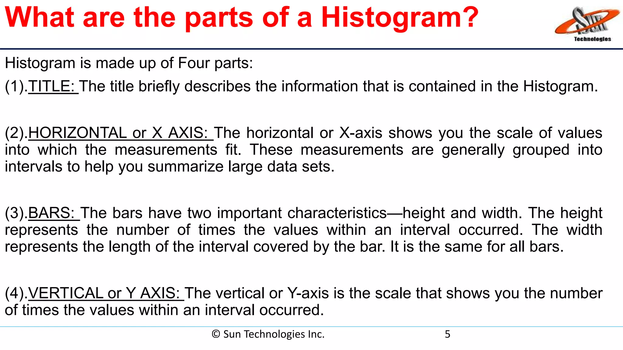
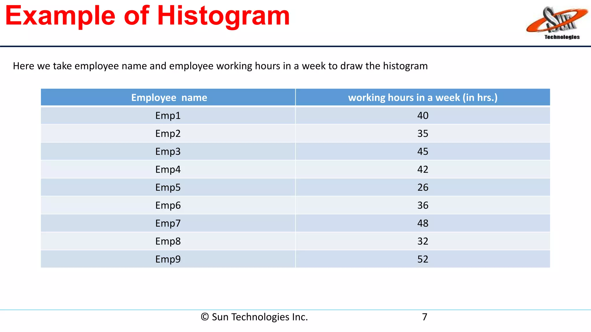
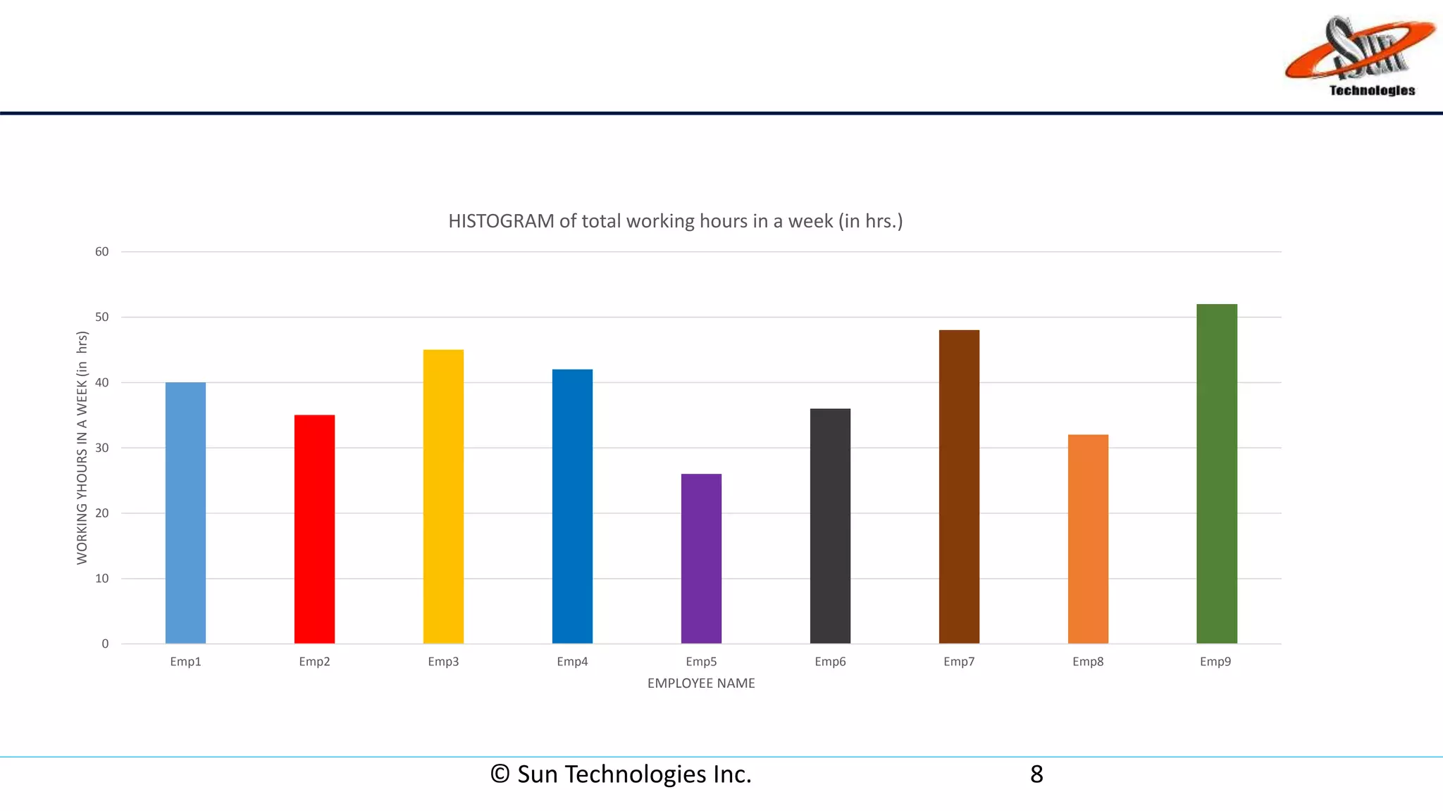
© Sun Technologies Inc. 1
HISTOGRAM QUALITY TOOL
Quality tools
Any type of device or tool that is used to support the quality of all products. It can
take the shape of a chart, technique or strategy that can be used to ensure quality
is maintained during production techniques.
Seven basic quality tools in software development are:
• Check list
• Pareto diagram
• Histogram
• Stratification/ Run chart
• Scatter diagram
• Control chart
• Cause-and-effect diagram (also known as the "fishbone" or Ishikawa diagram)
© Sun Technologies Inc. 2
What is histogram?
• Graphical representation of the frequency distribution of data in bar form is called
histogram .
• Summarizes data from a process that has been collected over a period of time .
• Histograms provide the easiest way to evaluate the distribution of data.
© Sun Technologies Inc. 3
When Are Histograms Used?
• Summarize large data sets graphically.
• Compare measurements to specifications.
• Communicate information to the team.
• Assist in decision making.
© Sun Technologies Inc. 4
What are the parts of a Histogram?
Histogram is made up of Four parts:
(1).TITLE: The title briefly describes the information that is contained in the Histogram.
(2).HORIZONTAL or X AXIS: The horizontal or X-axis shows you the scale of values
into which the measurements fit. These measurements are generally grouped into
intervals to help you summarize large data sets.
(3).BARS: The bars have two important characteristics—height and width. The height
represents the number of times the values within an interval occurred. The width
represents the length of the interval covered by the bar. It is the same for all bars.
(4).VERTICAL or Y AXIS: The vertical or Y-axis is the scale that shows you the number
of times the values within an interval occurred.
© Sun Technologies Inc. 5
Constructing a Histogram
• Step 1 - Count number of data points
• Step 2 - Summarize on a tally sheet
• Step 3 - Compute the range
• Step 4 - Determine number of intervals
• Step 5 - Compute interval width
• Step 6 - Determine interval starting points
• Step 7 - Count number of points in each interval
• Step 8 - Plot the data
• Step 9 - Add title
© Sun Technologies Inc. 6
Example of Histogram
Employee name working hours in a week (in hrs.)
Emp1 40
Emp2 35
Emp3 45
Emp4 42
Emp5 26
Emp6 36
Emp7 48
Emp8 32
Emp9 52
© Sun Technologies Inc. 7
Here we take employee name and employee working hours in a week to draw the histogram
© Sun Technologies Inc. 8
0
10
20
30
40
50
60
Emp1 Emp2 Emp3 Emp4 Emp5 Emp6 Emp7 Emp8 Emp9
WORKINGYHOURSINAWEEK(inhrs)
EMPLOYEE NAME
HISTOGRAM of total working hours in a week (in hrs.)
Advantages of Histogram
• Display large amount of data that are difficult to interpret in a
tabular form.
• Show the relative frequency of occurrences of the various data
values.
• Reveal the variation ,centering and distribution shape of the
data.
• Very useful when calculating capability of a process.
• Helps predict future performance of process.
© Sun Technologies Inc. 9
Disadvantages of Histogram
• Use only with continuous data.
• More difficult to compare two data sets.
• Cannot read exact values because data is grouped into categories.
© Sun Technologies Inc. 10
Thank you
© Sun Technologies Inc. 11

Histogram

  • 1.
    © Sun TechnologiesInc. 1 HISTOGRAM QUALITY TOOL
  • 2.
    Quality tools Any typeof device or tool that is used to support the quality of all products. It can take the shape of a chart, technique or strategy that can be used to ensure quality is maintained during production techniques. Seven basic quality tools in software development are: • Check list • Pareto diagram • Histogram • Stratification/ Run chart • Scatter diagram • Control chart • Cause-and-effect diagram (also known as the "fishbone" or Ishikawa diagram) © Sun Technologies Inc. 2
  • 3.
    What is histogram? •Graphical representation of the frequency distribution of data in bar form is called histogram . • Summarizes data from a process that has been collected over a period of time . • Histograms provide the easiest way to evaluate the distribution of data. © Sun Technologies Inc. 3
  • 4.
    When Are HistogramsUsed? • Summarize large data sets graphically. • Compare measurements to specifications. • Communicate information to the team. • Assist in decision making. © Sun Technologies Inc. 4
  • 5.
    What are theparts of a Histogram? Histogram is made up of Four parts: (1).TITLE: The title briefly describes the information that is contained in the Histogram. (2).HORIZONTAL or X AXIS: The horizontal or X-axis shows you the scale of values into which the measurements fit. These measurements are generally grouped into intervals to help you summarize large data sets. (3).BARS: The bars have two important characteristics—height and width. The height represents the number of times the values within an interval occurred. The width represents the length of the interval covered by the bar. It is the same for all bars. (4).VERTICAL or Y AXIS: The vertical or Y-axis is the scale that shows you the number of times the values within an interval occurred. © Sun Technologies Inc. 5
  • 6.
    Constructing a Histogram •Step 1 - Count number of data points • Step 2 - Summarize on a tally sheet • Step 3 - Compute the range • Step 4 - Determine number of intervals • Step 5 - Compute interval width • Step 6 - Determine interval starting points • Step 7 - Count number of points in each interval • Step 8 - Plot the data • Step 9 - Add title © Sun Technologies Inc. 6
  • 7.
    Example of Histogram Employeename working hours in a week (in hrs.) Emp1 40 Emp2 35 Emp3 45 Emp4 42 Emp5 26 Emp6 36 Emp7 48 Emp8 32 Emp9 52 © Sun Technologies Inc. 7 Here we take employee name and employee working hours in a week to draw the histogram
  • 8.
    © Sun TechnologiesInc. 8 0 10 20 30 40 50 60 Emp1 Emp2 Emp3 Emp4 Emp5 Emp6 Emp7 Emp8 Emp9 WORKINGYHOURSINAWEEK(inhrs) EMPLOYEE NAME HISTOGRAM of total working hours in a week (in hrs.)
  • 9.
    Advantages of Histogram •Display large amount of data that are difficult to interpret in a tabular form. • Show the relative frequency of occurrences of the various data values. • Reveal the variation ,centering and distribution shape of the data. • Very useful when calculating capability of a process. • Helps predict future performance of process. © Sun Technologies Inc. 9
  • 10.
    Disadvantages of Histogram •Use only with continuous data. • More difficult to compare two data sets. • Cannot read exact values because data is grouped into categories. © Sun Technologies Inc. 10
  • 11.
    Thank you © SunTechnologies Inc. 11